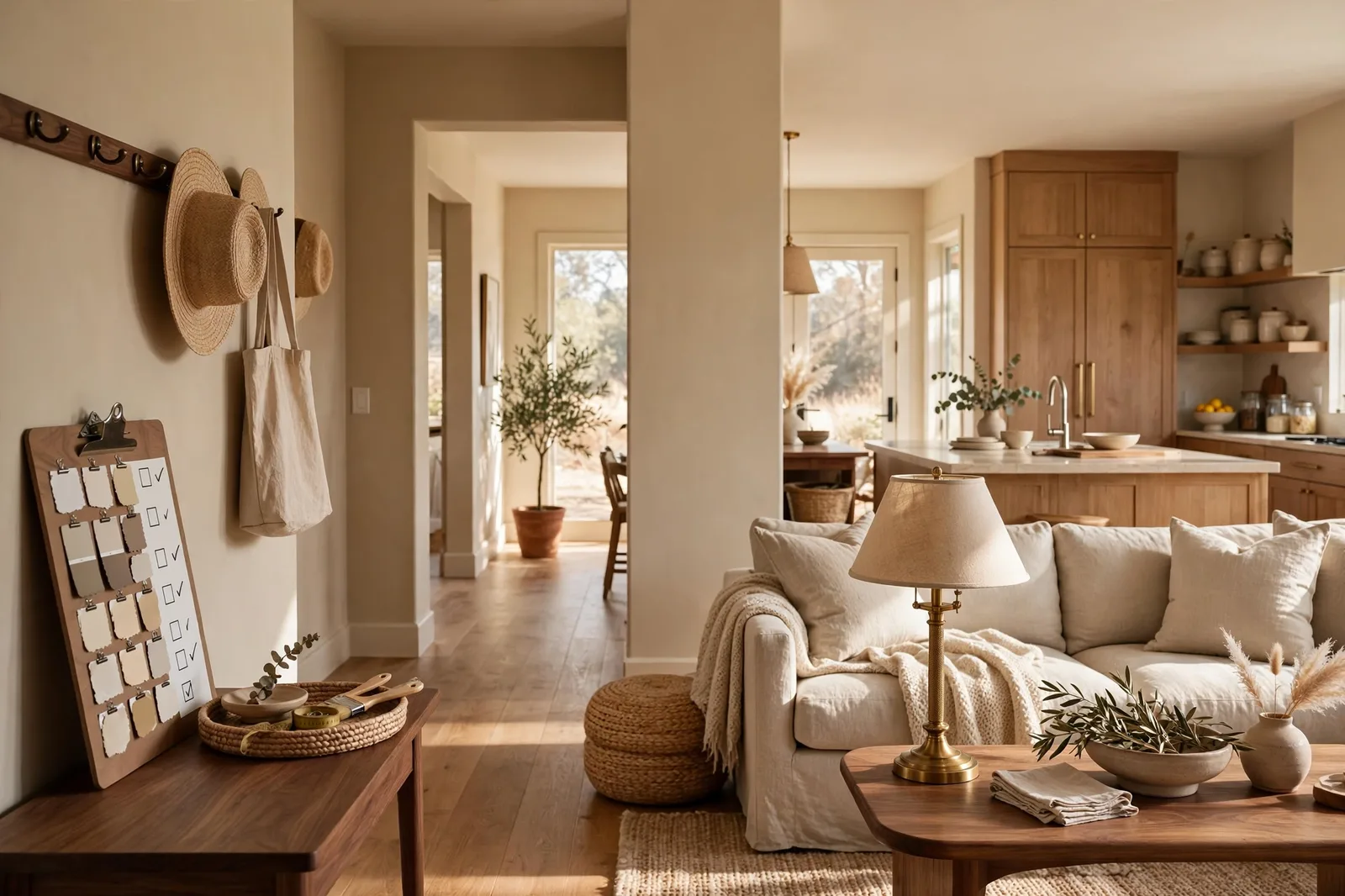
Most paint disasters are not color disasters, they are sequence disasters. A beautiful greige that would have worked in the bedroom gets rejected because it fights the hallway; a kitchen wall chosen in isolation argues with the living room visible through the doorway. The room-by-room checklist fixes the order of decisions, not just the colors. It starts with the rooms you see first and most (entry, hallway, living), anchors the connected spaces, handles the rooms where fixed finishes boss you around (kitchens, baths), frees the private rooms with discipline, and finishes with the trim and ceiling decisions that span every room. Paint colors shift with lighting, surface, and sheen, so always test a large physical sample in your own space before committing, screen swatches are approximations. The Global Abode is an independent publication, not affiliated with or endorsed by Sherwin-Williams or Benjamin Moore; all color names and codes are referenced as widely-known designer examples.
Key takeaway: Plan in this order, (1) the entry-first sequence: foyer, hallway, living room, because every sightline starts there; (2) the living and open-plan anchor: one neutral family that carries every connected space; (3) the fixed-finish rooms: kitchens and baths, where stone, tile, and cabinetry get the first vote; (4) the private rooms: bedrooms and studies, where you may go deeper or bolder within the same temperature family; (5) the spanning decisions: one trim white, one ceiling treatment, and consistent sheens across the whole house. Undertone notes below are widely-reported designer observations, not exact manufacturer specifications.
Why Room-by-Room Planning Beats Color-by-Color Shopping
Walk into a paint store with a room-by-room mindset and you will come out with better walls than the person who walked in with a favorite color. The reason is simple: a home is not a collection of rooms, it is a sequence of views. You never see the living room alone, you see it from the hallway, from the kitchen, from the front door. Every color is judged against whatever it sits next to. Choosing colors room by room, in the right order, means each decision accounts for the neighbors it will be seen with.
The color-by-color shopper picks the living room first (it is the biggest room, so it feels most important), then the kitchen, then the bedrooms, each in isolation, and discovers at the end that none of them quite talk to each other. The room-by-room planner works in the opposite direction: connections first, rooms second. The hallway neutral is chosen before the bedroom color. The living room anchor is chosen before the kitchen wall. The ceiling white is chosen before anything, because it touches every room in the house.
There is a second reason the checklist matters: decisions have a natural order of permanence and visibility. The rooms you see most, the entry, the main living spaces, the sightlines that run through the house, deserve the calmest, most considered colors, because you will live with them every day. The rooms you see least, the powder room behind a closed door, the guest bedroom, are where the personality and the boldness live. Planning room by room lets you put the restraint where the traffic is and the drama where the doors are.
Finally, the checklist protects you from the most expensive mistake in interior paint: choosing a wall color for a finish you are about to replace. If the kitchen is getting new counters next year, don’t pick its wall color around the old granite. If the sofa is on its way out, don’t match the walls to it. The checklist puts finishes and furniture decisions ahead of paint decisions in every room, because paint is the cheapest thing to change and should always be chosen last. For the full method, our finishes-first color scheme guide covers how to read your fixed surfaces before a single chip is chosen.
Tip: Before choosing anything, walk your home’s sightline circuit, the route a guest walks from the front door through the entry, hallways, living room, and kitchen, and note which rooms are visible from each point. Every pair of rooms visible at once must agree. Write the pairs down; they are the real planning unit, not the rooms.
The Entry-First Sequence: Foyer, Hallway, Living
Designers consistently agree on one starting point: the entry leads the palette. The foyer is the first color anyone sees, it sets the temperature, the mood, and the undertone family for the whole house. If the foyer is warm and welcoming, the house reads warm and welcoming. More importantly, the entry and the hallways are the connective tissue, they touch every other room, so their color has to agree with everything it borders. That makes them the most constrained decision in the house, which is exactly why they go first.
The foyer. Choose your foyer color as the palette’s thesis statement. It should be the calmest version of your home’s dominant temperature, a warm greige or soft warm white in a warm home, a soft gray or clean neutral in a cool one. Keep it light enough to feel welcoming (entries are often low-light spaces) and neutral enough that it doesn’t argue with the living room, the kitchen, or the hallway it feeds into. The foyer is not the room for your boldest color, it is the room that makes your boldest color possible elsewhere. One strong exception: a foyer you can close off, an entry with doors, can take a deeper, moodier tone, because it becomes its own moment rather than the house’s connective tissue.
The hallways. Hallways are corridors, not destinations, and their color job is to disappear gracefully. Carry the foyer’s neutral (or a step deeper or lighter within the same family) through every hallway and landing. This is the single highest-impact move for whole-home flow: one continuous neutral through all the connective spaces, and the house reads as one home instead of a collection of rooms. Resist the urge to make hallways interesting with their own color, a hallway with a different temperature than the rooms it connects breaks the circuit at every doorway. Interest in hallways belongs to art, lighting, and runners, not wall color.
The living room. This is where the anchor decision lands. The living room is usually the largest room, the one with the most sightlines, and the room you spend the most waking hours in, so it gets the whole-home neutral or the first supporting color. In an open plan, the living room wall color is the palette’s anchor (see section 3). In a closed plan, choose the living room color with the hallway in mind: it should be the same temperature family as the entry neutral, stepped in depth to give the living room its own presence without a temperature argument at the doorway.
The entry-first logic, in one line: choose the colors that touch everything before you choose the colors that touch one room. Foyer, hallway, living, in that order, and the rest of the house inherits their discipline. Our color flow guide walks through the sightline method that makes this sequence work.
Watch out: The classic entry-first failure is choosing the hallway color last, after the bedrooms and living room are decided, and discovering nothing fits. Hallways touch every room; they have the least freedom and the most neighbors. Choosing them last means solving the hardest puzzle with the fewest pieces left. Always choose the connective spaces before the destination rooms.
Living and Open-Plan Spaces: The Anchor Decisions
In an open plan, the walls don’t stop where the room stops, the living room flows into the dining area, which flows into the kitchen, which opens to the hallway. So the open plan needs one anchor decision that covers all of it. This is the most visible paint decision in the house, and it has two parts.
Part 1: the anchor neutral. Choose one neutral family that can carry every connected space. This is the color you see from the most doorways, the background the whole floor shares. Warm-thread homes anchor in warm whites, warm greiges, or soft beiges; cool-thread homes in soft grays, clean whites, or cool greiges; mixed homes in the diplomatic warm greige that sits between both. The anchor should be calm enough to live behind everything, no strong undertone of its own, just enough temperature agreement with your dominant finishes to make them feel at home. Our whole-home palette guide covers anchor selection in full.
Part 2: the zones within it. An open plan still has rooms, they just don’t have walls between them. Use depth, not temperature, to mark the zones: the dining nook a half-step deeper than the living area, the kitchen walls in the same family as the living room, the reading corner one shade richer. The rule is strict on temperature and generous on depth, depth may change zone to zone, but temperature may not. The eye forgives a depth change; it punishes a temperature swap at the open-plan sightline more than anywhere in the house.
The accent question. In open plans, bold color works best as a single contained moment, not scattered accents. One feature wall, one painted built-in wall, one deep-toned dining nook, a single confident gesture reads as design; three half-hearted ones read as indecision. If you want color in the open plan, choose the one surface farthest from the main sightline and commit to it fully.
Don’t stop the color where the kitchen “feels like” it ends. This is the open-plan mistake professionals flag most often: ending a wall color at an imaginary room boundary in the middle of an open space, with no architectural feature (no doorway, no corner, no beam) to justify the change. Color must change at a real boundary, a doorway, an inside corner, a structural line, or it must not change at all. Stopping mid-wall draws a line where none exists, and the eye reads it as a mistake, not a design choice.
Sheen continuity. In open plans, keep the same wall sheen across the whole connected space, eggshell everywhere, or matte everywhere, but not a patchwork. Sheen differences are visible at sightlines, and a sheen patchwork makes one continuous space read as chopped up. Kitchens and dining areas that take more wear can step up to a washable eggshell, but step the whole connected space together.
Kitchens and Baths: The Fixed-Finish Rooms
Kitchens and bathrooms are planned differently from every other room in the house, because their walls are not the decision, their finishes are. Stone, tile, cabinetry, and fixtures outrank paint in both permanence and visual weight, so the wall color’s only job is to agree with them. Plan these rooms by cataloging the fixed surfaces first, then choosing the wall color that serves them.
| Room | Key finish to read | Color decision |
|---|---|---|
| Kitchen | Countertop stone (read background + veining separately) and cabinet color | Wall agrees with the stone’s temperature; the brighter the stone, the more deliberate the wall white must be |
| Primary bath | Tile (background + veining separately) and vanity finish | Wall temperature matches the tile’s temperature; cool tile gets cool or neutral walls |
| Powder room | Tile or vanity, but the door closes, so drama is allowed | The one fixed-finish room where you may go deep and bold; wrap walls, trim, and ceiling |
| Laundry / mudroom | Floor and utility fixtures; usually the most forgiving finishes | Match the hallway neutral or go one step deeper in the same family; durability sheen matters more than color |
| Kitchen in open plan | Everything visible from the living room, stone, cabinets, backsplash | Wall color is a sightline decision: it must agree with the stone and the living room anchor |
The kitchen protocol. (1) Read the countertop’s undertone, Carrara’s cool gray veining wants cool walls; black granite wants light, deliberate walls; butcher block wants warm walls; white quartz wants a wall white chosen so the comparison reads intentional. (2) Read the cabinet color, white cabinets free the walls up; stained cabinets vote warm; painted cabinets (navy, green) are accent decisions the wall must agree with. (3) Read the backsplash, it sits at the junction and can bridge a disagreement between counter and wall. (4) Only then choose the wall. Our kitchen wall color guide covers the cabinet-counter-wall triangle in full, and our countertop guide gives the wall verdict for every major stone.
The bathroom protocol. (1) Read the tile’s background and its veining, a white tile with cool gray veining is a cool finish. (2) Match the wall’s temperature to the tile’s: cool tile with cool or neutral walls, warm tile with warm walls. (3) Factor the fixtures, chrome leans cool, brass and bronze lean warm. (4) Use a moisture-appropriate sheen (satin or bath-rated) regardless of color, bathrooms are one room where sheen is non-negotiable. Small baths are ideal candidates for either extreme: pale and reflective, or deep and enveloping across walls, ceiling, and trim.
The powder room exception. The powder room is the one fixed-finish room where you break the rules on purpose. It has a door, guests see it for minutes, and it takes almost no paint, so it is the house’s approved drama zone: deep navy, moody green, warm charcoal, wrapped across walls, ceiling, and trim in one envelope. Choose it after the rest of the floor’s palette is set, so the drama reads as a deliberate counterpoint rather than a random accident.
Bedrooms and Private Rooms: Freedom with Discipline
Bedrooms, studies, and any room with a door that closes are where the palette loosens up, but loosen doesn’t mean abandon. The discipline here is one rule with a generous allowance: the temperature family stays constant; the depth and personality may change.
The primary bedroom. This is your room, and it should feel like it. The standard move: the whole-home neutral, stepped one or two shades deeper in the same family, warmer and more enveloping than the public spaces, but recognizably related. The bolder move: a color with real personality (soft sage, dusty blue, warm clay, deep and moody) chosen from the same temperature side as the hallway it opens onto. North-facing bedrooms, which get cool, indirect light, want warmth, warm whites, warm greiges, soft beiges, to absorb the cool cast. South-facing bedrooms can take anything the temperature allows. The one thing to avoid: a bedroom color from the opposite temperature family to the hallway outside its door, the doorway comparison is constant, and a warm hallway outside a cool gray bedroom is an argument you see every morning.
Kids’ rooms. Plan for change. Kids’ rooms get repainted more than any room in the house, tastes change fast, and the walls take a beating. The smart move: keep the walls in the whole-home neutral (it stays when the theme changes) and put the personality in the furnishings, bedding, and one easy-to-repaint accent wall. If the kids are old enough to have opinions, give them the accent wall, one wall, their color, your temperature family. Sheen matters more than color here: a washable eggshell or satin on the walls, because these are the most touched walls in the house.
Home offices and studies. Offices want focus, which means color with conviction, either calm and light (to feel open during a long workday) or deep and enveloping (to feel intentional and cocooned). Rooms where you work all day should lean light and calm; rooms used for evening reading or thinking can go deep and moody. A study with a door that closes is a fine place for the palette’s boldest closed-door color, the deep green or warm charcoal that would fight the open plan works beautifully in a room you enter on purpose.
Guest rooms. Guest rooms are low-traffic, low-light-often, and low-stakes, the perfect room for a color you love but can’t commit to full-time. They also photograph well in the real-estate listing, which is a practical consideration: a guest room in a soft, composed color (pale blue, warm greige, soft sage) reads as a retreat in photos. Keep it in the temperature family; everything else is your call.
The upstairs/downstairs reset. If there is a true separation between floors, a closed stairwell, no open sightline, you may run a different mood upstairs. This is not permission for a different palette so much as a different register: the same temperature family, but deeper, quieter, more restful upstairs. And the stairwell itself should stay neutral, it is a hallway with steps, and hallway rules apply.
Trim, Ceilings, and Doors: The Decisions That Span Rooms
Some decisions don’t belong to any room, they belong to the house. Trim, ceilings, and doors touch every wall in every room, so they are chosen once, before the room colors, and they never vary. Get these right and the room colors have room to breathe; get them wrong and no wall color quite works.
One trim white, whole house. This is the most important spanning decision. Choose one trim white, warm white for warm homes, clean white for cool ones, a soft neutral white for mixed homes, and carry it through every room: baseboards, casings, crown, window frames, interior doors. The trim is the frame around every wall-floor-finish meeting, and a single constant frame is what allows the wall colors to change at all. Without it, each room becomes its own island. Test your trim white against your floors and your fixed finishes (not just against the wall color), the trim touches the floor in every room, so it must agree with the floor’s temperature first.
One ceiling treatment, whole house. Keep one ceiling color consistent across the entire main level, usually a soft flat white, or a shade or two lighter than the whole-home neutral. The eye reads the ceiling as one continuous plane as you move room to room, which reinforces flow even when the wall colors change. Flat sheen, always: flat scatters light and hides imperfections, and ceilings show every flaw a higher sheen would print. The exceptions to the constant-ceiling rule are the wrapped rooms, powder rooms, dens, and bedrooms done in full color-drenching, where the ceiling deliberately joins the wall color, and small rooms where the ceiling matches the walls to erase the boundary.
Doors match the trim. Interior doors should match the trim white, a different-colored door in every room is a billboard at every doorway. (The front door is the exception: it may be an accent color, chosen deliberately, because it is the house’s handshake.) In rooms wrapped in one color, the doors join the wall color.
Sheen by room, not by whim. Sheen is half the result, and it is a per-room decision with house-wide logic: flat on ceilings everywhere; eggshell on walls in most rooms (the default, enough light bounce, no glare); a washable eggshell or satin on walls in hallways, kitchens, baths, laundry, and kids’ rooms, anywhere walls get touched; satin or semi-gloss on trim and doors everywhere. Matte is defensible in a formal living room or bedroom where nothing touches the wall; it is the wrong choice in the rooms that take wear. Choose the sheen map once, apply it everywhere, and the house’s finishes will read as intentional.
Planning the whole home, not just picking one wall color?
The Whole Home Paint Guide is a complete, ready-to-use color system, anchor neutrals, trim and ceiling pairings, accent colors, all with undertones already coordinated, so every room’s color lands in a house designed to hold it. And the Paint Color Workbook includes room-by-room planning worksheets, a finish-inventory checklist, and a sampling protocol for testing finalists with evidence, not guesswork.
Frequently asked questions
Three to five core colors, including your whole-home neutral, is the sweet spot for most homes. That might be one anchor neutral for the connective spaces and main living areas, one or two supporting colors for bedrooms and secondary rooms, and one or two bolder colors reserved for rooms with doors that close. Add depth by stepping within families rather than adding new families, variation with agreement. Our whole-house color count guide covers the counting method in full.
Start downstairs, the main living level is where the sightlines live, so its colors are the most constrained and the most visible. Choose the entry, living, and open-plan colors first, then carry the logic upstairs. If the stairwell is closed (no open sightline between floors), the upstairs may take a different mood in the same temperature family, deeper and more restful, but the downstairs palette is still the anchor the house is judged by.
Treat every visible pair as one decision: stand in the living room, look at what you can see, and choose colors that work as a pair, not just individually. Use depth rather than temperature to mark zones, a dining nook a half-step deeper than the living area, the same family throughout. Change color only at real architectural boundaries (doorways, inside corners, beams), never mid-wall. Our color flow guide walks through the sightline method.
Keep the walls in the whole-home neutral and put the personality in the furnishings and one easy-to-repaint accent wall, kids’ tastes change fast, and these are the most touched walls in the house. If the child is old enough to choose, give them the accent wall: their color, your temperature family. Use a washable eggshell or satin sheen on the walls, because durability matters more than the exact color in a kids’ room.
Match the hallway neutral, or go one step deeper in the same family, utility rooms are connective spaces, not destinations, so they should read as part of the circuit. Color matters less than sheen here: use a washable eggshell or satin, because these rooms take the most wear. If the room has a window and decent light, a slightly deeper tone in the family can make a small utility room feel intentional rather than forgotten.
Serve two relationships at once: the room’s own finishes and the color visible through its doorway. Stand in the doorway, look at the hallway or room you see from it, and choose a color in the same temperature family, stepped deeper or lighter, or a deliberate accent if the room has a door. Sample the finalist against the existing hallway color side by side, and check the sightline at four moments of the day. Our 48-hour sampling method walks through the protocol.

