Interior Design
Interiors that feel cohesive, not decorated
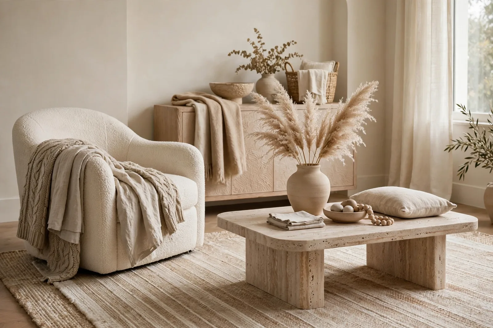
Cohesive interiors aren’t about matching sets, they’re about repetition with intention. The same undertone family in the paint, the same wood tones in the furniture, texture doing the work that color doesn’t have to.
The cohesion principles
1. Repeat, don’t match. You don’t need the same beige everywhere, you need the same family of warm neutrals recurring in paint, upholstery, rugs, and wood.
2. Let texture carry quiet rooms. A neutral room with linen, wool, oak, and stone feels rich; the same room in flat synthetics feels empty. When the palette is restrained, texture is the design.
3. Wood tones are a color decision. Mixing warm oak, cool walnut, and gray-washed pine in one sightline creates the same visual noise as clashing paint. Pick a lane per room, ideally per floor.
4. Every room needs one thing with depth. A dark frame, a deep green plant pot, an espresso side table, one dark note keeps neutrals from floating away.
Guides in this collection
Interior Design
How to Choose the Right Sofa
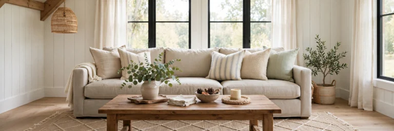
The anchor piece of the living room, how to choose it so the paint works harder.
Coming soon
- Decorating with neutrals without going bland
- Modern farmhouse, Japandi, and organic modern: style guides
- Mixing wood tones without the chaos
- Small-space design that stays calm