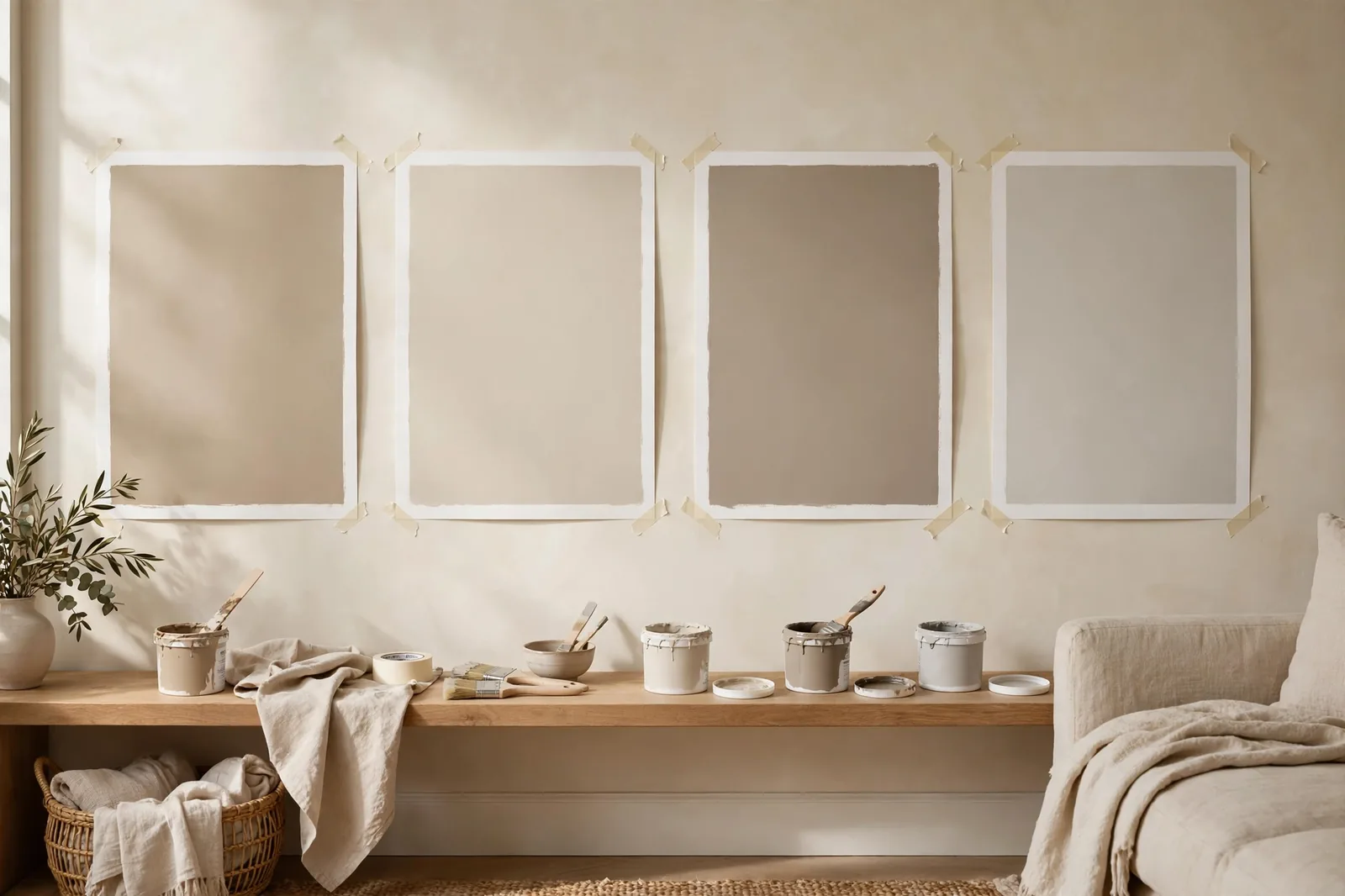
The most expensive paint is the paint you buy twice. A few sample pots and 48 hours of patience are the cheapest insurance in all of home improvement, and almost nobody does the testing part right. Here’s the method that actually prevents repaints.
Why paint chips lie (and your screen lies more)
A two-inch paint chip is a promise the wall can’t always keep. The color on the chip and the color on your wall are the same formula, but your eye doesn’t read formulas. It reads scale, light, and context, and all three change between the store and your living room.
Scale changes everything. A color that looks soft and quiet at two inches wide can feel intense across 400 square feet of wall. Neutrals are especially deceptive: the faint warmth you barely notice on the chip becomes the defining character of the room at full scale. This is also why experienced painters tell you to go lighter than your instinct, colors almost always read deeper on the wall than on the chip, and white trim around them deepens the effect further by contrast.
Light is the other half of the color. Paint chips are chosen under store fluorescents. Your room has a north-facing window, warm lamplight, and a hallway that gets no direct sun at all. A gray that looked perfectly balanced in the store can turn unmistakably blue or purple in cool daylight, which is why undertones deserve their own investigation before you commit.
Context finishes the trick. The chip sits on a white card. Your wall sits next to oak floors, a cream sofa, and cherry cabinets, and every one of those surfaces nudges how the paint reads. A beige that harmonized with the store’s white card can clash with your warm wood the moment they share a room.
Your phone screen is the least trustworthy judge of all: uncalibrated, backlit, and viewed in wildly different ambient light. Use screens and chips to build a shortlist. Use real paint, in your real room, to make the decision. That’s what the 48-hour method is for.
What to buy before you test
Testing properly costs very little, roughly the price of a takeout dinner, and it protects a paint job worth hundreds. Here’s the complete kit:
1. Sample pots of your three finalists. Three is the magic number: enough for a genuine comparison, few enough that the decision stays clear. Buy them in the exact sheen you plan to use on the walls, eggshell, satin, matte, because finish changes how light bounces off the color. A matte sample tells you nothing reliable about how the same color will look in satin.
2. Two or three large white poster boards. Get the biggest you can find, at least 2×2 feet of painted area per color. Small boards defeat the purpose; you need enough surface for the color to read as a wall, not a swatch.
3. A decent brush or small roller. You don’t need professional tools, but don’t test with a foam brush that leaves streaks either. A basic 2-inch angled brush or a small mohair roller gives you a true read on coverage and texture.
4. Painter’s tape and a marker. Tape the boards to the wall without damage, and label every sample. When you’re staring at three similar beiges on day two, you’ll be grateful you wrote the names down.
The 7-step 48-hour method
Step 1, Start with a clean, white test surface
If you’re painting sample boards, you’re already set, white boards are a neutral starting point. If you’re testing directly on the wall, prime the test area white first. Testing over your existing wall color distorts everything: a beige tested over green reads differently than the same beige over white, and you’ll be choosing based on a lie. One coat of white primer on the test patch takes ten minutes and removes the single biggest source of false readings.
Step 2, Paint large, two coats, in your finish
Paint each board (or wall patch) at least 2×2 feet with two full coats, letting the first dry completely. One thin coat looks washed out and patchy, it will read lighter and less saturated than the real thing, which is exactly the wrong direction to err. Two coats is what the wall will actually look like.
Step 3, Label everything
Write the color name on the back of each board or on tape beside each wall patch. Similar neutrals become genuinely hard to tell apart after a day, and “the middle one” is not a decision-making system.
Step 4, Place samples at eye level on two or three walls
Tape boards at eye level, that’s how you’ll experience the color day to day, not crouched near the baseboard. Put samples on multiple walls: one that gets direct light and one in shadow. The same color can look like two different paints on opposite sides of one room, and you need to love both versions. If you’re comparing finalists, place similar colors on opposing walls rather than side by side, adjacent similar colors skew your perception (the darker one looks darker, the bluer one looks bluer), while separation lets each read honestly.
Step 5, Run the 48-hour watch
This is the method’s core. Check your samples at four moments: morning light (cool, soft), midday (bright, neutral), evening (warm, golden), and under your lamps at night. If you can stretch the test across a sunny day and a cloudy one, even better, overcast light is brutally honest about undertones. Pay closest attention to the time of day you’ll actually use the room: a bedroom you only see at night should be judged at night.
Step 6, Judge against your fixed finishes, in a tidy room
Move the boards next to your flooring, countertops, cabinets, and largest furniture pieces. The paint has to get along with everything you aren’t changing, that’s the real test, not whether it’s pretty in isolation. And tidy the room first: clutter genuinely skews how you perceive color depth and temperature. A chaotic room makes every color feel wrong.
Step 7, The finalist face-off
Narrow to two, place them side by side, and choose the one that looks best in the room’s worst light, the dim corner, the north wall at dusk. A color that survives bad light thrives everywhere else. Never decide from memory: test finalists simultaneously, because memory is a terrible color comparator.
The 5 mistakes that ruin a good test
Most bad paint decisions aren’t bad taste, they’re bad testing. Here are the five errors that invalidate an otherwise careful process:
| Mistake | Why it happens | Do this instead |
|---|---|---|
| Testing over the old wall color | It’s faster to paint the sample straight onto the existing wall | Prime the test patch white first, the old color underneath shifts every reading |
| Tiny swatches | A 4-inch square feels like enough until it’s on a 12-foot wall | Minimum 2×2 feet per color, the color needs room to read as a wall, not a chip |
| One light condition | You checked at noon on Saturday and called it done | Four checks: morning, midday, evening, lamplight, plus a cloudy day if you can |
| Testing one color at a time from memory | “I’ll remember how the last one looked” | You won’t. Test finalists simultaneously, side by side, memory invents differences and erases real ones |
| Deciding same-day | Impatience, or the painter is coming Monday | Give it 48 hours. The color you love at noon and doubt at dusk is telling you something, listen before you buy gallons |
Two more subtle traps worth naming. Don’t hold samples in your hand to judge them, your skin tone reflects onto the surface and shifts the reading. Tape them to the wall and step back. And don’t judge in a messy room: visual clutter makes colors feel harsher and darker than they are. Ten minutes of tidying buys you a far more honest read.
Poster boards vs. painting the wall: the honest answer
This is the liveliest debate in paint testing, and both sides have a point, so here’s where we land after years of watching both methods in real homes.
Poster boards win for the shortlist phase. They’re movable, which is their superpower: you can test the same color in the bedroom, the hallway, and the living room without painting three walls. They don’t damage anything, which matters for renters. And you can line up all three finalists at once for a true side-by-side read. For 90% of the decision, boards are the right tool.
The wall wins for the final confirmation. Wall texture, orange peel, knockdown, smooth plaster, changes how paint catches light, and a board can’t replicate it. Neither can it replicate true scale. So once you’ve narrowed to one winner, paint a generous test patch directly on the wall (primed white first), live with it one more day, and then buy the gallons.
Peel-and-stick samples vs. sample pots
Peel-and-stick samples, large adhesive sheets printed with real paint, have earned their place. But they’re a different tool than a sample pot, not a replacement. Here’s the honest comparison:
| Peel-and-stick samples | Sample pots | |
|---|---|---|
| Cost | Higher per color (a few dollars per sheet) | Cheapest per color |
| Mess | Zero, peel, stick, reposition | Brushes, drop cloths, cleanup |
| Movability | Excellent, move between rooms and walls freely | Only if painted on boards |
| Texture accuracy | Good, but it’s a printed film, not your wall | Exact, it’s the actual paint |
| Finish options | Usually one standard finish | Any sheen you plan to use |
| Best for | Renters, quick shortlisting, testing across many rooms | Finalists, the colors you’re actually choosing between |
The practical play: use peel-and-stick to narrow a long list quickly and painlessly, then confirm your two or three finalists with real sample pots in your exact finish. Speed where it doesn’t matter, precision where it does.
Testing is easier with a system to test against
The Paint Color Workbook includes sample-testing worksheets, side-by-side comparison grids, light-check checklists, and undertone notes, so your 48 hours produce a decision instead of a pile of boards.
Frequently asked questions
At least 48 hours. That window covers the four light conditions that matter, morning, midday, evening, and lamplight, and ideally a mix of sunny and cloudy weather. Anything less and you’re deciding on incomplete information.
Use boards for comparing your shortlist, they’re movable and damage-free, then paint one test patch directly on the wall to confirm your winner’s texture and scale before buying gallons. Prime the wall patch white first so the old color doesn’t distort the reading.
Three. Fewer and you’re not really comparing; more and decision fatigue sets in, every additional option makes the choice harder without making it better. If you have five contenders, use peel-and-stick sheets to cut the list to three, then test those three properly.
Yes. Sheen changes how light reflects off the color, the same formula looks noticeably different in flat versus satin. Testing a matte sample when you’ll paint in eggshell is testing a different visual result. Always sample the sheen you’ll live with.
Then trust the tie-breakers in this order: which looks best in the room’s worst light, which gets along better with your fixed finishes, and which felt right on first instinct. If two colors are truly tied after all that, they’re both fine, pick one and don’t look back. Analysis paralysis wastes more weekends than a slightly imperfect beige.
For narrowing a long list, yes, they’re fast and mess-free. For the final decision between two or three finalists, use real sample pots in your exact finish. Only actual paint shows you the true texture, depth, and sheen you’ll live with.

