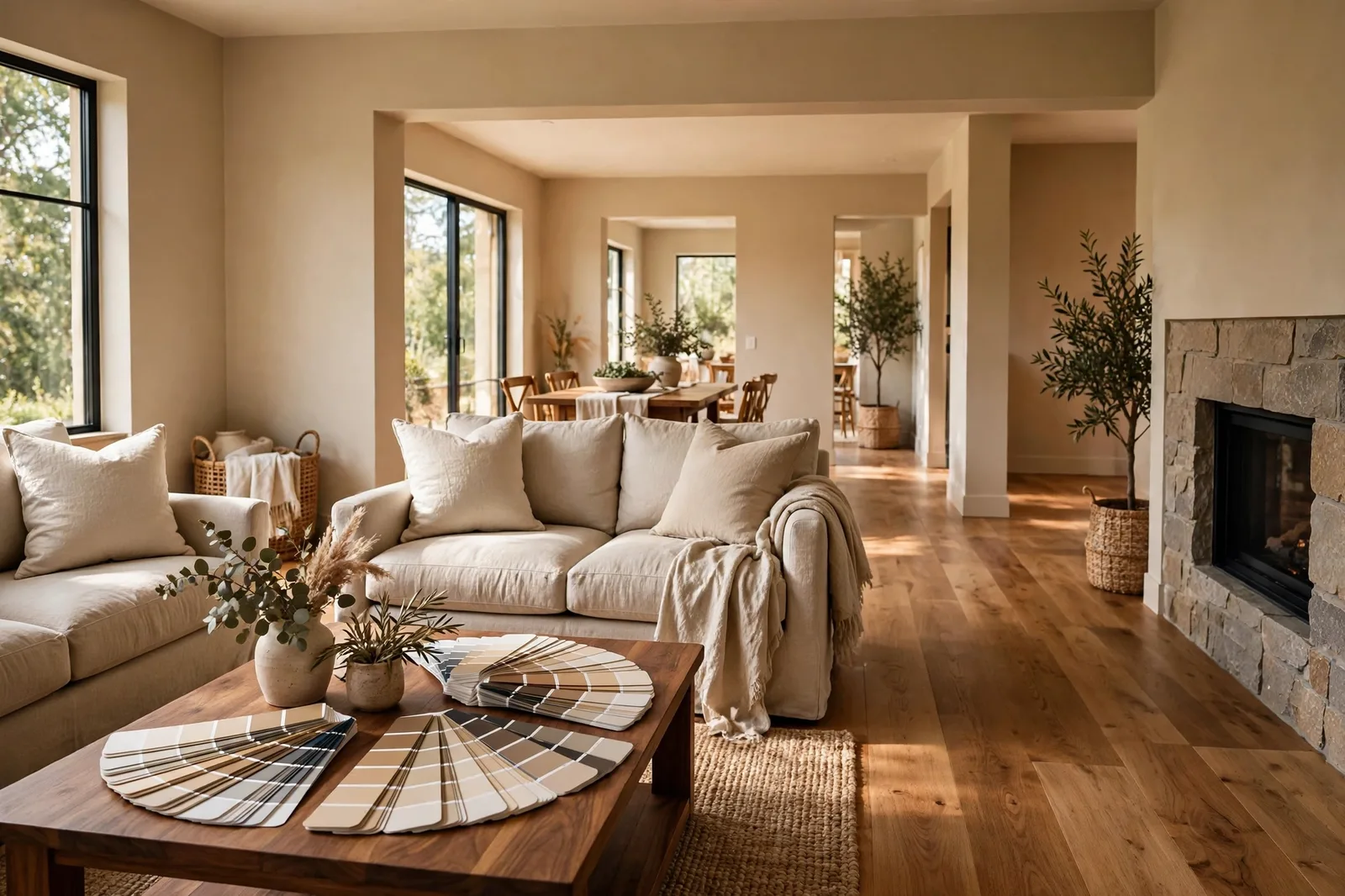
The most common way to choose a home’s colors is also the most backwards: fall in love with a paint color at the store, buy the gallons, and then discover it argues with the floors, fights the granite, and looks like a mistake next to the tile. The walls are the most flexible surface in your home, a gallon and a Saturday, while the finishes are the most permanent: refinishing a floor costs thousands, replacing stone costs tens of thousands. So the logic runs one way only. The finishes you cannot easily change decide the palette; the paint obeys. This guide teaches the finishes-first method that designers actually use, how to inventory what you have, read the undertone anchors hiding inside your floors and stone, build a palette that agrees with them, and sample against the real surfaces before a single wall is touched. Paint colors shift with lighting, surface, and sheen, so always test a large physical sample against your actual finishes, in your own space, before committing, screen swatches are approximations. The Global Abode is an independent publication, not affiliated with or endorsed by Sherwin-Williams or Benjamin Moore; all color names and codes are referenced as widely-known designer examples.
Key takeaway: Build your color scheme from the most permanent surface inward. Catalog your floors, stone, tile, cabinetry, brick, and metals; read each one’s undertone (warm, cool, or neutral); find the dominant temperature thread; then choose a wall neutral that agrees with it, supporting colors in the same family, and accents you choose freely. Paint is chosen last and changed most easily, never let the paint lead when the finishes can’t follow. Undertone notes below are widely-reported designer observations, not exact manufacturer specifications.
The Finishes-First Mindset: Why Paint-Led Palettes Fail
Walk through the paint deck and every color looks like a possibility. That is the trap. On a white card in a brightly lit store, a soft warm greige looks golden and generous; the same greige next to your honey-oak floors and butterscotch granite can read as a third yellow too many, and the room tips from warm into muddy. The paint was never the problem. The order was.
Here is the hierarchy that governs every room, whether you are renovating or refreshing: permanence decides. The surfaces that are hardest and most expensive to change get the first vote, and they outrank everything else. A wood floor runs for decades. Stone countertops and a tile shower will outlive several paint jobs. Brick, cabinetry, and the roof you see from the windows are effectively fixed for the life of the renovation. Paint is the cheapest, fastest change you can make to a home, which means paint is the last decision, not the first, and it exists to serve the finishes, not the other way around.
Designers put it plainly: the most permanent material in the room should always drive the palette, usually the flooring or the stone. The undertone is read there first, warm, cool, or somewhere in between, and the wall color, the cabinetry, and eventually the furnishings are built around that reading. Furniture and decor can express personality and change over time; they should not be what the whole scheme is anchored to.
This mindset reframes the entire job. You are not decorating an empty room. You are negotiating with what is already there, and the negotiation goes much better when you know exactly what you are working with before you choose a single wall color. The rooms that feel effortlessly cohesive are rarely the ones where someone found a magical perfect paint color. They are the ones where the paint quietly agreed with everything that was already in the room.
The practical consequence is simple: do not choose paint from a chip in isolation. Every candidate wall color must be judged next to the finishes it will live with, the floor, the counter, the tile, the trim. The chip is a starting rumor; the finishes are the evidence.
The Finish Inventory: What to Catalog Before You Shop for Color
Before you think about a single wall color, walk your home with a notebook and catalog the fixed surfaces room by room. This is the finish inventory, and it takes about an hour. It is the highest-value hour in the entire project.
Floors. The single most influential finish in the house, the largest fixed surface, visible in nearly every room. Note the material (oak, hickory, walnut, pine, tile, carpet, stained concrete), the stain tone, and, most importantly, the undertone. A golden oak floor leans yellow-orange; a walnut floor leans purple-brown; a gray-washed floor leans gray. The undertone is what the wall color is really negotiating with, not the wood’s name. Our wood floor guide teaches the white-paper test for reading it in thirty seconds.
Stone and counters. Granite, quartz, marble, butcher block, the busiest stones carry the most votes. A granite slab with golds, rusts, and blacks is practically shouting its undertone; a quiet white quartz whispers it. Photograph your counters in daylight and look for the dominant hue threads: gold, beige, gray, black, rust. Whatever shows up most is the undertone your walls must agree with or deliberately play against.
Tile. Backsplash, shower, bath floors. Note the background color and the veining or pattern color separately, a white tile with cool gray veining is a cool finish, even though the background is “white.” Busy pattern tile (encaustic, zellige, terracotta) behaves like a finish family of its own: it wants calm, quiet walls that let it be the star.
Cabinetry and built-ins. Stained wood cabinets are finishes with strong undertones of their own, cherry cabinets read red, honey-oak cabinets read golden. Painted cabinets (white, navy, green) are closer to wall colors than to wall colors; they still get a say, but a quieter one, because they can be repainted eventually.
Brick and stone fireplaces. Red brick, painted brick, limestone, fieldstone. A red-brick fireplace is one of the warmest fixed elements a room can hold, and it anchors everything around it toward warmth. Note whether it is warm red, orange-brown, buff, or painted, each points to a different wall family.
Metals and fixtures. Faucets, hardware, light fixtures, door handles. Metals are the quiet finish, but a home full of oil-rubbed bronze and warm brass leans warm, while a home full of chrome and polished nickel leans cool. Metals usually echo the finish temperature rather than setting it, but note them anyway: they confirm the reading.
The view from the windows. Not a finish, but it behaves like one: a room overlooking greenery gets a constant dose of green; a room facing warm brick sees warm light bounce. Note what dominates the biggest window in each room, it is part of the finish landscape the walls have to agree with.
Tip: Photograph every finish in daylight with your phone and keep the photos in one album. When you are at the paint store choosing chips, pull up the album, the phone camera slightly exaggerates undertones, which makes it a useful lie detector for exactly the hidden hues you need to read. A floor that looks neutral in person but golden in the photo is telling you its truth.
Reading the Undertone Anchors: Find Your Dominant Thread
An inventory is a list. The next step turns it into a direction: read the undertone of each finish and find the dominant thread, the temperature the majority of your permanent surfaces agree on.
Every finish leans somewhere on three axes. Warm finishes carry yellow, gold, orange, red, or brown threads: golden oak floors, honey cabinets, warm granites, red brick, travertine, brass. Cool finishes carry gray, blue, green-gray, or near-black threads: gray-washed floors, Carrara marble, concrete-look tile, chrome, black granite with gray veining. Neutral finishes sit near the middle and accept either direction: pale maple, white quartz, simple white subway tile, warm-gray stone.
Now do the count. If your floor is warm, your granite is warm, and your brick fireplace is warm, your home is a warm home, the dominant thread is unmistakable, and the palette builds warm: warm whites, warm greiges, soft beiges, creams. If your floors are cool gray tile, your counters are cool quartz, and your fixtures are chrome, the thread is cool, the palette builds cool: soft grays, clean whites, blue-grays. Most real homes are mixed, which is where the real skill lives:
Find the loudest finish. In a mixed home, one finish usually dominates, the largest, busiest, or most colorful one. A warm granite with strong gold veining outranks a quiet gray tile floor. The golden-oak floor that runs through the whole main level outranks the cool bathroom tile. The loudest finish sets the temperature; the quieter finishes adapt. You are not trying to please every finish equally, you are choosing a direction the majority can live with.
Find the warmest and coolest fixed elements. In a mixed home, mark the warmest finish and the coolest finish in the same sightline. Those two are the boundaries your palette must negotiate. The wall color that lives between them is the peacemaker: a warm greige that shakes hands with both the warm floor and the cool tile, a soft warm white that sits between honey cabinets and gray quartz. This is the diplomatic skill of whole-home color, the anchor neutral that belongs in every room of the sightline.
Respect the un-changeables. A busy granite or a red-brick fireplace cannot be argued with, its undertone is loud, permanent, and it will be there long after the paint dries. When one finish is dramatically louder than the others, build the palette to it and let the quiet finishes enjoy the harmony. Trying to fight a loud finish with a wall color is how rooms end up looking like a compromise nobody chose.
Two finishes deserve special caution because they are both loud and sneaky. Red-thread finishes, cherry cabinets, mahogany floors, red brick, carry a red undertone that wakes up in evening lamplight and can turn beige walls pinkish and gray walls muddy. They need the calmest, most neutral walls you can give them. And busy stone, heavily veined granite, colorful tile, carries several hues at once; pick the one thread you want to echo and choose walls that agree with that thread, letting the rest of the stone recede.
Watch out: The classic finish-led failure is the “trend photo” wall, the cool blue-gray wall chosen from a magazine photo and dropped into a home full of warm golden-oak floors and butterscotch granite. Against the cool wall, every warm finish looks more orange by contrast, and the whole house reads as dated instead of refreshed. The wall color didn’t fail in the magazine; it failed in this house. Always judge a candidate wall color against your actual finishes, never against a photograph of someone else’s.
Building the Palette: Anchor, Supports, and Accents
Once you know your dominant thread, the palette assembles itself in three layers, and two of them are finishes-led. The third is where your personality gets to speak.
The anchor neutral. One neutral family that travels through the main living spaces and hallways, chosen to agree with the dominant finish thread. Warm-thread homes anchor in warm whites, warm greiges, or soft beiges; cool-thread homes anchor in soft grays, clean whites, or cool greiges; mixed homes anchor in the diplomatic neutral, the warm greige or soft warm white that shakes hands with both sides. This is the wall color you will live with most, so it should be the calmest, quietest choice: no strong undertone of its own, just enough temperature agreement to make the finishes feel at home. Our whole-home palette guide walks through the anchor selection in detail.
The supporting colors. One or two stepped colors for bedrooms, offices, and secondary spaces, a step deeper or lighter within the same family as the anchor. The temperature stays constant while the depth changes: the same warm greige two steps deeper in the study, a barely lighter tint of the anchor white in the bedroom. This is what makes a house feel designed instead of painted, variation with agreement.
The accents. Here is where the finishes stop voting and you start. An accent, the front door, the kitchen island, a powder room, built-in bookshelves, can be deep, rich, and personal: navy, deep green, charcoal, even a confident color. The one rule: the accent must either echo a thread already in the finishes (a navy island that picks up the navy in the granite’s veining) or be confidently itself. A deep accent against a well-anchored neutral scheme reads as intentional in a way that a weak accent never does.
| Finish family | Palette direction | Watch out for |
|---|---|---|
| Warm wood floors (golden oak, hickory, honey pine) | Warm whites, warm greiges, soft beiges; accents with confidence | Cool blue-gray walls make the floors look more orange by contrast |
| Dark warm woods (walnut, cherry, mahogany) | Calm warm whites, light warm greiges, muted blue-gray as deliberate contrast | Red threads wake up at 8pm, test evenings; keep walls neutral |
| Warm busy stone (gold-rust granite, travertine) | Warm whites and creams that agree with the dominant thread; quiet walls, let the stone star | Don’t add more pattern, busy stone needs the calmest walls |
| Cool stone and marble (Carrara, gray quartz, cool granite) | Soft grays, clean whites, cool greiges; warm accents as deliberate warmth | Warm beige walls against cool stone can make both look like mistakes |
| Cool gray tile (concrete-look, blue-gray veining) | Soft grays, cool whites, blue-grays; warm textiles rather than warm walls | The tile’s coolness is permanent, the wall’s job is to agree, not fight |
| Red brick fireplace | Warm neutrals that echo the brick’s warmth, creams, warm greiges, soft tans | Cool gray walls can make the brick look dirty by contrast; bridge with warm trim |
| Mixed warm + cool finishes | The diplomatic neutral: warm greige or soft warm white that sits between both | Don’t let one room go warm and the next go cool, keep the temperature constant through sightlines |
Two finishing principles hold the whole thing together. Temperature agreement through sightlines: whatever temperature your anchor neutral carries, it must stay constant across every wall visible from the main living spaces. Rooms can go deeper or lighter, but they may not go warmer or cooler, the eye forgives a depth change and punishes a temperature swap. And one trim white, whole house: trim is the frame around every finish meeting. Choose one trim white that agrees with the dominant thread, warm whites for warm homes, clean whites for cool ones, and carry it everywhere. Trim is the constant that lets wall colors vary.
One Room or Whole House: Prioritizing When Paint Is the Only Budget
Most people are not renovating the whole house at once. The typical reality is a paint-only budget and a home that needs cohesion, which raises the prioritization question: where does the first gallon go?
If you can only repaint some rooms, start where the finishes are loudest. The rooms where the finish-palette relationship matters most are the ones where the finishes are most visible and most demanding: the kitchen (stone + cabinetry + backsplash), the main living space (floor + fireplace + sightlines into everything else), and the primary bathroom (tile + fixtures). A paint color that finally agrees with the kitchen’s granite changes the whole house’s feeling more than a perfect bedroom color ever will, because the kitchen is where the loud finishes live.
Build outward from the anchor. Establish the anchor neutral in the most visible space first, the open-plan main level, the hallway that connects everything. Once the anchor is working against the floors and the sightlines read as one home, the remaining rooms inherit it: bedrooms step within the family, the office deepens it, the powder room can play. The anchor does the heavy lifting; the rest of the house is just variations.
The one-room rescue. Sometimes the problem is one room that never looked right, the dining room with the inherited wallpaper, the office that fights the hallway. The finish-first method still applies, just scoped down: inventory that room’s finishes, find its dominant thread, and choose its wall color to agree with the finishes and with the anchor color visible through the doorway. A rescued room must satisfy two relationships at once, to its own finishes and to its neighbors.
What paint alone cannot fix. Honesty matters here: no wall color rescues a finish that is genuinely failing, the countertop that is cracked, the floor that is buckling, the tile that is dated beyond diplomacy. Paint can negotiate with finishes; it cannot resurrect them. If a finish is so loud or so worn that no neutral agrees with it, the honest answer is that the finish is the next project, not the paint. Spend the paint budget on the rooms where paint can actually win.
The renter’s version. If you cannot change the finishes and cannot paint, the palette still starts with the finishes, you just build it in textiles instead. Read the dominant thread of the floors and counters you are stuck with, then let curtains, rugs, bedding, and art carry the agreement the walls cannot. A rug that agrees with the floor does half the work of a wall color.
Building the whole palette, not just choosing one wall color?
The Whole Home Paint Guide is a complete, ready-to-use color system, anchor neutrals, trim and ceiling pairings, accent colors, all with undertones already coordinated against the finishes most homes actually have, so your palette lands in a house designed to hold it. And the Paint Color Workbook includes finish-inventory worksheets, undertone-testing pages, and a room-by-room sampling checklist for testing finalists against your actual surfaces with evidence, not guesswork.
Frequently asked questions
Start with whichever is loudest, and when in doubt, the floor. The floor covers the most area and appears in the most sightlines, so its undertone usually dominates. But a busy, colorful granite can outshout a quiet floor: if your counters carry strong gold, rust, or black threads, read them first and choose walls that agree with that thread. The real answer is that you read both, find the dominant thread, and let the quieter finish enjoy the harmony.
Yes, and many of the most cohesive homes do exactly that. One anchor neutral carried through the main living spaces and hallways, with bedrooms and secondary rooms stepped a shade deeper or lighter within the same family, is the simplest path to a house that feels designed. Our whole-home palette guide covers how to choose the anchor; the key rule is that depth may change room to room but temperature must stay constant.
The opposite: dark finishes (walnut floors, dark granite, espresso cabinets) almost always want lighter walls, because the walls have a lighting job, they must bounce light back into the room. Light walls over dark finishes create the classic grounded look: anchored below, open above. Keep the wall’s temperature in agreement with the finish’s undertone, warm dark finishes with warm-leaning light walls, and the rooms will feel connected, not disconnected. See our fixed-finish matching framework for the method.
Find the loudest finish and build to it, then choose the diplomatic neutral, usually a warm greige or soft warm white, that sits between the warm and cool threads. The critical discipline is temperature constancy through sightlines: rooms can vary in depth but not in temperature. Sample every candidate against all the finishes in the same sightline, not just one at a time, and read the transitions in the doorways. Our color flow guide covers how to carry one temperature across connected spaces.
Absolutely, the method is the same, the materials change. Read the dominant thread of the finishes you are stuck with (floors, counters, tile), then build the agreement in textiles: a rug that agrees with the floor, curtains that agree with the walls, bedding and art that echo the dominant thread. A renter who furnishes with the finishes instead of against them gets most of the cohesion that paint would have provided, without touching a wall.
Paint large boards (2×2 feet minimum), two coats, in your actual sheen, then hold them against each fixed finish in the room, the floor at floor height, the countertop, the tile, the cabinetry, and judge each pairing separately. Check the doorways and sightlines for temperature constancy, and check at four moments of the day with the evening lamplight check as the verdict. Live with the boards for 48 hours. Our 48-hour sampling method walks through every step in detail.

