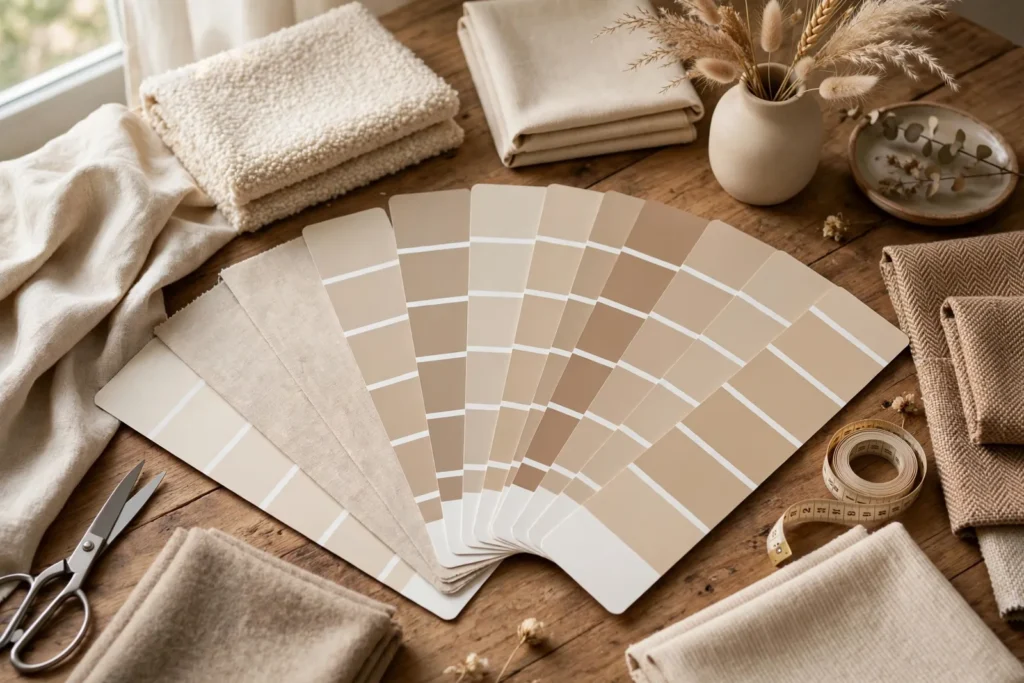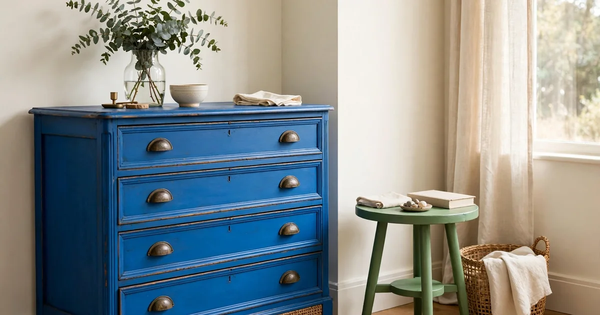
Annie Sloan has named her 2027 Colours of the Year, and for the first time in a while, she has chosen two: Frida Blue and Firle. Both are existing colours from her Chalk Paint range, elevated to colour-of-the-year status for 2027. One is a saturated, joyful blue drawn from Frida Kahlo’s famous blue house in Mexico City. The other is a fresh, leafy green rooted in the Bloomsbury Group’s Charleston farmhouse in East Sussex. Together, they celebrate creativity and artistic freedom at home.
In this guide to the Annie Sloan 2027 colour of the year picks, you will learn what these two colours are, the stories behind them, which furniture pieces they suit, and how to sample chalk paint before you commit. Our companion palette guide with curated pairings is linked below.
What Did Annie Sloan Announce for 2027?
Annie Sloan’s 2027 Colours of the Year are Frida Blue and Firle, announced in October 2026. Both are bright, optimistic Chalk Paint shades chosen to encourage creativity and self-expression at home. Rather than introducing new formulations, Sloan elevated two existing colours from her range, each named for an artist’s home: Frida Blue for Frida Kahlo’s Casa Azul, and Firle for the village near Charleston, the farmhouse where Vanessa Bell and Duncan Grant painted nearly every surface.
The shared idea, in Sloan’s words, is that art and colour belong in everyday life, not just in galleries. That is a useful lens for deciding how to use them: these are not background neutrals. They are colours with a point of view, and they reward confident placement on the right piece of furniture.
A quick orientation before we go deeper:
| Colour | Family | Mood | Best first project |
|---|---|---|---|
| Frida Blue | Saturated blue | Bold, joyful, full of life | A statement cabinet, desk, or front door |
| Firle | Fresh leafy green | Happy, versatile, lively | Cabinetry, doors, or a painted trunk |
Frida Blue: The Bold Blue of Casa Azul
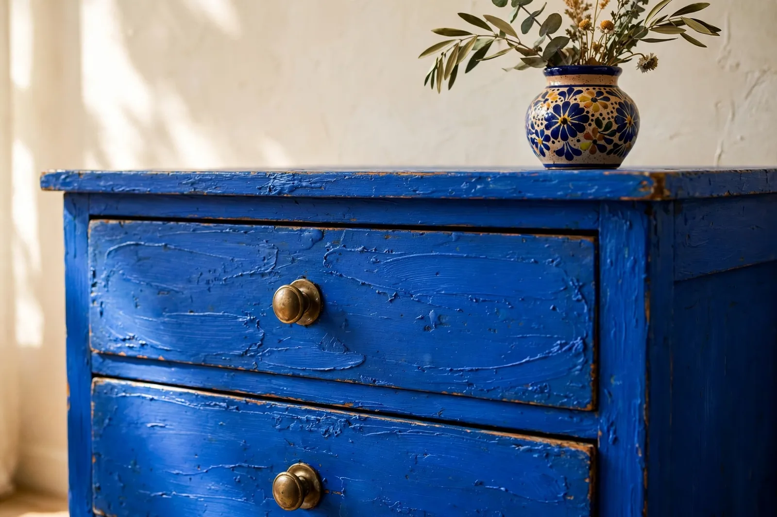
Frida Blue is a saturated, energetic blue with real personality. Sloan describes it as bright, joyful, and full of life, and that is an accurate read. It is not a quiet blue. It does not recede. It holds a room the way a good painting holds a wall.
The colour takes its cue from the vivid blue walls of Casa Azul, Frida Kahlo’s home in Coyoacán, Mexico City. That reference matters because it tells you how the colour wants to be used: generously, and with confidence. Kahlo did not use blue as an accent. She lived inside it.
What to know before you buy:
- Undertone and light: Frida Blue is a clear, warm-leaning blue. In bright daylight it reads vivid and electric; in warmer evening light it deepens without going navy. Test it in the room where the piece will live, because blues shift more than most colours between north and south light.
- Coverage: One litre covers approximately 13 square metres, and most pieces need two coats. A standard dresser or sideboard typically needs one litre.
- Mood pairing: Because the colour is so self-assured, it works best where you want a focal point. Sloan suggests hand-painted details in lighter blues and white alongside it, a gentle way to soften its intensity on a large piece.
Where it shines: A cabinet or armoire that anchors a hallway. A desk in a home office that needs energy. A front door that makes the whole facade memorable. Dining chairs painted in Frida Blue around a neutral table. These are the placements where the colour’s confidence becomes an asset instead of a risk.
Firle: The Lively Green from Charleston
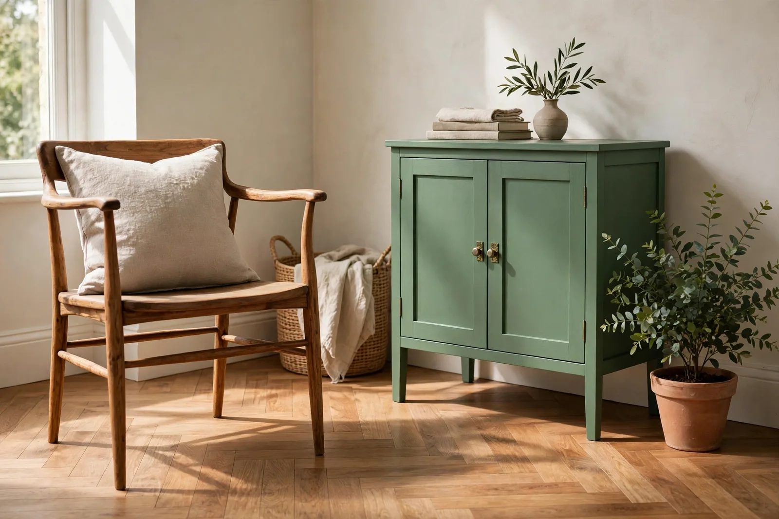
Firle is a fresh, leafy green with a lively zing. It has enough depth to sit beautifully on furniture, and Sloan loves greens for the way they bring a little of the outdoors inside. Where Frida Blue announces itself, Firle invites. It is the easier of the two colours to live with, and the more versatile across furniture types.
The name comes from the East Sussex village near Charleston, the farmhouse where artists Vanessa Bell and Duncan Grant lived and worked, covering walls, doors, fireplaces, and furniture in paint until the house itself became a work of art. Firle echoes the colour of a wall in Clive Bell’s study there, and it was originally developed in collaboration with the Charleston Trust.
What to know before you buy:
- Undertone and light: Firle is a yellow-leaning, botanical green. It stays fresh in daylight and warms up under lamplight without turning muddy. Greens are among the most forgiving colours for beginners because they harmonise with wood tones, which most furniture already has.
- Coverage: Roughly 13 square metres per litre, two coats for most pieces.
- Mood pairing: Sloan notes that Firle pairs well with soft pinks and warm terracotta tones.
Where it shines: Painted cabinetry, where green has become a modern classic. Interior doors, which take colour beautifully and are easy to repaint if you change your mind. Trunks and blanket boxes, where the colour’s depth shows off the piece’s shape. A bookcase or dresser in a bedroom, where the green reads calm rather than loud.
Inside our Annie Sloan 2027 palette guide: a complete pairing system for both colours, with furniture-by-furniture assignments and finish recommendations. See the guide on Etsy →
Another 2027 green story: Webster Green, Benjamin Moore’s Color of the Year.
The Stories Behind the Colours
Most paint brands name a colour of the year after a mood. Sloan named hers after two houses where artists lived inside their art. Casa Azul is one of the most recognisable artist homes in the world, Kahlo’s cobalt-blue house in Coyoacán. Charleston is quieter but no less radical, Vanessa Bell and Duncan Grant treated their farmhouse as a canvas. The shared belief: art and colour belong in everyday life.
Where to Use Frida Blue & Firle: A Furniture-First Guide
Chalk paint is a furniture paint first, so think in pieces, not walls. Best for Frida Blue: tall cabinet or armoire, writing desk, dining chairs as a set, front door, picture frames. Best for Firle: kitchen or hallway cabinetry, interior doors, trunks and blanket boxes, dressers, bookshelves. Together: keep one dominant, a Firle dresser with Frida Blue drawer interiors.
How to Sample Chalk Paint Before You Commit
Bold colours punish guesswork, so sample properly.
- Buy the smallest tin first. A 120ml sample pot is enough for a large test board.
- Paint a test board, not the furniture. A3 size minimum, two coats, let it dry fully.
- Move the board around. Check in daylight and evening lamplight.
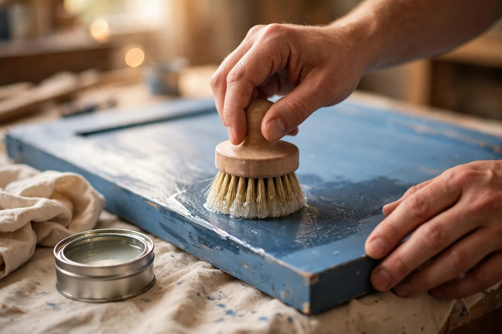
- Test your finish on the sample. Wax half the board, wax deepens colour slightly.
- Live with it for 48 hours: before buying the litre.
Frequently Asked Questions
Frida Blue and Firle. Announced in October 2026, they are the two Chalk Paint colours Annie Sloan chose as her 2027 Colours of the Year. Frida Blue is a saturated blue inspired by Frida Kahlo’s Casa Azul; Firle is a fresh leafy green named for the village near Charleston, the Bloomsbury farmhouse.
No. Both are existing colours from the Annie Sloan Chalk Paint range elevated to colour-of-the-year status. They are tried, tested, and already stocked by retailers.
Sloan suggests hand-painted details in lighter blues and white alongside Frida Blue. Warm neutrals also let it stay the star.
Firle pairs well with soft pinks and warm terracotta tones, per Sloan. Its yellow-leaning botanical character also harmonises with wood tones.
Yes. Keep one dominant and the other as the surprise: a Firle dresser with Frida Blue drawer interiors, or a Frida Blue chair beside a Firle side table.
Through independent stockists listed on the Annie Sloan website’s stockist finder, plus select online retailers.
Ready to paint with the 2027 colours? Our Annie Sloan 2027 palette guide builds a complete furniture system around Frida Blue and Firle. Get the guide on Etsy →
Annie Sloan and Chalk Paint are trademarks of Annie Sloan Interiors Ltd. This is an independent guide by The Global Abode and is not affiliated with, endorsed by, or sponsored by Annie Sloan or any paint manufacturer.