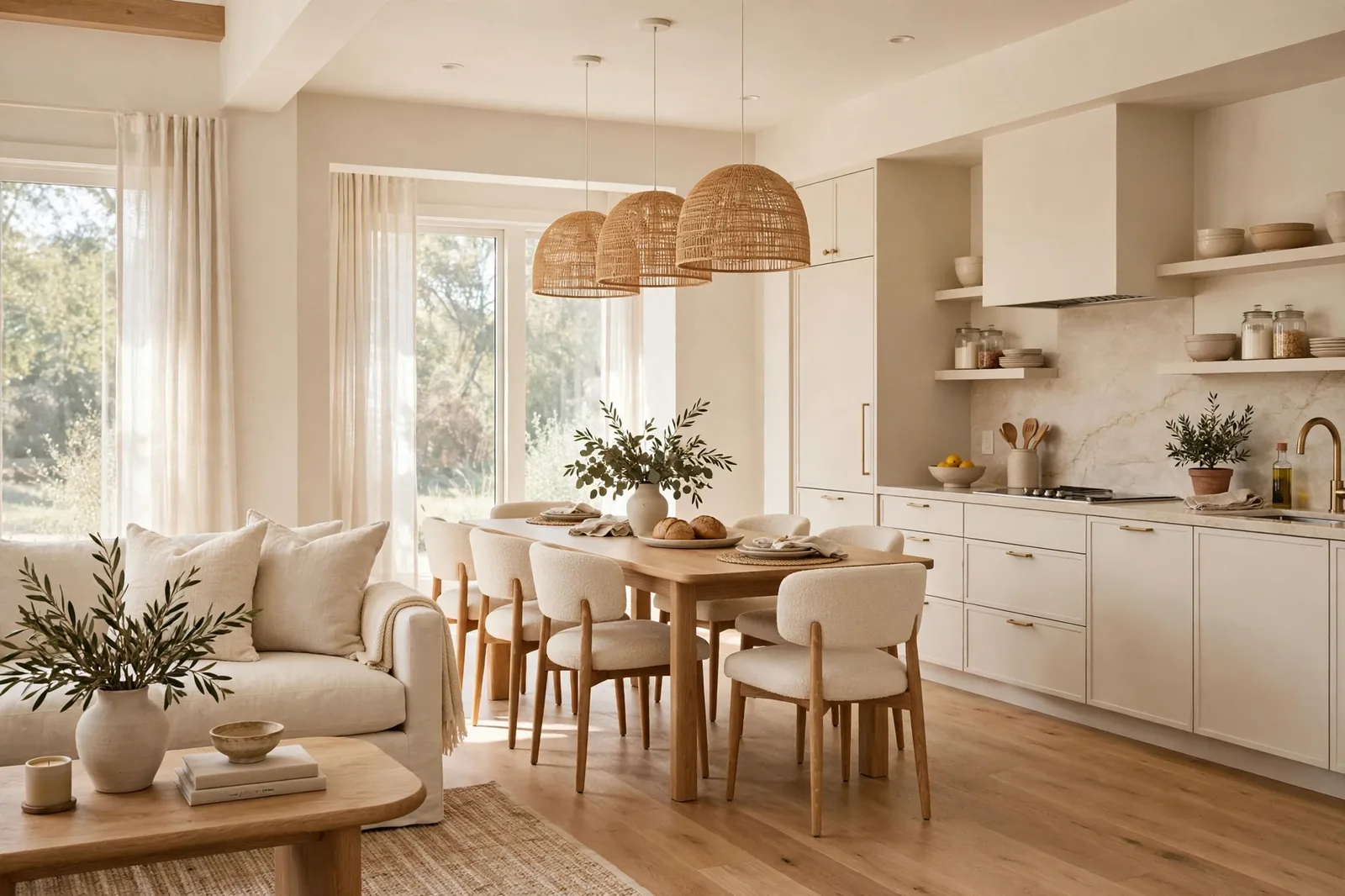
An open-concept home removes the walls, and with them, the forgiveness. In a traditional house, a questionable color choice stays contained behind a door. In an open plan, every choice is visible from everywhere, all at once. That’s why open plans don’t need more color decisions. They need fewer, made better.
Why open plans punish room-by-room thinking
Here’s the scenario that plays out in thousands of open-concept homes: the living room gets a warm greige because it looked perfect on the chip. The dining area gets a sage green because a photo inspired it. The kitchen gets a crisp white because “kitchens should be bright.” Each choice is defensible alone. Together, standing at the island with all three in view, they look like three different houses stitched together.
The problem isn’t any single color, it’s that open plans have no visual reset. In a traditional layout, walking through a doorway gives your eye a fresh start; the brain files each room separately. In an open plan, there’s no doorway, no pause, no separation. Light flows across the whole space, and so does every color relationship, including the bad ones.
This is also why open plans amplify undertone mistakes. A greige with a pink undertone next to a green with a yellow undertone might survive in separate rooms. In one shared sightline, the clash is constant and inescapable. The open plan doesn’t create the problem; it just removes every place to hide it.
The fix is structural, not decorative: stop thinking in rooms and start thinking in one continuous space with zones. You don’t need three palettes. You need one palette, applied with intention.
The sightline rule: your 3-spot audit
Before choosing anything, do the audit that professionals do first. Stand in three places, the sofa, the kitchen island (or main counter), and the dining table, and slowly turn your head. Every wall you can see from each spot is in the same “room” as far as paint is concerned, whether or not there’s furniture dividing it.
The rule is simple: every wall color visible from a single vantage point must get along. Not “look nice individually”, get along with each other. If two colors share a sightline and their undertones disagree, one of them has to change, no matter how much you love it on its own.
This audit also reveals something useful: which walls actually matter most. The long wall that runs the full length of the space, visible from all three spots, is your most important surface, it deserves the anchor neutral, full stop. A short wall tucked behind the dining table, visible from only one angle, is where you have room to maneuver.
Do this audit with your current colors too, even if you’re repainting everything. It trains your eye to see the space the way it actually reads, as one continuous visual field, instead of the way the floor plan labels it.
The anchor-neutral method
The method that works in nearly every open plan: one anchor neutral across the entire open space, living walls, dining walls, kitchen walls, all of it. This single decision does more for flow than any other choice you’ll make. It gives the eye one continuous backdrop, makes the space feel larger, and lets your furniture, art, and textiles carry the personality instead of the walls competing for attention.
But “one color everywhere” doesn’t mean flat. The art is in the zone shift: moving lighter or darker within the same hue family between zones, never jumping to an unrelated color. The practical way to do this is the strip-card rule, pick colors one or two positions apart on the same paint strip. A warm greige in the living area can deepen by one strip position in the dining zone; the relationship is obvious, the shift is gentle, and the undertones are guaranteed to agree because they came from the same formula.
The kitchen deserves special mention. In an open plan, the kitchen’s “color” mostly comes from its cabinets, backsplash, and island, not its walls. That’s liberating: keep the kitchen walls in the anchor neutral and let the cabinetry do the talking. A deep green island or warm wood cabinets against quiet walls gives you all the character of a bold kitchen with none of the sightline risk. If your cabinets are white and the walls are white, vary the whites deliberately (a slightly warmer wall white against a crisper cabinet white) so it reads as intentional layering, not a mismatch.
What about the common advice to just paint everything the identical color? It’s safe, and for very small open plans it’s often the right call. But in a larger space, a single unvarying color can feel institutional. The strip-card shift, same family, one step lighter or darker, is the middle path: unified but not monotonous.
| Zone | Wall strategy | Why it works |
|---|---|---|
| Living area | Anchor neutral | The largest wall expanse; sets the tone for everything visible |
| Dining zone | Anchor, or one strip-step deeper | A slightly deeper tone adds intimacy without breaking flow |
| Kitchen walls | Anchor neutral | Cabinets, island, and backsplash carry the kitchen’s color weight |
| Hallway off the space | Anchor neutral | Connective tissue, a shift here reads as a visual interruption |
| Trim, doors & ceiling | One white, everywhere | The quiet thread that unifies every zone (see §6) |
Where color transitions CAN happen
Sometimes you do want a genuine color change, a moodier dining room, a distinct entry. In an open plan, the question isn’t whether you can transition, but where the transition is allowed to happen. The rule is absolute: end a color only at an architectural break, a cased opening, an inside corner where two walls meet, the line where wall meets ceiling, or a stairwell. These are the places the eye naturally accepts a change, because the architecture itself changes there.
The corollary is the most common amateur mistake in open plans: stopping a color mid-wall. A hard paint line running down the middle of a flat wall, with no corner or trim to justify it, reads as a mistake from every angle, because it is one. If there’s no architectural break, there’s no transition. Carry the anchor through.
Legitimate transition points in an open plan, ranked by how well they work:
1. Cased openings and archways. The gold standard. Paint stops at the casing edge; the trim itself becomes the punctuation mark between colors.
2. Inside corners. Where two walls meet at an inward angle, the eye expects a shift. Ending one color and starting another here looks deliberate.
3. Hallways and stairwells leading off the space. Once you’re past the opening, you’re in a different visual field, a shift here is natural. (But keep the undertone family consistent with the main space.)
4. A true second floor. If the open plan flows up a staircase to a landing with a door or a distinct turn, the upstairs can shift mood while the trim white stays constant.
Accent walls in open plans: the rules
Accent walls aren’t forbidden in open plans, they’re just governed by stricter rules, because a bad accent wall in an open plan is visible from the sofa, the sink, and the front door simultaneously. Follow these and they work beautifully:
Rule 1, One per sightline, maximum. If you can see two accent walls at once from any of your three audit spots, that’s one too many. In most open plans, that means one accent wall total.
Rule 2, It must be a natural focal wall. The fireplace wall. The wall behind the dining table. The wall the kitchen island faces. An accent color needs an architectural reason to exist, a wall that already draws the eye. A random stretch of wall painted deep green with nothing on it just looks like you ran out of the main color.
Rule 3, Stay in the family, go 2–3 shades deeper. The safest accent is your anchor neutral deepened by two or three strip positions, same undertone, same temperature, just more saturated. It reads as depth, not as a different idea. An unrelated bold color (navy accent in a beige space) can work, but only when it’s repeated elsewhere in the room, in the island, the textiles, the art, so it feels like a decision, not an accident.
Rule 4, Consider not painting a wall at all. In open plans, the most elegant “accent” is often the kitchen island, a painted built-in, or the dining room’s wainscoting in a deep tone. You get the depth and personality with zero sightline risk, because furniture and cabinetry don’t create the mid-wall problem that paint does.
Trim white, testing, and the final check
If the anchor neutral is the foundation of flow, one consistent trim white is the mortar. Keep the same white on every piece of trim, every interior door, and every ceiling across the entire open space, no exceptions. When wall colors shift slightly between zones, the unchanging white trim is what tells the eye it’s all one home. Choose it deliberately against your anchor (enough contrast to read as trim, not so much it looks stark), and then don’t second-guess it zone by zone.
Ceilings deserve a decision, not a default. In most open plans, the ceiling should match the trim white, it lifts the space and keeps the plane continuous overhead. The one exception worth considering: in a dining zone with a lower ceiling or a defined nook, carrying the wall color onto the ceiling (a technique called color drenching) can make the zone feel intentionally intimate. Just know it’s a commitment, it visually lowers the ceiling, which is the point, so only do it where coziness is the goal.
Testing in an open plan has one extra requirement: test from all three vantage points. Paint your finalists on large boards, two coats, at least 2×3 feet, and move the same boards to the living wall, the dining wall, and the kitchen wall. Then stand at the sofa, the island, and the dining table and look at each board in place. A color that looks warm and welcoming on the living room wall can read flat or green on the kitchen wall under different light. You’re not choosing a color for a wall; you’re choosing it for the whole visual field.
Two practical tricks that help specifically in open plans. First, photograph the boards from each vantage point. Phone cameras flatten light and exaggerate contrast, which makes clashing undertones jump out in a way your eyes, which constantly adapt, might miss. Second, test at night. Open plans often mix window light, pendant lights over the island, and lamps in the living zone; a color has to survive all of them at once. And as always: screen swatches are approximate. Confirm every finalist with physical samples in your own light before a single wall gets painted.
Want the open-plan palette without the guesswork?
The Whole Home Paint Guide maps your entire open space in advance, anchor neutral, zone shifts, trim pairings, and undertones already coordinated, so living, dining, and kitchen read as one home from every angle.
Frequently asked questions
In an open plan, yes, start with one anchor neutral across all three. You can shift one strip-step lighter or darker between zones for subtle definition, but every wall visible from a single spot should belong to the same color family. Unrelated colors in one sightline are what make open plans feel choppy.
Only at architectural breaks: cased openings, inside corners where two walls meet, or where a hallway or stairwell leads off the space. Never stop a color mid-wall, a hard paint line with no corner or trim to justify it reads as a mistake from every angle.
Yes, with rules: one per sightline, on a natural focal wall (fireplace, dining wall, island wall), in the same color family as your anchor but 2–3 shades deeper. And consider accenting the island or built-ins instead of a wall, you get the depth with none of the sightline risk.
Let the cabinets carry the kitchen’s color and keep the walls quiet in your anchor neutral. Check that the wall color’s undertone agrees with the cabinet finish, that’s the relationship that matters. A deep green island against warm neutral walls gives you a bold kitchen without any sightline risk.
Eggshell on the walls is the standard, it has enough sheen to be wipeable without highlighting imperfections across large expanses. Use satin or semi-gloss on trim for contrast and durability. Avoid flat on high-traffic open-plan walls; it marks easily and touch-ups flash.
Define zones with everything except wall color: area rugs, lighting (pendants over the island, a chandelier over the table), furniture arrangement, and textiles. These create clear zone boundaries that can be changed anytime, unlike paint, which is permanent and visible from everywhere.

