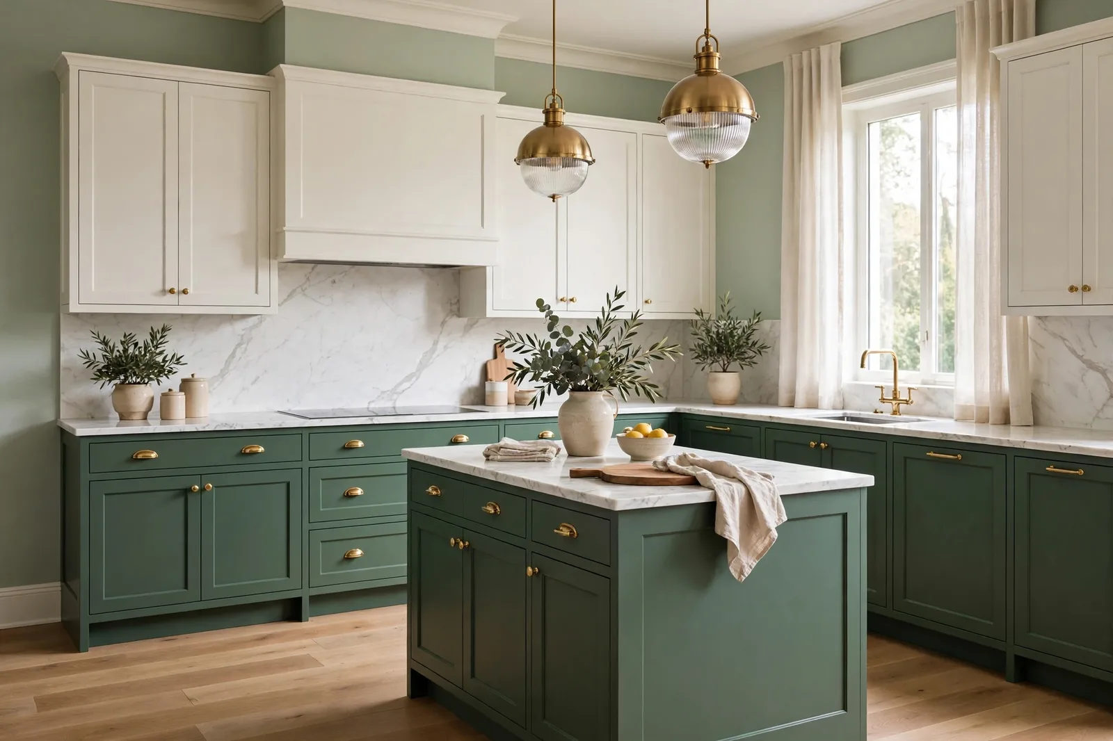
Kitchens are the one room where the wall color has the least power and the most to prove. Cabinets cover half the wall space, countertops and backsplash claim another share, and what’s left, a strip above the upper cabinets, a window wall, the corner by the range, is asked to pull everything together. That’s why designers work the kitchen color order in reverse: the wall color is chosen last, after the cabinets, counters, and backsplash have already cast their votes. Get the hierarchy right and the wall color practically picks itself. This guide follows that order, cabinet-by-cabinet wall pairings, countertop and backsplash coordination, kitchen lighting reality, open-plan flow, and the practical sheen decisions that make a kitchen wall survive real cooking. Colors shift with lighting and surrounding finishes, so always test a large physical sample on your actual kitchen wall before committing. Sherwin-Williams and Benjamin Moore color names appear as widely-known designer references only; The Global Abode is an independent brand, not affiliated with or endorsed by either company.
Why Kitchen Walls Are Chosen Last
Most rooms are painted from the walls outward: you pick a wall color, then furnish around it. Kitchens are built in the opposite direction, because the biggest color decisions in a kitchen aren’t paint at all. Cabinets are a permanent, high-investment finish chosen for decades. Countertops are stone, literally, most of the time, with veining and undertones that cannot be repainted. The backsplash is tile, pattern, and sheen in a space you stare at while chopping vegetables. By the time you get to wall paint, three loud, permanent voices have already spoken.
Designers describe the kitchen as a fixed-finish-first room. The cabinets, counters, floors, and appliances are the fixed finishes, expensive to change, impossible to ignore, and the wall color’s job is to make peace among them. That is a supporting role, not a starring one, and it’s exactly why choosing the wall color first is the most common kitchen color mistake. Fall in love with a sage wall, then discover it clashes with your granite’s pink undertones, and you’re choosing between repainting and re-tiling. The wall is the cheapest element in the room to change; it should also be the most flexible.
The practical hierarchy runs like this:
Cabinets vote first. They cover the most visual area and carry the strongest color commitment. The wall color must relate to the cabinet color, complement it, contrast it deliberately, or get out of its way.
Countertops vote second. Stone has undertones, gray, warm, pink, green, and the wall color must agree with them. A wall color that fights the countertop’s undertone will look wrong forever, because the countertop isn’t leaving.
The backsplash votes third. It sits between the wall and the counter, often literally bridging them. It can either echo the wall (a quiet subway tile) or be the accent the wall stays neutral for (a patterned or colorful tile).
The walls get the last vote. With the fixed finishes locked, the wall color becomes a solvable puzzle: it needs to agree with the cabinet undertone, flatter the countertop, and give the backsplash its stage. That sounds constraining, but it’s actually freeing, instead of choosing from the entire fan deck, you’re choosing from the small set of colors that work with what you already own.
One more reason walls come last: kitchen wall space is small and fragmented. Between uppers, under cabinets, around windows and the range hood, most kitchens have surprisingly little paintable wall. Small areas of color behave differently than whole rooms of it, they read as accents, not fields. A color that would be too much on four bedroom walls can be exactly right as a kitchen’s window wall. Keep that in mind as you read the cabinet pairings below: kitchen walls can handle a little more personality than their square footage suggests, because they rarely get a full, unbroken run.
Wall Colors by Cabinet Color
This is the heart of the guide. Find your cabinets, and the wall shortlist writes itself.
| Cabinets | Wall shortlist | Why it works | Avoid |
|---|---|---|---|
| White / off-white (White Dove, Alabaster, Simply White) | Warm greige (Agreeable Gray, Edgecomb Gray); soft sage (Clary Sage, October Mist); pale blue (Sea Salt, Rainwashed) | White cabinets are a neutral backdrop, the wall brings the warmth, color, and personality the cabinets don’t | Another white on the wall (undertone clashes look like a mistake); cool grays that turn the kitchen clinical |
| Warm wood (oak, walnut, hickory, stained) | Warm whites (White Dove, Alabaster); soft greens (Clary Sage, Retreat); warm greige (Accessible Beige) | Warm wood needs warmth echoed back, cool walls make wood look orange by contrast | Cool grays and crisp blue-whites (they fight the wood’s warmth); anything pink-leaning near red-toned wood |
| Navy / deep blue (Hale Navy, Naval) | Warm whites (White Dove, Simply White); light warm greige (Edgecomb Gray); soft warm gray (Agreeable Gray) | The cabinetry is the color statement, walls stay quiet, warm, and light so the navy reads as intentional | Cool whites (they make the kitchen feel icy); competing deep colors on the wall |
| Deep green (Evergreen Fog, Pewter Green) | Warm whites (White Dove, Alabaster); warm light greige (Accessible Beige, Edgecomb Gray) | Green cabinets already carry the room’s color, warm neutrals on the wall keep it grounded and sophisticated | Other greens on the wall (the kitchen goes monochrome-muddy); stark cool whites |
| Charcoal / near-black (Iron Ore, Kendall Charcoal, Tricorn Black) | Bright warm whites (Simply White, Pure White); light warm greige (Agreeable Gray); warm pale beige (Accessible Beige) | Dark cabinets need light walls for balance, the contrast is the design | Mid-tone walls (they muddy the contrast); dark walls with dark cabinets (the kitchen becomes a cave) |
| Light gray / greige (Repose Gray, Mindful Gray, Revere Pewter) | Warm whites (White Dove, Simply White); slightly deeper greige accent (one step deeper than cabinets) | Gray cabinets want warmth from the walls, a warm white keeps the kitchen from going flat and cold | More gray on the wall (the kitchen goes monochrome and lifeless); cool blue-whites |
A few notes on the most common situations:
White cabinets are the most forgiving partner in the kitchen, and the most common reason people choose the wrong wall. Because the cabinets are neutral, the temptation is to pick a white or pale gray wall to match. Designers consistently advise against the white-on-white wall: two near-identical whites with different undertones read as a matching failure, not a design. Give the wall its own identity, a warm greige, a soft sage, a pale blue, and the white cabinets become the crisp frame the color sits in. The wall is where a white kitchen gets its personality.
Wood cabinets are the opposite problem: the cabinets already have strong warmth, so the wall’s job is to echo it gently, not add a competing temperature. Warm whites are the safest answer, they keep the kitchen bright while agreeing with the wood. Soft greens are the designer’s favorite move with oak and walnut: green and warm wood are a natural pairing (think forests), and a muted sage on the wall makes wood cabinets look richer instead of dated.
Navy and green cabinets are color commitments, and the wall must respect that commitment by staying out of the way. Warm whites are the professional default, White Dove against Hale Navy is one of the most-specified combinations in kitchen design for a reason. The warmth in the white keeps the deep cabinet color from reading cold, and the light value keeps the kitchen from closing in. If you want more than a white wall, a light warm greige is the furthest you should go, anything deeper starts competing with the cabinetry.
Dark cabinets, charcoal, near-black, run on contrast. The wall must be light, period. This is the one cabinet situation with a hard rule: dark cabinets plus mid-tone or dark walls makes a kitchen that feels like evening at noon. Bright warm whites or light greiges give the dark cabinetry the bright field it needs to read as dramatic rather than oppressive.
Countertop and Backsplash Coordination
Cabinets set the wall’s temperature; countertops set its undertone allegiance. Stone is the undertone lie detector of the kitchen, marble veining, quartz patterns, and granite movement all carry warm or cool threads, and the wall color has to agree with them.
White marble and marble-look quartz (Carrara, Calacatta, and their quartz cousins) carry cool gray veining on a white ground, with, in natural marble, occasional warm gold threading. The wall color should respect the veining: warm whites and light warm greiges keep the kitchen feeling soft rather than stark. Designers warn against pairing cool-gray walls with gray-veined marble, the kitchen goes monochrome and chilly, and the beautiful stone disappears into the background instead of standing out.
Warm granite (the Santa Cecilia, Baltic Brown, and Uba Tuba family) is the busiest fixed finish in the kitchen, gold, rust, black, and cream all in one slab. Busy stone needs a quiet wall: warm whites, soft creams, or a warm greige pulled from the stone’s lightest tone. Never introduce a new strong color on the wall next to busy granite; the stone is already the room’s pattern, and a competing wall color turns the kitchen into an argument.
Dark countertops (soapstone, honed black granite, dark quartz) ground the kitchen visually and pair best with light walls, the same contrast logic as dark cabinets. Warm whites keep the combination from going severe; a soft sage or warm greige adds personality without breaking the contrast.
Butcher block and wood counters want the warm-white-and-sage treatment from the wood-cabinet playbook: they add another warm voice to the room, so the wall should stay warm and quiet. Warm whites, soft creams, and muted greens are the natural companions.
The backsplash is the bridge. In most kitchens it sits directly between the counter and the wall, which makes it the mediator between the two. Two strategies work: the quiet bridge (a white or cream subway tile, a soft handmade-look tile) that lets the wall color carry the room’s personality, or the statement bridge (a patterned cement tile, a deep green zellige, a bold mosaic) that is the room’s personality while the wall stays neutral. What doesn’t work is a statement backsplash and a statement wall, two accents in a small room fight, and the kitchen loses. Decide which element gets to be the star, and let the other one support.
One coordination rule covers all of it: pull the wall color from the fixed finishes, don’t invent it. The best kitchen wall colors are usually a lighter, quieter version of a tone that’s already in the room, the warm thread in the granite, the cream in the backsplash, the soft gray in the marble veining. A wall color that echoes something permanent always looks intentional. A wall color imported from nowhere always looks like a guess.
The Light Reality of Kitchens
Kitchens are the most artificially lit rooms in the house, and the most used after dark. A wall color chosen at noon in a showroom is lived with at 7pm under a pendant. The lighting plan is part of the color plan.
Under-cabinet LEDs are the kitchen’s secret color-shifter. They wash the backsplash and the lower wall in direct, close-range light, usually 2700K to 3000K, warm and flattering, but they also create a bright band that makes the wall above the uppers look darker by contrast. If your under-cabinet lights are warm, your wall color will read warmer in the work zone and cooler above the cabinets. Test your sample in both zones: tape it to the backsplash area and to the wall above the uppers, and check both with the under-cabinet lights on.
Pendants and task lighting create pools of warm light over islands and sinks. A wall color near a pendant zone reads warmer and slightly deeper than the same color on a far wall. In open kitchens, this means the wall color can look like two different colors depending on which end of the room you’re standing at, normal, but worth seeing before the gallons are open.
Window placement matters more in kitchens than in most rooms, because kitchen windows are often small and positioned over the sink, the wall with the least paint on it. A north-facing kitchen window gives you cool, indirect light that flatters warm wall colors and punishes cool ones. A south-facing window floods the room with warm sun that can make an already-warm wall read golden. East-facing kitchens swing from warm morning to neutral afternoon; west-facing kitchens get the golden evening push right at dinner-prep time.
The bulb temperature rule: match your bulbs to your wall’s intention. Warm walls (greiges, warm whites, sages) want warm bulbs (2700K–3000K), the light and the color agree, and the kitchen glows. Cool walls (pale blues, cool grays) can take slightly cooler bulbs but still rarely want to go above 3500K in a home kitchen. The most common kitchen lighting mistake is cool daylight-balanced bulbs (4000K+) over warm wall colors, it flattens the warmth, exposes undertones, and makes food look unappetizing. Kitchens are for eating; the light should make food look good.
The evening test is non-negotiable for kitchens. Unlike a bedroom, which you judge in lamplight anyway, kitchens get judged in showroom daylight and lived in under pendants. Tape your sample boards up, turn on every light the kitchen will actually use, pendants, under-cabinet LEDs, and the range hood light, and look at the color at 8pm. The wall you chose at noon and the wall you’ll cook under at night are two different colors. Choose the night one.
Open-Plan Kitchens: Flowing Into Living and Dining
Most new kitchens aren’t rooms, they’re zones, open to the living room, the dining area, sometimes the entry. And that changes the wall color’s job from “support the cabinets” to “support the cabinets and flow into the next space.”
The one-color rule for open plans: the kitchen wall color should be the same color as, or a deliberate, visible step from, the adjacent living space. Open plans punish the “kitchen gets its own color” instinct, because there’s no doorway to contain the transition. A sage kitchen wall crashing into a greige living room wall reads as a mistake, not a moment. The safest move is one continuous wall color through the whole open space, with the kitchen’s personality coming from the backsplash, the island color, or textiles rather than a separate wall color.
If you want the kitchen zone to feel distinct, do it with depth, not with a different hue: the living room in a light warm greige, the kitchen’s window wall one step deeper in the same family. Same undertone, different depth, the zones read as related but distinct. What breaks flow is a hue change (greige living room, blue kitchen) without an architectural boundary to justify it.
The island is the kitchen’s accent wall. In open plans, the island is visible from the living room more than any kitchen wall is, it’s the kitchen’s public face. That makes the island color, not the wall color, the right place for drama: a navy or deep green island against quiet walls gives the open plan its moment of color without breaking flow. Walls stay neutral; the island speaks.
Sightline thinking: stand in the living room and look at the kitchen. What do you see? Usually the island, the range hood, and one wall, often the window wall or the wall beside the fridge. That visible wall is the one that must flow; walls hidden behind uppers or inside the work zone matter less. Spend your color deliberation on the sightline wall, and let the hidden walls follow.
Ceilings in open plans should stay consistent, one ceiling white through the whole space. A kitchen ceiling painted differently from the living room ceiling chops the open plan into pieces overhead, which is the opposite of what open means. Keep the ceiling quiet and continuous, and let the walls do the zoning work.
Sheen, Scrubbability, and the Practical Half
Kitchen walls get abused: steam, grease, splatter, fingerprints, the occasional tomato-sauce incident. The sheen you choose is a durability decision disguised as a finish decision.
Eggshell is the kitchen wall standard. It has enough sheen to wipe clean without looking shiny, hides wall imperfections reasonably well, and reads as a normal wall finish rather than a utilitarian coating. Most designers specify eggshell for kitchen walls as the default, it’s the finish that balances cleanability with a residential look.
Satin is the upgrade for hardworking zones. The wall behind the range (if it’s not tiled), the wall by the trash pullout, the breakfast-nook wall that takes chair bumps, these earn a satin finish. Satin scrubs better than eggshell and resists moisture more effectively, at the cost of showing wall imperfections slightly more. In a kitchen with imperfect drywall, keep satin to the zones that need it and eggshell everywhere else.
Semi-gloss is for trim, not walls. It belongs on the window casings, the baseboards, and any wainscoting, the architectural details that take handling. On a full kitchen wall, semi-gloss looks commercial and shows every flaw. The three-tier system (eggshell or satin walls, semi-gloss trim, flat ceiling) is the professional standard for a reason.
Moisture and grease are the real enemies. Steam from the range and dishwasher raises the humidity around kitchen walls daily, and airborne cooking grease settles on every surface over time. A quality kitchen-and-bath paint (formulated with extra mildew resistance and scrubbability) is worth the premium on kitchen walls, standard wall paint in a hardworking kitchen will show wear years earlier. And the range wall deserves special attention: if it’s painted rather than tiled, it wants the most scrubbable finish you can stand, because it’s the wall that takes the most punishment.
Sheen shifts color. This catches people: the same color in eggshell and in satin are not quite the same color. Higher sheen reads slightly deeper and more saturated, because the glossier surface reflects more light directly. If you fall in love with a sample in one sheen and buy another, you’ve changed the color. Test the sample in the sheen you plan to buy, always.
The backsplash-to-paint handoff: where tile meets paint, usually at the top of the backsplash or around the range hood, the transition should be clean and deliberate. A painted wall butting directly against tile needs a crisp line; a small bead of caulk or a pencil trim piece makes the handoff look finished rather than accidental. This is a detail, but kitchens are all details.
Building the whole kitchen palette, not just the walls?
The Whole Home Paint Guide is a complete, ready-to-use color system, anchor neutrals, cabinet and trim pairings, undertone coordination across every room, so your kitchen walls land in a house that’s designed to hold them. And the Paint Color Workbook includes side-by-side comparison worksheets and a room-by-room sampling checklist for choosing between finalists with evidence, not guesswork.
Frequently asked questions
A warm greige (Agreeable Gray, Edgecomb Gray), a soft sage (Clary Sage, October Mist), or a pale blue (Sea Salt, Rainwashed), something with its own identity that lets the white cabinets be the crisp frame. Avoid another white on the wall; two near-identical whites with different undertones read as a matching mistake. Our undertones guide explains why near-whites clash.
Warm whites (White Dove, Alabaster) are the safest answer, they keep the kitchen bright while agreeing with the wood’s warmth. Soft greens (Clary Sage, Retreat) are the designer’s favorite move: green and warm wood are a natural pairing that makes oak and walnut look richer. Avoid cool grays and crisp blue-whites, which fight the wood and can make it look orange by contrast.
Warm, quiet whites, White Dove or Simply White are the professional defaults against navy cabinetry like Hale Navy. The warmth keeps the deep blue from reading cold, and the light value keeps the kitchen from closing in. A light warm greige (Edgecomb Gray) is the furthest you should go toward color; anything deeper competes with the cabinets. See our cabinet color guide for the full navy playbook.
Yes, but only with light cabinets to balance it, dark walls need the contrast the way dark cabinets need light walls. A deep green or charcoal on one kitchen wall (the window wall, not the work zone) with white or light cabinets can be striking. With dark or mid-tone cabinets, a dark wall closes the kitchen in; keep walls light and let the cabinetry carry the depth. And dark walls demand a real lighting plan, pendants, under-cabinet LEDs, and warm bulbs are non-negotiable.
Light and warm: warm whites (White Dove, Simply White) or the lightest warm greiges (Agreeable Gray, Edgecomb Gray). Small kitchens punish mid-tone and dark walls, they read heavy and make the room feel smaller. Keep the walls light, let the backsplash or the island carry any color ambition, and make sure the lighting is warm and layered. See how light changes paint color for the orientation rules.
Eggshell is the standard, wipeable without looking shiny. Step up to satin for hardworking zones (behind the range, by the trash pullout) where scrubbability matters most. Keep semi-gloss for trim and casings, not walls. And test your color in the sheen you’ll buy, higher sheen reads slightly deeper, so the sample and the gallon need to match. Our sheen guide covers the full three-tier system.

