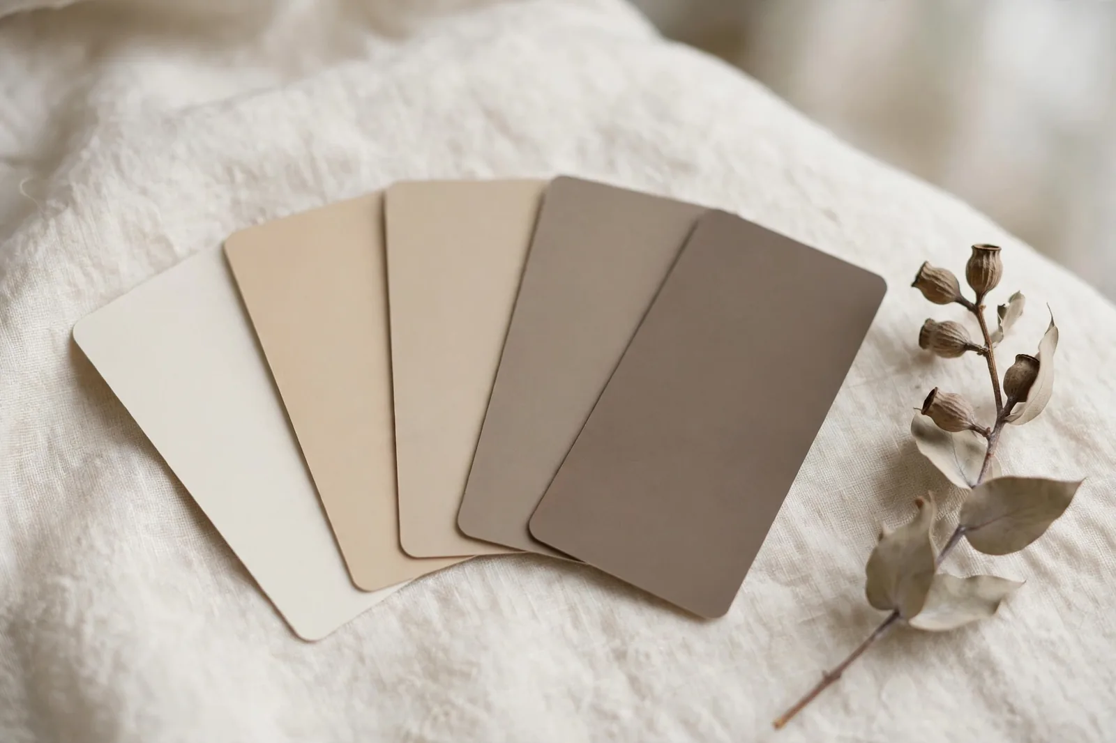
Ask ten homeowners how many paint colors are in their house and most will hesitate, then guess. That hesitation is the tell. The number of colors in a home shouldn’t be an accident you discover years later; it should be a decision you make before the first can is opened.
Why the number matters more than the colors
Here’s an uncomfortable truth about paint: the specific colors matter less than most people think, and the number of colors matters more. A house with four well-related neutrals almost always feels better than a house with nine beautiful colors that were chosen independently. The count is a constraint, and constraints do the coordinating for you.
Think of it this way. Walking through a house is a sequence: hallway, living room, kitchen, back down the hallway, bedroom. Each room is experienced relative to the room before it. When the colors relate, same undertone family, sensible shifts in depth, the sequence feels calm and intentional. When every room introduces a new, unrelated color, the brain reads it as noise. Designers call that feeling “choppy,” and it’s almost always a counting problem, not a taste problem.
This is why deciding the number first is so powerful. With three to five colors, cohesion is nearly automatic. With nine or ten, you’d need genuine expertise to keep the house from fragmenting, and even then, you’d be fighting the math. Set the number, and the individual choices get easier, because the boundaries are already drawn. Our whole-home palette guide builds on exactly this principle: decide the family of colors once, then assign them room by room.
The designer consensus: 3–5 (and what counts)
Ask around the design world and the answer converges fast: three to five main colors for the whole house. Interior designer Bobby Berk puts it plainly, he aims for 3 to 5 total, noting that more starts to feel “chopped up and inconsistent” as you move through the home, while fewer can feel “a little flat and undifferentiated.” Jane Boddy, a color forecaster at the Pantone Color Institute, gives the same advice in different words: build a palette of three to five colors that flow between the spaces.
One thing worth clearing up, because it confuses people: designers don’t all count the same way. Some count every painted surface, walls, trim, ceilings, in the 3–5 total. Others (including our own framework) count 3–5 wall colors, then add one trim white and one or two deep accents as separate supporting roles. Both conventions describe the same house. What matters isn’t which counting method you use; it’s that the total stays small and every color relates.
So what are the 3–5 actually doing? They fall into roles:
The anchor neutral (1–2 colors). This is the color on most of your walls, the main living areas, the hallways, the connective tissue. It should be the quietest decision in the house: a warm white, a soft greige, a gentle beige that gets along with your floors and fixed finishes. If you only get one color right, make it this one.
Supporting colors (2–3 colors). Bedrooms, offices, secondary spaces. These vary in depth and mood but stay in the anchor’s undertone family, a warm greige anchor pairs with warm beiges and taupes, not with a cool blue-gray. This is where personality enters without breaking cohesion.
The trim white (1 color, everywhere). Every trim board, interior door, and ceiling in the same white. It’s the quiet thread that ties the whole home together even as wall colors change, which is why it deserves a deliberate choice, not a default.
Deep accents (1–2 colors, contained). The powder room, the dining room, the front door, a wall of built-ins. Depth keeps a neutral palette from feeling bland, but only when it’s contained, where it can’t fight the broader palette.
The roles every palette needs
Here’s the full breakdown in one place. If your house covers every row, the number takes care of itself:
| Role | How many | What it covers | Where it lives |
|---|---|---|---|
| Anchor neutral | 1–2 | Most walls; the visual baseline of the home | Living areas, hallways, open-plan zones |
| Supporting colors | 2–3 | Variety with discipline, same undertone family | Bedrooms, offices, secondary rooms |
| Trim & ceiling white | 1 | The constant thread across every room | All trim, doors, and ceilings, no exceptions |
| Deep accents | 1–2 | Contained doses of drama | Powder room, dining room, front door, built-ins |
Notice what isn’t on the list: a separate color for every room, a different white per floor, an accent wall in each bedroom. Each of those adds a color to the count without adding anything to the feeling of the house. The table is also a diagnostic tool, if a room feels off, check which role its color is supposed to play. Most problem rooms are playing two roles at once, or none.
How size and layout change the count
Three to five is the center of gravity, not a law. Your house’s size and layout nudge the number up or down. Here’s how to adjust:
Small homes, condos, and apartments: lean fewer
In a small home, fewer colors make the space feel larger and calmer, there are fewer visual interruptions as the eye travels. Two to three main colors is plenty, and one color throughout is a legitimate strategy, not a compromise. A single warm neutral on every wall makes a small home feel connected and open, and it has a practical bonus: future touch-ups need only one can, one formula, one name to remember.
Going with one wall color doesn’t mean going flat. Vary the sheen instead of the hue, flat on walls, satin on trim, and let textiles, wood, and art carry the interest. Our room guides are built around exactly this idea: personality through furnishings, calm through the palette.
Large homes: you can carry more, carefully
A bigger house with genuinely separated spaces can handle the upper end of the range, and occasionally a color or two beyond it, because you simply see less of the house at once. But the discipline doesn’t relax: the undertone family still has to hold across everything, and the trim white still stays constant. More rooms is permission for more depth variation, not more color families.
Separate floors are the one place you can genuinely shift the mood, a calmer, deeper palette upstairs, a brighter social palette down, as long as the stairwell and landing transition gracefully between them and the undertone family doesn’t change.
Open-plan layouts: treat it as one room
Open concept is where color counts matter most, because there are no walls to separate decisions. Carry one anchor neutral across the entire open area and shift only slightly lighter or darker between zones, never jump to an unrelated color where nothing divides them. Reserve deeper or bolder colors for the enclosed rooms off the open space: the powder room, the office, the laundry. For the full method, see our guide to choosing a whole-home palette that flows room to room.
Divided, traditional layouts: slightly more freedom
Walls and doors are natural separators, so a traditional layout forgives a little more variety, each room is experienced more on its own terms. But the sightline rule still governs: stand in the hallway or the main living area, and every color visible from that one spot must get along. Closed doors don’t excuse clashing undertones in the rooms you see together.
One more factor: resale
If you plan to sell within a few years, lean toward fewer colors and calmer neutrals. Broad appeal is a numbers game, the next buyer has to imagine their life in your palette, and a restrained, cohesive scheme makes that easier than a highly personal one. Save the boldest choices for the contained, easily repainted spots.
Where people go wrong
Almost every color-count mistake falls into one of two traps: too many or too few. Both are fixable once you see them.
Too many: the room-by-room trap
The classic failure mode: choosing paint one room at a time, each choice defensible alone, the total a patchwork. By the third or fourth room, the undertones are fighting and the house feels restless. The tell is a hallway that looks different every ten feet. The fix is the one this whole article is about, decide the palette once, at the whole-house level, then assign. Related reading: how paint colors really behave, so the colors you do choose earn their place.
Two subtler versions of “too many”: an accent wall in every room (an accent everywhere is an accent nowhere, pick one or two moments), and a different white per floor or per room (whites clash harder than colors do, because the eye expects them to match).
Too few: the flat problem
The opposite trap is real too, usually a rental-beige situation where one safe color covers everything and the house feels washed out and impersonal. The fix isn’t more colors; it’s more depth. One deep, contained color, a moody powder room, a rich dining room, a dark front door, gives the whole house something to play against. Sheen variation and texture do the rest: flat walls against satin trim, linen against oak, wool against stone.
The counting mistakes
Forgetting the trim white counts visually. Even in the “3–5 wall colors” convention, the trim white is doing quiet work in every room. Choose it deliberately against your anchor neutral, enough contrast to read as trim, not so much it looks stark.
Putting the bold color in a connector space. Hallways, entries, and stairwells touch nearly every room, which makes them the worst place for a statement color. Keep connectors in the anchor neutral; save the drama for rooms with doors.
Counting the front door as a wall color. The front door is an accent by nature, contained, changeable, barely visible from inside. It doesn’t spend your wall-color budget. Our exterior guide covers the outside count separately: body, trim, and one accent is the classic trio.
The shortcut: start from a finished palette
Knowing the number is the easy part; choosing the actual colors, in the right undertones, in the right depths, for your light, is where most people stall. That’s the entire reason done-for-you color systems exist: the counting, the coordinating, and the testing logic are already worked out.
Want the number, and the colors, already decided?
The Whole Home Paint Guide is a complete Sherwin-Williams color system: every room mapped, trim and ceiling pairings included, undertones already coordinated, the 3–5 decision made for you. And the Paint Color Workbook walks you through counting, testing, and committing to any palette step by step.
Frequently asked questions
You can, and in small homes and open floor plans, it’s often the best choice. One warm neutral throughout feels calm, connected, and open, and it makes touch-ups trivially easy. Avoid flatness by varying sheen (flat walls, satin trim), leaning on texture and furnishings for interest, and adding one deep accent in a contained spot like the powder room or front door.
Treat the open area as one room: one anchor neutral across the whole space, shifting only slightly lighter or darker between zones. Save deeper or bolder colors for the enclosed rooms off the open plan. The fewer walls you have, the fewer colors you need.
It depends on whose convention you’re reading. Some designers count everything, walls, trim, ceilings, in the 3–5 total; others count 3–5 wall colors plus one trim white as a separate role. Both describe the same house. What actually matters is keeping one consistent trim white everywhere and keeping the total number of distinct colors small.
Two to three main colors is the sweet spot, fewer visual interruptions make small spaces feel larger and calmer. A single color throughout is a legitimate strategy for condos and apartments; create variety with sheen, textiles, and wood tones rather than additional hues.
You can, but the discipline gets stricter as the count rises. It works best in large homes with genuinely separated spaces, where you see less of the house at once, and only if every color stays in the same undertone family with one constant trim white. If rooms are starting to feel disconnected as you move through them, that’s the signal to edit down.
Three is the classic exterior count: a main body color, a trim color, and one accent for the front door, shutters, or porch details. Start with your roof and any brick or stone, their undertones govern everything else. See our exterior color guide for the full order of operations.

