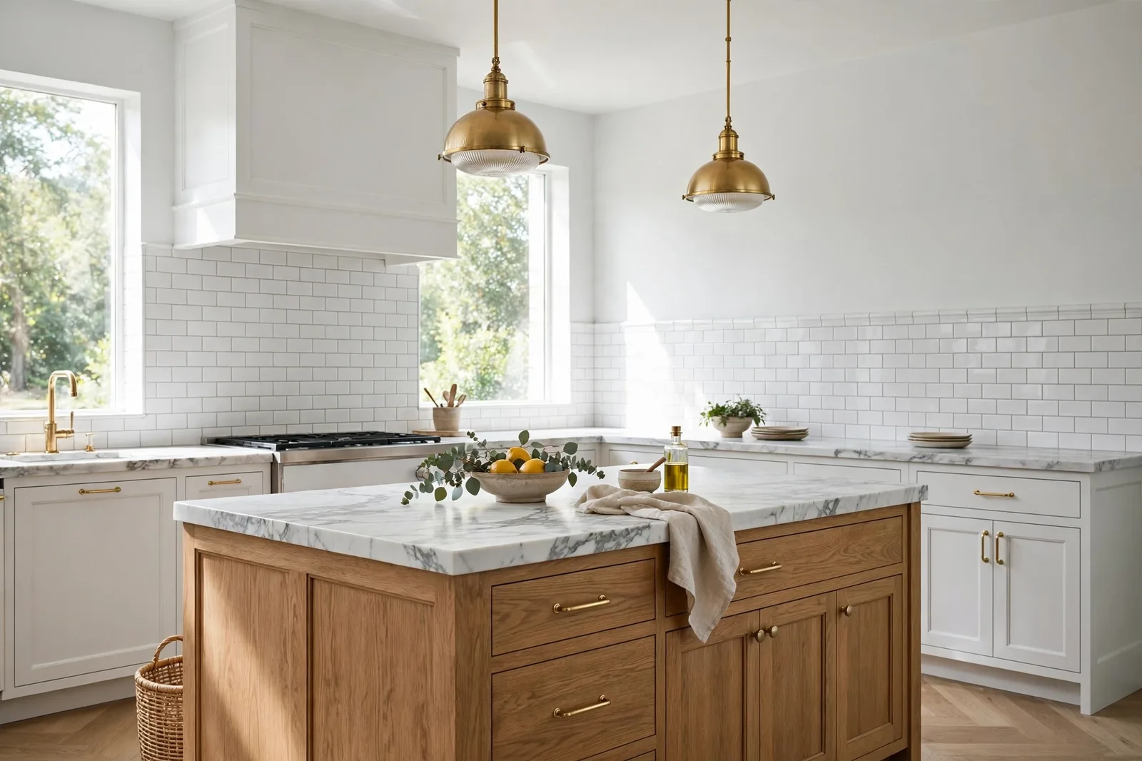
Your countertop is the largest permanent surface in your kitchen, and the one that will still be there long after the paint cans are recycled. Walls are repaintable; stone is not. That single fact makes the countertop the boss of your kitchen color scheme, and the wall color the employee that must agree with it. Carrara marble’s wispy gray veining pulls every wall near it toward cool. Black granite’s depth swallows light and demands walls that can carry contrast. Butcher block’s warm wood turns cool grays into strangers. And white quartz’s brightness makes soft whites look dingy by comparison. This guide gives you the wall verdict for each major countertop and backsplash surface, what agrees with the stone, what fights it, and the backsplash-as-bridge method that ties them together when nothing else will. Paint colors shift with lighting, surface, and sheen, so always test a large physical sample of the real paint against your actual countertop and backsplash, in your own kitchen’s light, before committing, screen swatches are approximations. The Global Abode is an independent publication, not affiliated with or endorsed by Sherwin-Williams or Benjamin Moore; all color names and codes are referenced as widely-known designer examples.
Key takeaway: Walls match countertops by undertone, not by lightness. Read the stone first: Carrara’s gray veining wants cool whites, soft grays, and blue-grays; black granite wants contrast, warm whites, soft greiges, and walls with enough presence to stand up to the drama; butcher block wants warmth, warm whites, creams, and soft sages; white quartz wants cleanliness, crisper whites and grays chosen so the wall reads intentional, not accidental. The backsplash is the bridge: when counter and wall disagree, the tile ties them together. Undertone notes below are widely-reported designer observations, not exact manufacturer specifications.
The Stone-First Rule: Read the Veining Before You Choose the Wall
Every kitchen wall color should be chosen with the countertop in the conversation, literally. Prop your paint boards next to the actual countertop, step back, and look. The countertop is permanent, expensive, and, this is the part people underestimate, the largest single plane of fixed color in the room. It casts its undertone over everything nearby. Choose the wall without it, and the wall gets chosen wrong.
The stone-first method is three steps. First, read the stone’s undertone. Look at the background and the veining separately. Carrara marble has a white-to-light-gray background with soft gray veining, cool overall. Black granite reads near-black with flecks of gold, silver, or white depending on the variety, its undertone hides in the flecks, and you need to find them. Butcher block reads as warm wood, honey, amber, sometimes walnut-dark, with all the warmth of a wood floor. White quartz reads bright white with a consistent, cool-clean finish and often a manufactured gray or gold vein. Each of these undertones is a vote about what the wall should be.
Second, decide whether you want harmony or contrast, deliberately. Harmony means the wall agrees with the stone’s temperature: cool whites with Carrara, warm whites with butcher block. Contrast means the wall deliberately pushes against it: a muted blue-gray island against Carrara, a crisp white wall against black granite. Both are legitimate design moves. What fails is the accidental middle, a wall that leans slightly warm against cool stone or slightly cool against warm wood, so the two read as a mismatch instead of a choice. Agree or contrast; never drift.
Third, test in the room’s real light, and at night. Kitchen lighting changes everything. Under-cabinet lighting is usually warm; daytime window light shifts by orientation; evening overhead lighting is whatever your bulbs make it. Stone looks different under each, and so does paint. Test your finalist wall color against the countertop at midday and again at 8pm under your actual kitchen lights. The evening check is the verdict: if the wall and stone agree at night, they agree always.
Tip: Bring your samples to the stone, not the other way around. Paint boards at least 2×2 feet, prop them on the counter itself, leaning against the backsplash where the wall meets the stone, and view from standing height across the kitchen. The junction where wall meets counter is the relationship that matters most; judge it there, not from across the room.
Carrara Marble: Cool White-Gray Stone, Cool Walls
Carrara marble is the classic kitchen stone, white to light gray background, soft wispy gray veining, cool and crisp overall. Designers consistently describe it as a cool stone: the gray veining gives it a monolithic layered-gray character that pulls everything nearby toward cool. That coolness is the wall color’s marching order.
Carrara’s best walls are the ones that speak its language:
Cool and clean whites, walls a half-step softer than the stone’s white, so the marble stays the star. Whites with a neutral or faintly cool lean (think clean whites rather than creamy ones) sit beautifully against Carrara: the wall reads fresh, the stone reads rich, and the gray veining ties them together. The classic Carrara kitchen is white cabinets, cool-white walls, and the stone doing all the talking.
Soft grays and greiges with a gray pull, the walls that echo the veining itself. A soft light gray wall pulls the gray out of Carrara’s veining and makes the whole kitchen read as one composed cool palette. Lean toward true grays and cool greiges here rather than warm beiges; the beige thread in a warm greige can look disconnected against cool stone.
Muted blue-grays and soft blue accents, the color move that loves Carrara. Blue is gray’s cousin, and muted blues (soft blue-gray walls, deeper blue islands or accent cabinets) harmonize with Carrara’s cool veins in a way that reads intentional and serene. A blue island against Carrara is one of the most repeated pairings in kitchen design, and it works because the stone’s coolness is doing half the job.
Deep contrast accents, navy, charcoal, black metals. Carrara’s brightness can take a dark anchor: a deep navy or dark gray island, black window frames, unlacquered brass that will darken toward brown. The dark accents give the cool palette its depth and keep it from floating away.
| Wall family | Why it works | Watch out for |
|---|---|---|
| Cool/clean whites | Agree with the stone’s coolness; let the marble be the star | Avoid creamy warm whites, the yellow reads against cool veining |
| Soft grays | Echo the gray veining; the most composed read | Keep them light and warm-side-neutral; blue-grays can chill a north kitchen |
| Muted blue-grays | Blue rhymes with the cool veins; islands in blue-gray are the classic move | Test in evening light, some blue-grays deepen dramatically under warm bulbs |
| Deep navy / charcoal | The dark anchor that grounds Carrara’s brightness | Use on islands or accents, not all four walls in a small kitchen |
| Warm beiges | Generally the mismatch family, warm wall against cool stone | If you must, choose a gray-civilized beige and test against the actual slab |
One more Carrara note: read the veining, not the name. Calacatta’s gold-toned veining and warmer background actually welcome warmer walls than Carrara does, creamy neutrals and warm whites that would fight Carrara can harmonize with Calacatta. The name on the stone matters less than what your eyes see in the slab. Judge the veining in your own stone, not the marble family it came from.
Watch out: The most common Carrara failure is the warm-white wall chosen from habit. A creamy or buttery white against cool gray veining doesn’t read as “warm and inviting”, it reads as yellow. The stone makes the wall’s warmth visible by contrast, and the kitchen looks like two different renovations. If you want warmth with Carrara, put it in the wood, the brass, and the textiles, keep the wall cool.
Black and Dark Granite: The Drama Anchor
Black granite, and its cousins, black quartz, soapstone-look, dark marbles, is the drama anchor of the kitchen. It’s near-black, light-absorbing, and visually heavy. A kitchen with black countertops doesn’t have a neutrality problem; it has a balance problem. The walls have to do two jobs: bounce light back into the room (because the counter won’t) and stand up to the stone’s presence without disappearing or clashing.
Crisp white walls are the classic answer, and they remain the safest one. The white-black contrast is timeless: the walls reflect light, the counter anchors the room, and the kitchen reads as clean and deliberate. White upper cabinets against black counters is the pairing that has survived every trend cycle. With dark stone, choose the wall white deliberately, a clean white that matches the kitchen’s overall temperature, warm or cool, so the wall reads as intentional rather than default.
Warm whites and creams are the warmth answer. Black granite with flecks of gold or brown has a warm thread, and a warm white wall picks it up, the kitchen reads as rich rather than stark. This is the pairing for kitchens with warm wood floors or warm metal fixtures: the wall bridges the dark counter and the warm room.
Soft grays and greiges are the sophistication answer. A light warm-gray or greige wall against black granite reads as layered and modern, less contrast than white, more depth than cream. The gray family handles the transition between dark stone and everything else gracefully, which is why it’s the designer’s default in black-granite renovations.
Color with presence is the confident answer. Black countertops can carry real wall color: deep greens, muted navies, warm charcoals on the island, even rich jewel tones. The rule is that the color must be deliberate enough to hold its own against the stone’s weight, a tentative pale color next to black granite looks like it wandered in. If you’re going for color, go for it. This is also where our deep guide to paint colors with black granite goes into full detail.
The black-granite failures to avoid: mid-tone beige walls that read as neither bright nor intentional (the stone makes them look dingy), cool blue-gray walls chosen without noticing the warm flecks in the granite (temperature argument at the junction), and dark walls on all four surfaces in a small kitchen (the room caves inward). Light walls, deliberate temperature, and one strong move, that’s the formula.
Butcher Block: Warm Wood Wants Warm Walls
Butcher block is wood, not stone, and it behaves like wood. Honey, amber, sometimes deep walnut tones; warm through and through. Everything the fixed-finish chapter of color theory says about warm wood floors applies to butcher block countertops, compressed into the most-used work surface in the house. Our butcher block vs. quartz vs. granite comparison covers the surfaces themselves; here is the wall verdict.
Warm whites and creams are butcher block’s native walls. The warmth in the wall echoes the warmth in the counter, and the kitchen reads as collected and welcoming, the farmhouse kitchen at its best. This is the pairing that never fails: warm white walls, butcher block counters, and the room glows.
Soft sages and muted greens are butcher block’s color move. Green and warm wood is one of the most natural pairings in design, the green reads richer against the wood’s warmth, and the kitchen feels organic and calm. A soft sage wall or sage island against butcher block is the modern farmhouse signature, and it earns the reputation.
Warm greiges and light tans are the depth option. A touch more color than cream, a warm greige wall gives a butcher-block kitchen weight and coziness without the coolness risk. Keep the greige’s temperature clearly warm, the beige thread should be visible, shaking hands with the wood.
Deep contrast, navy, forest green, charcoal islands, works the same way it does with black granite: butcher block’s warmth can carry a confident dark. A deep green island under butcher block counters is a pairing that reads as designed, not decorated.
The butcher block failure is the same as the warm-wood-floor failure: cool gray walls. A blue-gray wall against honey-toned butcher block makes the counter look more orange and the wall look colder than either does alone, the temperature argument, right at the most-used surface in the kitchen. If your kitchen has butcher block and you love gray, choose a warm gray (greige), not a blue-gray. Test at the junction. Trust your eyes.
White Quartz and Quartzite: Bright Surfaces, Deliberate Whites
White quartz is the engineered answer to marble: bright white, consistent, often with a manufactured gray or gold vein. Quartzite (the natural stone) sits nearby, white-gray backgrounds, often with more dramatic veining. Both share the key trait: they are bright, and they are the boss of the room’s brightness. The wall’s job is to be deliberately chosen against that brightness, not accidentally close to it.
The brightness trap is the defining white-quartz problem. A soft warm white wall next to a bright white countertop can read as dingy, creamy, or gray by comparison, the contrast effect, the same one that sinks White Dove next to Chantilly Lace. The wall isn’t wrong; the neighbor is brighter. With white quartz, either match the brightness with a crisp clean white wall, or step away from white entirely into soft gray, greige, or color, where the comparison can’t happen.
Crisp clean whites, the match-brightness move. A clean white wall (neutral to faintly cool) at the same brightness level as the counter reads as seamless and modern. The kitchen becomes a white box with the veining as the only texture, calm, bright, gallery-like. This is the move for quartz with minimal veining, where the counter is a plane of light.
Soft grays and cool greiges, the step-away move. When the counter is veined (gray-veined quartz, quartzite with movement), a soft gray wall picks up the veining and the kitchen reads as composed rather than blinding. This is the Carrara playbook applied to quartz: cool walls for cool stone.
Warmth with discipline, the mixed move. If your quartz has warm gold veining or your kitchen has warm wood floors, warm whites and warm greiges belong, but choose them with the brightness comparison in mind. A warm white next to bright white quartz must be confidently warm (a clear warm white, not a white that accidentally leans) so the difference reads as intention, not mismatch.
Color on the island or walls, the quartz-island pairing. White quartz is the most forgiving bright surface for colored cabinetry: navy, deep green, charcoal, and warm wood islands all sit beautifully against it. The counter’s brightness gives any color behind it a clean frame. If you’re choosing bold cabinets, white quartz is the counter that says yes.
The Backsplash Bridge: When the Tile Ties It Together
Sometimes the countertop and the wall want different things, and neither will compromise. That’s what the backsplash is for. The backsplash is the smallest permanent surface in the kitchen, and the most strategic one. It sits at the exact junction where wall meets counter, which means it can be the bridge between two surfaces that don’t quite agree.
The bridge method works like this. Identify the disagreement: your countertop is cool Carrara, but you want warm walls; your counters are warm butcher block, but you love blue-gray. Choose a backsplash that contains both temperatures: a handmade-look tile with warm and cool variation, a marble mosaic that echoes the counter’s veining in a warmer grout, a zellige tile whose glaze shifts between warm and cool. Let the tile do the diplomatic work: the backsplash touches both surfaces, so it can agree with the counter on one edge and the wall on the other, and the eye reads the whole sequence as intentional.
| The disagreement | Bridge tile | Why it works |
|---|---|---|
| Cool Carrara + warm wall wishes | Handmade-look white tile with warm variation; warm-gray grout | The tile’s variation carries both temperatures; the grout warms the junction |
| Black granite + cool gray walls | White subway with dark grout; black-and-white patterned tile | Echoes the counter’s drama; the pattern gives the wall a reason to be gray |
| Butcher block + blue-gray wishes | Soft blue-gray handmade tile; sea-glass zellige | The tile introduces the cool tone gradually; the wood warms it from below |
| White quartz + warm white walls | Warm white tile matching the wall; brass or warm grout line | Extends the wall’s warmth down to the counter; removes the brightness comparison |
| Busy granite + any wall | Quiet solid tile in the granite’s background tone | Calms the junction; lets the busy stone be the only pattern |
Two bridge principles cover nearly everything. First, one pattern per kitchen. If the countertop is busy (speckled granite, dramatic marble), the backsplash should be quiet, a solid tile in the stone’s background tone. If the countertop is quiet (solid quartz, honed black), the backsplash can carry the pattern. Two busy surfaces fight; one busy surface stars. Second, grout is a color decision. Dark grout sharpens and modernizes; matching grout calms and unifies; warm-gray grout can warm a cool junction and cool-white grout can freshen a warm one. The grout line is thin, but it runs the whole kitchen, choose it like paint.
Choosing wall colors for your stone, or building the whole palette?
The Whole Home Paint Guide is a complete, ready-to-use color system, anchor neutrals, trim and ceiling pairings, accent colors, all with undertones already coordinated, so your kitchen walls agree with your counters, your floors, and every room beyond. And the Paint Color Workbook includes the fixed-finish matching worksheets and a room-by-room sampling checklist for testing wall finalists against your actual stone with evidence, not guesswork.
Frequently asked questions
Yes, gray is one of Carrara’s best walls, because it echoes the stone’s gray veining. Choose a light, soft gray with a neutral or faintly warm lean rather than a blue-gray, especially in north-facing kitchens where blue-grays can read cold. Keep the gray light enough that the kitchen stays bright, and test it against your actual slab: Carrara’s veining varies, and the wall should agree with your stone’s veining, not marble in general. Our undertones guide teaches the temperature-reading method behind this.
Beautifully, white cabinets with black granite is the most timeless pairing in kitchen design. The contrast is clean, the kitchen feels bright despite the dark stone, and the combination has survived every trend cycle. For the deepest dive on this exact pairing, see our guide to paint colors with black granite, which covers wall colors, island colors, and backsplash choices for dark stone in full.
Yes, warm walls are butcher block’s native company. Warm whites, creams, warm greiges, and soft sages all harmonize with the wood’s honey and amber tones. The warmth in the wall echoes the warmth in the counter, and the kitchen reads as collected and welcoming. What to avoid is the cool gray wall: blue-gray against warm wood creates the temperature argument at the most-used surface in the kitchen. If you love gray, choose a warm greige instead. See our countertop surface comparison for more on butcher block itself.
A warm greige or a soft warm white, the most temperature-flexible neutrals in the kitchen. Mixed surfaces (Carrara on the perimeter, butcher block on the island, say) need a wall that doesn’t take sides: warm greiges bridge warm and cool elements, and soft warm whites recede without arguing. Avoid walls with a strong undertone of their own, a pink-beige will fight the cool stone, a blue-gray will fight the warm wood. The wall in a mixed-stone kitchen should be the diplomat. Our kitchen wall color guide covers the full cabinet-counter-wall triangle.
Paint large boards (2×2 feet minimum), two coats, in your actual sheen, then prop them on the counter itself, leaning against the backsplash where the wall meets the stone, and view from standing height. Check at four moments: morning, midday, late afternoon, and 8pm under your actual kitchen lights (under-cabinet lighting is usually warm and changes everything). Hold the board against the countertop, the backsplash, and the cabinet color together, all three must agree. Live with the boards for 48 hours. Our 48-hour sampling method walks through every step.
Start with the stone-first rule from section 1: read your countertop’s undertone (background and veining separately), decide whether you want harmony or deliberate contrast, and choose two or three finalist wall colors from the right family for your stone. Then test large boards against the actual counter at the wall-counter junction, in morning and evening light. Do not choose from memory at the paint store, bring a photo of your kitchen and, if possible, a sample chip of your counter material. The counter is the constant; the wall adapts to it, not the other way around. For the whole workflow, see how light changes paint color before you finalize.

