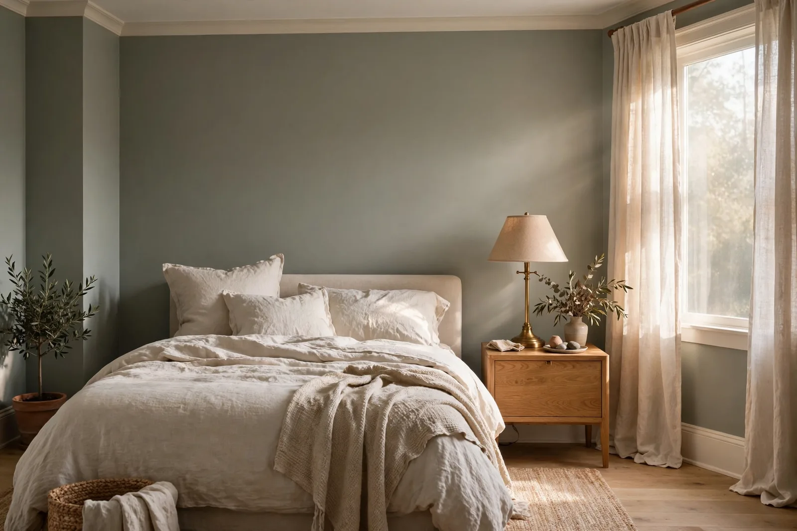
Some paint colors arrive with a parade and leave with the season. Evergreen Fog did the opposite: it arrived in 2022 as Sherwin-Williams’ Color of the Year, settled quietly into thousands of bedrooms, kitchens, and cabinet jobs, and years later is still the color designers reach for when someone asks for “green, but not green green.” It is a gray-green with a soft blue thread running through it, a color that reads calm and grounded in one light and misty and cool in another, which is exactly why it needs a proper review before it goes on your walls. This guide walks through what Evergreen Fog actually is, how its undertones behave in real light, where it shines and where it struggles, what to pair it with, and how it compares to the other muted sages crowding the same territory. Paint colors shift with lighting, surface, and sheen, so always test a large physical sample in your own space, in your own light, before committing, screen swatches are approximations. The Global Abode is an independent publication, not affiliated with or endorsed by Sherwin-Williams or Benjamin Moore; all color names and codes are referenced as widely-known designer examples.
Key takeaway: Evergreen Fog is a mid-depth, muted gray-green with a subtle blue-gray undertone, calm, organic, and versatile, but genuinely light-sensitive: it leans greener and warmer in south- and west-facing light, grayer and cooler in north-facing rooms, and moodier in dim spaces. Give it a warm white trim (Alabaster and Shoji White are the most-referenced designer choices), pair it with warm woods and brass or go deeper with dark bronze accents, and always test it on a large board in your own light. Undertone notes below are widely-reported designer observations, not exact manufacturer specifications.
What Evergreen Fog Is: The 2022 Color of the Year
When Sherwin-Williams named Evergreen Fog SW 9130 its 2022 Color of the Year, the announcement landed in the middle of a collective exhale. The gray decade was finally ending, homeowners were craving nature inside their four walls, and the palette of the moment was shifting from stark and cool toward organic and warm. Evergreen Fog was the perfect ambassador for that shift: a green that doesn’t act like a green. It carries the idea of green, fresh, natural, alive, without any of the intensity that makes people hesitate to commit to a green wall. It is, in essence, a neutral that happens to be green.
Structurally, the color sits in the sage family: a muted, grayed-down green with a quiet blue-gray undertone that keeps it from reading grassy or yellow. Designers widely describe it as a “green-gray” rather than a “gray-green”, a subtle distinction that matters, because the green is what you notice first and the gray is what makes it livable. It has enough depth to hold a wall (this is a mid-tone, not a whisper-pale tint), but it stays soft enough to behave like a neutral in a layered room. That balance is precisely why it resonated: it let people who had spent a decade in gray step into color without feeling like they’d done anything dramatic.
Why did it endure when so many Colors of the Year fade? Three reasons, all practical. First, it photographs and lives the same way, it doesn’t promise one thing on a swatch and deliver another on the wall, provided you understand its light sensitivity (section 2). Second, it works with both warm and cool companions, it can sit beside warm woods and brass or beside black fixtures and cool marble, which gives it enormous decorating range. And third, it answers a real design need: the middle ground between gray and color. Most homeowners don’t want a colorful house; they want a house that doesn’t feel flat. Evergreen Fog is color for people who are nervous about color, and it respects that nervousness.
It also arrived with a story that matched the culture. The 2022 COTY narrative leaned into biophilic design, bringing the outdoors in, calming interiors, the home as refuge. Evergreen Fog was literally named for the feeling of a misty forest: green, but softened, distant, atmospheric. Whether or not you buy into the marketing poetry, the color genuinely delivers that sensation. In a bright room with warm light, it can read like eucalyptus leaves in afternoon sun. That emotional register, calm, grounded, slightly wild, is the reason it stuck around.
Undertones and Light Behavior: The Chameleon Question
Ask ten designers about Evergreen Fog’s undertones and you’ll get the same core answer phrased ten ways: green first, gray second, blue third. It is fundamentally a green, muted by a strong gray cast, with a soft blue thread that designers consistently report seeing in cooler or dimmer light. The gray is what keeps it from reading as a “sage” in the yellow-green sense; the blue is what keeps it from reading as an earthy olive. Together they create the misty quality that gives the color its name, less like a leaf, more like a leaf seen through morning fog.
This is a color that shifts, and honest reviewers all flag the same behavior. In warm, bright light, south- or west-facing rooms in the afternoon, the green comes forward and the color reads its warmest and most sage-like, sometimes showing a whisper of yellow-green that designers describe as the sunniest version of the color. In cool, indirect light, north-facing rooms, overcast days, the gray and blue threads take over, and it reads cooler, moodier, and more distinctly gray-green. In shadowy corners and dim hallways, it deepens and can take on a slightly blue-gray cast that some describe as its most sophisticated and others as its least forgiving.
What this means practically: Evergreen Fog is not a color you choose from a chip. It is a color you choose from a large board, in the room, across a full day. The same wall that glows softly green at 3pm can read as a cool gray-green at 8am, and if you’re painting a north-facing bedroom, you need to love the cool version, because that’s the version you’ll live with most. The widely-reported guidance is consistent: in rooms with generous warm light, it’s warm and organic; in rooms with cool or limited light, it’s calm and misty but demands warm companions (warm woods, warm bulbs, warm textiles) to keep it from feeling chilly.
Artificial light matters just as much. Under warm 2700–3000K bulbs, Evergreen Fog relaxes into its greenest, most welcoming version, which is why it’s so often photographed beautifully in styled rooms with warm lamps. Under cool daylight-balanced bulbs, it flattens toward gray. If you’re testing this color, test it under the bulbs you’ll actually live with, in the evening, because that lamplight version is the one that will greet you every night.
Tip: Test Evergreen Fog the way designers test all chameleon colors: paint a 2×2-foot board with two coats, then move it around the room for 48 hours, the sunniest wall, the darkest corner, beside the trim, beside the floor. Judge it at morning, midday, and 8pm under your actual lamps. Our 48-hour sampling method walks through the full protocol, and it’s the difference between a color you love and a color you repaint.
Best Rooms and Uses: Bedrooms, Kitchens, Cabinets, Exteriors
Evergreen Fog is one of the rare mid-tone colors that genuinely works across the whole house, but it works differently in each room, and knowing which version you’re getting is the key to placing it well.
Bedrooms. This is the color’s natural habitat. A bedroom in Evergreen Fog reads as a retreat: calm, cocooning, softly organic, with enough depth to feel intentional and enough softness to rest against. It pairs beautifully with the things bedrooms already have, warm wood furniture, natural linen bedding, soft lamplight, and it flatters both light and dark bedding. In a north-facing bedroom, lean into the misty version deliberately: warm wood tones, cream textiles, and warm bulbs turn the cooler read into a feature rather than a compromise. All four walls in Evergreen Fog can feel enveloping in the best way; if that feels like a lot, try it on the bed wall with a warm white elsewhere.
Kitchens and cabinetry. Evergreen Fog has become a genuine cabinet color, not a trend flash, but a working neutral-green that designers keep specifying. On lower cabinets or a full kitchen run, it sits in the sweet spot: more interesting than white, calmer than navy, warmer than gray. It loves white or light countertops, and it has a particular affinity for brass and champagne-gold hardware, which warm up its cool thread. On a kitchen island, it can carry the whole room’s color story while the perimeter stays in a warm white, one of the most-referenced applications in designer reviews. One caution: in a kitchen with very little natural light, test it carefully against your countertop, because the gray thread can go flat next to cool stone.
Living rooms. As an all-over living room color, Evergreen Fog creates what designers describe as a “collected, cocooning” feel, the room reads as designed rather than decorated, especially with layered textures (bouclé, linen, wool) and warm wood. As an accent wall behind a sofa or a fireplace wall, it gives a living room a focal point without the commitment of a deep, saturated color. It works in both traditional rooms (with warm woods and classic lines) and modern ones (with black accents and clean shapes), which is part of its range.
Bathrooms. In small bathrooms and powder rooms, Evergreen Fog delivers the spa-like calm that everyone says they want from a bath, especially paired with white tile, natural wood vanities, and matte black or brass fixtures. The green-gray reads as fresh rather than clinical, and in a windowless bath the moody version of the color can feel intentional and enveloping rather than dark. Keep the trim and ceiling bright to protect the light.
Exteriors and front doors. This is the application people underestimate. Evergreen Fog on siding or shingles reads as a soft, organic neutral that sits beautifully against both brick and stone, and it ages gracefully because its muted quality doesn’t shout. On a front door, it’s a confident but not loud choice, welcoming, distinctive, and far more interesting than black without being risky. As with any exterior, test it on the actual siding in daylight; exterior light is cooler and brighter than interior light, and the gray thread will show more.
Where Evergreen Fog Struggles
No color is universal, and Evergreen Fog has real failure modes worth knowing before you commit. None of them are dealbreakers, they’re placement problems, and they’re all solvable once you see them.
Dark, north-facing rooms with no warm companions. This is the big one. Evergreen Fog’s cool thread is honest: in a dim, north-facing room with cool light, gray floors, and cool-white bulbs, the color can read flat, chilly, and a little lifeless, the mist without the forest. The fix isn’t to abandon the color; it’s to warm the room around it. Warm wood furniture, warm 2700K lighting, cream or warm-white textiles, and a warm undertone in the rug can pull the green forward and make the same wall feel intentional. But if the room is going to stay cool and dim, a north-facing office with gray carpet and daylight bulbs, say, this may not be the color for that room.
Next to the wrong undertones. Evergreen Fog’s blue-gray thread means it argues with certain companions. The most common clash designers report is with warm yellow-beiges, the creamy, golden beiges that were popular a decade ago. Put Evergreen Fog next to a yellow-beige trim or adjacent wall and both colors look worse: the beige looks dingier, the green looks grayer. It also sits uneasily with pink-beiges and mauve-toned neutrals, where the pink thread and the blue thread visibly disagree. The safe neighbors are warm whites, true warm greiges, and soft taupes, neutrals whose undertones lean warm without going yellow. Our greige vs. beige vs. taupe guide breaks down exactly which neutral family your companions belong to.
Whole-house use in mixed light. Evergreen Fog can absolutely work as a whole-home color, designers do specify it across main living spaces, but it demands the sightline discipline. Because it shifts with light, the version in the bright south-facing living room and the version in the dim north-facing hallway are genuinely different colors to the eye. That can be beautiful if it’s intentional (a gradient of the same family), or it can feel inconsistent if it isn’t. If you’re carrying it through the house, test it in the dimmest room it will appear in, not just the brightest, and keep the trim constant everywhere to anchor the transitions. Our whole-home palette guide covers the anchor-and-sightline method that makes this work.
Watch out: The most common Evergreen Fog regret is choosing it from a small chip in a paint store and painting a north-facing room. The chip shows the warm, green, sunlit version; the north-facing room delivers the cool, gray, misty version. These are both the same color, but only one of them is the room you’re painting. Always test a large board in the actual room, in the actual light, before committing.
Pairings: Trim Whites, Neutrals, and Accent Colors
Evergreen Fog is a generous color to pair with, its muted quality means it rarely fights, but the companions you choose decide which version of it shows up. The trim white is the single highest-leverage decision.
| Role | Widely-referenced choices | What it does to Evergreen Fog |
|---|---|---|
| Trim white (warm) | Alabaster, Shoji White | Warms and softens the color; the most-referenced designer pairing, cozy, cohesive, forgiving |
| Trim white (clean) | Pure White | Crisp, polished contrast; keeps the green reading fresh and slightly more modern |
| Trim white (cool) | Snowbound | Leans into the gray thread; serene and quiet, best in well-lit rooms |
| Warm neutral walls | Accessible Beige, warm greiges | Creates a layered, tonal palette; the beige warms the green’s cool edge |
| Deep accent | Urbane Bronze, Iron Ore | Grounds the palette; bronze doors, islands, or built-ins add drama without heaviness |
| Blue-green accent | Naval, Sea Salt | Naval gives bold contrast on built-ins; Sea Salt keeps adjacent walls light and airy |
| Warm earth accent | Terracotta tones, Canyon Clay | Complementary warmth; textiles and art in clay tones make the green feel collected |
| Metals & woods | Brass, champagne gold; warm oak, walnut | Brass warms the cool thread; warm woods are the color’s most natural partner |
On trim whites specifically: the designer consensus clusters around two favorites. Alabaster is the warm, creamy choice, it softens Evergreen Fog, pulls the green forward, and creates the cozy, layered look that dominates styled photos of this color. Shoji White is the slightly cleaner warm white that designers reach for when they want warmth without creaminess. Pure White is the crisper option, it makes Evergreen Fog look fresher and more contemporary, with a touch more contrast. The trim white you choose is genuinely a style decision: warm white for cozy and collected, clean white for fresh and modern. Our guide to the best Sherwin-Williams whites walks through how each of these behaves against colored walls.
On neutrals: Evergreen Fog loves company from the warm-neutral family. Accessible Beige on adjacent walls creates the tonal, layered palette that designers describe as “updated minimalism”, two muted colors in quiet conversation. Warm greiges keep the palette grounded; soft taupes add a touch of formality. What it doesn’t love is competition from other mid-tone colors with strong personalities, let Evergreen Fog be the color in the room, and let the neutrals be the supporting cast.
On accents and metals: for depth, the dark bronzes, Urbane Bronze on a door, an island, or built-ins, give Evergreen Fog a sophisticated anchor without the starkness of black. For contrast with energy, deep navy on a built-in or a piece of furniture makes the green look fresher by comparison. And for the finish layer, brass and champagne gold are the metals this color was made for: they warm its cool thread and pick up the organic quality in a way that chrome and polished nickel simply don’t. Warm woods, white oak, walnut, honey-toned maple, are the material equivalent of a warm white trim: they make the color feel inevitable rather than chosen.
Evergreen Fog vs. Similar Sages
Evergreen Fog doesn’t live alone in the sage aisle, it’s surrounded by cousins that are one nudge greener, grayer, lighter, or deeper. Knowing the neighbors helps you confirm that Evergreen Fog is actually the one you want, rather than the one you settled for.
Evergreen Fog vs. Sea Salt (SW 6204). The most common comparison, and the most useful. Sea Salt is lighter, airier, and bluer, it reads as a pale coastal green-gray, while Evergreen Fog has noticeably more depth and more green. If Sea Salt feels too washed-out or too blue in your light, Evergreen Fog is the step deeper and greener. If Evergreen Fog feels too heavy or too committed for the room, Sea Salt is the lighter alternative. They can also work together: Sea Salt on adjacent walls with Evergreen Fog as the accent is a tonal pairing designers use often.
Evergreen Fog vs. Clary Sage (SW 6178). Clary Sage is the greener, slightly more saturated cousin, it reads more distinctly as a green, with less of the gray-blue mist. If you love Evergreen Fog but wish it were a touch more green, Clary Sage is worth sampling. If Clary Sage feels a shade too colorful or too yellow-green in your light, Evergreen Fog’s gray thread is the restraint you’re looking for.
Evergreen Fog vs. Acacia Haze (SW 9132). These two sit near each other in the Sherwin-Williams deck, and the difference is temperature and weight. Acacia Haze is widely described as lighter and slightly warmer, with a softer gray-green read; Evergreen Fog is deeper and cooler, with the blue thread more present. For a whole room where you want the misty quality but less depth, Acacia Haze is the gentler option.
Evergreen Fog vs. October Mist (Benjamin Moore 1495). The cross-brand comparison everyone asks about, BM’s 2022 Color of the Year against SW’s. October Mist is widely described as a touch lighter and more silvered, with a slightly more ethereal quality; Evergreen Fog carries more green body and a touch more depth. They’re in the same emotional territory, calm, organic, misty, and choosing between them is genuinely a matter of sampling both in your light. Our cross-brand equivalent guide covers how to think about near-matches across brands without expecting exact duplicates.
The decision framework for all of these: sample the finalists side by side, on large boards, in the room, across a full day. The differences between these sages are subtle on chips and obvious on walls, which is exactly why chips mislead. Two boards, 48 hours, morning/midday/evening checks, and the right color usually declares itself.
Building a whole palette around a color like this?
The Whole Home Paint Guide is a complete, ready-to-use color system, anchor neutrals, trim and ceiling pairings, accent colors, all with undertones already coordinated, so a statement color like Evergreen Fog lands in a house designed to hold it. And the Paint Color Workbook includes undertone-comparison worksheets and a room-by-room sampling plan for testing finalists side by side with evidence, not guesswork.
Frequently asked questions
It’s close to neutral, which is why the question comes up so often. Designers widely describe it as a green with a gray cast and a subtle blue undertone, it reads warmer and greener in south- and west-facing light, and cooler and grayer in north-facing or dim light. If you need a single answer: it leans very slightly cool as a paint color, but it behaves warm in warm light. That’s why sampling in your own light matters more for this color than for most.
The most-referenced designer choices are Alabaster and Shoji White for a warm, soft pairing that pulls the green forward, and Pure White for a crisper, more contemporary contrast. Snowbound works if you want to lean into the cooler, grayer read. The trim white is a style decision as much as a color one, warm white for cozy and collected, clean white for fresh and modern, so test your finalist trim against a large board of Evergreen Fog in the room’s light before deciding.
Yes, it’s one of the most-referenced uses of the color. It reads as calm, cocooning, and softly organic, with enough depth to feel intentional. In a north-facing bedroom, pair it with warm wood furniture, cream or warm-white textiles, and warm 2700K lighting to keep the cooler read feeling deliberate. All four walls can work beautifully; if that’s more commitment than you want, try it on the bed wall with a warm white elsewhere.
Both, and that’s the honest answer. Designers consistently describe it as a chameleon: greener and warmer in bright, warm light; grayer and cooler in indirect, north-facing, or dim light, where a soft blue thread can also appear. Neither version is wrong; they’re the same color responding to light. The version you’ll live with is the one in your room, which is why a 48-hour board test across morning, midday, and evening light is the only reliable way to know which Evergreen Fog you’re getting.
It has outlasted the typical Color of the Year arc. Because it’s a muted, organic neutral-green rather than a loud trend color, it reads as timeless rather than timestamped, designers continue to specify it for bedrooms, cabinetry, and exteriors years after its 2022 debut. Colors that feel dated are usually the ones that were intense or highly specific; Evergreen Fog’s restraint is exactly what keeps it current.
The closest widely-referenced neighbors: Sea Salt (lighter, airier, bluer), Clary Sage (greener, slightly more saturated), Acacia Haze (lighter, a touch warmer), and Benjamin Moore’s October Mist (a touch lighter and more silvered). Each is one nudge away in depth, temperature, or saturation. If you’re choosing between them, sample the finalists side by side on large boards in your room, the differences are subtle on chips and obvious on walls.

