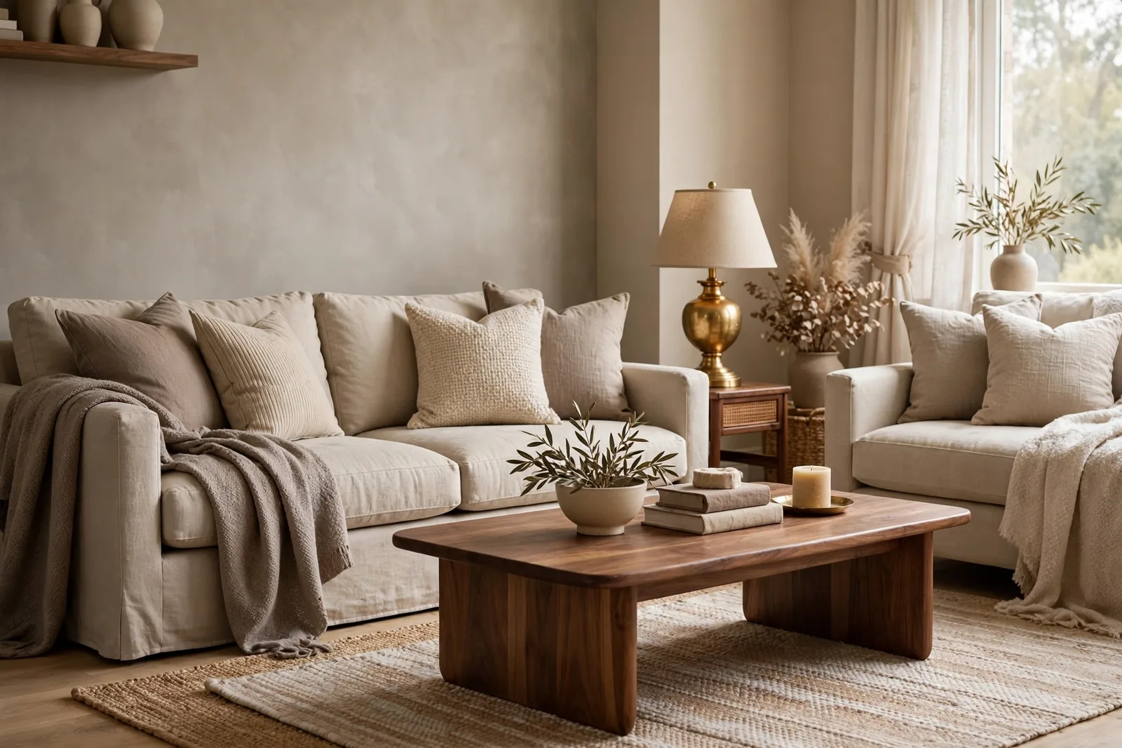
Somewhere between beige and gray sits the most confusing territory in paint. The chips look nearly identical in the store, the names overlap, greige, taupe, “warm gray”, and yet these are three different families with three different personalities, and choosing from the wrong family is how a perfectly good repaint ends up feeling off by a whisper nobody can name. Beige is the warm family: yellow-orange at heart, cozy and traditional, carrying a reputation it is still outliving. Greige is the hinge: part gray, part beige, the diplomat that mediates between warm and cool and made itself the whole-house color of a generation. Taupe is the moody one: gray-brown with a violet thread, deeper and more dramatic, the sophisticated backdrop that lets color sing around it. This master guide gives you each family honestly, what it is, where it shines, where it fails, the specific colors designers reach for, then a head-to-head comparison and a decision framework so you can pick the right family for your style, your light, and your finishes. Paint colors shift with lighting, surface, and sheen, so always test a large physical sample in your own space before committing, on-screen swatches are approximations. The Global Abode is an independent publication, not affiliated with or endorsed by Sherwin-Williams or Benjamin Moore; all color names and codes are referenced as widely-known designer examples.
Key takeaway: Beige leans warm (yellow-orange undertones), greige sits at the gray-beige hinge (most often a green lean), and taupe leans brown-gray (most often a violet or violet-pink lean). Choose beige for traditional warmth and warm wood homes, greige for whole-house flexibility and mixed finishes, and taupe for moody sophistication and rooms that can handle depth. Undertone notes below are widely-reported designer observations, not exact manufacturer specifications.
The Three Families Defined: Beige, Greige, Taupe
Forget the jargon for a moment and start with temperature, because temperature is what your eye actually feels when you walk into a room. Every neutral paint color sits somewhere on the warm-to-cool spectrum, and the three families are simply three addresses on it.
Beige is the warm family. At heart, beige is a yellow-orange neutral, think sand, wheat, camel. Its undertones run warm: yellow, orange, occasionally a whisper of pink. Beige is the color that reads as cozy the instant you enter. It flatters warm wood, harmonizes with brass and leather, and glows in evening lamplight. Its range runs from pale, near-white tints to full-strength tans. The modern beige, the one worth considering, has been civilized by a drop of gray, which mutes the yellow and keeps it current. The dated beige everyone remembers was beige without that gray: flat, yellow-heavy, and slightly pink in the wrong light.
Greige is the hinge. The name is a portmanteau, gray plus beige, and the color is exactly that: a neutral that sits at the intersection of the two. Greige is the diplomat of the neutral world. Some greiges lean gray (cooler, more composed), others lean beige (warmer, more inviting), but all of them do the same job: they let warm and cool elements coexist in one room without choosing sides. As for undertones, greige most commonly leans into green, a quiet, natural warmth that reads as organic rather than yellow, and more rarely flashes faintly violet in tricky light. It is the family that made whole-house color easy, because one greige can cross a bright south-facing living room and a dim hallway and stay coherent in both.
Taupe is the moody neutral. Taupe lives between gray and beige too, but it leans brown rather than yellow, a gray-brown, or warm gray, that reads deeper and more dramatic than most greiges. Its signature undertone is violet or violet-pink, and it rarely hides it: taupe is the family most likely to reveal its undertone to a sensitive eye, especially as it darkens. Where greige mediates, taupe states, it is the sophisticated backdrop that lets bolder colors come alive around it: blues, eggplant, chartreuse, coral, high-contrast patterns. Taupe is also the darkest of the three families on average, which means it soaks up light and brings genuine drama to a room.
One honest caveat before we go further: these families are descriptions, not legal boundaries. A warm-leaning greige and a gray-leaning beige can look nearly identical on the wall, and different brands classify borderline colors differently. What matters is not which drawer a color files into, but how it behaves, its temperature, its depth, its undertone, and how it responds to your light and your finishes. The families are a shortcut to that understanding, not a substitute for it. Our undertones guide covers the full method for reading any neutral’s hidden hues.
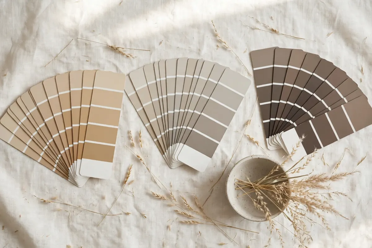
Tip: The fastest family test is the side-by-side: hold three large swatches, a known beige (Accessible Beige SW 7036), a known greige (Agreeable Gray SW 7029), and a known taupe (Warm Stone SW 7032), against white paper in daylight. In ten seconds your eye learns the family signatures: the beige reads warm and welcoming, the greige reads balanced and calm, the taupe reads deeper and moodier. Every other neutral you’ll ever consider is some variation on that trio.
Beige: Warmth With a Past
Beige has a reputation problem, and it is worth being honest about it. For much of the 2000s, beige was the default, the flat, yellowish wall color of builder-grade homes and rental apartments everywhere. It earned its dullness honestly: those beiges were often yellow-heavy, flat in low light, and prone to a faint pink cast under certain bulbs. When gray took over in the 2010s, it did so partly by promising to be everything beige wasn’t. Beige became shorthand for dated.
But the beige of today is not the beige of 2005. The modern beige has been rebuilt: a drop of gray mutes the yellow, a whisper of green steadies the warmth, and the result is a neutral that keeps everything good about beige, the coziness, the warmth, the harmony with natural materials, while dropping the qualities that made it feel tired. Designers now reach for beige deliberately, not by default, and it has become one of the strongest choices for traditional, farmhouse, and warm-modern homes.
Where beige shines: rooms that want to feel warm the moment you walk in. Beige is the natural family for traditional and farmhouse styles, for homes with warm wood floors (oak, walnut, hickory), for north-facing rooms whose cool light needs a warm counterweight, and for evening rooms, living rooms, dining rooms, bedrooms, where lamplight makes beige glow. It is forgiving with wood furniture and textiles, it flatters warm metals like brass and bronze, and it makes a house feel established rather than stark.
Where beige fails: in bright south-facing rooms, strong warm sun can push beige past cozy into golden, the warmth that flatters at dusk can read as yellow at 2pm. Against cool finishes, gray tile, cool quartz, chrome, blue-gray fabrics, beige can look mismatched, as if the wall belongs to a different renovation than everything else. And in dim rooms, a mid-depth beige can read heavy and a little flat. Beige wants light and warm company; without them it dulls.
The key beiges to know: Accessible Beige SW 7036 is the modern standard-bearer, technically a beige-leaning greige, warm and earthy, with a gray base and a whisper of green that keeps it current (see our full Accessible Beige color review). Balanced Beige SW 7037 is the warmer, more golden sibling, a true beige with sunny warmth for traditional rooms. Kilim Beige SW 6106 is the full-strength version: a deeper, more orange beige for people who want real, enveloping warmth. On the Benjamin Moore side, Manchester Tan HC-81 is the classic refined beige, and Bleeker Beige HC-80 is its deeper, more traditional sibling for rooms that can carry drama.
Watch out: Beige’s old reputation is not entirely dead, it lives on in the contrast effect. A modern beige next to a crisp white ceiling or bright white trim can read warmer than expected by comparison, and next to cool gray furnishings it can look distinctly yellow even when it’s perfectly neutral on its own. Always judge your beige finalist against the actual fixed finishes and trim in the room, not against white board in the store.
Greige: The Bridge
Greige did what no neutral family had done before: it ended the warm-versus-cool war. When gray was the color of the 2010s, it was cool, blue-leaning, and increasingly clinical, and it fought with the warm woods and warm finishes that most real homes already had. Greige arrived as the answer: a neutral that reads gray enough for the gray lovers and warm enough for the wood-and-brass crowd, letting both sides of the temperature divide coexist in one room. It became, for most of a decade, the most specified neutral family in residential design, and its best members are still among the most popular paint colors in the country.
Where greige shines: as a whole-house color and a hinge between rooms. Greige’s superpower is consistency across shifting light, one greige can flow through an open plan, crossing a bright south window wall and a dim hallway in the same sightline, and stay coherent. It handles mixed finishes better than either pure gray or pure beige: warm wood floors and cool gray tile, brass fixtures and stainless appliances, oak cabinetry and white quartz. For open-concept homes, for transitional styles, and for anyone who wants one color carried confidently through the house, greige is the default family, which is exactly why designers specify it more than any other neutral.
Where greige fails: the near-neighbor clash is its signature failure. Two greiges that look nearly identical, Agreeable Gray and Accessible Beige are the famous example, can fight at the edges when placed in adjacent spaces, reading as a matching mistake rather than a choice. Designers are consistent on this: one neutral per sightline. Greige can also read as bland when everything in the room is pale, it needs deep contrast (a navy island, black window frames, dark wood) to show its character. And its green lean, usually invisible, can surface against finishes with their own strong green or blue cast.
The key greiges to know: Agreeable Gray SW 7029 is the famous one, the true warm greige that defined the category, gray-first with soft beige warmth (see our full Agreeable Gray color review). Perfect Greige SW 6073 leans warmer, deeper into the beige side. Revere Pewter HC-172 (Benjamin Moore) is the all-time designer favorite, a touch deeper, with an earthy complexity that holds its own in larger rooms. Edgecomb Gray HC-173 (BM) is the lighter, airier cousin, often cited as the closest Benjamin Moore answer to Agreeable Gray. Anew Gray SW 7030 sits at medium depth, the sweet spot for cabinetry and accent walls. Useful Gray SW 7050 and Worldly Gray SW 7043 round out the SW family, the latter slightly cooler. For deeper greige, Mega Greige SW 7031 is the natural darker step from Agreeable Gray. On the BM side, Tranquility AF-490 and London Fog offer balanced mid-tone options.
Is greige dated? The honest answer: the all-gray-everything era is over, but greige was never really a cool gray in the first place. The warm greiges, Agreeable Gray, Revere Pewter, Accessible Beige, bridge gray and beige, which is why they’ve outlasted most of the cool grays of their era. A greige chosen for your light and your finishes, rather than for a trend, does not date. A greige chosen because it was fashionable in 2017 can feel tired the same way any trend-pick can. Choose the family for what your home needs, and it stays current.
Taupe: The Moody Neutral
If greige is the diplomat, taupe is the poet, quieter, deeper, more dramatic. Taupe is the gray-brown neutral: warmer than gray, grayer than beige, and carrying a violet or violet-pink thread that gives it a distinctive, sophisticated character. It is, on average, the darkest of the three families, which means it does something neither beige nor greige quite does, it brings genuine depth and drama to a wall while still reading as a neutral.
Where taupe shines: as a backdrop for color. Taupe’s great talent is letting bolder elements come alive around it, a warm taupe on the walls makes blues, eggplant, chartreuse, and coral look electric; it loves high-contrast patterns, Greek key rugs, black chandeliers, and espresso wood tones. It is soothing and elegant in a subdued palette of light taupe, blue-gray, and cream, and it goes dramatic when paired with crisp white in traditional rooms. Taupe suits contemporary, mid-century modern, and traditional styles alike, anywhere a neutral needs to do more than disappear.
Where taupe fails: the violet thread is the family caveat, and it is more real than greige’s green. In dim light, against pink-cast finishes, or for viewers sensitive to purple undertones, taupe can read as distinctly mauve or plum, and a room that was supposed to feel sophisticated ends up feeling dated or off. Taupe is also light-hungry: its depth means it needs good light or strong artificial lighting to show its best, and in a dim north room it can read muddy or heavy. And because it runs darker, it is the least forgiving family to sample badly, small chips lie about taupe more than about any other neutral.
The key taupes to know: Warm Stone SW 7032 is the accessible entry point, a medium-depth taupe that reads as warm, grounded, and safe. Keystone Gray SW 7504 goes deeper, with real drama for accent walls, cabinetry, and moody bedrooms. Pashmina AF-100 (Benjamin Moore) is the mushroom-taupe beloved by designers, warm, earthy, with a vague green-gray balance that keeps it flexible. Stone Hearth (BM) is another mid-depth warm taupe in the same family. Note that Mega Greige SW 7031 sits at the greige-taupe border, proof that the families are a spectrum, not boxes.
Tip: Taupe is the family where the violet check is mandatory. Before committing to any taupe, hold a large sample against your fixed finishes and look at it at 8pm under your evening lamps, the violet thread, if it’s going to appear, appears after dark. If you see it and you love it, proceed. If you see it and it bothers you, that’s the color telling you honestly what it is, and a greige will serve you better.
Head to Head: The Comparison Table
Here is the whole guide on one table, the family signatures, so you can see at a glance which one your room is asking for.
| Family | Temperature | Typical depth | Undertone lean | Best rooms | Worst rooms | Finishes it loves |
|---|---|---|---|---|---|---|
| Beige | Warm | Light to mid | Yellow-orange | North-facing rooms, living rooms, bedrooms, dining rooms | Sun-blasted south rooms, cool gray-tiled baths | Warm wood floors, brass, leather, warm granite |
| Greige | Balanced, leans warm | Light to mid-light | Green, rarely faint violet | Open plans, whole-house use, mixed-finish homes | Adjacent to a near-neighbor neutral, all-pale rooms | Mixed woods, white quartz, marble, both metal families |
| Taupe | Warm-neutral to moody | Mid to mid-dark | Violet or violet-pink | Living rooms with color, dining rooms, moody bedrooms | Dim north rooms, rooms with pink-cast stone | Espresso wood, black accents, crisp white trim, bold patterns |
Read the table the way a designer reads it: the columns that matter most are temperature, undertone, and finishes. Depth you can adjust by choosing a lighter or deeper color within the family; temperature and undertone are the family DNA, and they don’t change. A beige will always be the warmest of the three. A greige will always be the best mediator. A taupe will always bring the most depth and the most violet risk. Choose the DNA first, then pick the specific color.
The Decision Framework: Style, Light, Finishes
Choosing a neutral family is not a matter of taste alone, it is a three-input decision. Style, light, and finishes each vote, and the family that wins two out of three is usually the right one.
Input 1: your style. Traditional, farmhouse, and cottage styles vote beige, warmth is their native language, and beige’s coziness feels intentional rather than dated in these settings. Transitional and modern-farmhouse styles vote greige, the hinge family is built for the mix of warm woods and clean lines that these styles run on. Contemporary, mid-century modern, and moody traditional styles vote taupe, the depth and drama suit rooms with strong design statements. If your style is eclectic, greige is the safest vote, because it gets along with everything else in the room.
Input 2: your light. North-facing rooms with cool, indirect light vote for the warmest family your finishes allow, usually beige or a warm greige, which pushes back against the cool cast. Bright south-facing rooms can take any family, but watch beige going golden in strong sun, greige and taupe are often the calmer choice there. Dim rooms vote lighter and simpler: a light greige or a pale beige, never a deep taupe, which will read muddy without enough light to show its character. Evening rooms, the ones you live in after dark, vote for the family that looks best under your lamps, which is a sampling question, not a theory question.
Input 3: your finishes. This is the tiebreaker, and often the deciding vote. Warm wood floors (oak, walnut, hickory) vote beige or warm greige, the warmth echoes and the room feels collected. Cool finishes (gray tile, cool quartz, chrome) vote greige or taupe, beige fights them. Busy warm stone (granite with gold and rust movement) votes beige or warm greige, but always test the specific combination, busy stone is the undertone lie detector. Pink-cast stone or cherry wood votes against taupe, whose violet thread will argue with the pink. White marble and white quartz get along with all three, though greige is the classic pairing.
Walk through three quick scenarios to see the framework working. Scenario one: a traditional home, north-facing living room, oak floors. Style votes beige, light votes warm, finishes vote warm, beige wins three for three. Accessible Beige or a warm modern beige, sampled large. Scenario two: an open-plan transitional home, mixed exposures, oak floors plus gray tile in the kitchen. Style votes greige, light is mixed, finishes are mixed, greige wins, and it’s not close. Agreeable Gray or Revere Pewter, carried through the plan. Scenario three: a contemporary dining room, west light, espresso furniture, blue-gray draperies. Style votes taupe, light supports depth, finishes want drama, taupe wins. Warm Stone or Pashmina, with crisp white trim for contrast.
And the universal step that no framework replaces: sample the finalist the way designers do. Large boards, two coats, your actual sheen, propped on the real walls, checked at four moments of the day, held against every fixed finish, photographed from across the room, and lived with for 48 hours. Our guide to testing paint samples walks through every step in detail.
Choosing a neutral family, or choosing between finalists?
The Paint Color Workbook includes side-by-side comparison worksheets, undertone-testing pages, and a room-by-room sampling checklist, so the decision happens with evidence in your own light, not in the paint aisle. And the Whole Home Paint Guide gives you a complete color system, every room mapped with undertones already coordinated, so your neutral lands in a house designed to hold it.
Frequently asked questions
Neither the trend panic nor the blind loyalty is quite right. The all-gray-everything era is over, but warm greiges, Agreeable Gray, Revere Pewter, Accessible Beige, were never really cool grays; they bridge gray and beige, which is why they’ve outlasted most of the cool grays of their era. A greige chosen for your light and your finishes reads as timeless. A greige chosen because it was fashionable in 2017 can feel tired. Choose the family for what your home needs, sample it properly, and it stays current. Our best greige paint colors guide covers the family in full.
Usually beige, or a warm-leaning greige. North-facing rooms get cool, indirect light, and both families’ warmth pushes back against the cool cast. Beige has the edge in genuinely dim north rooms, where its warmth survives and greige can cool down; greige has the edge when the room’s finishes are mixed or cool, where beige might look mismatched. If the room is both north-facing and dim, choose a lighter member of whichever family you pick, depth is what goes muddy in low light, not warmth. See our Agreeable Gray review for how a greige behaves in north light specifically.
You can, but it’s the hardest family to carry whole-house. Taupe’s depth means it needs good light in every room it touches, and its violet thread means every room’s finishes need to agree with it, pink-cast stone in one bathroom can sink the whole scheme. Most designers use taupe as a featured neutral (dining room, primary bedroom, study, exterior accents) with a lighter greige or warm white carrying the connecting spaces. If you do go whole-house taupe, choose the lightest member of the family and sample it in your darkest room first.
The warm-leaning greiges: Agreeable Gray, Accessible Beige, Perfect Greige, and Revere Pewter all harmonize with oak’s warmth rather than fighting it. Avoid cooler greiges with a strong gray pull, against warm oak they can look disconnected, gray walls floating above orange floors. And test against your specific oak: golden oak is warmer than white oak, and the warmer the floor, the warmer the greige should lean. Our most-asked paint color comparisons include the head-to-heads designers use for exactly this decision.
Both brands have outstanding members of both families, and the brand matters less than the specific color. Sherwin-Williams owns the famous greiges (Agreeable Gray, Accessible Beige, Perfect Greige, Anew Gray) and strong taupes (Warm Stone, Keystone Gray). Benjamin Moore answers with Revere Pewter and Edgecomb Gray on the greige side, and Pashmina and Stone Hearth on the taupe side. Compare them as real stock colors from each brand, never as store-mixed matches, and let your light and finishes pick the winner. Our Sherwin-Williams guide covers the brand’s full neutral system.
Large boards (at least 2×2 feet), two coats, in your actual sheen, chips lie about exactly the things you need to judge. Prop the boards on the real walls and check them at four moments: morning, midday, late afternoon, and 8pm under your lamps. For beige, watch the south-sun goldening. For greige, watch the evening behavior and the trim-white pairing. For taupe, run the violet check at night under your lamps. Hold every finalist against your floors, countertops, and tile, photograph from across the room, and live with the boards for 48 hours.

