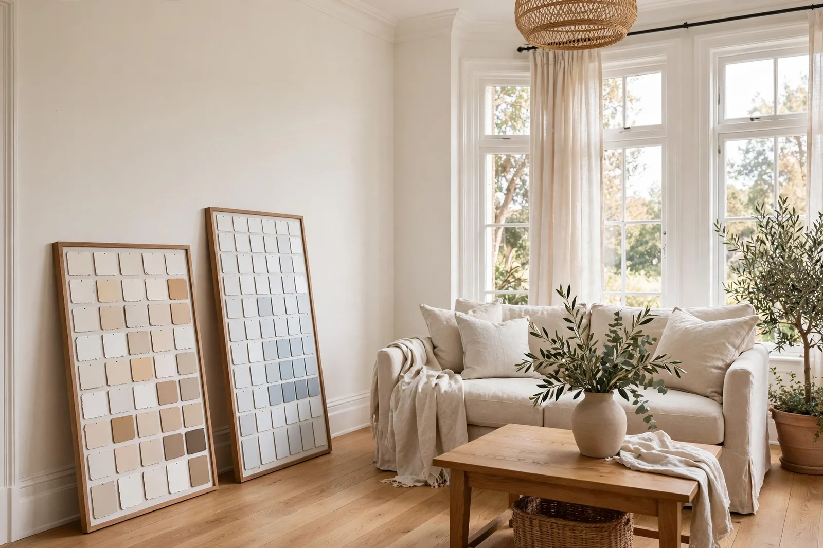
White paint is the most deceptive decision in home design. It looks like the absence of a decision, until the “white” you loved on the chip reads pink on your north-facing wall, yellow against your new quartz, or dingy next to your trim. This guide settles the Sherwin-Williams white lineup once and for all: the warm whites and the cool ones, what each one actually does in real rooms, the decision framework that picks the right white for your light and your finishes, how to pair trim and ceilings, and the sampling method that catches undertone surprises before they cost you a repaint. Paint colors shift with lighting, surface, and sheen, so always test a large physical sample in your own space before committing, screen swatches are approximations. The Global Abode is an independent publication, not affiliated with or endorsed by Sherwin-Williams or Benjamin Moore; all color names and codes are referenced as widely-known designer examples.
Key takeaway: There is no single “best” Sherwin-Williams white, there is only the best white for your light, your finishes, and your job. Warm whites (Alabaster, Greek Villa, White Duck, Dover White) flatter wood, stone, and warm-lit rooms but can look creamy next to bright white finishes. Clean/cool whites (Pure White, Extra White, Snowbound, High Reflective White) stay crisp in bright light and modern schemes but can feel stark in dim, north-facing rooms. The deciding factors are your exposure, your fixed finishes, and whether the white is going on walls, trim, or cabinets. Undertone notes below are widely-reported designer observations, not exact manufacturer specifications.
Why White Is the Hardest Color to Choose: The Undertone Trap
Every other paint color announces itself. A green is green; a navy is navy. White is the only color that hides, and that hiding is exactly what makes it the hardest choice on the paint deck. Every white paint contains undertones: a whisper of yellow, beige, gray, blue, or pink that is invisible on the tiny deck chip and unmistakable on your wall at 8pm. The chip shows you the color in miniature under store lighting; your wall shows you the color at scale under your light, next to your finishes, across the whole day. Those are two different experiences, and the undertone trap is the gap between them.
Here’s how the trap works in practice. You fall for a crisp white on the fan deck. You paint your north-facing bedroom. Under cool, indirect daylight, that white’s faint gray-blue thread, the thing that made it look “clean” in the store, takes over, and the room reads as icy and flat instead of crisp. Or you choose a warm white for your kitchen, and against your bright white quartz and crisp subway tile, the warmth that felt cozy on the chip reads as yellowish by contrast. Or you paint the whole house one white, and it looks different in every room, glowing in the south-facing living room, creamy in the dim hallway, pinkish in the bathroom under old vanity bulbs. Same paint. Three different rooms. The undertone didn’t change; the context did.
The second thing that makes white hard is scale sensitivity. A deep color looks roughly like its chip, just more of it. A white looks like a different color entirely once it’s on four walls, undertones multiply across square footage. Designers report the same rule again and again: the paler the color, the more the undertone matters, and the more you need to test it large. A chip is a rumor; a two-by-two-foot board is a report.
The third complication is relational perception. You never see a white alone, you see it against your trim, your ceiling, your floors, your countertops, your daylight. A white that looks neutral against gray tile can look yellow against oak floors. The same white can read clean in the morning and creamy at dusk. This is why “best white” is the wrong question. The right question is always: best white for this room, this light, these finishes, this job.
That said, Sherwin-Williams has one of the strongest white benches in the business, and designers return to the same handful again and again. They fall into two families, the warm whites and the cool/clean whites, and understanding the family first, then the individual color, is the whole method. Section 2 covers the warm whites. Section 3 covers the cool and clean ones. Section 4 gives you the decision framework that puts your room into the right family and your eye on the right finalist.
Tip: Before you compare any two whites, decide what job the white is doing. Walls, trim, ceilings, cabinets, and exteriors each want different things from a white, walls want forgiveness across changing light, trim wants definition against walls, ceilings want brightness without attention, cabinets want warmth that flatters and hides wear, exteriors want softness that doesn’t wash out. A white that’s perfect for trim can be wrong for walls, and vice versa. Name the job first.
The Warm Whites: Alabaster, Greek Villa, White Duck, Dover White
Warm whites are the whites of cozy homes: they carry a whisper of yellow, beige, or cream that keeps rooms feeling welcoming instead of clinical. Designers reach for them in north-facing rooms, in homes with warm wood floors and warm stone, in farmhouse and traditional styles, and anywhere cool daylight needs softening. The family spans a warmth staircase, from barely-warm to openly creamy, and each step has its room.
| White | Warmth level | Undertone notes | Best job |
|---|---|---|---|
| Pure White SW 7005 | The hinge, reads neutral with a warm lean | A soft warmth that keeps it from going blue; designers call it the most versatile SW white | Trim, cabinets, walls in mixed-light homes |
| Alabaster SW 7008 | Warm but restrained | Yellow-beige warmth tempered by gray; warm without ever reading yellow | Walls, cabinets, and exteriors in warm-leaning homes |
| Greek Villa SW 7551 | Noticeably warm | Beige-yellow warmth, a touch more pronounced than Alabaster; cozy, inviting | Walls in bright rooms, trim against warm walls, exteriors |
| White Duck SW 7010 | Warm off-white | Yellow-beige with a gray thread that keeps it from going yellow; deeper than the others here | Walls in well-lit rooms, a softer alternative to stark white |
| Dover White SW 6385 | The warmest of the bunch | Creamy yellow-beige warmth; classic, traditional, unapologetically cozy | Walls and trim in traditional homes, warm kitchens, exteriors |
Alabaster SW 7008 is the warm white with the biggest reputation, a former Sherwin-Williams Color of the Year and the farmhouse era’s signature white. Its warmth is real but disciplined: a yellow-beige base held in check by a drop of gray, so it reads as warm white rather than cream. Designers consistently call it the most forgiving warm white, no pink threads, no green casts, no dramatic surprises. It sits in the low-80s reflectance band, which makes it one of the deeper whites: softer than crisp whites, with visible substance on the wall. Its natural habitat is warm-leaning homes with wood floors, warm granite, and traditional-to-transitional style. Where it stumbles: against bright white quartz or cool gray tile, its creaminess shows by contrast, and next to a crisper white its softness becomes visible. For the full deep dive, see our complete Alabaster guide.
Pure White SW 7005 is the hinge of the whole white lineup, the white that can go either way. It reads as clean and neutral, with a soft warmth that keeps it from ever looking blue or icy, but it never reads creamy. That neutrality is why designers call it the most versatile Sherwin-Williams white: it works as trim against warm walls (the standard trim partner for Alabaster), as cabinets in modern and transitional kitchens, and as walls in homes where the light and finishes are mixed. It is slightly brighter and crisper than Alabaster, which makes it the “step up in brightness” when Alabaster feels too soft. Its one caveat: because it reads so clean, it can look flat in very dim rooms and it shows scuffs more readily than softer whites on high-touch surfaces.
Greek Villa SW 7551 is the warm white for people who want the warmth to be felt. It carries a more pronounced beige-yellow warmth than Alabaster, cozy, welcoming, and noticeably softer than the crisp whites. Designers report it as a favorite for walls in bright rooms, where strong daylight keeps the warmth from going heavy, and as a trim color against deeper warm walls. It flatters wood, stone, and traditional detailing beautifully. The caution: in dim or north-facing rooms, its warmth can read as cream or even slightly tan, it needs light to stay white. And next to cool finishes, the warmth can look mismatched, so test it against your tile and counters.
White Duck SW 7010 sits at the edge of the white family, designers describe it as an off-white rather than a true white. Its undertone stack is yellow and beige with a slight gray thread, and the gray is doing the important work: it keeps the warmth from reading as yellow. In the mid-70s reflectance band, it is noticeably deeper than the whites above it, which makes it a deliberate choice rather than a default: walls in White Duck read as soft, warm, and intentional. It works beautifully in well-lit rooms where its depth can glow, and it is a popular choice for homes that want warmth without committing to a full beige. Where it struggles: in dim rooms it can read as beige rather than white, and against bright white trim the contrast can make it look darker than expected. Test it at scale, its chip undersells its depth.
Dover White SW 6385 is the warmest white on this list and the most traditional. It is a soft, creamy warm white with clear yellow-beige warmth, the white of classic kitchens, warm farmhouse interiors, and traditional trim. Designers reach for it when a room wants comfort more than crispness: it glows under warm lamplight, it flatters warm wood and cream cabinetry, and it has a lived-in softness that the crisper whites can’t offer. It is not a white you choose for a modern, minimal scheme, it is a white you choose for warmth. The honest caveats: in the low-80s reflectance band it can read creamy rather than white, especially in dim light; against cool finishes it can look yellow by comparison; and it is the white on this list most likely to read as “off-white” to a modern eye. In the right traditional or farmhouse home, it is exactly right.
The warm-white family rule: match the warmth to the light. Bright rooms can carry the deeper, warmer whites (White Duck, Dover White, Greek Villa) and keep them reading as white. Dim or north-facing rooms are safer with the restrained ones (Alabaster, Pure White), which hold their whiteness in low light. And warm whites want warm company, wood floors, warm stone, warm metals, the same temperature agreement that governs every neutral decision.
Watch out: The warm-white failure mode is always the same: the bright-white neighbor. A warm white wall under a crisp white ceiling, warm white cabinets next to bright white quartz, warm white trim against a stark white door, in every case, the warm white reads as creamy, dingy, or yellow by contrast. This isn’t a flaw in the color; it’s how eyes work. Never pair a warm white with a noticeably brighter white without testing the two together first. Either commit to the warm white everywhere in the sightline, or step the brighter white down to something closer.
The Cool and Clean Whites: Extra White, Snowbound, Pure White, High Reflective White
Cool and clean whites are the whites of crisp, bright homes: they minimize warmth and read as clean, fresh, and modern. Designers reach for them in bright south-facing rooms, in modern and Scandinavian schemes, in kitchens and baths with cool finishes (white quartz, gray tile, chrome), and for trim and ceilings where definition and brightness are the job. The family spans a crispness staircase, from clean-neutral to near-true white, and each step has its purpose.
| White | Character | Undertone notes | Best job |
|---|---|---|---|
| Pure White SW 7005 | The hinge, clean with a warm lean | Soft warmth keeps it from going blue; the most versatile of the lineup | Trim, cabinets, walls in mixed schemes |
| Snowbound SW 7004 | Cool-leaning soft white | A faint gray thread; cool without going icy, softer than the crisp whites | Walls in cool schemes, cabinets, trim against gray walls |
| Extra White SW 7006 | Crisp and brilliant | Hints of blue/gray in some light; reads as a true clean white | Trim, cabinets, walls in bright modern rooms |
| High Reflective White SW 7757 | The brightest white | Minimal undertone, the closest to a true white in the lineup | Trim, doors, ceilings, maximum-contrast schemes |
Extra White SW 7006 is the crisp white of the lineup, bright, clean, and unapologetically white. Designers reach for it when the goal is brightness: modern kitchens, crisp trim against colored walls, ceilings that need to lift, rooms where the white should read as white and nothing else. In the mid-80s reflectance band it reflects noticeably more light than the softer whites, which is why rooms painted Extra White feel brighter. Its undertone story is minimal, designers report hints of blue or gray in some light, but on the wall it mostly reads as clean. The honest caveats: in dim or north-facing rooms it can feel stark or cold rather than crisp; against warm finishes it can look disconnected; and its brightness next to a softer white will make the softer white look creamy by comparison. Extra White is a statement white, choose it when you want the statement.
Snowbound SW 7004 is the cool white with manners. It carries a faint gray thread, enough to read as cool and sophisticated, not enough to go icy. Designers describe it as the versatile cool white: it pairs naturally with grays and greiges, it works in Scandinavian and minimal schemes, and it stays composed in bright rooms without the starkness of the crispest whites. It is a popular cabinet white in modern kitchens and a popular wall white in cool-scheme homes. The gray thread is its character and its risk: in dim north-facing rooms it can flatten slightly, reading more gray than white, and under warm lamplight it can look a touch dull compared to warm whites that glow. Test it in your evening light before committing it to a north room.
Pure White SW 7005 appears in both staircases because it genuinely belongs to both, the hinge. Designers consistently call it the most versatile white in the Sherwin-Williams lineup: clean enough for modern schemes, warm enough for traditional ones. As trim, it is the default partner for Alabaster walls and one of the most-specified trim whites in the country. As a wall color, it suits homes where the light and finishes are mixed, because it doesn’t lean hard enough in either direction to fight anything. If you can only learn one SW white, learn this one, it is the white against which the others are measured.
High Reflective White SW 7757 is the brightest white Sherwin-Williams makes, the closest the lineup gets to a true, undertone-free white. Designers use it almost exclusively as a utility white: trim, doors, ceilings, and any place where maximum brightness and maximum contrast are the goal. Against a deep wall color, High Reflective White trim gives the sharpest definition in the lineup. As a wall color, it is a specialist choice, ultra-modern, gallery-like spaces that want the walls to disappear into brightness. In most residential rooms, it reads as too stark for walls; its job is framing, not enveloping. Note the sheen rule: High Reflective White in flat on a ceiling is a workhorse; in satin or semi-gloss on trim, its brightness is at its most architectural.
The cool/clean-white family rule: match the crispness to the brightness. Bright, sun-filled rooms can carry Extra White and High Reflective White and keep them feeling crisp. Dim or north-facing rooms are kinder to Snowbound and Pure White, which have enough softness to avoid the stark read. And cool whites want cool or neutral company, gray tile, white quartz, black metals, pale woods, where their crispness reads as intentional rather than cold.

The Warm-vs-Cool Decision Framework: Exposure, Finishes, Style
Choosing between warm and cool is not a style quiz, it’s a reading of your room. Three factors decide it, in this order.
Factor 1: Exposure, the light decides the family. Your room’s natural light is the single biggest vote. South-facing rooms get strong, warm sun that flatters everything and keeps warm whites reading as white, these rooms can carry the whole lineup, including the deeper warm whites (White Duck, Dover White, Greek Villa). North-facing rooms get cool, indirect light that exaggerates undertones: warm whites absorb the cool cast gracefully and stay cozy, while cool whites can read icy and flat. So the exposure rule is simple: north and dim rooms lean warm; bright south rooms can go either way; west rooms lean warm because golden evening light amplifies warmth; east rooms are neutral. The one hard rule: never put a crisp cool white (Extra White, High Reflective White) on the walls of a dim north room, it will read as cold rather than clean. For the full orientation method, see our natural light guide.
Factor 2: Fixed finishes, the floor and stone decide the winner. Walls are repaintable; floors and stone are not. Hold your finalist whites against the finishes, not against white board. Warm wood floors, warm granite, natural stone, and brass want warm whites, the temperatures agree and the room feels intentional. Cool gray tile, white quartz with cool veining, concrete-look floors, and chrome want cool or neutral whites, the crispness reads as deliberate rather than disconnected. The most common mismatch in the country: a warm white chosen for a kitchen with cool gray tile, or a cool white chosen for a living room with oak floors. In both cases the wall and the finishes look like they came from different renovations. The undertone agreement rule from our undertones guide is the whole method: the wall’s temperature should agree with the fixed finishes’ temperature.
Factor 3: Style and job, the intent sets the crispness. Traditional, farmhouse, and transitional homes live in warm whites, Dover White, Alabaster, Greek Villa, because warmth is the aesthetic. Modern, Scandinavian, and minimal homes live in clean whites, Extra White, Snowbound, Pure White, because crispness is the aesthetic. And the job matters: trim usually wants one step crisper than the walls (definition is trim’s whole purpose), ceilings usually want the brightest white in the palette (lift without attention), cabinets in warm kitchens want warm whites while cabinets in modern kitchens want clean whites, and exteriors almost always want a soft white rather than a stark one (sunlight washes out subtlety, so a slightly warm white reads as clean white outdoors).
Putting it together, four common rooms, decided:
| Room | Lean warm if… | Lean cool/clean if… |
|---|---|---|
| Living room | North-facing, wood floors, warm stone, evening gathering room → Alabaster, Pure White | Bright south light, gray tile or cool finishes, modern scheme → Snowbound, Extra White |
| Kitchen | Warm wood floors, warm granite, brass, traditional → Alabaster, Greek Villa on walls or cabinets | White quartz, gray tile, chrome, modern → Pure White, Extra White cabinets |
| Bedroom | North-facing, cozy brief, cream bedding → Alabaster, White Duck in bright rooms | Bright and airy brief, cool bedding, modern → Snowbound, Pure White |
| Bathroom | Warm tile, brass, wood vanity → Alabaster, Greek Villa | Cool gray tile, chrome, marble → Snowbound, Pure White |
When the factors disagree, a north-facing room with cool gray tile, or a bright south kitchen with warm wood floors, let the fixed finishes win. Light is changeable (bulbs, window treatments, time of day); stone and floors are forever. And when two whites both work, choose the one with the softer undertone profile, the white with the fewest surprise threads (no pink, no green, no blue flash) is the one that will age most gracefully through changing trends.
Tip: The fastest decision shortcut in the whole lineup: hold your two finalists against your floor and your countertop in daylight. The white that disappears calmly against your finishes is the right one; the white that starts arguing, looking yellow, blue, or gray by comparison, is telling you its undertone disagrees with your home. Ten seconds, two surfaces, and the decision is usually made.
Trim and Ceiling Pairings for Every White Family
Trim is not a separate decision, it’s the second half of the wall decision. The rule that covers nearly everything: trim one step crisper than the walls. Trim’s job is definition, the clean edge at every doorway, window, and baseboard, and definition needs contrast. Trim in the exact same white as the walls (even in a higher sheen) can work, but it removes the crispness that makes trim look like trim.
For warm white walls (Alabaster, Greek Villa, White Duck, Dover White), the standard trim partners are Pure White or a soft white one step crisper, enough definition without a temperature argument. Alabaster walls with Pure White trim is the most-specified warm-white pairing in the country for exactly this reason: the trim reads as white, the walls read as warm white, and the two agree. Extra White trim against warm white walls is the bolder choice, maximum crispness, but test it first, because in dim light the contrast can make the walls read creamy by comparison.
For cool or neutral white walls (Snowbound, Extra White, Pure White), the standard trim partners are Extra White or High Reflective White, stepping up the crispness while staying in the family. Snowbound walls with Extra White trim is a clean, modern pairing. And when the walls are a color, a greige, a sage, a navy, white trim can be any of the clean whites, chosen by the scheme’s temperature: Pure White for warm schemes, Extra White for cool and modern ones.
Ceilings have their own logic. The ceiling is the largest surface you’ll never look at directly, and its job is to disappear upward, bright, clean, and forgettable. The workhorse ceiling white is High Reflective White or Extra White in flat: maximum brightness, zero attention. A flat sheen is essential, flat hides imperfections and doesn’t reflect light in distracting ways. The common mistake is using the wall white on the ceiling in the same sheen, which makes the ceiling compete with the walls; or using a warm white on a ceiling in a cool room, which reads as dingy overhead. When in doubt: brightest white, flat sheen, done.
One more pairing that deserves its own line: color-drenching with whites. Painting walls, trim, and ceiling in the same white, walls in eggshell, trim in satin or semi-gloss, ceiling in flat, is one of the most forgiving moves in design. It removes the trim decision entirely, it makes small rooms feel larger and calmer, and it works beautifully with soft whites like Alabaster and Pure White. The sheen steps (eggshell → satin → flat) provide the definition that color contrast would have. If choosing between whites is paralyzing you, drenching the room in one is the legitimate escape hatch.
How to Sample Whites: The Board Test and the Neighbor Test
Whites are the color family where sampling matters most and where chips lie the hardest. Here is the protocol, built around the two tests that matter: the board test (does this white work in my light?) and the neighbor test (does this white work against my finishes?).
Step 1: Buy real sample pots of your finalists. Narrow to two or three whites maximum, more than that and your eye can’t hold the comparisons. A sample pot of the actual color, in the sheen you plan to use: eggshell for walls, satin or semi-gloss for trim and cabinets, flat for ceilings. Sheen shifts whites visibly, a glossier white reads slightly deeper and reflects more light.
Step 2: Paint large boards, two coats. Minimum two-by-two feet on white poster board or primed drywall, labeled on the back. This is the board test’s whole foundation: whites cannot be judged at chip scale because the undertones you’re hunting are only visible at scale. Paint the boards, let them cure fully (wet paint reads darker and cooler), and judge them dry.
Step 3: The board test, four moments. Prop the boards on the actual walls, one on the brightest wall, one on the darkest, and look at them in the morning, at midday, in the late afternoon, and at 8pm under your evening lamps. Write down what you see each time: does it read white or creamy? Clean or yellow? Cool or warm? The evening check under your actual bulbs is the verdict, that is the light you’ll live with most. If a white reads as white at 8pm, it will read as white always.
Step 4: The neighbor test, finishes and trim. This is the test that catches the bright-white-neighbor failure. Hold each finalist board against your floor, your countertop, your tile, and your planned trim white. Look for temperature arguments: the white that disappears calmly against your finishes is right; the white that looks yellow, blue, gray, or dingy by comparison is telling you its undertone disagrees. Pay special attention to anything bright white in the room, counters, appliances, existing trim, because those are the neighbors that will expose a warm white’s creaminess or a cool white’s starkness.
Step 5: The white-paper test. Hold a sheet of plain white printer paper against each board in daylight. Against true white, the board’s real character shows: you’ll see the warmth in a warm white, the gray in Snowbound, the crispness in Extra White. Thirty seconds, no painting, surprisingly revealing, it calibrates your eye before the wall test.
Step 6: Photograph from across the room. Phone cameras exaggerate undertones, the yellow thread your eyes adapt to will jump out in a photo, which shows you what guests notice before they adapt. If the photo looks yellow and the wall doesn’t, trust the wall, but know the photo is showing you the color’s worst day.
Step 7: Live with the boards for 48 hours. Tape them up and walk past for two days. The right white stops catching your eye; the wrong one keeps nagging. Trust the nag.
For the complete method, our guide to testing paint samples walks through every step in detail.
Choosing a white is step one, building the palette around it is the project.
The Whole Home Paint Guide is a complete, ready-to-use color system, anchor neutrals, trim and ceiling pairings, accent colors, all with undertones already coordinated, so your white lands in a house designed to hold it. And the Paint Color Workbook includes side-by-side comparison worksheets and a room-by-room sampling checklist for testing white finalists with evidence, not guesswork.
Frequently asked questions
Alabaster SW 7008 and Pure White SW 7005 are the two most-specified Sherwin-Williams whites, Alabaster as the forgiving warm white for walls and cabinets, Pure White as the versatile trim and cabinet white. Greek Villa and Snowbound round out the designer favorites for walls, and Extra White dominates for crisp trim and ceilings. Popularity is a starting point, not a decision: the right white is the one that agrees with your light and your finishes. Our Alabaster guide covers the most famous of them in depth.
Of the whites on this list, Dover White SW 6385 is the warmest, a soft, creamy warm white with clear yellow-beige warmth. White Duck SW 7010 and Greek Villa SW 7551 sit a step below it on the warmth staircase, and Alabaster SW 7008 is the restrained warm white that reads as white rather than cream. Choose your warmth level by your light: bright rooms can carry Dover White and keep it reading as white; dim rooms should stay at the Alabaster-to-Pure-White end.
Warm whites: Alabaster SW 7008 or Pure White SW 7005. North-facing rooms get cool, indirect light that exaggerates undertones, warm whites absorb the cool cast and stay cozy, while cool whites can read icy and flat. Pair them with warm 2700–3000K bulbs and test a large board on the actual wall, judged in the evening. See how light changes paint color for the full orientation rules.
Pure White SW 7005 is the most-specified SW trim white, clean, versatile, warm enough to agree with warm walls. Extra White SW 7006 is the crisper choice for modern schemes and maximum definition. High Reflective White SW 7757 is the brightest, for ceilings and maximum-contrast trim. The rule: trim one step crisper than the walls, so the trim white depends on what the walls are.
They are the two most-compared whites in design, and the difference is subtle: Alabaster is the warmer and creamier of the two, with a beige-leaning warmth; White Dove is slightly brighter with a gray restraint that keeps it more neutral and versatile. Designers describe White Dove as the more forgiving, less surprising choice and Alabaster as the cozier one. In warm-leaning homes with wood floors, Alabaster usually wins; in mixed or cooler homes, White Dove is the safer pick. Test both large, side by side. The Global Abode is not affiliated with or endorsed by either brand.
Alabaster SW 7008 is the classic SW exterior white, in bright sunlight it reads as a soft, clean white, warm and welcoming without any identifiable yellow. Greek Villa SW 7551 is a close alternative with a touch more warmth. The exterior rule: choose a slightly warm white, because intense sunlight washes out subtlety and makes warm whites read as clean white outdoors, a crisp white that looks perfect inside can read as stark on siding. Always test on large boards on the actual house, in morning and afternoon sun. See our warm vs cool white guide for the full breakdown.

