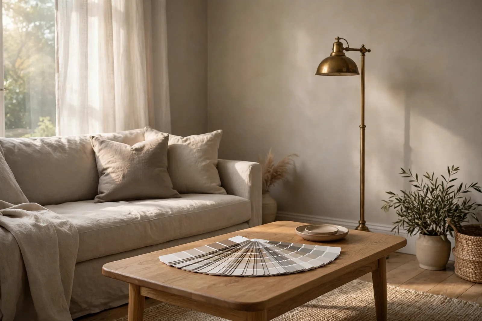
For two decades, designers kept returning to the same handful of Benjamin Moore colors whenever a client said “I want a neutral that’s warm but not beige.” The best Benjamin Moore greige and taupe paint colors earned that trust the slow way: room by room, renovation by renovation, with undertones that behave predictably instead of pulling surprises. This guide walks through nine designer-proven picks, the legends like Revere Pewter and Edgecomb Gray, and the quieter contenders like Pashmina, Manchester Tan, and Antique Pewter, with honest notes on undertone, light behavior, and where each one actually shines. Color shifts with lighting, screen settings, and surrounding finishes, so always test a large physical sample in your own space before committing. Benjamin Moore is an independent paint brand; The Global Abode is not affiliated with or endorsed by Benjamin Moore & Co.
Key takeaway: If you want one safe starting point, Edgecomb Gray HC-173 is the most forgiving warm greige on the list, soft enough for whole-house use, warm enough to read cozy, and notably resistant to the pink or green “flashes” that can appear in cooler neutrals. Need depth instead of lightness? Pashmina AF-100 is the designer go-to warm taupe for that rich, cocooning mid-tone. As with all paint color guidance: undertones are observed tendencies from how these colors behave in real homes, not exact manufacturer specs, and nothing replaces a painted sample board viewed in your own light.
Why Benjamin Moore’s Greiges Outlasted the Gray Era
Paint trends move in slow waves, and no wave was louder than the gray one. For the better part of a decade, cool gray covered everything from open-plan great rooms to kitchen islands, until enough homeowners noticed the same thing: in north-facing rooms or under cool LED lighting, those sleek grays turned icy, flat, and a little unwelcoming. Enter greige, and more importantly, Benjamin Moore’s particular library of them.
Benjamin Moore’s greiges survived the gray backlash for a structural reason, not a marketing one. Many of the brand’s most-used neutrals sit on warm or complex undertone bases rather than clean blue-gray bases. That matters because a neutral’s undertone is what you actually live with once the “color” fades into the background of daily life. A greige with a soft warm or green-leaning base tends to read cozy under warm evening light and stays composed under cool daylight. Designers kept specifying them because the failure rate was low: fewer callbacks, fewer repaints, fewer “why does my living room look lavender at 5pm?” phone calls.
The other reason is range. The brand’s greige family spans from near-tan warmth (Manchester Tan) all the way to pale cool whisper (Balboa Mist), which means a designer can build an entire home’s palette, walls, trim, cabinets, even the front door, from one coherent color family without anything feeling repetitive. That is the whole idea behind whole-home color systems: repetition of a compatible undertone across rooms creates flow, while shifting depth from room to room keeps it interesting.
None of this makes these colors magic. They still respond to light, fixed finishes, and the color of your sofa. But they represent one of the most forgiving sets of neutrals a homeowner can choose from, which is exactly why they appear on nearly every designer’s shortlist year after year.
The Greige Spectrum: 9 Picks Ranked Warm to Cool
Before the deep dives, it helps to see the whole family at a glance. The nine colors below are ordered from warmest to coolest based on how they read in typical residential lighting, not on paint-chip labels, which can mislead. Undertone is the column that matters most: it’s the hue that can emerge when the light changes or when the color sits next to a strong fixed finish.
| # | Color | Code | Dominant undertone | Best use |
|---|---|---|---|---|
| 1 | Manchester Tan | HC-81 | Warm tan with soft green balance | Heritage-style warmth, living rooms |
| 2 | Pashmina | AF-100 | Warm taupe, brown-leaning | Moody depth: dining rooms, studies, cabinets |
| 3 | Revere Pewter | HC-172 | Greige with green-mauve shifting | The classic; great rooms, open plans |
| 4 | Edgecomb Gray | HC-173 | Soft warm greige, taupe-leaning | Whole-house anchor, bedrooms |
| 5 | Antique Pewter | 1560 | Complex gray-green-taupe | Character rooms, libraries, studies |
| 6 | Pale Oak | OC-20 | Light warm-neutral greige | Dependable light greige, halls, bedrooms |
| 7 | Balboa Mist | OC-27 | Pale warm, nearly off-white | Quiet brightness, small or dark rooms |
| 8 | Wickham Gray | HC-171 | Hushed cool gray | Crisp serene spaces, baths |
| 9 | Gray Owl | OC-52 | Cool modern gray, blue-green cast | Contemporary kitchens, home offices |
A few observations before we go deeper. First, notice that the middle of the spectrum, Revere Pewter through Pale Oak, is where the true greiges live: the colors that genuinely blend gray and beige rather than leaning hard to either side. Second, the warm end (Manchester Tan, Pashmina) is where taupe territory begins, and the cool end (Wickham Gray, Gray Owl) is where these colors start flirting with true gray. Your home’s fixed finishes, flooring, countertops, the direction your windows face, should decide where on this spectrum you land. We’ll cover that in Section 5.
Tip: Don’t shop this list by chip alone. Paint swatch cards are printed under perfect store lighting and viewed at thumbnail scale. A greige that looks identical to its neighbor on the card can read a full step warmer or cooler at wall scale. Always move your decision to a large sample before finalizing.
The Legends: Revere Pewter, Edgecomb Gray & Pashmina
Three colors carry most of Benjamin Moore’s greige reputation, and each earned its status differently.
Revere Pewter HC-172, the classic
Revere Pewter is arguably the most-specified greige in residential design history, and it arrived early: it was named a go-to color of the year era’s backbone long before greige was a household word. What made it famous is its balance. It sits right at the hinge between gray and beige, with a green-leaning undertone base that keeps it from reading either cold or muddy. In south- or west-facing rooms with warm daylight, it reads as a comfortable mid-tone greige; in north-facing light, the gray side comes forward and it can feel cooler and slightly more formal.
The honest caveat, which designers repeat constantly: Revere Pewter can “flash”, momentarily reveal, a faint mauve or purple cast in certain lights, especially evening light or next to pink-leaning fixed finishes. Many homeowners never notice it; some are bothered by it. It also reads a touch darker on the wall than on the chip, so rooms with limited natural light can feel heavier than expected. Sample it large, view it at different times of day, and it remains one of the safest medium greiges you can choose.
Edgecomb Gray HC-173, the forgiving one
Edgecomb Gray is frequently described as Revere Pewter’s lighter, warmer sibling, similar DNA, less commitment. It is a soft warm greige that leans gently toward taupe, which gives it a built-in coziness that makes it one of the most popular whole-house colors in the brand’s library. Where Revere Pewter can occasionally flash cool or mauve, Edgecomb Gray stays remarkably consistent: warm morning light makes it glow softly, evening lamplight keeps it calm, and it rarely surprises.
Its lighter value is its superpower for all-over use. Bedrooms, hallways, open-plan spaces, Edgecomb Gray covers large areas without the heaviness a mid-tone greige can bring, and its warmth flatters wood floors, cream upholstery, and brass or bronze metals. It pairs naturally with crisp white trim (a warm white like White Dove keeps the palette cohesive) and handles both traditional and transitional furnishings. If you want to paint most of your home one color and move on with your life, this is the strongest candidate on this list.
Pashmina AF-100, the warm taupe with depth
Pashmina comes from the Affinity collection, and it plays a different role than the two above: it is the answer when “greige” feels too light or too gray, and you want something with real presence. A soft warm taupe with a brown-leaning base, Pashmina delivers the cocooning depth that makes dining rooms feel intimate, studies feel scholarly, and powder rooms feel like jewelry boxes. It has unusual depth for a neutral, enough color to be interesting, enough restraint to stay a backdrop.
Because it carries more saturation than the lighter greiges, Pashmina asks for confident pairings: creamy whites on trim, warm metals, and furniture with some visual weight so the walls don’t overpower the room. It is also a standout cabinet color, kitchen islands and built-ins in Pashmina read custom and expensive, especially in a satin or semi-gloss finish that lets the depth show. Keep it out of very small, very dark rooms unless you’re deliberately going for a moody envelope; in those spaces, its richness can close in.
The Quiet Contenders Worth Knowing
Beyond the big three, six more colors round out the designer shortlist. Each solves a specific problem the legends don’t.
Manchester Tan HC-81, heritage warmth
Manchester Tan is the warmest color on this list and the closest to a true tan. Its undertone balance, warm with a soft green grounding that keeps it from going peachy, makes it a favorite for heritage and colonial-style homes, where cooler grays can feel historically wrong. In bright south-facing light it reads warm and welcoming; in dimmer conditions the warmth deepens into something quietly traditional. It flatters honey-toned woods and classic millwork, and it is one of the few colors here that can carry a formal living room or dining room on its own. If your home already leans beige in its fixed finishes, travertine, warm granite, golden oak, Manchester Tan meets those finishes where they live instead of fighting them.
Antique Pewter 1560, the complex one
Antique Pewter is the color designers recommend when a client says their neutral feels “boring.” It is a genuinely complex color, gray, green, and taupe notes all present, and it shifts noticeably through the day: greener in morning light, warmer and smokier by evening. That chameleon quality is its charm and its risk. In rooms with good natural light and layered furnishings, it looks sophisticated and ever-changing; in flat, single-source lighting it can look muddy. It belongs in character rooms, libraries, studies, dens, dining rooms with actual dining happening in them, where its movement becomes a feature rather than a question mark. Sample it longer than the others: give it a full day of observation before deciding.
Pale Oak OC-20, the dependable light greige
Pale Oak is the quiet workhorse of the light greiges. It reads as a warm-neutral greige that stays composed in most lighting, light enough to keep small rooms airy but with enough body to avoid the “is it white or is it dirty?” ambiguity that plagues the palest neutrals. Designers reach for it in bedrooms, hallways, and secondary spaces where they want calm without sterility. Its warmth is gentle rather than assertive, which makes it unusually compatible with both warm and cool fixed finishes, a rare trait. If Edgecomb Gray is the whole-house anchor, Pale Oak is the whole-house whisper: same family feeling, one step lighter and softer.
Balboa Mist OC-27, pale and quiet
Balboa Mist sits at the palest end of the warm greiges, so light it nearly functions as an off-white, but with a greige undertone that keeps it from reading stark. It is the right choice when you want brightness without the clinical edge of a true white: small rooms, north-facing bedrooms, hallways with no windows. Because it is so light, its undertone only reveals itself in contrast, next to bright white trim, you can see the soft warmth; on its own in a sunlit room, it may read barely-there. That subtlety is the point. Use it where you want the feeling of white with the manners of a neutral.
Wickham Gray HC-171, hushed and cool
Wickham Gray is where the spectrum tips cool. A hushed, muted cool gray with enough softness to avoid the icy feeling that sank the gray era, it suits serene, crisp spaces: bathrooms, laundry rooms, bedrooms for hot sleepers who want a visually cool retreat. It pairs beautifully with white trim and chrome or nickel fixtures, and it gives contemporary furnishings a calm backdrop without the chill of a blue-gray. The caution is the same as with any cool-leaning neutral: in north-facing rooms or under cool-toned bulbs, it can flatten. Warm up the lighting (2700K bulbs) and it stays composed.
Gray Owl OC-52, the modern cool gray
Gray Owl is the coolest color on this list and the most contemporary, a clean, modern gray with a faint blue-green cast that reads crisp and current. It found its audience in modern kitchens, home offices, and minimalist living spaces where warmth would feel out of place. It is the least forgiving of the nine when it comes to lighting: abundant natural light makes it sing; dim or north-facing light can push it toward the chilly side. If your home’s fixed finishes are cool, gray tile, white quartz, stainless steel, Gray Owl coordinates with them naturally. If your finishes run warm, choose from the middle of the spectrum instead.
Watch out: The coolest colors on this list, Wickham Gray and especially Gray Owl, are the most likely to read blue or chilly in north-facing rooms or under daylight-balanced (5000K+) bulbs. If you love them, warm your artificial lighting to 2700–3000K and sample on the actual north-facing wall before committing.
The Light Test: Mauve Flashes, Green Flashes & How to Avoid Them
Every greige carries an undertone, and undertones reveal themselves when light changes. Understanding the two most common “flashes” will save you from the most common greige regret.
The mauve (pink-purple) flash
Some greiges, Revere Pewter is the famous example, can reveal a faint mauve or lilac cast in certain conditions. This happens most often in evening light, under warm incandescent-style bulbs, or when the color sits next to pink-leaning fixed finishes like certain granites, terracotta tile, or warm brick. The undertone was always there; the light simply gave it a stage. Whether it bothers you is personal, many homeowners live happily with it for years without noticing, but if you are sensitive to pink in neutrals, this is the single most important thing to check during sampling.
The green flash
The green-leaning base that keeps many BM greiges from reading cold (Revere Pewter, Manchester Tan, Antique Pewter) can also surface as a visible green cast, typically in rooms with abundant green-reflecting surroundings, like walls of windows facing a lawn or garden. South-facing rooms with garden views are the classic scenario: the landscape literally tints the light entering the room. Again, sampling in place is the only way to know whether your room does this.
The 3-day sampling protocol
Professional color consultants don’t sample for an hour; they sample for days. Here’s the condensed version:
Day 1, Paint large. Paint two coats on a large poster board or directly on two walls (a light-facing wall and a shadow wall). Small chips lie; you need at least a 2×2-foot area to judge a neutral honestly.
Day 2, Observe the arc. Check the sample in morning light, midday light, late-afternoon light, and under your evening artificial lighting. Note when the color looks its best and when it looks questionable. Photograph it at each stage, phone photos exaggerate casts, which actually helps you spot undertones your eye forgives in person.
Day 3, Test against finishes. Hold the sample next to your fixed finishes: flooring, countertops, fireplace stone, the sofa that isn’t being replaced. A greige that looks perfect on a white board can clash with a busy granite; this is where most mismatches are caught. If the sample fights more than one fixed finish, move one step warmer or cooler on the spectrum and repeat.
Tip: Test your top two finalists side by side on the same wall, with a strip of your trim color between them. Comparing greiges in isolation is nearly impossible, the eye needs a reference point. The trim strip also shows you exactly how the wall color will relate to your woodwork in the finished room.
Where to Place Them: Anchors, Cabinets, Exteriors & Sampling
Knowing the colors is half the job; knowing where each one earns its keep is the other half.
Whole-house anchors
If you want one color flowing through most of your home, the approach behind every successful whole-home palette, choose from the middle of the spectrum: Edgecomb Gray, Pale Oak, or Revere Pewter. The ideal anchor is light-to-mid in value (so it doesn’t darken hallways), warm-neutral in undertone (so it flatters both warm and cool furnishings), and consistent across lighting changes (so the bedroom doesn’t feel like a different house than the living room). Edgecomb Gray is the most forgiving of the three for this role; Pale Oak suits homes that want a lighter, airier feel; Revere Pewter brings more depth and presence for larger, well-lit open plans.
Cabinets and built-ins
Greiges make exceptional cabinet colors because they sit between the starkness of white and the heaviness of dark stained wood. The strategy designers use: go one to two steps deeper than the wall color, in the same undertone family. Pashmina on a kitchen island against Edgecomb Gray walls is a classic execution. Antique Pewter makes striking built-ins and library shelving. Revere Pewter works beautifully on mudroom lockers and laundry cabinetry. Use a durable enamel in satin or semi-gloss, the slight sheen deepens the color and stands up to daily wear, and keep the undertone consistent with the walls so the palette reads intentional rather than assembled.
Exteriors
Several of these colors translate well outdoors, with one adjustment: exterior light is brighter and bluer than interior light, so colors read one to two steps lighter and cooler outside. Revere Pewter is a proven siding and body color for traditional and farmhouse exteriors; Edgecomb Gray works on homes that want a softer, warmer facade. Manchester Tan suits brick-adjacent exteriors and heritage styles. Always sample exterior colors on the actual sun-facing and shade-facing walls, and view them next to the roof color, the roof is the largest fixed finish on a house and the most common source of exterior color clashes.
Trim, ceilings, and the finishing layer
Greige walls need a trim strategy. The most reliable pairing is a warm white, White Dove is the designer default against these colors, because a stark blue-white trim can make warm greiges look dingy by contrast. For ceilings, either carry the wall color up (in flat finish) for a cocooning effect in bedrooms, or use the trim white for lift in living spaces. And remember the 60-30-10 rhythm: roughly 60% dominant neutral (your greige anchor), 30% secondary (trim white, upholstery, flooring tones), 10% accent (art, textiles, a front door with personality).
Build your whole-home palette around these colors
Choosing the right greige is step one, placing it confidently through every room is the real project. Our Whole Home Paint System walks you through building a flowing, designer-level palette room by room, with undertone guidance, finish schedules, and coordination worksheets.
Frequently Asked Questions
Manchester Tan HC-81 is the warmest pick on the designer shortlist, closer to a true tan than a gray, with a warm base grounded by a soft green note that keeps it from going peachy. If Manchester Tan feels too warm and you want a true greige with warmth, step toward Pashmina AF-100 (warm taupe) or Edgecomb Gray HC-173 (soft warm greige). Always confirm warmth in your own light, since south-facing sun intensifies warm undertones.
Both are beloved warm greiges, but they sit differently on the spectrum. Revere Pewter HC-172 is a touch deeper and more complex, with a green-leaning base that can occasionally flash mauve in certain lights. Agreeable Gray is generally lighter and a bit more straightforward in its warmth. Designers often describe Revere Pewter as having more “movement” through the day, while Agreeable Gray stays more consistent. The choice comes down to whether you want depth and character (Revere Pewter) or lightness and predictability (Agreeable Gray), and, as always, which one flatters your fixed finishes.
North-facing rooms get cool, indirect light that exaggerates gray and mutes warmth, so choose from the warm side of the spectrum: Edgecomb Gray HC-173, Pale Oak OC-20, or Manchester Tan HC-81. Avoid the cool end (Wickham Gray, Gray Owl) in north rooms unless you warm the artificial lighting to 2700–3000K. Revere Pewter can work in a north room with good supplemental lighting, but sample it there first, its cooler moments are most visible in exactly this light.
That fleeting pink-purple cast is the color’s undertone surfacing, most famously with Revere Pewter, which can flash a faint mauve in evening light or next to pink-leaning finishes. It’s not a defect; it’s how complex neutrals behave. If it bothers you, the fix is to move to a greige with a warmer, more stable undertone base, Edgecomb Gray HC-173 and Pale Oak OC-20 are the usual substitutes, and to check your light bulbs, since very warm bulbs can amplify the effect. Sample any replacement in the exact spot and light where you saw the flash.
Yes, greige cabinets are one of the most requested designer looks, and Pashmina AF-100, Revere Pewter HC-172, and Antique Pewter 1560 are frequent choices. Use a dedicated cabinet enamel (like an alkyd or urethane-modified formula) in satin or semi-gloss for durability and depth, and keep the cabinet undertone in the same family as your wall color so the palette feels intentional. Deeper tones like Pashmina work best as island or lower-cabinet accents against lighter uppers, which keeps the kitchen from feeling heavy.
The designer default is White Dove OC-17, a soft warm white that sits comfortably against every greige on this list without the stark contrast of a blue-white. For a slightly brighter trim, decorators also use Simply White OC-117, though its cleaner read can make very warm greiges look slightly dingy by comparison, so check the pairing in your light. Avoid stark, cool whites against warm greiges; the temperature mismatch is what makes neutrals look “dirty” rather than the wall color itself.

