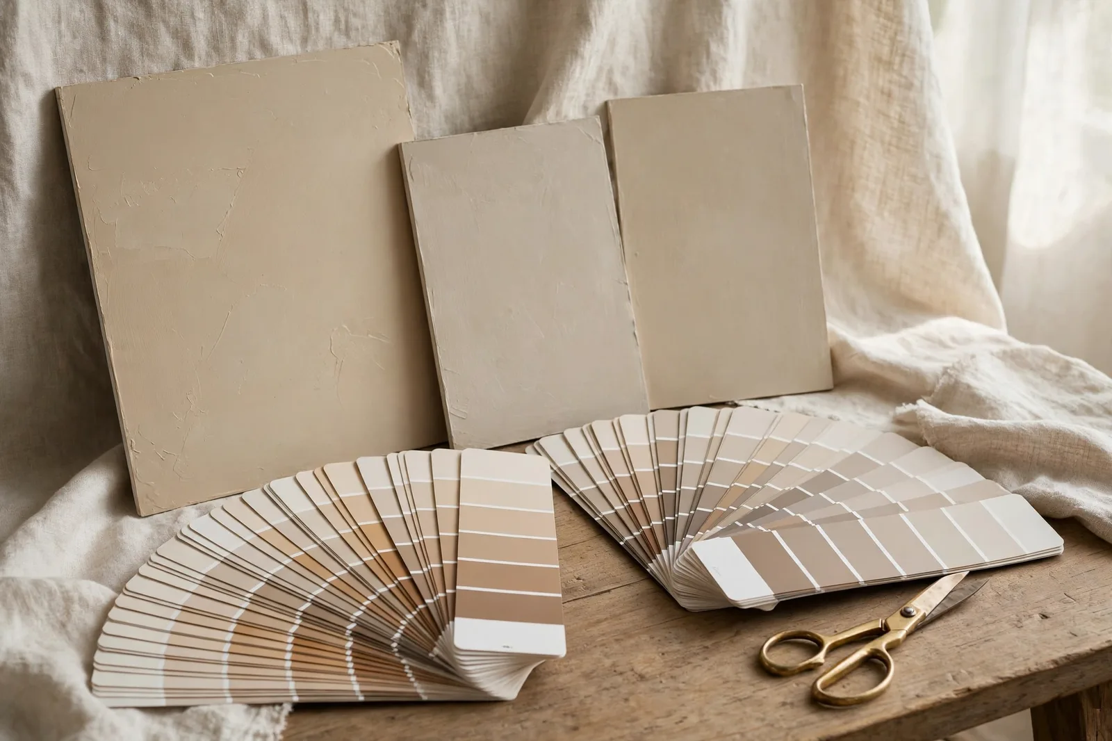
Search “Sherwin Williams Benjamin Moore equivalent colors” and you’ll find chart after chart claiming Color X equals Color Y. Here’s the honest version: no cross-brand equivalent is ever exact. Different bases, different pigment recipes, different manufacturing, a matched color is, by definition, a new color. That doesn’t make cross-brand shopping useless. It makes it a comparison skill, not a lookup table. This guide gives you the famous “closest cousin” pairs, tells you exactly how each pair differs, warns you about the same-name trap, and walks you through a testing protocol so you never commit to a matched color you haven’t seen on your own wall. Disclaimer: this is an independent editorial guide. The Global Abode is not affiliated with, endorsed by, or sponsored by Sherwin-Williams or Benjamin Moore. Always test a physical sample on your own wall before committing, colors shift dramatically with light.
Key takeaway: Cross-brand “equivalents” are never duplicates, they’re closest cousins. Sherwin-Williams Alabaster is a touch warmer and creamier than Benjamin Moore White Dove; Iron Ore leans warm where Wrought Iron leans cool; Agreeable Gray’s closest BM neighbors are Edgecomb Gray and Revere Pewter, not twins. Treat every pair as a starting point, then test side-by-side samples in your own light. (Independent guide, not affiliated with or endorsed by Sherwin-Williams or Benjamin Moore. Test physical samples before painting.)
1. Why Everyone Wants a Conversion Chart (and Why None Exists)
Every week, someone falls in love with a Benjamin Moore color and walks into a Sherwin-Williams store, or vice versa, because that’s the store near their house, that’s the brand their painter stocks, or that’s where the sale is happening. They ask the question this guide is built around: “What’s the equivalent?”
It’s a completely reasonable question. And it has no clean answer, for three structural reasons that have nothing to do with you and everything to do with how paint is made:
Reason one: proprietary formulas. Sherwin-Williams and Benjamin Moore each design their colors on their own base paints with their own pigment systems. There is no shared master recipe book. An “equivalent” can only be a lookalike built from scratch in a different system, and the building blocks differ.
Reason two: colors are named, not measured, by the brand. A brand can give any name to any color. There is no rule that “Alabaster” means the same thing twice (more on that trap in Section 4). The names are marketing; the chemistry is proprietary.
Reason three: neither brand publishes a conversion chart. Think about why. Every match is approximate, and approximate claims create angry customers. The brands know something the internet’s conversion charts don’t want to admit: the moment you mix Brand A’s formula into Brand B’s base, you have created a brand-new color that exists nowhere else.
So this guide doesn’t give you a chart to blindly trust. It gives you something better: the pairings that color consultants and designers discuss most, with an honest account of how each pair differs, so you know exactly what you’re comparing instead of pretending two colors are the same.
2. The Honest Truth About Color Matching Across Brands
Let’s define the terms, because three different things hide under the word “equivalent”:
1. A stock-to-stock “closest cousin.” This is what this guide lists. Both colors exist in their brands’ official fan decks. You buy each off the shelf (or off the color wall). They’re simply similar, same neighborhood, different houses. This is the most reliable kind of comparison, because both colors are the brands’ intended, tested formulations.
2. A computer color match. You bring a Benjamin Moore chip to a Sherwin-Williams store, and their spectrophotometer reads it and generates a formula to approximate it in SW base paint. The store will tell you, if they’re honest, that this is an approximation. How close? On a large, evenly lit wall, a good match can be remarkably close. But the match is made for one specific lighting condition and one specific base; under different light, metamerism can pull the two apart. Two “identical” formulas can look like siblings in daylight and strangers under warm evening lamps.
3. An eyeball match by the paint associate. Someone holds your chip against their fan deck and says “this one.” This is a guess with a smile. Sometimes it’s a good guess. Sometimes it isn’t. Treat it as a starting suggestion, not a match.
Warning: A store-mixed “match” voids the predictability of the original color. All the beautiful room photos, all the blogger reviews, all the undertone analysis of the original color describe the original formula in its original base. Once it’s re-created in another brand’s base, you’re painting with an unreviewed color. That doesn’t make it bad, it makes it untested. Sample it like a stranger, not a friend.
The practical upshot: if you love a Benjamin Moore color, the lowest-risk move is to buy Benjamin Moore paint. If you can’t or won’t, the next-best move is to find the closest stock cousin in your preferred brand, a real color with real reviews and real behavior, rather than asking a machine to clone a color across incompatible chemistry. That’s what the next section is for.
3. The Famous Pairs, Compared Honestly
These are the pairings that come up again and again in designer discussions, color-consultant comparisons, and homeowner forums. Each is a genuine “closest cousin”, and each differs in ways you should know before choosing. Undertone descriptions here are widely discussed consensus among color professionals; always confirm with your own samples.
Warm Whites
| What you’re looking for | SW color | Closest BM cousin | How they differ |
|---|---|---|---|
| A warm, creamy, beloved white | Alabaster (SW 7008) | White Dove (OC-17) | The most famous pair in the business. Colorimetric comparisons show them very close, but Alabaster typically reads a touch warmer and creamier, with a soft yellow-beige warmth; White Dove reads slightly cooler and more gray-muted. Side by side, most eyes see Alabaster as the cozier of the two. |
| A clean, bright, near-neutral white | Pure White (SW 7005) | Chantilly Lace (OC-65) | Genuinely close, both are among each brand’s cleanest whites. Chantilly Lace is often described as the crisper, cooler of the two with barely-there undertones; Pure White carries a whisper more softness. On trim, the difference is subtle; on large walls, lighting decides. |
| A soft white with gentle warmth | Snowbound (SW 7004) | Simply White (OC-117) | Both are soft, livable whites, but Simply White is known for its subtle warm-yellow glow while Snowbound leans slightly cooler and grayer. Not twins, more like neighbors you might confuse from across the street. |
Greiges & Grays
| What you’re looking for | SW color | Closest BM cousin | How they differ |
|---|---|---|---|
| The world’s most popular greige | Agreeable Gray (SW 7029) | Edgecomb Gray (HC-173) / Revere Pewter (HC-172) | Agreeable Gray’s warm, beige-gray balance sits between these two BM classics. Edgecomb Gray is lighter and a touch softer; Revere Pewter is deeper and can flash slightly green-gray in some lights where Agreeable Gray stays warmer. Same family, three distinct personalities. |
| A soft, livable warm gray | Repose Gray (SW 7015) | Gray Owl (OC-52) / Wickham Gray (HC-171) | All three are light, versatile grays, but their cool-warm leanings differ. Repose Gray carries a gentle warmth; Gray Owl is famously chameleon-like, shifting with light and sometimes showing green or blue; Wickham Gray sits cool with subtle blue-gray notes. Test all three in the room, they’re not interchangeable. |
| A mid-tone modern gray | Mindful Gray (SW 7016) | Coventry Gray (HC-169) | Both are mid-depth greige-grays, but Mindful Gray leans warmer and earthier while Coventry Gray leans cooler and crisper. If your room runs warm (wood floors, brass), that difference matters. |
Beiges & Warm Neutrals
| What you’re looking for | SW color | Closest BM cousin | How they differ |
|---|---|---|---|
| A light, flexible warm beige | Accessible Beige (SW 7036) | Manchester Tan (HC-81) / Pashmina (AF-100) | Accessible Beige is one of SW’s most recommended warm neutrals. Manchester Tan is a touch deeper and more golden-tan; Pashmina is softer, grayer, and more muted. All three are warm, but they sit at different points on the beige-to-greige spectrum. |
| A rich, cozy tan | Kilim Beige (SW 6106) | Shaker Beige (HC-45) | Both are warm, traditional tans with orange-beige undertones. Kilim Beige tends to read slightly deeper and more saturated; Shaker Beige a touch lighter and softer. In a north-facing room, both will lean warmer and cozier. |
Deep Colors & Near-Blacks
| What you’re looking for | SW color | Closest BM cousin | How they differ |
|---|---|---|---|
| A soft black for cabinets & doors | Iron Ore (SW 7069) | Wrought Iron (2124-10) | A beloved pair with a real, documented split: Iron Ore leans warm with a subtle green-charcoal undertone, while Wrought Iron leans cool with a blue-violet undertone. In daylight they can look like twins; under warm interior lighting, the warm/cool split shows. Choose by the temperature of your room. |
| A true, crisp black | Tricorn Black (SW 6258) | Black (2132-10) / Onyx (2133-10) | Tricorn Black is SW’s go-to near-true black, notably dark and neutral. BM’s Black is similarly deep; Onyx is a touch softer. At this depth, differences are whisper-fine, sheen and lighting dominate more than the formula gap. |
| A deep bronze-charcoal | Urbane Bronze (SW 7048) | Kendall Charcoal (HC-166) | Both are deep, earthy charcoals, but Urbane Bronze carries a warmer, bronze-brown depth while Kendall Charcoal reads cooler and grayer with a hint of green in some lights. Urbane Bronze was SW’s Color of the Year; Kendall Charcoal is a BM historic-color staple. Cousins, not clones. |
| A muted coastal blue-green | Sea Salt (SW 6204) | Quiet Moments (1567) / Beach Glass (1564) | Sea Salt is the famous chameleon, green in one light, blue-gray in another. Quiet Moments leans slightly more blue-gray and serene; Beach Glass is a touch deeper and greener. All three shift with light, so sample in the actual room at multiple times of day. |
Tip: Use this table as a shortlist generator, not a final answer. Pick the two or three cousins closest to what you want, buy sample pots of each, and let your room’s light hold the election. The “winner” on paper frequently loses on the wall.
4. The Same-Name Trap
Here’s a trap that catches even experienced painters: the same color name in two brands is not the same color.
The classic example: Benjamin Moore makes an Alabaster, and it is not Sherwin-Williams Alabaster. BM’s Alabaster is a soft, muted greige with warm depth; SW’s Alabaster (SW 7008) is the famous warm white. Same word, completely different colors, different depths, different jobs. If someone says “paint it Alabaster” without naming the brand, you genuinely don’t know which color they mean.
This happens because color names are unregulated. Neither brand owns everyday words like Alabaster, Linen, or Ivory in any exclusive sense, and each brand’s color team names colors for their own collections. Other examples of the pattern:
- White Dove is Benjamin Moore (OC-17). Sherwin-Williams has no White Dove, the closest SW stock cousin is Alabaster, and as Section 3 showed, it’s warmer and creamier.
- Sea Salt is Sherwin-Williams (SW 6204). BM’s coastal light blue-greens (Quiet Moments, Beach Glass) are cousins, not the same color.
- Simply White is Benjamin Moore (OC-117). Don’t assume any “Simply White” at another brand is related, check the actual color.
The rule is simple and non-negotiable: a color name means nothing without the brand and code. Always say “Alabaster SW 7008” or “White Dove OC-17”, name, brand, and number together. When a contractor, a blog, or a Pinterest pin says only a color name, your first question should be which brand’s.
Warning: This trap is most dangerous in writing. “We painted the kitchen Alabaster” in a home-tour caption tells you nothing usable. Before you buy five gallons based on a photo caption, confirm the brand and code, or better, confirm with a sample board in your own light.
5. When to Cross-Shop vs. When to Stay Loyal
Not every project needs cross-brand thinking. Here’s a decision framework to tell you when comparing brands earns its effort, and when it’s just adding noise.
Cross-shop (compare cousins across brands) when:
- Your painter or store stocks only one brand. This is the most common reason. If your contractor sprays Sherwin-Williams all day, finding the closest SW cousin of your BM crush is smarter than forcing an unfamiliar product into their workflow.
- You’re chasing a specific undertone. Maybe you love Agreeable Gray but wish it were a whisper cooler, Revere Pewter might be your answer. Cross-brand comparison is really an undertone-tuning tool: it widens the field of near-neutrals so you can fine-tune warmth, depth, and gray-vs-beige balance.
- One brand’s color is discontinued or hard to get. Cousins are your backup plan. The table in Section 3 is your starting shortlist.
- You’re comparing product lines, not just colors. Cabinet-grade enamels, exterior durability, scrub resistance, sometimes the brand decision is about the paint, and the color has to follow. That’s legitimate; just re-test the cousin in the new brand’s actual product, since sheen and base affect color.
Stay loyal (buy the original brand) when:
- You fell in love with a specific, reviewed color. If fifty room photos of BM White Dove are what sold you, buy BM White Dove. A cousin is a different color with different behavior, the photos you loved don’t transfer.
- You’re matching existing paint. Touch-ups, additions, and phased projects should use the original brand and formula. A “close enough” cousin next to the original on the same wall is where “close” goes to die, the eye is ruthless at edges and corners.
- The difference is smaller than your testing error. If two cousins differ less than the variation between two sample boards painted on different days, you’re optimizing noise. Pick one and move on.
- You’re doing a whole-house palette. A palette is a system: whites, neutrals, and accents tuned to work together. Converting each color to a different brand’s “equivalent” compounds small shifts into a palette that no longer relates the way the original did. If the palette was designed in one brand, keep it in one brand, or rebuild and re-test the whole system in the new one.
The one-sentence version: cross-shop to widen your options; stay loyal to protect a decision you’ve already validated.
6. How to Test a Cross-Brand Finalist
Cross-brand finalists deserve a stricter test than ordinary finalists, because you’re comparing colors that were never designed to relate to each other. Here’s the protocol:
Step 1: Sample the real thing, not a match. Buy sample pots of the actual stock colors, SW Alabaster in SW paint, BM White Dove in BM paint. Do not test a store-mixed “match” against the original; you’re testing two unknowns instead of one.
Step 2: Paint large, movable boards. Two coats on white poster board or primed drywall sheets, at least 60 × 60 cm each. Small chips lie; large boards tell the truth. Label each board on the back with brand, name, and code.
Step 3: Test in the real room, on the real wall orientation. Prop the boards against the wall they’ll live on, not in the garage, not in a different room. North-facing light cools everything; south-facing warms it. A cousin that wins in your living room can lose in your bedroom.
Step 4: Judge at three times of day. Morning daylight, midday, and evening under your actual lamps. Cross-brand pairs often diverge most under artificial light, because different pigment recipes respond differently to warm bulbs. The pair that looks identical at noon can split at 8 p.m., and you live with the 8 p.m. version.
Step 5: Test next to your fixed elements. Hold each board against the floor, the countertop, the tile, the sofa fabric. Undertone clashes show up against fixed finishes, not against white board. This is where “warm cousin vs. cool cousin” decisions get made.
Step 6: Photograph, then distrust the photograph. Phone photos are useful for comparing boards side by side later, but cameras auto-white-balance and lie about subtle neutrals. Use photos as notes, not as judges.
Step 7: Live with the finalists for 48 hours. Tape the top two boards to the wall and walk past them for two days. The right cousin stops catching your eye; the wrong one keeps nagging you. Trust the nag.
Tip: If you’re testing a store-mixed match (Section 2’s option 2), add one more step: paint the match next to a board of the original brand’s color and view the seam from across the room. If you can see the line from ten feet away in evening light, the match failed, no matter what the computer said.
Build Your Whole-Home Palette With Confidence
Comparing cousins across brands is easier when you have a system: a structured way to test undertones, compare samples, and build a palette that flows room to room. Our digital guides walk you through exactly that.
7. Frequently Asked Questions
Yes, most Sherwin-Williams stores (and vice versa) can computer-match a competitor’s color from a chip or sample. But a match is an approximation built in a different base with different pigments, not the original formula. It can look very close in store lighting and drift apart under your home’s lighting, so always sample the matched paint on your wall before committing.
No. Different paint bases, pigment systems, and manufacturing processes mean a matched color is technically a new color. It may be visually indistinguishable in some lights and clearly different in others. Treat every “equivalent” as a close cousin and verify with a sample board in your own light.
Both are premium paint brands with loyal professional followings, and the honest answer is that it depends on your project. Professionals often praise Benjamin Moore for rich color depth and Sherwin-Williams for product innovation and wide availability. For most homeowners, the right color in either brand beats the wrong color in the “better” one, and your painter’s familiarity with a brand matters more than brand rankings.
Generally, no. A palette is a tuned system, small shifts in each converted color compound into a palette that no longer relates the way the original did. If you must switch brands, don’t convert color-by-color; instead, use the original palette as inspiration, shortlist cousins in the new brand, and re-test the whole system in the new one.
Compare the actual stock colors, not a store-mixed match: buy sample pots of each brand’s real formula, paint large boards with two coats, and view them side by side in the actual room at morning, midday, and evening light, next to your fixed finishes. That’s the only comparison that predicts what the finished wall will look like.
Three likely causes: the match was built for the store’s lighting, not yours; the different base paint shifts how pigments read (a phenomenon called metamerism); and chips are printed ink while walls are real paint, they were never truly identical to begin with. If the difference bothers you in evening light, the match has failed for your purposes, regardless of what the spectrophotometer reported.

