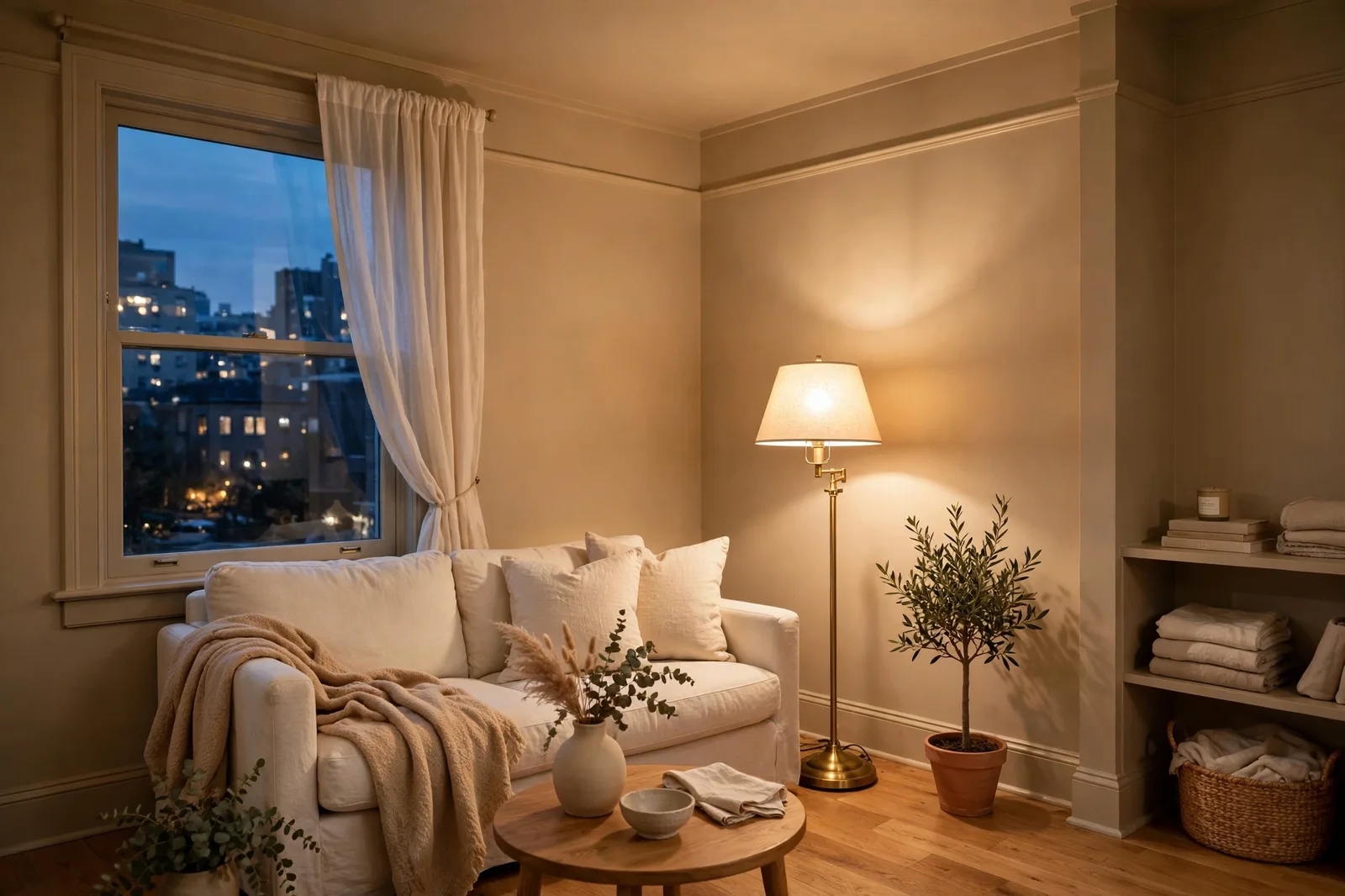
Small homes ask a different question of color than large ones do. In a big house, each room can carry its own personality and the house absorbs it. In a condo, an apartment, a small bungalow, or a finished basement, every wall is visible from the next room, which means every color choice is a whole-house choice. The good news is that the palette for a small or low-light home is simpler, not harder: fewer colors, one temperature, and a method that lets a compact footprint feel calm and connected instead of chopped up. This guide gives you that method, the one-neutral envelope, the low-light rules that actually hold up, the basement special case, and how to carry color through stairs, landings, and compressed sightlines. Paint colors shift with lighting, surface, and sheen, so always test a large physical sample in your own space, in your own light, before committing, screen swatches are approximations. The Global Abode is an independent publication, not affiliated with or endorsed by Sherwin-Williams or Benjamin Moore; all color names and codes are referenced as widely-known designer examples.
Key takeaway: Small and low-light homes want fewer colors, not bolder ones, one warm-leaning anchor neutral carried through the main spaces, stepped a shade deeper or lighter in secondary rooms, with trim, doors, and ceilings in the same color to erase boundaries. Basements get a special choice: bright and cozy with warm neutrals, or deep and intentional with a dark envelope and engineered light, never the dim middle. Undertone notes below are widely-reported designer observations, not exact manufacturer specifications.
Why Small Homes Need Fewer Colors
In a 3,000-square-foot house, you can walk from a sage bedroom to a navy den to a terracotta kitchen and each room reads as its own world. In a 900-square-foot condo, you stand in the kitchen and see the living room, the hallway, and the bedroom door all at once. There is nowhere for a color to hide, every wall participates in one continuous view. This is the defining condition of small-home color: you are not choosing colors for rooms; you are choosing a color for one small world seen all at once.
The eye does not judge a small home room by room. It takes in the whole sightline, from the front door through the living area to the farthest visible wall, and asks one question: does this read as one calm place, or as several small pieces? Every additional wall color is another piece. A large home can afford five or six wall colors because distance separates them; a small home shows them all at once, and five colors in one view reads as busy, restless, and smaller than it is. The negotiation-overload principle is simple: the fewer color relationships the eye has to resolve in one view, the larger and calmer the home reads.
This is why the classic advice, three to five coordinated shades from one family, anchored by a single neutral in the main spaces, works so well in small homes, and why the “accent wall in every room” instinct works so poorly. A studio apartment with one warm neutral on every wall, a slightly deeper version in the sleeping alcove, and one confident accent on the entry wall feels designed and generous. The same apartment with a different trendy color on every wall feels like a paint store at closing time.
Small homes also magnify the cost of the wrong color. In a large room, a slightly-too-cool gray has square footage to dilute it. In a small, dim bedroom, that same gray owns the whole space, there is no far corner where the eye escapes it. Every undertone decision matters more, which is why the sampling discipline in this guide (section 3’s 8pm test, applied house-wide) is not optional. You cannot afford a surprise.
The low-light dimension compounds everything. Many small homes, ground-floor apartments, condos facing a courtyard, garden-level flats, finished basements, are dim as well as compact. Dim light cools everything it touches: a neutral white reads as gray, a warm beige reads as tan, a pale sage reads as flat green. The palette must be chosen for the light you have, warmer and slightly deeper than you think, with enough reflectance to catch what light exists. Trying to fight dimness with the brightest possible white is the most common failure in this guide: a stark white in a dim home does not create light; it just shows you exactly how little light there is, and it looks dingy doing it.
Tip: Before choosing anything, stand in the middle of the main space and photograph the view from the front door to the farthest visible wall. That photograph is your palette canvas, it shows you every surface one color must agree with. Print it, or keep it on your phone, and judge every candidate wall color against that view, not against a single room.
The One-Neutral Envelope: Anchor, Steps, and Accents
The whole method for a small or low-light home fits in one sentence: one anchor neutral carried through the main spaces, stepped a shade deeper or lighter in secondary rooms, with trim, doors, and ceilings in the same color. This is the one-neutral envelope, and it is the single highest-impact decision a small home can make.
The anchor. Choose one neutral that can live on the main living walls, the hallway, and every connecting space. In a low-light home this should be a warm-leaning neutral, a warm white, a light warm greige, a soft warm beige, with enough warmth to absorb the cool cast of dim light and enough lightness to bounce what light exists. Widely-used families for this job: warm whites like Alabaster and White Dove, light warm greiges, soft creams. The anchor should be the calmest, quietest color you are considering, no strong undertone of its own, just warmth and light. Our whole-home palette guide covers anchor selection in full.
The steps. Bedrooms, offices, and secondary rooms can each take one step within the same family, a shade deeper for a cozy bedroom, a half-step lighter for a small office. Depth may change; temperature may not. The eye forgives a room that is a touch deeper or lighter than its neighbor; it punishes a room that is suddenly cooler or warmer. This is the discipline that keeps a small home feeling like one place with variations rather than several small apartments sharing a hallway.
The accents, sparingly. A small home can carry one, maybe two, confident accents: the entry wall, the far wall of the living area that the eye lands on, the powder room, the kitchen island. Deep navies, forest greens, warm charcoals, rich terracottas, all of these can work in a small home, and the rule is the same as the large-home rule: the accent must be confident enough to read as a choice. A tentative half-measure accent in a small home just reads as a wall that did not get finished.
The envelope. In a small home, painting the trim, doors, and ceilings in the same color as the walls, or the closest constant your scheme allows, pays double dividends. It removes every visual full stop at the wall-ceiling and wall-trim boundary, so the eye travels without registering edges, and the rooms read larger. It also simplifies the whole decision set: one color, one trim logic, whole home. Our small-room colors guide covers the envelope technique in detail.
| Home type | Palette strategy | Watch out for |
|---|---|---|
| Studio / one-room apartment | One anchor everywhere; accents in furnishings and textiles, not on walls | Any wall-color change reads as a room division you may not want |
| 1–2 bedroom apartment | Anchor through living and hall; bedrooms one step deeper or lighter in the same family | Keep the temperature constant across the bedroom doorway sightline |
| Condo, open plan | One anchor across the open space; one confident accent on the far focal wall | The accent must be visible from the entry, it becomes the home’s signature |
| Finished basement | See section 4: warm-neutral envelope, or the committed dark envelope | The dim middle, mid-tone gray that reads as neither bright nor intentional |
| Garden-level / low-light flat | Warmer, slightly deeper anchor than you think; avoid stark whites | Cool neutrals that go gray and flat in dim light |
| Small multi-level home | One anchor through the stair and landings; floors can step within the family | A different color per floor, the stair becomes a gear change |
One more principle that belongs in this section because it is the small-home version of an old truth: choose the palette for the worst light in the house, not the best. If the living room is bright but the hallway and the far bedroom are dim, the anchor must survive the hallway. Test every finalist in the dimmest room it will appear in, the color that holds its warmth in the dim hallway will glow in the bright living room, while the color chosen for the living room may die in the hall.
Watch out: The small-home palette killer is the mid-tone, mid-temperature “compromise” color, the beige-gray that is neither warm enough to glow nor cool enough to be crisp, chosen to “work with everything.” In a small, dim home it works with nothing: it reads as flat, dirty, and smaller than the space deserves. Choose a color with a clear temperature and a clear lightness, warm and bright, or deep and confident, never the muddy middle.
Low-Light Whole-Home Rules
Low light changes every color it touches, and it changes them in predictable ways. Learn the shifts, and the palette practically chooses itself.
Rule 1: warm up the palette on purpose. Dim and indirect light is cool light, it pushes every color toward gray-blue. A white that looks clean in the store can read as gray in a dim apartment; a greige can read as flat concrete. The countermeasure is to choose the palette half a step warmer than your instinct says. Warm whites over clean whites. Warm greiges over cool grays. Soft creams over stark whites. The warmth is not decoration here, it is compensation for what the light takes away. Designers consistently describe warm neutrals like White Dove as the go-to for dim spaces for exactly this reason: the warmth survives the cool light and the room stays inviting.
Rule 2: never fight the dimness with stark white. The most common low-light failure is the bright, cool white chosen to “add light.” It does not add light. In a dim room it reads as flat, gray, and slightly dingy, the eye compares it to the bright white it remembers being and finds it wanting. A warm off-white, by contrast, never promised brightness, so the dim light cannot disappoint it, it just reads as warm. Choose the color that flatters the light you have.
Rule 3: the 8pm test, house-wide. In a well-lit home, the midday check is the verdict. In a low-light home, the evening check is, because the home’s artificial lighting is what you will actually live under most of the day. Walk the whole home at 8pm under your actual lamps: every room, the hallway, the stair. The palette must read as one warm, continuous place in lamplight. If one room’s walls argue with the next under warm bulbs, that room is the one to fix. And use warm bulbs, 2700–3000K, everywhere, because cool daylight bulbs in a dim home make every warm neutral read as tired.
Rule 4: sheen is a lighting tool. In low-light homes, eggshell on the walls reflects measurably more light than flat, without the flaw-magnification of satin. Satin or semi-gloss on trim and doors in the same color adds a soft luminosity at the room’s edges. In the dimmest rooms, a windowless hallway, an interior bath, eggshell is doing real work: bouncing the little light that exists back into the space. Save matte for rooms with genuinely good light, where the walls do not need the help.
Rule 5: light the rooms, not just the walls. Paint can compensate for dim light only so far, the rest is lighting design. Layer it: ambient overhead or cove light, task light where you read and cook, and lamps in the corners where shadows collect. A low-light home with three warm lamps per main room and a well-chosen warm palette feels like an evening retreat; the same home with one overhead fixture and the wrong white feels like a basement. The paint and the lighting are one decision.
Rule 6: the view beyond the windows counts. Low-light homes often face something, a courtyard, a brick wall, a shaded garden. Whatever the windows look at is part of the finish landscape: greenery outside the window lends a green cast, warm brick lends warmth. Note it, and choose the palette to agree with it rather than fight it. Our natural light guide covers the orientation rules behind all of this.
Basements: The Special Case
Basements break the normal rules, so they get their own. A finished basement is usually the dimmest, lowest-ceilinged, most enclosed space in the home, and designers consistently describe it as the one place where the usual “go light” logic deserves a second thought. There are two strategies that work in a basement. There is no third.
Strategy 1: the warm-neutral envelope. The classic move, warm whites, light warm greiges, soft creams, carried across walls, ceiling, and trim in one continuous envelope. The goal is brightness and cohesion: the basement reads as a calm, welcoming extension of the upstairs. This is the strategy for basements used as living space, a family room, a guest suite, a playroom, a home office. The warmth is doing double duty here: it compensates for the cool, dim light and it keeps the space from feeling institutional. Real-world basement successes cluster around warm neutrals with visible warmth, soft creams, light warm greiges, with white trim, and warm 2700–3000K lighting layered generously. The ceiling should be the same color in flat or a barely lighter tint: with low basement ceilings, the wall-ceiling boundary must disappear.
Strategy 2: the committed dark envelope. The counterintuitive move, and the one many designers now prefer for basements with very little natural light: embrace the dimness and go deep. Color-drench the space, walls, ceiling, trim, doors in one deep, rich color: a deep green that evokes the outdoors the basement lacks, a deep navy, a warm charcoal, a rich aubergine. The logic is perceptual: dark colors absorb light and visually recede, so when every surface is wrapped in the same deep tone, the boundaries dissolve and the eye cannot find the corners. The basement stops trying to be bright and becomes atmospheric, a media room, a library, a lounge that feels intentional and generous. The rule is commitment: the envelope must be complete, one dark wall with a white ceiling is a cave, while the full envelope is a jewel box. And the lighting must be engineered: layered warm lamps, light-toned furnishings that pop against the dark, reflective surfaces like marble or glass tables to bounce light around.
What never works: the dim middle. The basement painted a mid-tone cool gray, a flat beige, a washed-out cream, the colors chosen by people who could not decide between the two strategies. In basement light these read as neither bright nor intentional: gray goes concrete, beige goes muddy, cream goes dingy. The basement palette must commit to an extreme, clearly light and warm, or clearly deep and deliberate, because the light is too poor to flatter anything in between.
The basement’s special conditions. Basements have low ceilings, so the same-color ceiling is non-negotiable in both strategies. They have little or no natural light, so the 8pm test is the only test, judge every finalist under the basement’s actual lighting, never in the store and never by a chip held up in daylight. They often have concrete or cinderblock walls, which need proper priming and may read cooler than drywall, test on the real surface. And the basement is the one space in the home that does not have to match the upstairs: it is on a different level, behind a door, and designers consistently treat it as a bigger version of a powder room, a place where the rules are different and the palette can be its own statement. If the upstairs is a warm-neutral envelope and the basement is a deep green media room, the house loses nothing; the stair is the transition, and the transition is allowed to be a doorway.
Tip: The fastest way to decide between the two basement strategies is the use test: will the basement be lived in like the rest of the house (family room, office, guest suite)? Go warm-neutral. Will it be used for evenings, movies, gatherings, and atmosphere? Go deep. If the answer is genuinely both, zone it, the living area in the warm envelope, the media corner drenched dark.
Condos and Apartments: Sightline Compression
Condos and apartments have the most compressed sightlines of any small-home type: the entry, the living area, the kitchen, and the hallway often occupy one view. The palette strategy follows from that compression.
One anchor, whole unit. In an apartment, the anchor neutral should run through the living area, the kitchen walls, and the hallway, every space the eye reaches from the front door. Bedrooms can step within the family, but the doorway sightline must stay in the same temperature. This is the discipline from section 2 applied to the tightest case: one view, one temperature.
Rental-adjacent thinking. Many condo and apartment dwellers cannot repaint everything, or cannot repaint at all. The palette method survives this: read the existing wall color’s temperature (most rental whites and beiges lean somewhere identifiable), and build the furnishing palette to agree with it. A rental with cool-gray walls gets cool-leaning textiles and art; a rental with warm beige walls gets warm ones. And the one move almost every lease allows, painting a single accent wall, or the inside of the front door, or the bedroom, should be the temperature that agrees with the existing walls, not the one that fights them. The accent is a guest in the landlord’s palette.
The entry wall is the signature. In a small apartment, the wall the eye lands on from the front door is the home’s first and last impression. This is the highest-value accent wall in the house: a deep, confident color here, navy, forest green, warm charcoal, terracotta, sets the tone for everything beyond it and makes the small entry feel like a designed moment rather than a passage. Keep it to the one wall, keep the temperature agreement with the anchor, and let the furnishings in front of it (a console, a mirror, art) be lighter than the wall so the contrast does the work.
Kitchen walls in open plans. In an open-plan condo, the kitchen is usually part of the living view, which means the kitchen wall color is a living-room decision. Keep it in the anchor family. If the cabinets or counters have a strong undertone (warm wood, cool quartz), the wall must agree with that while staying in the family, this is where the stepped neutral earns its keep. Our kitchen wall color guide covers the cabinet-counter-wall triangle for exactly this case.
The balcony and the beyond. Apartment windows often frame a specific view, a courtyard, a skyline, a brick building. Treat it like a finish: its temperature is part of the room. A view of greenery lends green; a view of warm brick lends warmth. The wall color that agrees with the view reads as larger, because the eye travels past the window instead of stopping at it.
Watch out: The apartment version of the mid-tone trap is the “landlord greige”, the flat, mid-temperature beige-gray that so many rentals come with. If you can repaint, it is the first thing to replace: it makes every furnishing look slightly wrong and the whole unit feel smaller. If you cannot repaint, furnish around it in its temperature family rather than fighting it, a cool gray rental wants cool textiles, and warm ones will only make the walls look muddier.
Vertical Flow: Stairs, Landings, and Multi-Level Homes
Small homes often stack instead of sprawl, a split-level, a two-story townhouse, a garden flat with a mezzanine, a basement reached by a stair. The stair is the spine of the home, and it needs its own color logic.
The stair is one room, not a boundary. The most common multi-level mistake is treating the stair as a seam: one color downstairs, a different one upstairs, with the stairwell as the gear change between them. In a small home, the stairwell is fully visible from both levels, the gear change is on display. The fix: run the anchor neutral through the entire stairwell, top to bottom. The stair becomes a continuous ribbon of one color connecting the levels, and the house reads as one vertical space instead of stacked boxes.
Landings are transitions, not destinations. A landing with its own bold accent color stops the eye mid-climb and chops the vertical view. Keep landings in the anchor family, a step deeper or lighter is fine, a different temperature is not. If a landing gets an accent, let it be in the furnishings (a runner, art, a mirror) rather than on the walls.
Ceilings in stairwells. Stairwell ceilings are often the highest surface in a small home, and they are seen from below at a steep angle, which means they read larger than they are. Keep them in the envelope: the same anchor in flat, or a half-step lighter. A white ceiling over mid-tone stairwell walls draws a hard line across the vertical view; the envelope keeps it flowing.
Light the vertical. Stairs are often the dimmest part of a small home, interior stairs with no window, a basement stair lit by one fixture. The lighting rules from section 3 apply vertically: warm 2700–3000K light, layered where possible (a wall sconce mid-stair, a pendant at the landing), so the anchor color reads warm and continuous all the way up or down. A dark stair in a small home is a tunnel; a lit one is a spine.
The basement stair as transition. If the basement runs its own palette (section 4’s dark envelope, say), the stair is the one place where the two palettes meet. Let the stairwell stay in the upstairs anchor family all the way down, and make the palette change at the basement doorway, a clean, deliberate transition, like stepping through a threshold. The change reads as intentional because it happens at a boundary the architecture already provides.
Our color flow guide covers the sightline method that underlies all of this, the same gradient-not-gear-change discipline, applied to every doorway, hallway, and stair in the home.
Building the palette for your whole home, not just one room?
The Whole Home Paint Guide is a complete, ready-to-use color system, anchor neutrals, trim and ceiling pairings, accent colors, all with undertones already coordinated, so your small home reads as one calm, connected space instead of a set of chopped-up rooms. And the Paint Color Workbook includes room-by-room worksheets and a whole-home sampling checklist for testing your anchor in every room’s light with evidence, not guesswork.
Frequently asked questions
Yes, it is one of the best moves a small home can make. One warm-leaning neutral on every wall, with trim, doors, and ceilings in the same color, erases every boundary the eye uses to measure the space, and the apartment reads as one continuous, generous place. Bedrooms can step a shade deeper or lighter within the same family if you want variation; the rule is that temperature stays constant everywhere. Our whole-house color count guide covers how many colors a home really needs.
Commit to one extreme, there is no good middle. For a basement lived in like the rest of the house (family room, office, guest suite), go light and warm: warm whites, light warm greiges, soft creams in a full envelope with the ceiling the same color. For a basement used for evenings and atmosphere (media room, lounge, library), go deep and deliberate: one rich color drenched across walls, ceiling, and trim, with layered warm lighting and lighter furnishings for contrast. Test only under the basement’s actual lighting.
A warm white, yes; a stark cool white, no. In dim light, cool whites read as gray and flat, they show you exactly how little light there is. Warm whites like Alabaster and White Dove keep their warmth in dim light and make the room feel inviting rather than dingy. Whatever white you choose, judge it in the dimmest room at 8pm under your actual lamps before committing, that is the light you will actually live in. See our natural light guide for the orientation rules.
The anchor neutral, the hallway is the connector, and connectors should be the calmest, most continuous surface in the home. In a dim hallway, choose the warm-leaning version of your anchor and carry it onto the ceiling in flat to erase the tunnel effect. Never give a small hallway its own distinct color: it is visible from every room it connects, and a different color there reads as a gear change in the home’s flow. Our sampling guide shows how to test the anchor in your dimmest space.
Paint large boards (2×2 feet minimum), two coats, in your actual sheen, and judge them in the dimmest room they will appear in, not in the brightest. Check at morning, midday, and evening, with the 8pm lamplight check as the verdict, because artificial light is what you will live under most of the day. Prop the boards where the walls meet the finishes and the sightlines: the junction with the floor, the view from the front door. Live with the boards for 48 hours before deciding.
Once the anchor envelope is working, the walls read as one calm, continuous place, color is safe in three places: one confident accent wall (the entry view, the far focal wall), textiles and furnishings (rugs, art, bedding carry color without chopping the architecture), and closed-door rooms (a bedroom or powder room can go deeper and bolder than the open plan). The rule: the architecture stays in the envelope; the color lives in the layers on top of it. Our undertones guide teaches the temperature discipline that keeps it all coherent.

