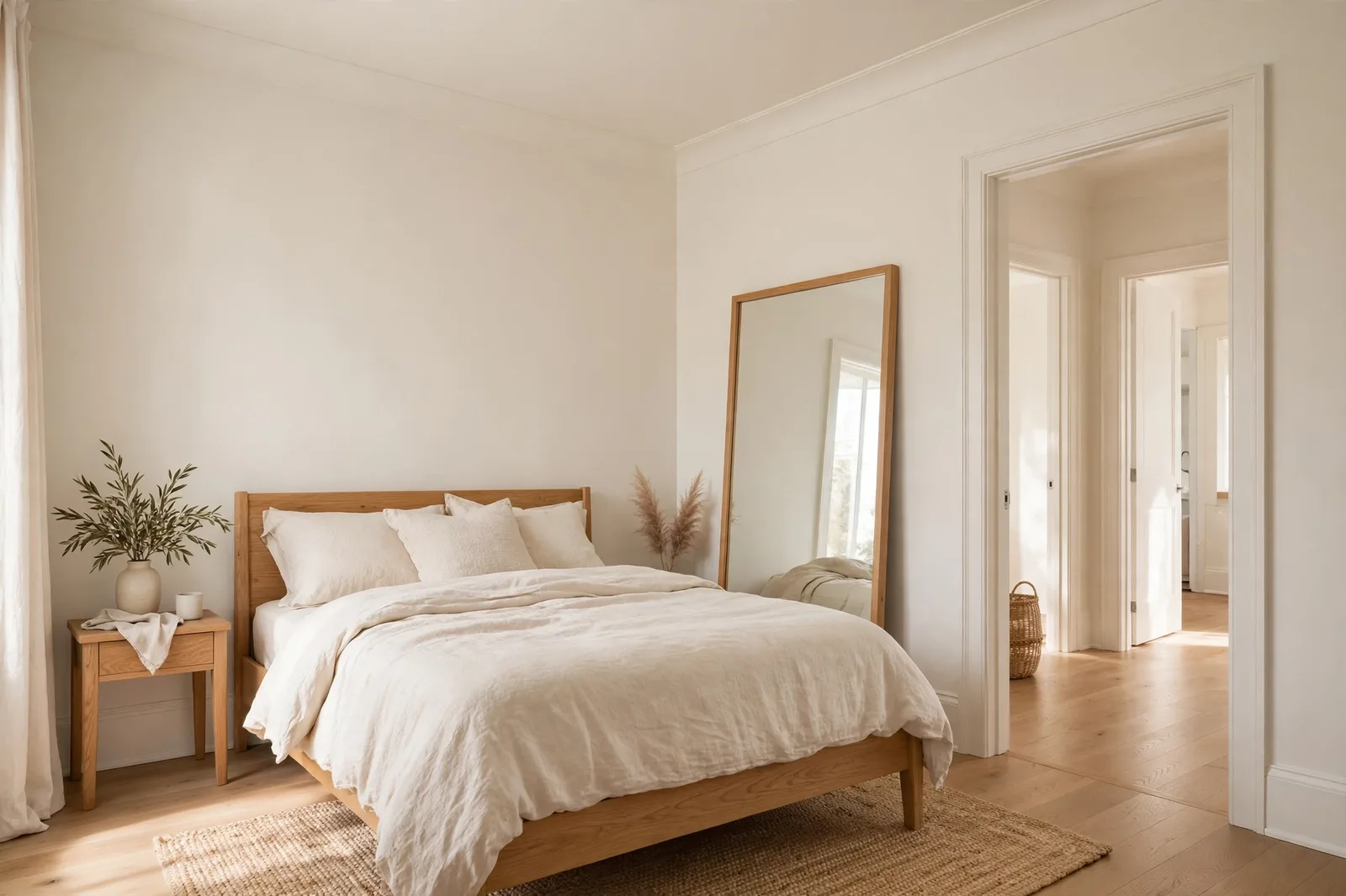
The conventional advice for small rooms is simple and wrong: paint everything white and hope for the best. White can help, but it is only one of the tools, and in the wrong room it can make a small space feel stark and cold rather than open and calm. What actually makes a small room feel bigger is not a specific color at all. It is light management, visual continuity, and the relationship between your walls, ceiling, trim, and furnishings. Some small rooms want pale, reflective color. Others want to be wrapped in deep, boundary-blurring dark. And every small room rewards the same three disciplines: fewer lines breaking the eye, color that agrees with the room’s natural light, and sheen used deliberately. This guide gives you the complete method, the light colors that work and why, the honest case for going dark, the monochrome technique designers use to erase boundaries, and the ceiling and trim decisions that expand a room more than any paint color can. Paint shifts with lighting, surface, and sheen, so always test a large physical sample in your own space before committing, screen swatches are approximations. The Global Abode is an independent publication, not affiliated with or endorsed by Sherwin-Williams or Benjamin Moore; all color names and codes are referenced as widely-known designer examples.
Key takeaway: A small room feels bigger when light moves freely and the eye finds few places to stop. That means pale, reflective colors in well-lit rooms, and it also means deep, enveloping color carried across walls, ceiling, and trim in dim or windowless rooms, where boundaries disappear instead of closing in. The real levers are continuity (one color across walls, trim, and ceiling), the ceiling decision, and matching the color’s depth to the room’s light. Undertone notes below are widely-reported designer observations, not exact manufacturer specifications.
The Myth of White-Only: What Actually Makes a Room Feel Big
Walk into any paint store and ask about a small room, and you will hear the same prescription: white. And white is not bad advice, pale colors reflect more light back into a space, and reflected light is one of the genuine levers of perceived spaciousness. But “paint it white” is a shortcut around a more interesting question: why do some rooms feel generous while others, the same size, feel cramped? The answer is perceptual, not dimensional, and it comes down to three things.
First: light. Every room is judged by your eye on how light moves through it. Light colors reflect light; dark colors absorb it. In a room with good natural light, a pale wall bounces that light around and the room feels airy. But light alone is not the whole story, a small room with pale walls and heavy, high-contrast trim lines can still feel busy and small, because the eye keeps tripping over the boundaries. And a dim room painted white does not magically gain light that isn’t there; it just reads as a dim white room.
Second: continuity. Your eye measures a room by where it has to stop. Every place where one color meets another, white ceiling against gray walls, bright trim against colored walls, a dark door in a pale room, is a visual full stop. Each stop is the eye registering a boundary, and each boundary is a reminder of the room’s actual dimensions. Reduce the number of stops, and the eye travels further, and the room reads larger. This is the single most important principle in small-room painting: fewer lines, more space. It is why designers so often recommend painting walls, trim, and ceiling in one continuous color, the boundaries dissolve, and the room’s edges recede from attention.
Third: agreement. A color has to agree with the room’s light, its finishes, and its job. A cool pale gray in a north-facing room can go flat and make the room feel dimmer and smaller. A warm pale beige in a bright south room can glow golden and feel enveloping rather than expansive. The “right” small-room color is always contextual, the same pale blue that opens up a bright guest room can chill a dim hallway. Our natural light guide walks through how orientation changes every color; the short version is that you choose the color for the light you have, not against it.
So the white-only prescription fails in two directions. In bright, well-lit rooms, it undersells what you could do, a pale blue, a soft sage, or a light greige can reflect nearly as much light as white while giving the room far more character. And in dim, windowless, or north-facing rooms, it can actively disappoint: a stark white in a dark room often reads as gray and flat, emphasizing the lack of light rather than compensating for it. Those rooms often do better going the other direction entirely, deep, enveloping color that stops apologizing for the darkness and turns it into atmosphere. That is section 3.
Tip: Before choosing any color, stand in the room at three moments, morning, midday, and evening under your lamps, and ask one question: what does this room’s light want? Bright rooms with generous windows want reflective color that rewards the light. Dim rooms with small windows want either the palest warm neutral (to catch what light exists) or a confident dark (to make the darkness intentional). The rooms that fail are the ones painted in disagreement with their own light.
Light Colors That Work: Whites, Greiges, and Pale Color
The classic small-room palette works, when it is chosen with care. The goal is not “the palest color on the deck”, it is a color pale enough to reflect light, warm or cool enough to agree with the room’s exposure, and clean enough in undertone to stay calm at scale. Here are the families, with the honest notes on each.
| Family | What it does | Best light | Watch out for |
|---|---|---|---|
| Warm whites (Alabaster SW 7008, White Dove OC-17, Greek Villa SW 7551) | Reflect light while keeping the room feeling welcoming, never clinical | North-facing and dim rooms, the warmth absorbs the cool cast | In sun-blasted south rooms, warmth can go golden; test at midday |
| Clean whites (Pure White SW 7005, Extra White SW 7006) | Maximum reflectance and crispness; the airiest read in bright rooms | Bright south and west rooms with good natural light | In dim north rooms they can read icy or flat, stark, not spacious |
| Light greiges (Agreeable Gray SW 7029, Edgecomb Gray HC-173, Pale Oak OC-20) | Reflect nearly as much as whites while giving the room warmth and depth | Mixed exposures; the most forgiving family across light conditions | Against cool gray tile or in very dim rooms, some can cool down noticeably |
| Pale blues (Sea Salt SW 6204, Rainwashed SW 6211, pale powder blues) | Cool tones recede visually, the walls read as slightly further away | Bright rooms; bathrooms and guest rooms especially | In dim light, pale blue can go chilly; warm the bulbs to 2700–3000K |
| Soft sages (Clary Sage SW 6178, Saybrook Sage HC-114) | Muted green reads as organic and calm; keeps a small room feeling fresh | Rooms with greenery outside the windows; warm and north light alike | The green thread can surface in dim corners, sample at scale |
| Pale warm neutrals (Accessible Beige SW 7036 in its lightest use, Manchester Tan HC-81) | Cozy spaciousness, the room feels open and welcoming | North-facing rooms, evening rooms, homes with warm wood floors | Needs decent light; in dim rooms mid-depth beiges can read heavy |
A few things this table can’t show. First, undertone discipline matters more in small rooms than anywhere else. A small room gives an undertone nowhere to hide, there are fewer square feet to dilute a surprise pink thread or a creeping yellow cast. This is why designers are strict about small-room whites: choose the white with the quietest undertone profile, the one with no pink, no green, no blue flash waiting to surface at 8pm. White Dove and Alabaster are famous partly because they behave; Pure White because it stays neutral. The loud whites are the ones that shrink a room by making it feel off in a way nobody can name.
Second, the pale-color ceiling rule. In a small room with pale walls, the ceiling should be the same color in flat, or a barely lighter tint of it. A bright white ceiling over pale walls is fine. But a stark white ceiling over a colored or mid-tone wall creates a hard boundary line at the top of every wall, which is exactly the kind of visual full stop that shrinks a room. The ceiling is the fifth wall; treat it as part of the color decision, not an afterthought.
Third, sheen is a light tool. In small rooms, eggshell on the walls reflects a touch more light than flat, without the glare or flaw-magnification of satin. Satin or semi-gloss on trim in the same color adds a subtle luminosity at the edges. And in the dimmest small rooms, a windowless bath, a dark hallway, a slightly higher sheen on the walls themselves (eggshell rather than matte) can genuinely help bounce what little light exists. Gloss magnifies surface flaws, so reserve it for well-prepped trim and millwork.
Watch out: The most common small-room mistake is choosing the palest chip on the deck and assuming the job is done. Pale color on the chip can read as flat, cold, or surprisingly dark once it is on four walls in your actual light, especially in north-facing or dim rooms, where pale cool colors lose their brightness. Always paint a large board (at least 2×2 feet), prop it on the actual wall, and judge it at morning, midday, and evening before committing. Our paint sampling guide covers the full protocol.
The Dark-Room Case: When Deep Color Expands
Here is the counterintuitive truth that surprises most homeowners: a small room painted a deep, rich color can feel bigger than the same room painted white. Designers have known this for years, and the logic is perceptual, not magical. Dark colors absorb light and visually recede. When every surface, walls, ceiling, trim, is wrapped in the same deep tone, the boundaries of the room stop registering. Your eye can’t find the corners, can’t measure where the wall ends and the ceiling begins, and without boundaries to measure, the room’s dimensions become ambiguous. The walls seem further away because the eye has no reference point for where they actually are. It feels like depth rather than size, but it reads as spacious.
This is the technique behind the color drenching that has defined recent design: one color, carried across walls, ceiling, trim, doors, and baseboards, in a seamless envelope. It works best in exactly the rooms that fight the white-only prescription, small, dim, windowless, or north-facing spaces where pale color would just read as flat and gray. A tiny powder room in deep navy, a windowless hallway in moody green, a small study in warm charcoal: these rooms stop trying to be bright and start being atmospheric, and the atmosphere reads as generous.
But the dark-room case has rules, and they are strict:
Rule 1: commit to the envelope. Dark drenching only works as a full envelope, walls, ceiling, trim, doors, all in the same color. A single dark accent wall surrounded by white trim and a white ceiling does the opposite: the room reads as a dark wall inside a small white box, and every boundary becomes more visible, not less. If you go dark, go dark everywhere. This is non-negotiable.
Rule 2: choose the right dark. The best small-room darks have complexity, deep navies (Naval SW 6244, Hale Navy HC-154), moody greens (Evergreen Fog SW 9130 at full strength, deep sages), warm charcoals (Iron Ore SW 7069, Urbane Bronze SW 7048), rich plums and deep teals. Flat, one-note darks can read as heavy; complex darks read as dimensional. And test the color in the room’s actual light, a navy that reads as rich and dimensional in a south-facing room can flatten toward near-black in a north-facing one.
Rule 3: light it like a stage. Dark rooms need deliberate lighting, layered lamps, warm 2700–3000K bulbs, and attention to the corners. A dark room with one overhead light reads as a cave; the same room with three warm lamps reads as a jewel box. The lighting is not decoration here, it is part of the color decision.
Rule 4: let the contents pop. Dark walls are a backdrop, and backdrops make everything in front of them look intentional, art, brass fixtures, cream bedding, wood furniture, plants. This is one of the genuine pleasures of a dark small room: a tiny space where every object reads as curated. Keep the furnishings and textiles lighter than the walls so the contrast does the work.
When not to go dark: rooms where you need to feel energized and alert (a home office you work in all day, a kitchen you cook in every morning), rooms with strong cool finishes that will argue with a warm dark, and rooms where the darkness would fight the home’s overall flow, a single dark room in an otherwise pale open plan can feel like a dead end. And renters and the resale-cautious should know that dark is a commitment: it takes more primer and more coats to cover than pale color does.
The Monochrome Method: One Color, No Boundaries
Whether you go light or dark, the most powerful small-room technique is the same: monochrome, one color carried across walls, trim, ceiling, and doors, with sheen doing the work that contrast used to do. This is the method behind both the pale enveloping room and the dark drenched one, and it is the single highest-impact decision you can make in a small space.
Here is how it works. Paint the walls in eggshell, the trim and doors in satin or semi-gloss in the same color, and the ceiling in flat in the same color (or a barely lighter tint). The sheen steps, eggshell, satin, flat, give the eye just enough variation to read the architecture: trim still looks like trim, the ceiling still lifts. But there are no color boundaries, no lines where the eye has to stop. The room reads as one continuous envelope, and one continuous envelope reads as larger than a room chopped into contrasting bands.
The method works in every depth. Light monochrome, a whole room in Alabaster, walls in eggshell, trim in satin, ceiling in flat, is the classic small-bedroom and small-bathroom move: calm, bright, seamless. Mid-tone monochrome, a soft greige or pale sage carried everywhere, gives a small room warmth and character without a single visual interruption. Dark monochrome is the color-drenching envelope from section 3: deep navy or moody green on every surface, boundaries dissolved, the room reading as depth rather than dimension.
Two refinements make monochrome work harder:
Tonal layering. If one flat color feels too uniform, layer tones of the same family instead of contrasting colors: walls in the mid-tone, trim a half-step lighter, ceiling a half-step lighter still. The steps are close enough that the eye glides across them, no hard stops, but the subtle graduation gives the room dimension and keeps it from feeling flat. This is the technique behind the most successful tonal rooms: same family, small steps, no contrast.
Furniture camouflage. Extend the monochrome thinking to the room’s largest pieces. A bed with bedding close to the wall color, a dresser painted to match the walls, shelving in the same tone, these erase the bulky silhouettes that chop a small room into pieces. The eye focuses on the open space rather than the furniture’s edges. You don’t need to match everything; matching the one or two largest pieces is enough to change how the room reads.
Tip: The fastest way to preview the monochrome method costs nothing: photograph the room, then use any free photo editor to sample the wall color and paint it digitally over the trim and ceiling. The before-and-after, contrasting trim versus one continuous color, shows you in thirty seconds whether your room is a monochrome candidate. If the edited version feels calmer and larger, the real thing will too.
Ceilings, Trim, and Sightlines: The Details That Expand
After the wall color itself, the ceiling is the highest-leverage surface in a small room, and the most neglected. Here are the ceiling, trim, and sightline decisions that expand a room more than any wall color can.
| Strategy | How it works | Best for |
|---|---|---|
| Ceiling same as walls (flat) | Erases the wall-ceiling boundary; the eye travels upward without stopping | Low ceilings; the core monochrome move |
| Ceiling a half-step lighter than walls | Lifts the ceiling visually while keeping the envelope calm | Rooms where full monochrome feels too uniform |
| Crisp white ceiling over pale walls | Maximum brightness overhead; the classic airy read | Bright rooms where height and light are the goal |
| Dark ceiling, pale walls | Lowers the ceiling visually, cozy, intimate, grounding | High-ceilinged small rooms that feel cavernous, not small |
| Trim same color as walls (satin) | Removes the trim outline that traces the room’s exact dimensions | Nearly every small room; the highest-ROI trim decision |
| Baseboards painted to match the floor | Extends the floor visually instead of cutting it off at the wall | Rooms with wood floors where the baseboard line chops the space |
| Doors in the wall color | A white door in a colored room is a billboard; a matched door disappears | Small rooms with multiple doors breaking up the walls |
The ceiling height illusion. Low ceilings are the most common small-room complaint, and paint has two answers. The first is continuity: carrying the wall color onto the ceiling removes the line where the wall ends, and without that line the eye can’t measure the ceiling’s height, it reads taller. The second is the vertical pull: painting trim, doors, and even curtain panels in one continuous tone from floor to ceiling draws the eye upward in an unbroken line. Designers also hang curtain rods high, a few inches below the ceiling molding, and let curtains fall to the floor, which stretches the wall’s apparent height. These are small moves with outsized effects.
Sightlines beyond the room. A small room rarely ends at its walls, it opens onto a hallway, a larger room, a window with a view. Paint can borrow space from beyond the room’s boundaries. Keeping the small room’s color in the same family as the adjacent space (or carrying one color through both) makes the eye travel past the doorway instead of stopping at it, the small room reads as part of a larger whole. And never underestimate the window: a small room with a view of greenery or sky feels larger because the eye has somewhere distant to rest. Keep window treatments light and minimal so the view does its work. Our color flow guide covers how to carry color across connected spaces.
The trim temperature rule. Whatever you do with trim, match its temperature to the walls. Warm walls with cool white trim create a visible temperature argument at every doorway and baseboard, and in a small room, that argument is all you see. Warm walls want warm trim; cool walls want cool or neutral trim. When in doubt, trim in the wall color itself sidesteps the question entirely.
Small-Room Failures: The Mistakes That Shrink a Room
Small rooms are unforgiving of the mistakes that larger rooms absorb. Here are the failures to avoid, each one is common, each one is fixable, and each one shrinks a room more than any color choice expands it.
Failure 1: Too many colors. The small room with a different color on every wall, a contrasting ceiling, bright trim, and a bold door is a room chopped into pieces, and each piece is smaller than the room. The fix is the monochrome discipline from section 4: one color, or one family in small tonal steps, across every surface. A small room can handle depth of color; it cannot handle variety of color.
Failure 2: The lonely accent wall. One dark or bold wall in an otherwise pale small room does not add depth, it adds a billboard. The eye goes straight to the contrasting wall, measures it, and the room’s dimensions become unmistakable. Accent walls work in large rooms with distance to absorb them. In small rooms, they almost always shrink. If you want the color, drench the whole room instead.
Failure 3: Ignoring the room’s natural light. A cool pale gray in a north-facing room, a warm beige in a sun-blasted south room, a stark white in a windowless bath, these are colors chosen for the chip, not the room. The fix is the three-moment test from section 1: judge every finalist in the room’s actual morning, midday, and evening light before committing. Color chosen against the light always looks wrong; color chosen with it rarely does.
Failure 4: Glossy dark in dim light. Deep color in a small room wants matte or eggshell, finishes that absorb light evenly and let the color read as depth. High-gloss dark paint in a dim room does two bad things at once: it reflects the room’s few light sources as harsh hotspots, and it magnifies every wall flaw. Save the gloss for well-prepped trim and millwork, where it adds luminosity without the risk.
Failure 5: The white ceiling default. Painting every ceiling bright white regardless of the walls is a habit, not a decision. Over a deep or mid-tone wall, a stark white ceiling draws a hard line around the top of the room, the exact boundary the monochrome method is trying to erase. Over pale walls it’s fine; over anything with real color, carry the wall color up or step it down gently.
Failure 6: Cluttered color in the furnishings. Paint is only half the room. A small room with calm walls but a riot of clashing textiles, busy patterns, and high-contrast furniture has the same problem as too many paint colors: the eye stops everywhere and the room reads as its pieces. Keep the large furnishings in the wall color’s family, let one or two accents do the talking, and give the walls’ continuity something to work with.
Planning color for the whole home, not just the small rooms?
The Whole Home Paint Guide is a complete, ready-to-use color system, anchor neutrals, trim and ceiling pairings, accent colors, all with undertones already coordinated, so your small rooms flow into the rest of the house instead of feeling like afterthoughts. And the Paint Color Workbook includes room-by-room worksheets and a sampling checklist for testing finalists with evidence, not guesswork.
Frequently asked questions
Either, the decision is about light and continuity, not about white versus color. Bright rooms with good natural light do beautifully in pale color (light greige, pale blue, soft sage), which reflects nearly as much light as white with far more character. Dim or windowless rooms often do better going deep and enveloping, where boundaries disappear. What shrinks a room is not color itself but disagreement, color fighting the light, or too many colors chopping the space. Our sampling guide shows how to test finalists in your actual light.
Not if you commit to the full envelope. A small bedroom wrapped in one deep color, walls, ceiling, trim, doors, can feel larger than the same room in white, because the boundaries dissolve and the eye can’t measure the dimensions. The failure mode is the half measure: one dark wall with white trim and a white ceiling, which makes every boundary more visible. Go dark everywhere, light it with warm layered lamps, and keep bedding and furnishings lighter than the walls.
Usually yes, it is one of the highest-impact small-room moves. Carrying the wall color onto the ceiling (in flat) erases the boundary line at the top of the walls, and the room reads taller and more continuous. The alternatives that also work: a half-step lighter tint of the wall color for a gentle lift, or a crisp white ceiling over genuinely pale walls. What to avoid is a stark white ceiling over mid-tone or dark walls, which draws a hard line around the room.
Almost never. In a small room, a single contrasting wall becomes a focal point the eye measures, and measured rooms feel small. The color you love on that one wall will almost always work better drenched across the whole room, where it creates depth instead of a billboard. The one exception: a small room with one genuinely distant focal point (a fireplace wall, a window wall with a view), where the accent draws the eye outward rather than stopping it. Even then, keep the contrast gentle.
Small bathrooms are ideal candidates for either extreme. Pale and reflective (a warm white, a light greige, a pale blue) bounces the limited light and feels fresh, use a moisture-appropriate satin or semi-gloss. Or go deep and enveloping (navy, moody green, warm charcoal) across walls, ceiling, and trim for a jewel-box powder room that feels intentional and generous. Match the wall’s temperature to the tile’s temperature, and use warm 2700–3000K lighting, bathroom vanity bulbs decide how every color reads. See how light changes paint color for the orientation rules.
Hallways are corridors, not rooms, treat them as connectors. Carry one continuous color through the hallway and into the rooms it joins, so the eye travels past the doorway instead of stopping at it; our color flow guide covers the method. Paint trim, doors, and ceiling in the same color to erase the tunnel effect. In a dim hallway, either go pale and warm to catch the light or commit to a deep enveloping tone, the worst hallway color is a mid-tone gray that reads as neither bright nor intentional.

