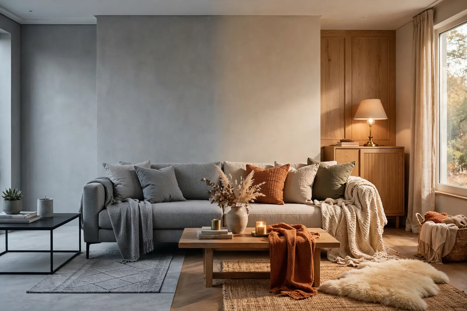
For a solid five years, gray was the answer to everything: gray walls, gray sofas, gray tile, gray kitchen cabinets. It photographed beautifully, it hid nothing and revealed nothing, and it felt modern. Then, slowly, something shifted, the rooms started feeling less like a retreat and more like a waiting room. If your whole house went gray between roughly 2015 and 2020 and now feels cold, flat, or oddly lifeless, you’re not imagining it, and you’re not alone. The good news: you don’t need a gut renovation to fix it. You need a swap strategy, a deliberate, phased way to trade cold grays for warm neutrals, room by room, without tearing out the things you can’t change.
Why gray homes feel cold now
Gray didn’t become a bad color, it became an overplayed one. Between about 2015 and 2020, gray was the default setting for nearly every surface: walls, floors, upholstery, tile, countertops, cabinetry. When a whole house is built from one temperature family with minimal contrast, two things happen. First, the eye stops registering anything, there’s nothing for it to land on, so rooms feel flat rather than calm. Second, the coolness compounds: cool walls + cool floors + cool fabrics + cool-toned lighting adds up to a space that reads clinical rather than serene.
What’s changed since then isn’t a rule that gray is “out”, it’s a shift in what people want their homes to do. The newer mood is comfort-first: rooms that feel sheltering, tactile, and warm in the literal sense. Warm neutrals, greige, mushroom, warm taupe, oatmeal, clay, carry brown and yellow in their bones, which reads as warmth even before a single lamp turns on. They flatter skin tones, wood floors, and evening light in ways cool gray never quite managed.
Here’s the honest reassurance: your gray home is not a mistake to be erased. Gray is a genuinely useful neutral, and plenty of it can stay. The goal of this guide isn’t to purge every gray surface, it’s to rebalance the temperature of the house. Most successful gray-to-warm transitions keep a surprising amount of the original gray; they just stop letting it run the whole show.
The warm-neutral spectrum: your new vocabulary
If gray is one word, warm neutrals are a whole vocabulary. Learning the families is the single most useful thing you can do before buying a single sample pot, because each family behaves differently, and each one pairs with different things. Think of it as a spectrum from closest-to-gray to fully warm:
| Family | Character | Pairs well with | Watch for |
|---|---|---|---|
| Warm greige | Balanced gray and beige, the gentlest exit from gray | Mixed metals, stone, painted cabinetry, varied woods | Can read cooler than expected in north-facing rooms |
| Mushroom | Gray-beige with soft brown and earthy depth | Oak, walnut, linen, aged brass, cream | Occasional violet or muddy-green shifts in tricky light |
| Putty | Soft, mineral gray-beige with low saturation | Stone, warm white, black accents, natural textiles | Can look dull under weak or very cool bulbs |
| Oatmeal / flax | Light beige with a natural-fiber quality | Warm white, pale oak, woven rugs, soft blue | Can yellow next to cool white trim |
| Warm taupe | Brown-backed gray, sometimes with red or pink influence | Dark wood, bronze, muted green, plaster textures | Pinkness can appear beside yellow-beige flooring |
| Clay | Dusty tan with restrained red, peach, or brown | Terracotta, cream, olive, medium wood | Can push more orange in strong warm light |
| Soft brown | Medium or dark earth neutral | Cream ceilings, leather, art, rich woods | Needs enough lighting and value contrast to avoid heaviness |
The strategic insight: you don’t have to jump the whole spectrum at once. Designers consistently recommend warm greige as the gentle exit ramp, close enough to your existing gray that the transition feels natural, warm enough that the room’s temperature visibly shifts. Once greige feels like home, you can move further down the spectrum toward taupe, mushroom, or clay in the rooms that want more warmth.
Notice what’s not on this table: plain beige. Flat, yellow beige is the other trap, it reads dated rather than warm. The families above all have gray in their ancestry, which is exactly what keeps them sophisticated instead of 1990s.
The 5 easiest swaps with the biggest impact
Before a single paint can opens, these five changes do more warming per dollar and per hour than almost anything else. Designers working on gray-era homes start here nearly every time, because the cold feeling is often less about the walls than about everything sitting in front of them.
Swap 1, Change your light bulbs
This is the fastest, cheapest transformation available, and it’s the one most gray homes are missing. Many gray-era homes are lit at 4000K–5000K, cool, blue-leaning LEDs that make every gray surface read colder. Swapping to warm-white bulbs (around 2700K–3000K) casts a cozier glow on the entire space. One room’s worth of bulbs takes an afternoon and changes how every existing color in the room reads, including the gray walls you’re deciding whether to keep.
Swap 2, Introduce warm wood
Wood is the quickest way to warm up cool gray, full stop. An oak shelf, a walnut coffee table, rattan baskets, a jute rug, natural materials have inherent warmth that cool gray can’t produce on its own. The practical rule: pick two wood tones maximum and repeat them. If your gray leans cool, a neutral-to-warm wood like oak or ash bridges beautifully; if your gray already leans warm, walnut adds depth. And greige deserves special mention here, as a gray-beige hybrid, it acts as a translator between warm woods and cool textiles, letting you mix oak, walnut, and gray upholstery without clashing.
Swap 3, Warm up the metals
Gray-era homes are full of brushed nickel and chrome, cool metals that reinforce the cold. You don’t have to replace every faucet. Swapping the most visible metals, cabinet hardware, a lamp or two, picture frames, a mirror, to brass, bronze, or copper introduces warmth and a gentle glow that flatters everything around it. A little goes far: too much brass reads hotel lobby.
Swap 4, Layer warm textiles
This is where the biggest visual shift happens for the least money. Gray sofas and gray bedding are the signature of the era, and they’re the first thing the eye reads as “cold.” Drape a camel or caramel throw over the gray sofa, add cushions in oatmeal, putty, or mushroom, lay a jute or warm-patterned rug over cool floors. Aim for three main warm tones, layered with texture (bouclé, linen, wool, knit), texture is what makes a neutral room feel rich instead of flat. Layered warm neutrals over a mid-tone gray anchor is the exact formula designers use to make gray living rooms feel like a hug.
Swap 5, Add green
Plants are the fastest mood changers in a gray space. Trailing pothos, a large fiddle-leaf fig, even a bowl of eucalyptus, green tones neutralize gray’s coolness and add the one thing gray interiors usually lack: life. Pick two natural materials (wood + plant, say) and repeat them across the room for cohesion.
The swap table: if you have this gray, try this warm neutral
When you’re ready to repaint, use this as your starting direction, not a prescription. Every color family below is named as widely-known designer-reported examples; your actual finalist should be found by sampling in your own light. The pattern to notice: each swap moves one step warmer and stays at roughly the same depth, that’s what keeps the room feeling familiar rather than foreign.
| If your gray is… | Swap toward… | Designer-reported starting points | Watch for |
|---|---|---|---|
| Cool blue-gray walls | Warm greige | The Agreeable Gray / Accessible Beige family | Check in north-facing rooms, greige can still read cool there |
| Icy light gray walls | Warm white or oatmeal | The White Dove / Swiss Coffee family | Don’t go warmer and darker than the original gray |
| Mid-tone true gray | Mushroom or putty | Mushroom-toned neutrals with soft brown depth | Violet shifts in dim light, sample at night too |
| Charcoal / dark gray accent walls | Warm taupe or soft brown | Deep taupes with brown backing | Pinkness can appear beside warm flooring |
| Gray kitchen cabinets | Greige or warm putty cabinets | Balanced gray-beige cabinet colors | Test against your countertop, stone often leans cool |
| Gray-beige “greige” that’s too cool | True warm greige or light taupe | One step warmer on the same fan-deck strip | Sometimes the fix is warmer bulbs, not new paint |
| Blue-gray bedroom | Warm greige or clay-tinted neutral | Soft, dusty warm neutrals | Bedrooms need the calm kept, don’t jump to full clay |
Two patterns to internalize from this table. First, most swaps are small moves, not leaps, one step warmer on the same depth level. The rooms that feel coldest are rarely fixed by the boldest change; they’re fixed by the right small change repeated everywhere. Second, notice how many rows say “check against your existing finishes”, because your countertop, your floors, and your trim are voting on every new color whether you ask them to or not.
Room-by-room swap strategy (and gray finishes you can’t change)
Not every room needs the same treatment. The rooms where you live in the evenings, living room, bedroom, dining room, feel the cold most, because warm lamplight against cool gray is where the temperature clash is most visible. Start there. Utility spaces (laundry, mudroom, hallways) can wait, and honestly, cool gray is perfectly fine in a hallway.
Living room: This is the room the whole house is judged by. If your walls are cool gray, a warm-greige repaint here changes the home’s entire temperature baseline. Keep the gray sofa if you like it, with warm textiles, wood, and brass layered over it, a gray sofa inside a warm-greige room reads intentional rather than leftover.
Bedroom: Warmth matters most where you want to feel held. Swap cool blue-gray walls for a warm greige or a soft clay-tinted neutral, but keep it calm. Bedrooms punish drama; the goal is “warm exhale,” not “new personality.” If repainting feels like too much, warm bedding, wood nightstands, and 2700K bedside lamps do genuine work here.
Kitchen: Gray cabinets are the era’s most permanent artifact, and repainting them is a real project. Before you commit, try the decor layer: warm wood cutting boards and open shelving, brass hardware, a warm runner, woven pendant shades. If you do repaint, greige or warm putty cabinets keep the kitchen feeling current while shedding the chill, but test your finalist against the countertop first, because stone and quartz usually lean cool and they don’t move.
Bathroom: Small, often windowless, and frequently full of cool gray tile. Here the answer is usually not repainting the tile, it’s everything around it. Warm white walls (not cool white), wood-framed mirrors, brass fixtures, warm-toned towels and a woven bath mat. The tile stays gray; the room stops feeling like it.
Now the honest part: some gray finishes aren’t going anywhere, gray tile floors, gray carpet, a gray stone fireplace surround. The strategy for these is the beige-bridge principle: use a warm transition color that sits between the cool finish and your new warm palette. Warm greige is the classic bridge, close enough to the gray floor to feel related, warm enough to carry the room toward your new palette. And off-white walls over gray floors work when the white is genuinely warm (think creamy, not crisp) and the textiles carry the rest. The finish you can’t change becomes a design constraint, not a design failure, constraints are what make palettes interesting.
The traps to avoid + your phased plan
Three traps catch nearly everyone making this transition:
Trap 1, The pink/beige trap. In the rush away from gray, it’s easy to land on a beige with a pink or peach undertone that reads dated the moment it’s on four walls, or worse, a greige that flashes violet in your north-facing room. The defense is the same white-paper test used everywhere else: hold every finalist against pure white in daylight and under your evening lamps. Pink and violet undertones love to hide until the paint is dry.
Trap 2, Swapping everything at once. Repainting the whole house in one weekend feels decisive, but it removes your ability to calibrate. Warmth is relative, a greige that feels perfectly warm next to your old gray might feel flat once the whole house is greige. Work room by room so each space teaches you something for the next.
Trap 3, Forgetting the trim. Gray-era homes often have bright, cool-white trim, and a warm greige wall next to icy trim creates exactly the undertone clash you’re trying to escape. When you warm the walls, check the trim: it may need to shift to a warm white to match. One consistent trim white through the warmed house is what makes the whole thing feel deliberate.
Your phased plan
The weekend phase: Swap bulbs to 2700K–3000K. Add warm textiles (throw, cushions, rug). Bring in one wood element and one warm metal. Add a plant. Cost: modest. Impact: you’ll know within days whether the house needed paint at all.
The month phase: Repaint the highest-impact room, usually the living room, in a warm greige, working from the swap table. Update the trim white if it clashes. Live with it for two weeks, then decide the next room. This is also when gray cabinets get their hardware swap to brass or bronze.
The season phase: Roll the palette through bedrooms, dining room, and kitchen using what the living room taught you. By now you’ve learned which warm-neutral family your house likes; the remaining rooms are execution, not experimentation. The gray finishes you kept, the tile, the stone, the carpet, now read as intentional contrast instead of leftover chill.
Want the whole palette planned for you?
If working room by room still feels like guesswork, the Whole Home Paint Guide gives you a complete warm-neutral color system, every room mapped, trim and ceiling pairings included, undertones already coordinated, so the swap happens once, correctly, instead of in anxious stages.
Frequently asked questions
Not exactly, gray is still a useful neutral, and warm grays and greiges remain widely used. What’s shifted is the all-gray, cool-on-cool look of the late 2010s. The current direction is warmer neutrals with more brown and texture, but a gray sofa or gray tile inside a warm palette reads current, not dated.
Often, yes. Warm-white bulbs (2700K), warm wood furniture, brass or bronze accents, layered warm textiles, and plants can transform how a gray room feels without touching the walls. Try the decor layer first and live with it for two weeks, many people find the gray walls suddenly feel fine.
Warm greige is the safest first move, close enough to gray to feel like a natural transition, warm enough to shift the room’s temperature. From there, mushroom, warm taupe, and oatmeal are the next steps down the spectrum. Match the family to your fixed finishes and light, and always sample first.
Swap cool hardware for brass or bronze, add warm wood cutting boards and open shelving, hang woven pendant shades, and lay a warm runner. If you do repaint, greige or warm putty keeps the kitchen current while shedding the chill, but test against your countertop, since stone usually leans cool.
Hidden undertones. Many warm beiges and taupes carry pink, peach, or red undertones that are invisible on the chip and obvious on the wall. Hold finalists against pure white paper in daylight and under your evening lamps before committing, and consider greige or mushroom families, which tend to hide their warmth more gracefully.
Bridge them. Use a warm greige on the walls, close enough to the gray floor to feel related, warm enough to carry the room toward your new palette. Warm the trim white, layer warm textiles, and let the gray floor read as intentional contrast rather than leftover chill.

