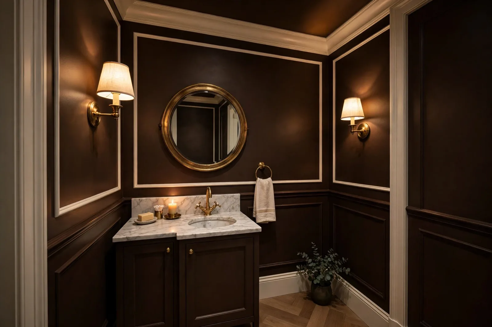
Every October, Benjamin Moore announces a Color of the Year, and every year, the announcement tells you where the whole industry is heading. For 2026, the brand named Silhouette AF-655: a rich, espresso-brown dark with charcoal undertones that the brand describes as “a warm, neutral alternative to black,” drawn from the world of classic tailoring. After years of pastel-leaning picks and last year’s mauve-tinted Cinnamon Slate, a dark espresso is a deliberate statement. This is the honest expert review: what Silhouette actually looks like in real light, how it compares to the dark colors you already know, where it belongs in your home, and where it doesn’t.
Why Benjamin Moore chose a dark espresso for 2026
Color of the Year picks are never just about one color. They’re a brand’s thesis about where taste is moving, and Benjamin Moore’s thesis for 2026 is that the era of cautious pastels is over. Consider the trajectory: 2023’s Raspberry Blush was a pink-violet statement; 2024’s Blue Nova leaned cool and ethereal; 2025’s Cinnamon Slate was a mauve-tinted plum-brown that already started the turn toward earthy depth. Silhouette AF-655 completes that turn. It’s a dark, grounded, grown-up brown, the kind of color that doesn’t ask permission.
The brand’s framing is fashion. Benjamin Moore’s color team drew the 2026 inspiration from a renewed interest in classic tailoring, well-cut suits, layered pieces, craftsmanship, and described Silhouette as having the versatility and softness of a perfectly tailored suit: “rich yet soft, intriguing yet familiar, and bold yet approachable.” That tailoring metaphor is doing real work here. A suit is structured, timeless, and a little formal; so is this color. It signals that brown has finished its comeback, not as the dusty tan of 2000s Tuscan kitchens, but as a sophisticated dark neutral with real gravity.
And there’s a cultural read underneath. The design world keeps circling a mood people call “cocooning”, rooms that envelop rather than open, depth that reads as luxury, spaces designed for evening. A dark espresso is the cocooning color par excellence. It’s also Benjamin Moore’s answer to the black-everything trend: brown, the brand’s color team notes, has become a softer substitute for black or charcoal, with warmth where black has none. Choosing a brown rather than a black as the year’s statement says: we still want the drama of dark walls, but we’ve outgrown the harshness.
One more thing worth noting: Silhouette comes from the Affinity Color Collection (the AF in AF-655), reportedly the first Affinity shade ever named Color of the Year. The Affinity line was formulated so its colors harmonize with each other, which quietly hints that the whole 2026 palette was designed as a working system, not a set of isolated stars. We’ll use that palette in section 3.
The color itself: character, undertones, and what it sits next to
Let’s be precise about what Silhouette AF-655 looks like, because dark colors are where verbal descriptions fail hardest and undertones matter most.
Character. Silhouette is a deep, rich brown, the dark-roast-coffee end of espresso, with enough depth to read as a “dark neutral” rather than a color. In bright daylight it shows its brown clearly: warm, enveloping, quietly luxurious. In dim light it approaches near-black, though never quite reaching the inky finality of a true black. Designers consistently note it feels softer than expected for its depth, that’s the brown doing its job. Black asserts; Silhouette embraces.
Undertones. The signature blend is burnt umber (the warm, earthy brown) with delicate charcoal notes (a cool, smoky gray). That charcoal thread is what keeps Silhouette from tipping into the overly warm, almost-orange territory where some dark browns land, it cools the brown just enough to keep it sophisticated. Some observers also report a faint violet hint alongside the charcoal, especially in cool or dim light, worth knowing, worth testing, but subtle rather than defining.
Depth. This is genuinely dark territory. Silhouette sits deep in the dark range, think “accent dark,” the kind of color that makes a room feel enclosed and intentional. On the Light Reflectance Value scale, independent color databases place it in the single digits, very dark, absorbing most of the light that hits it. (Hedge this in your own mind: exact numbers vary by database and none of them replace your eye.) The practical consequence: Silhouette will read noticeably darker on your wall than on a chip, and darker again at night. If you want it to read as “dark espresso” rather than “almost black,” it needs either generous natural light or thoughtful artificial lighting, section 6 covers the lighting.
What it sits next to. Because it’s a warm dark with a cool thread, Silhouette behaves like a bridge between two families. Next to warm woods and brass, its brown side comes forward and the room feels rich and cohesive. Next to cool whites and chrome, its charcoal thread surfaces and the room reads more modern and graphic. Both are legitimate, which means you should decide, before committing, which Silhouette you want: the warm, enveloping one or the cool, tailored one. The finishes around it will decide for you if you don’t.
The Color Trends 2026 palette around it
Benjamin Moore surrounds each Color of the Year with a Color Trends palette, and the 2026 set is described as a balance of “enchanting pales and handsome midtones.” That phrasing is the strategy in miniature: Silhouette is the anchor dark, and everything around it is either a pale that glows against it or a midtone that shares its depth. If you’re decorating with Silhouette, this is your native vocabulary.
| Color | Character | Its job next to Silhouette |
|---|---|---|
| Silhouette AF-655 | Deep espresso brown with charcoal notes | The anchor, the dark that gives the palette its gravity |
| Swiss Coffee OC-45 | Creamy, warm off-white | The trim white, softens Silhouette’s edges; the highest-impact pairing in the set |
| Raindance 1572 | Muted, dusty blue-green | The cool counterpoint, a calm secondary that keeps the palette from going all-warm |
| First Crush CSP-310 | Soft, blushing pink-beige | The “enchanting pale”, unexpected romance against the dark; use in small doses |
| Batik AF-610 | Dusty violet-leaning midtone | The enveloping midtone, dining rooms and bedrooms that want depth without darkness |
| Narragansett Green HC-157 | Deep heritage green | The second deep, pairs with Silhouette for layered, library-like richness (separate rooms!) |
| Southwest Pottery 048 | Earthy terracotta | The warm accent, textiles and accessories that echo Silhouette’s umber warmth |
Read the palette as a set of relationships, not a shopping list. The pattern: one dark anchor, two deep companions (Narragansett Green for green-depth, Batik for violet-depth), one essential creamy white, one cool relief valve (Raindance), and two warm accents (Southwest Pottery’s terracotta, First Crush’s blush). The design logic is that Silhouette makes everything around it “shine”, pale colors look paler, warm colors look warmer, and textured fabrics (bouclé, woven rugs, linen) read richer against the dark ground.
The most practical takeaway: if you commit to Silhouette in one room, shop the rest of the palette for the adjacent spaces. A Silhouette study, a Batik dining room, a Swiss Coffee hallway, Raindance in the bedroom, the Affinity-collection DNA means these colors were designed to harmonize, and the result is a house that feels curated rather than assembled. That’s the entire point of a trends palette, and it’s the one part most homeowners ignore.
The rival darks, compared: Urbane Bronze, Iron Ore, Kendall Charcoal
Nobody chooses Silhouette in a vacuum. The moment you fall for a dark warm neutral, three famous rivals line up for comparison, and the differences between them are exactly the kind that vanish on a chip and matter enormously on a wall. All comparisons below are designer-reported character, hedged where the numbers are concerned; test the actual finalists in your own light.
| Silhouette AF-655 (BM) | Urbane Bronze SW 7048 (SW) | Iron Ore SW 7067 (SW) | Kendall Charcoal HC-166 (BM) | |
|---|---|---|---|---|
| What it is | Rich espresso brown with charcoal notes | Dark warm bronze-gray, a former SW Color of the Year | Soft black, charcoal with a warm lean | BM’s most versatile dark neutral |
| Temperature | Warm (umber-forward, charcoal-tempered) | Warm (brown-gray, earthier) | Warm-neutral leaning (gray-forward soft black) | Warm-neutral (the least warm of the four) |
| Relative depth | Deep dark, reads as a true dark brown | A touch deeper and earthier than Silhouette | Darkest-reading of the group, closest to black | Similar depth to Silhouette, slightly grayer |
| Personality | Tailored, luxurious, “wrapping”, the blanket | Moody evening, earthy, the one that “makes a room feel like evening” | Graphic punch, architectural, the punchiest black | Steady, dependable, the workhorse dark |
| Best use | Powder rooms, studies, dining rooms, front doors | Studies, exteriors, dining rooms, moody accents | Kitchen islands, interior doors, shutters, front doors | Any dark application where you want zero risk |
| Watch out for | Faint violet note in cool dim light; wall imperfections amplified | Can swallow light in dim rooms; earthier than it looks | Reads nearly black in dim rooms, the least forgiving | Can read flat in low light; less warmth than the others |
A few notes that help you actually choose between them:
Silhouette vs. Urbane Bronze is the closest contest and the most common question. Both are dark, warm, and designed for the same rooms. The difference: Urbane Bronze is earthier and more bronze-gray, it has a mineral, almost metallic quality in bright light, while Silhouette is browner and more “espresso,” reading as a refined dark brown rather than a dark greige. Independent color-data comparisons suggest Silhouette reads very slightly lighter than Urbane Bronze. If your finishes run warm (oak, brass, cream stone), Silhouette usually harmonizes better. If the room is more mineral (concrete, slate, black metal), Urbane Bronze belongs there. Sample both on the same wall, this is a decision chips genuinely cannot make.
Silhouette vs. Iron Ore is really a question of how much black you want. Iron Ore is a soft black, gray-forward, dramatic, the color of maximum contrast. Silhouette is a brown, warm, enveloping, the color of depth with softness. On a front door, Iron Ore reads as the bold, classic statement; Silhouette reads as the sophisticated, unexpected one. In a powder room, Iron Ore is graphic; Silhouette is cocooning. If you’re choosing between them, you’re really choosing between drama (Iron Ore) and embrace (Silhouette).
Silhouette vs. Kendall Charcoal is the subtlest distinction. Kendall Charcoal is Benjamin Moore’s most-referenced versatile dark, steady, dependable, warm-neutral but fundamentally a charcoal. Silhouette is its more romantic sibling: browner, warmer, with more personality and slightly more risk (that faint violet note, the stronger light dependence). Designers reach for Kendall Charcoal when the dark needs to disappear into the architecture; they reach for Silhouette when the dark is meant to be felt. If you want the safe dark, take Kendall Charcoal. If you want the dark that started this article, you know which one it is.
Where to use Silhouette: room by room
Dark colors follow a different placement logic than light ones. The rule for Silhouette: put it where depth reads as luxury, contained, intentional spaces, and let the light rooms stay light. Here’s the room-by-room deployment:
Powder rooms, the natural home. Small, windowless or single-window, used in short bursts: the powder room is where dark colors perform best, because the room’s job is drama, not daylight. Silhouette on all four walls, warm brass fixtures, a warm-white ceiling, one good mirror, it’s the highest-impact, lowest-risk use of the color. Designers consistently call the powder room the ideal first dark-color experiment, and Silhouette’s brown warmth makes it more flattering than a true black in a space with skin tones and mirrors.
Studies and home offices, the tailored room. This is the tailoring metaphor made literal. Silhouette walls in a study read as a well-cut suit: serious, composed, quietly luxurious. Pair with walnut or dark wood shelving, brass library lights, and leather. One practical note: dark walls behind a video-call camera can read as a black void on screen, keep the camera-facing wall lighter, or make sure your desk lighting is warm and forward-facing.
Dining rooms, the evening room. Dining rooms are used after dark, under warm lamplight, which is exactly when Silhouette is at its best, the brown glows, the charcoal recedes, and the room feels like evening itself. This is also the room where the 2026 palette earns its keep: Silhouette walls, Batik or Southwest Pottery in the textiles, Swiss Coffee on the ceiling. Candlelight and dark espresso walls are a combination that has never once disappointed.
Kitchen islands and lower cabinetry, the contained statement. A Silhouette island against warm-white perimeter cabinets is one of the strongest uses of the color: the dark anchors the kitchen, the warm white keeps it bright, and the contrast reads as intentional architecture rather than a trend. Test it against your countertop first, cool white quartz next to Silhouette wants a crisp edge, while warm stone wants the whole scheme to lean warmer.
Front doors, the curb statement. A Silhouette front door against a light or mid-tone facade is distinguished without being stark, warmer and more welcoming than black, more decisive than a mid-tone. It pairs beautifully with brass hardware and warm porch lighting. Check it against your brick or siding: red brick loves Silhouette’s brown; cool gray siding wants the scheme to stay crisper.
The statement ceiling, the advanced move. Painting a ceiling in Silhouette while the walls stay light is the color-drenching-adjacent move for people who want drama without commitment. In a bedroom or dining room, a dark ceiling lowers the visual height and creates the enveloping “tent” feeling, but only in rooms with enough height (9 feet and up) and warm lighting. In an 8-foot room with cool bulbs, a dark ceiling just reads as low.
Where not to use it: north-facing rooms with weak light and no lighting plan (it will read as near-black and swallow the room); small windowless rooms you use for tasks (laundry, home gym, depth without purpose just feels dark); and whole-house main walls in an open plan, where a dark this saturated fragments the flow instead of grounding it. Dark colors are accents and rooms, not fields.
Pairing rules: trim, woods, metals, and lighting
A dark color is only as good as what surrounds it. Silhouette’s pairing rules are stricter than a light neutral’s, get the companions right and the color sings; get them wrong and it sulks.
Trim whites: creamy, not crisp. This is the single most important pairing decision. Silhouette wants a warm, creamy white, Swiss Coffee OC-45 (its palette partner), White Dove OC-17, or the Sherwin-Williams equivalents like Alabaster. What it does not want is a stark, cool white: a crisp white trim against deep espresso brown creates a harsh, almost graphic contrast that reads as jarring rather than tailored. The trim should soften the dark, not spotlight it. Keep the trim white consistent through the whole room, and if the room opens onto lighter spaces, carry that same creamy white into the hallway so the transition feels deliberate.
Woods: warm and medium-to-dark. Walnut is Silhouette’s natural partner, the dark wood and the dark brown harmonize into one continuous warm depth, which is why the study-with-walnut-shelving combination works so well. White oak is the contrast partner: light, warm wood against the dark wall creates the light-dark rhythm that keeps a Silhouette room from feeling like a cave. What to avoid: gray-washed or cool-toned woods, which fight the brown’s warmth and make both finishes look muddy. Pick warm wood, and repeat it, one wood species, used consistently, reads as intention.
Metals: brass, bronze, aged, never chrome. Gray-era homes are full of brushed nickel and chrome, and those cool metals are Silhouette’s enemies: they emphasize the charcoal thread and make the room feel cold. Brass, aged bronze, and copper emphasize the umber warmth instead, and warm metal against dark brown is one of the most flattering combinations in interiors, it glows. You don’t need to replace every fixture: the most visible metals (cabinet hardware, a lamp or two, the mirror frame, the faucet if it’s in the sightline) do most of the work.
Lighting: warm, layered, and non-negotiable. Dark colors live or die by lighting, and Silhouette is no exception. The rules: warm-white bulbs (2700K–3000K), never cool daylight bulbs, which turn the brown gray and flat. Layered sources, a ceiling fixture plus table lamps plus (ideally) picture lights or sconces, because one overhead source on a dark wall creates hotspots and dead zones. And pay attention to the room’s worst light: check your Silhouette sample at night under your actual bulbs before committing, because the color you chose at noon is not the color you’ll live with at 9pm. In north-facing rooms especially, the lighting plan is the color plan, budget for it.
Textiles and texture: the softness budget. Dark walls need softness around them or the room feels severe. This is where the 2026 palette’s “textural fabrics” note earns its keep: bouclé, linen, wool, woven rugs, velvet, texture is what keeps a dark room feeling rich instead of flat. A Silhouette study with a leather chair, a wool rug, and linen curtains is a room; the same walls with flat synthetic fabrics is a waiting room. When in doubt, add texture before you add color.
Building a whole palette around a dark anchor?
The Whole Home Paint Guide is a complete, ready-to-use color system, anchor neutrals, deep accents, trim and ceiling pairings, all with undertones already coordinated, so a statement color like Silhouette lands in a house that’s designed to hold it.
Frequently asked questions
Dark browns age better than most trend colors because they read as classic rather than novel, think leather, walnut, and tailored suiting, all of which are permanent fixtures of design. The risk isn’t the color dating; it’s the application dating. A Silhouette powder room or study will look correct for a decade. A whole open-plan main floor drenched in it may feel like a 2026 time capsule. Keep it to contained, intentional moments and it stays timeless.
Very dark, firmly in dark-accent territory, reflecting only a small fraction of light. In bright daylight it reads as a rich espresso brown; in dim rooms and at night it approaches near-black without quite reaching it. It reads slightly lighter than Urbane Bronze and noticeably lighter than a true black like Tricorn Black. If you want it to read as brown rather than black, it needs good light, natural or well-planned artificial.
You can, but the lighting plan becomes the color plan. North light is cool and weak, which will pull Silhouette toward its charcoal side and make it read darker and grayer. Compensate with warm-white bulbs (2700K–3000K), layered lamps, and creamy (not crisp) trim, or choose a room with better light for your first Silhouette experiment. Always sample on the actual north wall and check it at night.
A creamy, warm white, Swiss Coffee OC-45 (its 2026 palette partner) or White Dove OC-17 are the natural choices. Avoid stark, cool whites, which create a harsh contrast against the deep brown. Keep the same trim white consistent through the whole room and into adjacent spaces so the transition feels deliberate.
Bigger and longer than you’d think. Paint large boards (at least 2×2 feet) with two coats, small swatches can’t show you how a dark color behaves at scale, and live with them for at least 48 hours: morning, midday, evening, and under your night lighting. Judge it in the room’s worst light, not its best, and hold it against your trim, floors, and countertops. Our 48-hour sampling method covers the full protocol.
Warm overall, it’s an espresso brown with burnt-umber warmth at its core, but tempered by charcoal undertones that keep it from going overly warm or orange. Some observers note a faint violet hint in cool, dim light. In warm light and next to warm finishes it reads as a rich, enveloping brown; in cool light it leans toward its charcoal side. Test it in your own light to see which Silhouette your room gets. Our undertones guide explains how to read this before it surprises you.

