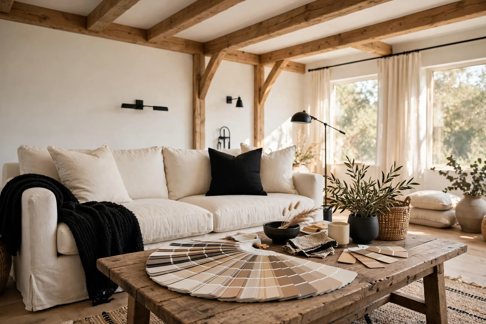
If you’ve researched paint colors for more than an hour, you’ve noticed something: Sherwin-Williams colors dominate the conversation. Designers name them like colleagues. Color consultants build whole businesses around comparing them. Yet the library behind all that talk, roughly 1,700 colors, organized by families, numbers, and reflectance values, is rarely explained. This guide is the orientation you were never given: how the SW color system works, which colors people actually use and why, how it compares to Benjamin Moore, and how to turn any of it into a whole-home palette.
Why Sherwin-Williams became the default language of paint
Every industry has a lingua franca, the shared vocabulary that lets professionals talk to each other without translation. In American residential paint, that vocabulary is Sherwin-Williams color names. Say “Agreeable Gray” or “Alabaster” to any designer, painter, or color consultant and you’re understood instantly. It’s not that other brands lack good colors. It’s that SW’s colors became the reference points everything else gets compared to.
There are practical reasons for that. Sherwin-Williams runs thousands of company stores in the US, so their colors are easy to buy and easy to match. Their library leans heavily toward livable neutrals, warm whites, greiges, soft beiges, the colors most homeowners actually want on their walls. And their naming-and-numbering system is simple enough to carry in your head: a name you can remember plus a number you can look up.
That last point matters more than it sounds. When your painter, your designer, and your mother-in-law all say “Alabaster,” you know exactly which color is meant. A brand whose colors can be discussed by name has a structural advantage over one whose colors can only be described. This guide assumes you’ll work within that shared language, while keeping the independence to cross-reference everything.
How the SW system works: families, numbers, and LRV
Sherwin-Williams organizes its roughly 1,700 colors the way a library organizes books, by section. Understanding the sections is the difference between browsing 1,700 colors and browsing 30.
Color families. In stores, the ColorSnap display groups colors by family: reds, oranges, yellows, greens, blues, purples, plus dedicated sections for whites and neutrals. Each family panel shows colors arranged from saturated to neutral, so you can see at a glance whether you want a color with presence or one that whispers. For whole-home palettes, nearly all the action happens in two families: whites and neutrals (the grays, greiges, beiges, and taupes). That alone eliminates roughly 80% of the library.
Names and numbers. Every SW color has both: “Alabaster SW 7008.” The name is for conversation; the number is for precision. Paint is mixed by formula, not by name, two colors with similar names can be very different, but the number is unique. Always carry both when you talk to a paint counter. In practice, neighboring numbers often sit near each other on the fan deck, so a color’s number neighborhood is a decent clue to its family, but the chip itself is the authority, not the digits.
LRV, Light Reflectance Value. Each SW chip carries an LRV: a number from 0 (absolute black) to 100 (pure white) that measures how much light the color reflects. Higher means lighter and more reflective; lower means darker and more absorbing. This is the single most useful number on any paint chip, because it tells you the color’s true lightness, independent of your screen, your store lighting, or the chip’s size. A “warm white” with an LRV in the high 80s will feel bright and airy; a greige in the low 60s will read as a mid-tone with real presence. Designers consistently use LRV bands to shortlist colors for dim versus bright rooms, and our LRV guide shows how to apply those bands room by room.
The fan deck. SW’s ColorSnap fan deck is the portable version of the whole system, every chip, organized by family, with name, number, and LRV on each. Professionals carry it to job sites; serious homeowners can buy one. It’s the fastest way to compare colors side by side under identical conditions, and it’s far more reliable than a phone screen.
The 15 Sherwin-Williams colors designers actually use
Out of 1,700 colors, the professional conversation keeps circling back to a remarkably short list. These are the colors that appear again and again in designer portfolios, color-consultant roundups, and whole-home palettes, not because they’re trendy, but because they solve real rooms reliably. All character descriptions below are designer-reported; your light decides whether any of them is right for you.
The whites
Alabaster SW 7008. The warm white that built a thousand farmhouses. Soft, creamy, forgiving, it glows against oak floors and warms up north-facing rooms. Designers call it when they want white that reads as warm rather than stark. Pairs with warm greiges like Accessible Beige and with real black accents.
Pure White SW 7005. The neutral white, not warm, not cool, just clean. Designers reach for it when a client wants white without a temperature commitment, and it’s one of the most-used trim whites in the library. Against warm walls it reads crisp; against cool walls it reads soft. That chameleon quality is its superpower and its caution: judge it next to your actual wall color, never alone.
Snowbound SW 7004. A white with a soft gray lean, slightly cooler and more modern than Alabaster. Designers report it as the answer for people who find Alabaster too creamy but Pure White too bright. Best in bright rooms; in dim north light it can read a touch gray, which some love and some don’t.
Shoji White SW 7042. A warm off-white with a faint greige undertone, the “white that isn’t quite white.” Designers use it as a whole-house anchor in homes that want warmth without going full beige. It sits beautifully between Alabaster and Accessible Beige, and it’s forgiving across light conditions.
The greiges and grays
Agreeable Gray SW 7029. The single most-cited SW color in the design world, full stop. A warm greige that lands in the sweet spot: warm enough for oak floors, neutral enough for gray tile, light enough for dim rooms. Designers report it as the color they reach for when a client wants “a greige that just works.” Its known quirk: in certain lights it can flash faintly blue-purple, test before you commit, especially in north rooms.
Repose Gray SW 7015. The cooler counterpart, a true light gray with a faintly cool lean. Designers pair it with white trim and cool finishes: marble, gray tile, chrome. It’s the color of calm, modern spaces. Its caution: in dim rooms it can go cold, so designers often steer north-facing clients toward Agreeable Gray instead. (Our Repose vs. Agreeable head-to-head settles this exact choice.)
Worldly Gray SW 7043. The deeper, warmer greige, Agreeable Gray’s moodier sibling. Designers use it where they want more presence: dining rooms, home offices, bedrooms that should feel enveloping. It carries a warm, earthy undertone that loves lamplight and wood tones.
Dorian Gray SW 7017. A mid-tone warm gray, deeper than Repose, cooler than Worldly. Designers report it as a favorite for rooms that need definition without drama: powder rooms, laundry rooms, media rooms. It holds its own against white trim and reads as intentional rather than default.
The warm neutrals
Accessible Beige SW 7036. The warm greige that keeps up with Agreeable Gray in designer portfolios. Slightly deeper and warmer than Agreeable Gray, with a beige heart that flatters wood floors and traditional architecture. Designers call it the farmhouse-and-craftsman answer, warm, grounded, hard to get wrong.
Natural Linen SW 9109. A pale, airy warm neutral, lighter than Accessible Beige, softer than Shoji White. Designers describe it as linen in paint form: textured-feeling, calm, quietly warm. A favorite whole-house anchor for people who want warmth but find beige too heavy.
Divine White SW 6105. A creamy warm white with a pink-beige undertone. Designers use it in traditional homes where everything skews warm, cream tile, honey oak, brass. Its pink lean is its personality and its risk: test it against white paper and in your own light, because pink undertones amplify at wall scale.
The depth and accent colors
Sea Salt SW 6204. The beloved blue-green-gray, soft, coastal, calming. Designers report it as the most-used color accent in the library: bathrooms, bedrooms, laundry rooms, kitchen islands. It shifts with light (grayer in dim rooms, greener in bright ones), which is part of its charm and the reason to test it everywhere you plan to use it.
Iron Ore SW 7067. The soft black, a charcoal with a warm lean that’s gentler than pure black. Designers use it on kitchen islands, interior doors, shutters, and the occasional accent wall. It gives the graphic punch of black without the harshness, and it flatters warm neutrals the way true black sometimes doesn’t.
Tricorn Black SW 6258. The true black, deep, neutral, definitive. Designers reach for it for front doors, shutters, and trim accents where they want maximum contrast. One rule governs it: black needs a reason, a door, an island, a frame. Floating black without architecture behind it reads as random.
Urbane Bronze SW 7048. The dark, earthy bronze-gray that was SW’s Color of the Year a few seasons back. Designers use it where they want moody depth with warmth: studies, dining rooms, powder rooms, exteriors. It pairs beautifully with warm whites and brass, and it’s the color that makes a room feel like evening.
| Color | Code | Family | Best for | Watch out for |
|---|---|---|---|---|
| Alabaster | SW 7008 | Warm white | Farmhouse walls, north rooms, oak floors | Can read creamy in bright south light |
| Pure White | SW 7005 | Neutral white | Trim everywhere, modern walls | Judge next to your wall color, not alone |
| Snowbound | SW 7004 | Cool-leaning white | Bright rooms, modern trim | Can read gray in dim north light |
| Shoji White | SW 7042 | Warm off-white | Whole-house anchor, transitional homes | Deeper than it looks on the chip |
| Agreeable Gray | SW 7029 | Warm greige | The safest whole-house neutral in the library | Can flash blue-purple in some lights |
| Repose Gray | SW 7015 | Cool light gray | Cool finishes, marble, modern spaces | Can go cold in dim rooms |
| Worldly Gray | SW 7043 | Warm greige, deeper | Dining rooms, offices, enveloping bedrooms | Needs light to show its warmth |
| Dorian Gray | SW 7017 | Warm mid-tone gray | Powder rooms, laundry, media rooms | Reads darker than the chip suggests |
| Accessible Beige | SW 7036 | Warm greige-beige | Farmhouse, craftsman, wood floors | Warmer than Agreeable Gray, know which you want |
| Natural Linen | SW 9109 | Pale warm neutral | Airy whole-house anchor | Very subtle, can wash out in bright light |
| Divine White | SW 6105 | Pink-beige white | Traditional homes, warm tile | Pink undertone amplifies at wall scale |
| Sea Salt | SW 6204 | Blue-green-gray | Baths, bedrooms, islands | Shifts with light, test in every room |
| Iron Ore | SW 7067 | Soft black | Islands, doors, shutters | Softer than black, don’t expect Tricorn |
| Tricorn Black | SW 6258 | True black | Front doors, maximum contrast | Needs an architectural reason |
| Urbane Bronze | SW 7048 | Dark bronze-gray | Studies, dining rooms, moody accents | Swallows light, not for dim rooms |
Sherwin-Williams vs. Benjamin Moore: the honest comparison
Every paint conversation eventually becomes this argument. Here’s the version without the tribalism.
Color libraries. Both brands publish deep, professional-grade libraries organized by family with LRV data on every chip. Sherwin-Williams’ library skews toward approachable, livable neutrals with memorable names that make colors easy to discuss, which is a genuine practical advantage when you’re coordinating with a painter. Benjamin Moore’s library is larger and leans more complex: richer historic colors, more nuanced off-whites (White Dove, Simply White), and deeper saturated options. Neither library is “better”, they’re tuned differently, and many designers happily use both.
Selection tools. SW’s ColorSnap system (in-store displays, fan deck, visualizer app) organizes colors by family with saturation gradients, it’s built for narrowing down. BM’s tools emphasize curated palettes and historic collections. Both are starting points, not decision-makers: no app replaces a physical sample in your room.
The practical difference for homeowners. In practice, the SW-vs-BM question usually resolves into a color question, not a brand question. If the color you love lives in SW’s library, buy SW. If it lives in BM’s, buy BM. Cross-brand color matching exists, but matching is never perfect, a matched color is a new color, and it should be tested like one. Our cross-brand comparison guides handle the famous matchups one pair at a time.
The one real structural difference. Sherwin-Williams sells primarily through its own stores, which means consistent mixing and easy reordering, your color formula is on file at any SW store. Benjamin Moore sells through independent retailers, which means the experience varies by dealer but often comes with more personalized service. Neither is universally better; they suit different temperaments.
Building a whole-home system from SW colors
Fifteen good colors don’t make a palette, a structure does. Here’s how the SW shortlist maps onto the five roles of a whole-home system:
Anchor neutral: Agreeable Gray, Accessible Beige, or Natural Linen across the main living areas and hallways. These are the workhorses, light enough for dim rooms, warm enough for oak floors, neutral enough to repeat everywhere.
Supporting colors: Repose Gray or Worldly Gray for bedrooms and offices (same undertone family as your anchor, warm with warm, cool with cool), Shoji White or Divine White for secondary spaces that want softness.
Trim white: Pure White or Alabaster on every trim, door, and ceiling. One white, everywhere, no exceptions. Compare it directly against your anchor, you want enough contrast to read as trim, not so much it looks stark.
Deep accents: Iron Ore or Tricorn Black on the kitchen island, interior doors, or front door; Sea Salt in the powder room or laundry; Urbane Bronze in the study or dining room. One deep color per sightline.
Notice the pattern: the system uses five or six colors total, all from the shortlist, all in one undertone family. That’s not a limitation, it’s the discipline that makes whole homes feel designed instead of decorated. For the full method behind this structure, see how to choose a whole-home palette.
Want the system without building it yourself?
The Whole Home Paint Guide is a complete Sherwin-Williams color system, every room mapped, trim and ceiling pairings included, undertones already coordinated, so you skip the shortlisting and go straight to a house that feels finished. (Independent guide; not affiliated with or endorsed by Sherwin-Williams.)
Choosing and testing: chips, apps, and sample pots
Knowing the library is half the battle. The other half is testing correctly, because every tool in the SW system has limits.
Fan-deck chips are for shortlisting, not deciding. They’re accurate to the formula, but a two-inch chip can’t show you scale, light, or context. Use the deck to narrow 1,700 colors to three finalists. The white-paper test works on chips too: hold any chip against true white paper in daylight and the undertone announces itself.
The ColorSnap visualizer is useful for one thing: seeing a color at wall scale before you buy samples. It’s genuinely helpful for ruling colors out. But phone screens shift color, room photos have their own lighting baked in, and the app can’t show you your evening lamplight. Treat it as a sketch, not a preview.
Sample pots are the decision tool. SW sells small sample sizes, buy your three finalists, paint large boards with two coats in your actual finish, and live with them for 48 hours: morning, midday, evening, and lamplight, next to your fixed finishes. Judge every candidate in the room’s worst light. The full protocol is in how to test paint samples.
Frequently asked questions
By every designer roundup and usage report, Agreeable Gray SW 7029 is the most-cited SW color, a warm greige that works across light conditions and fixed finishes. Alabaster SW 7008 and Accessible Beige SW 7036 round out the top tier. “Most used” doesn’t mean “right for you,” though, test in your own light before committing.
The number (as in SW 7029) is the color’s unique identifier, paint is mixed by formula, and the number is how the counter finds it. Neighboring numbers often sit near each other on the fan deck, which hints at the color family, but the chip itself is the authority. Always carry both the name and the number to the store.
Warm. Alabaster SW 7008 is a warm white with a soft, creamy lean, it glows in north-facing rooms and flatters oak floors. If you want white without that warmth, designers point to Pure White SW 7005 (neutral) or Snowbound SW 7004 (slightly cool-leaning) instead. Our warm vs. cool white guide covers the full decision.
Choose the color, not the brand. SW’s library skews toward approachable neutrals with easy-to-discuss names; BM’s is larger with more complex historic and off-white options. If the color you love is a SW color, buy SW. Cross-brand matching is never exact, a matched color is a new color and should be tested like one.
LRV runs 0 (black) to 100 (white) and measures how much light the color reflects, it’s printed on every SW chip. Higher means lighter and more reflective. Use it to compare the true lightness of two colors and to shortlist by room brightness. But LRV says nothing about undertone, so always check the color’s temperature separately. See what LRV means for your rooms.
Three reasons: scale (undertones amplify across a whole wall), light (store fluorescents are cooler and flatter than home light), and context (your floors, furniture, and trim all vote). This is normal and expected, it’s why designers never choose from chips alone. Buy sample pots, paint large boards, and test for 48 hours in your own light.

