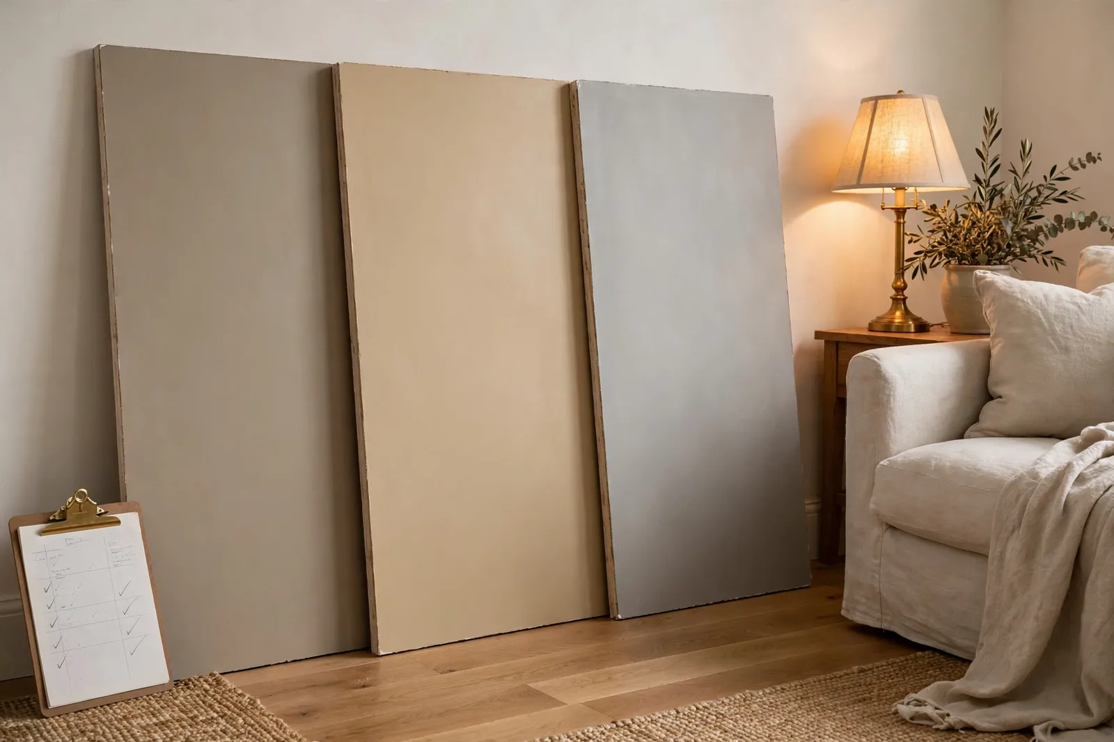
Three Sherwin-Williams neutrals show up in nearly every “which paint color?” conversation in America: Agreeable Gray (SW 7029), Accessible Beige (SW 7036), and Repose Gray (SW 7015). They live next to each other on the fan deck, they appear in the same room photos, and they get confused constantly, because on a two-inch chip, in store lighting, they really do look similar. On your wall, in your light, next to your floors, they are three distinct personalities. This is the three-way showdown that settles it: each color’s true character, head-to-head comparisons by warmth, depth, undertone, and light, the finish-pairing test that catches most mismatches, and a decision framework so you can choose with evidence instead of anxiety. Color shifts with lighting, screen settings, and surrounding finishes, so always test a large physical sample in your own space before committing, on-screen swatches are approximations. The Global Abode is an independent publication, not affiliated with or endorsed by Sherwin-Williams; all color names and codes are referenced as widely-known designer examples.
Key takeaway: These three are a warmth staircase: Accessible Beige is the warmest and most beige (earthy, cozy, with a whisper of green grounding); Agreeable Gray is the true greige middle, balanced gray-beige warmth that made it famous; Repose Gray is the lightest and coolest of the three, a warm gray with a faint blue thread. For whole-house use, Agreeable Gray is the safest default; for warmth that flatters wood floors and traditional furnishings, Accessible Beige; for a crisper, more modern read, Repose Gray. Undertones below are widely-discussed designer observations from real homes, not exact manufacturer specifications, and nothing replaces a painted sample board viewed in your own light.
Why These Three Are the Most-Confused Trio in Paint
No three paint colors generate more “which one?” threads than this trio. Part of the reason is Sherwin-Williams’ own design: all three sit in the same warm-neutral family, all three are light-to-mid in depth, and all three were engineered for the same job, the agreeable, whole-house neutral that offends nobody and coordinates with everything. They are siblings, and siblings get confused.
But the deeper reason is the chip problem. Paint chips are viewed at thumbnail scale under bright, balanced store lighting, held against nothing. At that scale, the differences between these three, a thread of green here, a whisper of blue there, one step of depth between them, are nearly invisible. It is only at wall scale, in your home’s actual light, against your actual floors and furniture, that the differences announce themselves. That is when the forum posts start: “My Accessible Beige looks tan,” “My Agreeable Gray looks blue,” “My Repose Gray looks flat.” None of those painters chose wrong colors, exactly, they chose without enough information about how each color behaves in place.
There is also a history angle. These three became famous in sequence, riding the same wave of taste. Agreeable Gray became the poster color of the greige era, the one everyone asked for by name. Accessible Beige rose as the answer for people who found Agreeable Gray slightly too gray, or who wanted their neutral warmer. Repose Gray rose as the answer for people who wanted the same reliability with a cooler, more modern read. Each one exists partly as a response to the other two, which is exactly why comparing them directly is more useful than reviewing any one of them alone.
This guide compares them the way a color consultant would: character first, then the head-to-head tables, then light and finishes, the two forces that decide which one is right for your room, and finally a decision framework that turns the whole comparison into one clear answer.
Tip: The fastest way to feel the difference between these three is to pull large swatches of all three and line them up against a sheet of plain white printer paper in daylight. Against true white, Accessible Beige’s warmth shows immediately, Agreeable Gray’s balanced greige reads clearly, and Repose Gray’s cooler, lighter character separates from the pack. Thirty seconds, no painting required.
Each Color’s True Character: Three Deep Dives
Before the tables, meet each contender properly. Character is what survives every lighting condition, the personality that shows through morning and evening, north and south.
Agreeable Gray SW 7029, the famous one
Agreeable Gray is arguably the most-specified warm neutral of its generation, and its reputation is structural, not accidental. It is a true greige: it sits at the intersection of gray and beige with neither side dominating. Sherwin-Williams’ own color team describes it as blending the cool elegance of gray with a hint of warmth, and that “hint of warmth” framing is doing real work. Agreeable Gray is warm enough to feel soft and inviting in a way the cool grays of the early 2010s never were, but not so warm that it reads as beige. It is the diplomatic neutral.
Its undertone story is subtlety itself: a gray base with beige warmth and a touch of yellow that designers consistently report. In most lights it reads as exactly what its name promises, agreeable. But like all complex neutrals, it has its moments: in certain lights, some observers report a faint pink or blue tendency, never dominant, but visible if you are sensitive to it, and most often noticed in evening light or against strongly colored fixed finishes. This is the color’s honest caveat, and it is why sampling matters more for Agreeable Gray than its “safe choice” reputation suggests.
Where it wins: whole-house use, open-plan spaces, and rooms that need one neutral that coordinates with both warm and cool furnishings. Its middle-of-the-road warmth makes it the most flexible of the three, the color that asks the least of your light and your finishes. Designers reach for it when the client wants warmth without commitment, and when the house mixes warm woods with cool stones. It pairs naturally with blue and green accents, crisp white trim, and warm metals alike.
Accessible Beige SW 7036, the warm one
Accessible Beige is the warmest of the three, and the most beige, a warm greige that leans decisively toward the beige side of the family. Unlike the yellow-heavy builder beiges of the early 2000s, it carries a soft gray base and a whisper of green undertone that keeps it grounded and modern. That green thread is the color’s secret: it reins in the warmth just enough to keep Accessible Beige from going golden or muddy, and it is what separates it from every dated beige it gets compared to.
The green is subtle in most conditions, barely noticeable in balanced daylight, but it can surface in dim rooms or next to cool-toned flooring and countertops, where it occasionally reads as a faint green cast. This surprises people who expected pure beige warmth. It is also the deepest of the three colors: at wall scale it reads noticeably richer than the other two, which makes it the coziest of the trio but also the one most likely to feel heavy in a dark or north-facing room. In rooms with warm floors and natural wood furniture, it is spectacular, designers consistently call it out as one of the most reliable warm neutrals available, and one of the least likely to flash pink or purple.
Where it wins: living rooms, bedrooms, and dining rooms that want warmth to be felt, traditional, farmhouse, and transitional homes especially. It is the choice for the client who looked at Agreeable Gray and thought “I like it, but I want more warmth.” It flatters oak and walnut floors, warm granite, brass, and cream upholstery, the warm-boned house.
Repose Gray SW 7015, the modern one
Repose Gray is the lightest and coolest of the three, a warm gray rather than a true greige, with a faint blue thread that designers report as its defining undertone. That blue is what makes it read as the most “modern” of the trio: cooler, crisper, more composed. In bright daylight it can read close to a soft warm gray; in dim or north-facing light the cool side comes forward and it can feel slightly more serious than its siblings.
Its lighter value is both its asset and its constraint. It keeps rooms feeling bright and open, excellent for small rooms, hallways, and homes that want the gray-era airiness without the gray-era chill. But it also means less contrast against white trim, and less coziness at night: under warm lamplight it calms down nicely, but it never envelops the way Accessible Beige does. The blue undertone means it pairs best with cool-to-neutral finishes, gray tile, white quartz, stainless steel, cool woods, and it is the one of the three most likely to clash with strongly warm, golden finishes.
Where it wins: modern and transitional homes, rooms with cool fixed finishes, and anyone who wants the lightest, crispest version of this neutral family. It is the choice for the client who looked at Agreeable Gray and thought “I like it, but I want it cooler and brighter.”
Head to Head: Warmth, Depth, Undertone, Light, Finishes
Now the direct comparison, everything in one place, the way you will actually use it: standing in the paint aisle, or staring at three sample boards on your wall.
| Agreeable Gray SW 7029 | Accessible Beige SW 7036 | Repose Gray SW 7015 | |
|---|---|---|---|
| What it is | True greige, balanced gray-beige | Warm greige, leans beige | Warm gray, leans cool-gray |
| Warmth ranking | 2, middle warmth | 1, warmest | 3, coolest |
| Depth ranking | 2, mid-light | 1, deepest of the three | 3, lightest |
| Undertone | Gray base, beige-yellow warmth; can hint pink or blue in some light | Beige base, soft gray, whisper of green grounding | Gray base with a faint blue thread |
| Biggest surprise | Occasional faint pink/blue cast in tricky light | Faint green cast in dim rooms or next to cool finishes | Can read chilly or flat in north rooms |
| Best light | Any, the most light-forgiving | Warm rooms, south/west; needs decent light | Bright rooms; benefits from strong daylight |
| Best finishes | Mixed, warm woods and cool stones alike | Warm woods, warm granite, brass, cream textiles | Cool finishes, gray tile, white quartz, stainless |
| Trim partner | Warm white (Pure White, Alabaster) | Warm white (Alabaster, warm whites) | Cleaner white (Pure White, High Reflective White) |
| Personality | The diplomat, flexible, balanced, safe | The hug, warm, earthy, cozy | The minimalist, crisp, composed, modern |
Three pairwise notes that the table compresses:
Agreeable Gray vs. Accessible Beige is the most-asked duel, and the answer is warmth and depth. Accessible Beige is both warmer and a touch deeper, it reads as a richer, cozier neutral, while Agreeable Gray reads as the more balanced, more versatile one. Designers generally advise against using these two together in adjacent spaces: they are close enough to look like a matching mistake and different enough to clash at the edges. Pick one per sightline.
Agreeable Gray vs. Repose Gray is the temperature question. Repose Gray is lighter and cooler, the modern, crisper read, while Agreeable Gray is warmer and more enveloping. In a bright south-facing room the difference can be subtle; in a north-facing room it is unmistakable, with Repose Gray going cooler and Agreeable Gray holding its warmth. This is the pair where the room’s exposure makes the decision.
Accessible Beige vs. Repose Gray is the widest gap of the three, the warmest against the coolest, and the choice is usually obvious once samples are on the wall. Warm-boned house, traditional furnishings, evening coziness: Accessible Beige. Cool finishes, modern lines, bright airiness: Repose Gray. If you are torn between these two, you are really torn about the temperature of your whole home, and that is a useful thing to know.
Watch out: Do not use two of these three in adjacent rooms or on connecting walls. They are close enough in value that the eye reads them as “almost the same color”, and then punishes the difference. One neutral per sightline. If you want variation between rooms, change depth by two full steps (a genuinely lighter or darker color), not by switching between cousins.
The Light Test: North vs. South, Morning vs. Evening
These three are light-dependent neutrals, each one has a version of itself that shows up in the wrong exposure. Here is what designers report, direction by direction.
North-facing rooms (cool, indirect light): this exposure separates the trio most clearly. Agreeable Gray holds up best here, its beige warmth absorbs the cool cast and it stays composed. Accessible Beige is the riskiest north-room choice: without strong daylight, its depth can feel heavy and its green thread is most likely to surface. If you love it for a north room, warm your artificial lighting to 2700–3000K and test on the actual wall. Repose Gray is the cautionary tale for north rooms, cool light plus its faint blue undertone can push it toward flat or chilly. In north rooms, the ranking is: Agreeable Gray first, Accessible Beige with caveats, Repose Gray last.
South-facing rooms (bright, warm light): the sun does the warming work, so all three behave well, but watch the warm end. Accessible Beige in strong southern sun goes more golden and can read as tan rather than greige; beautiful if you want it, too much if you do not. Agreeable Gray is superb in south rooms, balanced, glowing, the version from the brochure. Repose Gray reads at its warmest and most flattering in southern light, which is why designers often recommend it as “the cool neutral that still works” in bright houses.
East and west rooms: east rooms swing from warm morning to cool afternoon, and all three handle the swing, Agreeable Gray most gracefully, Accessible Beige with a noticeable warm-to-neutral shift that most people enjoy. West rooms get the golden evening push: Accessible Beige’s warmth amplifies (test at 6pm, not noon), while Repose Gray’s blue thread can surprisingly sharpen at sunset against warm light. The evening check matters most for this trio.
Artificial light: warm 2700K bulbs flatter all three, they activate the beige in Agreeable Gray and Accessible Beige and calm Repose Gray’s cool edge. Cool daylight-balanced bulbs (4000K+) are the enemy of this family: they flatten the warmth and expose the gray-green-blue threads. If your home is full of cool LEDs, either change the bulbs or expect these colors to read cooler than you planned.
Tip: The single most predictive test for this trio is the evening check. Paint large boards, prop them on the actual walls, and look at them at 8pm under your real lamps. The “surprises”, the pink hint in Agreeable Gray, the green thread in Accessible Beige, the chill in Repose Gray, are all evening phenomena. If you love all three at 8pm, you will love your choice at every other hour.
The Finish-Pairing Test: Floors, Stone, and Furniture
Light decides the shortlist; finishes decide the winner. These three neutrals are famously finish-sensitive, because their undertones reveal themselves in contrast. Run your finalists against each fixed finish using the notes below.
Oak and warm wood floors: this is Accessible Beige’s home turf. Warm wood amplifies warm neutrals, and Accessible Beige’s beige-green base harmonizes with oak, walnut, and hickory instead of fighting them, designers consistently call this pairing out as one of the color’s strengths. Agreeable Gray also works beautifully with warm woods; its balanced warmth neither clashes nor disappears. Repose Gray is the careful one here: against honey-toned oak, its cooler character can look disconnected, like the wall belongs to a different house than the floor. If your floors are warm, the ranking is Accessible Beige, then Agreeable Gray, then Repose Gray.
Gray tile and cool stone: now the order flips. Repose Gray coordinates naturally with gray tile, white quartz, and cool marble, its faint blue thread is a feature, not a bug, in a cool-finished kitchen or bath. Agreeable Gray handles cool finishes well too, staying balanced rather than clashing. Accessible Beige is the risk: next to cool gray tile or white quartz, its warmth can look mismatched, and its green thread is most likely to surface. If your hard finishes are cool, lead with Repose Gray or Agreeable Gray.
Warm granite and busy stone: busy stone is the undertone lie detector. A granite with pink, gold, or rust movement will pull the matching thread out of your wall color, and this is exactly where Agreeable Gray’s occasional pink hint and Accessible Beige’s green thread get noticed. Hold large sample boards directly against your countertop and fireplace stone in both daylight and lamplight. The color that disappears calmly against your stone is the right one; the color that starts arguing with it is not.
Furniture and textiles: cream and ivory upholstery loves all three. Navy and deep green accents, the classic pairings for this neutral family, work with all three, though they read crispest against Repose Gray and coziest against Accessible Beige. Gray upholstery wants Repose Gray or Agreeable Gray; warm leather and cognac tones want Accessible Beige or Agreeable Gray. The rule: match the undertone temperature of your big, unchangeable pieces, and let the small things follow.
The Decision Framework and the Sampling Protocol
Everything above compresses into a decision you can make in five questions:
1. What temperature is your house? Warm bones (oak floors, warm granite, brass, traditional furnishings) → Accessible Beige or Agreeable Gray. Cool bones (gray tile, white quartz, stainless, modern lines) → Repose Gray or Agreeable Gray. Mixed → Agreeable Gray, which is built for exactly this.
2. What is your worst light? Dim north rooms → Agreeable Gray (safest), Accessible Beige only with warm lighting and a real test. Bright south rooms → any of the three; choose by desired warmth.
3. How much warmth do you actually want to feel? Cozy and enveloping → Accessible Beige. Balanced and flexible → Agreeable Gray. Crisp and bright → Repose Gray.
4. Whole house or one room? For whole-house flow, Agreeable Gray is the most forgiving single color, it asks the least of varying light from room to room. Accessible Beige works whole-house in warm, well-lit homes. Repose Gray works whole-house in bright, modern homes.
5. Which surprise can you live with? Every complex neutral has one. Agreeable Gray’s is the occasional pink/blue hint in tricky light. Accessible Beige’s is the faint green thread in dim rooms. Repose Gray’s is the cool flatness in weak light. Choose the color whose worst day you can tolerate, because you will see its worst day.
Then the sampling protocol, five steps, because this trio is the most sample-dependent decision in the neutral family:
1. Narrow to two finalists using the framework above. Do not sample all three at full scale, the comparisons blur and decision fatigue sets in.
2. Paint large boards (2×2 feet minimum), two coats, in your actual sheen. Prop them on the real walls, one on the brightest wall, one on the darkest.
3. Check at four moments: morning, midday, late afternoon, and 8pm under your evening lamps. The evening check is the one that predicts regret.
4. Hold each board against your fixed finishes, floors, counters, stone, the sofa. Undertone clashes show up against finishes, not against white board.
5. Photograph from across the room. Cameras exaggerate undertones, the green thread or pink hint your eyes adapt to will jump out in a photo, which tells you what guests will notice before they adapt.
For the full method, our guide to testing paint samples walks through every step.
Choosing between finalists? Work through it methodically.
The Paint Color Workbook includes side-by-side comparison worksheets, undertone-testing pages, and a room-by-room sampling checklist, so the decision between these three happens with evidence in your own light, not in the paint aisle. And the Whole Home Paint Guide gives you a complete color system, every room mapped, trim and ceiling pairings included, so the whole house stays coordinated once you have chosen.
Frequently asked questions
Accessible Beige is the warmest, it leans beige with an earthy, grounded warmth. Agreeable Gray is the middle: a balanced warm greige. Repose Gray is the coolest of the three, a warm gray with a faint blue thread. If warmth is the goal, the ranking is Accessible Beige, Agreeable Gray, Repose Gray, no contest.
Agreeable Gray, its beige warmth absorbs cool north light and it stays composed where the others struggle. Accessible Beige can work in a north room with warm 2700–3000K lighting and a real in-place test, but its depth can feel heavy and its green thread may surface. Repose Gray is the riskiest north-room choice; cool light plus its faint blue undertone can read flat or chilly. See how light changes paint color for the full orientation guide.
Agreeable Gray, for most homes, it is the most light-forgiving and the most finish-flexible, which is what a whole-house color needs as it travels through rooms with different exposures and finishes. Accessible Beige works whole-house in warm, well-lit homes with warm finishes. Repose Gray works whole-house in bright, modern homes with cool finishes. Our whole-home palette guide shows how to build the full system around your anchor.
They are close cousins, not twins. Revere Pewter is a touch deeper and more complex, with a green-leaning base that can occasionally flash mauve; Agreeable Gray is generally lighter and a bit more straightforward in its warmth. Designers describe Revere Pewter as having more “movement” through the day, while Agreeable Gray stays more consistent. Do not use them together in adjacent spaces, they are similar enough to clash. Our cross-brand comparison guide covers the famous pairs in detail.
Yes, it is a popular cabinet color in warm kitchens, especially with warm wood floors and natural stone. Use a dedicated cabinet enamel in satin or semi-gloss, and test it against your countertop first: its warmth and faint green thread need to agree with your stone. In kitchens with cool gray tile or white quartz, Agreeable Gray or Repose Gray are usually safer cabinet choices.
Not in adjacent sightlines, they are close enough to read as a matching mistake. Pick one as your main neutral per connected space. If you want variety across a house, use your chosen neutral in most rooms and bring in genuinely different colors (a deep accent, a soft white, a muted green) for contrast, rather than swapping between cousins. Our undertones guide explains why near-neighbors clash and true contrasts work.

