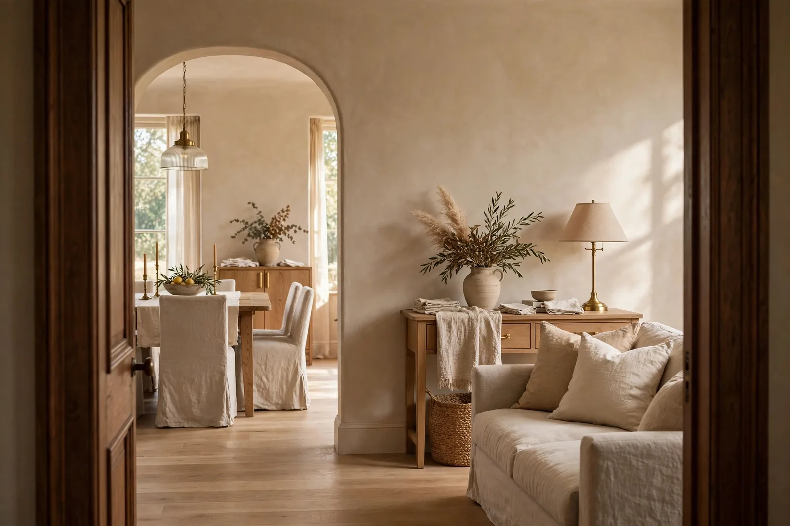
You can feel color flow before you can name it. Walk into one home and every room belongs to the next, the hallway hands you to the living room, the living room hands you to the kitchen, and the whole house reads as one calm thought. Walk into another home and each room is a fresh argument: the blue-gray living room fights the yellow kitchen, the pink hallway ambushes the green bedroom, and the house feels like a playlist on shuffle. Nothing about the rooms individually is wrong. What is missing is the invisible design layer that designers call color flow, the system that makes many rooms read as one home. This guide gives you that system: the undertone-family backbone, the sightline method for testing any transition, the rooms that exist only to connect, and the two rules that prevent nearly every clash. Paint colors shift with lighting, surface, and sheen, so always test large physical samples in your own spaces before committing, screen swatches are approximations. The Global Abode is an independent publication, not affiliated with or endorsed by Sherwin-Williams or Benjamin Moore; all color names and codes are referenced as widely-known designer examples.
Key takeaway: Color flow is the agreement between rooms, not the sameness of them. It comes from three disciplines: keeping every wall in the home inside one undertone family (temperature constancy), testing every color against what is visible through the doorways (the sightline method), and giving transition spaces, hallways, stairs, landings, a deliberate bridging role instead of leftover color. Rooms can change in depth and mood; they should not change temperature. Undertone notes below are widely-reported designer observations, not exact manufacturer specifications.
What Color Flow Is: The Invisible Design Layer
Color flow is not a paint color. It is the relationship between paint colors, the reason some homes feel effortless and others feel exhausting, even when every individual room looks fine on its own. Think of it as the grammar of your home’s color: any one sentence can be beautiful, but if the sentences don’t agree with each other, the paragraph doesn’t work.
The homes that feel calm and put-together are rarely the ones with the most restrained palettes. A house can carry real color, deep navy, forest green, warm clay, and still feel perfectly calm, provided the colors agree with each other. And a house painted entirely in neutrals can feel chaotic if those neutrals argue: a cool gray next to a yellow-beige, a pink-white trim against a green-gray wall. Flow is not about being boring. It is about being deliberate. The eye relaxes when it senses intention, and it tenses when it senses accidents.
This is the first thing to internalize: flow is felt, not seen. Nobody walks into a house with good color flow and thinks “what excellent undertone-family constancy.” They think the house feels calm, or expensive, or restful, they attribute it to the furniture, the architecture, anything but the invisible agreement between the wall colors. And nobody walks into a house with broken flow and thinks “the temperature swapped between rooms.” They think the house feels restless, or small, or dated. The feeling is real; the cause is color relationships.
The good news is that flow is a system, not a talent. It has rules you can learn, a test you can run, and two failure modes that explain nearly every clash you’ll ever see. A single afternoon with paint boards and an honest walk through your doorways will tell you more about your home’s flow than any inspiration board. That is this guide’s whole premise: the invisible layer, made visible and manageable.
Tip: Before choosing any room color, do the doorway tour: stand in every doorway of the house and photograph what you see. Those photos are your home’s actual color flow, not the rooms in isolation, but the rooms as they appear together. Any color that argues in the doorway photo will argue in person. Start the palette from the photos, not the paint deck.
Undertone Families as the Backbone: The Temperature Constancy Rule
Every wall color in your home belongs to an undertone family, the hidden hue that determines how it relates to every other color. Warm families carry yellow, gold, orange, red, or brown threads (warm whites, warm greiges, soft beiges, creams, warm tans). Cool families carry gray, blue, green-gray, or near-black threads (soft grays, cool whites, blue-grays, muted sages). Neutral families sit near the middle and can lean either way depending on the light (pale taupes, warm-gray blends, soft warm whites with quiet undertones).
Here is the single rule that governs whole-house flow: every wall visible in the same flow should belong to the same undertone family. Not the same color, the same family. A warm-white living room, a warm-greige hallway, a warm-beige bedroom: different colors, one temperature agreement, and the house reads as one thought. A warm-white living room, a cool-gray hallway, a pink-beige bedroom: the same house chopped into three temperature arguments, and the eye renegotiates at every doorway.
This is why the neutral-on-neutral home can still feel wrong. A cool gray wall next to a warm beige wall is not a contrast, it is a clash, because neither color intended it. And it is why the colorful home can feel right: a deep navy dining room, a warm greige living room, and a soft sage study can all belong to the same family logic if their undertones agree. Designers consistently describe this as the first and most important discipline of whole-house color: choose the temperature, then let the colors vary within it.
Practically, the backbone works like this. First, choose the family’s direction from the home’s fixed finishes, warm wood floors point warm, cool marble points cool, mixed finishes point to the dominant thread. Second, audition every candidate wall color against the family’s temperature, not against your affection for it alone. A color you love that belongs to the wrong family is not a compromise waiting to happen; it is the gear-change room in waiting. Third, hold the family through the connectors, the hallways, stairs, and landings carry the family’s temperature between rooms, which is why they exist in section 4.
The family rule also answers the most common flow question: can I have both warm and cool rooms? Yes, in closed rooms, where the door shuts and the sightline breaks. A warm living room and a cool-toned bedroom with a door between them do not need to agree, because the eye never sees them together. The family rule applies to flow, the connected spaces, the sightlines, the rooms that hand off to each other. Where the eye travels, the family must hold.
The Sightline Method: Test the Doorway, Not Just the Room
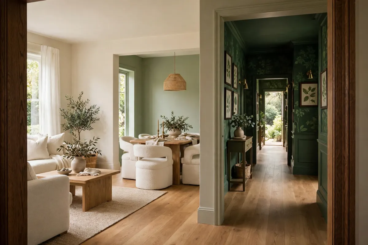
The biggest mistake in whole-house color is choosing colors room by room, each one perfect in isolation, each one wrong in sequence. The sightline method fixes this by changing what you test: not the room, but the view. Stand in each room’s brightest spot and read what is visible through every doorway and archway. Whatever you can see from there belongs to one composition, and it must agree as one composition.
The method is simple and merciless. Stand in the living room, usually the home’s brightest main space, and look. The kitchen wall you can see through the opening, the hallway beyond it, the dining room through the arch: all of those walls are part of the living room’s color story, whether you chose them together or not. Now move to the kitchen and look back. Walk the hallway and read both directions. Stand on the stairs and look down. Every sightline is a test, and every test asks the same question: do these colors belong to the same family, at depths that feel like a gradient rather than a gear change?
| Stand here | What to check |
|---|---|
| Main living space | Every wall visible through doorways, arches, and open-plan breaks, the master composition; temperatures must agree |
| Kitchen | The walls visible from the cook’s station and the dining sightline; backsplash and cabinet tones in the same view |
| Entry and foyer | The first impression sequence: entry wall plus everything visible beyond it, this sets the house’s color promise |
| Hallway, both directions | Do the rooms at each end belong to the same family as the hallway? The hallway is the bridge, not an afterthought |
| Top and bottom of stairs | The vertical sightline: does the upstairs palette read as the same house as downstairs, one landing away? |
| Primary bedroom doorway | The bedroom can shift mood and depth, but its temperature should still greet the hallway politely |
| Open-plan junctions | Where living meets dining meets kitchen with no walls at all, one shared temperature, depth changes only |
Two practical notes make the method work. First, test with boards in the doorways, not chips in your hand. Paint large boards (2×2 feet minimum) for each room’s candidate color, prop them in the actual doorways, and stand back at the vantage points above. The transition you see between the boards is the transition the house will have. If one room’s board makes the neighboring board look different, more orange, more pink, more gray, that room’s undertone is off, and no amount of loving the color in isolation changes that. Second, judge in the light that the sightline lives in. The brightest room’s light washes into the dimmer rooms beyond it; test the boards together in morning, midday, and evening light, because a transition that agrees at noon can argue at 8pm.
Watch out: The most skipped step in whole-house color is the evening sightline check. Warm lamplight (2700–3000K) amplifies warm undertones and wakes up red threads in wood floors and trim, and it does this differently in each room, depending on the bulbs and the exposure. A warm-white living room and a warm-greige hallway that agree beautifully at midday can drift apart at night if one has warm bulbs and the other has daylight-balanced ones. Match your bulb temperatures across connected spaces (2700–3000K everywhere is the safe default), then run the sightline test at 8pm. The house you live in at night is the house you actually live in.
Transition Spaces: Hallways, Stairs, and Landings as Bridges
Hallways, stairs, and landings are the most under-designed spaces in the house, treated as leftover wall between the “real” rooms, painted in whatever was convenient. In a color-flow framework, they are the opposite of leftover: they are the bridges, the rooms whose entire job is to carry the eye from one space to the next without a jolt. Give them that job deliberately and the whole house gets calmer.
Hallways want the family’s anchor neutral, the calmest, quietest version of the home’s temperature direction. In warm homes, a warm white or warm greige; in cool homes, a soft gray or cool white. The hallway is seen from everywhere and dwelled in nowhere, so it should never be the loudest color in the house. Its job is to make every room it touches feel like it belongs: a hallway in the anchor neutral gives the eye a resting place between a deeper living room and a softer bedroom, and the transition reads as a gradient rather than a gear change. The hallway failure is the orphaned color, a hallway painted a bold or unrelated shade because someone wanted “interest” in a boring space. A hallway’s interest comes from art, runners, and light; its color should be the calmest in the house.
Stairs and stairwells carry the palette vertically. The stairwell is a single tall room that connects two floors, and it should be painted as one room, the anchor neutral carried all the way up, so the eye travels the height without interruption. The mistake is splitting the stairwell: one color downstairs, another upstairs, with a visible seam at the landing. That seam is a gear change the eye hits every time it climbs. If you want drama in a stairwell, put it in the runner, the art, the light fixture, and keep the walls constant. The constant wall is what lets upstairs and downstairs read as the same house.
Landings are the exhale between floors, small, visible from two directions, and often the brightest spot in the upper hallway. Treat a landing like a hallway, not like a room: the anchor neutral, maybe a half-step lighter to reward the light, and let the doors off it carry the personality. A landing that matches the hallway above it makes the whole upper floor feel like a continuation; a landing in a different color makes the upper floor feel like a separate apartment.
One more transition space people forget: the ceiling and trim through the connectors. One trim white carried through the whole house, chosen to agree with the family’s temperature, is the frame around every transition. Hallways and stairs touch the trim more than any room does (baseboards, handrails, door casings, crown), so a single constant trim color through all of them multiplies the bridge effect. The eye reads the trim as the house’s handwriting; keep the handwriting consistent and the sentences can vary.
For the deeper method on using connectors as palette tools, our color flow guide for open-concept homes covers the connector discipline in full, and our whole-home palette guide walks through choosing the anchor neutral those connectors carry.
Depth Changes vs Temperature Swaps: Step, Don’t Swap
Here is the distinction that separates intentional flow from accidental clash: rooms can change in depth, but they should not change temperature. A living room in a warm greige and a bedroom in the same warm greige two steps deeper is a step, the eye glides, the family holds, the house feels designed. A living room in a warm greige and a bedroom in a cool blue-gray is a swap, the eye jolts, the family breaks, and the doorway between them becomes a small argument. Steps are how rooms get personality within flow. Swaps are how flow dies.
The step is the workhorse of whole-house color. Nearly every successful palette is built from one family’s tints and shades: the anchor neutral on the main level, a half-step lighter in the bedrooms for airiness, a step deeper in the study or dining room for intimacy, the same family on the island or the built-ins for punctuation. The temperature stays constant, warm stays warm, cool stays cool, while the depth does the expressive work. This is why designers can paint a den deep and moody without breaking the house: the deep color is the family’s own dark, not a visitor from another family.
The swap is the failure, and it usually happens by accident. Someone falls for a cool gray bedroom while the house runs warm; someone paints the office a blue-gray because the inspiration photo was beautiful; someone chooses the powder room color from a different palette entirely. Each room is lovely alone. Together, they are a playlist on shuffle. The test is the doorway: stand in the hallway and look at the two rooms’ boards together. If the difference reads as depth, lighter, deeper, same temperature, it is a step. If it reads as temperature, warmer, cooler, a different hue family, it is a swap, and the room needs a family-compliant alternative.
Two refinements make stepping work harder. First, keep the steps small in open sightlines and let them grow behind doors. Rooms visible together, open plan, wide doorways, arches, want half-steps and single steps: gentle depth differences the eye reads as a gradient. Rooms with doors, bedrooms, offices, powder rooms, can take two-step and three-step changes, because the door breaks the sightline and the eye resets. Depth is a dial; the sightline sets the range. Second, let sheen do quiet stepping. The same color in eggshell on the walls, satin on the trim, flat on the ceiling reads as a subtle depth shift with zero temperature change, the calmest possible variation, and a useful one for rooms that need to feel distinct without leaving the family.
Building one palette for the whole house, not just one room?
The Whole Home Paint Guide is a complete, ready-to-use color system, anchor neutrals, stepped supporting colors, trim and ceiling pairings, accent colors, all with undertones already coordinated, so your rooms step in depth without swapping temperature. And the Paint Color Workbook includes the sightline checklist, undertone-family worksheets, and a room-by-room sampling plan for testing every transition with evidence, not guesswork.
Flow Failures: The Gear-Change Room and the Orphaned Accent
Nearly every broken-flow home has one of two failures. Learn to recognize them and you can diagnose any house in a single doorway tour.
Failure 1: The gear-change room. This is the room that belongs to a different undertone family than the rest of the flow, the cool blue-gray bedroom off a warm hallway, the yellow-beige kitchen visible from the cool-gray living room, the pink-white laundry room glaring through the mudroom. It is always the same story: the room was chosen in isolation, loved in isolation, and never tested against its neighbors. The fix is never to repaint the whole house to match the room, it is to bring the room into the family. Find the room’s depth and mood, then re-choose it inside the home’s temperature: the cool blue-gray bedroom becomes a warm slate or a muted warm blue-gray; the yellow kitchen becomes a restrained warm cream. Same personality, right family. The doorway test after the fix should read as a step, not a swap.
Failure 2: The orphaned accent. This is the bold color that appears exactly once, the navy island in a house with no other navy, the terracotta accent wall in a home that otherwise runs gray-green, the black front door with no black anywhere inside. An accent that appears once reads as a mistake; an accent that appears twice reads as a choice. The rule is simple: every accent gets at least one echo. The navy island gets navy pillows in the living room or navy art in the hallway. The terracotta wall gets a terracotta vase, a rug thread, a book spine. The echo does not need to be large, it needs to exist. Two appearances is the difference between “why is that there” and “this house has a navy story.”
The failures share a root cause: colors chosen without considering their neighbors. The gear-change room ignores the family; the orphaned accent ignores the echo rule. And both share a fix in the same direction, not fewer colors, but related colors. A house with six colors in one family flows better than a house with three colors in three families. Count families, not colors. Our guide to how many paint colors a house needs covers the counting method in detail.
One more failure worth naming, because it is the sneakiest: the slow temperature drift. This happens room by room, over years, the living room repainted a touch cooler, the kitchen a touch warmer, the hallway touched up in a slightly different white, until the house that once flowed has drifted into three families. Nobody chose the drift; time did. The cure is the doorway tour from section 1, done once with fresh eyes: photograph every sightline, lay the photos out in room order, and look for the drift. Then re-anchor: repaint the drifted rooms back into the family, one at a time, starting with the connectors.
Frequently asked questions
Step, don’t swap. In open plans with no walls to break the sightline, keep one undertone family across the whole space and let rooms differ in depth, the living zone a half-step deeper, the dining zone the anchor, the kitchen a half-step lighter, rather than in temperature. Zone with furniture, rugs, and lighting rather than with different wall families. The eye reads depth changes as intention; it reads temperature changes as accidents. Our open-concept color flow guide covers the zoning method in full.
The calmest version of your home’s undertone family, usually the anchor neutral itself. In warm homes, a warm white or warm greige; in cool homes, a soft gray or cool white. The hallway is seen from everywhere and dwelled in nowhere, so it should never be the loudest color in the house. Its job is to bridge: a hallway in the anchor neutral lets a deeper living room and a softer bedroom read as one continuous gradient instead of two separate statements.
Same family, not necessarily the same colors. The stairwell and landing are the bridge, carry the anchor neutral all the way up so the vertical journey never breaks, and then let the upstairs rooms step within the family: bedrooms a half-step lighter for airiness, a study a step deeper for intimacy. The rule is temperature constancy across the whole house; depth can shift floor by floor as long as the family holds through the connectors.
One for the flow, the connected spaces, sightlines, and open plan, with closed rooms allowed their own family behind a shut door. Count families, not colors: a house can carry six or seven colors in one warm family and flow beautifully, while three colors in three different families will feel chaotic. If you want a room to leave the family (a cool bedroom in a warm house, a bold powder room), give it a door and let the doorway be the boundary.
Yes, with two conditions. First, the accent room should still belong to the family’s temperature logic, a warm-navy or a muted navy with the right undertone reads as a step in depth, not a swap in temperature. Second, the accent gets an echo: navy appears once more somewhere in the flow, pillows, art, a rug thread, so it reads as a deliberate story rather than an orphan. Rooms with doors are the natural home for accents; the door lets the color be bold while the sightline stays calm.
Paint large boards (2×2 feet minimum) for each room’s candidate color, prop them in the actual doorways, and stand at the vantage points from the sightline checklist: the main living space, the entry, both hallway directions, top and bottom of the stairs. Judge the boards together in morning, midday, and evening light, the 8pm check under your actual lamps is the verdict. The transitions should read as a gradient, not a gear change. Our 48-hour sampling method walks through the full protocol.

