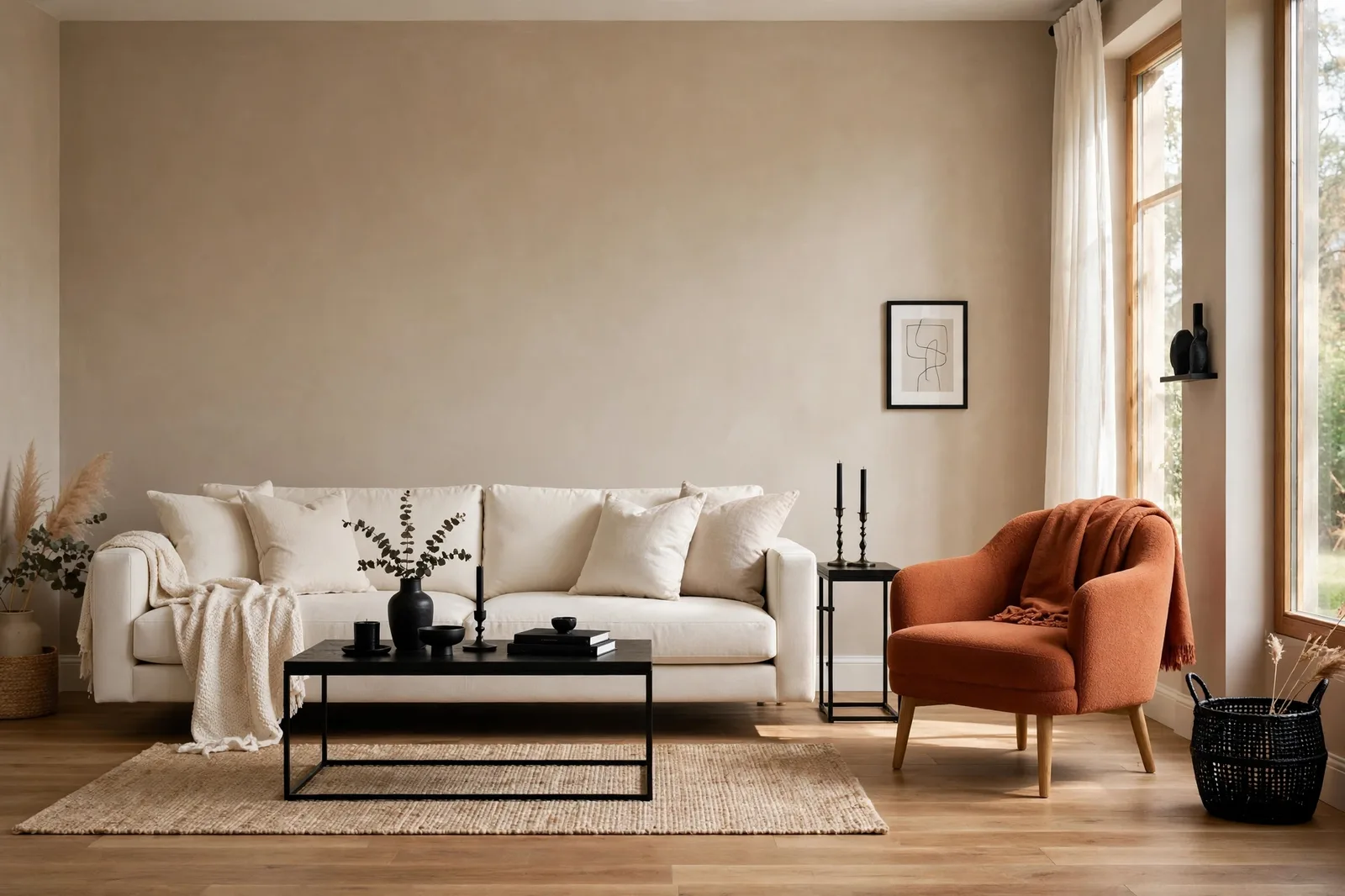
The 60-30-10 rule is the most repeated piece of color advice in interior design, and one of the most misunderstood. Most guides explain the percentages and stop there: 60% dominant, 30% secondary, 10% accent. But the percentages were never the hard part. The hard part is choosing which three colors, making them behave in an actual room, and knowing the moments when the rule itself is the wrong tool. Here’s the honest version.
What the 60-30-10 rule actually says
The rule is a distribution formula for color in a room: roughly 60% dominant color, 30% secondary color, 10% accent color. That’s the whole rule. Everything else is interpretation.
The 60% is the background of the room, the color that covers the largest surfaces. In most real homes, that’s the wall color plus the flooring plus the biggest pieces of furniture. Pick a neutral or a quiet version of your favorite color here; this is the canvas everything else sits on, and it has to be livable at scale.
The 30% is the supporting actor: area rugs, curtains, an accent chair, the sofa if the walls are doing the 60% job. It’s distinct enough to create depth and contrast against the dominant color, but related enough not to fight it. If the dominant is a warm white, the 30% might be a warm greige or a muted sage.
The 10% is the personality, the color that says “look here.” Throw cushions, artwork, a lamp base, a small stool, a vase. Used sparingly is exactly what makes it effective: a little of it reads as intention, a lot of it becomes a second dominant and the balance tips.
One point of honesty up front: nobody measures this. The numbers are a feeling, not a formula, you won’t be calculating square footage of sofa versus rug. The rule’s real value is the hierarchy it enforces: one clear lead, one clear support, one clear spark. When a room feels chaotic, it’s almost always because two or three colors are all trying to be the lead.
Why it works: visual weight, not magic numbers
The reason this particular ratio keeps getting repeated is that it mirrors how the eye actually processes a room. Visual weight, how much attention a color commands, isn’t just about area. It’s about area × saturation × contrast. A small patch of saturated color can outweigh a large field of neutral. The 60-30-10 split works because it assigns the most area to the least demanding color and the least area to the most demanding one, which keeps the eye comfortable.
This is also why the rule is really about balance and rhythm, two of the oldest principles in design. The dominant color is the calm background; the accent is the loud voice; the ratio stops the loud voice from taking over. And repetition does quiet work inside the 10%: an accent color repeated three times around a room, a cushion, a frame, a vase, creates a loop that pulls the eye around, which is a big part of what makes a room feel finished rather than staged.
It also explains the rule’s most useful property for beginners: it’s a training wheel. Learning color balance from scratch is overwhelming; the rule gives you one decision to make at a time (pick the 60%, then the 30%, then the 10%) instead of juggling everything at once. Breaking a rule on purpose and never having learned it are not the same thing, and rooms show the difference.
But the ratio has a blind spot, and it’s the reason this article exists: the rule tells you how much of each color to use, and says nothing about whether the colors belong together. Which brings us to the constraint almost no guide mentions.
The constraint most guides skip: undertones sit underneath the rule
Here’s the failure mode that derails more 60-30-10 rooms than any other: three colors in perfect proportion that quietly hate each other. A warm greige dominant, a cool blue-gray secondary, a warm brass accent, the ratios are textbook, the room still feels “off,” and nobody can say why. The reason is undertones.
Every color carries a hidden lean, warm (yellow, pink, beige) or cool (blue, gray, green). The 60-30-10 rule distributes quantity; undertones decide harmony. Get the ratios right and the undertones wrong and you’ll still be unhappy, because the rule operates on top of color relationships rather than beside them. The proportion is the easy part. The relationship is the work.
The practical fix is simple: choose the undertone family before you choose the colors. Decide whether your room runs warm or cool (your fixed finishes, floors, cabinets, stone, get the first vote, since they don’t move), then require every color in the 60-30-10 split to live inside that family. A warm 60% pairs with a warm 30% and a warm-leaning 10%. The moment one color crosses families, the whole ratio starts working against you instead of for you.
This is also where white stops being innocent. White counts as a color in the rule, if your walls are white, that’s a large chunk of your 60% already spoken for, and its undertone (warm cream vs. cool crisp) is quietly setting the terms for everything else. People who treat white as “free” end up with a warm white 60%, a cool gray 30%, and a room that never quite settles.
Where the rule breaks down
The rule is a good default, but defaults have edges. Here are the four situations where the textbook version actively misleads.
Open-concept homes. This is the big one. A kitchen, dining area, and living room that each run their own 60-30-10 will look like three schemes pretending to be one. The fix is to apply the rule across the whole open zone, not per room: set the 60% and 30% across the entire space and let only the 10% change from zone to zone. The dominant and secondary become the connective tissue; the accents give each zone its own moment.
Small, dark rooms. Powder rooms, studies, windowless hallways, in these spaces, the standard split can feel timid. A tiny room divided into three color territories reads as busy, not balanced. Small dark rooms often look better swallowed whole by a single strong color, which is where the deliberate 80-15-5 alternative (covered next) earns its keep.
All-neutral palettes. When your three colors are a warm white, a warm greige, and a soft taupe, the rule’s contrast logic barely applies, the “accent” at 10% isn’t really accenting anything. Neutral schemes still benefit from the hierarchy (background, support, detail), but the percentages matter less than the depth steps between the tones. If the tones are too close together, the room goes flat; the fix is more contrast between them, not better math.
Paint-first thinking. Most 60-30-10 guides are written for furniture and decor, because that’s where the ratios are easiest to see. But in a paint project, the 60% is often decided before you start, it’s your walls, which you chose for the whole house, not for one room. Trying to force a per-room 60-30-10 onto walls that belong to a whole-home system creates the exact disconnection the palette was built to prevent. Let the whole-home palette set the 60%; use the rule for what goes inside each room.
The deliberate alternatives: 80-15-5, 50-30-20, and the second accent
Breaking the rule on purpose is a design skill. Here are the four variations worth knowing, each with a job the standard split can’t do.
| Ratio | When to use it | What it feels like |
|---|---|---|
| 60-30-10 (standard) | The default, most rooms, most styles, especially when you’re unsure | Balanced, calm, finished; the accent has a clear job |
| 80-15-5 (the cocoon) | Small dark rooms: powder rooms, studies, dining rooms you want to feel enveloping | Confident and immersive; one strong color swallows the room and the confidence is the design |
| 50-30-20 (the bold room) | When you want a genuinely colorful room, not a neutral one with a highlight | Rich and saturated; the accent becomes a second character rather than a supporting one |
| 60-30-10-10 (the double accent) | When one accent feels thin but a second color keeps calling to you | Layered and personal; the two accents must relate to each other or they compete |
| Monochromatic (tones of one color) | Minimalist, serene, or very small spaces | Cohesive and calm; all the interest comes from depth steps and texture, not hue |
A few notes on using these well. The 80-15-5 cocoon works because small rooms don’t need visual complexity, they need confidence. Deep green walls, a slightly lighter trim, a whisper of brass: the room feels intentional instead of apologetic. The 50-30-20 is the honest choice for color lovers, 10% of emerald in a neutral room always leaves you wanting more, and admitting that upfront produces a better room than a timid accent ever could.
The double accent (60-30-10-10) is the most useful and the most dangerous. It solves the common problem of the accent that feels lonely, but the two accents must be related (two warm metals, two botanical tones, two shades of the same family) or they start competing with each other and the room loses its hierarchy. If the two 10s don’t get along, drop one.
And the monochromatic route deserves more respect than it gets. A room in three depths of warm greige, light walls, mid-tone upholstery, deep charcoal-brown details, with linen, wool, oak, and stone doing the talking, is often the most sophisticated room in the house. When in doubt about color, depth plus texture beats hue every time.
Three worked examples
Theory is cheap; here’s what the rule, and its deliberate breaks, look like in real rooms. Colors are described, not prescribed; confirm any paint with physical samples in your own light.
Example 1, Neutral living room (classic 60-30-10)
The 60%: warm white walls and light oak floors, the room’s quiet background, one undertone family throughout.
The 30%: a warm greige sofa and a large natural-fiber rug, deeper than the walls, same warm family, creating the room’s main contrast.
The 10%: matte black (floor lamp, frames, hardware) plus small hits of aged brass, the black gives the neutrals something to lean against; the brass warms the black.
Why it works: the undertone discipline does the heavy lifting. Everything warm means the eye never catches on a clash, so the small black moments read as crisp rather than harsh. The accent is repeated in at least three places, creating the rhythm that makes the room feel finished.
Example 2, Warm kitchen (the rule meets fixed finishes)
The 60%: warm white cabinetry and walls, in a kitchen, the cabinetry is the dominant color, and it was chosen for the whole house, not for this room.
The 30%: warm wood tones, the island in white oak, open shelving, oak floors. The wood is the room’s warmth engine.
The 10%: oil-rubbed bronze hardware, a deep green runner, black window frames, small, deliberate, repeated.
Why it works, and the lesson: the 60% wasn’t chosen for this room at all; it came from the whole-home palette. The rule here organizes what goes inside the room around a dominant that was already decided. This is the paint-first reality most guides skip: in real homes, the 60% is often a given, and the skill is in the 30 and the 10.
Example 3, Moody bedroom (the deliberate break: 80-15-5)
The 80%: deep forest green on walls, trim, and ceiling, the room swallowed whole by one color, doors closed, lamplight doing the rest.
The 15%: warm cognac leather (a chair, a bench) and natural linen bedding, the warm counterpoint that keeps the green from going cold.
The 5%: aged brass, picture light, drawer pulls, a small mirror frame. Barely there, and that’s the point.
Why breaking it works here: a bedroom is a small, enclosed, evening room, exactly the conditions where the standard split feels fussy. One enveloping color reads as luxury; three competing territories would read as indecision. The confidence is the design.
Want the palette without the guesswork?
The Whole Home Paint Guide is a complete, ready-to-use color system, every room mapped with its dominant, supporting, and accent roles already assigned, trim and ceiling pairings included, undertones coordinated across the whole house. Skip the ratio math and start from colors that already work together.
Frequently asked questions
Both, but differently. In a single room, the wall color is usually the 60%. In a whole-home paint project, the 60% is often decided at the palette level (your anchor neutral across the house), and the rule organizes what goes inside each room. Don’t force a per-room wall-color split onto a whole-home system; let the palette set the dominant and use the rule for furnishings and accents.
Yes, white is a color in the rule, not a free pass. If your walls are white, a large share of your 60% is already spoken for, and the white’s undertone (warm cream vs. cool crisp) sets the terms for everything else. Forgetting that white counts is one of the most common ways the rule goes wrong.
Yes, but apply it across the whole open zone, not per room. Set the 60% and 30% across the entire space so the kitchen, dining, and living areas read as one scheme, and let only the 10% accent change from zone to zone. Per-room ratios in an open plan create three schemes pretending to be one. See our open-concept color flow guide for the placement details.
Yes, the rule limits roles, not colors. Use multiple tones within each role: three shades of your dominant neutral, two textures in the secondary, a double accent (60-30-10-10). What you can’t do without losing the balance is give four unrelated colors equal visual weight. Keep one clear hierarchy and the room stays coherent.
Partly. The hierarchy still helps (background, support, detail), but the percentages matter less than the depth steps between your neutrals, if the tones sit too close together, the room goes flat regardless of the math. In neutral schemes, increase the contrast between tones and let texture (linen, wool, oak, stone) carry the interest that color would otherwise provide.
Then don’t force one, go monochromatic instead. Three depths of the same color family (light walls, mid-tone upholstery, deep details) with varied textures is a complete, sophisticated scheme with no accent at all. The rule is a tool for balance, not a requirement to own a colorful object. Our undertones guide helps you build depth within one family.

