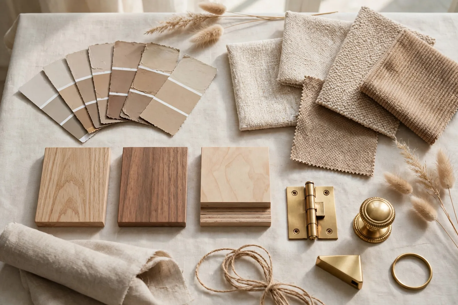
A mood board is not a Pinterest collage of pretty rooms, it’s a decision-making tool. A working mood board answers one question for every choice you’ll make: does this belong in the story? Built properly, it keeps you from buying the wrong sofa, painting the wrong white, and mixing metals that fight each other. The Global Abode is an independent publication, not affiliated with or endorsed by Sherwin-Williams or Benjamin Moore; color names and codes are referenced as widely-known designer examples. And one rule before we begin: paint colors shift with lighting, surface, and sheen, always test a large physical sample in your own space before committing.
Key takeaway: A mood board that works is a working document, not decoration. Gather real samples in three layers, palette, materials, imagery, then run every purchase through a single test: does this element harmonize with everything already on the board? If a choice passes that test, it’s right for your home.
Why mood boards work, and why most fail
Interior designers don’t use mood boards because they look pretty in a portfolio. They use them because decorating a home is a hundred decisions made over weeks or months, and human memory is a terrible place to store a vision. By the time you’re standing in a showroom three weeks later, you’ve forgotten exactly which warmth your wood tones need and whether your metals were soft and aged or crisp and polished. The board remembers for you.
But most DIY mood boards fail, and they fail for the same three reasons. First, they’re built from screen-only inspiration, screenshots of rooms photographed in other people’s houses, under other people’s lighting, with other people’s fixed finishes. A photo can’t tell you how a fabric feels next to your floor, or whether two whites clash at the seam where wall meets trim. Second, they collect ideas instead of commitments: fifty images, no samples, no palette, nothing you can actually hold against a paint chip. Third, and most commonly, the board is finished once and never consulted again. It becomes a scrapbook of the planning phase instead of a working reference for the buying phase.
A working board flips all three. It uses real, physical samples wherever decisions are irreversible, paint chips you can hold to the window, fabric swatches you can drape over your sofa, metal finishes you can catch light on. It distills inspiration into a tight, legible story: a palette of five to eight colors, a small family of materials, one mood. And it lives where you’ll actually use it, pinned to the wall of the room you’re decorating, or open on your phone in every showroom, so every choice gets checked against it before money changes hands.
Think of the difference this way: an inspiration board says “I like this kind of thing.” A working board says “this is what we chose, and here’s the test everything new must pass.” That shift, from inspiration to accountability, is the entire subject of this guide.
Gathering: what actually goes on the board
Before anything goes on the board, gather widely. The gathering phase is for quantity; the editing phase is for ruthlessness. Pull paint chips from the hardware store (grab whole strips, not single chips), request fabric swatches from upholstery and curtain sources, collect wood and flooring samples, metal finish samples in the tones you’re considering, stone or tile chips if hard finishes are in play, and print your strongest room references at a size you can actually see, small phone-screen thumbnails blur into each other and hide the clashes you’re trying to catch.
Your board has three layers, and every element should belong clearly to one of them:
- The palette layer, the color story. Paint chips, fabric color references, and anything that defines the room’s hues. This is the layer that says “these are our colors.”
- The material layer, texture, sheen, and substance. Wood grain, linen weave, matte vs polished metal, stone veining. This layer answers whether things feel like they belong together, not just whether the colors match.
- The imagery layer, two or three reference photos that capture the mood and style. Not fifty. These are directional: they show the atmosphere you’re chasing and the kind of furnishings that fit it.
Start with one anchor item you genuinely love, a rug, a fabric, a piece of art, an existing sofa you’re designing around. Place it at the center and build outward from it. Designers consistently report that starting from a real, owned item produces more coherent rooms than starting from a blank screen, because the anchor imposes real constraints and constraints are what make a scheme feel intentional.
Then edit. This is the painful part and the most important one. If two fabrics are close but not quite right together, keep one. If a reference photo pulls toward a completely different style, remove it. Aim for twelve to twenty elements total, enough to tell the story, few enough that every element has a job. A common designer rule of thumb: anything on the board should explain the mood, define a material, represent an anchor item, or support a real decision. Anything else is noise.
The palette layer: extracting your color story
The palette is the board’s most important layer, because color is where the most expensive mistakes happen. Extracting your color story means looking at everything you’ve gathered and asking a simple question: what colors keep repeating? Circle the colors that appear in three or more places. Those are your story. Everything else is a visitor.
A workable room palette has five to eight colors, and they should fall into three roles:
- Two or three foundation neutrals, your walls, large furniture, main flooring tones. These are the quiet colors that everything else sits on. For most modern farmhouse and neutral schemes, this means a soft white, a warm mid-tone (sand, greige, warm taupe), and possibly a deeper grounding tone.
- Two or three mid-tones, the colors that give the room its personality. These might be wood tones, a muted sage or dusty blue, warm terracotta. They appear in upholstery, rugs, art, and window treatments.
- One or two accents, the smallest doses of the strongest color. A deep espresso, a black finish, a touch of ochre. Accents add depth; they should never dominate.
This is where undertones matter more than color names. Two “warm whites” from different brands can clash visibly when they’re side by side on your wall, one widely-reported designer observation is that some popular whites lean noticeably pink or green in certain lighting. You don’t need manufacturer data or exact numbers; you need your actual chips, side by side, viewed in the room’s light, at the seam where wall meets trim and wall meets floor. If you want a deeper understanding of why whites and neutrals misbehave, our guide on paint undertones explained walks through the reading-undertones process in detail.
Arrange the palette on the board in proportion: large chips or swatches for the foundation colors, smaller ones for accents. This roughly mirrors how much of each color the room will actually contain, and it immediately reveals an unbalanced story, if your accent color is taking up half the board, it’s going to take over the room too.
Designer habit: Paint your board’s background in your wall color before you pin anything. Laying fabrics, woods, and metals against the actual wall color, rather than a white foam board, shows you immediately whether each element works in the room. It’s the closest thing to a dry run of the finished space.
Once the palette reads clearly, five to eight colors, roles assigned, undertones checked against each other, write the color names down on the board or in a note attached to it. Memory fades; the note doesn’t. This is also the moment to connect the board to the rest of the house: a room’s palette should feel like a sibling of your other rooms, not a stranger. If you’re building a house-wide story, our guide to cohesive interior color schemes explains how to keep rooms related without making them identical.
The material layer: texture, sheen, and weight
Here’s the layer most DIY boards skip, and it’s the layer that separates rooms that photograph well from rooms that feel expensive in person. Two rooms can share an identical color palette and look completely different, because what your eye actually reads in a room is texture and sheen as much as hue.
The material layer answers three questions for every surface in the room:
- Texture: Is it smooth or tactile? Linen, bouclé, velvet, jute, and leather each read completely differently in the same color. A scheme with no texture variation feels flat; a scheme with too many competing textures feels restless. Aim for a mix, typically one smooth, one medium, one nubby or natural.
- Sheen: Matte, satin, or polished? Sheen is how a surface handles light, and mixed sheens are what make neutral rooms glow instead of looking flat. Matte walls with a polished metal lamp, honed stone with a glossy ceramic, contrast in sheen creates the depth that color alone can’t.
- Weight: Is the material visually heavy or light? A chunky oak beam, a delicate brass picture light, a thick wool rug, a sheer linen curtain. Balanced schemes mix weights the way they mix textures.
Don’t forget hard finishes, this is a classic blind spot. Designers warn that fabric schemes get all the attention while the timber floor, the stone around the fireplace, and the metal finishes get chosen in isolation, and then everything has to “work” after the fact. Put flooring samples, stone or tile chips, and metal finish samples on the board before you choose upholstery. Hard finishes are the hardest to change, so they get first say in the material story.
Metals deserve special attention because mixing metals is one of the fastest ways to either elevate or undermine a room. Two metals can coexist beautifully, but they should be deliberately different (aged brass and matte black, for instance) rather than accidentally close. Two “almost the same but not quite” gold tones read as a mistake; two clearly different finishes read as a choice. Hold your metal samples together on the board and be honest about which situation you’re in.
| Layer | What to include | The question it answers |
|---|---|---|
| Palette | Paint chips, foundation color swatches, accent color references | “Are these our colors?” |
| Materials | Fabric swatches, wood/flooring samples, metal finishes, stone or tile chips | “Do these feel like they belong together?” |
| Imagery | 2–3 reference photos of rooms or details you love | “Is this the mood and style we’re chasing?” |
| Anchors | The one or two existing pieces you’re designing around | “Does everything new work with what we own?” |
| Notes | Color names, the three adjectives for your mood, the decisions log | “What did we decide, and why?” |
The working test: does every decision pass the board?
Everything so far is preparation. This section is the point. A working board earns its keep through one ritual: before you buy anything, paint, fabric, furniture, a lamp, a throw pillow, you hold it against the board and ask three questions.
- Does the color belong to our palette? Not “is it pretty”, does it sit comfortably next to your foundation colors, or does it introduce a brand-new hue that will fight the story? One rogue color can pull a whole room off course.
- Does the material belong to our family? Does the texture, sheen, and weight harmonize with what’s already committed? A high-gloss chrome bar cart has no business in a matte, earthy scheme, unless the board says otherwise.
- Does it strengthen the mood? Your board should carry two or three adjectives, “warm, calm, collected,” say, that define the feeling you’re chasing. If a piece doesn’t reinforce those words, it’s a distraction, no matter how much you like it in isolation.
If a candidate passes all three, buy with confidence. If it fails one, you now know exactly what’s wrong with it, which is the whole value of the test. “I love it but it introduces a cool gray into a warm scheme” is a clear, actionable verdict; “it doesn’t feel right” is just anxiety. The board turns decorating anxiety into specific information.
Run this test in the store, not at home. Photograph your physical board and keep the photo on your phone, front-facing, well-lit, with a piece of paper noting the palette. In a showroom, hold the candidate item up against the photo. It takes thirty seconds and it has saved more budgets than any other decorating habit we know. The designers’ version of this is carrying a “scheme kit”, a small bag with the actual swatches, to every appointment. A photo of the board is the everyday version.
Don’t skip the light check: Screens lie about color. A fabric that reads warm cream on your phone can be icy beige in your north-facing room. The working test only counts if your board’s samples were viewed in the actual room’s light, morning, midday, and evening, before anything got pinned as final. Never commit to a paint color or large fabric order from a screen alone.
Finally, let the board evolve, but consciously. When a new piece genuinely improves the story, it earns a place on the board, and something else may need to come off. Update the palette note. Log the decision: what changed, what it replaced, and why. A board that never changes is either perfect or ignored; a board that changes with a paper trail is doing its job.
Physical vs digital boards, and how to use both
You’ll need to choose a format, and honestly, the best answer for a real home project is both, with each format doing what it’s best at.
Digital boards excel at the gathering phase. Pinterest, Canva, Google Slides, PowerPoint, even a phone photo album, they’re free, fast to rearrange, easy to share, and infinite. Screen-grab rooms you love, save fabric photos, build your palette digitally, share the file with a partner or designer for feedback. Digital is where you explore ten directions quickly and narrow to one. Its limitation is the one that matters most: screens don’t show true color, texture, or sheen. A digital board can never verify a decision, it can only suggest one.
Physical boards excel at verification. A foam board, a corkboard, even a large tray on a table, pin the real paint chips, drape the real fabric swatches, lay the wood and metal samples side by side. Physical boards reveal what screens hide: the undertone that only appears at the seam, the fabric that photographs soft but feels scratchy, the “almost matching” metals that are actually two different finishes. They can’t be emailed or infinitely rearranged, but they can be trusted.
The workflow that works: explore digitally, verify physically, carry both. Build your first board on a screen in an afternoon. Then order the physical samples for your top choices, paint chips, fabric swatches, finish samples, and assemble a physical board before you spend real money. Photograph the finished physical board and keep that photo on your phone as your in-store decision tool. If you’re working with a designer, send the digital version for discussion and bring the physical samples to any in-person meeting.
A few practical notes on each format. For digital boards, name every image file with its source so you can find the actual product later, a screenshot of a sofa with no source is decoration, not a plan. For physical boards, don’t glue anything down until the scheme is final; use pins, clips, or tape so you can rearrange. And keep the board at a sensible size, roughly the size of a large poster, big enough to see relationships, small enough to photograph clearly and store when the project is done.
If you’re building toward a particular style rather than a single room, style guides help you calibrate the board’s story before you gather samples. Our modern farmhouse colors guide is a good example of how a style’s palette, materials, and mood translate into board-ready ingredients.
Turn your board into a whole-home plan
A mood board is the first step, a whole-home color system is what carries it through every room. Our Modern Farmhouse Whole Home Paint System gives you the coordinated palette, undertone-tested combinations, and room-by-room guidance to execute the story your board tells.
Frequently asked questions
An interior design mood board is a curated collection of colors, materials, textures, furniture references, and atmosphere photos that communicates the intended direction of a room. It’s a working tool: designers use it to align on a concept and test decisions before committing money to paint, fabric, or furniture.
Aim for ten to twenty carefully chosen elements, fewer is usually better. Each item should earn its place by defining the mood, showing a material, representing an anchor piece, or supporting a real decision. Fifty loosely related images create visual noise and make the board useless as a decision tool.
Digital boards are better for fast exploration, rearranging, and sharing; physical boards are better for verifying real color, texture, and sheen. For a real project, use both: explore digitally, then verify with physical samples before you spend money, and photograph the finished physical board to carry on your phone.
A mood board communicates atmosphere and visual direction; a concept board develops that direction with more specific products, materials, finishes, and notes. The terms overlap, and a decision-ready mood board like the one in this guide will gradually take on concept-board features as your choices get locked in.
Yes. Pinterest, Canva, Google Slides, PowerPoint, a phone album, or a physical pinboard all work. Organization and curation matter far more than the tool. Choose whatever lets you collect, compare, revise, and keep track of where each item came from.
Run the working test: hold any new purchase against the board and ask whether its color belongs to your palette, its material belongs to your family, and it strengthens your mood words. If every decision you test gets a clear yes-or-no verdict, and you act on the verdicts, the board is working. A board you never consult is just a collage.

