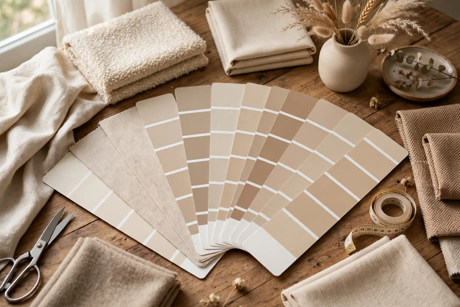
Interior designers carry something you probably don’t: a pocket-sized stack of color cards, organized by project, that they pull out in every showroom, paint store, and client meeting. Swatch cards are the designer’s trick for seeing colors together, real, physical color you can rearrange, compare, and hold against your actual finishes, no screen required. The printable version gives you the same power with an ordinary printer and a pair of scissors: a custom set of cards for your whole home, each one carrying a color, a name, a room, and a decision. One essential note before we begin: paint colors shift with lighting, surface, and sheen, so a swatch card is a planning tool, not a substitute for a large physical paint sample in your own space, test before you commit. The Global Abode is an independent publication, not affiliated with or endorsed by Sherwin-Williams or Benjamin Moore; all color names and codes are referenced as widely-known designer examples.
Key takeaway: Printable swatch cards turn your palette from a mental image into something you can hold, shuffle, and compare side by side. Each card records one color’s name, room, and role; used together, the set lets you spot clashes, eliminate options, and keep every decision tethered to the plan, in the store, at home, and everywhere in between.
Why Designers Use Swatch Cards: The Paper Advantage
Ask a working interior designer how they keep a whole-home palette coherent across months of decisions, and the answer is rarely an app. It’s usually a stack of cards. Designers build physical color decks for the same reason chefs mise en place: the work goes better when every ingredient is visible, comparable, and in the hand. A color you can hold against a fabric, fan out across a countertop, or photograph in a client’s living room is a color you can actually decide about.
The paper advantage comes down to three things screens can’t do. First, true comparison. Your phone shifts color with brightness, night mode, and calibration, the same paint chip photographed twice can look like two different colors. A printed card doesn’t change when the light does; it changes with the light, the way paint does. When you hold two cards side by side in your north-facing living room, you see their actual relationship, not a rendering of it. Second, portability with context. A swatch deck rides in a purse, a tote, or a binder ring through paint stores, fabric showrooms, and tile shops. At the moment a fabric catches your eye, the card is already there to be held against it, no scrolling, no screenshots, no “I think it’s close.” Third, ruthless editing. There’s something about paper that digital tools can’t replicate: you can physically remove a card, set it aside, and see what the palette looks like without it. The discard pile is the most honest feedback a palette can get.
This is the same principle behind the classic designer swatch board, a literal board covered in the actual colors, fabrics, and materials of a project that gets referenced throughout a renovation, so nothing drifts off plan over the years a project can take. A printable card set is the portable version of that discipline: the whole board, condensed to a deck you carry. And it connects directly to the decision test at the heart of good decorating: before you buy anything, you hold it against the plan. Our whole-home palette guide builds the plan; swatch cards are how you keep it with you.
The other reason cards matter is memory. A whole-home project spans weeks or months, and between the first paint decision and the final throw pillow, the details blur. Which exact white went on the trim? Was the bedroom accent the warm greige or the cool one? A labeled card set is the project’s memory, immune to forgetting. Five minutes of printing saves five months of second-guessing.
What Goes on Each Card: Color, Name, Room, Sheen, Notes
A swatch card earns its keep by carrying enough information to be useful alone. A color patch with no label is just a pretty square; a card with a name, a role, and a note is a decision record. Here’s what each card should carry.
The color patch itself. This is the visual heart of the card, a generous block of the color, large enough to read clearly when held against a fabric or finish. Aim for the patch to cover at least half the card. Color the patch by painting it with a sample pot, coloring it carefully with markers or pencils, or gluing a cut-out from a printed palette, the method matters less than the honesty of the color. One caution: home printers shift colors, so a printed patch is a reference for the color’s identity, not a contract for its exact appearance. Label it as approximate, and let physical paint samples make the final call.
Color name and code. Write the full name and any code exactly as the manufacturer gives it, not your shorthand. “That warm white we liked” is useless in a paint store six weeks later; the name and code are what gets the right can mixed. If a color is a widely-known designer example (say, a warm white you’re comparing), note the source so you can find it again.
The room or application. Where does this color go? “Primary bedroom walls,” “kitchen island,” “whole-house trim.” This is what stops a bedroom accent from accidentally becoming a living room wall. If a color appears in multiple rooms, list all of them, that’s useful information, not clutter.
Sheen and paint details. The same color in flat and satin behaves differently, so record the intended sheen on the card: walls in eggshell, trim in satin, ceiling in flat. Also note primer needs or special notes (a deep color that needs a tinted primer, a bathroom color that needs a moisture-rated formula).
Undertone and temperature notes. A short note on the card’s temperature, warm, cool, neutral, and anything you’ve observed about the color’s behavior (“reads green in the north bedroom,” “warm in afternoon light”). Undertone observations are widely-reported designer observations to be recorded, not exact data to be trusted from the card alone, they’re reminders to check the real sample again.
Role in the palette. Anchor, supporting neutral, accent, or trim, the job this color does. This is the field that keeps a swatch deck from becoming a random pile: when every card has a role, you can see at a glance whether the palette has its structure, or whether it’s all accents and no anchors.
Status. A simple mark for where each color stands: candidate, testing, approved, painted. Cards for rejected colors don’t get thrown away, they go to a separate “rejected” section, because knowing what you ruled out (and why) is valuable when a new option appears.
Building Your Card Set from Your Palette
Don’t print cards for colors you haven’t chosen yet. The set is built from your palette, not instead of it. Work in this order: settle the palette first, then make the deck.
Step 1: Finalize the palette on paper. Before touching the printer, write down your whole-home palette: the anchor neutral, the trim color, the room-by-room companions, the accent colors. This is the output of your palette planning, if you haven’t done it yet, our whole-home palette guide walks through the full process. A card set for an unsettled palette just freezes indecision in cardstock.
Step 2: One card per color decision. Every distinct color choice gets its own card, not every room. If three rooms share the anchor white, that’s one card listing all three rooms. If the kitchen island and the powder room vanity share a deep green, one card. The deck represents decisions, and duplicate decisions collapse. Expect a typical whole-home deck to run eight to fifteen cards: anchor, trim, ceiling, two or three companions, two or three accents, and any specialty colors (a front door, a fireplace, a mudroom).
Step 3: Add candidate cards for undecided slots. For every slot still open, say, you’re choosing between two bedroom accents, make a card for each candidate, marked clearly as CANDIDATE. Candidate cards are the working edge of the deck: they exist to be compared, eliminated, or promoted. Limit yourself to two or three candidates per slot. A deck with thirty candidates isn’t a plan; it’s a pile.
Step 4: Print, cut, and finish. Print on heavy cardstock, regular printer paper curls, tears, and absorbs color unevenly. A simple grid of identical rectangles works best; leave the bottom third of each card for the written fields. Cut cleanly, fill in the fields by hand or before printing, and consider laminating the approved cards (not the candidates, candidates should stay easy to discard). A hole punched in one corner lets the deck ride on a binder ring, which is how designers keep sets from scattering.
Step 5: Check the set against your fixed finishes. Before the deck is official, fan every card out next to your flooring, countertop, and tile samples, the fixed finishes the palette has to live with. If a card’s color fights a finish, the card is wrong, not the finish. Our undertones guide covers reading the temperature relationships that this check depends on. Fix the palette, reprint the card, and only then call the deck final.
| Field | What to write | Why it matters |
|---|---|---|
| Color patch | A generous block of the color, ≥ half the card | The visual reference everything else hangs on |
| Name + code | Full manufacturer name and code, exact | What gets the right can mixed at the store |
| Room / application | Everywhere this color is used | Stops a bedroom accent becoming a living room wall |
| Sheen + paint notes | Intended finish; primer or formula notes | Same color, different sheen = different behavior |
| Temperature note | Warm / cool / neutral; observed behavior | Reminder to verify undertones in real light |
| Palette role | Anchor, support, accent, or trim | Shows whether the palette has structure |
| Status | Candidate / testing / approved / painted | Tracks each decision’s stage; rejects stay filed |
How to Use the Cards: Comparing, Eliminating, Sequencing
A finished deck is a tool, not a trophy. Here’s the working method, the actual designer routine the cards enable.
Comparing: the fan test. When two colors compete for the same slot, fan the cards side by side in the room’s actual light, morning, midday, and evening. The side-by-side read is what your eye needs: colors are always judged relatively, never absolutely, and a warm white that looked perfect alone can reveal a pink undertone the moment it sits next to a cleaner white. Hold the fanned cards against the fixed finishes too, the floor, the counter, the trim. Widely-reported designer observations confirm that the winner is usually obvious within seconds when cards are compared in real light; the loser is the one that “fights” the finishes.
Eliminating: the discard ritual. When a candidate loses, move its card to the rejected section and write why on the back: “too cool against the oak floor,” “disappeared next to the anchor white,” “read gray in the north bedroom.” This note is the whole point. Six weeks later, when a new fabric or a new idea tempts you back toward the rejected color, the note reminds you what you already learned, and saves you from re-running the experiment. Designers who skip this step famously re-test the same doomed colors months later.
Sequencing: the whole-home fan. Once cards are approved room by room, lay the entire deck out, every card, in room order, and look at the whole home at once. This is the test no single room can pass on its own: does the house read as one story? Look for temperature consistency across sightlines, repeated colors appearing often enough to feel intentional (every shared color should show up at least twice across the home), and accents that relate to something. If one room’s cards look like they belong to a different house, that room needs work. Our cohesive interiors guide has the repetition system this whole-home check depends on.
Shopping: the pocket reference. Take the deck, or just the relevant cards, everywhere you shop for the project. At the paint store, the card’s name and code get the can mixed; at the fabric store, the card held against a bolt settles the question in seconds; at the tile shop, fanning the palette against the tile candidates reveals undertone clashes before money changes hands. One habit worth adopting: photograph each card against each candidate you consider, in the store’s light. The photo becomes a dated record of what you compared, and the store’s lighting is honest about at least one thing, which is how the combination looks under retail fluorescents.
Painting: the execution record. When the painters start, the deck becomes the spec sheet. Each room’s card says the color, the code, the sheen, and the application, hand the relevant cards to the painter, or photograph them into the work order. After the room is painted, mark the card PAINTED and note the date and the number of coats. Months later, when you need a touch-up or you’re painting the adjacent room, the card tells you exactly what went on the wall.
Tip: Make two copies of each approved card, one for the working deck you carry, one for a project binder that never leaves the house. The binder copy becomes the permanent record: staple the actual paint chip to it, note the purchase date and store, and you’ll never again wonder “what white is on the trim?” when it’s time for touch-ups or the next project.
Swatch Cards vs Digital Palettes
Digital palettes have their place, they’re fast to build, easy to share, and infinite. But they fail at exactly the jobs swatch cards do best, and understanding the difference keeps you from trusting the wrong tool for the decision at hand.
Where digital wins: exploration and sharing. Building your first palette direction, trying ten schemes in an afternoon, sending options to a partner or designer for feedback, digital is unmatched for speed and volume. Screenshots, palette apps, and mood board tools are where you explore. They’re also the only format that travels instantly: email a palette to your painter, text it to the tile shop. For communication, digital rules.
Where paper wins: verification and decision. The moment a color choice needs to be true, true against your floor, true in your north light, true next to your countertop, paper wins. Screens don’t show true color, texture, or sheen, and no amount of screen calibration fixes the fact that your phone renders the same color differently at 30% brightness and 100%. A printed card isn’t perfect either (home printers shift color, as noted), but it fails honestly: it shifts the way paper shifts, and it sits in your actual light next to your actual finishes. That’s a comparison. A phone screen is a rendering.
The workflow that works: explore digitally, verify on paper. Build your palette direction on screen. Then print the candidate cards, fill in the fields, and run the real comparisons, the fan test, the fixed-finish check, the whole-home fan, on paper, in your rooms, in your light. Photograph the paper results and send the photos digitally if you need to share them. Digital for thinking, paper for knowing.
One more distinction worth making: a swatch card deck is not the same as a digital color palette, and it’s not the same as a mood board either. The palette is the list of colors; the mood board is the story of the room; the card deck is the working reference that carries both into the world. If you’re building toward a full room story, the deck slots naturally alongside a mood board, the cards are the palette layer of the board, made portable.
Watch out: Never make a final color decision from a printed card alone. Home printers are not color-accurate instruments, a printed patch is a reference for which color, not proof of how the color looks. The card gets you to the right shortlist and keeps the project organized; the large physical paint sample, viewed in your own space across a full day of light, makes the final call. Cards organize decisions, samples make them.
Organizing and Carrying Your Set
A deck that lives in a drawer doesn’t work. The organization system should make the cards grab-able in ten seconds, because the moments you need them, a fabric bolt, a tile sample, a paint counter, don’t wait for you to dig.
The binder ring. Punch a hole in the same corner of every card and thread them on a 2-inch binder ring. Order the cards: anchors and trim first, then room companions in the order you’ll shop for them, then accents, then candidates at the back, then rejected cards at the very back (kept, labeled, and out of the way). The ring keeps the set together and lets you flip through it like a fan deck, which is, not coincidentally, how professional fan decks work.
The project binder. The second copy of each approved card lives in a binder with the paint chips stapled on, purchase receipts, the painter’s work order, and a page per room noting what went where. This binder stays in the house. When it’s time for touch-ups, when you sell the house and the buyer asks what the paint colors are, when the next project starts, the binder answers.
The room envelope. For active projects, keep a small envelope or zip pouch per room with that room’s cards, the fabric swatches, and any finish samples. Grab the envelope, and you have everything the room needs, no flipping through the whole deck in the store. When the room is done, the envelope’s contents go to the binder.
Maintenance: the deck is a living document. When a color changes, print a new card, mark the old one SUPERSEDED with the date, and file the old one behind the rejects. When a room is painted, mark its cards PAINTED. When a new project starts, clone the anchor and trim cards into the new deck rather than rebuilding from scratch, the whole-home anchors should be the same cards, literally, so the house’s consistency is physical, not just remembered. A deck that’s maintained this way becomes more valuable with every project: it’s the color history of your home.
What not to do. Don’t laminate candidate cards (you want them easy to discard). Don’t skip the written fields, an unlabeled card is a mystery in six months. Don’t let the deck grow past about twenty cards; if it does, split it by floor or by project phase. And don’t treat the printed color as gospel: the card is the reference, the sample is the truth.
Turn your card set into a whole-home plan
Swatch cards organize the palette, but the palette itself has to be right first. The Whole Home Paint Guide is a complete, ready-to-use color system: warm anchor neutrals, trim and ceiling pairings, and accent colors with undertones already coordinated, so every card in your deck belongs to one coherent story. And the Paint Color Workbook includes palette-planning worksheets you can print right alongside your cards.
Frequently asked questions
Swatch cards are individual cards, one per color decision, carrying a color patch plus the details that make it useful: the color name and code, the room or application, the intended sheen, temperature notes, and the color’s role in the palette. Designers use them as a portable, physical reference for comparing colors, shopping for finishes, and keeping a project on plan.
Print a simple grid of identical rectangles on heavy cardstock, leaving the bottom third of each card for written fields. Fill in one card per color decision: color patch, full name and code, room and application, sheen, temperature note, palette role, and status. Cut the cards, punch a corner hole, and thread them on a binder ring. One caution: home printers shift color, so a printed patch is a reference for which color, not proof of how it looks, physical paint samples make the final call.
Large enough to read the color clearly and small enough to carry. A card roughly the size of an index card (3 x 5 inches) with the color patch covering at least half of it works well, the patch needs to be big enough to hold against fabrics and finishes without the card’s edges interfering. Whatever size you choose, keep every card identical so comparisons are fair.
No, and this is the most important thing in this guide. Swatch cards organize your palette and keep decisions consistent, but they cannot replace large physical paint samples viewed in your own space across a full day of light. Cards organize decisions; samples make them. Use the cards to reach a confident shortlist, then test the real paint before committing to gallons.
A typical whole-home deck runs eight to fifteen cards: one per distinct color decision (shared colors collapse to one card), plus two or three candidate cards for any undecided slots. If the deck grows past about twenty cards, split it by floor or project phase. Keep rejected colors filed at the back with the reason written on them, the discard notes save you from re-testing doomed colors later.
For exploring and sharing, yes, digital is faster and travels instantly. For verifying a color against your finishes and your light, no. Screens shift color with brightness and calibration, while a physical card sits in your actual room light next to your actual finishes. The workflow that works: explore digitally, verify on paper, photograph the paper results to share.

