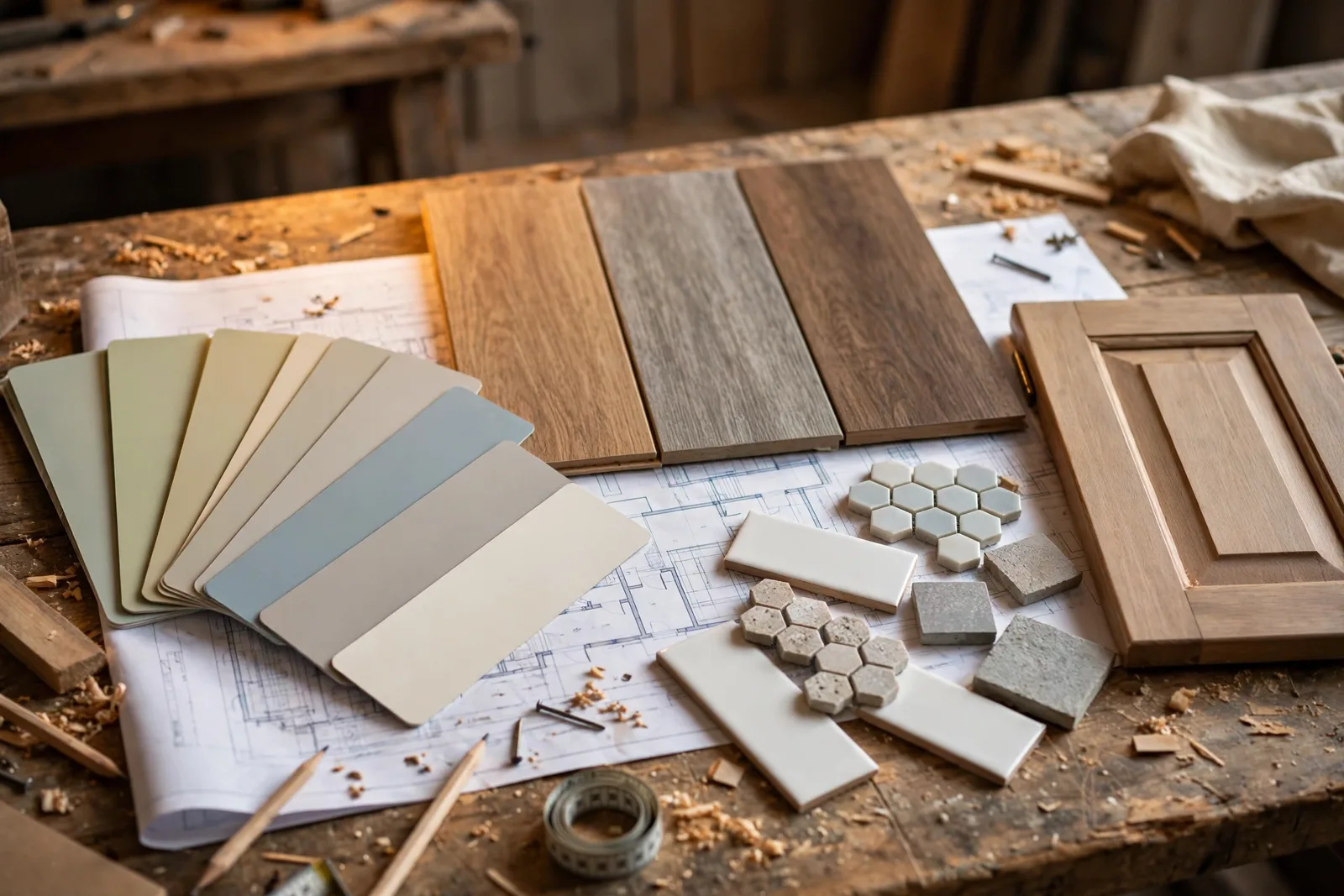
There is a reason so many renovated homes look “almost right.” The paint was chosen first, the cabinets second, and the tile somewhere in between, each decision made in isolation, in the wrong order. This checklist puts every color decision in the correct sequence, from the finishes you can never change cheaply to the paint that should always come last. One important note before we begin: paint colors shift with lighting, surface, and sheen, so test a large physical sample in your own space before committing to anything. The Global Abode is an independent publication, not affiliated with or endorsed by Sherwin-Williams or Benjamin Moore; color names and codes appear here as widely-known designer examples only.
Key takeaway: Choose renovation colors in order of “hardest to change first”: fixed finishes (flooring, tile, stone, cabinetry) before paint, paint before accessories. Paint is the most flexible decision in a renovation, it should be the last color you finalize, never the first.
Why color planning has an order (the renovation sequence)
Walk into any half-finished renovation and you will find the same quiet panic: a countertop already ordered, a cabinet door leaning against the wall, and a homeowner holding a paint swatch fan, asking the question that should have been answered weeks ago, “Does this wall color go with everything else?” The answer is almost always “we can’t know yet,” and that uncertainty is expensive. Color decisions made out of order are one of the most common sources of renovation rework: repainting a kitchen because the backsplash clashes with the wall color, or living with a bathroom floor that fights the vanity because both were picked from catalogs on different days.
The principle behind the checklist is simple, and it comes from how renovations actually work in practice. Every finish in your home sits somewhere on a spectrum of flexibility. Paint is the most flexible: a gallon costs a fraction of the project and a room can be repainted in a weekend. Tile, stone, and flooring are the least flexible: changing them means demolition, disposal, labor, and sometimes replacing adjacent materials too. Cabinetry sits in the middle, expensive to change, though refacing is an option. The golden rule of renovation color planning is to choose colors in order from least flexible to most flexible. Hard finishes anchor the palette; paint responds to them. When you follow this order, every decision narrows the next one instead of contradicting it.
There is a second reason the order matters: undertones. Every finish, a gray tile, a beige counter, an oak floor, carries a subtle color temperature underneath its surface. Warm-leaning finishes and cool-leaning finishes mixed without a plan create that nagging “something is off” feeling that no amount of paint can fix. If you select the hard finishes first, you can read their undertones once and then choose paint colors that agree with them, rather than trying to reconcile three competing temperatures with a single wall color. Designers consistently report the same pattern: paint color should be the last thing you choose when designing a room, because paint can be mixed to coordinate with anything, while stone and wood cannot be mixed at all.
This guide walks you through four phases, in the exact order to finalize them. Treat each phase as a gate: don’t lock in Phase 2 until Phase 1 is settled, and don’t let anyone, not a well-meaning salesperson, not your own enthusiasm, push you to pick paint before the surfaces it has to live with are chosen.
Phase 1: Fixed finishes first, flooring, tile, counters, brick
Phase 1 covers everything that is installed once and stays for decades: flooring, tile, countertops, fireplaces, brick, and any existing features you are keeping. These are the bones of your color palette, and they carry the most color information, which is exactly why they come first. A warm white oak floor, a cool-veined quartz counter, and a handmade terra-cotta backsplash each speak a different color language; your job in this phase is to make sure they all speak the same one.
Flooring is almost always the first decision. It is the largest continuous surface in the home, the most expensive to change, and the one that shows up in every room’s color story. Bring flooring samples home and look at them in the actual rooms, against the actual light, next to anything you are keeping, existing brick, a stone fireplace, built-in cabinetry. Photograph the samples in morning and evening light. Widely-reported designer observations note that wood floors can lean warm, orange, or gray depending on the species and finish, and that even “neutral” options like gray-washed oak or concrete-look tile carry undertones that will echo through every paint color you choose later.
Next, tile and countertops together, never separately. The bathroom floor tile, the shower surround, the kitchen backsplash, and the countertop will all touch each other in small, high-contrast rooms, so their undertones need to agree. Take a sample of each and stand them together. If the counter leans warm (golden veining, creamy base) and the tile leans cool (blue-gray undertones), pause. One of them needs to change, because no wall paint can bridge a warm-cool fight at the sink. This is also the moment to consider existing elements you can’t change: a red brick fireplace, a stone hearth, original hardwood. These fixed features have their own undertones, and they get a vote in the palette. If you are working around fixed brick or stone, read our guide to coordinating paint with brick, stone, carpet, curtains, and rugs before moving on.
Tip: Build a single “finish board”, a tray, box lid, or flat surface, that holds one sample of every Phase 1 material. Carry it with you when shopping for anything else in the renovation. If a new candidate clashes with the board, it clashes with the home. The board is your palette’s constitution.
At the end of Phase 1, you should be able to answer three questions: What is the dominant undertone of our flooring? Do our tile and countertop share a temperature, or do they at least relate? And which existing features (brick, stone, built-ins) must the rest of the palette respect? Write the answers down. They are the brief you hand to Phase 2.
Phase 2: The whole-home palette, anchor, flow, temperature
With the hard finishes locked, Phase 2 sets the palette that will carry through the entire house: the anchor neutrals, the way color flows from room to room, and the overall temperature the home reads. This is the planning phase, you are not yet choosing the exact white for the primary bedroom. You are deciding what family of color the house belongs to.
Start by extracting the palette from your Phase 1 board. The anchor is usually a whole-home neutral, a warm white, a soft greige, a gentle gray, that appears in the largest connected spaces: entry, living areas, hallways. Choosing it from the finishes rather than from a swatch fan is what makes it “coordinate” instead of merely match. Look at the lightest tones in your countertop veining, your tile grout, your flooring’s natural highlights; your anchor neutral typically lives somewhere in that range, one or two steps deeper or lighter.
Next, define the temperature of the home. This is the single decision that prevents the most chaos. A house that leans warm everywhere, warm woods, creamy counters, brass fixtures, needs warm-leaning paint, even in the grays and whites. A house that leans cool, gray tile, charcoal stone, black fixtures, needs cool-leaning paint. Mixed-temperature homes are possible, but they need a deliberate plan (for example, warm wood tones with cool gray walls balanced by warm lighting), not accidental drift. Widely-reported designer observations consistently flag white as the trickiest choice here: whites reveal their undertones the moment they sit next to fixed finishes, which is why a white that looked perfect on the card can read pink, yellow, or blue against your actual counters.
Then plan the flow. In an open-plan home, color should shift gradually from space to space, not restart in every room. A common approach: one anchor neutral for main living areas, one or two deeper companions for bedrooms and offices, and consistent trim color throughout. The trim color is the ribbon that ties rooms together, when every door and window frame wears the same shade, the house feels intentional even when wall colors vary. For the full method, see our guide on how to choose a whole-home paint palette that flows room to room.
End Phase 2 with a one-page palette plan: anchor neutral, trim color, 2–3 companion colors by room, and the temperature note. This document is what you bring to the paint store, and what stops anyone from handing you a swatch that belongs to a different house.
Phase 3: Room-by-room decisions, cabinets, vanities, accent walls
Phase 3 is where the renovation gets personal: cabinets, vanities, built-ins, accent walls, and the saturated or deep colors that give rooms their character. These decisions come after the palette because they are the expression of the palette, and they are also where most out-of-order chaos happens, when a homeowner falls in love with a navy island or a sage vanity before the kitchen’s undertone direction is settled.
Cabinets and vanities first within Phase 3. Cabinetry is a semi-fixed finish: more flexible than tile, far less flexible than paint. Choose cabinet color against the actual countertop sample and the actual floor sample, not from memory, not from a photo on your phone. In kitchens, the classic pairing structure is simple: perimeter cabinets in the anchor family, island or lower cabinets in the accent color if you want one. In bathrooms, the vanity should relate to the tile and counter the way cabinets relate to counters in the kitchen. When the cabinet color, counter, and floor all share a temperature, the wall paint becomes easy, almost any neutral from your Phase 2 palette will work.
Accent walls and deep colors last. A moody green office, a charcoal powder room, a navy dining room, these are high-impact, low-risk choices precisely because they are paint. But they still need to honor the palette: the accent color should share the home’s temperature and ideally echo something already present, like the veining in the kitchen stone or the tone of a wood floor. And remember that deep colors behave differently on the wall than on a swatch, they absorb light, shift under artificial lighting, and can change the perceived size of a room. Sample them large and live with them for days, not hours.
One practical note for renovations where cabinets are being painted rather than replaced: painted cabinetry is a paint decision wearing a cabinetry costume. It needs the same sampling protocol as wall paint (see Phase 6 below), on the actual cabinet material, cured and viewed in the room’s light. A cabinet color that looks right on a paper swatch can read entirely differently on a large, vertical, semi-gloss surface.
| Phase | Decide this | Why it comes here |
|---|---|---|
| Phase 1 | Flooring, tile, countertops, brick and stone you are keeping | Hardest and most expensive to change; sets the undertone direction for everything |
| Phase 2 | Whole-home anchor neutral, trim color, temperature, room-to-room flow | Turns the fixed finishes into a plan before any single room is designed |
| Phase 3 | Cabinets, vanities, built-ins, then accent walls and deep colors | Semi-fixed before flexible; paint is the easiest decision and comes last |
| Phase 4 | Exterior body, trim, front door, and outdoor fixed finishes | Often a separate project phase, decided with its own fixed finishes in view |
| Final gate | Sampling and sign-off protocol | No color is final until a large physical sample has been approved in the real light |
Phase 4: The exterior and the curb
The exterior is frequently treated as an afterthought, a decision made at the end, when the budget is tired and the attention is gone. It deserves its own phase, because exterior colors are judged under completely different conditions: harsh midday sun, long shadows, and the company of roofing, stone, and landscaping that have their own strong color personalities.
The Phase 1–3 logic applies here too, just with different materials. The exterior’s “fixed finishes” are the roof, any stone or brick on the facade, and hardscaping. The roof is the flooring of the exterior, the largest, most permanent surface, so its color and temperature lead. A brown-toned roof asks for warm siding; a charcoal or gray roof pairs more naturally with cooler siding palettes. Brick and stone on the facade get the same vote they got indoors: their undertones must be respected, not fought.
From there, the sequence runs: body color (siding, stucco, or main cladding), trim color, then front door and accents. The body color should be chosen from large exterior samples, paint a poster board or, better, a section of the actual siding and look at it from the street at different times of day. Exterior light is roughly three times brighter than interior light, which washes colors out; colors almost always need to go one shade deeper than you think. The front door is the one place for personality, but even it should relate to the palette, a door color that echoes an interior accent ties the whole property together.
Don’t forget the often-missed exterior decisions: garage doors, shutters, railings, and the underside of porch ceilings. Decide them in the same phase, with the same samples in hand, or they default to whatever the contractor had on the truck. Our detailed walkthrough of how to choose exterior house colors covers the roof-to-door sequence in full.
Warning: The most expensive color mistake in a renovation is choosing paint before finishes, not because paint is costly, but because it becomes the scapegoat. Homeowners repaint rooms two or three times trying to “fix” a clash that was actually set the day the warm countertop met the cool tile. Lock the hard finishes first and the paint almost chooses itself.
The sampling and sign-off protocol (never skip this)
A checklist without a sampling protocol is just a wish list. This is the final gate every color must pass through before it is ordered, mixed, or applied, and it is the step most often skipped under deadline pressure. Skipping it is how “we thought it matched” becomes “we live with it anyway.”
Step 1: Sample large, on the real surface. Tiny swatches lie. Paint samples should be at least two feet square, applied to the actual wall (or a large primed board you can move around the room). Cabinet colors should be sampled on the cabinet door material or an offcut. View flooring, tile, and counter samples together, at full size, in the room they will live in.
Step 2: Live with the sample for a full day cycle. Check it in morning light, midday sun, and evening lamplight, and with the room’s actual bulbs switched on, since bulb temperature changes everything. Widely-reported designer observations confirm that a color can read as three different shades across a single day; the only honest test is time. For exterior colors, add an overcast-day check, flat gray light reveals undertones that sunshine hides.
Step 3: Photograph the sample next to every adjacent finish. A phone photo in natural light, showing the sample touching the counter, the floor, and the trim, is the cheapest second opinion available. If something clashes in the photo, it will clash in the room, cameras flatten color relationships and make disagreements easier to see.
Step 4: Sign off in writing. Before the painter opens a can or the tile is ordered, record the final selections: product, color name and code, sheen, and where it goes. Share the list with your contractor. Mid-renovation changes are where budgets quietly bleed, and a written sign-off turns “I thought we said…” into a five-second check.
One last discipline: when a sample fails the protocol, go back one phase, not forward. If the wall color fights the counter, the answer is rarely a better wall color, it is usually revisiting whether the counter’s undertone was fully understood in Phase 1. The order protects you only if you let it.
Plan your palette before the first gallon
A renovation is too expensive to wing the color order. Our whole-home paint system maps the anchor-to-accent method for every room, so your finishes and your paint agree from day one.
Frequently asked questions
After, always. Flooring is the largest fixed surface in your home and the most expensive to change, while paint is the cheapest and most flexible decision in a renovation. Choose the flooring first, read its undertones, then select a paint color that agrees with them. Paint can be mixed to coordinate with anything; flooring cannot.
That is a different question, the color decision order and the installation order are not the same thing. Finalize the flooring color first (Phase 1), finalize paint colors last (Phase 3), but schedule the actual painting before the new floors go in to protect them from drips and damage. Most professionals prefer painting walls before flooring installation, with touch-ups after.
Cabinets come first. Cabinetry is a semi-fixed finish that is expensive to change, so its color should be chosen against the actual countertop and flooring samples. Wall paint is selected afterward, in a color that supports the cabinet-counter-floor combination. Choosing paint first and then trying to find cabinets that “go” is one of the most common paths to a repaint.
No, digital swatches are a starting point, never a decision. Screens shift color with brightness and calibration, and no photo captures how a color interacts with your room’s light, sheen, and adjacent finishes. Paint colors shift with lighting, surface, and sheen, so always test a large physical sample in your own space before committing.
Exterior colors deserve their own phase, decided with the roof, brick, and stone in view, typically after interior hard finishes are settled but before final sign-off. Choose body color first, then trim, then the front door and accents. Sample large boards in real daylight and view them from the street at different times of day, because exterior light washes colors out and flat overcast light reveals hidden undertones.
Hold the line: give the contractor the Phase 1–2 plan (fixed finishes and the palette direction) and explain that final paint selections follow the sampling protocol once finishes are in. A contractor asking for paint colors early is usually scheduling painters, not making color decisions, a primer coat and a written sign-off date satisfy the schedule without forcing premature choices you will pay to undo.

