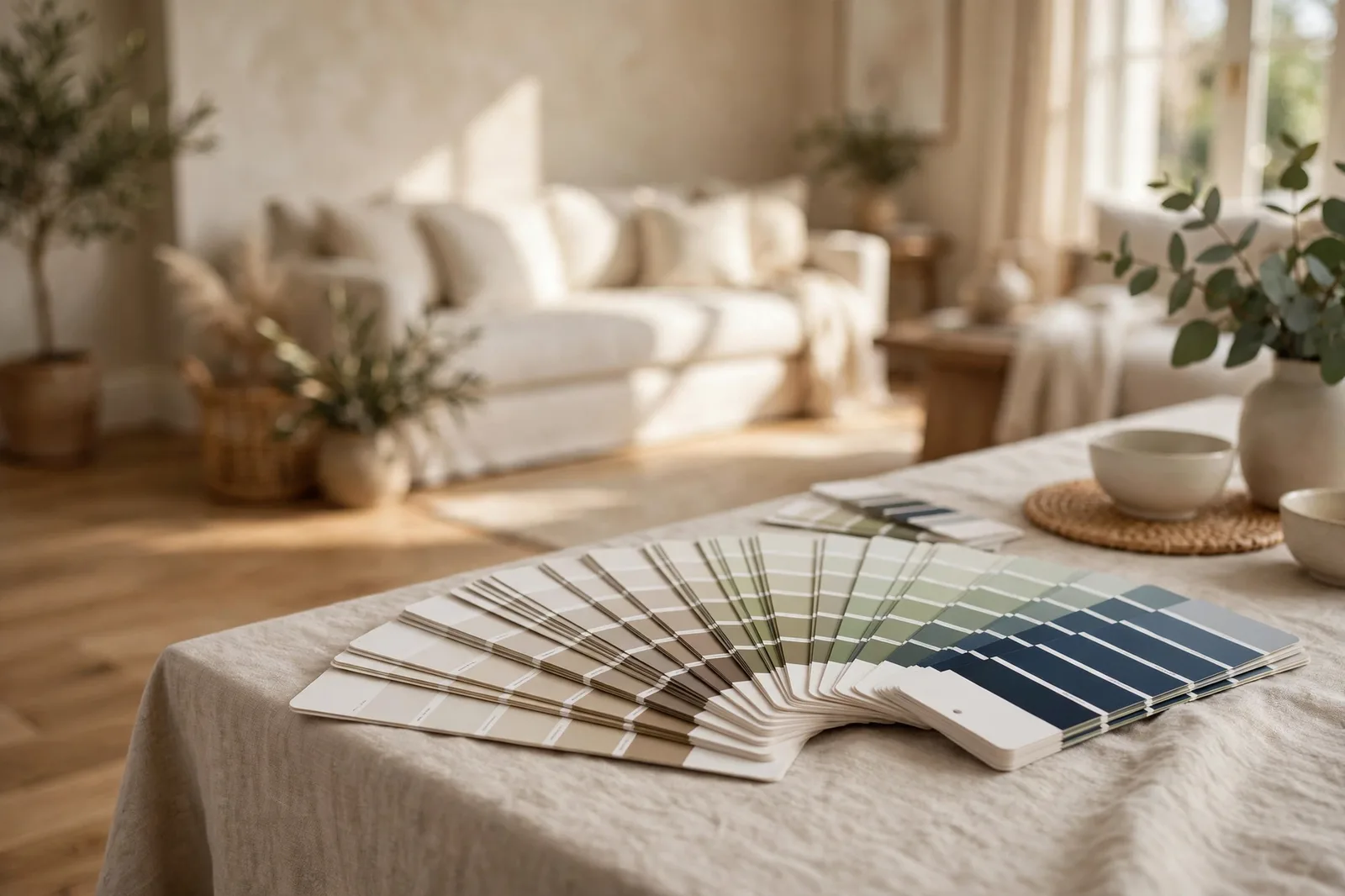
Choosing paint color by color is how houses end up feeling like twelve separate decisions. Choosing a palette, a small family of colors designed to work together from the start, is how they end up feeling like one home. Below are twelve complete whole-home palettes that designers reach for again and again: not single colors, but full systems with an anchor neutral, supporting colors, a trim white, and accents, plus the house styles, fixed finishes, and light each one suits best.
Why start from a palette, not a color
Most paint regret doesn’t come from one bad color. It comes from a dozen fine colors that were never introduced to each other, the living room greige with a pink undertone, the bedroom gray with a blue one, the kitchen white that’s secretly yellow. Each looked great on its own chip. Together, they’re twelve separate arguments.
A palette solves this structurally. Instead of making the same “does this go with that?” decision twelve times, you make one decision, which family of colors, and every later choice happens inside boundaries that already agree. The undertone question gets answered once. The light question gets answered once. Everything after that is just placement.
There’s a second reason designers work from palettes: variety comes from texture and finish, not from more colors. A house in three well-chosen neutrals, layered with linen, oak, wool, brass, and stone, feels richer than a house in nine unrelated paint colors with nothing interesting touching them. Restraint in color buys you freedom everywhere else.
The twelve palettes below are organized by mood, from warm and welcoming to calm and cool to rich and moody. Every one includes the same four roles so you can compare like with like, and every one tells you the undertone family, the finishes it suits, and the light it prefers, so you can match the palette to the house you actually have.
How to read these 12 palettes (at a glance)
Each palette uses the same four roles. Learn them once and you can mix, match, and adapt any system:
Anchor neutral, the color on most walls: living areas, hallways, the connective spaces.
Supporting colors, 2–3 colors for bedrooms, offices, secondary rooms, in the same undertone family as the anchor.
Trim white, one white for all trim, doors, and ceilings. The quiet thread that ties every room together.
Accents, 1–2 deeper colors in contained doses: powder room, dining room, kitchen island, front door, built-ins.
Named colors throughout are hedged as designer-reported examples, “in the spirit of” widely-used colors, not prescriptions. Your version of any palette should be found by sampling in your own light, next to your own finishes.
| # | Palette | Undertone family | Best light | Best for |
|---|---|---|---|---|
| 1 | Modern Farmhouse Classic | Warm | Any; glows in bright light | Farmhouse, warm oak floors |
| 2 | Coastal Warmth | Warm-neutral | Bright, airy rooms | Coastal, transitional, rentals |
| 3 | Craftsman Earth | Warm, earthy | Any; rich in lamplight | Craftsman, dark wood trim |
| 4 | Classic Colonial | Warm-neutral | Any | Colonial, traditional, millwork |
| 5 | Modern Gray Calm | Neutral, faintly warm | Any | Modern, concrete or light floors |
| 6 | Soft Blue-Gray Retreat | Cool | South or east (not dim north) | Bedrooms, baths, home offices |
| 7 | Sage & Stone | Warm-green | Any, lovely with garden views | Transitional, oak, nature lovers |
| 8 | Light & Airy Scandinavian | Warm-neutral | Low light, small spaces | Apartments, minimal homes |
| 9 | Deep Green Library | Warm | Lamplight, enclosed rooms | Traditional homes with a study |
| 10 | Navy & Charcoal Modern | Neutral | Any | Modern homes wanting drama |
| 11 | Warm Terracotta Mediterranean | Warm | Afternoon sun | Stucco, tile, warm climates |
| 12 | Monochrome Warmth | Warm | Any | Minimalists, open plans |
Warm & welcoming palettes (1–4)
1. Modern Farmhouse Classic
Anchor: a warm white, in the spirit of Alabaster, across main living areas and hallways. Supporting: a warm greige (Accessible Beige territory) for bedrooms and a soft warm mid-tone like a muted sage for the home office. Trim white: the same warm white as the walls for softness, or a crisper white for contrast, one choice, everywhere. Accents: black on interior doors or the kitchen island, plus one deep navy for the powder room or front door.
Undertone family: warm throughout. Best for: farmhouse and modern-farmhouse architecture, white or honey oak floors, black hardware and lighting, exposed beams. Best light: any, but it glows in bright south-facing rooms.
Designer note: the single most-used whole-home palette in American design right now, which is both its strength and its risk, done well it’s timeless; done on autopilot it can feel expected. The difference is the black: real matte black accents (not charcoal, not espresso) are what keep the warmth from going sleepy. For the full system, see our house-style templates.
2. Coastal Warmth
Anchor: a soft warm sand, light, sunbaked, easy. Supporting: a sea-glass blue-gray for one or two bedrooms and a pale aqua for a bath. Trim white: a clean warm white, consistent everywhere. Accents: a driftwood deep taupe for the kitchen island or built-ins, plus natural rattan and woven textures as the “color” in textiles.
Undertone family: warm-neutral. Best for: coastal, cottage, and transitional homes; rentals where you want calm without blandness; light wood or whitewashed floors. Best light: bright, airy rooms, this palette wants daylight.
Designer note: the blue-gray here is doing quiet work: it’s the only cool note in a warm palette, which keeps the whole thing from feeling monotone. Keep it muted and dusty, anything brighter reads beach-theme instead of beach-calm. This is the palette to choose when you want serenity but gray feels too cold.
3. Craftsman Earth
Anchor: a warm greige-taupe, earthy, grounded, mid-tone enough to hold its own against dark wood. Supporting: olive and sage greens (Evergreen Fog territory) for bedrooms and the study, plus a warm putty for secondary spaces. Trim white: a soft warm white with gentle contrast, or, in a true craftsman, let the original stained woodwork be the trim and keep painted trim minimal. Accents: a deep barn red for the front door or dining room, and/or a dark bronze-green for built-in bookcases.
Undertone family: warm and earthy. Best for: craftsman and arts-and-crafts homes, dark stained trim and built-ins, brick fireplaces, quartersawn oak. Best light: any, this palette is at its richest in evening lamplight.
Designer note: if your house has original woodwork, this palette isn’t a style choice, it’s a respect choice, earthy tones are what those houses were built around. The barn-red accent is the heritage move; designers note it’s been on craftsman doors for a century because it works.
4. Classic Colonial
Anchor: a soft warm white, crisper than the farmhouse anchor, because colonials want formality. Supporting: historic muted tones, a soft blue-gray, a gentle sage, a pale warm gray, for bedrooms and studies. Trim white: crisp and bright, with deliberate contrast; in a colonial, trim is architecture and deserves to be seen. Accents: classic navy for shutters, a study, or the dining room, and true black for the front door.
Undertone family: warm-neutral. Best for: colonial, Georgian, and traditional homes; houses with crown molding, wainscoting, and paneled doors; brick exteriors. Best light: any.
Designer note: the colonial formula, light body, white trim, dark accent, has worked for three centuries because it’s nearly impossible to get wrong. The modern update: keep at least one muted supporting color in the mix so the formality feels warm rather than sterile. Historic colors should feel like they’ve been on the wall for decades, never neon.
Calm & cool palettes (5–8)
5. Modern Gray Calm
Anchor: a light warm gray, in the Repose Gray family, through the main living spaces. Supporting: one step lighter (a soft warm white for bedrooms) and one step deeper (a mid-tone greige for the media room or office). Trim white: bright and sharp, with crisp contrast against the gray. Accents: charcoal for a feature wall or kitchen island, and true black for window frames, doors, or exterior accents.
Undertone family: neutral, faintly warm. Best for: modern and contemporary architecture, white oak or concrete-look floors, black window frames, flat-panel cabinetry. Best light: any, but test the anchor on the most glass-adjacent wall, since modern homes often have walls of glass and shifting light.
Designer note: the gray here must have a faint warm undertone, a truly cool gray in a modern home with cool floors can read clinical. Check it against white paper; if it reads blue, go one step warmer. Restraint is the aesthetic: this palette is edited on purpose.
6. Soft Blue-Gray Retreat
Anchor: a warm light gray for the main spaces. Supporting: a soft blue-gray, dusty, muted, calm, for the primary bedroom, baths, and home office. Trim white: a soft white that doesn’t fight the blue. Accents: one deep navy (Hale Navy territory) for the powder room or a bedroom accent wall, plus nickel and natural linen as the supporting cast.
Undertone family: cool. Best for: bedrooms, bathrooms, and offices, the rooms where calm is the job. Transitional and traditional homes. Best light: south or east-facing rooms. This is the one palette with a real light constraint: cool colors need light to stay friendly, and in dim north-facing rooms they can turn chilly.
Designer note: designers consistently flag blue-grays as the most light-sensitive family, the same color can read serene in a south bedroom and icy in a north one. If your rooms are mixed exposures, keep the blue-gray in the bright rooms and let the warm gray anchor carry the dim ones. Undertones explained shows how to spot the blue lean before it surprises you.
7. Sage & Stone
Anchor: a warm greige, soft, stony, easy to live with. Supporting: a muted sage green (Evergreen Fog family) for the kitchen, dining room, or primary bedroom, plus a pale stone tone for secondary bedrooms. Trim white: warm white, consistent everywhere. Accents: terracotta for the powder room or front door, and olive for textiles and the mudroom.
Undertone family: warm-green. Best for: transitional homes, oak floors, houses with garden views, green inside echoes green outside. Nature lovers who want color without brightness. Best light: any; particularly lovely in rooms that look onto greenery.
Designer note: sage is the hardest-working “color” in the neutral world: it reads as a neutral in most lights but gives the eye somewhere to rest that beige never could. The terracotta accent is the move designers use to keep sage from going flat, warm against cool-green is the contrast that makes both sing.
8. Light & Airy Scandinavian
Anchor: a soft white, warm enough to glow, light enough to bounce every available photon. Supporting: a pale warm gray for one or two rooms that need a whisper of definition. Trim white: bright white, barely a step from the walls, the look is seamless, not contrasty. Accents: black in small doses (frames, hardware, one light fixture) and natural wood tones everywhere as the real “color.”
Undertone family: warm-neutral. Best for: apartments, condos, small or low-light homes, minimalists. Anywhere square footage or daylight is limited. Best light: designed for low light, this palette is the answer to dim rooms.
Designer note: in small spaces, this palette does something counterintuitive: fewer color changes make rooms feel larger, because the eye never hits a visual stop. Keep wall colors to two at most and let texture, bouclé, linen, light oak, wool, carry all the interest. One black moment per room keeps it from floating away.
Rich & moody palettes (9–12)
9. Deep Green Library
Anchor: a warm greige or warm white through the main living areas, the calm backdrop. Supporting: warm neutrals in bedrooms. Trim white: warm white, consistent. Accents: the star, a deep, rich green (Salamander-type depth) in the enclosed rooms: the study, the dining room, the powder room. Somewhere with a door that closes.
Undertone family: warm, with a deep green moment. Best for: traditional and transitional homes with a library, study, or den; anyone who wants drama without committing the whole house to it. Best light: lamplight, deep green is at its most enveloping in the evening.
Designer note: this is the containment principle at its best: the boldest color goes in the most enclosed room, where it reads as intentional luxury instead of a shout. Designers note deep green flatters wood tones and brass like nothing else, if you have either, this palette was made for you.
10. Navy & Charcoal Modern
Anchor: a warm white through main spaces. Supporting: light warm grays. Trim white: crisp white for sharp contrast. Accents: navy in the dining room or powder room, charcoal on the kitchen island or a bedroom accent wall, black on frames and hardware.
Undertone family: neutral. Best for: modern and transitional homes that want drama in measured doses; open plans where the island or dining zone can carry a deep color. Best light: any.
Designer note: navy and charcoal are the two deep colors that behave like neutrals, they anchor a room without hijacking it. The rule: one deep color per sightline. A navy dining room visible from a charcoal island is one deep moment too many; separate them with the warm white anchor and both get to shine.
11. Warm Terracotta Mediterranean
Anchor: a warm sand, sunbaked, soft, forgiving. Supporting: a muted clay/terracotta for the dining room or a bedroom, plus a pale cream for secondary spaces. Trim white: creamy warm white. Accents: olive green for shutters, the front door, or the mudroom, plus wrought iron and natural stone as texture.
Undertone family: warm. Best for: Mediterranean, Spanish, and stucco homes; warm climates; houses with tile floors or saltillo; anyone whose light runs golden. Best light: afternoon sun, this palette was born in it.
Designer note: terracotta on walls is a commitment, it saturates fast at full scale, so designers use it in the muted, dusty register, never bright. If you’re nervous, start with the terracotta on the front door and in textiles, and let the sand anchor do the heavy lifting inside.
12. Monochrome Warmth
Anchor: a warm greige. Supporting: the same hue family, one step lighter for bedrooms and one step deeper for the office or media room, a true monochrome, built from tints and shades of one color. Trim white: warm white. Accents: black, frames, hardware, lighting, as the only contrast.
Undertone family: warm. Best for: minimalists, open-concept homes (one family across the whole open space is the safest possible choice), and anyone paralyzed by options. Best light: any.
Designer note: this is the palette for people who don’t trust themselves with color, and it’s secretly the most sophisticated choice on the list. Because there’s only one hue, undertone clashes are impossible; all the interest comes from depth variation and texture. Designers build character here with sheen variation and materials: matte walls, eggshell trim, linen, oak, wool, stone.
How to choose between them
Twelve palettes is still twelve decisions, so here’s how to narrow it in about fifteen minutes.
Step 1, Let your fixed finishes vote first. Walk the house and note the undertones of what you can’t change: floors, cabinets, countertops, tile, brick. Warm oak and honey tones point to palettes 1–4, 7, 11, or 12. Cool gray tile, concrete, or white marble point to 5, 6, or 10. Mixed finishes point to the neutrals: 5, 8, or 12. Our undertone-matching framework walks this step in detail.
Step 2, Check your light. Dim, north-facing main rooms eliminate palette 6 (cool colors need light) and favor 8, 1, or 12. Bright south-facing rooms can take anything, including the moody palettes, since strong light keeps deep colors from going heavy. West-facing evening sun means testing warm palettes at sunset before committing.
Step 3, Be honest about your appetite. If the thought of a deep green dining room excites you, you’re palettes 9–11. If it terrifies you, you’re 1, 5, 8, or 12, and that’s not settling, it’s self-knowledge. The best palette is the one you’ll still love in five years, not the one that photographs best today.
Step 4, Test the anchor before anything else. Once you’ve shortlisted two or three palettes, don’t test all their colors, test just the anchors. Buy sample pots, paint large boards, and live with them for 48 hours in your light, next to your finishes. The anchor is the palette’s foundation; if it works, the supporting colors (chosen in the same family) almost always follow. The full protocol is in how to test paint samples.
And if choosing between finished palettes still feels like a lot, that’s the entire reason done-for-you color systems exist.
Want the palette without the guesswork?
The Whole Home Paint Guide is a complete, ready-to-use color system, every room mapped, trim and ceiling pairings included, undertones already coordinated, so you skip the shortlisting entirely and go straight to the part where your house feels finished.
Frequently asked questions
Carefully. The safe way is to take one palette’s anchor and trim system, then borrow a single accent from another, the farmhouse anchor with the craftsman barn-red door, for example. Mixing two full anchors in one sightline is where cohesion breaks. When in doubt, the designer consensus on color count keeps you honest.
Palettes 12 (Monochrome Warmth), 1 (Modern Farmhouse Classic), and 5 (Modern Gray Calm), all built on one anchor carried across the whole open space. In open plans, every wall visible from one spot must get along, so single-family palettes are the safest choice. Our open-concept color flow guide covers placement in detail.
Choose a neutral-leaning palette, 5, 8, or 12, that sits between the two families rather than siding with either, and let one consistent trim white do the unifying work. The dominance rule still applies: the larger, more permanent finish gets the most say. See undertones explained for the white-paper test.
No, the named colors are designer-reported starting points, not prescriptions. Use them to find your undertone family and depth range, then sample 2–3 finalists in your own light. The palette’s structure (roles, temperature, placement) matters far more than any single color name. Screen swatches are approximate; confirm with physical samples.
Palettes 1, 8, or 12, all built on warm, light-reflecting anchors that keep dim rooms from going flat. Avoid palette 6 (cool colors turn chilly in weak light). Whichever you choose, go one step lighter and warmer on the anchor than you think, and test in the room’s worst light.
Most homes need 3–5 wall colors total plus one trim white, you don’t have to use every color in a palette. Start with the anchor and trim, add supporting colors only where rooms genuinely need them, and keep accents to one or two contained moments. Unused palette colors aren’t wasted; they’re options you chose not to need.

