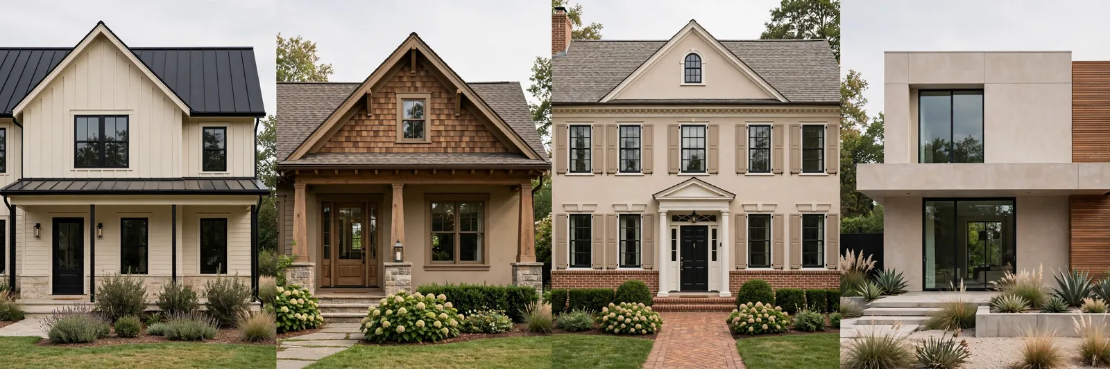
Every house style already speaks a color language. A farmhouse wants warm whites and black accents; a craftsman wants earthy, grounded tones; a colonial wants crisp formality; a modern home wants contrast and restraint. When your palette agrees with your architecture, the house looks inevitable. When it fights it, something always feels slightly off, even if you can’t name it.
Why your house style should choose your palette
Architecture carries expectations. A farmhouse with cool blue-gray walls reads as confused because the style’s whole identity is warmth, whitewashed boards, honeyed oak, black iron hardware. A colonial in muddy earth tones loses the crisp formality that makes colonials feel stately. These aren’t rules anyone wrote down; they’re patterns your eye absorbed from every house in the style you’ve ever seen.
Working with that expectation is the fastest shortcut in color planning. Instead of inventing a palette from 2,000 swatches, you start from a proven family of colors that already belongs on your house, then spend your energy on the part that actually matters: getting the undertones right and adapting to your light.
That’s what the four systems below are. Not rigid recipes, starting frameworks, each tuned to one architectural language, each complete enough to paint a whole house from.
How to read these templates (and compare them)
Every template follows the same five roles. Learn the roles once and you can read, and mix, any system:
Anchor neutral, the color on most walls: living areas, hallways, open spaces. Sets the temperature of the whole house.
Supporting colors, 2–3 colors for bedrooms, offices, secondary spaces. Same undertone family as the anchor, varied in depth.
Trim white, one white for all trim, doors, and ceilings. The quiet thread that ties everything together.
Deep accents, 1–2 saturated colors in contained doses: powder room, dining room, kitchen island, front door, built-ins.
Fixed finishes it suits, the floors, wood tones, and materials each system was built to sit next to. Match yours before committing.
| System | Anchor neutral | Temperature | Trim approach | Signature accent |
|---|---|---|---|---|
| Modern Farmhouse | Warm white | Warm | Same warm white, or crisp white | Black / deep navy |
| Craftsman | Warm greige / taupe | Warm, earthy | Warm white, soft contrast | Deep red / bronze green |
| Colonial / Traditional | Soft warm white | Warm-neutral | Crisp white, high contrast | Navy / black |
| Modern / Contemporary | Light warm gray | Neutral-cool | Bright white, sharp contrast | Charcoal / black |
Adapting any template to your light
Templates are built for average light. Yours isn’t average, so adjust: in north-facing or dim rooms, choose the warmest option within each role and consider going one step lighter on the anchor, cool dim light flattens color. In bright south-facing rooms, you can use the crisper or slightly deeper version of each role without it washing out. And everywhere: test large samples for 48 hours, morning and evening, next to your fixed finishes. The template gets you 90% there; your light decides the final 10%.
Template 1, Modern Farmhouse
The look in one line: warm white walls, black accents, wood warmth everywhere. Clean but never cold.
Anchor neutral: a warm white, think the family of Sherwin-Williams Alabaster or Benjamin Moore White Dove. Warm enough to glow against oak floors, neutral enough to run through the whole main floor. This is the farmhouse signature: white that feels like linen, not like a laboratory.
Supporting colors: a warm greige (in the spirit of Accessible Beige or Agreeable Gray) for bedrooms and secondary spaces, plus a soft warm mid-tone, a muted sage like Clary Sage works beautifully, for a home office or dining room.
Trim white: use the same warm white as the walls for a soft, seamless look, or step up to a crisper white (Extra White / Chantilly Lace territory) if you want the trim to pop against the walls. Pick one and use it on every trim, door, and ceiling.
Deep accents: black, on interior doors, a kitchen island, or window frames, plus one deep navy (Naval / Hale Navy family) for a powder room or front door. Black is the farmhouse exclamation point; use it sparingly and it never fails.
Suits: white oak or honey oak floors, white or wood-tone cabinets, black hardware and lighting, exposed beams. The classic modern-farmhouse fixed palette.
Template 2, Craftsman
The look in one line: earthy, grounded, “in and of the ground”, nature’s palette brought indoors.
Anchor neutral: a warm greige or taupe, the Mega Greige / Grant Beige family. Mid-tone enough to hold its own against dark wood trim (craftsman homes are full of it), warm enough to feel like earth rather than concrete.
Supporting colors: olive and sage greens (Clary Sage, Evergreen Fog territory) and a warm putty or stone tone for bedrooms. These are the colors of moss, bark, and river rock, they belong in a house built around woodwork.
Trim white: a soft warm white (Alabaster family) with gentle contrast against the deeper walls. Craftsman trim is often stained wood rather than painted, if yours is, let the wood be the “trim” and keep painted trim minimal and warm.
Deep accents: a deep barn red (Fireweed family) for the front door or a dining room, and/or a dark bronze-green (Green Bay family) for built-in bookcases or a study. These are historic craftsman hues, they’ve belonged on these houses for a century.
Suits: dark stained wood trim and built-ins, quartersawn oak floors, brick fireplaces, stone accents. If your house has original woodwork, this template was made for it.
Template 3, Colonial / Traditional
The look in one line: crisp, formal, timeless, historic colors with fresh contrast.
Anchor neutral: a soft warm white, White Dove / Shoji White territory. Lighter and crisper than the farmhouse anchor; colonials want formality, and formality reads as contrast.
Supporting colors: historic muted tones, a soft blue-gray (Knoxville Gray family), a gentle sage, or a pale warm gray for bedrooms and studies. Muted, never neon; these colors should feel like they’ve been on the wall for decades.
Trim white: crisp white (Chantilly Lace / Extra White family) with deliberate contrast against the walls. In a colonial, trim is architecture, crown molding, wainscoting, paneled doors, and it deserves to be seen.
Deep accents: navy (Hale Navy / Naval family) for shutters, a study, or dining room, and classic black for the front door. The colonial formula, light body, white trim, dark accent, has worked for 300 years because it’s nearly impossible to get wrong.
Suits: hardwood floors, crown molding and wainscoting, brick exteriors or chimneys, traditional cabinetry. The more millwork your house has, the better this template looks.
Template 4, Modern / Contemporary
The look in one line: edited, high-contrast, calm, every color earns its place.
Anchor neutral: a light warm gray, the Repose Gray family. Modern homes want neutrality without iciness; a gray with the faintest warm undertone keeps open spaces feeling calm rather than clinical.
Supporting colors: keep it tight, one step lighter (a soft warm white for bedrooms) and one step deeper (a mid-tone greige for a media room or office). Modern palettes are edited; restraint is the aesthetic.
Trim white: bright, sharp white (Extra White / Chantilly Lace family) with crisp contrast. In modern architecture, the line between wall and trim should be clean enough to read from across the room.
Deep accents: charcoal (Iron Ore family) for a feature wall or kitchen island, and true black for window frames, doors, or exterior accents. One deep green (a dark forest tone) can substitute if you want the accent to feel organic rather than graphic.
Suits: white oak or concrete-look floors, black window frames, flat-panel cabinetry, minimal trim. The sleeker the architecture, the better this template performs.
Frequently asked questions
Yes, if your fixed finishes agree with it. The template follows the finishes more than the floor plan: warm oak floors and white cabinets will carry a farmhouse palette in a ranch, a colonial, or a new build. But if your house has cool gray tile and dark walnut, the craftsman or modern template will fight you less.
Pick the template that matches your dominant fixed finishes, not your furniture, furniture changes, floors don’t. Most “mixes” resolve clearly once you inventory undertones: warm wood everywhere points to farmhouse or craftsman; cool stone and chrome points to modern.
Same family, not same colors. Exteriors need to work with the roof, brick, and stone in harsh daylight, so use the template’s undertone family and accent logic (e.g., the colonial navy door, the craftsman earth tones) rather than copying interior wall colors outside.
Modern Farmhouse or Colonial, both are built on warm whites that reflect the limited light instead of absorbing it. Whichever you choose, go one step lighter and warmer on the anchor than the template’s default, and keep deep accents tightly contained.
Carefully. The safe way is to take one template’s anchor and trim system, then borrow a single accent from another, farmhouse bones with a craftsman deep red door, for example. Mixing two full anchors in one sightline is where cohesion breaks.
No, they’re starting points from widely-used colors, not prescriptions. Use them to find your undertone family and depth range, then sample 2–3 finalists in your own light. The template’s structure (roles + temperature + placement) matters far more than any single color name.
Want a finished system instead of a starting point?
These templates give you the framework. The Whole Home Paint Guide gives you the finished thing, a complete Sherwin-Williams color system with every room mapped, trim and ceiling pairings included, and undertones already coordinated. (Independent guide; not affiliated with or endorsed by Sherwin-Williams.)

