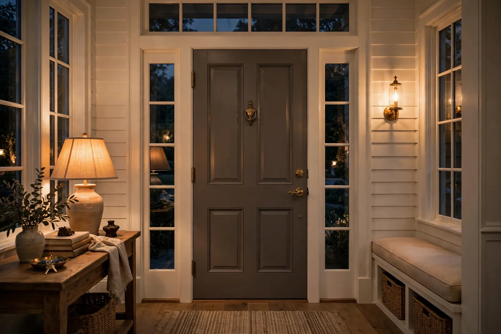
Some dark colors shout. Urbane Bronze doesn’t, it hums. Named Sherwin-Williams’ 2021 Color of the Year, SW 7048 is a deep, warm bronze-gray that reads like aged wood, weathered stone, or rich earth held in shadow: darker than most people expect from a neutral, yet warm enough to feel grounding rather than cold. It’s the color designers reach for when a space needs gravity without gloom, a front door with presence, an accent wall with confidence, a kitchen island that anchors the whole room, an exterior that looks expensive without trying. But very dark colors have honest limits, and Urbane Bronze rewards a proper review before it goes on your walls. This guide walks through what the color actually is, how its undertones shift in real light, where it shines and where it struggles, what to pair it with, and how it compares to the other deep darks crowding the same territory. Paint colors shift with lighting, surface, and sheen, so always test a large physical sample in your own space, in your own light, before committing, screen swatches are approximations. The Global Abode is an independent publication, not affiliated with or endorsed by Sherwin-Williams or Benjamin Moore; all color names and codes are referenced as widely-known designer examples.
Key takeaway: Urbane Bronze is a very dark, warm-leaning bronze-gray with brown and charcoal threads and a whisper of green underneath, grounded, meditative, and versatile, but genuinely light-dependent: it reads as a rich bronze-brown in warm, bright light, a murky gray-green in cool north light, and near-black in dim rooms. Use it deliberately, front doors, exteriors, accent walls, islands, and moody enclosed rooms, pair it with warm creamy whites, natural wood, and brass, and never as a whole-house interior color. Undertone notes below are widely-reported designer observations, not exact manufacturer specifications.
What Urbane Bronze Is: The 2021 Color of the Year
When Sherwin-Williams named Urbane Bronze its 2021 Color of the Year, the choice landed in a very particular cultural moment. Homes had become everything, office, classroom, refuge, and the palette of the moment was turning inward: toward colors that felt rooted, calm, and connected to the natural world. Sherwin-Williams described Urbane Bronze as “grounded, meditative, and serene,” and the color genuinely delivers that sensation. It is an earthy, warm dark that sits somewhere between brown and gray, a deep bronze with a charcoal backbone and, if you look closely in the right light, a quiet thread of green that keeps it feeling organic rather than industrial.
Structurally, the color is best understood as a warm dark neutral with a gray base. It is not quite a brown, it is too muted, too grayed-down for that. It is not quite a charcoal, it is too warm, too earthy. Designers widely describe it as straddling the line between the two, which is precisely what makes it so useful: it can read as the warm anchor in a gray room or the grounding dark in a warm room, depending on its companions and its light. The name is honest, urbane because it is sophisticated and composed, bronze because of the warm metallic earthiness at its core.
One thing to calibrate before anything else: this is a very dark color. It absorbs most of the light that hits it, which means it will always read dramatically darker on your wall than on a small swatch, and in a dim room it can read as near-black. That depth is the source of both its power and its limits. Used deliberately, a front door, an accent wall, a kitchen island, a moody study, the darkness is the point: it creates contrast, depth, and a sense of intention that lighter neutrals simply cannot. Used carelessly, a small dark room, a whole-house scheme, a space with no natural light, the same darkness just reads as a cave.
Why did it endure when so many Colors of the Year fade? Because it answers a real, recurring design need rather than a seasonal whim. Every home eventually needs one deep, grounding color, for the door, the island, the built-ins, the one wall that gives the room its spine. Urbane Bronze fills that role with unusual grace: it is dark enough to do the job, warm enough to stay livable, and neutral enough to work with both warm and cool companions. It also has a quiet quality that loud darks (true blacks, navy) lack, it recedes rather than advances, which makes it one of the few very dark colors that can feel calm instead of dramatic.
Undertones and Light Behavior: The Three Faces of the Color
Ask ten designers about Urbane Bronze’s undertones and you will get a consistent answer phrased ten ways: brown first, gray second, green third. It is fundamentally a warm brown, muted by a strong gray-charcoal cast, with a subtle green thread that designers consistently report surfacing in certain lights. The gray is what keeps it from reading as a plain chocolate brown; the green is what gives it the organic, earthy quality that separates it from a flat charcoal. Together they create a color that feels like something found in nature, bark, stone, turned earth, rather than something mixed in a lab.
This is a color with three distinct faces, and honest reviewers all describe the same behavior. In warm, bright light, south- or west-facing rooms in the afternoon, warm lamplight in the evening, the bronze-brown comes forward. This is the color at its most welcoming: rich, earthy, almost glowing, with the warmth that makes it feel like a natural material rather than paint. In cool, indirect light, north-facing rooms, overcast days, the gray and charcoal threads take over, and it reads as a murky dark gray with the warmth held in reserve. In dim or shadowy conditions, it deepens toward near-black, and the subtlety that makes it beautiful in good light can disappear entirely, this is the face that causes the most regret when people skip the sampling step.
The green thread deserves its own note because it is the undertone that surprises people. In evening lamplight, warm 2700–3000K bulbs, designers widely report a faint green-gray cast emerging, especially on large wall areas. It is not a “green color” by any stretch; it is a whisper, the kind of thing you notice when you compare it against a true charcoal. But it matters for pairing: it is why Urbane Bronze sits so naturally beside deep greens, olive tones, and natural wood, and why it can argue quietly with pink-beige or mauve-leaning neutrals, where the green thread and the pink thread visibly disagree.
Artificial light matters enormously with a color this dark. Under warm bulbs, Urbane Bronze relaxes into its richest, most bronze version, which is why it photographs so beautifully in styled rooms with layered warm lighting. Under cool daylight-balanced bulbs, it flattens toward gray and can look colder and harder than intended. If you are testing this color, test it under the bulbs you will actually live with, in the evening, because that lamplight version is the one that will greet you every night, and on a very dark color, the bulb temperature changes the whole emotional register of the room.
Tip: Test very dark colors differently than light ones: paint a large board (2×2 feet minimum) with two coats, then check it at three moments, bright midday, late afternoon, and 8pm under your actual lamps. Dark colors change more between these moments than light colors do, because they have less reflected light to stabilize them. Our 48-hour sampling method walks through the full protocol, and it matters twice as much for a color this deep.
Best Rooms and Uses: Doors, Exteriors, Accents, and Moody Rooms
Urbane Bronze is at its best when it is doing a specific job. This is not a background color, it is a statement neutral, and the applications below are where designers consistently reach for it.
Front doors. This is arguably the color’s most natural application. A front door in Urbane Bronze reads as confident and welcoming without the starkness of black, warm enough to feel like an invitation, dark enough to give the entry real presence. It works on nearly every exterior palette: white siding, brick, stone, board-and-batten. And because a door is a small, contained surface, there is no risk of the darkness overwhelming anything.
Exteriors. On siding, shingles, or as a trim and shutter color, Urbane Bronze is one of the most-referenced dark exterior choices in designer reviews. On a full exterior, it reads as a soft, organic near-black that sits beautifully against landscaping, it does not have the harsh edge of a true black house, and it ages gracefully because its muted quality doesn’t shout. As an accent, shutters, garage doors, the roofline trim against lighter siding, it gives a house definition and depth. As with any exterior, test it on the actual material in daylight; exterior light is cooler and brighter than interior light, and the gray thread will show more.
Kitchen islands and cabinetry. Urbane Bronze has become a genuine cabinet color, on a kitchen island, it can carry the entire room’s color story while the perimeter stays in a warm white, one of the most-referenced applications in designer reviews. It has a particular affinity for brass and champagne-gold hardware, which warm up its cool thread, and for white or light countertops, which keep the composition from getting heavy. On lower cabinets or a full kitchen run, it sits in the sweet spot: more interesting than white, calmer than navy, warmer than gray.
Accent walls. One wall in Urbane Bronze, the fireplace wall, the wall behind the bed, the dining room’s far wall, gives a room a focal point with genuine gravity. The key is contrast: it needs lighter companions around it (warm white trim, lighter adjacent walls) so the darkness reads as intentional rather than oppressive. In a bedroom, it creates the cocooning, restful quality that makes dark bedrooms so loved; in a living room, it gives the room a designed spine.
Moody enclosed rooms. Studies, libraries, dens, powder rooms, media rooms, the rooms with doors that close are where Urbane Bronze can go furthest, including full color-drenching across walls, trim, and ceiling. In a small, enclosed room, a very dark color does something counterintuitive: because every surface is the same deep tone, the boundaries dissolve and the room feels intentional and atmospheric rather than small. The rule is commitment, one dark wall with a white ceiling is a cave; the full envelope is a jewel box. And the lighting must be layered: warm lamps, lighter furnishings for contrast, reflective surfaces to bounce light around.
Furniture and built-ins. A dresser, a console, a bookcase wall, or built-in shelving in Urbane Bronze gives a room a grounded anchor without committing a single wall. This is the lowest-risk way to live with the color, and often the most beautiful, because the dark finish against lighter walls shows off the bronze warmth at its best.
Where Urbane Bronze Struggles
No color is universal, and a very dark color has real, non-negotiable limits. None of these are flaws in the color, they are placement truths, and respecting them is what separates a stunning Urbane Bronze room from a regretted one.
Low-light rooms. This is the big one, and designers are unanimous: do not use Urbane Bronze in a dim interior room. Because it absorbs most of the light that reaches it, a north-facing room with a small window, a windowless hallway, or a basement space will turn it into something close to black, and not the rich, intentional black of a moody study, but a flat, light-swallowing dark that makes the room feel smaller and heavier. The test is simple and merciless: if your large sample board reads as near-black in the room’s actual light, the color is too dark for that room. Choose a room with generous natural light or strong layered artificial light, or choose a lighter color.
Whole-house interiors. Urbane Bronze is not a whole-house color. Designers consistently advise against carrying it through connected living spaces, it is simply too dark to serve as the background of daily life, and it would make the home feel heavy and closed-in rather than calm. The whole-home palette wants light-reflecting neutrals that carry sightlines; Urbane Bronze’s job is punctuation, not prose. Our whole-home palette guide covers the anchor-neutral method that a color like this is designed to punctuate, not replace.
Next to the wrong undertones. Urbane Bronze’s green thread means it argues with certain companions. The most common clash designers report is with pink-beige and mauve-toned neutrals, the pink thread and the green thread visibly disagree, and both colors look worse for it. It also sits uneasily with cool, clean grays that have a blue cast, where the warmth of the bronze reads as muddy by comparison. The safe neighbors are warm whites, true warm greiges, warm wood tones, and deep greens, companions whose undertones lean warm or earthy without going pink.
Small rooms without a plan. A small room in Urbane Bronze can be magnificent (see the jewel-box powder room above) or miserable, the difference is entirely in the execution. Without layered warm lighting, lighter furnishings for contrast, and full commitment to the envelope, a small dark room just reads as dark. If you cannot commit to the lighting and the full drench, keep the color to one wall or one piece of furniture instead.
Watch out: The most common Urbane Bronze regret is choosing it from a small chip and painting a dim room. The chip shows the rich, warm, bronze version; the dim room delivers the flat, near-black version. These are the same color in different light, but only one of them is the room you’re painting. Always test a large board in the actual room, in the actual light, including the 8pm check under your real lamps, before committing.
Pairings: Trim Whites, Neutrals, and Accent Partners
Urbane Bronze is a generous color to pair with, its muted, earthy quality means it rarely fights, but the companions you choose decide which version of it shows up. The trim white is the single highest-leverage decision.
| Role | Widely-referenced choices | What it does to Urbane Bronze |
|---|---|---|
| Trim white (warm) | Alabaster, Shoji White, White Dove | The most-referenced pairing, creamy warmth softens the dark, pulls the bronze forward, cozy and cohesive |
| Trim white (crisp) | Pure White, Simply White | Fresh, modern contrast; keeps the composition polished without starkness |
| Trim to avoid | Extra White, Chantilly Lace and other cool, clean whites | Too stark and cool, makes the bronze read muddy by comparison |
| Warm neutral walls | Accessible Beige, warm greiges, Modern Gray | Creates a layered, tonal palette; the neutrals keep adjacent walls light while the bronze punctuates |
| Deep green accent | Evergreen Fog, deep olive and moss tones | The green thread in Urbane Bronze finds its echo, organic, collected, natural |
| Warm earth accent | Terracotta, clay, and cognac tones | Complementary warmth; textiles and leather in these tones make the bronze feel inevitable |
| Metals & woods | Brass, champagne gold, oil-rubbed bronze; white oak, walnut | Brass warms the cool thread; natural woods are the color’s most instinctive partner |
| Dark contrast | Matte black fixtures and hardware | Sharp, modern punctuation, black against bronze reads as deliberate edge |
On trim whites specifically: the designer consensus is clear, warm, creamy whites win. Alabaster is the warm, soft choice that harmonizes with the bronze and creates the cozy, layered look that dominates styled photos of this color. Shoji White is the slightly cleaner warm white for those who want warmth without creaminess. White Dove sits in the same family. Crisp off-whites like Pure White and Simply White also work well, giving a fresher, more contemporary contrast. What designers consistently advise against is cool, clean whites, Extra White, Chantilly Lace, and their cousins, which read as stark and cold next to the bronze and make its warmth look muddy. Our guide to the best Sherwin-Williams whites walks through how each of these behaves against dark, warm walls.
On neutrals: Urbane Bronze loves company from the warm-neutral family on adjacent walls, Accessible Beige, warm greiges, and soft warm whites create the tonal, layered palette that lets the bronze be the exclamation point. This is also where our Evergreen Fog guide becomes relevant: deep, muted greens are among the most natural accent partners for Urbane Bronze, because the green thread in the bronze finds its echo in the green wall, and the two read as one organic story.
On metals and materials: brass and champagne gold are the metals this color was made for, they pick up the bronze warmth and make it glow. Oil-rubbed bronze hardware disappears into it beautifully for a seamless look. Matte black gives it modern edge. And natural materials, white oak, walnut, leather, stone, linen, are its native habitat: Urbane Bronze was quite literally designed to sit among them, and a room that pairs it with real wood and natural textures almost cannot go wrong.
Urbane Bronze vs. Similar Deep Darks
Urbane Bronze doesn’t live alone in the deep-dark aisle, it’s surrounded by cousins that are one nudge warmer, cooler, blacker, or greener. Knowing the neighbors helps you confirm that Urbane Bronze is actually the one you want, rather than the one you settled for. All comparisons below are descriptive, based on widely-reported designer observations, sample finalists side by side to judge for yourself.
Urbane Bronze vs. Black Fox (SW 7020). The closest comparison, and designers describe them as near-siblings: Black Fox is the slightly darker, slightly browner version, essentially Urbane Bronze taken one step deeper toward black-brown. If Urbane Bronze feels a touch too gray or not quite deep enough for the drama you want, Black Fox is worth sampling. If Black Fox feels like it disappears into black in your light, Urbane Bronze’s extra gray thread is the restraint you’re looking for.
Urbane Bronze vs. Iron Ore (SW 7069). Iron Ore is the cooler, more charcoal cousin, a dark gray with far less of the bronze warmth. Designers widely describe Iron Ore as the choice for those who want the depth without the brown: it reads as sophisticated charcoal, while Urbane Bronze reads as earthy bronze. If your room leans cool (gray floors, cool stone, black fixtures), Iron Ore may sit more naturally; if it leans warm (wood floors, brass, warm textiles), Urbane Bronze is the better fit.
Urbane Bronze vs. Tricorn Black (SW 6258). Tricorn Black is a true, soft black, noticeably darker and more neutral than Urbane Bronze, without the bronze warmth or the green thread. The decision here is about temperature and softness: Tricorn Black is the crisper, more graphic choice (striking on a front door, dramatic on cabinetry); Urbane Bronze is the warmer, more organic one. If you want black but find true black too harsh, Urbane Bronze is often the answer.
Urbane Bronze vs. Peppercorn (SW 7674). Peppercorn is the cooler dark gray in this family, designers describe it as a charcoal with far less brown than Urbane Bronze. It is the choice for cool-leaning schemes where Urbane Bronze’s warmth would feel out of place. Think of Peppercorn as the gray answer and Urbane Bronze as the bronze answer to the same question: “what deep dark grounds this room?”
Urbane Bronze vs. Sealskin (SW 7675). Sealskin sits near Urbane Bronze in depth but leans warmer and browner, with less of the gray-charcoal cast, designers describe it as the more chocolate-leaning of the two. If Urbane Bronze’s gray thread feels too cool or too muted in your light, Sealskin’s extra brown warmth may be what you’re actually after.
Urbane Bronze vs. Enduring Bronze (SW 7055) and Muddled Basil (SW 7745). These are the neighbors for those drawn to the green thread: Enduring Bronze carries the bronze idea with a touch more metallic earthiness, while Muddled Basil leans openly into olive-green territory. If you find yourself wishing Urbane Bronze showed more of its green, these are the directions to sample, but know that each step greener is a step away from neutral territory.
The decision framework for all of these: sample the finalists side by side, on large boards, in the room, across a full day. The differences between these deep darks are subtle on chips and decisive on walls, which is exactly why chips mislead at this depth. Two or three boards, 48 hours, morning/midday/evening checks, and the right dark usually declares itself. Our cross-brand equivalent guide covers how to think about near-matches and close cousins without expecting exact duplicates, a useful discipline when the differences are this fine.
Building a whole palette around a statement dark like this?
The Whole Home Paint Guide is a complete, ready-to-use color system, anchor neutrals, trim and ceiling pairings, accent colors, all with undertones already coordinated, so a deep color like Urbane Bronze lands in a house designed to hold it. And the Paint Color Workbook includes undertone-comparison worksheets and a room-by-room sampling plan for testing dark finalists side by side with evidence, not guesswork.
Frequently asked questions
Warm-leaning, by designer consensus. It is a deep bronze-brown muted by a gray-charcoal cast, with a subtle green thread underneath. It reads warmest and most bronze in south- or west-facing light and under warm bulbs; in cool north light it leans grayer, but the brown warmth is still present in the background. If you need a single answer: warm, with the gray keeping it from ever reading as a plain brown.
Warm, creamy whites, Alabaster, Shoji White, and White Dove are the most-referenced designer choices. They harmonize with the bronze warmth and keep the composition cozy rather than stark. Crisp off-whites like Pure White and Simply White also work for a fresher, more contemporary contrast. Avoid cool, clean whites like Extra White or Chantilly Lace, which read as stark and cold next to the bronze and make its warmth look muddy.
Not if the room has decent light and you commit to the mood. A bedroom in Urbane Bronze reads as cocooning and restful, one of the most-loved uses of the color, especially with warm wood furniture, cream textiles, and layered warm lighting. In a dim, north-facing bedroom with little natural light, though, it can read as near-black and oppressive. Test a large board in the room’s actual light, including the 8pm check, before committing.
Yes, it is one of the most-referenced dark exterior colors in designer reviews, for full siding, shutters, garage doors, and trim. On an exterior it reads as a soft, organic near-black that sits beautifully against landscaping and doesn’t have the harsh edge of a true black house. Test it on the actual siding material in daylight, since exterior light is cooler and brighter than interior light and will bring out more of the gray thread.
It is not black, but in a dim room it can read as near-black, that is the honest caveat with every very dark color. In good light, its bronze-brown warmth and subtle complexity are clearly visible and clearly distinct from a true black like Tricorn Black. The rule designers give is simple: if your large sample board looks black in the room’s actual light, the room is too dim for this color. In a well-lit room, it reads as exactly what it is, a rich, warm, deep bronze-gray.
The closest widely-referenced neighbors: Black Fox (slightly darker and browner, the nearest sibling), Iron Ore (cooler, more charcoal), Tricorn Black (a true soft black), Peppercorn (cooler dark gray), and Sealskin (warmer, more chocolate-leaning). Each is one nudge away in depth, temperature, or brown content. Sample finalists side by side on large boards in your room, at this depth, the differences are subtle on chips and decisive on walls.

