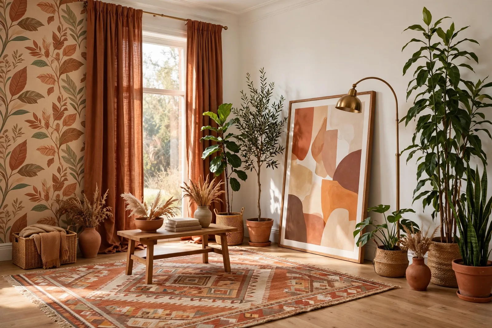
Renting does not mean living in a colorless box, it means building your color system around someone else’s walls. Most rental homes arrive in one of a handful of landlord finishes: an off-white, a warm greige, a soft beige, the occasional cool gray. Your job is not to fight those walls. It is to read their temperature and undertone, agree with it on purpose, and then carry your color in everything you are allowed to change: textiles, art, rugs, lighting, removable wallpaper, and, where the lease allows, one well-negotiated accent wall. This guide gives you a complete renter-friendly whole-home color system, from reading the walls you inherited to negotiating the one wall you might paint, with a plan for every room that survives the move-out inspection. Paint colors shift with lighting, surface, and sheen, so always test a large physical sample in your own space before committing, screen swatches are approximations. The Global Abode is an independent publication, not affiliated with or endorsed by Sherwin-Williams or Benjamin Moore; all color names and codes are referenced as widely-known designer examples.
Key takeaway: A renter-friendly color system works in three layers: first, read the landlord walls’ temperature (warm, cool, or neutral) and make it your palette’s anchor; second, carry your real color in everything removable, textiles, art, rugs, lighting, removable wallpaper, so it leaves with you; third, if you paint at all, make it one accent wall with written landlord permission and a plan to restore it. The temperature you agree with matters more than the color you wish you had. Undertone notes below are widely-reported designer observations, not exact manufacturer specifications.
Why Renters Need a System, Not Random Decor
Most renters decorate room by room, purchase by purchase, a rug from here, a print from there, curtains found on sale, and end up with a home that reads as a collection of good things rather than a place designed to be lived in. Owners do the same thing, to be fair. But renters pay a higher price for it, because the one element that could tie everything together, wall color, is off limits or nearly off limits. Without the walls working for you, every purchase has to work harder.
A system flips that. Instead of asking “what color do I like?” item by item, you decide one thing up front, the palette’s temperature direction and its two or three signature colors, and then every purchase, from bedding to art to a single cushion cover, gets filtered through it. The result is a home that reads as intentional even though the walls are borrowed. This is the same discipline behind our whole-home palette guide, adapted for the renter’s constraint: you don’t choose the walls, so you choose everything else with more discipline.
The renter’s system has one advantage over the owner’s: it is portable. A well-built renter’s palette lives in your textiles, your art, your rugs, your lighting, things that move with you. Get it right once, and your next apartment inherits a finished color story on day one. The walls change; your color story doesn’t. Think of it as a capsule wardrobe for your home: a coherent set of pieces that work together in any neutral-walled space.
The system also protects your deposit. Decorating around the existing walls means fewer nail holes, fewer paint cans, fewer negotiations with the landlord, and when you leave, the restoration is measured in weekends, not weeks. Color confidence for renters is really permission confidence: knowing exactly which moves are safe, which need a conversation, and which need a plan to undo.
Read the Walls You Inherited: Temperature and Undertone
Before buying a single thing, read the walls. This is the highest-leverage hour in the whole renter’s system, because everything downstream, your textiles, your art, your one accent wall if you get one, will either agree with these walls or argue with them, and agreement is what makes a rental look designed.
Step 1: find the temperature. Stand in the brightest room at midday and look at a large stretch of wall next to a white sheet of paper. Compare. Does the wall read warm against the paper, a hint of cream, peach, yellow? Then your walls are warm. Does it read cool, a hint of gray, blue, green? Then they’re cool. If it looks nearly identical to the paper with only a whisper of tint, it’s neutral. Designers consistently describe this as the single most important read in any space: temperature is the axis every other decision rides on.
Step 2: name the undertone family. Most landlord walls fall into one of five camps, and each one wants a different agreement strategy. Warm beige or cream walls (the most common) lean yellow-gold and want warm-leaning textiles, wood tones, and brass-toned metals. Warm greige walls, the gray-beige blend that dominates rental refreshes, sit near the middle and want either warm-leaning furnishings or careful neutrals; this is where our greige versus beige versus taupe guide helps you name exactly what you’re looking at. Cool gray walls (the flip-renovation special) want cool-leaning textiles, blues, cool greens, silver metals, and will make warm beige textiles look muddy. Off-white walls are the renter’s jackpot: near-neutral, agreeable with almost anything, and the easiest to build around. And the occasional tired yellow-white wants warmth doubled down on, not fought.
Step 3: check the light, not just the wall. The same landlord white reads differently in a north-facing dim bedroom and a south-facing bright living room. Dim, indirect light cools everything, warm beige walls can read nearly gray in a dark hallway. Walk the unit morning and evening, and note which rooms cool the walls down. Your palette’s anchor choices should flatter the worst light in the unit, not the best, because that’s the light you’ll actually live in most of the day.
Step 4: photograph everything before you touch anything. This is deposit protection and design documentation in one. Photograph every wall, floor, fixture, and existing mark on move-in day, in daylight. You’ll need these photos twice: once when planning (your palette canvas, as described in our room-by-room checklist), and once at move-out, to show the condition you received.
Tip: If the walls disagree with you everywhere, a cool gray you hate, a beige that fights your cool-toned furniture, don’t despair and don’t repaint yet. Sections 3 and 4 are built for exactly this case: large-scale art, floor-to-ceiling curtains, and a removable-wallpaper feature wall can bury the existing walls so thoroughly that their temperature stops mattering. The walls only win the argument if you let them be visible.
The No-Repaint Color Carriers: Textiles, Art, Rugs
When you can’t paint, your color story lives in the layers, and the good news is that layers carry color better than walls do. Walls give you one flat note; textiles, art, and rugs give you pattern, texture, and variation, which is what makes a room feel rich rather than just colored.
Floor-to-ceiling curtains are the renter’s paint. A wall of curtains covers more square footage than any accent wall, carries your palette’s temperature and signature color at the largest possible scale, and moves with you. In a living room with boring walls, curtains in a deep, confident color, forest green, warm terracotta, rich navy, do the work of a painted feature wall with zero risk. The rule: choose the curtain color from your palette’s signature colors (decided up front, per section 1), not from whatever was on sale. Hung high and wide, past the window frame, curtains also make low ceilings read taller, a bonus every rental needs.
Rugs are art for the floor. A large area rug can define the entire color temperature of a room. In an open-plan rental where the landlord walls run through every sightline, the rugs are what give each zone its identity: a warm patterned rug in the living zone, a cooler flat-weave in the dining zone, all inside the same temperature family so the zones agree. Layering helps too, a smaller statement rug over a larger inexpensive natural-fiber rug gives you color impact at half the budget.
Art at scale, not art in corners. Small prints scattered on big landlord walls make the walls look bigger and the art look smaller. Renters should go big: one oversized piece (or a tight, floor-to-near-ceiling gallery wall) that reads as a color decision, not a decoration. Lean large pieces on the floor against the wall, use a picture ledge, or invest in proper hanging hardware, small nail holes are usually considered normal wear in most jurisdictions, but photograph before and after either way. Art is where your palette’s accent colors get to be boldest: the deep tones that would be a commitment on a wall are a delight on canvas.
Bedding as the bedroom’s walls. In a bedroom, the bed is the largest surface, bigger than any wall section you can see. A deliberate bedding palette (duvet, throw, cushions in your system’s colors) turns the bed into the room’s color anchor and pushes the landlord walls into the background. This is the single fastest room transformation in a rental: an hour, one shopping trip, zero tools.
| Layer | Color job | Moves with you? |
|---|---|---|
| Floor-to-ceiling curtains | Largest removable color surface; sets the room’s temperature at scale | Yes, rods and panels come down |
| Area rugs | Zone definition in open plans; pattern and warmth underfoot | Yes |
| Oversized art / gallery walls | Boldest accent colors; the room’s signature moment | Yes |
| Bedding and throws | The bedroom’s color anchor; seasonal palette swaps are cheap | Yes |
| Plants and greenery | Living color and texture; softens the institutional edge of rentals | Yes |
| Removable wallpaper | A true feature wall, pattern and color like real paint | Yes, peels off at move-out |
| Lighting (lamps, shades, bulbs) | Warms the whole unit; bulb temperature shifts every wall’s read | Yes |
Plants are color too. Greenery is the renter’s secret weapon: it adds living green, a color that agrees with nearly every undertone family, and it softens the sharp, institutional edges of rental architecture. A tall plant in a corner, trailing plants on a shelf, a cluster on the dining table: each one adds color that no landlord can object to.
Removable Wallpaper and Peel-and-Stick Moments
Removable wallpaper is the closest thing renters have to painting, a genuine feature wall, with pattern and depth, that comes down at move-out. The category has matured: modern peel-and-stick papers come in designer-quality prints, grasscloth textures, and large-scale murals, and the adhesive technology has improved enough that reputable brands remove cleanly from properly prepared walls. This section is the honest version: what works, where it fails, and how to use it inside your color system.
Where removable wallpaper earns its keep. One feature wall per unit, chosen where the eye lands: the wall behind the bed, the living room’s far focal wall, the wall you see from the front door. The paper should carry your palette’s signature color or pattern, it’s the largest single design decision you’ll make, so don’t spend it on something timid. Powder rooms are a brilliant second location: small enough to be affordable, enclosed enough to take a bold pattern, and the paper wraps the room into a jewel box that guests remember.
The honest risks. Removable paper can damage walls, textured walls, fresh paint (less than about 30 days cured), flat or matte paint finishes, and walls in very humid bathrooms are the known failure cases. It can also lose adhesion in heat or pull paint on removal if the wall wasn’t primed. The renter’s protocol: test one strip behind furniture for a week before committing to a wall; keep the room ventilated; photograph the wall before application; and budget one weekend at move-out for careful, slow removal with a hair dryer on stubborn sections. This is a move for renters planning to stay at least a year, the cost per month drops fast, but it’s not worth it for a six-month lease.
Peel-and-stick beyond walls. The same technology works on smaller moments: a kitchen backsplash panel (the removable tile decals genuinely transform rental kitchens), the inside of open shelving, stair risers, a wardrobe or bookshelf back panel. These small applications carry your accent colors into rooms where a full wall of paper would be too much, and they remove in minutes.
Wall decals and murals. Large-scale decals, a botanical mural, an arch shape, a landscape scene, sit between art and wallpaper: bigger than a print, easier than a full wall of paper. They’re the lowest-commitment way to make a genuine statement on a landlord wall, and they work especially well in kids’ rooms, where tastes change fast and the walls take a beating.
Watch out: Removable does not mean risk-free. Test every product on an inconspicuous patch first, wait a full week, and remove the test strip to check for paint pull, especially on matte or freshly painted walls. If the test strip damages the wall, that product does not go on your walls, no matter how beautiful the print. Your deposit is worth more than any feature wall.
The One Accent Wall: Permission, Strategy, and Restore Plan
Sometimes you really want paint, one wall, in your color, doing what only paint does. Many leases allow this with permission, and the renters who succeed follow a protocol. This section is that protocol, distilled from how landlords actually think about repainting.
Step 1: check the lease, then ask in writing. Most leases require written permission for any painting. Verbal permission is not permission, landlords change, properties sell, and memories fade; only a written record protects your deposit. Your request should include: the exact room and wall, a sample of the color (a swatch, a photo of it painted in a similar room), the paint brand and finish you plan to use, who will do the work (you, or a professional, offering a professional strengthens your case), and your commitment to restore the wall to its original color before move-out.
Step 2: choose a color a landlord can live with. This is the negotiation reality: neutrals and muted tones get approved far more often than bold colors. A warm greige, a soft sage, a muted blue-gray, colors with clear temperature agreement with the rest of the unit, are easy yeses. If you want the deep navy or the forest green, propose it for the smallest, most enclosed room (a bedroom, a study) rather than the open-plan living wall, and frame it as a contained choice. Our small-room colors guide covers exactly the colors that work in contained spaces, use it to pick a landlord-friendly candidate.
Step 3: pick the highest-value wall. If you get one wall, spend it where the eye lands: the wall visible from the front door, the wall behind the bed, the far focal wall of the living area. One confident wall in the right place does more than three timid ones scattered around. And keep the temperature agreement with the rest of the unit, the accent wall is a guest in the landlord’s palette, not a rebellion against it.
Step 4: execute like a professional. Proper prep (tape, drop cloths, primer where needed), two coats minimum, cut-in lines sharp enough to photograph. A sloppy accent wall is a deposit deduction with your name on it; a crisp one is often something landlords are happy to keep, some will even waive the repaint requirement if the work is good. Photograph the finished wall in daylight for your records.
Step 5: the restore plan. Budget for it from day one: one gallon of the original wall color (ask the landlord or property manager for the exact paint name and finish, many keep it on file), one weekend, and the same careful prep. Deep colors over light walls need a stain-blocking primer first, or the old color ghosts through. Restoring properly is the difference between getting your full deposit back and funding the landlord’s repaint.
Lighting and Furnishings as Undertone Glue
Here’s the move most renters miss: lighting changes what the walls look like more than anything you can buy. Landlord units almost always come with the cheapest possible lighting, a single overhead fixture per room, often with cool daylight bulbs that make warm walls read gray and cool walls read institutional. Fixing the light is fixing the walls, without touching them.
Bulb temperature is a palette decision. Swap every bulb you can to 2700K warm white, the single cheapest whole-home color upgrade in existence. Warm bulbs make warm walls glow, warm greiges read richer, and even cool gray walls soften at the edges. The one exception: a home office or craft corner where you need true color accuracy can take a 3000K bulb, but keep it consistent within each room. Mixed bulb temperatures in one sightline are one of the most common reasons a rental feels “off” without anyone knowing why.
Layer the light. One overhead fixture per room is what makes rentals feel like rentals. Add floor lamps and table lamps in the corners where shadows collect, three warm light sources per main room is the rough target, and the unit starts feeling like an evening retreat instead of a holding cell. Lampshades matter too: a colored or textured shade is a color carrier, and warm-toned shades (linen, amber glass) add glow that flat white shades don’t.
Furnishings as undertone glue. When the landlord walls lean one temperature and your furniture leans another, the fix isn’t replacing the furniture, it’s adding bridging pieces. A cool-gray-walled rental with warm wood furniture wants warm-leaning textiles (cream, camel, terracotta) that connect the wood to the walls. A warm-beige rental with cool-toned furniture wants cool-leaning art and textiles that build a bridge. The principle comes straight from our color flow framework: the eye forgives a lot when the temperature story is consistent, and it punishes temperature arguments more than anything else.
Metal finishes: pick one story. Rentals come with whatever the builder chose, chrome faucets, nickel hardware, brass-toned light fixtures that disagree with each other. You can’t change the fixtures, but you can choose your added metals (lamp bases, curtain rods, picture frames, cabinet knobs you swap and keep the originals of) in one consistent finish. Brass-toned additions warm a cool rental; matte black additions ground a warm one. One consistent metal story across your additions makes the landlord’s mixed metals recede.
The move-out audit. Before you schedule the final walkthrough, run the reverse of your move-in process: every nail hole filled and touched up (keep a small jar of the wall color if you were allowed to paint, or color-matched spackle), all removable paper and decals down with walls cleaned, original hardware restored (keep every original knob, switch plate, and curtain rod bracket in a labeled bag), curtains and rods down, walls wiped. Walk the unit with your move-in photos side by side. The renters who get full deposits back aren’t lucky, they’re documented.
Building your color system, rented walls or your own?
The Whole Home Paint Guide is a complete, ready-to-use color system, anchor neutrals, trim and ceiling pairings, accent colors, all with undertones already coordinated, and its palette logic works beautifully as a renter’s buying filter: choose everything you bring into the unit from one coordinated system. And the Paint Color Workbook includes room-by-room worksheets and a finish-inventory checklist for reading any space’s walls, light, and fixed finishes before you spend a dollar.
Frequently asked questions
Usually yes, with written permission, but never without it. Most leases require advance written approval for any painting, and painting without it can be treated as damage with the repaint cost deducted from your deposit. Ask in writing with the exact wall, a color sample, your paint plan, and a commitment to restore the original color at move-out. Verbal permission is not enough: landlords change and properties sell, so only a written record protects you.
Carry color in the layers: floor-to-ceiling curtains (the largest removable color surface in any room), a large area rug, oversized art or a gallery wall, deliberate bedding, plants, and removable wallpaper for a true feature wall. Decide your palette’s temperature and signature colors first, then filter every purchase through it, and the unit will read as designed even though the walls are borrowed. Everything in this system moves with you to the next apartment.
Agree with the walls’ temperature: warm beige or warm greige walls want warm-leaning textiles and wood tones, cream, camel, terracotta, warm greens, while cool gray walls want cool-leaning colors, blues, cool greens, soft charcoal. Read the wall’s temperature against a white sheet of paper first (section 2), then build your furnishings palette on the same side. Fighting the walls’ temperature is the fastest way to make a rental look unintentional.
Usually, with caveats. Modern peel-and-stick papers remove cleanly from properly prepared walls, but textured walls, fresh paint (under about 30 days cured), matte finishes, and humid bathrooms are known risk areas. Always test one strip behind furniture for a full week and remove it to check for paint pull before committing to a wall. Photograph the wall before application, and budget a careful, slow removal, a hair dryer helps stubborn sections, at move-out.
In most cases, yes, unless your written permission says otherwise. Plan the restore from day one: get the exact original paint name and finish from the landlord or property manager, keep a gallon on hand, and budget one weekend. Deep colors over light walls need a stain-blocking primer first. A proper restore is the difference between a full deposit refund and funding the landlord’s repaint, and a crisp, professional paint job is sometimes something the landlord is happy to keep.
Three moves, under the cost of a single gallon of good paint: swap every bulb to 2700K warm white, add floor-to-ceiling curtains in one confident color hung high and wide, and put your largest rug under the main seating area. Warm light alone transforms how landlord walls read, curtains give you the largest removable color surface in the room, and a rug anchors the furniture into a deliberate composition. Do all three in one weekend and the unit reads as a different home.

