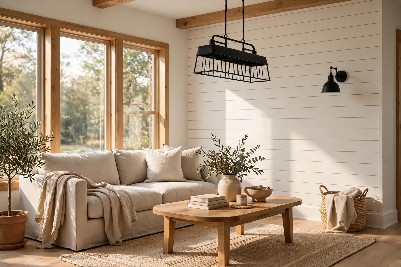
Modern farmhouse color looks simple from the outside, white walls, black hardware, done. But ask anyone who has tried to recreate it and they’ll tell you the truth: it is one of the easiest styles to get subtly wrong. The wrong white turns a room stark and cold. The wrong gray turns it gloomy. The wrong dark accent turns it heavy instead of grounded. The modern farmhouse palette is not a handful of paint chips, it is a system of warm whites, deep contrast colors, and natural materials working together, room by room. This guide breaks that system down: what the colors actually are, where each one belongs, how they change from living room to kitchen to bedroom, and how the style has evolved in 2026 toward something softer and warmer than the stark black-and-white farmhouse of a decade ago. Paint colors shift with lighting, surface, and sheen, so always test a large physical sample in your own space, in your own light, before committing, screen swatches are approximations. The Global Abode is an independent publication, not affiliated with or endorsed by Sherwin-Williams or Benjamin Moore; all color names and codes are referenced as widely-known designer examples.
Key takeaway: Modern farmhouse color is a three-part system: a warm white or cream foundation on most walls, one or two deep accent colors (black, charcoal, deep bronze-green, navy) used with restraint, and natural wood and material tones doing the warming work. The 2026 evolution leans warmer and softer, warm whites over stark whites, creamy beiges over cool grays, muted sage over harsh contrast. Undertone notes below are widely-reported designer observations, not exact manufacturer specifications.
What Modern Farmhouse Color Actually Is
Strip away the shiplap, the sliding barn doors, and the “gather” signs, and modern farmhouse color comes down to a simple idea: high contrast, warm temperature, natural materials. High contrast between the light foundation and the dark accents gives the style its crisp, graphic read. Warm temperature, warm whites, creamy beiges, honeyed wood, keeps that contrast from feeling cold. And natural materials do half the color work, so the paint itself can stay quiet.
It helps to know what the style isn’t. The classic country farmhouse of earlier decades was warm but busy, lots of pattern, lots of color, lots of stuff. The early-2010s modern farmhouse was the pendulum swing: stark white everything, black hardware, gray everything else, minimal to the point of sterile. The current version, the one designers are actually specifying in 2026, sits between those two extremes. It keeps the clean lines and the contrast of the modern version, but it brings warmth back through creamy whites, natural wood, and muted earthy accents. Think of it as farmhouse that grew up: still simple, but no longer afraid of warmth.
The palette, at its core, is small. Most modern farmhouse homes run on four to six colors total: 1. The warm white, the foundation on walls, trim, and ceilings; 2. The supporting neutral, a warm greige, soft beige, or warm light gray that adds depth where pure white would feel flat; 3. The deep accent, black, charcoal, deep bronze, navy, or deep green, used in small deliberate doses; 4. The natural wood tones, oak, walnut, reclaimed pine, carrying as much color weight as paint; 5. (Optional) The muted earthy accent, sage green, dusty blue, warm terracotta, the 2026 addition that softens the whole scheme.
That’s it. The discipline of the palette is what makes it work, every color has a job, and nothing is decorative for its own sake. When a modern farmhouse home feels “off,” the cause is almost always a color that wandered outside this system: a cool blue-gray that fights the warm whites, a bright accent that shatters the calm, a stark white that forgot the warmth.
The Warm White Foundation: Interiors and Exteriors
The single most consequential decision in a modern farmhouse home is the white. Get it right and everything else falls into place; get it wrong and the house fights you in every room.
The white must be warm. This is the lesson of the last decade, learned the hard way by thousands of homeowners. The stark, bright whites, the ones with blue or cool gray undertones, look crisp on the chip and cold on the wall. They turn north-facing rooms icy, they make wood floors look orange by contrast, and they give the whole house a clinical feeling that no amount of cozy decor can fix. Designers consistently steer modern farmhouse whites toward the warm side: whites with a whisper of yellow or cream in them, the kind that read as clean in daylight and glow softly at night.
Widely-referenced warm whites in the designer community include names like Alabaster (SW 7008), Pure White (SW 7005), and Simply White (OC-117), all described by designers as sitting on the warm side of white without going creamy-yellow. The differences between them are subtle, which is exactly why sampling matters: on your walls, in your light, the subtle difference becomes visible. Our whole-home palette guide walks through how to choose and test a foundation white across rooms.
Where the white goes. In the classic modern farmhouse interior, the warm white covers most walls, all trim, and most ceilings, a continuous, calm envelope that lets the architecture, the wood, and the dark accents do the talking. This is not laziness; it’s strategy. A single warm white running through the main living spaces creates the flow and spaciousness the style is known for. Bedrooms and bathrooms can depart from it (see section 5), but the public spaces stay white.
The supporting neutral. Pure white-on-white can feel flat, which is where the second neutral comes in. A warm greige or soft beige on a bedroom wall, a warm light gray in a bathroom, a slightly deeper warm white on the ceiling versus the walls, these small shifts add depth without breaking the calm. The 2026 direction leans toward warmer supporting neutrals: creamy beiges and warm taupes rather than the cool grays that dominated the 2010s. If your farmhouse still has cool gray walls from that era, warming them up is the single fastest way to bring the style current.
Exteriors. The warm white foundation applies outside too: white or cream siding with dark trim is the defining modern farmhouse exterior. The same temperature rule holds, warm whites that agree with the roof and any brick or stone, not stark whites that fight them. For the full exterior method, see our front door color ideas and the exterior guides it connects to.
Tip: When choosing between two warm whites, paint large samples of both on the same wall and live with them for two days. The difference that looks negligible on chips becomes obvious at wall scale, one will glow warm at night, the other will stay neutral. The right white for your house is the one that looks good in your morning light, your afternoon light, and your lamplight, not the one that looked best at the store.
The Dark Accents: Black, Charcoal, and Deep Bronze
If the warm white is the farmhouse’s calm, the dark accents are its confidence. Used sparingly, dark colors give the style its graphic edge, the crisp window frames, the striking front door, the kitchen island that anchors the room. Used excessively, they turn the house heavy and gloomy. The difference is dosage.
Black is the signature. Matte black hardware, black window frames, black light fixtures, black faucets, black at small scale, repeated consistently, is the thread that runs through the whole modern farmhouse look. It works because black behaves like a neutral with presence: it sharpens everything around it without adding a new color to the palette. The key discipline is consistency: pick one black finish (matte is the modern farmhouse standard) and repeat it, hardware, lighting, fixtures, frames. Mixed blacks (glossy here, matte there, oil-rubbed somewhere else) read as accidental.
Charcoal and deep bronze for larger doses. When the dark color needs to cover more area, a kitchen island, a bathroom vanity, an accent wall, the front door, pure black can feel harsh. This is where charcoal, deep bronze, and near-black greens earn their place. Widely-referenced designer examples include deep charcoals and bronze-dark tones that read as black from a distance but reveal warmth up close. A deep bronze island against warm white cabinets is the modern farmhouse kitchen in one image: contrast without severity.
Navy and deep green as the color accents. Black and charcoal are neutrals; navy and deep green are the farmhouse’s actual colors. A navy front door, a deep green kitchen island, a charcoal-green accent wall in a bedroom, these are the moments of real color in the palette, and they work because they’re used once or twice, not everywhere. Designers widely note that deep greens and navies pair naturally with warm whites and wood tones: they’re nature colors, so they feel at home in a style built on natural materials.
The dosage rule. A useful guideline: dark accents should cover roughly 10 percent of the visual field, the hardware, the island, the door, the frames. When dark colors creep past that into walls and large furniture, the farmhouse balance tips: the house starts to feel moody rather than crisp, and moodiness is a different style. If you love dark and want more of it, that’s legitimate, but know you’re drifting toward modern rustic or moody traditional, and commit to that direction rather than ending up between two styles.
Watch out: Dark colors show everything, dust, fingerprints, brush marks, and uneven prep. A black front door or dark island demands thorough surface preparation and quality paint, because every flaw is visible at dark values. And on exteriors, dark colors absorb more heat and fade faster in sun; use exterior-grade paint formulated for dark colors and expect a shorter refresh cycle on south- and west-facing surfaces.
The Natural Materials: Wood, Stone, and Metal Finishes
Here’s the secret of the modern farmhouse palette: a third of it isn’t paint. Wood, stone, and metal carry enormous color weight in these homes, and they’re what keep the white-and-black scheme from feeling stark. Get the materials right and the paint barely has to work.
Wood is the warmth engine. White oak floors, reclaimed wood beams, a walnut island top, cedar porch posts, wood tones are doing the warming work that the paint can’t do alone. The designer consensus on farmhouse wood is consistent: medium, natural wood tones (white oak, natural pine, warm walnut) rather than very dark stains or gray washes. The gray-washed wood trend of the 2010s fought the warm whites; natural wood agrees with them. And wood’s texture matters as much as its color: the grain, the knots, the variation are what make a white room feel alive rather than flat.
Stone and brick as fixed color. A stone fireplace, an exposed brick wall, a brick floor in the mudroom, these are permanent color members of the palette, and the paint must agree with them. Warm brick wants warm whites; cool gray stone wants whites that don’t fight its temperature. The paint is the flexible partner here: choose it after reading the masonry, not before.
Metal finishes: matte black leads. As noted above, matte black is the modern farmhouse metal standard, hardware, lighting, plumbing fixtures. The secondary metals are warm: aged brass and oil-rubbed bronze appear in lighting and hardware as the warming counterpoint to all that black. The rule that keeps it intentional: one dominant metal (black), one supporting metal (brass or bronze), consistent within each room. Chrome and polished nickel are the outsiders here, they read as contemporary rather than farmhouse, and they fight the warm, matte material story.
Textiles as soft color. Linen, cotton, wool, jute, leather, the farmhouse textile palette is all natural fibers in neutral tones: cream linen curtains, a jute rug, wool throws, a leather chair. These add the texture variation that keeps an all-neutral room from feeling flat. They also carry subtle color: the warm tan of jute, the honey of leather, the cream of unbleached linen. None of it is loud, but together it’s the difference between a room that photographs well and a room that feels good to sit in.
| Palette member | Role | Where it lives | Dosage |
|---|---|---|---|
| Warm white | Foundation | Walls, trim, ceilings, exterior siding | ~60%, the envelope |
| Warm greige / soft beige | Supporting neutral | Bedroom walls, secondary spaces | ~15%, depth without noise |
| Black / charcoal | Contrast accent | Hardware, frames, island, door, fixtures | ~10%, the graphic edge |
| Navy / deep green | Color accent | Front door, island, one accent wall | ~5%, used once or twice |
| Natural wood tones | Warmth engine | Floors, beams, furniture, shelving | ~10%, the living material |
| Muted earthy accent | 2026 softener | Textiles, decor, small moments | Trace, pillows, art, ceramics |
Room by Room: Living, Kitchen, Bedroom, Bath
The system is the same everywhere, but each room applies it differently. Here’s how the palette lands room by room.
Living room: white envelope, wood warmth, black punctuation. Warm white walls, warm white or natural wood ceiling beams, wood floors, a comfortable neutral sofa (cream, oatmeal, warm gray), black metal in the lighting and hardware, wood in the coffee table and shelving. The color accents, if any, come through textiles: a sage throw, a dusty blue pillow, art with muted earthy tones. The living room is the calmest room in the farmhouse system; resist the urge to add a bold accent wall here. The architecture and materials are the interest.
Kitchen: the hardest-working room in the palette. The classic modern farmhouse kitchen is warm white cabinets, a dark island (charcoal, deep bronze, or deep green), warm wood in open shelving or the range hood, black hardware and faucets, and a natural stone or quartz countertop with warm veining. The island is the room’s dark moment, it’s the one large dark surface the dosage rule allows, and it anchors the whole space. Backsplash in a handmade-look white or cream tile adds texture without new color. If the kitchen feels cold, the culprit is usually the white (too stark) or missing wood (too little warmth), fix those before adding color.
Bedroom: the softest version of the system. Bedrooms get the warmest, quietest application: warm white or soft beige walls, natural linen bedding in cream and oatmeal, wood in the bed frame and nightstands, black only in small doses (a lamp, a frame). This is the room for the supporting neutral, a warm greige or soft beige on the walls instead of white gives the bedroom its restful, enveloping feeling. A deep green or navy accent wall behind the bed is the farmhouse bedroom’s one bold move, and it works beautifully, contained, dramatic, restful. For the full method, our color drenching guide covers committing to a saturated bedroom wall without regret.
Bathroom: crisp white, black fixtures, warm wood. The farmhouse bathroom is the most contrast-driven room: white tile, white walls, black faucets and hardware, a wood vanity or wood mirror frame for warmth. A dark vanity (charcoal or deep green) against white tile is the signature move. Keep the palette tight here, bathrooms are small, and every color shows. Warm whites matter enormously in bathrooms because cool whites plus bathroom lighting is the fastest route to a clinical feeling.
Entry and mudroom: the handshake. The entry sets the expectation: warm white walls, a wood bench or console, black hooks and lighting, a jute or wool runner. It’s a small space, so the system reads instantly, white, wood, black, done. The front door color (visible from inside through glass, or as the exterior accent) is part of this composition; our front door guide covers choosing it.
The 2026 Evolution: Softer, Warmer, Less Stark
Styles don’t stand still, and modern farmhouse color in 2026 looks noticeably different from the stark black-and-white farmhouse of 2016. The evolution is consistent across designer commentary: warmer, softer, more textured, less stark. Here’s what’s shifting.
Warm whites replace stark whites. The brightest, coolest whites are out; creamy, warm whites are in. This is the single biggest shift, and it’s a correction: the stark white farmhouse looked great in photos and felt cold in person, and the style has adjusted. If your farmhouse was painted in the stark-white era, warming the white is the highest-impact update available.
Beige is back, but a new beige. The word “beige” carried baggage from the Tuscan 2000s, but the 2026 beige is different: lighter, warmer, more nuanced, creamy beiges, warm taupes, soft oatmeal tones that read as sophisticated rather than dated. These are appearing as the supporting neutrals (bedroom walls, secondary spaces) and even as main wall colors in living spaces, replacing the cool grays of the last decade.
Cool gray exits. The gray that defined 2010s farmhouse, cool, blue-leaning grays on walls and in textiles, is the clearest casualty. It fought the warm whites, it fought the wood tones, and it made rooms feel flat. Warm greiges (gray-beige hybrids that lean warm) survive; cool grays don’t. If you’re updating, this is the swap: cool gray out, warm greige or creamy beige in.
Muted earthy accents enter. Sage green, dusty blue, warm terracotta, muted clay, nature-derived, desaturated colors are appearing as the farmhouse’s color accents, softening the old black-and-white severity. They show up in textiles, in a painted island or vanity, in art and ceramics, small doses that warm the whole scheme. A sage island where a black island would have been five years ago is the 2026 farmhouse kitchen in miniature.
Texture does more work. Limewash, plaster-look finishes, handmade tile, nubby linen, honed stone, the 2026 farmhouse leans on texture for interest rather than adding more color. A limewashed warm-white wall has more presence than a flat stark-white wall, with no additional color at all. This is the maturation of the style: interest through material rather than through contrast.
What hasn’t changed. The bones are stable: warm white foundation, dark accents in small doses, natural wood doing the warming, matte black as the metal standard. The evolution is a warming and softening, not a reinvention. A 2016 farmhouse updated with a warmer white, warmer neutrals, and a sage accent is a 2026 farmhouse, the architecture and the system were right; only the temperature needed adjusting.
Want the whole farmhouse system, done for you?
The Whole Home Paint Guide is a complete, ready-to-use modern farmhouse color system, warm white foundations, supporting neutrals, dark accents, and room-by-room application, with undertones already coordinated so every room belongs to the same story. And the Paint Color Workbook walks you through sampling and testing every color in your own light before you commit.
Frequently asked questions
Start with a warm white foundation, widely-referenced designer favorites include warm whites like Alabaster (SW 7008) and Simply White (OC-117), then add a warm greige or soft beige as a supporting neutral, and use deep accents (black, charcoal, deep bronze, navy, or deep green) in small doses: hardware, island, front door, frames. Natural wood tones do the rest of the warming work. The system matters more than any single color: warm foundation, restrained dark accents, natural materials.
Cool, blue-leaning gray is fading from the style, it fights the warm whites and wood tones that define modern farmhouse. Warm greiges (gray-beige hybrids that lean warm) are still very much in the palette. If your farmhouse has cool gray walls, warming them toward a warm greige or creamy beige is the fastest way to bring the style current without changing anything else.
Warm white for the perimeter cabinets is the classic, it keeps the kitchen bright and timeless. The island is where the dark accent lives: charcoal, deep bronze, deep green, or navy, all widely used by designers. An all-dark kitchen can work but changes the style’s balance toward moody; the classic farmhouse kitchen keeps the dark to the island and lets the white do the rest.
Four moves, in order of impact: first, check whether your white is warm, a stark white is the usual culprit, and warming it fixes the whole house. Second, add natural wood (a wood coffee table, wood beams, oak shelving), wood is the warmth engine. Third, layer warm textiles: jute, wool, cream linen. Fourth, add a muted earthy accent, sage, dusty blue, warm terracotta, in small doses. Warmth comes from temperature and material, not from adding more color.
Yes, and the best farmhouse homes do. Farmhouse pairs naturally with industrial (black metal, exposed bulbs), Scandinavian (light woods, minimalism), traditional (antique furniture, classic patterns), and coastal (lighter palette, natural textures). The key is keeping the farmhouse color system, warm white foundation, restrained dark accents, natural materials, while borrowing shapes and pieces from the other style. One dominant style, one accent style; never two competing systems.
Warm white siding with dark (black or charcoal) trim and a bold front door, it’s the defining modern farmhouse exterior and the most widely replicated. Natural wood accents (cedar posts, a stained wood door) warm the composition. For choosing the door color and the full exterior method, see our front door color ideas guide.

