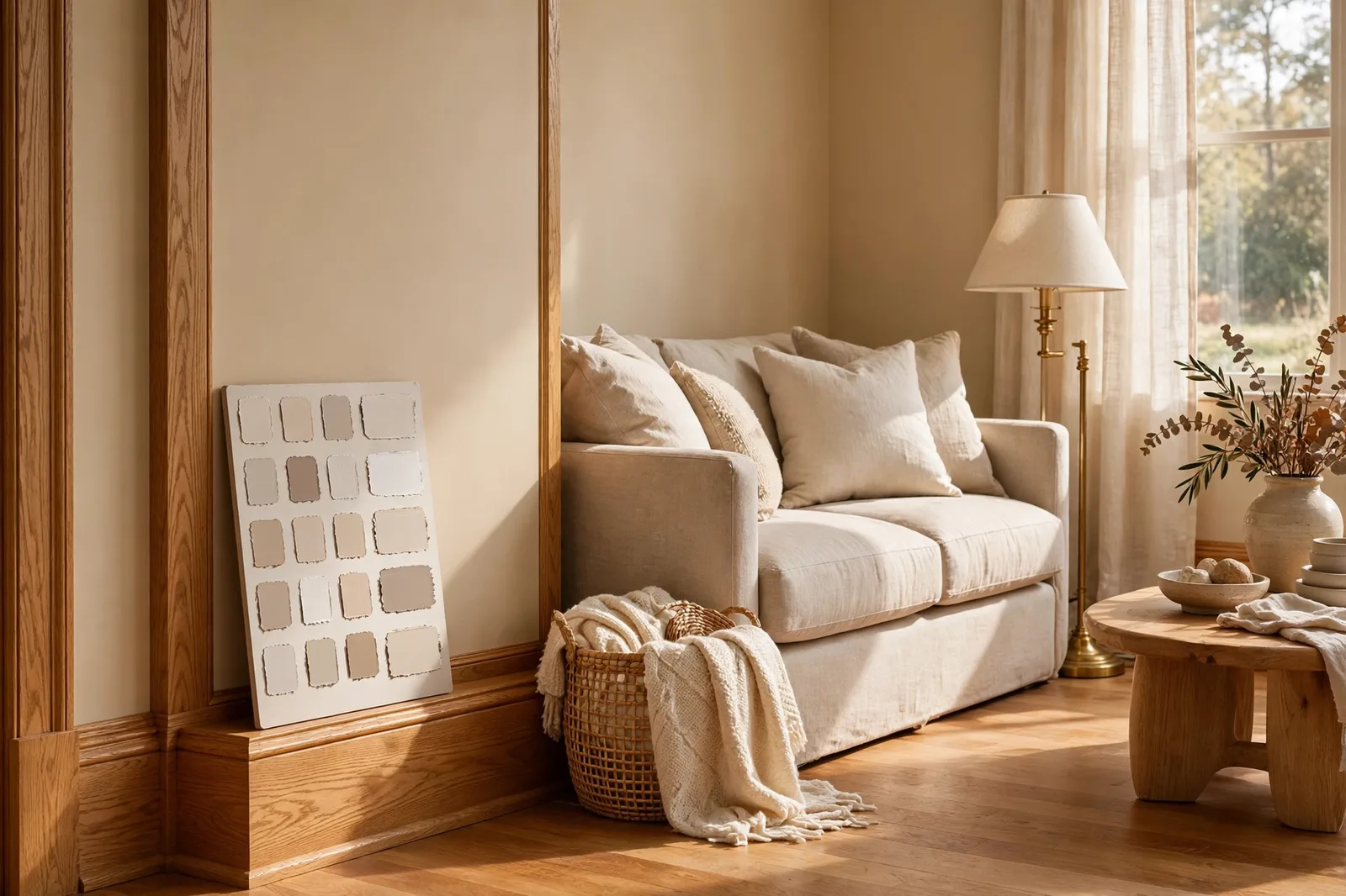
Honey oak is the wood tone nobody chose recently, and nearly everybody inherited. If your home was built between the late 1980s and the mid-2000s, there’s a good chance your trim, doors, stair railings, floors, or kitchen cabinets wear that unmistakable golden, yellow-orange finish. And there’s an equally good chance you’ve typed some version of “what paint colors go with honey oak” into a search bar at least once. This guide is the complete answer: why honey oak fights certain wall colors, the two strategies that make it look intentional instead of dated, the wall color families designers actually specify with oak (with examples), the ones to avoid, the honest keep-it-or-paint-it trim decision, and a whole-house plan that lets the oak stay while the house feels current. Paint colors shift with lighting, surface, and sheen, so always test a large physical sample in your own space before committing, screen swatches are approximations. The Global Abode is an independent publication, not affiliated with or endorsed by Sherwin-Williams or Benjamin Moore; all color names and codes are referenced as widely-known designer examples.
Key takeaway: Honey oak works with wall colors that either harmonize with its yellow-orange undertone (warm greiges, soft beiges, warm whites, muted sages) or deliberately contrast with it (dusty blues, deep navies, forest greens, green sits opposite orange on the color wheel and calms it). What fails is the accidental middle: cool blue-grays that make the orange look more orange, and yellow-heavy walls that double the warmth. The color of the trim is rarely the real problem, the wall next to it usually is. Undertone notes below are widely-reported designer observations, not exact manufacturer specifications.
The Honey Oak Reality Check: Why It Fights Cool Grays
Before choosing a single wall color, it helps to understand what honey oak actually is, because the problem people blame on the wood is usually a problem with the wall next to it.
Honey oak is a yellow-orange-toned stain applied to oak, popular through the 1990s and early 2000s, and present today in millions of homes as trim, interior doors, stair railings, baseboards, floors, and kitchen cabinets. Its undertone leans yellow-orange, sometimes reading more golden, sometimes more amber, depending on the stain batch, the finish sheen, and the light. That undertone is the whole story. Everything honey oak does to a wall color happens through that warm hue.
Here’s the physics that matters: contrast amplifies undertones. When you place a cool, blue-gray wall against a yellow-orange trim, the two colors sit on opposite temperature sides, and each one makes the other look more extreme. The wall looks cooler and bluer than it did on the chip; the trim looks more orange than it did in the store. Designers call this the orange-amplification effect, and it’s the reason so many honey-oak homes with trendy cool-gray walls look more dated, not less. The homeowner was trying to modernize; the wall was fighting the trim, and the trim was losing in public.
This is why honey oak got its “dated” reputation. The wood itself is a warm neutral, pleasant, natural, nothing about it is inherently stuck in 1994. What dated it was a decade of cool gray walls, white-on-white schemes, and Stark Contrast decorating placed against it. Take the same honey oak trim and put a warm greige or a soft sage next to it, and most people stop reading “1990s” and start reading “warm traditional home.” The oak didn’t change. The context did.
So the reality check is this: you probably don’t have a honey oak problem. You have a honey-oak-and-wall-color problem. And wall color is the cheapest thing in the room to change. Before you price out painting every door, window casing, and baseboard in the house, a project that can run into serious money when you count doors, stair railings, and two-story foyers, start with the walls. The right wall color makes the oak look intentional, rich, and current. The wrong one makes it look like it time-traveled.
Tip: Test every wall finalist against the actual oak, not against a white board. Paint a large board (at least 2×2 feet), prop it so it touches the trim, and look at the pairing in morning, midday, and evening light. The evening check matters most: warm lamplight (2700–3000K) intensifies the oak’s orange, and that is when a bad pairing shows itself. If the pairing looks good at 8pm, it will look good always.
The Harmony Rule: How Wall Undertones Should Meet the Oak
There are exactly two strategies that work with honey oak, and every successful wall color uses one of them. Knowing which move you’re making, before you buy paint, is the whole decision.
Strategy 1: Harmony. Choose a wall color whose undertone agrees with the oak’s warmth. Warm greiges, soft beiges, warm whites, muted sages, warm tans, these colors share a temperature with the oak, so the eye reads the wall and the trim as one family. The oak stops shouting because it has company. Harmony is the forgiving strategy: it’s hard to get badly wrong, it works in every room of the house, and it’s the safest path for whole-house color, resale, and open floor plans where you see a lot of trim at once.
Strategy 2: Deliberate contrast. Choose a wall color that stands apart from the oak on purpose, far enough apart that the difference reads as a choice, not a clash. This is the dusty blue wall, the deep navy accent, the forest green den, the charcoal powder room. Contrast works through the complementary principle: green sits opposite orange on the color wheel, so a muted green wall actually calms the orange in the oak, it cancels the loud warmth rather than competing with it. Blue does something similar by temperature: a dusty blue is cool enough that the eye separates wall from trim cleanly, and the oak reads as warm accent instead of dated leftover. Contrast is the bolder strategy, best for rooms you can close the door on, accent walls, and spaces where you want the oak to look like a feature, not a compromise.
What never works is the accidental middle: a wall that is neither warm enough to harmonize nor confident enough to contrast. The cool gray that’s just gray enough to fight the oak. The beige that’s just beige enough to blend but not enough to glow. The near-white that’s slightly cooler than the trim, so the trim looks dirty by comparison. If you can’t name which strategy your wall color is using, it’s probably in the accidental middle, and that’s the wall to replace.
A practical way to apply this: hold your wall-color chip against the oak and ask one question, does this chip look like it belongs to the oak’s family, or does it clearly belong to a different family? Either answer is fine. A shrug is not.
Watch out: The single most common honey-oak mistake is the cool blue-gray wall, the exact color that defined 2010s decorating. Against honey oak, blue-gray amplifies the orange in the trim and reads colder than intended, so both the wall and the wood look worse. If you love gray, it must be a warm gray, a greige with a beige thread that shakes hands with the oak’s warmth. Agreeable Gray, warm greiges, and gray-beige blends in general: yes. Straight cool gray: never.
The Best Wall Color Families for Honey Oak
These are the families designers return to, with widely-cited examples from the two big paint brands. Every one of them has a track record in real honey-oak homes, not because a designer declared it, but because clients kept it.
| Family | Example colors | Why it works |
|---|---|---|
| Warm greiges | Agreeable Gray, Revere Pewter, Edgecomb Gray | The default harmony answer, the beige thread agrees with the oak’s warmth while the gray thread keeps the room current; widely used with oak trim and cabinets |
| Soft sages & muted greens | Clary Sage, Saybrook Sage, Oyster Bay, Comfort Gray | Green is orange’s complement, it calms the oak’s loud warmth; the most reliable way to make honey oak look fresh rather than dated |
| Warm whites | Alabaster, White Dove, Greek Villa, Shoji White | Bright without stark; the warmth in the white keeps it from clashing with the trim the way cool whites do |
| Soft beiges & tans | Accessible Beige, Manchester Tan, Canvas Tan, Muslin, Linen | Full harmony, the wall and the oak belong to one warm family; cozy, traditional, resale-safe |
| Dusty & muted blues | Dusty blue-grays with a grayed, muted cast | Deliberate contrast, cool enough to separate from the oak cleanly; best in bedrooms, baths, and accents |
| Deep navies & forest greens | Hale Navy, Naval, deep forest greens, Iron Ore-adjacent charcoals | High contrast makes the oak look richer and more golden, the “distinguished, not dated” move; best for dens, dining rooms, powder rooms, and accents |
| Warm charcoals & deep browns | Warm darks with brown undertones | The moody envelope, the oak reads as golden accent against the dark, like fine mahogany; needs good light or it’s a cave |
A few notes on how designers actually use these. Warm greige is the whole-house workhorse, it’s the color real-estate stagers and designers reach for most often when a home has honey oak trim, doors, and cabinets throughout, because it harmonizes with the wood everywhere and still reads current to buyers. If you need one color for the whole main level, start with a warm greige.
Sage is the single most flattering color for honey oak. Because green complements orange, a soft sage wall makes the oak’s orange quieter, the wood reads as honey and warmth rather than as “that orange trim.” It flatters the oak in nearly any light, and it bridges traditional and modern furniture. If you want the oak to look intentional and not apologetic, sage gets you there faster than anything.
Deep colors are the secret weapon. Most homeowners assume a honey-oak house must be kept light to look updated. Designers report the opposite surprise: a den in deep forest green, a powder room in warm charcoal, a dining room in navy, against those darks, honey oak takes on a golden, amber, almost-expensive quality. The wood stops reading “1990s builder-grade” and starts reading “rich natural material.” The rule: go deep in rooms with doors, in rooms with good light, or on accent walls, not in the dim hallway.
Warm whites are the bright-room answer. Where you want brightness, a sunny kitchen, a white-trim-adjacent hallway, choose a warm white, not a crisp one. Alabaster, White Dove, and their cousins carry enough warmth to sit beside the oak without the stark-contrast clash that cool whites create. The wall reads as white; the trim reads as warm wood; the two coexist instead of arguing.
For the deeper method behind matching wall temperature to wood undertone, our guide to matching paint with wood floors covers the white-paper undertone test and the floor-first rule, and our undertones guide teaches the temperature system all of this runs on.
Walls to Avoid: The Colors That Make Oak Look Dated
The avoid list is shorter than the use list, but each item on it has ruined more rooms than any color on the good list has saved.
Cool blue-grays. The biggest one. Straight blue-gray, concrete gray, “modern gray”, against honey oak, these do the orange-amplification effect at full strength. The trim looks more orange; the wall looks colder; the room reads as two different decades. This pairing is the visual signature of the dated honey-oak home. If you already have it, you don’t need to repaint the trim, you need to warm the wall into a greige.
Stark, cool whites. Extra White, Chantilly Lace, and other crisp cool whites create the same contrast problem at maximum brightness: next to a near-pure white wall, honey oak’s golden cast becomes the loudest thing in the room. The wall isn’t wrong, it’s just too cool to be the oak’s neighbor. Step to a warm white and the argument ends.
Yellow-heavy walls. The opposite failure: a warm beige or tan with a strong yellow cast, placed against yellow-orange oak, doubles the warmth until the room goes golden, and then amber, and then, in evening light, a kind of Tuscan glare. Warmth wants restraint when the wood is already warm. Choose beiges with a gray civilizing thread, not yellow-forward ones.
Burgundy, hunter green, and 1990s earth tones. Deep reds, forest greens with a 90s cast, rust, and brown-reds match the era of the oak, which is exactly the problem. They reinforce the dated reading instead of refreshing it. Deep colors can work beautifully with honey oak (see section 3), but they need to be current deep colors, dusty, complex, muted, not the earthy palette the oak originally came with.
Busy wallpaper and high-contrast patterns as the main wall treatment. Honey oak trim is already visually active, warm, grained, present. A busy patterned wall competing with busy wood trim exhausts the eye. Keep pattern to textiles and accents; let the walls be calm fields that give the oak room to breathe.
The pattern underneath: every avoid-color either fights the oak’s temperature (cool grays, cool whites) or doubles its era (yellow-heavies, 90s earth tones). Avoid both traps and the oak is easy to live with.
Should You Paint the Trim? The Honest Keep-vs-Paint Decision
At some point, everyone with honey oak trim asks the real question: not what color the walls should be, but whether the trim should stay wood at all. Here’s the honest accounting, from the keep side and the paint side.
The case for keeping it. Painting trim is expensive and nearly irreversible. A whole house of trim, baseboards, window casings, door casings, interior doors, stair railings, built-ins, is one of the costliest paint projects a homeowner takes on, because the labor is in the prep: sanding, priming, caulking, two coats on every profile, with drying time between. And stripping it back to wood later is a project nobody wants. Stained oak trim also has practical virtues: it doesn’t show scuffs, fingerprints, and chips the way white paint does (families with kids and dogs notice this fast), and it needs essentially no maintenance beyond dusting. Quality matters too: chunky, well-milled oak trim in an older home reads as real material, designers consistently say good woodwork is an upgrade compared to painted builder-grade trim, and many homeowners who painted theirs later wished they hadn’t. Finally, stained oak is having a slow design rehabilitation: warm wood tones are cycling back into current interiors, and honey oak kept in good condition with current wall colors reads as warm traditional, not dated.
The case for painting it. Sometimes the oak really is the problem, not the color, but the amount. In homes where oak trim, oak doors, oak cabinets, oak railings, and oak floors all appear in one sightline, the room can feel like it’s inside a wooden box, and no wall color fully fixes that. Painting the trim white (or off-white) is the single highest-impact update in that situation, it instantly brightens the house, simplifies every future color decision, and reads as current to buyers. It’s also the right call for thin, builder-grade trim that never had much character to lose, and for homeowners planning to stay long-term who simply prefer the painted look. If you paint, do it properly: the doors should go with the trim (mixed painted trim and stained doors looks unfinished), the prep determines the result, and a warm white beats a stark one in most oak homes.
The partial strategy, the move most people should consider first. You don’t have to choose all-or-nothing. Designers who work in honey-oak homes constantly use the partial update: paint the kitchen cabinets but keep the trim; paint the stair railing and newel posts but keep the baseboards; paint the built-ins but keep the window casings. Partial painting breaks up the wood mass, introduces the brightness people crave, and costs a fraction of a whole-house trim job, and it’s reversible in the sense that you haven’t touched the trim everywhere. Another partial move: paint the doors and keep the trim, or replace just the hardware, swapping dated brass door levers for oil-rubbed bronze or matte black is a small job with an outsized modernizing effect.
The decision framework, in one paragraph: Keep the trim if it’s good-quality woodwork, if the budget for whole-house painting isn’t there, if you have kids or dogs, or if the oak appears in manageable amounts that good wall color can calm. Paint the trim if the house feels like a wooden box, if the trim is thin builder-grade with little character, if you’re staying long-term and the look is what you want, or if you’re selling and the market rewards it. Go partial if you’re unsure, it’s the reversible experiment that answers the question with evidence.
A Whole-House Plan That Works with Honey Oak
Honey oak homes have one special challenge: the trim is the constant. It runs through every room, the living room, the hallway, the bedrooms, the kitchen, so the wall colors can’t be chosen room by room in isolation. They have to work with the same oak everywhere, under different light, and read as one house. Here’s the plan.
Step 1: Choose the anchor neutral. Pick one warm neutral that harmonizes with the oak and can carry the main living spaces and all the connecting hallways. For most honey-oak homes, this is a warm greige (Agreeable Gray-family) or a soft warm beige. This is the color you see from every doorway, it’s the background the whole house shares. Choose it with the oak’s undertone in mind (warm with warm), test it large against the actual trim, and check it in the dimmest hallway, because the anchor has to survive the worst light in the house.
Step 2: Assign the accents by room type. Bedrooms, studies, dining rooms, and powder rooms can each take one accent from the good list, a soft sage in the bedroom, a dusty blue in the study, a deep navy or forest green in the dining room or den. The rule: accents should be from the same temperature family logic as the anchor, if the anchor harmonizes, accents can harmonize or deliberately contrast, but they shouldn’t land in the accidental middle. And any room with a door can go deeper and bolder than an open-plan space.
Step 3: Keep the ceiling and trim logic constant. The oak trim stays oak everywhere (unless you’ve decided to paint it, see section 5). Ceilings stay one consistent warm white through the whole house. Doors match the trim. This constancy is what lets the wall colors vary: the trim and ceiling are the frame, and the frame doesn’t change from room to room.
Step 4: Test the sightlines. Stand in the main living space and look through every doorway and down every hallway. Every wall you can see should belong to the same undertone logic, warm with the oak, or deliberately, confidently contrasting. If one room’s wall makes the oak look different, more orange, more pink, more yellow, that room’s color is off. Our color flow guide covers the sightline method in full, and our whole-house color count guide keeps the palette from sprawling.
Step 5: Update the supporting cast. Wall color does the heavy lifting, but three small updates multiply the effect: hardware (oil-rubbed bronze or matte black door levers and cabinet pulls instead of dated brass), lighting (warm 2700–3000K bulbs so the evening light flatters rather than exposes the oak), and furnishings (modern or transitional pieces in the accent colors, a sage sofa, navy dining chairs, linen curtains, that signal the house’s era is now, not 1994). The oak is the constant; everything around it should read current.
Building a whole palette around your oak, not just one wall?
The Whole Home Paint Guide is a complete, ready-to-use color system, anchor neutrals chosen to agree with warm wood trim and floors, trim and ceiling pairings, accent colors, all with undertones already coordinated, so your honey oak reads as intentional in every room. And the Paint Color Workbook includes side-by-side comparison worksheets and a room-by-room sampling checklist for testing finalists against your actual trim with evidence, not guesswork.
Frequently asked questions
Yes, but it must be a warm gray. A greige (gray-beige) like Agreeable Gray or Revere Pewter harmonizes with the oak’s warmth while still reading as gray. A cool blue-gray is the pairing to avoid: it amplifies the orange in the trim and makes the room look dated. The rule is temperature agreement, gray is fine, blue-gray is the risk. Test a large board against your actual trim in evening light before committing. Our greige guide covers the warm-gray family in full.
Warm whites, Alabaster, White Dove, Greek Villa, Shoji White. The warmth in the white keeps it from clashing with the trim the way crisp cool whites (Extra White, Chantilly Lace) do. A cool white next to honey oak creates maximum temperature contrast, which makes the oak’s orange the loudest thing in the room. Choose a warm white and the wall reads as white while the trim reads as warm wood, coexistence, not argument. See warm white vs cool white for the full comparison.
The most reliable answer is a warm greige or a soft warm white, colors that harmonize with the trim while giving the kitchen a current read. Deep navy or forest green lower cabinets (with warm-white uppers) are the bold move: the dark makes the oak trim in the room look richer and more golden. What to avoid: cool grays that fight the trim, and yellow-heavy creams that double the warmth. If the kitchen has honey oak cabinets too, the wall color carries the whole update, a soft sage or warm greige on the walls changes the kitchen more than any other single move. See how to test paint samples before committing to cabinet paint.
A warm greige, it’s the color designers and stagers reach for most often in honey-oak homes. The beige thread agrees with the oak’s warmth; the gray thread keeps the room reading current. It works on the main living spaces, in hallways, and as a whole-house anchor, and it flatters both traditional and transitional furnishings. Runner-up: a soft sage, which is the single most flattering accent color for honey oak because green complements orange. Our fixed-finish matching framework extends the method to floors, stone, and tile.
It depends on the trim’s quality, your budget, and how much oak the house shows. Keep it if the woodwork is good quality, the budget for a whole-house paint job isn’t there, you have kids or pets (stained wood hides wear), or the oak appears in manageable amounts. Paint it if the house feels like a wooden box, the trim is thin builder-grade, or you’re staying long-term and prefer the painted look. Go partial, paint the cabinets or the railing but keep the trim, if you’re unsure; it’s the reversible experiment that answers the question with evidence. And before deciding the trim is the problem, try the right wall color first, it changes the oak’s read more than most people expect.
Four moves, in order of impact: (1) wall color, a warm greige, soft sage, or current deep color (navy, forest green) instead of cool gray; (2) hardware, swap dated brass for oil-rubbed bronze or matte black; (3) furnishings, modern or transitional pieces in linen, with the room’s accent color picked up in textiles; (4) lighting, warm 2700–3000K bulbs and updated fixtures. The oak itself isn’t dated, it’s the context that dates it. Change the context and the same trim reads as warm, current, and intentional. See how natural light changes paint color for the orientation rules behind every choice.

