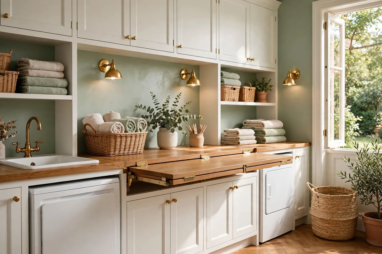
Every home has rooms that get all the color attention, the living room, the kitchen, the primary bedroom, and rooms that get whatever was left in the roller tray. The laundry room, the mudroom, the hallway, the nursery, the dining room, the entryway: these are the spaces you pass through, work in, and welcome guests through every single day, yet they are planned last and painted as afterthoughts. The irony is that these underserved rooms are often the most visible ones. The hallway touches every room in the house. The entryway is the first color anyone sees. The laundry room is where you spend hours every week. This guide gives each of these forgotten rooms the color thinking it deserves: the right color direction, the undertone logic that ties it to the rest of the home, the sheen that survives the room’s workload, and, for every room, how its color connects to the whole-house palette so nothing reads as a random afterthought. Paint colors shift with lighting, surface, and sheen, so always test a large physical sample in your own space, in your own light, before committing, screen swatches are approximations. The Global Abode is an independent publication, not affiliated with or endorsed by Sherwin-Williams or Benjamin Moore; all color names and codes are referenced as widely-known designer examples.
Key takeaway: Underserved rooms deserve the same temperature discipline as the rest of the house, not random leftover colors. Hallways and entryways carry the home’s anchor neutral so the whole house reads as one thought. Laundry rooms and mudrooms want cheerful, washable color, light and clean, or one confident accent, in a satin or semi-gloss sheen that survives splashes and scuffs. Nurseries want calm, muted tones that will grow with the child, not themed colors with a two-year lifespan. Dining rooms are the house’s best case for depth and drama, especially behind a closed door. Every room below ties back to the whole-home palette through temperature agreement. Undertone notes below are widely-reported designer observations, not exact manufacturer specifications.
Why the Forgotten Rooms Matter Most
Paint planning usually starts with the rooms you love and ends, if it ever ends, with the rooms you merely use. The living room gets the careful undertone analysis; the laundry room gets whatever neutral was already open. But step back and look at the home the way a guest sees it, and the forgotten rooms are doing more color work than the showcase rooms. The entryway sets the palette’s thesis in the first three seconds. The hallway is visible from every room it connects. The laundry room is where you personally spend more hours than in the dining room you painted so carefully. When these rooms are afterthoughts, the whole house feels slightly unfinished, not because anything is wrong, but because the spaces you move through most never got their own intention.
The second reason these rooms matter is that they are the home’s connectors. The hallway, the entryway, and the mudroom are transition spaces, they exist to carry you and your eye from one room to the next. A transition space in a random color is a gear change the eye hits dozens of times a day. Our whole-house color flow framework covers this in depth: the rooms you move through should be the calmest, most continuous surfaces in the home, because they are seen from everywhere and dwelled in nowhere. A hallway in the anchor neutral makes every room it touches feel like it belongs; a hallway in an unrelated color makes every doorway a small argument.
The third reason is purely practical: these are hardworking rooms. Laundry rooms take splashes, humidity, and lint dust. Mudrooms take muddy boots, wet coats, and backpacks thrown against walls. Hallways take shoulder brushes and suitcase corners. Nurseries take everything small humans can produce. Dining rooms take candle soot and chair backs. A forgotten room painted in a flat, delicate finish is not just an aesthetic afterthought, it is a maintenance problem waiting to happen. The sheen decision matters as much as the color decision in every room below, and we will call it room by room.
The good news is that none of these rooms needs a complicated palette. Each one wants a simple, deliberate decision: one color direction, one undertone agreement with the rest of the house, one sheen suited to the workload. This guide walks through all six rooms, laundry, mudroom and entryway, hallway, nursery, dining, with the same four questions answered for each: what color direction works, what undertone logic ties it to the home, what sheen survives the work, and how it connects to the whole-house palette. Our room-by-room paint planning checklist puts these rooms in their proper sequence position, connectors first, destination rooms after.
Tip: Before choosing a color for any room in this guide, stand in the doorway and photograph what is visible through it. That photo is the room’s real context, not the room in isolation, but the room as it appears next to its neighbors. Any color that argues in the doorway photo will argue in person. Choose the room’s color against that view, not against a blank wall.
Laundry Rooms: Utility and Joy
The laundry room is the hardest-working room in the house and the least designed, a combination that makes no sense once you notice it. You spend hours there every week, it is often windowless or dimly lit, and it is usually the last room anyone paints. Designers consistently describe the laundry room as the room with the highest happiness-per-dollar potential in the whole house: it is small, it takes almost no paint, and almost any deliberate color transforms it from a chore closet into a space you do not mind being in.
Color direction. Laundry rooms want light and cheer. The classic move is a clean, bright palette, soft whites, pale blues, gentle greens, that makes the small, often dim space feel larger and airier. Soft blues are a particular favorite: they read as clean and fresh, which is exactly the association a laundry room wants, and they sit calmly next to white appliances and cabinetry. Pale greens, soft mints, muted sages, bring a fresh, natural feeling that makes the chore of laundry feel a little less like a chore. Warm, cheerful options work too: a soft buttery yellow or warm cream can make a windowless laundry room feel sunlit even when it isn’t. The bolder move, and a genuinely popular one, is a single confident accent: a deep teal, a rich navy, a vibrant turquoise on one wall or inside open shelving, with the remaining walls in a clean white. In a small room, one bold wall reads as personality; four bold walls read as a cave.
Undertone logic. The laundry room’s color should agree with the hallway or room it opens onto, most laundry rooms sit off a hallway or mudroom, and the doorway comparison is constant. If the home runs warm, lean the laundry room warm: warm whites, soft warm blues, creamy yellows. If the home runs cool, the cool blues and soft grays sit naturally. And read the fixed finishes: white appliances and white cabinetry are forgiving with almost anything, but if the room has warm wood shelving or a warm-toned floor, the wall color should stay on the warm side of the line. Our whole-home palette guide covers the anchor-and-temperature method that keeps a small room like this from drifting off-palette.
Sheen. This is the room where sheen is non-negotiable. Laundry rooms take splashes from the sink, lint dust, detergent drips, and constant touching around the machines and the folding counter. Use satin or semi-gloss on the walls, both wipe clean, resist moisture far better than flat or eggshell, and reflect a little extra light in what is often a dim room. Save flat paint for the ceiling only. If the room lacks ventilation, a mildew-resistant paint formula is worth the small premium, it does not replace good ventilation, but it helps in a room that runs humid.
How it ties to the whole home. The laundry room is usually a closed-door room, which gives it more freedom than the hallway, but the doorway sightline still matters. The safest structure: the home’s anchor neutral or a warm white on the walls that shows through the doorway, with the personality (the blue, the green, the bold accent) on the walls you see once you are inside. From the hallway, it reads as part of the house; from the folding counter, it reads as your room.
Mudrooms and Entryways: The First Impression
The mudroom and the entryway are the home’s handshake, the first color anyone sees and the last one they remember. They are also two of the hardest-working surfaces in the house: muddy boots, wet umbrellas, backpacks, dog paws, keys dropped on the console. The color job here is a balancing act: welcoming enough to set the right first impression, durable enough to survive the daily assault, and calm enough to hand the eye gracefully to the rest of the house.
Color direction. For the main entryway, the classic designer guidance is restraint: a warm, welcoming neutral, a soft warm white, a light warm greige, a gentle cream, that sets the home’s temperature thesis without shouting. The entry is not the room for the boldest color in the house; it is the room that makes the boldest color possible elsewhere, by establishing the calm baseline everything else plays against. Mudrooms have more latitude. Because a mudroom is a utility space with a door (or at least a distinct zone), it can take more personality: a deep, confident color on the built-in lockers or cubbies, a rich green or navy on the walls, a warm earthy tone that hides scuffs gracefully. The mudroom is where the home is allowed to show a little grit, it is the room that says “we live here” rather than “we receive here.”
Undertone logic. The entryway’s temperature sets the tone for the whole house, if the entry is warm, the house reads warm; the rooms beyond inherit the expectation. Choose the entry color as the calmest version of the home’s dominant temperature, and make sure it agrees with the living room and hallway visible beyond it. For the mudroom, the undertone should agree with the entryway it sits next to, a warm entry with a mudroom in a warm deep green reads as one thought; a warm entry with a mudroom in a cool blue-gray reads as a gear change at the front door. Designers consistently warn against two mudroom traps: muddy yellows, which can read tired and show dirt faster than expected in a room full of actual dirt, and very dark browns, which can make an already dim, cluttered space feel gloomy rather than grounded. Mid-tone and deep colors with clear, clean undertones, a true deep green, a confident navy, a warm charcoal, wear the room’s workload far better.
Sheen. High-traffic, high-touch, high-scuff: the mudroom and entryway want the most durable sheen you are willing to live with. Satin on the walls is the sweet spot, washable, scuff-resistant, and still soft-looking. In the true impact zones, the wall behind the bench, the lower half of the walls, around the door, consider semi-gloss, or a dedicated scuff-resistant paint, which is made for exactly this kind of abuse. Trim and doors in semi-gloss everywhere. Our room-by-room sheen guide walks through the full sheen map for every room in the house.
How it ties to the whole home. The entryway is the whole-home palette’s opening statement, it should be the anchor neutral or its closest relative. The mudroom, if it is a distinct space, can step one shade deeper or take one confident color, but it must stay in the home’s temperature family. A guest should be able to walk from the front door through the entry, past the mudroom, into the hallway, and feel one continuous color thought, not three separate decisions.
Watch out: The most common entryway mistake is choosing the color in isolation, falling for a beautiful entryway photo without checking what it looks like next to your hallway and living room. The entry is never seen alone; it is always the foreground of whatever is behind it. Sample the entry color with the neighboring rooms’ colors visible in the same view, or the beautiful entry becomes the room that fights the house.
Hallways: The Bridge, Not the Afterthought
Hallways are the most under-designed square footage in the house, long, often windowless, treated as leftover wall between the “real” rooms. But the hallway is the one surface that touches every room, which makes it the most structurally important color decision in the home. A hallway in the wrong color breaks the flow at every doorway; a hallway in the right color makes the whole house feel designed even if nothing else changed.
Color direction. Hallways want the home’s anchor neutral, the calmest, quietest version of the dominant temperature. In warm homes, a warm white or light warm greige; in cool homes, a soft gray or clean neutral white. The hallway is seen from everywhere and dwelled in nowhere, so it should never be the loudest color in the house. Its job is to be the resting place the eye returns to between rooms, the visual palate cleanser that makes a deeper living room and a softer bedroom read as one continuous gradient rather than two separate statements. The hallway failure is the orphaned color: a hallway painted a bold or unrelated shade because someone wanted “interest” in a boring space. A hallway’s interest comes from art, runners, and lighting; its color should be the calmest in the house.
Undertone logic. The hallway’s temperature must agree with every room it connects, which is all of them. This is the strictest undertone discipline in the house: if the living room is warm and the bedrooms are warm, the hallway is warm; if the home is mixed, the hallway takes the dominant thread. A hallway that sits between two temperature families is the single fastest way to make a house feel chopped up, because the eye renegotiates at every doorway. When in doubt, the hallway takes the whole-home anchor color straight, no stepping, no variation, just the constant.
Sheen. Hallways are touch zones, shoulders, hands, suitcases, vacuum cleaners. A washable eggshell at minimum; satin is better. Flat paint in a hallway is a maintenance sentence: every scuff shows, and touch-ups flash. The ceiling stays flat. And because hallways are often dim, the slight extra light bounce of eggshell or satin over flat is doing real work, it keeps the corridor from reading as a tunnel.
How it ties to the whole home. The hallway is the tie. It should be the anchor neutral carried straight through, the same color on every hallway, landing, and connecting corridor in the house. This is the single highest-impact move for whole-home flow, and it costs nothing extra: one color, all the connectors, and the house reads as one home. Our small-room colors guide covers the envelope technique, carrying the wall color onto the ceiling, which is especially powerful in narrow hallways, where erasing the wall-ceiling boundary makes the corridor feel wider.
| Room | Color direction | Sheen | Palette role |
|---|---|---|---|
| Laundry room | Light and cheerful, soft whites, pale blues, gentle greens; or one bold accent wall | Satin or semi-gloss walls; mildew-resistant formula if poorly ventilated | Closed-door freedom, but agree with the hallway through the doorway |
| Mudroom | Confident and hardworking, deep green, navy, warm charcoal; or the anchor neutral | Satin walls; semi-gloss or scuff-resistant in impact zones | One step deeper than the entry, same temperature family |
| Entryway | Calm and welcoming, warm white, light warm greige, soft cream | Satin walls; semi-gloss trim and doors | The palette’s thesis statement, the anchor neutral or its closest relative |
| Hallway | The anchor neutral, straight, calmest version of the home’s temperature | Washable eggshell minimum; satin preferred | The bridge, the constant that makes every room feel connected |
| Nursery | Calm and muted, soft sage, warm greige, dusty blue, gentle blush | Washable eggshell or satin, these walls get touched | A soft step within the home’s temperature family; grows with the child |
| Dining room | Depth and drama, deep green, navy, warm charcoal, rich earth tones | Eggshell or matte for mood; satin if it doubles as a homework zone | The house’s approved drama, behind a door or at the end of a sightline |
Nurseries: Calm Color That Grows with the Child
The nursery is the room most likely to be painted twice, once for the baby, once for the kid the baby becomes, and the color choice is what decides whether that second paint job happens in two years or ten. The instinct is to paint the theme: the pink room, the blue room, the jungle room. The smarter move is to paint the calm: a color that soothes a newborn, suits a toddler, and still works for a ten-year-old who has strong opinions about everything except, hopefully, the walls.
Color direction. Nurseries want soft, muted, restful color, the palette equivalent of a lullaby. The designer favorites are consistent: soft sages and muted greens, warm greiges, dusty blues, gentle blushes and warm peaches. These are colors with enough presence to feel intentional but enough softness to rest against, they calm the room rather than stimulating it, which is the whole job in a space built for sleep. What to avoid: anything saturated or high-contrast. Bright primary colors, intense pinks, electric blues, the colors that look adorable in a styled photo, are visually loud in a way that fights the room’s purpose, and they age out fast. A good test: if the color would feel wrong in a calm adult bedroom, it is probably too much for the nursery. And skip the theme trap, the mural, the character wall, the color that only makes sense for one age. Themes belong in bedding, art, and textiles, which change in an afternoon; the walls should outlast them.
Undertone logic. The nursery should sit inside the home’s temperature family, it is a bedroom, and the hallway outside its door sees it every day. A warm home gets a warm nursery: warm greige, soft sage with a warm thread, gentle peach-blush. A cool home gets a cool nursery: dusty blue, soft cool sage, pale misty gray. The temperature agreement matters more here than in most rooms because the nursery door is constantly open in the early years, the room is part of the hallway’s view, not a sealed box. Choose the color the way you would choose any bedroom color: same family as the hall, stepped in depth for softness.
Sheen. Nursery walls get touched, small hands, wiped spills, the occasional crayon. Washable eggshell or satin is the right call: scrubbable without the glare of semi-gloss, soft enough to keep the room feeling gentle. Flat paint in a nursery is a short-lived decision; the first year of life will write on it.
How it ties to the whole home, and how it grows. The grow-with-them strategy is simple: paint the walls in a calm, muted tone from the home’s palette family, and let the age live in the layers, the crib bedding, the art, the rug, the curtains. When the baby becomes a kid, the layers change and the walls stay. When the kid becomes a teenager, the layers change again and the walls still stay. A nursery painted in a soft, timeless neutral from the home’s own palette never needs repainting for taste reasons, only for wear. That is the difference between a two-year color and a ten-year color, and it is worth choosing deliberately on day one.
Dining Rooms: The Case for Depth and Drama
The dining room is the most underused case for bold color in the house, and the best one. Think about how a dining room actually lives: it is used in the evening, under warm lamplight or candlelight, for gatherings that want atmosphere. It is often a distinct room with a door or a clear threshold. And it is the room guests remember. Every one of those facts points the same direction: the dining room is where the house is allowed its drama.
Color direction. Dining rooms take depth beautifully. Deep greens, forest, emerald, deep olive, are the classic dining room move: they read as rich and enveloping under warm evening light, they make wood furniture glow, and they turn an ordinary weeknight dinner into an occasion. Deep navies do the same work with a slightly more formal register. Warm charcoals and rich earth tones, deep terracotta, warm umber, create a cozy, gathered feeling that suits the room’s purpose. The full-commitment version is color-drenching: walls, trim, and ceiling in the same deep tone, which dissolves the room’s boundaries and makes it feel intentional and atmospheric rather than small. The lighter alternative, for dining rooms that double as daytime homework zones or that open directly onto the living area, is a mid-depth warm neutral stepped from the home’s anchor: present enough to mark the zone, calm enough to live with at noon.
Undertone logic. The dining room’s temperature should agree with the rooms visible from it, usually the living room, the kitchen, or the hallway. A deep green dining room off a warm living room reads as a confident step within the family; a deep green dining room off a cool gray living room needs a bridging plan or it reads as a visitor. If the dining room has a door that closes, it gets the most freedom of any room in this guide, the closed door is a boundary the eye respects, and the color inside can be bolder than anything in the open plan. If the dining room is open to the living area, keep the temperature agreement strict and let the depth do the expressive work: same family, two steps deeper.
Sheen. Dining rooms are low-touch but high-atmosphere. Eggshell is the default, enough depth for the color to read richly, no glare under the chandelier. Matte is defensible in a formal dining room where the goal is pure mood and nothing touches the walls, it gives deep colors their most velvety, enveloping read. If the dining room doubles as a homework or craft zone, step up to a washable eggshell or satin for the durability. Trim in satin or semi-gloss as always.
How it ties to the whole home. The dining room is the house’s approved drama zone, the room where the palette gets to show its range. The discipline is the same as everywhere else: temperature agreement with the neighbors, depth doing the expressive work. A dining room in a deep, confident color that belongs to the home’s temperature family does not break the palette, it completes it, giving the house a moment of richness that makes the calm rooms feel calmer by contrast. The calm needs the drama to read as a choice rather than a default. Give the dining room its moment.
Planning every room, not just the showcase ones?
The Whole Home Paint Guide is a complete, ready-to-use color system, anchor neutrals, trim and ceiling pairings, accent colors, all with undertones already coordinated, so your laundry room, hallway, nursery, and dining room all belong to one temperature story instead of six separate decisions. And the Paint Color Workbook includes room-by-room worksheets and a finish-inventory checklist for planning the forgotten rooms with the same care as the main ones.
Frequently asked questions
Satin or semi-gloss. Laundry rooms take splashes, lint dust, detergent drips, and constant touching around the machines, satin and semi-gloss wipe clean and resist moisture far better than flat or eggshell, and they bounce a little extra light around what is often a dim room. Save flat paint for the ceiling only. If the room lacks ventilation, a mildew-resistant formula is worth the small premium. See our room-by-room sheen guide for the full sheen map.
Light, clean colors, soft whites, pale blues, gentle greens, light warm neutrals. They reflect what light exists and keep the small space feeling open rather than closed-in. Carry the color onto the ceiling in flat to erase the wall-ceiling boundary, which makes the room read larger. Our small-room colors guide covers the full method for making compact spaces feel generous.
They should agree with it in temperature, not match it exactly. Both rooms are usually seen through doorways from the hallway, so their colors need to sit in the home’s undertone family, a warm home gets warm laundry and mudroom colors, a cool home gets cool ones. Within that agreement, both rooms have real freedom: the laundry room can take a cheerful accent, the mudroom can go deep and hardworking. Temperature agreement is the rule; the exact color is your call.
The home’s anchor neutral, the calmest, quietest version of your dominant temperature. In warm homes, a warm white or light warm greige; in cool homes, a soft gray or clean neutral. The hallway is seen from everywhere and dwelled in nowhere, so it should never be the loudest color in the house. Its job is to bridge: a hallway in the anchor neutral lets every room it touches read as one continuous home. Our color flow framework explains the bridge principle in full.
Calm, muted tones that will grow with the child, soft sages, warm greiges, dusty blues, gentle blushes. These rest rather than stimulate, which suits a room built for sleep, and they still work when the baby becomes a kid and then a teenager. Avoid saturated brights and theme colors with a two-year lifespan; put the age-specific personality in bedding, art, and textiles instead. Keep the nursery in the home’s temperature family, since the door stays open and the hallway sees it daily.
Yes, with different rules for each. A dining room is the house’s best case for a deep, dramatic color: it is used in the evening under warm light, it often has a door, and depth makes gatherings feel like occasions. A laundry room can take one dark accent wall, a deep teal or navy behind the machines or inside open shelving, but four dark walls in a small, dim laundry room will read as a cave. In both rooms, keep the temperature agreement with the neighboring spaces, and let depth do the expressive work.

