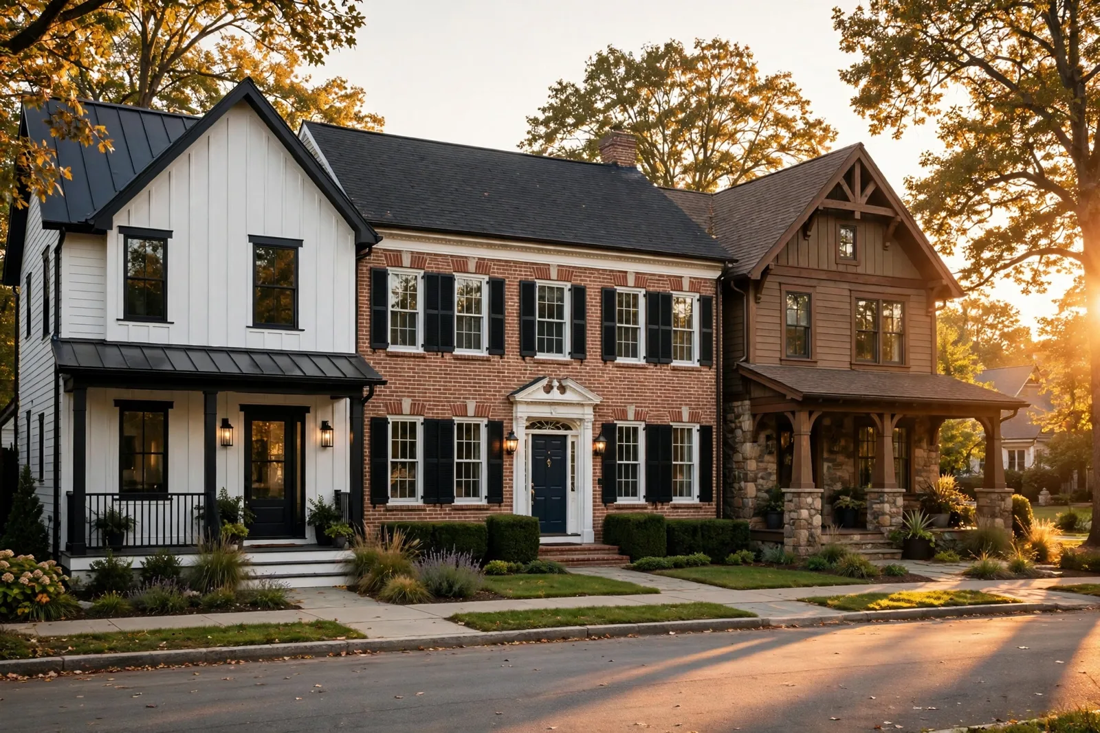
The fastest way to choose an exterior palette you’ll love for decades isn’t browsing thousands of swatches, it’s listening to your architecture. Every home style carries its own visual language: a farmhouse asks for crisp contrast, a colonial for classic order, a craftsman for earthy honesty, a modern for restraint, a ranch for warmth. This guide maps field, trim, and front-door palettes to five beloved architecture styles, so your colors work with the house instead of against it. One non-negotiable first: exterior colors shift dramatically with sun, shade, season, and weather, so always test large physical samples directly on the house itself, viewed from the curb, in multiple lights, before committing. The Global Abode is an independent publication, not affiliated with or endorsed by Sherwin-Williams or Benjamin Moore; color names and codes below are referenced as widely-known designer examples, and undertone notes are widely-reported designer observations rather than exact manufacturer data.
Key takeaway: Architecture should set your palette’s character. Farmhouses shine with high-contrast field-to-trim pairings, colonials with classic field-plus-white-trim combinations, craftsmen with earthy tones that echo natural materials, moderns with tonal restraint, and ranches with warm approachability. Choose your style’s logic first, pick your three colors second, and sample everything on the house before you buy a gallon.
Why architecture sets the palette’s character
Stand on any street in America and look down the row of houses. The ones that look effortlessly right, the ones that make you slow down, aren’t necessarily the ones with the boldest colors. They’re the ones whose colors agree with the architecture. That’s not an accident. Each architecture style evolved in a particular era, from particular materials, with particular proportions, and over decades we collectively developed an expectation of what “correct” looks like for each one.
Color consultants call this architectural appropriateness, but you don’t need the jargon to use the idea. Think of it this way: a farmhouse’s tall gables and clean board siding read as strong graphic shapes, so high-contrast color relationships (bright field against dark trim) amplify what the house is already saying. A colonial’s symmetrical windows and crisp detailing read as order, so a restrained palette with clear field-trim hierarchy confirms that order. A craftsman’s heavy brackets, exposed rafter tails, and stone piers read as grounded and handmade, so earthy colors that echo soil, wood, and stone feel honest there, while a glossy black-and-white scheme would feel like a costume.
This isn’t about rules you must obey. It’s about starting points that save you from expensive mistakes. When the palette matches the architecture, you get three things for free: curb appeal that photographs well, style-appropriate palettes tend to read correctly at distance, which is how most people experience your home; resale confidence, buyers respond to homes that feel architecturally coherent, even if they can’t articulate why; timelessness, trend-driven colors cycle in and out, but a colonial in classic colors or a craftsman in earthy tones reads well in every decade.
Before we get to the style-by-style palettes, let’s establish the three-role system every exterior palette needs, because all sections below are organized around it: 1. Field (body) color, covers the most surface area, usually the siding. It sets the emotional temperature of the whole house. 2. Trim color, window casings, corner boards, fascia, eaves. Trim outlines the architecture and creates contrast against the field. 3. Door color (accent), the front door, sometimes shutters or porch details. This is the smallest dose of color and the one place personality can shine without overwhelming the composition.
Designers widely recommend capping the palette at three colors (field, trim, door), with a possible fourth reserved for fixed elements like stone, brick, or roofing that you coordinate with rather than paint. More than that, and the eye doesn’t know where to land. With that framework set, let’s walk through the five styles, what makes each one tick, and exactly how to color it.
Modern farmhouse: crisp field, bold trim, confident door
The modern farmhouse look, board-and-batten siding, tall gables, deep porches, black-framed windows, is the dominant exterior aesthetic of the last decade, and its color logic is beautifully simple: maximum clarity. Farmhouse architecture is graphic. Big simple shapes. Strong rooflines. So the palettes that win here are the ones with confident contrast between field and trim.
The most recognizable modern farmhouse exterior is a warm white or soft cream field paired with dark trim, black, soft black, or deep charcoal on the window frames, fascia, and sometimes the front door itself. Why it works: white siding makes the gable shapes read crisp and sunlit, while dark trim sharpens every edge and gives the whole composition a tailored, finished feeling. Which whites work best? Designers commonly point to warm, soft whites rather than stark blue-whites, widely-known warm whites with a gentle warmth that reads clean in daylight are frequent designer examples. Pair with a near-black trim, a soft black with widely-reported cool-leaning undertones, or a deep charcoal-bronze that designers often describe as reading almost-black at distance. For a softer version of the same idea, swap the black trim for a warm dark bronze or deep espresso, you keep the contrast, you lose a touch of the drama.
For the front door, farmhouses can go three directions, all successful: match the trim (black or bronze door) for a seamless, architectural look; natural wood, a stained wood door warms up the white-and-black scheme and adds the farmhouse soul the style depends on; a confident color, deep red, navy, or forest green doors are widely reported as classics on farmhouses.
There’s a second farmhouse formula gaining ground: dark field, light trim. A charcoal or deep bronze-gray field with warm white trim reads modern and grounded, and it has a practical advantage, dark siding hides dirt, weathering, and landscape shadows far better than white. If you go dark, keep two cautions in mind. First, dark colors absorb significantly more heat, confirm your siding material and local climate can handle it. Second, test a dark field over a large area: a four-by-four-foot sample board minimum. Dark exteriors can read dramatically darker at full scale than they look on a small swatch.
Designer tip: On a modern farmhouse, paint the porch ceiling the same white as the field (never the dark trim color). A bright porch ceiling reflects daylight onto the porch, making the entry feel welcoming rather than cave-like, and it’s a classic farmhouse detail that costs nothing extra.
Colonial & traditional: classic order that never dates
Colonial architecture, Georgian, Federal, Dutch Colonial, and their revival cousins, is built on symmetry and hierarchy. Two or three stories of balanced windows, centered entries, and crisp detailing. The color logic that suits it is equally disciplined: a clear field color, crisp trim that outlines the order, and controlled accents. When in doubt on a colonial, fewer colors and more clarity always win.
A handful of field-trim combinations have decorated colonials for generations, and every one of them still works today: white field + black or deep-green shutters + black or red door, the most iconic American colonial scheme; gray-blue or slate-blue field + white trim + black shutters, widely recommended by color experts, reads historic and refined; sage or muted-green field + white trim + red or black door, stately, at home on historic streets; brick-red or barn-red field + cream trim, warm and established rather than stark; warm beige or greige field + off-white trim, the modernized colonial, classic architecture with a current feeling.
Notice what all of these share: white or off-white trim is doing the architectural work, outlining windows, corner boards, and entry details, while the field color provides the character. On colonials, resist the urge to go tonal (trim nearly the same color as the field). The whole pleasure of colonial architecture is its crisp detailing, and low-contrast palettes flatten it.
The front door is the traditional place for a colonial’s accent color, and this is one style where a bold door never looks wrong. Deep red doors are the heritage choice; black doors read as formal and timeless; navy doors bridge classic and current. The key is gloss level: a satin or semi-gloss finish on the door adds the traditional formality colonials want, while flat paint can look dull at the entry. For shutters: the shutter color should agree with the door, either match it, or choose a color in the same depth. Black shutters with a red door is a classic pairing; mismatched shutters and doors fight the colonial’s sense of order.
Craftsman & bungalow: earthy palettes from the landscape
Craftsman architecture is the opposite of the modern farmhouse in spirit: where farmhouses celebrate contrast, craftsmen celebrate connection to the landscape. Heavy tapered porch columns, exposed rafter tails, stone or brick piers, deep eaves, natural wood brackets, the style is literally built from earth materials. The palettes that honor it are drawn from the ground up: olive greens, warm browns, muted golds, terracotta, sage.
The classic craftsman scheme uses three values of related colors rather than high contrast: a mid-tone field, a lighter or darker trim, and a deep accent. For example, field: muted olive or sage green, warm taupe, chestnut brown, or dusty gold; trim: warm cream or soft off-white, lighter than the field, so the details still read without the stark punch of farmhouse black trim; door and accents: deep forest green, rich burgundy, warm rust, or natural stained wood. The palette is intentionally tonal, colors that sit near each other on the spectrum, separated by value rather than hue. That tonality is what makes craftsmen feel so settled and calm.
No style demands more respect for unpaintable elements than the craftsman. River rock foundations, stone piers, brick chimneys, stained wood beams, these are the permanent palette members, and your paint colors must harmonize with them rather than compete. Practical approach: hold your paint samples directly against the stone or brick at different times of day. If the paint color makes the masonry look muddy or the masonry makes the paint look harsh, adjust the paint, the stone isn’t moving. One more craftsman-specific note: the porch ceiling. Traditionally painted a soft sky blue (the famous “haint blue” of Southern porches), a pale blue-green porch ceiling is a period-authentic detail that designers still love.
A widely-referenced designer example for craftsman exteriors: Evergreen Fog (SW 9130), widely described by designers as a soft green-gray that sits beautifully against natural materials, a useful starting sample if you’re drawn to the green craftsman direction. As always, sample it on your house against your stone and brick before deciding. For a deeper treatment, see our Evergreen Fog SW 9130 review.
Modern & contemporary: tonal, quiet, architectural
Modern architecture, flat or low-pitched roofs, large expanses of glass, minimal ornamentation, strong geometric masses, asks color to do something different: get out of the way. On a modern home, the architecture itself is the statement. The palette’s job is to reinforce the geometry, separate the masses, and otherwise stay quiet.
Modern exteriors work best with one or two field colors in tonal relationship, colors that relate to each other rather than contrast. Common winning formulas: warm white or light greige overall, with one architectural mass in a slightly deeper tone; charcoal or dark bronze-gray field with matching or near-matching trim, going nearly monochromatic lets the shapes, shadows, and materials provide all the visual interest (designer examples in this family include Urbane Bronze SW 7048 and similar deep, warm charcoals); griege siding with warm gray accents, neutral enough to let the architecture speak while staying warm enough to feel like a home.
Notice what modern palettes don’t do: high-contrast white-on-black trim outlines (that’s farmhouse language), multi-color trim detailing (that’s Victorian language), or busy accent colors on every surface. If a modern home has an accent color, it should appear once, one door, one volume, one gesture. On modern homes, unpainted materials carry as much color weight as paint: cedar soffits, standing-seam metal, board-formed concrete, dark window frames. Plan these as part of the palette, not after it.
Caution: Dark colors on modern exteriors look stunning but carry real consequences, heat absorption, faster fading, and higher repaint frequency, especially on sun-blasted south and west walls. If your heart is set on a dark modern field, budget for premium exterior paint in a heat-reflective formula, and confirm the color with your siding manufacturer’s warranty terms before you commit.
Ranch & cottage: warm, approachable, inviting
Ranch homes, long, low, horizontal, usually with a modest footprint, and their cottage cousins share a color goal: approachability. These houses succeed when they look welcoming, grounded, and easy to live in. The palettes that do this are warm, mid-tone, and softly contrasted. Nothing here should shout.
The ranch formula: horizontal harmony. The best color strategies emphasize the horizontality rather than fighting it: warm white, greige, or light warm-gray field with trim in a slightly deeper tone of the same family; a two-tone horizontal split, slightly darker color below a belt line, lighter above, to make a low-profile ranch look more intentional; stone or brick wainscot accents treated as the palette’s anchor, with the field color pulled from their undertones. The ranch’s wide, low proportions mean the field color dominates the view, so choose one you genuinely love living with.
Cottages earn slightly more color freedom than ranches because their smaller scale forgives bolder choices: soft, sunlit colors (buttery yellow, pale sage, warm white, dusty blue); white trim, always, the detail that keeps soft field colors looking fresh rather than washed out; a storybook door, a soft red, teal, or sunny yellow door on a small cottage reads as delightful, not loud. If you’re exploring options, our front door color ideas guide walks through door colors that flatter every architecture style.
For both ranches and cottages, landscaping is part of the palette. Hold your field-color samples up against your actual plantings, not just the siding. A warm greige that looks perfect against bare siding can clash with the specific green of your hedges, or glow beautifully against them. You won’t know until you check.
| Style | Field (body) | Trim | Front door |
|---|---|---|---|
| Modern farmhouse | Warm white or cream | Black, charcoal, or deep bronze | Black, stained wood, or deep red/navy |
| Modern farmhouse (inverted) | Charcoal or deep bronze-gray | Warm white | Stained wood or black |
| Colonial / traditional | White, gray-blue, sage, or warm beige | Crisp white or off-white | Red, black, or navy |
| Craftsman / bungalow | Olive, sage, warm brown, or dusty gold | Warm cream or deep green | Forest green, burgundy, or stained wood |
| Modern / contemporary | Warm white, greige, or charcoal | Same-as-field or tonal | Single confident accent |
| Ranch / cottage | Warm white, greige, or soft color | White or slightly deeper tone | Teal, red, or cheerful color |
If your home blends styles, a farmhouse with craftsman porch details, a colonial with a modern addition, let the dominant architecture lead and borrow accents from the secondary style. And whatever style you land on, the decision process stays the same: narrow to two or three candidate palettes, buy sample quarts, paint large test boards, and view them from the curb at morning, midday, and dusk. Our complete walkthrough of that process is in our guide to choosing exterior house colors.
Take the guesswork out of your exterior palette
Choosing field, trim, and door colors is only half the battle, the real confidence comes from a complete color system that carries your exterior palette through the whole house. Our paint guides map designer-trusted palettes room by room, so every choice you make works together.
Frequently asked questions
It should agree with the style’s logic, not necessarily copy a formula. Colonials suit heritage colors (red, black, navy); craftsmen suit deep earthy tones or stained wood; farmhouses suit black, wood, or confident heritage colors; moderns suit a single restrained accent; cottages can carry cheerful colors. A door that clashes with the style’s character will always look off, even if you love the color itself.
Dark trim, black, soft black, or deep charcoal, is the signature choice, paired with a warm white or cream field. It sharpens the gable lines and gives the architecture its tailored, graphic look. If full black feels too stark, a deep bronze or espresso trim keeps the contrast with a softer edge.
You can absolutely go dark, deep navy, forest green, or charcoal fields with crisp white trim are widely loved on colonials and read as historic rather than trendy. What matters is keeping the trim bright enough to outline the architecture’s crisp detailing, since that detailing is the whole point of the colonial style.
Three: field (body), trim, and door/accent. That’s the sweet spot for nearly every home. A possible fourth color can acknowledge fixed elements like shutters or a porch floor, but more than four and the eye doesn’t know where to land. Modern homes often do best with even fewer, one or two tonal colors.
Treat the brick or stone as a permanent member of the palette, not a background to ignore. Hold paint samples directly against the masonry at multiple times of day and choose field and trim colors that harmonize with its undertones, pull from them rather than competing with them. The masonry isn’t changing, so the paint must do the adjusting.
Paint large samples, at least two by two feet, bigger for dark colors, directly on the house or on boards you can move around it. View them from the curb (that’s how everyone else sees your home) at morning, midday, and dusk, in sun and shade, and against your roof, stone, and landscaping. Exterior light shifts color dramatically, so a swatch viewed indoors tells you almost nothing.

