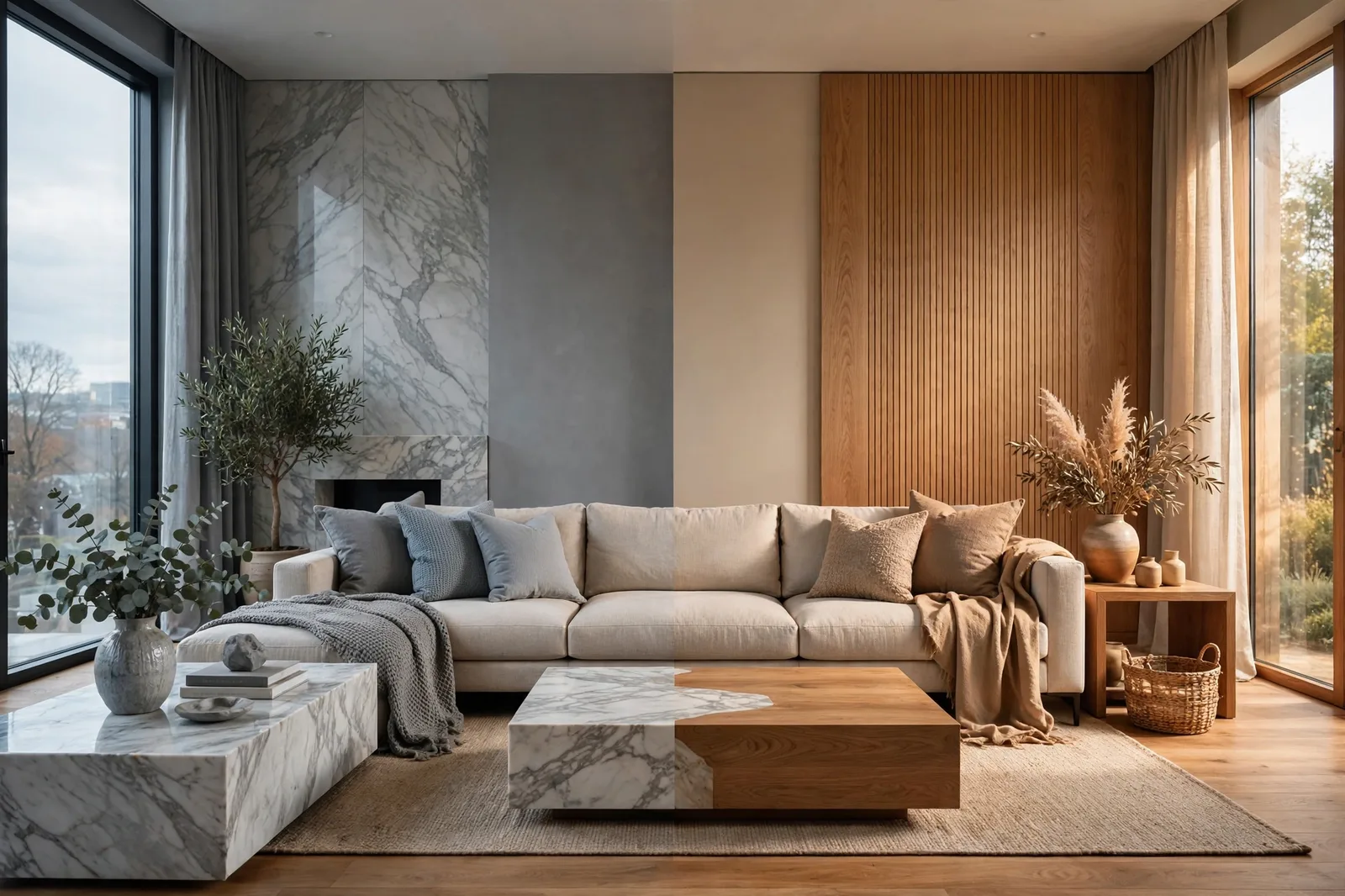
For a decade, this was the entire paint conversation: which gray. Now the question has split in two, and most people are really asking something simpler. They want to know whether their home should feel crisp or cozy, and which neutral will get them there without fighting their floors, their light, or the decade we’re in. Here’s the honest answer: both colors are still right. Just never for the same room.
Why this choice feels so hard
Gray was the defining neutral of the 2010s, whole subdivisions painted head to toe in it. Then taste shifted, and “warmth” became the word of the decade: warm whites, warm woods, warm minimalism. Homeowners caught in the middle now stand in the paint aisle paralyzed between the two families, afraid of choosing the color of yesterday.
Here’s what the trend coverage actually says, stripped of the hype. Cool, steely grays, the blue-toned, high-contrast kind, are receiving less enthusiasm in current design coverage; warmer grays, greiges, and beiges are where the momentum is, and both major brands’ 2026 colors of the year sit firmly in the warm, earthy camp. But the same coverage keeps saying something most trend roundups bury: gray isn’t wrong, it’s contextual. In a home with cool stone, marble, dark flooring, or strong warm south daylight, a cool gray can be exactly right. The room should make the final decision, not the trend forecast.
That reframes the whole question. You’re not choosing between “in style” and “out of style.” You’re choosing between two different personalities, crisp or cozy, and matching that personality to your light, your floors, and your finishes. The sections below give you the anatomy of each family so the choice stops being a guess.
Undertone anatomy: what each family is actually built from
Every “neutral” is a color wearing a disguise. The disguise is the undertone, and the two families wear different ones.
Cool grays are built on blue, green, or violet undertones. Designers often cite colors like Repose Gray as the family archetype, a gray whose cool lean is unmistakable once you know to look. That cool DNA is what makes the color read fresh, clean, and modern on the chip. It’s also what makes it the riskier family: in dim or north-facing light, a cool gray’s blue or violet undertone can surface and turn the wall icy or faintly lavender. There is no truly neutral gray, and the family hides its lean the best.
Warm greiges are a genuine hybrid, gray blended with beige, carrying brown, taupe, or warm tan undertones. Colors like Agreeable Gray are the family’s most-cited example: not quite gray, not quite beige, borrowing from both. That beige backbone is why greige reads warmer and more forgiving than a cool gray, and why it pairs so naturally with wood. But greige has its own trap: in cool north-facing light, even a warm-leaning greige can have its gray side pulled forward, and the wall can read cold or slightly purple, the same undertone surprise in a different costume.
How to read any candidate in the store, before you buy a sample pot:
1. The white-paper test. Hold the swatch against a sheet of pure white paper in daylight. Against true white, blue, green, violet, pink, or yellow hints jump out immediately. This is the same test designers use on real projects, it takes ten seconds and it’s more reliable than staring at the chip alone.
2. The chip-strip trick. Paint companies arrange strips by intensity, the darkest swatch is the same hue family as the lightest, concentrated. If the bottom of the strip looks dusty blue, your light gray carries blue DNA. If it looks like warm taupe, you’re holding a greige.
3. The direction check. Notice which way the undertone leans and which way your room’s light leans (north = cool, south = warm). Undertone plus light in the same direction amplifies; in opposite directions, they balance. A blue-leaning gray in north light doubles down on cool. A beige-leaning greige in south light doubles down on warm. Your job is to decide which of those amplifications you actually want.
The head-to-head: light, finishes, trim, and mood
This is the comparison that settles it. Read the row that matches your house, that’s your answer.
| Dimension | Cool gray | Warm greige |
|---|---|---|
| Undertone DNA | Blue, green, or violet | Beige, brown, or warm taupe |
| North-facing rooms | Risky, cool light amplifies the blue/violet lean; can read icy | Strong, warm backbone offsets the cool cast; choose a beige-dominant greige |
| South-facing rooms | Excellent, warm sun balances the cool lean; offsets “visual heat” | Caution, warm sun amplifies the beige side; can go golden by afternoon (lean gray, not beige) |
| East / west rooms | Works well, handles the shifting light without drama | Works well, test at the time of day you use the room |
| Fixed-finish partners | Cool stone, marble, gray tile, dark floors, chrome and black metal | Warm oak, honey wood, cream upholstery, brick, brass |
| Trim white pairing | Crisp, clean whites, the cool wall wants a true bright trim | Softer, warmer whites, a stark cool trim can make greige walls look dingy or yellow by contrast |
| Mood it creates | Crisp, calm, modern, the gallery feeling | Cozy, inviting, relaxed, the gathered feeling |
| Best rooms | Bathrooms, kitchens, home offices, south-facing living spaces | Bedrooms, living rooms, hallways, north-facing spaces |
Two rows deserve extra attention because they surprise people.
South light is the cool gray’s secret weapon. Most homeowners assume warm rooms need warm colors. But south-facing rooms get such intense, warm sun that a cool gray is often the balancing choice, the warm light neutralizes the blue lean, and the color takes “visual heat” out of a room that would otherwise feel toasty. If your sunniest room feels overwhelming, a cool gray may calm it better than any warm neutral could.
The trim row is the one people get wrong. A very bright, cool white trim next to warm greige walls is a documented mismatch, the trim becomes the “true white” your eye judges everything against, and the greige walls read dingy or yellowish by comparison. Sample your wall color and your trim white together before committing. Cool grays generally want the crisper white; greiges want a softer, slightly warmer one. This single pairing decision affects the result as much as the wall color itself.
Which family pairs with your fixed finishes
Your floors, counters, and tile aren’t changing, so they get the first vote. Here’s how each common finish points:
Warm oak or honey-toned wood floors → warm greige. This is the most common pairing in American homes, and it’s where greige earns its reputation. The beige backbone of the greige talks to the golden tones in the oak; a cool gray next to honey oak creates a temperature argument the eye never stops noticing. If your whole house is warm wood, greige is almost certainly your family.
Gray-washed, weathered, or cool-toned wood floors → cool gray. The reverse logic. Cool floors want cool walls, the undertones agree, the room reads intentional, and the gray stays gray instead of fighting.
White marble or cool stone (Carrara, Calacatta) → cool gray. Marble leans cool and gray itself; a cool gray wall extends that language instead of introducing a competing warmth. This is one of the contexts where design coverage consistently says gray remains the right call, beige walls next to cool marble can make the stone look dirty by comparison.
Warm granite, travertine, or limestone → warm greige. These stones lean gold and pink; greige’s brown-taupe backbone harmonizes where a cool gray would clash.
Red or orange brick → warm greige, carefully. Brick is one of the most undertone-heavy finishes in a home. A greige with a quiet, non-pink beige lean keeps the room cohesive; a cool gray directly against red brick usually loses.
Dark walnut or espresso floors → either, with contrast. Deep floors give you freedom because the wall’s job is contrast, not matching. Cool gray walls with dark walnut read sleek and modern; greige walls with the same floor read rich and traditional. Choose by the mood you want, this is one finish that doesn’t force the decision.
When your finishes disagree with each other, warm oak floors meeting a cool gray kitchen counter, say, greige is usually the better diplomat. Its hybrid nature lets it sit between two temperature camps without strongly siding with either. And keep one trim white constant through the whole house regardless; it’s the cheapest unity you can buy.
Room by room: where each one wins
General rules bend by room, because rooms have different light, different finishes, and different jobs.
Bedrooms → warm greige, usually. Bedrooms are rest spaces, and they skew north-facing and dim, exactly the conditions where cool grays go icy and greiges glow. A beige-dominant greige in a north bedroom reads warm and enveloping at 9pm under lamplight. The exception: a bright south-facing bedroom with cool bedding and minimal wood can carry a soft cool gray beautifully.
Living rooms → depends on the collision. This is the “structural” room, the one most likely to contain both warm wood and cool stone. When the room has mixed fixed elements, greige is the bridge. When the room is architecturally cool (concrete, steel, gray tile, floor-to-ceiling glass), a cool gray extends the architecture instead of softening it.
Kitchens → cool gray, often. Kitchens skew toward cool finishes, stainless steel, marble or quartz counters, white or gray cabinetry, and toward strong task lighting. Cool grays harmonize with all of it, and they read clean, which is what most people want where food is prepared. A warm greige kitchen works when the cabinets are wood-toned or the counters are warm stone.
Bathrooms → cool gray. Bathrooms are the cool gray’s natural habitat: tile, porcelain, chrome, mirrors, and usually bright cool lighting. Designers consistently reach for cool grays here for the spa feeling, crisp, clean, calm. Greige in a bathroom can work with warm tile, but it needs the room’s finishes to agree.
Home offices → cool gray. Focus rooms benefit from the crisp, alert feeling of a cool neutral, and offices often have screens and task lighting that run cool anyway.
Hallways and open plans → warm greige. Connective spaces touch everything, so they want the most forgiving family. Greige’s hybrid nature means it won’t clash with whatever’s in the adjacent rooms, and it keeps long transitional spaces from feeling like tunnels.
Exteriors → warm greige, usually. In harsh daylight, cool grays can read stark or blue on siding; greige’s beige backbone keeps the house looking grounded. (North-facing facades especially benefit from the warmth.)
The trend question, and 5 questions that pick your winner
Let’s settle the trend anxiety directly. Is gray out of style? The honest answer from current design coverage: cool, steely gray as a whole-house default is fading, the “millennial gray” era of gray-everything interiors is winding down, and warm neutrals (greige, taupe, warm beige, creamy whites) have the momentum. Some coverage goes further, arguing greige itself is starting to feel overdone and that richer browns and deeper earth tones are next.
But here’s the part that matters more than any of that: trend cycles don’t invalidate a color that’s right for your house. A cool gray in a marble bathroom with south light will look correct in any decade, because it’s correct for the conditions. A greige chosen because it’s “current” but fighting honey-oak floors will look wrong immediately, trend or no trend. Choose for your light and finishes; let the trend be a tiebreaker, not the judge.
And now the decision flowchart, five questions, in order. Answer them honestly and the winner picks itself:
Question 1, Which direction do your main windows face? North or mostly dim → lean warm greige (choose a beige-dominant one). South or very bright → cool gray becomes genuinely competitive, sometimes the better pick.
Question 2, What are your floors? Warm oak, honey, or golden wood → warm greige. Gray-washed, cool, or dark modern floors → cool gray earns its place. Dark walnut → either; move to question 3.
Question 3, What feeling do you want when you walk in? Crisp, calm, gallery-like → cool gray. Cozy, gathered, lived-in → warm greige. This is a real decision input, not a tiebreaker, you have to live inside the mood.
Question 4, What are your counters and tile saying? Marble, cool quartz, gray tile, chrome → cool gray. Warm granite, travertine, warm tile, brass → warm greige. When they disagree with the floors, the larger surface wins.
Question 5, Are you choosing for resale within a few years? If yes, lean warm greige, current buyer sentiment favors warmth, and greige photographs as “updated” in listings right now. If you’re choosing for yourself for the long term, ignore this question entirely and trust questions 1–4.
Work through all five before you buy a single sample pot. Most people find that questions 1 and 2 already agree, and when light and floors point the same way, the decision is made.
Want the neutral already chosen for your house?
The Whole Home Paint Guide is a complete Sherwin-Williams color system, anchor neutrals, supporting colors, trim and ceiling pairings, with undertones already coordinated to warm fixed finishes like oak floors. (Independent guide; not affiliated with or endorsed by Sherwin-Williams.)
Frequently asked questions
Cool, steely gray as a whole-house default is fading, design coverage for 2026 favors warm neutrals like greige, taupe, and creamy whites. But gray isn’t wrong; it’s contextual. In rooms with cool stone, marble, dark floors, or strong south daylight, a cool gray can still be exactly right. Choose for your conditions, not the trend cycle.
Gray is built on cool undertones, blue, green, or violet. Greige is a hybrid of gray and beige, carrying warm brown or taupe undertones. Gray reads crisp and modern; greige reads cozy and forgiving. Hold each against white paper and the difference is obvious: one leans cool, the other leans warm.
Greige, in most cases. North light is cool and indirect, which amplifies a cool gray’s blue or violet lean and can make the room feel icy. A greige with a dominant beige undertone offsets that cool cast. If you love gray in a north room, choose the warmest-leaning one you can find and test it in the room’s actual light.
You can, but keep it deliberate: assign the family per visual zone, not randomly per room. Every wall visible from one spot should belong to the same undertone family. A common working split is cool gray in the kitchen and baths (where finishes run cool) and greige in living areas and bedrooms, connected by one consistent trim white.
A softer, slightly warm white, not a stark cool white. A very bright cool trim next to greige walls becomes the “true white” your eye judges everything against, making the walls look dingy or yellowish by comparison. Always sample the wall color and trim white together before committing.
It’s one of the best pairings in paint. Greige’s beige-brown backbone harmonizes with the golden tones in oak, where a cool gray would create a temperature clash. For honey or golden oak, choose a greige whose beige side is clearly dominant, and confirm it with the white-paper test, since some “greiges” lean cooler than their name suggests.

