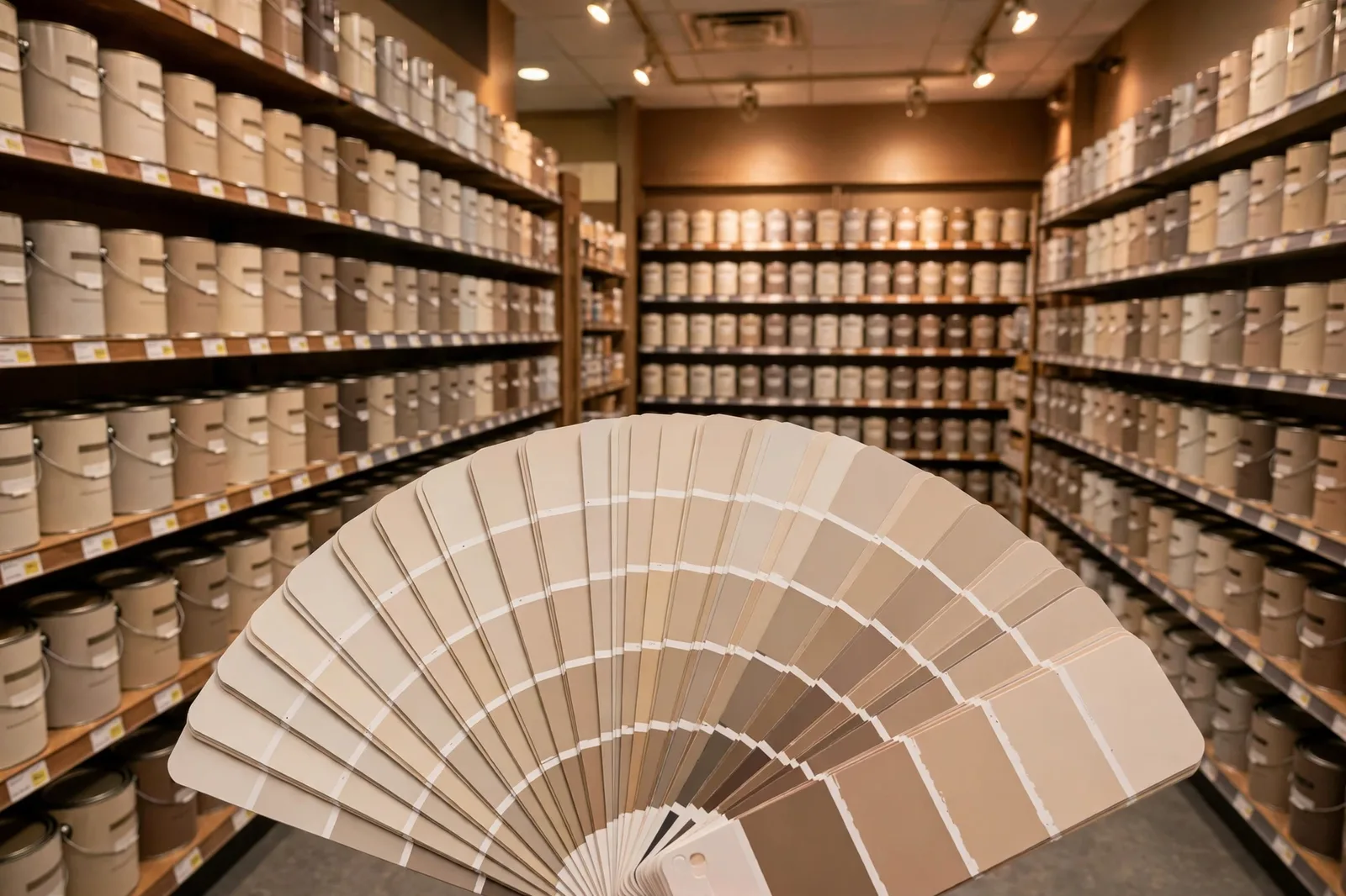
Somewhere between the designer paint color you fell in love with and the checkout counter, the math starts talking. A premium gallon costs noticeably more than a budget gallon, and when you’re painting a whole house, that difference multiplies into real money. So the question comes up in nearly every paint aisle in America: can’t I just get the dupe? This is the honest budget guide to Behr and Valspar dupes for popular paint colors, which near-matches are actually worth considering, how store color-matching really works, what you’re trading when you trade down in price, and the decision framework that tells you when a dupe is smart and when it’s a false economy. One principle governs everything below: dupes are never exact. They are closest cousins, not duplicates, and knowing the difference is what separates a savvy save from an expensive repaint. Paint colors shift with lighting, surface, and sheen, so always test a physical sample of the actual dupe paint in your own space before committing. The Global Abode is an independent publication, not affiliated with or endorsed by Behr, Valspar, Sherwin-Williams, or Benjamin Moore; all color names are referenced as widely-known examples only.
Why Dupes Exist, and What “Dupe” Really Means
Every popular paint color creates the same market pressure. A color like Agreeable Gray or White Dove gets specified in thousands of homes, photographed in thousands of rooms, and recommended in thousands of conversations, and every one of those recommendations sends someone into a paint aisle who then looks at the price difference between the premium brand and the budget brand and does the arithmetic. Dupes exist because that arithmetic is real. Painting a 2,000-square-foot home can mean fifteen or twenty gallons; the per-gallon savings of a budget brand multiplied across a whole house is not pocket change.
But the word “dupe” is doing a lot of quiet work, and most of it is misleading. In the beauty world, a dupe is a near-identical product at a lower price. In paint, there is no near-identical product, there can’t be, because of how paint is made. Each brand formulates its colors on its own base paints with its own pigment systems. There is no shared recipe book. So a “dupe” in paint is really one of two different things, and you need to know which one you’re dealing with:
1. A marketed stock-color dupe. This is what Behr does on its swatch wall: it offers specific Behr colors positioned as designer alternatives to famous premium colors, Blank Canvas for White Dove, Tranquil Gray for Agreeable Gray, and so on. These are real, permanent Behr colors with their own formulas, their own reviews, and their own behavior. They were chosen because they sit near the famous color in color space. They are not the famous color mixed into a Behr base; they are Behr’s own colors that happen to be neighbors. This is the most reliable kind of dupe, because the color is a known quantity, it has been painted in real homes, and its undertone behavior is documented.
2. A store-mixed color match. You bring a chip of the premium color to the counter, the spectrophotometer reads it, and the machine generates a formula to approximate it in the budget brand’s base. This is available at Home Depot (Behr), Lowe’s (Valspar), and most paint counters. It is an approximation built for one lighting condition, and as our cross-brand guide explains in detail, a matched color is technically a new color, subject to metamerism: it can look like the original in store lighting and drift apart under your home’s lamps.
The practical difference: a marketed stock dupe is a choice, you’re choosing a real color that resembles the one you wanted. A store match is a clone attempt, you’re asking chemistry to do something it can only approximate. Neither is “the same color for less.” Both can be perfectly good decisions, as long as you know which game you’re playing.
The Famous Dupe Pairs, Honestly Compared
Below are the dupe pairings that come up most often in designer discussions, DIY forums, and Behr’s own marketed dupe wall. The Behr column lists Behr’s positioned dupes where they exist; where no official dupe exists, the entry says so honestly and points to the nearest same-family stock color worth sampling. The Valspar column reflects an important asymmetry: Valspar doesn’t publish an official dupe list, so Valspar “dupes” in practice mean a computer color-match at Lowe’s or a same-family Valspar stock color, the table notes which. Undertone notes are widely-reported designer observations, hedged as always; confirm everything with your own samples.
| Popular color | Closest Behr cousin | Valspar route | How they differ (honest notes) |
|---|---|---|---|
| SW Agreeable Gray | Tranquil Gray (marketed dupe) | Computer match at Lowe’s, or same-family warm gray stock color | Tranquil Gray sits very near Agreeable Gray in color space; designers report it reading a touch cooler/grayer in some lights. Excellent starting point, sample it large before committing. |
| SW Repose Gray | Gratifying Gray (marketed dupe) | Computer match, or same-family light gray | Gratifying Gray is positioned as the Repose Gray neighbor; expect the usual small shifts in undertone and depth. The pair diverges most under warm evening lighting, test at night. |
| SW Accessible Beige | Even Better Beige (marketed dupe) | Computer match, or same-family warm beige | Even Better Beige is Behr’s beige answer; both are warm beiges with gray restraint. Accessible Beige’s faint green grounding may not fully survive the translation, check the dupe in dim light. |
| BM White Dove | Blank Canvas (marketed dupe) | Computer match, or soft warm white stock color | Blank Canvas is one of the most-discussed budget dupes in paint; it reads as a soft warm white very near White Dove’s territory. White Dove’s gray restraint is the subtle thing to verify, hold boards side by side. |
| BM Simply White | Natural White (marketed dupe) | Computer match, or clean warm white | Natural White is positioned near Simply White’s bright-warm territory. Simply White’s faint yellow whisper behaves differently across brands, judge the dupe in your dimmest room, where the whisper shows. |
| BM Chantilly Lace | Whipped Cream (marketed dupe) | Computer match, or near-neutral white | Whipped Cream is Behr’s clean-white answer. Chantilly Lace’s near-neutral crispness is hard to clone exactly; expect the dupe to carry a whisper more softness. Fine for most rooms; critical eyes should compare boards. |
| BM Revere Pewter | Vintage Pewter (marketed dupe) | Computer match, or same-family warm greige | Vintage Pewter is the marketed neighbor. Revere Pewter’s famous green-mauve shifting is the thing most likely to differ, the dupe may be steadier (or shift differently). A full day of observation settles it. |
| SW Snowbound | First Snow (marketed dupe) | Computer match, or soft cool-leaning white | First Snow is positioned as the Snowbound neighbor; both are soft whites with a cool whisper. Small differences, but whites show small differences at wall scale, sample large. |
| SW Alabaster | No official dupe, sample Behr’s warm-white family | Computer match | Alabaster’s warm, creamy character has no marketed Behr twin. The computer-match route is the honest path here; alternatively, sample Behr’s warm whites as neighbors, not equivalents, and pick the one your light likes. |
| SW Hale Navy / deep navies | No official dupe, sample Behr’s deep navy family as neighbors | Computer match | Deep colors are the hardest dupes: undertones amplify at depth, and a near-miss in navy reads as a different color, not a close one. Computer-match, then test the match ruthlessly in evening light. |
| SW Evergreen Fog / sage family | No official dupe, sample Behr’s sage family as neighbors | Computer match | Sages shift with their gray content; a dupe that misses the gray balance reads as a different green entirely. Neighbors worth sampling, but verify the muted quality in your own light. |
A few patterns worth noticing. First, Behr’s marketed dupes cluster around the famous neutrals and whites, the colors with the biggest audiences. The deeper and more colorful the original, the less likely a marketed dupe exists, and the more you’re relying on computer matching. Second, the whites are the most forgiving dupes and the darks are the least, a near-miss in a warm white reads as “a slightly different warm white,” while a near-miss in a navy reads as “the wrong navy.” Third, every dupe in this table is a starting point for sampling, not a purchase order. The table shortlists; your wall decides.
How Store Color-Matching Actually Works (and Its Limits)
When no marketed dupe exists, or when you want the closest possible approximation, the paint counter offers computer color-matching. Here’s what’s actually happening behind the counter, and why it matters.
The process. You hand over a sample of the target color: a paint chip, a swatch, a piece of painted drywall, sometimes even a fabric swatch or a photo (photos are the least reliable source, don’t). The associate places it under a spectrophotometer, which measures the color’s light reflectance across the visible spectrum. Software then calculates a formula, which colorants, in which amounts, to reproduce that measured color in the store’s brand base paint. The machine dispenses the colorants, shakes the can, and you get a gallon that the computer believes matches your sample.
What it does well. For mid-tone neutrals in balanced lighting, modern matching systems are genuinely impressive. A good match, viewed in the same kind of light it was measured under, can be very close, close enough that most eyes can’t tell the difference on a large wall. For rental repaints, closets, garages, and other low-scrutiny surfaces, a computer match is often all you need.
The limits, and they’re structural.
1. It matches one lighting condition. The spectrophotometer reads your sample under the store’s light. Your home’s light is different, warmer bulbs, north windows, evening lamps. Because the match uses different pigments than the original (different brands, different colorant systems), the two formulas can respond differently to your light. This is metamerism: two colors that match under one light source and diverge under another. It’s the reason a match that looked perfect at the counter can look “off” in your living room at 8 p.m.
2. It matches the sample, not the color. A printed paint chip is ink on paper, not paint. A swatch from a fan deck has aged. A photo has been through a camera, a screen, and compression. The machine faithfully reproduces the sample you handed it, including the sample’s own inaccuracies. The best source is a real painted sample of the original color: a peel-and-stick swatch in the actual paint, or a board you painted yourself from a sample pot of the original.
3. The base matters. Budget and premium bases differ in more than price, they differ in titanium dioxide content, resin quality, and how they accept colorant. A deep color that needs a lot of colorant can behave differently in a budget base: slightly different sheen, slightly different depth, sometimes slightly different dry-down (paint dries darker or lighter than it looks wet, and the shift varies by formula).
4. Sheen shifts the match. A match made for eggshell won’t look identical in satin. If you’re matching a color you saw in one sheen and painting in another, the match is already approximate twice over. Always match in the sheen you plan to buy.
The honest summary: computer matching is a skilled approximation, not a cloning machine. It works best when the stakes are low, the color is a mid-tone neutral, and you verify the result on your wall before committing to gallons. Our cross-brand equivalents guide covers the same mechanics in depth, the physics doesn’t change just because the price went down.
Behr vs. Valspar vs. Premium: What You’re Really Trading
Price is the headline, but it’s not the whole trade. Here’s what actually differs when you move between tiers, described in practical terms, not marketing terms.
Coverage and hide. Premium paints generally contain more titanium dioxide and higher-quality resins, which translates to better hiding, fewer coats to cover a contrasting color, more even results on the first pass. Budget paints have improved enormously, and for painting a similar color over a similar color, the difference is often negligible. But when you’re covering a dark color with a light one (or vice versa), the premium tier’s hiding advantage shows up as real labor saved: the difference between two coats and three is a full extra day of work.
Touch-up and consistency. One of the quiet advantages of premium paint is batch-to-batch consistency and touch-up blending. A premium wall touched up six months later tends to blend invisibly; budget paints can flash slightly at the touch-up edges. If you’re the kind of household that scuffs walls and touches up often, kids, dogs, high-traffic hallways, this matters more than the brochure suggests.
Washability and scrubbability. Higher-tier paints cure into a harder, more washable film. In kitchens, bathrooms, mudrooms, and kids’ rooms, the ability to scrub a wall without burnishing the sheen is worth real money over the years. Budget flat and eggshell finishes are the most vulnerable here; budget satin and semi-gloss hold up better.
Color accuracy and depth. Premium brands’ color systems are engineered together, the colorants, the bases, and the formulas are designed as one system, which is part of why designer colors behave so predictably. Budget brands’ systems are engineered for value, and while the results are good, the most complex colors, the ones with subtle undertone behavior that designers love, are where the premium system earns its keep. A simple warm white translates across tiers easily; a chameleon greige with green-mauve shifting translates less faithfully.
What you’re NOT trading. Modern budget paints are not the thin, chalky products of decades past. For straightforward applications, a bedroom repaint in a similar color, a rental refresh, a garage or basement, a quality budget paint applied properly (good prep, good roller, two coats) produces a result most people would never distinguish from premium. The trade is real but narrow: it concentrates in hiding over contrast, long-term washability, touch-up blending, and the fidelity of the most complex colors.
The Smart-Dupe Decision Framework
Not every surface deserves the same paint budget. Here’s the framework for deciding where a dupe is smart and where it’s a false economy.
Dupe smartly when:
The surface is low-scrutiny. Closets, garages, basements, laundry rooms, rental units, surfaces viewed briefly, in passing, or by people who aren’t studying your undertones. A close cousin is genuinely close enough here, and the savings are pure profit.
The square footage is large and the color is simple. Whole-house repaints in a warm white or a straightforward greige are the best dupe scenario: the per-gallon savings multiply across many gallons, and simple colors translate most faithfully across tiers. This is where Behr’s marketed stock dupes shine, they’re real colors, chosen for exactly this job.
You’re testing a color direction, not committing to it. Thinking about going dark in the dining room but not sure? A budget gallon for the experiment is rational. If you love it, you can repaint in premium later (or just enjoy the budget version, many people do).
The color is a background, not a feature. Hallway walls, secondary bedrooms, ceilings, colors whose job is to disappear. A dupe that misses by a whisper is still doing its job perfectly, because the job was invisibility.
Buy the original when:
The color is the star. The moody study, the statement front door, the kitchen island everyone photographs, when the color is the design decision, the original’s exact undertone behavior is what you fell in love with. Don’t approximate the thing people will actually look at.
You’re matching existing paint. Touch-ups, phased projects, additions, anything that must sit next to the original color on the same wall. A “close enough” dupe next to the original is where “close” goes to die; the eye is ruthless at edges and corners. This is the single clearest “buy the original” rule in paint.
The finish must endure scrubbing. Kitchens, kids’ bathrooms, mudrooms, hallways with dogs, high-contact surfaces where washability and touch-up blending pay for themselves. The premium tier’s harder film is a durability purchase, not a luxury purchase.
The color is complex. Chameleon greiges, nuanced sages, deep colors with tricky undertones, the colors whose beauty lives in subtle behavior are the ones that translate least faithfully. If the undertone analysis is why you chose the color, buy the formula the analysis was written about.
The one-sentence version: dupe the background, buy the foreground. Spend the premium money where eyes land and hands touch; save the budget money where neither happens.
Planning the whole palette, not just one color?
The Whole Home Paint Guide is a complete, ready-to-use color system, anchor neutrals, deep accents, trim and ceiling pairings, all with undertones already coordinated, so whether you dupe the background or buy the foreground, every color lands in a house designed to hold it. And the Paint Color Workbook includes side-by-side dupe comparison worksheets and a room-by-room sampling checklist for testing budget cousins against the originals.
How to Test a Dupe Fairly
A dupe deserves a stricter test than an ordinary color, because you’re judging two things at once: whether you like the color, and whether the dupe is faithful enough. Here’s the protocol:
Step 1: Get a sample of the dupe in the actual dupe paint. Not a chip, not a photo, a sample pot of the Behr or Valspar color (or the store-mixed match) in the sheen you plan to use. If you’re comparing against the original, get a sample pot of the original too. You’re testing paint, not paper.
Step 2: Paint large boards, two coats each, side by side. At least 2×2 feet per board, labeled on the back. The dupe board and the original board should touch, comparisons only work in contact, because separated boards let your eye adapt and the difference vanishes.
Step 3: Judge in the real room at four moments. Morning, midday, late afternoon, and under your evening lamps. Dupes diverge most under artificial light, different pigment recipes respond differently to warm bulbs, so the pair that looks identical at noon can split at 8 p.m. The evening check is the verdict that matters.
Step 4: Test against your fixed finishes. Move both boards to the floor, the countertop, the trim. Undertone mismatches show up against fixed finishes, not against white board. This is where a dupe’s slightly different undertone either disappears or announces itself.
Step 5: Apply the ten-foot test. Step back ten feet and look at the seam between the two boards. If you can’t see where one ends and the other begins in your evening light, the dupe passes for that room. If the line is visible, the dupe failed for that application, no matter what the computer or the swatch wall promised.
Step 6: Check the dry-down. Paint dries darker or lighter than it looks wet, and the shift varies by formula. Don’t judge a dupe until both boards are fully dry, at least a few hours, ideally overnight. Wet comparisons lie.
For the complete method, our guide to testing paint samples walks through every step in detail.
Frequently asked questions
No, and Behr doesn’t claim they are. Behr’s marketed dupes (Blank Canvas, Tranquil Gray, and the rest) are Behr’s own stock colors positioned near famous premium colors, not the premium formulas mixed into Behr base. They’re close cousins with real, documented behavior. Treat them as excellent starting points, then verify with a large sample board in your own light before buying gallons.
Both use modern spectrophotometer systems and both produce good matches for mid-tone neutrals, the honest answer is that the operator matters more than the store. A careful associate who calibrates the machine, uses a good sample, and mixes in your target sheen will beat a rushed job at either counter. Bring the best possible sample (real painted swatch beats a printed chip beats a photo) and ask them to confirm the match before shaking the gallon.
For similar-color repaints, usually yes, modern budget paints cover well with two proper coats. The gap appears when covering strong contrasts (dark to light or vice versa), where premium paints’ higher hiding power can mean the difference between two coats and three. Do the project math, not just the per-gallon math: an extra coat of labor can erase the per-gallon savings.
You can, but don’t convert color-by-color, small shifts in each duped color compound into a palette that no longer relates the way the original did. Instead, use the original palette as inspiration, shortlist the budget cousins, and test the whole system together on boards in your light. And consider the hybrid approach from the decision framework: dupe the background rooms, buy the original for the foreground moments.
Absolutely, and it’s even more common at the budget tier. Behr has its own Swiss Coffee, its own Canvas colors, its own Alabaster-adjacent names, and none of them are the premium colors with the same words. The rule from the cross-brand world applies double here: a color name means nothing without the brand and code. Always confirm you’re looking at the actual Behr or Valspar color, not the famous name you assumed it was.
It depends on the color’s complexity. For simple warm whites and straightforward neutrals, a good computer match is often perfectly satisfactory, verify it with the ten-foot test in evening light. For complex colors with tricky undertones (chameleon greiges, nuanced sages, deep navies), a marketed stock dupe is usually the safer budget route than a computer match, because the stock color is a known quantity with documented behavior while the match is an untested new formula.

