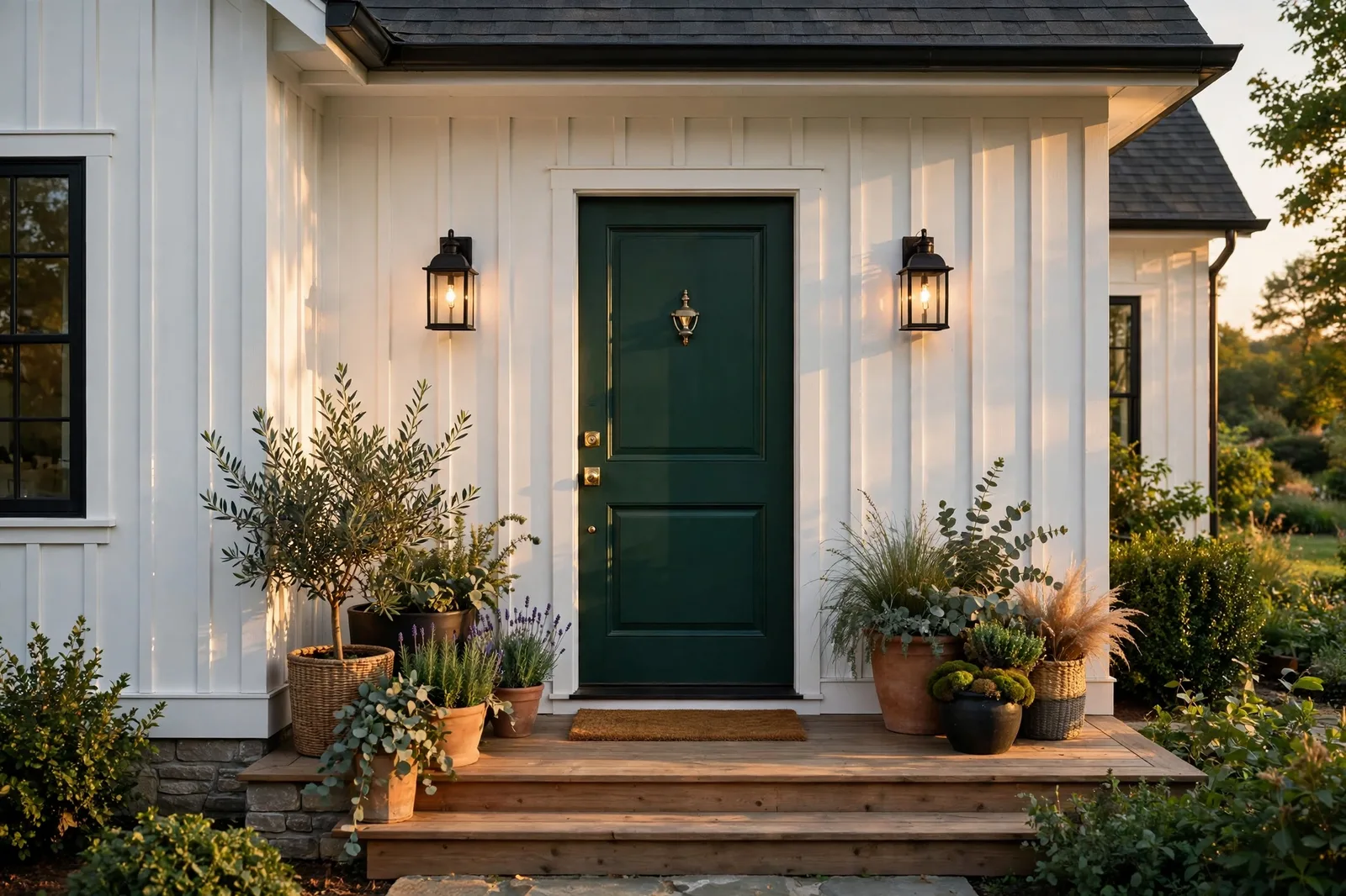
The front door is the smallest major decision on your home’s exterior, and the one with the largest return on confidence. A gallon of paint on a single door can change how the whole house reads from the curb: the same white farmhouse that looked quiet and unfinished with a plain white door looks considered and intentional the moment that door goes deep green, navy, or black. The door is the handshake of the house, the one place where the exterior gets to have a personality. This guide walks through the classic door colors that never fail, the modern farmhouse favorites designers reach for in 2026, how to match your door to your siding, brick, and trim, the finish and hardware choices that finish the job, and a simple test so you commit without regret. One important note first: exterior colors shift dramatically with sun, shade, and weather, so always test large physical samples on the door itself, viewed from the curb, in multiple lights, before committing. The Global Abode is an independent publication, not affiliated with or endorsed by Sherwin-Williams or Benjamin Moore; all color names and codes are referenced as widely-known designer examples.
Key takeaway: The front door follows the 80/20 rule of the exterior: it’s a tiny surface with an outsized effect, so it’s the safest place in the house to be bold. Black, deep green, and navy are the most reliable choices against light siding; classic red works when the rest of the exterior stays quiet; natural wood brings warmth no paint can match. Match the door’s temperature to your siding and trim, choose a satin or semi-gloss finish for durability, and always sample the door in curb light, morning, noon, and dusk. Undertone notes below are widely-reported designer observations, not exact manufacturer specifications.
The Front Door: The Exterior’s Jewelry
Every exterior has a hierarchy, and it helps to know yours. The siding or brick is the field, the big, quiet background that covers most of the house. The trim is the frame. And the front door is the jewelry: the one deliberate, concentrated moment of color that draws the eye and tells the visitor what kind of home this is. Designers talk about exterior lighting as the jewelry of the facade, but the door outranks even the lanterns, it’s bigger, it’s bolder, and it’s the first thing a guest actually touches.
The 80/20 rule is what makes the door such a forgiving place to take a color risk. On an interior wall, a bold color has to live with you all day, every day, at large scale. On a front door, the same bold color occupies maybe twenty square feet, viewed mostly from a distance, for a few seconds at a time. That small scale is liberating: a deep, saturated color that might feel like too much across a living room feels exactly right across a door. This is why the door is where homeowners should spend their boldness budget, and why designers consistently recommend choosing the door color last, as the punctuation mark on an exterior scheme that’s otherwise calm.
There’s also a practical side to the jewelry metaphor. Repainting a front door is a weekend project: one door, one quart of paint, an afternoon of work. Repainting siding is a five-figure job. So the door is not only the most expressive surface on the exterior, it’s the cheapest to change. That asymmetry is worth keeping in mind when you’re deciding how adventurous to be. If you pick a door color and love it, the whole exterior feels upgraded for the price of a quart. If you pick one and don’t, you’re out a Saturday, not a summer.
And the door does real work for the house’s value story. Real estate agents consistently note that curb appeal starts at the entry: a front door with a deliberate color reads as a maintained, considered home before anyone steps inside. A faded, flaking, or builder-white door suggests the opposite, however beautiful the landscaping. The door is the handshake, make it a firm one.
The Classics: Black, Deep Green, Navy, and Red
Some door colors have been chosen millions of times for a reason: they work against almost any exterior, they age gracefully, and they never look like a trend that expired. If you’re overwhelmed by options, start here. One of these four is almost certainly your answer.
Black. The most-chosen statement door color in modern design, and the safest bold move available. A black or near-black door against white or light siding is the defining image of the modern farmhouse, crisp, confident, timeless. Black works because it behaves like a neutral with presence: it grounds the entry, makes the surrounding trim look brighter, and pairs with any hardware finish. Designers describe the current preference as a shift toward dark, deeply saturated doors, black leading a family that includes charcoal, deep bronze, and espresso. The honest cautions: black shows dust and fingerprints more than lighter colors, and in direct, intense sun, dark colors absorb more UV and fade faster, so choose a quality exterior paint and expect to refresh sooner on a south-facing door.
Deep green. The organic classic. A deep forest or muted botanical green connects the house to its landscape, it reads as natural, welcoming, and quietly confident. Designers widely note that dark, warm greens that are nearly black make a dramatic statement that works with almost any exterior shade, from white siding to warm brick to gray stone. Green is the color that looks like it was always meant to be on a house, which is why it suits traditional, craftsman, and farmhouse styles so naturally. Pair it with brass or bronze hardware for warmth, or matte black for a crisper read.
Navy. The preppy classic that never left. A deep navy door is timeless in the truest sense, it reads as traditional without reading as old, and it flatters both warm and cool exteriors. Designers note navy as a versatile neutral: in direct sunlight its blue undertones become more vivid; by evening it deepens into something moodier. Navy is particularly strong against white and cream siding, and it pairs beautifully with natural materials, wood, stone, brick, because the blue gives the earth tones something to play against. If black feels too severe and green feels too rustic, navy is the middle path.
Classic red. The boldest of the classics, and the one that demands the most discipline from the rest of the exterior. A deep, rich red door is practically an invitation, designers describe it as the color that wants you to come inside and stay awhile. The rule with red is simple: the rest of the house must stay quiet. Red against white siding is the iconic pairing; red against gray can add warmth to a cool exterior. Red against brick, red trim, or a busy facade is where it goes wrong, too many warm voices talking at once. If your exterior is already calm and neutral, red is a legitimate, joyful choice. If it’s not, save the red for the interior.
Modern Farmhouse Favorites for 2026
Beyond the classics, designers are reaching for a warmer, earthier set of door colors in 2026, a shift that mirrors the broader move away from the stark white-and-black farmhouse toward something softer and more grounded. These are the colors showing up on real doors right now.
Natural wood. Not a paint color at all, and for many modern farmhouses, the right answer. A solid wood door, stained to show its grain, brings warmth that no paint can imitate, and it balances a white or light exterior the way nothing else does. Designers consistently name natural wood as the timeless farmhouse choice: it highlights craftsmanship, ages with character, and pairs with black hardware and black window frames in the classic modern-farmhouse composition. The maintenance is real, stained wood needs periodic resealing, especially in harsh sun, but the payoff is a front entry that looks custom rather than painted.
Warm eucalyptus and smoky greens. Designers describe warm eucalyptus as bringing an earthy softness that looks beautiful on craftsman and farmhouse-style homes, especially on wood or shaker-style doors. Smoky jade, a muted, grayed green, is the more modern sibling: elegant without feeling formal, and strong on transitional homes. Both read as green without shouting, and both pair naturally with warm brass or bronze hardware. If deep forest green feels too dark for your house, these are the step-down options that keep the organic feeling at a lighter register.
Moody teal. Teal sits between green and blue, and designers note it has just enough boldness to catch the eye while working beautifully with natural materials. A muted teal door is versatile enough for cottages, coastal-adjacent homes, and classic brick facades alike. It’s the choice for homeowners who want personality without going full red, noticeable, friendly, and easy to live with. Copper hardware against teal is a fresh combination designers mention specifically.
Chocolate bronze and aubergine. The moodier end of the 2026 palette: deep chocolate browns, smoky charcoal-browns, and aubergine, a dark purple-brown that designers describe as reading like a new neutral with real depth. These colors pair beautifully with creamy trim, natural wood, and aged brass, and they suit modern architecture especially well. They’re the sophisticated answer for a homeowner who finds black a little flat but still wants the grounding effect of a dark door. Our Urbane Bronze SW 7048 guide explores one widely-referenced bronze dark that designers use exactly this way.
Muted mustard and ochre. For the genuinely adventurous: a dusty, earthy yellow-ochre door brings instant warmth and optimism to a neutral exterior. Designers note bright sunshine yellows as joyful and playful, but for a modern farmhouse, the muted, dusty versions age better than the vivid ones. Ochre works best against white or warm-gray siding, where it reads as a confident accent rather than a shout. It’s the smallest category here for a reason, wonderful when it’s right, wrong for most houses, but worth knowing exists.
Tip: If you love a trendy door color but worry about commitment, remember the quart rule: a front door takes about one quart of paint. Buy the quart, paint the door, and live with it for a season. If the trend fades from your heart, you’re one more quart away from a classic, and you’ve spent less than a dinner out finding out.
Choosing by Your Exterior: Siding, Brick, and Trim
The door doesn’t exist in isolation, it’s read against the siding, the brick, the trim, and the roof every time someone approaches the house. The method is the same finishes-first discipline that governs interiors: read the fixed, permanent surfaces first, then choose the changeable one (the door) to agree with them. For a full treatment of the whole exterior palette, see our guide to choosing exterior house colors.
White and light siding. The most forgiving backdrop in existence. Against white, cream, or pale gray siding, almost any door color works, which is why white farmhouses carry the boldest doors so well. Black is the signature choice; deep green and navy are the softer classics; red is the joyful wildcard. The one caution: make sure the door has enough depth to stand apart from the trim. A white door on a white house with white trim disappears entirely, the entry needs the contrast to register as an entry.
Red and warm brick. Brick is a fixed finish with strong opinions, and the door must negotiate with it. Designers widely recommend grays and deep charcoals for brick exteriors, cool, warm, or neutral grays create balance with the brick’s warmth without competing. Warm bronze-browns are another strong option, echoing the brick’s earthiness at a deeper register. Navy with gray undertones also pairs beautifully with red brick. What to avoid: red doors on red brick (the warm voices collide), and anything in the orange family, which sits too close to the brick to read as a choice.
Gray siding. Gray siding is the trickiest common backdrop because gray’s undertone varies. The rule: match the door’s temperature to the siding’s undertone. Cool gray siding pairs with navy, black, and cool-leaning greens; warm gray (greige-leaning) siding pairs with deep warm greens, bronze, and chocolate browns. A black door works on both, it’s the universal donor of door colors. Where gray siding goes wrong is with a door that fights its temperature: a warm olive door on cool blue-gray siding reads as a mistake, not a statement.
Dark siding. A dark-sided house, charcoal, deep green, dark bronze, needs the door to do different work: instead of grounding, it needs to glow. Natural wood is the standout choice here, bringing warmth and light to a dark facade. Alternatively, go slightly lighter or slightly warmer than the siding, a deep green door on charcoal siding, a bronze door on dark green siding, so the entry reads as a distinct moment rather than disappearing into the field. Avoid matching the door exactly to the siding; the entry should be findable from the street.
Trim and shutters. The trim is the door’s frame, and the relationship matters. The classic composition is light trim with a dark door, the contrast is what makes the door pop. If your trim is dark, consider a door that’s lighter or warmer than the trim so the two don’t merge. Shutters don’t have to match the door, but they should be in conversation with it: black shutters with a deep green door, for instance, share a dark register without being identical. Matching door and shutters exactly is fine but can read as flat; a related-but-distinct choice usually looks more designed.
| Your exterior | Strongest door choices | Use with care |
|---|---|---|
| White / cream siding | Black, deep green, navy, classic red, natural wood | White or very pale doors, the entry disappears |
| Red / warm brick | Charcoal gray, warm bronze-brown, navy with gray undertones | Red, orange, or anything close to the brick’s warmth |
| Cool gray siding | Black, navy, cool-leaning deep green | Warm olive or mustard, temperature fights the siding |
| Warm gray / greige siding | Deep warm green, chocolate bronze, black | Icy blues, too cool against the warm field |
| Dark siding | Natural wood, a door lighter or warmer than the siding | Matching the siding exactly, the entry vanishes |
| Stone / mixed materials | Pull the door from the stone’s quietest undertone | Bold colors that compete with the stone’s variation |
Finish and Hardware: Satin vs Semi-Gloss, Knobs to Lanterns
Color gets the glory, but finish and hardware decide whether the door looks finished or merely painted. These are small decisions with visible consequences.
The finish question. For exterior doors, the professional consensus is clear: satin or semi-gloss, never flat. Flat finishes lack the durability and moisture resistance that outdoor exposure demands, they absorb weather, show handling marks, and fail sooner. Satin is the softer, more modern choice: it has a gentle glow, hides minor surface imperfections better than semi-gloss, and reads as sophisticated on paneled and shaker-style doors. Semi-gloss is the traditional, higher-shine choice: it reflects more light, wipes clean more easily, and gives the door a crisp, classic presence, but it also reveals every flaw in the door’s surface, so prep must be thorough. Either is correct; the choice is aesthetic. What matters is that it’s an exterior-grade acrylic latex paint with UV resistance, applied over proper primer in two thin coats, preparation is the main cause of paint failure on doors, not the color.
Hardware is the second jewelry. The door’s hardware, handle, lock, knocker, kick plate, is read at arm’s length, which makes it the detail layer of the entry. Matte black hardware is the modern farmhouse standard: it pairs with every door color in this guide and echoes the black window frames and lanterns that define the style. Oil-rubbed bronze is the warmer alternative, beautiful against greens and wood doors. Brass and aged brass bring glow, particularly striking against deep green, navy, and black, and read as the most traditional choice. Chrome and polished nickel are the crispest options; they suit modern doors but can feel cold against warm, rustic palettes. The rule that keeps hardware looking intentional: match the metals. The handle, lock, knocker, and hinges should share a finish, mixed hardware on a single door reads as unfinished, not eclectic. (Mixing metals across the whole exterior, black lanterns with brass door hardware, is a different matter and can work beautifully; it’s adjacency that causes trouble.)
The supporting cast. The door doesn’t carry the entry alone. Flanking lanterns or sconces in a finish that relates to the hardware, a simple wreath or seasonal greenery, a doormat with some texture, and house numbers in a legible, style-appropriate finish all contribute to the composition. None of these need to be expensive, but they do need to agree with each other. An entry where the lanterns, hardware, and numbers share a finish family looks designed; an entry where each is a different metal looks assembled by accident.
Watch out: Dark door colors fade faster in direct sun, it’s physics, not a paint defect. Dark and highly saturated colors absorb more UV radiation, which accelerates fading, especially on south- and west-facing doors. If your door takes full afternoon sun, choose a UV-resistant exterior paint, expect a shorter refresh cycle, and know that a deep green or bronze will hold its color longer than a true black. Never use interior paint on an exterior door: it lacks weather resistance and will deteriorate quickly.
The Commit Test: Sampling the Door in Curb Light
Choosing a door color from a chip in a store is the fastest route to regret. Exterior light is nothing like store light, it’s brighter, bluer at noon, golden at dusk, and it changes the color’s read completely. The commit test is simple, and it takes a weekend.
Step one: narrow to two or three candidates. Use this guide’s tables and your exterior’s fixed finishes to shortlist two or three colors. Don’t sample ten, decision fatigue is real, and three strong candidates tested properly beat ten tested casually.
Step two: paint large, on the door. Buy sample quarts (or peel-and-stick large samples) and paint generous swatches directly on the door itself, at least a square foot each, two coats, on the door’s actual surface. The door’s material, existing color, and texture all affect the read; a sample board held next to the door is a distant second. If you can’t paint the door directly, use large white poster boards propped against it, but know you’re seeing an approximation.
Step three: judge from the curb. This is the step everyone skips and the one that matters most. A door color is primarily viewed from twenty to fifty feet away, not from two feet. Walk to the street and look at each sample the way a visitor will: does the door read as a deliberate moment, or does it blur into the siding? Does it have the depth you expected, or does the distance wash it out? Colors almost always read lighter and less saturated from the curb than they do up close, which means the sample that looks “a bit much” at arm’s length is often exactly right from the street.
Step four: check three lights. Look at the samples in morning light, midday sun, and dusk. Navy shifts noticeably through the day, vivid at noon, moody at dusk. Greens warm up in golden-hour light. Black reads as pure silhouette in bright sun and softens in shade. The winner is the color that looks good in all three, not just one. And check it against the trim and siding in each light too, the door’s relationship with its neighbors matters as much as the door alone.
Step five: live with it for the weekend. Leave the samples up for two or three days. Walk past them coming and going. Glance at them from the car. The color that keeps looking right, that you stop noticing because it belongs, is your color. The one that nags at you is telling you something. Trust the nagging; a quart of paint is cheap, but repainting a door you talked yourself into is a chore nobody enjoys twice.
Choosing the door is one decision, the whole exterior is the system
The Whole Home Paint Guide is a complete, ready-to-use color system, anchor neutrals, trim and ceiling pairings, accent colors, all with undertones already coordinated, so your front door, siding, trim, and shutters all belong to one story. And the Paint Color Workbook includes exterior worksheets for reading your siding, brick, and roof before a single sample goes up.
Frequently asked questions
Black is the most widely-chosen statement door color in current design, designers describe the broader trend as a move toward dark, deeply saturated doors, with black leading a family that includes charcoal, deep bronze, and espresso. Deep green and navy are the next most popular, and natural wood remains the timeless farmhouse choice. All four work against the widest range of exteriors, which is why they stay popular.
They don’t have to match, but they should be in conversation. Shutters in a related-but-distinct color, black shutters with a deep green door, for example, usually look more designed than an exact match, which can read as flat. What matters most is that the door and shutters share a register: both dark, both muted, both in the same temperature family. Avoid pairing a bold door with shutters in a competing bold color.
Satin or semi-gloss, in an exterior-grade acrylic latex paint. Satin is the softer, more modern choice, a gentle glow that hides minor imperfections. Semi-gloss is the traditional choice, crisper, more reflective, easier to wipe clean, but less forgiving of surface flaws. Never use flat on an exterior door: it lacks the durability and moisture resistance outdoor exposure demands. Always prime properly and apply two thin finish coats.
Charcoal gray, warm bronze-brown, and navy with gray undertones are the strongest choices, they create balance with the brick’s warmth without competing with it. Avoid red doors on red brick and anything in the orange family, which sits too close to the brick to read as a deliberate choice. When in doubt, sample two or three grays against the actual brick and judge from the curb.
Yes, dark and highly saturated colors absorb more UV radiation, which accelerates fading, especially on south- and west-facing doors in direct sun. This is physics, not a paint defect. Mitigate it with a quality UV-resistant exterior paint and proper prep, and expect a shorter refresh cycle than a lighter door would need. Deep greens and bronzes tend to hold their color slightly longer than true black in harsh sun.
No. Interior paints lack the weather resistance, UV stability, and moisture tolerance that exterior exposure demands, and they will deteriorate quickly outdoors, peeling, fading, and chalking far sooner than an exterior formula. Use a high-quality exterior acrylic latex paint with UV resistance, matched to your door’s material with the right primer. The paint type matters more than the color for longevity.

