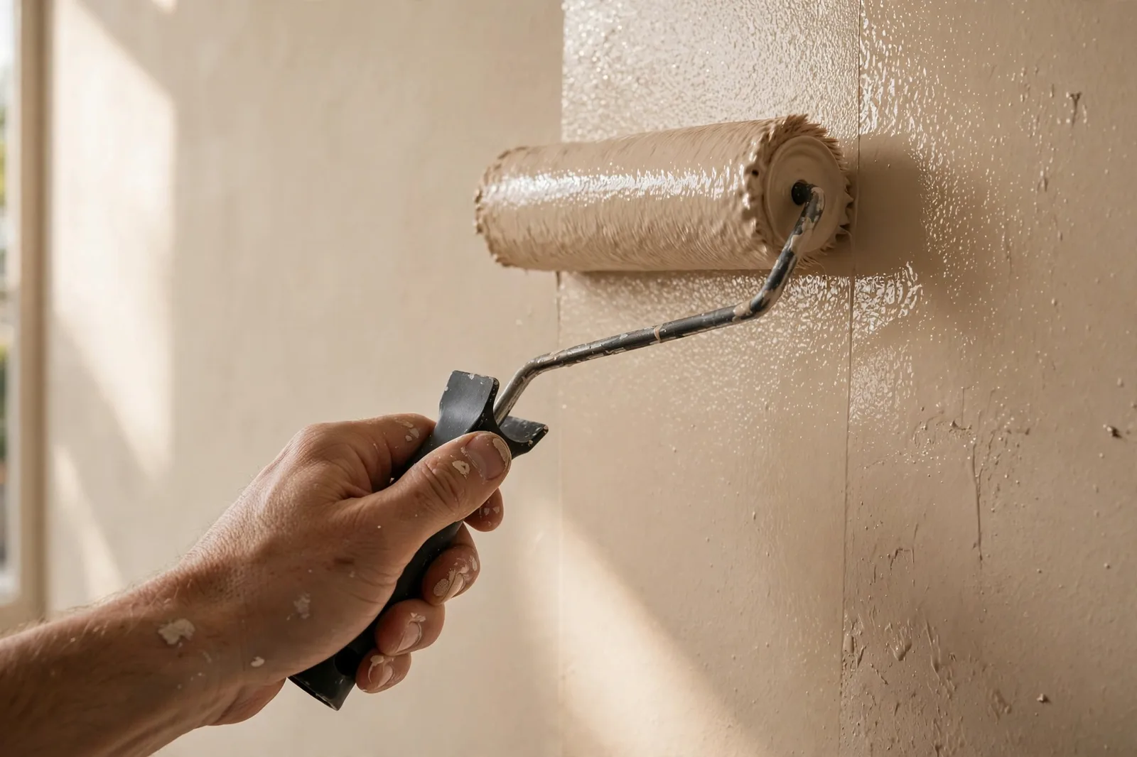
Most paint decisions are color decisions, and most paint regrets are sheen decisions. Two walls can wear the exact same color and look like different paints, because one is eggshell and the other is satin. A bedroom in flat reads as soft and velvety; the same bedroom in semi-gloss reads as restless and cheap. Sheen controls how light behaves on your walls, how easily you can wipe them, and whether the wall’s imperfections disappear or announce themselves. This guide is not another list of which sheen goes where, our room-by-room sheen reference covers that. This is the decision framework: how to think about sheen as a trade-off, how to weigh washability against light reflection against flaw-hiding, and how to choose with confidence for every surface in the house. Paint colors shift with lighting, surface, and sheen, so always test a large physical sample in your own space, in the sheen you will actually use, before committing. The Global Abode is an independent publication, not affiliated with or endorsed by Sherwin-Williams or Benjamin Moore; all color names and codes are referenced as widely-known designer examples.
Key takeaway: Sheen is the second half of every color choice: the same color reads softer, flatter, and more forgiving in a low sheen, and richer, deeper, and more revealing in a higher one. The decision is a three-way trade-off, washability pulls toward higher sheens, imperfection-hiding pulls toward lower ones, and light reflection depends on the room. The classic split (flat ceilings, eggshell or satin walls, semi-gloss trim) works because it puts the lowest-maintenance surface at the lowest sheen and the highest-touch surface at the highest. Sheen-effect notes below are widely-reported designer observations, not exact manufacturer specifications.
Sheen Is a Color Decision, Not Just a Durability One
Ask most homeowners what sheen means and they will talk about durability, satin wipes clean, flat doesn’t, semi-gloss is for trim. That is true, but it misses the more interesting half of the story: sheen changes how the color itself looks. The same color name, from the same can line, reads as a different color in different sheens, and the difference is large enough to surprise you.
The physics is simple. A paint film is a surface, and sheen describes how that surface handles light. Low-sheen finishes scatter incoming light in all directions, the color reads soft, even, and close to the swatch, because no single viewing angle gets a concentrated reflection. Higher-sheen finishes reflect light directionally, like a calm pond versus a matte stone. That directional reflection does two things at once: it makes the color read richer and deeper, because more light reaches your eye in a focused way, and it makes the surface read less forgiving, because every ripple, seam, and brush mark is revealed by the same reflection.
This is the “same color, different sheen” effect designers navigate constantly. A deep green in flat reads as velvety and enveloping, the color absorbs the light and sits quietly. The same green in satin reads as polished and present, the color pushes forward, catches the lamplight, and shows its depth. Neither is wrong; they are different readings of the same color, the way the same song sounds different on piano and guitar. The practical consequence is the one rule this guide keeps coming back to: test your color in the sheen you will use. A sample board painted in flat tells you almost nothing about how the color will read in satin, and judging a flat sample while planning satin walls is judging the wrong paint. Our 48-hour sampling method covers the full protocol, and the sheen of the test board is part of it.
The second consequence is that sheen is doing color work even when you think you are choosing for durability. A homeowner who picks satin for the kitchen because it wipes clean is also, unknowingly, choosing a slightly deeper, slightly more light-responsive read of their cabinet and wall colors. A homeowner who picks flat for the bedroom because it hides the wall’s texture is also choosing the softest, most swatch-faithful read of their color. Once you see sheen as a color decision, the room-by-room defaults start making deeper sense: they are not arbitrary traditions, they are color readings matched to each room’s light and purpose.
Tip: When you narrow to two or three finalist colors, paint each finalist in two sheens, your planned wall sheen and one step up, on the same board. The comparison shows you exactly what the sheen is doing to the color, and it often settles the eggshell-versus-satin debate faster than any chart can.
The Six Sheens Decoded, From Flat to Gloss
Paint sheen runs on a ladder, and every rung changes three things at once: how much light bounces back, how easily the surface cleans, and how honestly the surface shows its flaws. Here is the ladder, bottom to top.
Flat. No measurable shine, the paint film is porous and scatters light completely. Flat gives the softest, most velvety read of a color and hides wall imperfections better than anything else: drywall seams, patching, texture variation, and uneven rolling all disappear into the scattered light. The trade-off is the steepest on the ladder: flat is the hardest to clean. A scuff or fingerprint on flat paint often cannot be wiped without leaving a burnished patch, a shiny spot where the rubbing polished the finish. Flat’s natural home is the ceiling (where nothing touches it) and low-traffic adult spaces like formal dining rooms and primary bedrooms, where the priority is mood over maintenance.
Matte. Flat’s close cousin, with a whisper more body. Matte reads nearly as soft as flat and hides nearly as much, but most modern matte formulas wipe a little better, some premium matte lines are engineered to clean almost like eggshell while keeping the velvety look. Designers widely describe matte as the “have it both ways” sheen for living rooms and bedrooms: the flat look with a touch more forgiveness. The caution: matte still shows touch-ups more than higher sheens, and in truly high-traffic zones it will eventually show wear.
Eggshell. The most popular wall sheen in American homes, and the middle of the ladder. Eggshell carries a soft, low luster, like the shell it is named for, that gives walls a gentle glow without anything reading as shiny. It wipes clean of everyday marks, touches up more easily than satin, and hides minor imperfections reasonably well. Designers consistently describe eggshell as the default for living rooms, dining rooms, hallways, and adult bedrooms: enough durability for real life, enough softness to flatter the color. Its limitation is moisture and heavy abuse, eggshell is not the sheen for a steamy bathroom or a toddler’s art wall.
Satin. One step up in shine and a meaningful step up in durability. Satin reflects light evenly and noticeably, walls have a soft glow that reads as polished rather than matte, and the harder film resists scuffs, wipes clean of fingerprints and splashes, and stands up to moisture far better than eggshell. This is the workhorse sheen: kitchens, bathrooms, kids’ rooms, hallways, laundry rooms, mudrooms. Designers widely describe satin as the professional default when a homeowner cannot decide, it performs well everywhere without the mirror-like reflection that reveals wall flaws. The trade-off: satin shows imperfections more than eggshell, and it is harder to touch up invisibly, because the touched-up spot reflects light slightly differently than the surrounding wall.
Semi-gloss. Shiny, hard, and unapologetic. Semi-gloss reflects light directionally and obviously, it is the classic trim, door, and cabinet sheen because it makes woodwork read as crisp and finished, and because it survives the most abuse: vacuums, shoes, hands, pets, steam, grease. On walls, semi-gloss is a specialist choice, bathrooms and kitchens that need maximum moisture resistance, or accent moments where the shine is the point. The cost is honesty: semi-gloss shows every imperfection. Drywall seams, sanding scratches, roller texture, and patch edges are all amplified by the reflection. Walls in semi-gloss need to be smooth and well-prepped, or the sheen becomes a spotlight on the flaws.
Gloss / high-gloss. The top of the ladder: maximum reflection, maximum durability, maximum drama. Gloss creates a hard, almost lacquered film that wipes clean of nearly anything and reflects light like a mirror. It is reserved for statement surfaces, front doors, furniture, high-end millwork, powder-room walls in designer showhouses, where the shine is deliberate and the surface is perfectly smooth. Gloss magnifies every flaw and every application mark, so prep must be flawless and application careful. On ordinary walls, gloss is too much shine for most homes; on the right door or built-in, it is jewelry.
The Three-Way Trade-Off Every Sheen Decision Sits Inside
Every sheen choice is a negotiation between three forces pulling in different directions. Understanding the trade-off is what turns sheen from a memorized chart into a decision you can make for any room, any wall, any situation.
Force one: washability pulls up the ladder. The higher the sheen, the harder the paint film and the easier it cleans. This is the force that matters most in rooms that get touched, splashed, steamed, and scuffed, kitchens, baths, mudrooms, hallways, kids’ rooms. A flat wall in a hallway is a maintenance sentence: every scuff shows and touch-ups flash. The same wall in satin wipes clean and keeps its uniform look. When in doubt about traffic, the safe move is up one rung from your instinct.
Force two: imperfection-hiding pulls down the ladder. The lower the sheen, the more the finish forgives. Older homes with imperfect drywall, textured walls, visible seams, and patchwork repairs need low sheens, flat or matte, because anything shinier becomes a raking-light spotlight on every flaw. This is the force that governs most real-world homes: unless your walls are new and smooth, it argues against going higher than eggshell or satin on large wall surfaces. Designers consistently describe this as the most common sheen mistake, choosing satin for its cleanability on walls that are not smooth enough to carry it, and ending up with walls that show every seam.
Force three: light reflection depends on the room. Sheen is a light reflector, and whether reflection helps or hurts depends on the room’s light. In a dim hallway or a small, dark room, a step up in sheen bounces precious light around and keeps the space from reading as a tunnel, our small-room colors guide covers how finish and color work together in tight spaces. In a sun-drenched room with strong raking light across the walls, that same reflection becomes glare and texture-reveal, a lower sheen keeps the light calm. And at night, sheen interacts with your bulbs: warm lamplight on satin walls gives a soft glow, while the same light on semi-gloss can read as harsh. Our bulb color temperature guide pairs with this one, the bulb and the sheen are two halves of the evening light story.
The decision, then, is a balancing act: go as high as the room’s traffic and moisture demand, as low as the wall’s condition requires, and adjust for the room’s light. A smooth-walled kitchen wants satin (traffic wins). A textured-wall hallway wants eggshell (flaws win). A steamy bathroom with imperfect walls is the classic conflict, moisture says satin or semi-gloss, flaws say eggshell, and the honest resolution is usually satin with good prep, or eggshell with good ventilation. There is no perfect answer, only the best compromise for that specific wall.
Watch out: The most expensive sheen mistake is choosing for durability on walls that cannot carry the shine. Satin and semi-gloss on rough, patched, or textured walls do not look “durable”, they look wavy, because every imperfection is spotlighted. If your walls are not smooth, fix the prep or step down the sheen; never ask a high sheen to forgive a rough wall.
The Room-by-Room Decision Table
With the framework in place, here is how the trade-off resolves room by room. Think of each row as the starting point, then adjust up for traffic and moisture, down for wall condition, and sideways for light.
| Room | Walls | Trim & doors | Ceiling | Why |
|---|---|---|---|---|
| Living room | Eggshell (matte if walls are imperfect) | Satin or semi-gloss | Flat | Moderate traffic; softness flatters the main gathering space |
| Primary bedroom | Matte or eggshell | Satin or semi-gloss | Flat | Low traffic; calm, low-glare read suits rest |
| Kids’ bedroom | Satin | Semi-gloss | Flat | Sticky hands and art projects demand washability |
| Kitchen | Satin (semi-gloss if very steamy) | Semi-gloss | Flat (satin if no vent hood) | Grease, steam, splashes, the hardest-working walls in the house |
| Bathroom | Satin (semi-gloss for heavy steam) | Semi-gloss | Satin if poorly ventilated, else flat | Moisture resistance is non-negotiable; flat absorbs steam |
| Powder room | Eggshell or satin | Semi-gloss | Flat | Less moisture than a full bath; style can lead |
| Hallway & entry | Eggshell minimum; satin preferred | Semi-gloss | Flat | Touch zone, shoulders, bags, shoes; washability wins |
| Laundry & mudroom | Satin or semi-gloss | Semi-gloss | Flat (satin if humid) | Splashes, lint, scuffs, and moisture |
| Home office | Eggshell or matte | Satin or semi-gloss | Flat | Low traffic; calm, glare-free read suits focus |
| Dining room | Eggshell or matte | Satin or semi-gloss | Flat | Low-touch; atmosphere leads, durability follows |
| Ceilings (general) | – | – | Flat | Nothing touches it; flat hides seams and kills glare |
A few notes on reading the table. First, the bathroom row is the one people argue about most: can you use eggshell in a bathroom? You can, in a well-ventilated powder room or a lightly used guest bath, but in a steamy family bathroom, flat and matte are genuinely risky (they absorb moisture, which leads to peeling and mildew) and satin is the honest minimum. When the room fills with steam regularly, the moisture force outweighs everything else.
Second, the hallway row deserves emphasis because hallways are the most under-sheened surfaces in the house. Homeowners default to eggshell everywhere and then wonder why the hallway looks tired in two years. Hallways are touch zones, shoulders, hands, suitcases, vacuum cleaners, and satin is the sheen that keeps them looking painted. If you take one upgrade from this table, make it the hallway.
Third, the ceiling exceptions matter. Flat is the ceiling standard because it hides drywall seams and eliminates the glare that overhead lighting creates on anything shinier. The exceptions are moisture: a bathroom ceiling with no fan, or a kitchen ceiling over a range with no hood, wants satin, because a flat ceiling in a steam zone peels. For the full surface-by-surface reference behind these decisions, see our room-by-room sheen guide.
Walls vs Trim vs Ceilings: The Classic Split
There is a reason the classic split, flat ceilings, eggshell or satin walls, semi-gloss trim, has survived decades of design trends. It is not tradition for tradition’s sake. It is the three-way trade-off, resolved per surface, and each surface’s answer falls out naturally.
Ceilings go flat because the ceiling is the lowest-traffic surface in the house and the most flaw-revealing one. Nothing touches a ceiling, so washability is nearly irrelevant; meanwhile ceilings are large, flat planes viewed at an angle under overhead light, which is exactly the geometry that reveals seams and texture. Flat hides the seams, kills the glare, and disappears, which is what a ceiling should do. The only reason to leave flat is moisture, as the table above notes.
Walls go eggshell or satin because walls are the middle surface: touched sometimes, viewed always. Eggshell is the choice when the priority is the color’s softest, most flattering read, living rooms, bedrooms, dining rooms. Satin is the choice when the priority is surviving real life, kitchens, baths, hallways, kids’ rooms. The decision between them is the trade-off in miniature: eggshell forgives more and touches up better; satin cleans better and resists more. When a homeowner is torn, designers widely suggest this tiebreaker: who touches these walls? If the honest answer is “everyone, daily,” go satin. If the answer is “almost nobody,” go eggshell.
Trim goes semi-gloss because trim is the highest-touch painted surface in the house, baseboards meet vacuums and shoes, doors meet hands, window sills meet everything, and because the shine is doing visual work. The sheen contrast between a soft wall and a crisper trim is what makes millwork read as millwork: the baseboard, casing, and crown stand out against the wall precisely because they catch the light differently. A trim painted in the same flat sheen as the walls disappears into it; a trim in semi-gloss frames it. That contrast is one of the quiet signatures of a professionally painted room.
The modern variation worth knowing: satin trim. In older homes with imperfect woodwork, rippled trim, patched casings, wavy baseboards, semi-gloss can be too honest, spotlighting every ripple. Satin on trim gives most of semi-gloss’s durability with a softer, more forgiving read, and designers increasingly specify it for exactly that reason. The rule of thumb: new, smooth millwork can carry semi-gloss beautifully; older, imperfect woodwork is kinder in satin. Same trade-off, applied to wood instead of drywall.
When to Break the Rules
Frameworks are for the 90 percent. The remaining 10 percent is where sheen gets interesting, the deliberate rule-breaks that designers use to create effects the defaults cannot.
Matte in a bathroom. The rule says satin minimum for moisture. The break: a well-ventilated powder room or a lightly used guest bath, where moisture is minimal and style leads. A matte or flat wall in a powder room reads as velvety and sophisticated in a way satin cannot, and because the room sees little steam and little touching, the durability trade-off is theoretical rather than real. The condition is honest: good ventilation, low use, and quality paint. Break it in a steamy family bath and the paint will tell on you within a year.
Gloss on walls. The rule says gloss is too much shine for walls. The break: small, deliberate, and usually dark. A gloss or high-gloss wall in a tiny powder room, a butler’s pantry, or a single accent wall turns the surface into a lacquered jewel box, the shine makes the small space feel intentional and the dark color read as rich rather than flat. Designers widely describe this as one of the highest-impact small-room moves available. The conditions are strict: the walls must be smooth and well-prepped (gloss forgives nothing), the room should be small enough that the shine reads as drama rather than glare, and it works best in deep colors where the reflection adds depth.
Flat everywhere (the gallery move). The rule says trim should outshine walls. The break: painting walls, trim, and ceiling all in flat, the same color or tonal variations, for a soft, gallery-like envelope where architecture dissolves into atmosphere. This is the quiet cousin of color-drenching: instead of drama through color, calm through uniformity. It works best in calm, low-traffic spaces, bedrooms, studies, formal living rooms, where the goal is serenity rather than definition. The trade-off is real: flat trim scuffs and shows wear faster, so this is a look for rooms that are lived in gently.
Semi-gloss walls in a kitchen. The rule says satin for kitchen walls. The break: a kitchen with heavy cooking, poor ventilation, or young children, where the walls take genuine abuse. Semi-gloss on kitchen walls wipes clean of nearly anything and resists steam aggressively. The cost is the flaw spotlight, kitchen walls are often less than perfect, so this break demands good prep or smooth walls. Many homeowners split the difference: satin on the main walls, semi-gloss on the wall behind the range and around the sink, where the abuse concentrates.
One sheen for the whole house. The rule says vary by room. The break: a whole house in eggshell (or a whole house in satin) for simplicity, one product, one touch-up can, no decisions per room. Designers note this is more common than the internet suggests, especially in rentals and spec homes, and it is not wrong: a consistent eggshell throughout reads as calm and unified. The compromise is that some rooms are slightly under-served (the hallway would prefer satin) and some slightly over-served (the bedroom doesn’t need eggshell’s washability). For homeowners who value simplicity over optimization, the single-sheen house is a legitimate strategy, just choose the sheen for the hardest-working room, not the easiest, so nothing is under-protected.
Choosing finishes for the whole house, not just one room?
The Whole Home Paint Guide is a complete, ready-to-use color system, anchor neutrals, trim and ceiling pairings, accent colors, all with undertones already coordinated, so your colors and sheens work as one system instead of a room-by-room guessing game. And the Paint Color Workbook includes room-by-room worksheets with a sheen planner: traffic, moisture, wall condition, and light, decided once per room before a single can is opened.
Frequently asked questions
Eggshell is the softer, lower-sheen finish, a gentle glow that hides minor imperfections well and touches up easily. Satin is one step up in shine and a meaningful step up in durability: it wipes clean more easily, resists moisture better, and reflects light more noticeably. Eggshell suits living rooms and bedrooms; satin suits kitchens, bathrooms, hallways, and kids’ rooms. Satin also makes the same color read slightly richer and deeper than eggshell does, so test in the sheen you will use.
Satin is the standard answer for most bathrooms, it resists moisture, wipes clean, and doesn’t highlight imperfections the way semi-gloss can. In a heavily steamed family bathroom, step up to semi-gloss on the walls for maximum moisture resistance. Flat and matte are risky in steamy baths because they absorb moisture, which leads to peeling and mildew. In a well-ventilated powder room with little steam, eggshell is perfectly fine, and matte is a defensible style choice there too.
Not where steam and splashes are regular. Flat paint is porous, it absorbs moisture instead of deflecting it, which leads to peeling, staining, and mildew in humid rooms, and it cannot be wiped clean without burnishing. The honest minimum for a steamy bathroom or a working kitchen is satin. The one exception is a powder room or guest bath with good ventilation and light use, where flat or matte can work as a deliberate style choice rather than a durability compromise.
No, the classic split exists for good reasons. Trim, doors, and baseboards get touched and cleaned far more than walls, so they want the harder, more washable finish: semi-gloss traditionally, or satin on older imperfect woodwork. The sheen contrast also does visual work, crisper trim against softer walls is what makes millwork read as millwork. Painting trim in the same flat or eggshell as the walls makes the architecture disappear into the wall, which is occasionally a deliberate gallery-style choice, but usually just looks unfinished.
Flat hides the most, its non-reflective surface scatters light so seams, patches, texture, and roller marks disappear. Matte is a close second with slightly better washability. The rule runs in one direction: the shinier the finish, the more honest it is about the wall underneath. If your walls are older, textured, or patched, step down the sheen before blaming the paint color, and never put semi-gloss or gloss on a wall you haven’t prepped smooth, because the reflection becomes a spotlight on every flaw.
Yes, and you should. Different rooms have different traffic, moisture, and light, so different sheens are the correct answer: satin in the kitchen and baths, eggshell in the living room and bedrooms, semi-gloss on all the trim, flat on the ceilings. The transitions never read as jarring because each sheen is responding to its room. The one consistency rule that matters: keep the trim sheen constant through the whole house, since trim is the continuous frame around everything. See our room-by-room sheen reference for the surface-by-surface defaults.

