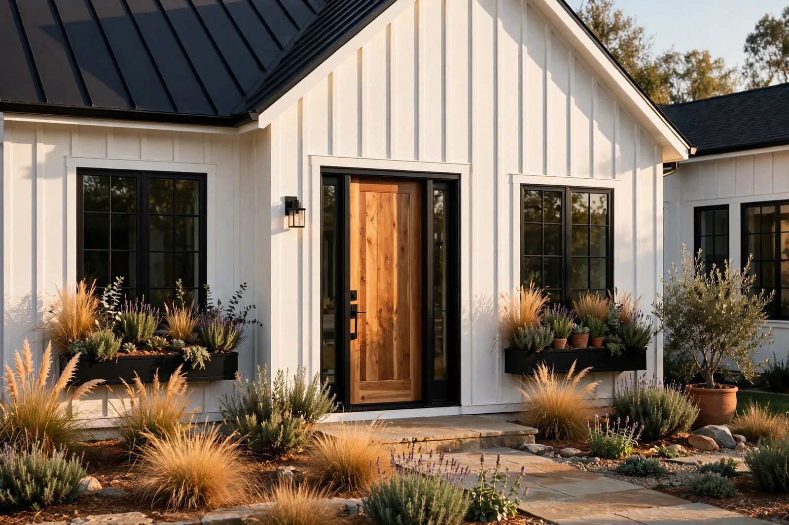
The modern farmhouse look is built on color discipline: warm whites against dark contrast, greiges that bridge wood and stone, deep greens and near-blacks that give the whole house its spine. Sherwin-Williams’ deck happens to hold nearly every color the style is known for, from the workhorse trim whites to the moody cabinet colors to the exterior palettes that define the look from the curb. This guide rounds up all four applications in one place: farmhouse cabinet colors, exterior palettes, trim and ceiling whites, and the neutrals that tie the whole house together, plus what to avoid so the look reads timeless instead of dated. Paint colors shift with lighting, surface, and sheen, so always test a large physical sample in your own space, in your own light, before committing, screen swatches are approximations. The Global Abode is an independent publication, not affiliated with or endorsed by Sherwin-Williams or Benjamin Moore; all color names and codes are referenced as widely-known designer examples.
Key takeaway: The modern farmhouse color story is a four-part system: (1) cabinets in warm whites, greiges, deep greens, or true black, chosen to agree with the countertop’s undertone; (2) exteriors in white or soft neutral siding with black or deep-bronze trim, the high-contrast combination the style is famous for; (3) trim and ceilings in one constant warm white (Alabaster, Pure White, or Shoji White) carried through the whole house; (4) whole-home neutrals, warm greiges and soft beiges, that bridge every room. Undertone notes below are widely-reported designer observations, not exact manufacturer specifications.
The Modern Farmhouse Color DNA
Modern farmhouse is less a set of colors than a contrast formula. Every iconic example runs on the same tension: bright, warm, light-reflecting surfaces against deep, grounding darks, with warm wood bridging the two. White siding against black window frames. Warm white walls against a black kitchen island. Cream trim against a deep bronze front door. The style reads as clean and modern because of the darks, and warm and welcoming because of the whites, take away either side and the look collapses into something either cold or cluttered.
The color temperature underneath is consistently warm-neutral. Farmhouse does not run on stark, blue-white minimalism; it runs on warm whites, warm greiges, warm woods, and brass, colors that read as gathered-over-time rather than installed-yesterday. Designers widely describe the palette’s backbone as a family of warm neutrals: Alabaster-style warm whites, greiges like Accessible Beige and Agreeable Gray, soft beiges, warm wood tones. The darks that punctuate it, Iron Ore, Urbane Bronze, Tricorn Black, are the warm end of the dark family too, chosen for their brown and bronze threads rather than their blue ones.
And the wood is not decoration; it is a color. White oak floors, walnut islands, cedar beams, walnut-topped vanities, natural wood tones are one of the style’s three primary color families, sitting between the whites and the darks. Designers consistently treat the wood as a finish the paint must agree with: the warm whites are chosen to harmonize with warm oak, the greiges to bridge oak and stone, the darks to echo walnut. Our whole-home palette guide covers the method for building a temperature story that holds across all three families.
One more piece of the DNA: texture carries half the color story. Shiplap, board-and-batten, limewashed brick, grasscloth, linen, wool, the farmhouse palette is mostly neutrals, and neutrals read as flat without texture. The paint color sets the temperature; the texture gives it life. This is why the same warm white can look stunning on shiplap and dull on flat drywall, the surface is doing half the work.
Tip: Before committing to any farmhouse color, photograph your fixed materials, floors, counters, brick, stone, in daylight and note their temperature. Farmhouse palettes succeed or fail on agreement with wood and stone, not on the paint deck. The white that glows next to warm oak can go gray next to cool marble.
Farmhouse Cabinet Colors
Cabinets are where the farmhouse kitchen shows its hand. The classic farmhouse kitchen is a two-tone composition: light perimeter cabinets, a darker island, and the contrast between them is the whole personality of the room. The cabinet color decision follows one rule: the cabinets must agree with the countertop first and the walls second, stone is the least forgiving finish in the house.
Warm white cabinets. The farmhouse default, and still the most forgiving choice. Warm whites like Alabaster and Dover White on perimeter cabinets give the kitchen its bright, collected feel while staying soft enough to agree with warm counters and oak floors. Designers widely describe warm-white cabinets as the choice that never fights: they sit quietly beside marble, quartz, butcher block, and wood alike. The caution is about the wrong white, a stark, cool white cabinet against warm counters reads as harsh rather than fresh. Our guide to the best Sherwin-Williams whites breaks down which whites warm a kitchen and which chill it.
Greige and warm gray cabinets. The step deeper: greiges like Accessible Beige and warm grays like Repose Gray on cabinets give the kitchen more substance than white without the commitment of a true color. Designers widely report these as the “transitional farmhouse” choice, modern enough for clean lines, warm enough for the farmhouse story. They pair beautifully with white counters and brass hardware, and they hide daily wear better than white.
Deep green cabinets. The farmhouse color moment that stuck. Deep, muted greens, Evergreen Fog and its deeper cousins like Pewter Green and Oakmoss, on an island or a full cabinet run give the kitchen an organic, collected feel that white alone cannot. Our Evergreen Fog guide covers the most-referenced of these in depth: it sits in the sweet spot of more interesting than white, calmer than navy, warmer than gray, with a particular affinity for brass hardware and light counters.
Black and near-black cabinets. The high-contrast farmhouse statement. Tricorn Black or Iron Ore on an island against warm white perimeter cabinets is the boldest version of the style’s contrast formula, and designers widely describe it as the choice that ages best precisely because it is so decisive. The rule is containment: the dark lives on the island or the lower run, never on every surface, and it needs the warm white around it to read as farmhouse rather than industrial.
Warm bronze darks. Between green and black sits the bronze family, Urbane Bronze chief among them. Designers increasingly reach for it on islands and built-ins as the dark that feels organic rather than graphic: dark enough for the contrast, warm enough to sit with oak and brass without the starkness of true black. If black feels too harsh and green feels too colorful, the bronze dark is the middle path.
Farmhouse Exterior Palettes
The farmhouse exterior is where the style is most recognizable, and the most imitated. The formula is famous: light siding, dark trim, natural wood accents. But the details decide whether it reads as crisp and current or flat and copy-paste.
The classic: white siding + black trim. Pure White or Alabaster siding with Iron Ore or Tricorn Black window frames, gutters, and rooflines is the combination that defined the modern farmhouse era. Designers widely describe it as the highest-impact exterior formula available: the contrast makes the architecture read, the white keeps it welcoming, and the black gives it the modern edge. The details that elevate it: a stained cedar or walnut front door (natural wood as the third color), black or bronze light fixtures, and landscaping that softens the geometry. The risk is starkness, on a house with little architectural relief, pure white plus true black can read as graphic rather than warm; a warmer white siding or a bronze-black trim softens the read.
The softened version: creamy siding + bronze trim. For homeowners who love the contrast but want warmth, the updated formula trades the stark white for a creamy siding, Shoji White, Alabaster, or a soft greige, and the true black for a warm bronze dark like Urbane Bronze on the trim, shutters, and front door. The contrast is gentler, the whole composition reads as collected rather than graphic, and it agrees better with warm brick and natural stone. This is the direction designers widely describe as “modern farmhouse 2.0”, the same DNA, less glare.
Board-and-batten and vertical siding. The siding profile is part of the color story. Vertical board-and-batten in white reads as the most farmhouse of all siding styles, the shadow lines give the white texture and depth that flat siding lacks. Designers consistently note that the same white looks richer on board-and-batten than on horizontal lap, because the relief breaks up the flatness. On dark exteriors, board-and-batten in a deep bronze or charcoal is the moody farmhouse variant, dramatic, grounded, and surprisingly timeless.
Brick and stone pairings. Farmhouse exteriors often meet existing brick or stone, and the paint must agree with the masonry rather than fight it. Warm red brick wants warm whites and bronze accents, the combination is classic and nearly foolproof. Cool gray stone wants cleaner whites and charcoal trim. Limewashed or whitewashed brick is the bridge move: it unifies a dated brick facade with the farmhouse palette while keeping the texture. Whatever the masonry, the rule is the same as interiors: read the fixed finish’s temperature first, then choose the paint to agree with it.
The rule of three. Designers consistently cite the same exterior discipline: one color for the body (siding/brick), one for the trim (eaves, window casings, rooflines), one for accents (front door, shutters). Three colors keep the composition designed; more than three reads as cluttered, fewer than two reads as flat. The farmhouse formula maps perfectly onto it: light body, dark trim, wood or bronze door.
Watch out: Exterior light is far brighter and cooler than interior light, colors read noticeably lighter and flatter outside than on the chip. Always choose an exterior color slightly deeper and grayer than your instinct says, and test it on the actual siding in full daylight before committing. The white that glows in the store can wash out to nothing on a sunlit facade.
Farmhouse Trim and Ceiling Whites
Trim is the frame around every farmhouse surface, baseboards, casings, crown, window frames, interior doors, porch ceilings, and in the farmhouse style it is almost always white. But which white is a whole decision, because the trim touches every wall, floor, and cabinet in the house.
The three workhorse trim whites. Designers’ farmhouse trim choices cluster around three: Alabaster, the warm, soft white that harmonizes with warm woods and greige walls, the coziest choice; Pure White, the clean, near-neutral white that gives crisper contrast against colored walls and dark cabinets; and Shoji White, the slightly deeper warm white that reads as calm and sophisticated against warm walls. The choice is a style decision as much as a color one: Alabaster for warm and collected, Pure White for fresh and crisp, Shoji White for soft and serene.
One trim white, whole house. This is the most important trim rule in the farmhouse system: choose one trim white and carry it through every room, interior and, where applicable, exterior. The trim is the constant that lets the wall colors change room to room without the house fragmenting. Designers consistently describe the single-trim-white decision as the backbone of whole-home cohesion. Test your trim white against your floors first, the trim touches the floor in every room, so it must agree with the floor’s temperature before it agrees with any wall.
Porch ceilings and the haint blue tradition. The farmhouse porch ceiling is one of the style’s most beloved details, and it has a real tradition behind it. Southern farmhouses have long painted porch ceilings a soft blue-green (“haint blue”), originally for folk reasons and now for the way it makes a porch feel like sky. A soft, muted blue-green on the porch ceiling against white trim is a signature farmhouse moment: subtle from the street, delightful up close. It is the one place in the farmhouse exterior where a color other than white, black, or wood is not just allowed but traditional.
Ceilings inside. Interior ceilings in farmhouse homes are usually the trim white in flat, flat sheen scatters light and hides imperfections, and a constant ceiling color reinforces flow room to room. The exception is beamed or shiplap ceilings, where the texture itself is the feature: keep the shiplap ceiling the trim white and let the wood beams stay natural for the contrast that defines the style.
The Neutrals That Tie It All Together
Cabinets, exteriors, and trim are the visible decisions, but the farmhouse whole-home palette is carried by its background neutrals, the wall colors that run through living rooms, hallways, and bedrooms and make the style feel like one home instead of a set of styled rooms.
| Role | Widely-referenced choices | Where it lives |
|---|---|---|
| Main living walls | Accessible Beige, Agreeable Gray, warm greiges | Living rooms, hallways, open plans, the connective background |
| Warm white walls | Alabaster, Shoji White, White Dove | Bedrooms, bright rooms, anywhere the light is generous |
| Deep accent | Urbane Bronze, Iron Ore, Tricorn Black | Islands, front doors, one accent wall, built-ins |
| Organic green accent | Evergreen Fog, Pewter Green, deep olives | Islands, built-ins, mudrooms, powder rooms |
| Trim constant | Alabaster, Pure White, or Shoji White | Every baseboard, casing, door, and ceiling in the house |
| Exterior body | Pure White, Alabaster, or soft greige siding | Siding, brick wash, board-and-batten |
| Exterior contrast | Iron Ore, Tricorn Black, Urbane Bronze | Window frames, shutters, rooflines, gutters |
| Natural bridge | White oak, walnut, cedar | Floors, beams, doors, island tops, the wood family |
The temperature discipline. What holds all of these together is temperature constancy: the farmhouse palette stays on the warm side of neutral from the trim white through the wall greige to the bronze dark. Designers consistently describe this as the style’s real signature, not any single color, but the refusal to mix warm and cool families in the same sightline. A warm greige wall, a warm white trim, warm oak floors, and a bronze-black island read as one thought; swap any one of them to the cool side and the composition starts arguing.
Carrying the palette room to room. The farmhouse whole-home method is simple: one anchor neutral through the connected living spaces (a warm greige or warm white), the same trim white everywhere, bedrooms stepped within the warm family, and the dark reserved for punctuation, the island, the door, the built-in. The wood tones are the bridge: white oak floors running through the house carry the warm story from room to room better than any paint can. Our whole-home palette guide walks through the anchor-and-step method that makes this work.
What to Avoid: The Farmhouse Dating Traps
Farmhouse is a victim of its own success: the most-copied version of the style is also the most dated version. The traps below are what separate a timeless farmhouse from one that reads as a 2016 time capsule.
The all-gray farmhouse. The earliest wave of modern farmhouse ran on cool grays, gray walls, gray floors, gray everything, and it is the version that dates fastest. Cool gray against the style’s warm woods and brass reads as muddy and flat; the whole point of the farmhouse warmth gets lost. If your farmhouse is running gray, the fix is temperature, not more gray: warm up the walls toward greige, warm up the trim toward Alabaster, and let the woods do their work.
Shiplap everywhere. Shiplap is a texture, not a wall treatment for every surface. A shiplap accent wall or a shiplap ceiling is a signature; shiplap in every room is a theme park. Designers widely describe restraint as the difference: use the texture where it earns its keep, the entry wall, the fireplace surround, the mudroom, and let flat walls elsewhere give it something to contrast against.
The word-sign farmhouse. “Gather,” “Blessed,” “Farmhouse” in script on every wall, the decor version of the style dates faster than any paint color. The paint palette itself is timeless; it is the themed accessories that timestamp it. Keep the walls in the warm-neutral system and let the decor be quiet: natural textures, real wood, simple lines.
Stark white + true black with no warmth. The crispest version of the contrast formula, pure white siding, true black trim, no wood, no warmth, reads as modern-minimalist rather than farmhouse, and it can feel cold and unyielding. The farmhouse version of the formula always includes the third family: warm wood somewhere (a cedar door, oak floors, walnut beams) that keeps the contrast from going clinical. If your black-and-white composition feels harsh, the missing ingredient is almost always wood.
Ignoring the fixed finishes. The fastest way to date any palette is to choose it against nothing. A farmhouse white chosen without reading the floor’s undertone, a cabinet color chosen without reading the countertop, an exterior white chosen without reading the brick, each of these is a temperature argument waiting to happen, and temperature arguments read as “wrong” long before they read as “old.” The finishes-first discipline is what keeps the palette timeless: colors chosen to agree with real materials age gracefully because the materials themselves do.
Building the whole farmhouse palette, not just picking one color?
The Whole Home Paint Guide is a complete, ready-to-use color system, anchor neutrals, trim and ceiling pairings, accent colors, all with undertones already coordinated, so your farmhouse whites, greiges, and darks all belong to one warm temperature story. And the Paint Color Workbook includes room-by-room worksheets and a finish-inventory checklist for reading your floors, stone, and wood before a single paint chip is chosen.
Frequently asked questions
Alabaster is the most widely-referenced warm white for farmhouse interiors, soft, warm, and forgiving on trim, walls, and cabinets. Pure White is the most-referenced for crisper contrast and exteriors. Designers choose between them on warmth: Alabaster for warm and collected, Pure White for fresh and bright. See our complete whites guide for the full comparison.
Warm whites on the perimeter with a darker island is the classic composition: warm white uppers and perimeter, and a deep green, bronze dark, or black on the island. Greiges work beautifully for a softer two-tone look. The rule: the cabinet color must agree with the countertop’s undertone first, stone is the least forgiving finish, and warm woods and brass hardware complete the story.
White or soft neutral siding, black or deep-bronze trim, and a stained wood front door, the rule of three the style is famous for. Pure White siding with Iron Ore trim is the crispest version; Alabaster or Shoji White siding with Urbane Bronze trim is the warmer, updated version. Always test exterior colors on the actual siding in full daylight, they read lighter and flatter outside than on the chip.
Off-white, almost always a warm white rather than a stark one. Alabaster, Pure White, and Shoji White are the three most-referenced farmhouse trim whites, and the choice is stylistic: Alabaster for warmth, Pure White for crispness, Shoji White for softness. Whichever you choose, carry it through the entire house, one constant trim white is the backbone of the style’s cohesion.
The themed, copy-paste version is, but the color system underneath is not. Warm whites, greiges, natural wood, and dark bronze accents are a timeless warm-neutral palette; what dates is the gray-everything version, the shiplap-everywhere version, and the word-sign decor. A farmhouse palette built on temperature agreement with real wood and stone reads as classic, not trendy.
Keep every neutral on the warm side and make sure natural wood is part of the composition. Warm white trim, warm greige walls, warm oak floors, brass or bronze accents, and a wood front door or beams, if the composition feels cold, the missing ingredient is almost always wood or warmth, not another color. Avoid cool grays and stark cool whites anywhere in the sightlines.

