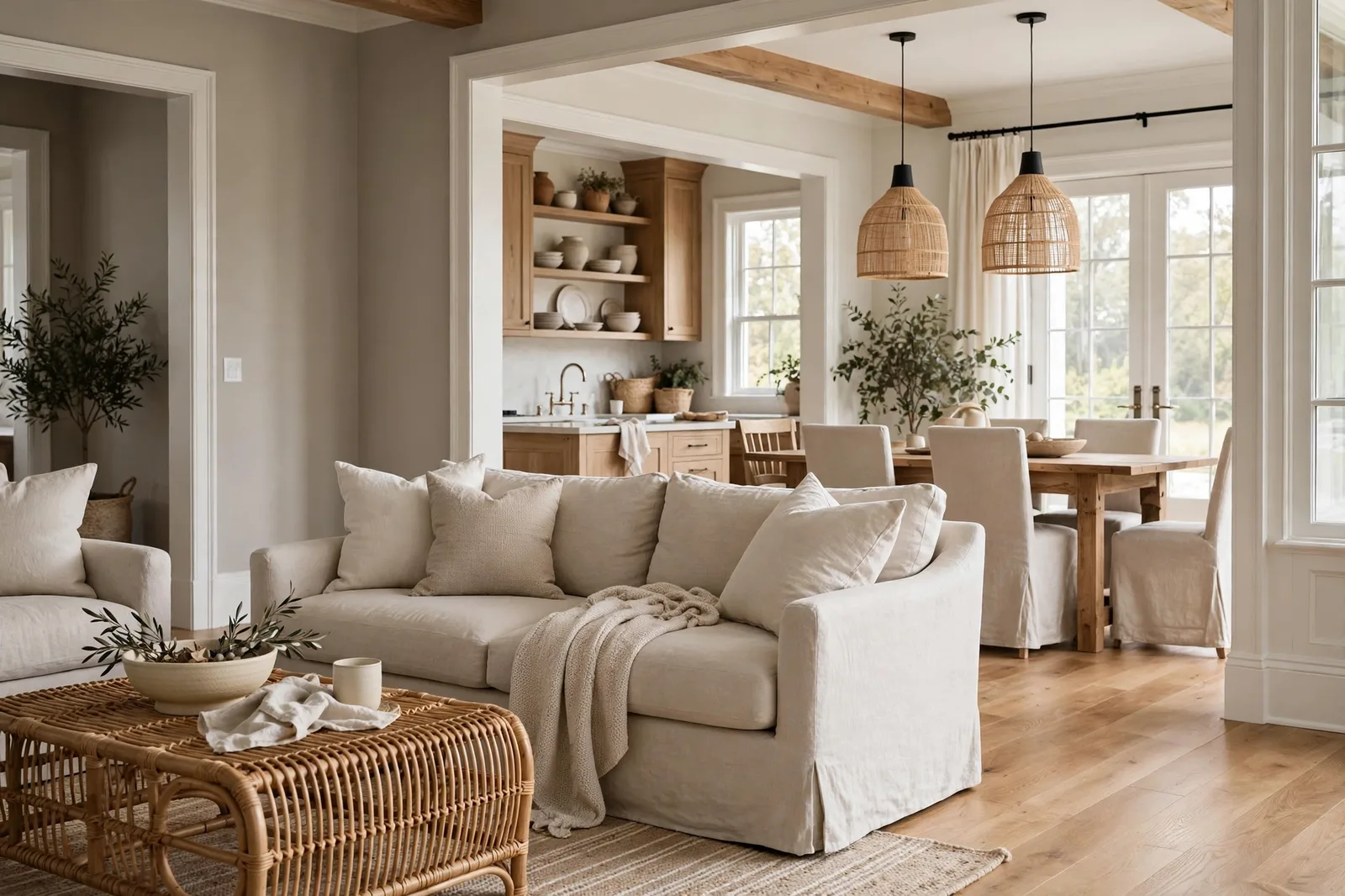
For most of the 2010s, one paint color was arguably the most specified neutral in American homes: Sherwin-Williams Agreeable Gray, SW 7029. Builders sprayed it through entire subdivisions, designers put it on whole-house specifications, and homeowners fell in love with a gray that somehow felt warm. This is the complete guide to that color, what it actually is beneath the fame, how its undertones behave in different light, where it shines room by room, the pairings designers rely on, the fixed finishes it loves and the ones it fights, and the sampling protocol that separates a confident choice from an expensive repaint. Paint colors shift with lighting, surface, and sheen, so always test a large physical sample in your own space before committing, on-screen swatches are approximations. The Global Abode is an independent publication, not affiliated with or endorsed by Sherwin-Williams or Benjamin Moore; all color names and codes are referenced as widely-known designer examples.
Key takeaway: Agreeable Gray SW 7029 is a true warm greige, gray-first with a soft beige warmth, and its fame is structural, not accidental: it bridges cool and warm schemes, stays remarkably consistent across shifting light, and works as a whole-house neutral in most homes. Designers report warm green-based undertones with an occasional faint violet or pink flash in tricky light, which means it rewards sampling more than its “safe choice” reputation suggests. It shines in open plans, well-lit living rooms, and homes with mixed finishes; it struggles in dim north-facing rooms, next to orange-leaning wood floors, and against busy pink-toned stone. Undertone descriptions below are widely-reported designer observations, not exact manufacturer specifications.
What Agreeable Gray Actually Is: The Famous Greige, Explained
Sherwin-Williams Agreeable Gray (SW 7029) is a warm greige, a color sitting at the intersection of gray and beige, and it was engineered for a single mission, stated right in the name: to be agreeable. It was designed to get along with cool grays and warm woods at the same time, to coordinate with both sides of the temperature divide, and to offend nobody while pleasing nearly everybody. For the better part of a decade, it became one of the most-specified residential paint colors in the country.
What made it different from the cool grays that dominated before it was warmth with restraint. The early-2010s grays were often cool, blue-leaning, and a little clinical; Agreeable Gray arrived as their warm cousin, a gray that a warm-neutral person could love, and the warmest gray a gray person would accept. It sits in a light-to-mid-light depth band: deep enough to read as a real color on the wall (never an off-white), light enough to keep rooms feeling bright and open. That depth placement is part of its whole-house genius, it has enough presence to be intentional, enough restraint to disappear when it needs to.
Designers describe its character as gray-first, beige-second. It reads as a warm gray rather than a tan beige, closer to the gray side of the greige family, softened by beige warmth. Color consultants consistently report warm green-leaning undertones as the base note, which is what keeps it from ever going yellow or muddy. And it is, by consensus, the more straightforward member of its famous trio: warmer and more consistent than its cool cousin Repose Gray, grayer and more flexible than its warmer cousin Accessible Beige.
Then the gray era ended. Warm neutrals, taupes, creamy beiges, earthy browns, took over the spotlight, and the all-gray-everything aesthetic faded. So the question everyone asks now is the honest one: is Agreeable Gray dated? The answer is that it was never really a cool gray in the first place. It’s a warm greige that bridges gray and beige, which is exactly why it has outlasted most of the other grays of its era and remains one of Sherwin-Williams’ most popular colors. Dated isn’t the risk with Agreeable Gray. The risk is using it in the wrong room, the wrong light, or against the wrong finishes, which is what the rest of this guide is for.
Tip: The fastest way to understand Agreeable Gray’s character is the white-paper test: hold a large swatch against plain white printer paper in daylight. Against true white, you’ll see exactly what it is, a soft, warm gray with a gentle beige cast, clearly a color and clearly not beige. If it reads warmer or cooler than you expected against white, that’s information about your light, not the color.
Undertones and Light Behavior: The Warmth, the Flash, the Exposures
Agreeable Gray’s undertone story is the reason it needs a full guide rather than a plain swatch glance. The base note, as widely reported by color consultants, is a warm green-leaning undertone, the quiet engine of its warmth. Green undertones in neutrals are the friendly ones: they read as natural and organic, and they’re why Agreeable Gray never tips into the yellow-beige territory of the builder beiges it replaced.
But there’s a second note, and it’s the one that generates all the forum threads: in certain lights, against certain fabrics and finishes, Agreeable Gray can flash the faintest violet or pink. It is subtle, most people never notice it, and in balanced daylight it never appears, but if you are sensitive to pink or purple undertones, this is the color’s honest caveat. The flash shows up most often in tricky conditions: dim rooms, evening lamplight, or next to finishes with their own pink or red cast (pink-toned stone, cherry wood, warm granite with rust movement). The wall isn’t broken; it’s a complex neutral responding to its environment. That is precisely why this color, more than most, should be sampled in place rather than chosen from a chip.
Here’s how the color behaves direction by direction, as designers consistently report:
Bright natural light (south and west exposures): this is Agreeable Gray at its best. In generous daylight it reads as a light, welcoming greige, balanced, glowing, the version from the brochure. The beige warmth comes forward, the gray stays composed, and the color does exactly what its name promises. South-facing living rooms and open plans are its natural habitat.
North-facing and dim rooms: the caution zone. In cool, indirect light the gray takes over and Agreeable Gray cools down noticeably, and in genuinely dim rooms it can read flat or muddy rather than soft. Designers are consistent on this: it’s a poor choice for a dark north-facing bedroom or a windowless hallway, where its depth becomes weight instead of warmth. If a room gets weak light, step lighter (a lighter greige or a warm white) rather than hoping Agreeable Gray will carry it.
East and west rooms: east rooms swing from warm morning to cool afternoon, and Agreeable Gray handles the swing gracefully, one of its genuine strengths. West rooms get the golden evening push: the beige side comes forward and the color can read almost tan at sunset. If you’re sensitive to that, test at 6pm, not at noon.
Evening lamplight: under warm 2700-3000K bulbs, Agreeable Gray is at its coziest, the beige warmth activates and the room glows. Under cool daylight-balanced bulbs (4000K+), the warmth flattens and the gray-green thread shows more. The bulb is part of the color decision: warm bulbs for this color, always.
Against white trim: Agreeable Gray needs a white with enough presence to frame it. Soft warm whites (the Snowbound and Pure White family) harmonize beautifully; very cool, stark whites can exaggerate the violet flash in certain light. The trim white should be warm-neutral, not icy.
Watch out: The violet/pink flash is real but conditional, it appears in dim light, against pink-cast finishes, or for viewers sensitive to purple undertones. If any of those describe your room, sample Agreeable Gray on a large board and check it at 8pm under your actual lamps before committing. In balanced daylight against neutral finishes, most people never see the flash at all.
Room by Room: Where It Shines and Where It Struggles
Agreeable Gray earned its reputation as a whole-house color because it travels well, but “travels well” doesn’t mean “works everywhere.” Here’s the honest room-by-room verdict.
Living rooms, the star turn. This is Agreeable Gray’s best room, especially in open-concept homes where the living room flows into the kitchen and dining areas. Its consistency across shifting light zones is a genuine advantage when one color has to cross a bright south window wall and a dim hallway in the same sightline. On its own it reads warm and welcoming in well-lit living rooms; it pairs naturally with both warm wood furniture and cool upholstery, which is exactly what a hinge room needs. The one caution: in a living room with limited or north-facing light, it can cool down, test it there before committing.
Bedrooms, good with caveats. Agreeable Gray makes a calm, enveloping bedroom in rooms with decent light, warm enough to feel cozy, neutral enough to let bedding and art do the talking. The caveat is the north-facing bedroom: designers consistently flag this as the room where Agreeable Gray disappoints, reading cooler and flatter than expected. For a north bedroom, choose a warmer member of the family (or a warm white) instead. For south and west bedrooms, it’s excellent.
Kitchens, a strong supporting player. Kitchens deal with layered lighting, daylight from windows, overhead fixtures, under-cabinet task lighting, and Agreeable Gray handles those transitions with unusual grace. It works beautifully on kitchen walls alongside white or cream cabinetry, and it’s a popular cabinet color in its own right: timeless, warm, and forgiving. As a cabinet color, pair it with walls a step lighter so the cabinetry reads as intentional. Two-tone kitchens (Agreeable Gray lowers, soft white uppers) are one of its classic applications.
Bathrooms, yes, with the right companions. In bathrooms with decent light, Agreeable Gray is a soft, sophisticated wall choice, warmer than the cool grays that can make bathrooms feel clinical. Use a moisture-appropriate sheen (satin for walls is the bathroom standard), and make sure the tile’s undertone agrees with it: it loves warm-toned tile and struggles against cool blue-gray tile, where the temperature disagreement shows.
Home offices and dining rooms, quietly excellent. These are the rooms where Agreeable Gray’s consistency pays off most: a dining room that shifts from daylight to candlelight, an office that needs to look composed on camera and feel calm for eight hours. It recedes gracefully behind furniture and art, which is exactly what these rooms ask of a wall color.
Hallways and entries, the safe corridor. As a connecting color, Agreeable Gray is one of the best choices available: it flows between rooms without arguing with anyone, and its mid-light depth keeps corridors from feeling either cavernous or stark. In very dim hallways, though, consider stepping lighter.
Exteriors, yes, with testing. Agreeable Gray works on exteriors, siding, brick painted over, shutters, where its warmth keeps it from reading cold in bright sun. But exterior light is intense and unforgiving: colors read lighter and the undertones behave differently outdoors. Always test exterior colors on large boards against the actual siding, in morning and afternoon sun, before committing.
Whole-house use, the signature move. This is what made Agreeable Gray famous: one color, carried through the open plan and into bedrooms, that stays coherent as the light changes from room to room. It works as a whole-house anchor in most homes with average-to-good light and mixed finishes. The homes where it fails whole-house are the dim ones and the ones with strongly pink- or orange-cast fixed finishes throughout.
Best Pairings: Trim Whites, Accents, and Coordinating Colors
A neutral is only as good as its companions. These are the pairings designers reach for with Agreeable Gray, organized by role.
| Role | Best choices | Why it works |
|---|---|---|
| Trim white | Snowbound, Pure White | Soft warm whites with enough presence to frame the greige; avoid very cool whites, which can exaggerate the violet flash |
| Ceiling white | Same trim white, in flat | Keeps the envelope coherent; a bright flat ceiling lifts the mid-light walls |
| Deep accent | Naval, Tricorn Black, Iron Ore | The classic contrast: deep navy or soft black against warm greige is one of the most reliable combinations in design |
| Warm accent | Warm whites, creamy beiges, cognac leather tones | Stays in the warm family; builds the cozy, layered look Agreeable Gray does best |
| Cool accent | Soft blues, dusty blue-grays | Blue is greige’s natural partner, the cool accent makes the warm wall look warmer by contrast |
| Green accent | Sage greens, muted olive | Harmonizes with the color’s own green undertone thread; reads as organic and intentional |
| Metal | Brass, oil-rubbed bronze, black | Warm metals flatter the beige side; black metals sharpen the gray side, both work |
| Wood | Walnut, warm oak (with care), white oak | Rich wood stains are the classic partner; very orange-leaning woods need testing (see section 5) |
A few pairing notes worth more than a line in a table:
The trim white decision matters more than people think. Agreeable Gray against the wrong white is the most common pairing failure: a stark, cool white next to it creates a temperature argument at every door frame and baseboard, and it can pull the violet flash out of the greige. Snowbound and Pure White are the designer defaults because they’re warm-neutral enough to agree with the wall while still reading as white. Test the trim white against the wall color, not alone, whites are relational.
Deep accents are this color’s best friend. Because Agreeable Gray is a mid-light neutral, it takes deep contrast beautifully: a Naval front door, Tricorn Black window frames or interior doors, an Iron Ore kitchen island. The dark accent gives the greige something to stand against, and the combination reads as designed rather than default. This is the pairing that keeps a whole-house Agreeable Gray scheme from feeling flat.
Don’t pair it with its near-neighbors. Agreeable Gray next to Accessible Beige, or next to Repose Gray, in adjacent spaces is the classic clash: close enough to read as a matching mistake, different enough to fight at the edges. One neutral per sightline. For our full three-way breakdown, see the Agreeable Gray vs. Accessible Beige vs. Repose Gray showdown.
Tip: The one-pairing test that predicts everything: paint your Agreeable Gray board and your trim-white board, prop them together against the actual wall, and look at them at 8pm under your lamps. If the white looks clean and the greige looks warm, the pairing works. If the white looks dingy or the greige looks pink, one of them is wrong for your light.
Fixed Finishes: Floors, Stone, and the Pairings That Make or Break It
Agreeable Gray’s reputation as “the color that goes with everything” is slightly overstated, it goes with most things, and the exceptions are specific and knowable. Here’s the finish-by-finish verdict.
Warm wood floors (oak, hickory, warm walnut): generally excellent. Agreeable Gray was built for the warm-wood house, its beige warmth harmonizes with oak and walnut instead of fighting them. The one exception is strongly orange-leaning wood (golden oak, orange-stained pine): against very orange floors, Agreeable Gray can read too warm overall, and the room tips from “warm” to “amber.” Test against your actual floor, not your memory of it.
Cool and gray floors (gray tile, pale ash, concrete-look): workable, with care. Agreeable Gray’s warmth provides a pleasant counterpoint to cool floors, this is the “warm wall, cool floor” balance that keeps modern rooms from feeling cold. But if the floor is strongly blue-gray, the temperature gap can feel disconnected; in that case a cooler greige (or warming the room with wood furniture and warm textiles) bridges the gap.
Warm granite and busy stone: the undertone lie detector. Warm granites with gold, rust, or pink movement will pull the matching thread out of Agreeable Gray, and this is exactly where the faint pink flash gets noticed. Against busy pink-toned stone (certain granites, pink-beige travertine), Agreeable Gray is a genuine risk: the stone amplifies the color’s pink thread and the combination can read rosy. Hold a large board directly against your countertop and fireplace stone in both daylight and lamplight. The color that disappears calmly against your stone is right; the color that starts arguing is not.
White quartz, marble, and cool stone: beautiful. Agreeable Gray against white quartz or soft marble is one of its best looks, the warm wall makes the cool stone look crisp, and the stone keeps the wall from going muddy. This is a cornerstone pairing for kitchens and bathrooms.
Brick (exposed or painted): warm brick loves Agreeable Gray; the beige thread harmonizes with the clay tones. If you’re painting brick, Agreeable Gray is a classic choice that keeps the texture visible while updating the color.
Existing cabinetry and built-ins: white and cream cabinetry is the natural partner. Wood-stained built-ins work when the stain is walnut-to-medium; very dark espresso built-ins create a handsome contrast; very orange built-ins need the same caution as orange floors.
The universal rule: test against the finishes, not against white board. Undertone agreements and disagreements reveal themselves in contrast with fixed finishes. A board that looks perfect against white paper can still fight your granite, and a board that looks slightly off against white can be perfect against your floors.
How to Sample It: The Protocol That Prevents Repaints
Agreeable Gray is the most sample-dependent “safe” color in the neutral family, precisely because its surprises (the violet flash, the cooling in dim light, the warming against orange wood) only appear in place. Here’s the protocol:
Step 1: Get the real color. A sample pot of actual Agreeable Gray in your planned sheen, not a store-mixed match, not a printed chip. Sheen shifts color, so the finish you test should be the finish you buy. For walls, that’s usually eggshell or matte.
Step 2: Paint large boards, two coats. White poster board or primed drywall sheets, at least 2×2 feet, labeled on the back. Small chips lie about exactly the things you need to judge: the violet flash, the depth in dim light, the behavior against your finishes. Agreeable Gray cannot be judged at chip scale.
Step 3: Prop on the real walls, brightest and darkest. One board on the wall with the most light, one on the wall with the least. In an open plan, put boards in each zone the color will cross. Agreeable Gray’s whole-house reputation depends on how it handles your home’s light range, not just one wall.
Step 4: Check at four moments. Morning, midday, late afternoon, and 8pm under your evening lamps. The evening check is the one that predicts regret: the violet/pink flash, if it’s going to appear, appears after dark. Write down what you see at each moment, memory lies, notes don’t.
Step 5: Hold against every fixed finish. Floors, countertops, fireplace stone, the sofa, the trim white board. Move the Agreeable Gray board to each one. Undertone clashes show up against finishes, not against white board, this is where the pink-thread risk and the orange-floor risk get caught.
Step 6: Photograph from across the room. Phone cameras exaggerate undertones, the pink hint or green thread your eyes adapt to will jump out in a photo. That’s useful: it shows you what guests will notice in the first ten seconds, before their eyes adapt the way yours have.
Step 7: Live with it for 48 hours. Tape the boards up and walk past them for two days. The right color stops catching your eye; the wrong one keeps nagging. Trust the nag.
For the complete method, our guide to testing paint samples like a designer walks through every step in detail, and our natural light guide explains the orientation effects behind everything above.
Choosing Agreeable Gray is step one, building the palette around it is the project.
The Whole Home Paint Guide is a complete, ready-to-use color system, anchor neutrals, deep accents, trim and ceiling pairings, all with undertones already coordinated, so Agreeable Gray lands in a house designed to hold it. And the Paint Color Workbook includes side-by-side comparison worksheets, undertone-testing pages, and a room-by-room sampling checklist for confirming your choice with evidence, not hope.
Frequently asked questions
Warm, it’s a warm greige, gray-first with a soft beige warmth. It reads warmer than most grays thanks to its warm undertone base, though it’s not a beige: it favors gray over beige. In dim or north-facing light it can cool down noticeably, which is why some people perceive it as cooler than it is. Judge the temperature in your own light, not on the chip. Our undertones guide explains how to read any neutral’s temperature.
Agreeable Gray is the warmer, more consistent greige; Repose Gray is slightly deeper and cooler, with a faint blue-green thread. Pick Agreeable Gray for warmth, coziness, and mixed finishes; pick Repose Gray for a crisper, more modern read in bright rooms with cool finishes. In north-facing rooms the difference is unmistakable. Our three-way showdown compares all three cousins head to head.
Accessible Beige is warmer and more beige, a touch deeper, with an earthy warmth and a whisper of green grounding. Agreeable Gray is grayer, lighter-feeling, and more flexible across different lights and finishes. Pick Accessible Beige when you want the warmth to be felt; pick Agreeable Gray when you want balanced versatility. Don’t use them in adjacent sightlines, they’re close enough to clash. See the three-way comparison for the full breakdown.
They’re close cousins, not twins. Revere Pewter is a touch deeper and more complex, with a green-leaning base that shifts through the day and can flash faintly mauve; Agreeable Gray is generally lighter-feeling and more straightforward in its warmth. Designers note there’s no exact Benjamin Moore twin, Edgecomb Gray is often cited as the closest BM cousin, lighter and a bit warmer. Compare them as real stock colors, never as store-mixed matches. Our greige guide covers the wider family.
Yes, it’s one of the best whole-house neutrals available, and that’s what made it famous. It stays remarkably consistent as it travels through rooms with different exposures, which is exactly what a whole-house color needs. The exceptions: very dim homes (it can read flat), and homes with strongly pink- or orange-cast fixed finishes throughout (the undertones can argue). Test it in your brightest and dimmest rooms before committing the whole house. Our Sherwin-Williams guide shows how it fits the wider brand system.
Yes, with testing. Its warmth keeps it from reading cold in bright sun, and it works on siding, trim, and even painted brick. But exterior light is intense: colors read lighter outdoors and undertones behave differently, so always test on large boards against the actual siding in morning and afternoon sun. Pair it with a crisp warm-white trim and a deep accent (front door, shutters) for the classic execution. And confirm the sheen and formulation are rated for exterior use.

