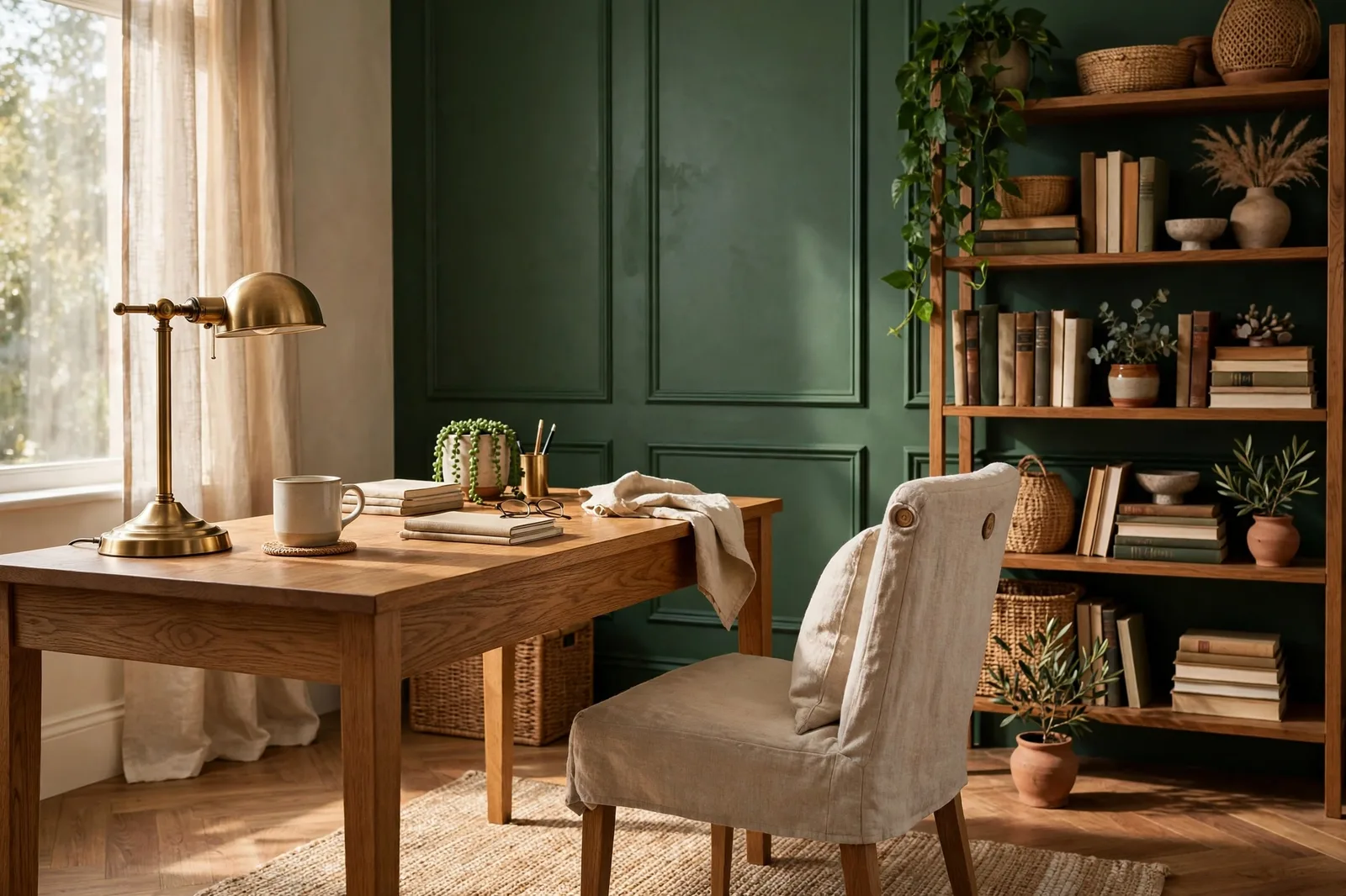
Your home office is the only room in the house with two bosses: you, who has to concentrate in it for eight hours a day, and everyone on your video calls, who will be staring at your wall for a significant portion of your shared meetings. Most rooms only have to please the people who live in them. The home office has to perform, for focus, for the camera, and for the person who works there long after the laptop closes. This guide treats it that way: the focus-friendly color families designers actually specify (deep greens, library navies, warm neutrals, soft blues), each judged on how it affects concentration and how it reads on a webcam; the video-call background test that catches the colors that flatter in person but fail on screen; small-office and spare-room strategies; and how to keep the room from feeling like a cubicle that happens to be in your house. Colors shift with lighting, surface, and sheen, so always test a large physical sample in your own space, under your actual desk lamp, before committing. Sherwin-Williams and Benjamin Moore color names appear as widely-known designer references only; The Global Abode is an independent brand, not affiliated with or endorsed by either company.
The Home Office’s Two Jobs: Focus and the Camera
Every other room in the house has one job. The bedroom helps you rest. The kitchen helps you cook. The living room helps you gather. The home office has two jobs that pull in slightly different directions: it must help you concentrate for hours, and it must present you well to the people who see you through a webcam. The good news is that the same color families serve both jobs, but only if you understand what each job actually asks of the walls.
Job one: focus. What helps the eye and mind settle isn’t a specific color so much as a specific character of color: muted, mid-toned, and low in visual noise. Color researchers and designers consistently land on the same families for concentration, calm blues and greens, which are widely reported to reduce eye strain and support steady mental work, and soft, warm neutrals, which give the eyes a place to rest without stimulation. The colors that hurt focus are the ones with high visual energy: saturated brights, high-contrast patterns, and stark whites that bounce light into tired eyes. Your office walls are the background of your attention. They should be the visual equivalent of a quiet room, present, but never demanding.
Job two: the camera. Webcams are terrible colorists. They auto-adjust exposure based on whatever is behind you, they compress subtle undertones into mush, and they flatten depth. The background colors that survive this treatment are mid-tones: deep enough that the camera doesn’t blow them out, light enough that they don’t turn your face into a silhouette. Stark white walls behind you make the webcam darken your face; near-black walls make the camera strain and grain. The sweet spot, muted blue-grays, soft greiges, mid-tone greens and navies, is well documented by video professionals, and it overlaps almost exactly with the focus-friendly families. When the two jobs agree, choosing is easy. When they don’t, the camera usually wins the tiebreak, because you can adapt to a wall color but your webcam cannot.
There’s a third, quieter job worth naming: separation. Designers working with remote workers report that painting the office differently from the rest of the home, a distinct color, or even just a distinct treatment like color drenching, creates a psychological boundary between work and life. Walking into a green study feels like going to work; walking back out feels like coming home. If your office is a spare room, a color with real presence earns its keep here. If your office is a corner of the living room, the boundary has to come from contrast rather than color, which is its own strategy, covered in section 4.
The honest framing for the whole guide: no paint color will make you productive. But the wrong color will quietly make the workday harder, glare in your eyes, visual restlessness, a background that makes every call slightly worse. The right color removes friction. That’s the bar: not inspiration, but the absence of irritation, sustained over thousands of hours.
The Focus Colors, Compared
These are the five families designers reach for in home offices, each with a different theory of concentration. Pick the theory that matches how you work.
| Family | Best colors | The focus effect | Watch out for |
|---|---|---|---|
| Deep greens | Evergreen Fog SW 9130 (SW), Clary Sage SW 6178 (SW) | The biophilic calm, green is widely associated with reduced stress and lower eye fatigue over long workdays; deep greens create a cocoon of concentration | Evergreen Fog needs real light or a lighting plan; Clary Sage can read beige-green in dim rooms, test at your desk |
| Library navies | Hale Navy HC-154 (BM), Naval SW 6244 (SW) | The serious room, navy signals “work happens here” and creates the study/library feeling that makes focus feel natural; excellent on camera | Demands controlled lighting (desk lamp + soft overhead); can feel cold without warm wood and warm bulbs |
| Warm greiges | Accessible Beige SW 7036 (SW), Edgecomb Gray HC-173 (BM) | The non-distracting background, warm neutrals give the eyes a place to rest, minimize visual interference, and suit long hours of screen work | Can read flat under cool lighting; the warmest members need warm bulbs to avoid looking muddy |
| Soft blues | Sea Salt SW 6204 (SW), Rainwashed SW 6211 (SW) | The clear-thinking color, lighter blues are widely linked with mental clarity and lower stress; soft blues reduce eye strain for analytical and writing work | Shift through the day (green one hour, blue the next); can read chilly in north light without warm companions |
| Warm whites | White Dove OC-17 (BM), Alabaster SW 7008 (SW) | The blank canvas, maximizes light and space, lets furniture and personal objects do the talking; warm whites avoid the sterile glare of cool whites | Stark on camera if too bright (the webcam darkens your face); needs texture and contrast in the room to avoid feeling blank |
A few notes on each family’s personality at the desk:
Deep greens are the current designer favorite for home offices, and the reasoning is layered. Green is the color of the natural world, and muted greens are consistently reported as the least fatiguing color family for long visual work, they sit in the middle of the spectrum, where the human eye rests most easily. Evergreen Fog brings the most depth: it’s a genuine cocoon color, the one designers specify when the client wants the office to feel like a study. Clary Sage is the warmer, lighter alternative, cozier, friendlier, and more forgiving in average light. Both pair naturally with wood desks and brass, which is half of why they photograph so well.
Library navies are the most decisive choice on this list. Hale Navy is the classic, a deep, gray-grounded navy that reads as architectural rather than bright, and one of the most-specified dark colors for studies and home offices. Naval is its bolder Sherwin-Williams counterpart. Navy offices work because they create enclosure: the darker the walls, the more the room feels like a single-purpose space, and single-purpose spaces concentrate the mind. The non-negotiable: lighting. A navy office with one overhead bulb is a cave; a navy office with a good desk lamp, warm ambient light, and maybe a picture light is a library. Budget the lighting before you buy the paint.
Warm greiges are the choice for people who find color distracting. Accessible Beige and Edgecomb Gray are both warm, muted, and visually quiet, the walls recede, and your attention stays on the work. Designers who keep client offices neutral often do it for exactly this reason: the neutral wall lets personal objects, art, and books be the visual interest. The trade is energy: a greige office never energizes you, which is perfect for deep analytical work and less ideal if your work needs creative spark. Warm it with wood and warm bulbs and it stays welcoming rather than flat.
Soft blues are the focus color with the most research-adjacent reputation: blues are widely described as promoting calm, clear thinking and reducing stress, which is why they dominate office-design guidance. Sea Salt and Rainwashed are the livable versions, muted enough to live with, blue enough to work. They’re particularly good for writing and analytical work, and they flatter most skin tones on camera. The caveat is their chameleon quality: they shift between green and blue through the day, which some people find delightful and others find distracting. If you need your walls to stay put, choose a steadier family.
Warm whites are the right answer when the office is small, shared, or multi-use, the spare bedroom that hosts guests twice a year, the corner of the living room, the room with one small window. White Dove and Alabaster keep the space bright and flexible, and they make the best backdrop for everything else you put in the room. The camera caution is real, though: a bright white wall behind you on a video call forces the webcam to expose for the wall, which darkens your face. If you’re on camera daily, a mid-tone is the safer choice; if the office is mostly for you, warm white is the most forgiving.
The Video-Call Background Test
If you spend any meaningful part of your week on video calls, the wall behind your desk is a broadcast set. Here’s how to choose it like one.
The mid-tone rule. Webcam auto-exposure is the whole game. A bright wall behind you makes the camera expose for the wall and darken your face; a very dark wall makes the camera strain, introducing grain and noise. Mid-tones, the middle of the value range, let the camera expose for you correctly. This is why muted blue-grays and soft greiges are the most-recommended video backgrounds: they sit in the camera’s comfort zone, and they hold skin tones naturally without color-casting your face green or orange.
The contrast check. You need gentle separation between you and the wall. If your hair and clothing are dark and your wall is near-black navy, you dissolve into the background; if you’re fair and the wall is near-white, you wash out. The professional setup is a mid-tone wall with you lit from the front, a window or a soft lamp facing you, never behind you. Before finalizing, sit at your desk and take a screenshot of yourself on a call. The screenshot is the truth: if you look flat, shadowy, or washed out, the wall is the problem.
What’s behind you matters as much as the color. A perfect mid-tone wall with a cluttered bookshelf, a visible laundry pile, or a bright window reads worse on camera than a slightly-off color with a calm, composed background. The hierarchy for the camera wall: calm color first, then controlled composition, a plant, a piece of art, a shelf with a few intentional objects, and nothing that moves or glints. Flat or matte paint on the camera wall is worth specifying: it kills the sheen hotspots that glossy paint throws back at the webcam.
Lighting is half the background. The best wall color in the world fails under bad call lighting. The rules: face a light source (window or lamp in front of you, slightly to the side), never sit with a bright window behind you, and warm your bulbs to 2700–3500K, warm enough to flatter skin, not so warm the room looks orange. If your office has no good front light, a simple daylight-balanced desk lamp aimed at the wall beside you (bouncing soft light back onto your face) is the cheapest studio upgrade that exists.
The two-wall strategy. Here’s the practical move for people who want a deep, moody office and a good camera background: put the deep color on the walls you face while working, and a calmer mid-tone on the wall the camera sees. Nobody on your calls ever sees the navy wall behind your monitor, they see the warm greige or soft blue behind your chair. You get the cocoon for focus and the flattering backdrop for calls. The two colors must share an undertone temperature (both warm-leaning or both cool-leaning) or the room feels split, but that’s the only constraint.
Small Offices and Spare Rooms
Most home offices aren’t studies, they’re spare bedrooms, nooks, and corners doing double duty. Small spaces need their own color logic.
The light-and-bright default. In a small office, light colors earn their keep structurally: warm whites, pale warm grays, and light sages bounce available light around and keep the walls from closing in. White Dove, Alabaster, and the lightest greiges are the workhorses here. If the room has one small window or none, this isn’t a preference, it’s physics. A dark color in a windowless box is a bet you will lose every workday.
The one-wall exception. The alternative to all-over light is one deep wall, usually the wall behind the desk, the one the camera sees. A single navy or deep green wall gives a small office depth and definition without shrinking it, because the other three walls stay light and keep the volume. This is also the cheapest way to get the two-wall strategy from section 3: the deep wall is your camera background, the light walls are your breathing room. One gallon of the deep color, a steady hand at the corners, and the room has a point of view.
Color drenching for definition. Designers increasingly recommend color drenching small offices, walls, trim, and sometimes ceiling in one color, as a way to make a tiny room feel intentional rather than leftover. It works because it removes all the visual edges: with no white trim cutting the room into pieces, a small space reads as one continuous envelope, which paradoxically feels larger and calmer. It works best in mid-tones (a muted green, a warm greige) rather than extremes. And it has the separation benefit from section 1 built in: a drenched office feels unmistakably like a different place from the rest of the house.
The corner office (as in, a corner of another room). When the office is a desk in the living room or bedroom, paint isn’t the boundary, contrast is. Define the zone with a rug under the desk, a different (warmer) lamp than the room’s overhead light, and a backdrop the camera likes: a folding screen, a large piece of art, or a bookcase positioned behind the chair. If you can paint, one accent wall behind the desk in a mid-tone focus color does the whole job: it marks the work zone, flatters the camera, and leaves the rest of the room alone.
Multi-use rooms need forgiving colors. The spare room that hosts guests, the office that doubles as a craft room, the study that’s also the library, shared spaces need colors that serve every use without fighting any of them. Warm neutrals and soft mid-tones are the answer: they’re calm enough for work, welcoming enough for guests, and quiet enough to disappear behind whatever the room is doing today. Save the dramatic deep colors for single-purpose rooms.
Warmth vs. Corporate: Keeping It a Home
The failure mode of the home office isn’t a bad color, it’s a color that makes the room feel like a satellite cubicle. Gray walls, gray carpet, a black task chair, a humming monitor: that’s not a home office, that’s a branch location. The paint color sets the tone, but warmth is what keeps the room human. Here’s how the pieces fit.
Wood is the anti-office. The single fastest way to warm up any office color, navy, gray, green, white, is a wood desk, wood shelving, or even just wood frames. Wood introduces organic variation and warm undertones that no paint can provide, and it breaks up the flat, manufactured feeling that makes offices feel corporate. Designers pairing cool focus colors (navy, soft blue, gray) with warm woods, brass, and leather aren’t decorating, they’re correcting the temperature. If your office color runs cool, your furniture must run warm. That’s the deal.
Textiles do what paint can’t. A rug under the desk, curtains instead of blinds, a throw on the reading chair, textiles absorb sound, soften light, and signal “home” in a way hard surfaces never will. They also fix the acoustics: hard-walled small offices echo on calls, and a rug plus curtains plus an upholstered chair noticeably clean up your microphone. Warmth you can hear is warmth that works twice.
Personal objects are the point. The corporate office is impersonal by policy; the home office should be personal by design. Books, art, travel objects, the good coffee mug, a plant that you’re keeping alive through sheer determination, these are what make the room yours, and they’re also what make it look good on camera. Designers who keep office walls neutral often do it precisely so the client’s personal artifacts can be the visual interest. The wall is the gallery; your life is the exhibition.
Warm the light, warm the room. Cool, flat overhead lighting is the fastest route to corporate bleakness. Layer it: a warm desk lamp for task light (2700–3000K), a floor lamp or wall sconce for ambient warmth, and the overhead as backup rather than default. Warm light flatters every focus color on this list, it deepens greens, enriches navy, and keeps warm neutrals from going flat. The bulb temperature is part of the color decision; a navy office under 4000K fluorescents and the same office under 2700K lamplight are two different rooms.
One living thing minimum. This is the cheapest warmth available: a plant. Real, if you can keep it alive; good faux if you can’t. Green against any office wall color, navy, gray, white, greige, is the oldest color combination in interior design, and it works because it’s the biophilic instinct made visible. A plant on the desk or in the corner behind you also happens to be excellent on camera: it’s the one background element that reads as alive.
Light, Desk Placement, and Sheen
Office color doesn’t exist independently of office light, and offices have the most demanding light in the house, because you’re staring at a glowing rectangle for hours. The color, the desk position, and the sheen are one decision.
Desk placement first, color second. The ideal desk position is perpendicular to the window: daylight from the side lights your face evenly for calls, avoids backlighting you, and keeps direct sun off your screen. Facing the window gives you great call lighting but screen glare by midday; facing away from the window puts your face in shadow on every call. Once the desk position is set, the wall colors sort themselves: the wall you face gets the focus color, the wall the camera sees gets the mid-tone background, and the light does the rest.
North vs. south offices. North-facing offices get cool, indirect light all day, steady, shadowless, and slightly blue. They flatter warm colors (greiges, warm whites, Clary Sage) and punish cool ones (soft blues can go chilly, grays can go flat). South-facing offices get bright, warm sun, generous light that can also mean glare and overheating color. They handle the cooler focus colors beautifully (Sea Salt, soft blue-grays) but can push warm colors toward golden. East offices get bright mornings and dim afternoons; west offices get the reverse. The rule: choose the color for the light you’ll work in most. If you’re a morning worker in an east office, judge the color at 9am. If you work late, judge it under your lamps.
Sheen: matte is the office finish. Walls in flat or matte, eggshell at most. This isn’t just about hiding imperfections (though matte does that well); it’s about glare. Any sheen above eggshell throws light back at you and at your screen, creating hotspots that cause eye strain over a workday. The camera wall especially wants flat paint: no sheen hotspots for the webcam to catch. Trim and doors can take semi-gloss for durability, they’re not in your sightline, and the ceiling takes flat, always.
The monitor-wall relationship. The wall behind your monitor is in your peripheral vision for hours. If it’s much brighter than your screen, your eyes work constantly to adjust between the two, a genuine source of fatigue. If it’s a calm mid-tone, the transition is gentle. This is a quiet argument for the deeper focus colors on the monitor wall specifically: a mid-tone green or warm gray behind the screen is easier on the eyes than a bright white wall, all day long. Dark-mode users, take note: a dark wall behind a dark-mode screen is the lowest-contrast setup your eyes can get.
Sample at the desk, not at the wall. The standard advice is to tape sample boards to the wall. For an office, add one more step: tape the board to the wall behind your monitor and work a full day with it in your peripheral vision, then move it to the camera wall and take a screenshot. The office has two viewing positions, the worker’s and the camera’s, and the color has to pass both. A color that looks perfect on the wall at noon and glaring behind your monitor at 3pm has failed the test that matters.
Building the whole palette around your office, not just one room?
The Whole Home Paint Guide is a complete, ready-to-use color system, anchor neutrals, deep accent colors, trim and ceiling pairings, all with undertones already coordinated, so your office color lands in a house designed to hold it. And the Paint Color Workbook includes room-by-room sampling checklists and a lighting worksheet for testing finalists at your desk, under your lamps, at your actual working hours.
Frequently asked questions
Muted blues and greens have the strongest reputation for focus, soft blues are widely linked with clear thinking and lower stress, and muted greens with reduced eye fatigue over long workdays. Deep greens (Evergreen Fog) suit dedicated studies; soft blues (Sea Salt) suit writing and analytical work; warm greiges (Edgecomb Gray) suit people who find color distracting. The common thread is muted: saturated color raises visual energy, which works against sustained concentration. Our undertones guide explains how to read these colors’ hidden hues before you commit.
Yes, if it’s a dedicated, single-purpose workspace with a real lighting plan, deep greens and library navies create a cocoon of concentration that many people find deeply focusing, and they look excellent on camera. The non-negotiables: a good desk lamp plus warm ambient light (a dark office with one overhead bulb is a cave), and warm woods or textiles to keep it from feeling cold. In small, shared, or windowless offices, keep the dark to one accent wall and the rest light. See how light changes paint color for the orientation rules.
Light and warm: warm whites (White Dove, Alabaster) or the lightest warm greiges, which bounce available light and keep the walls from closing in. The alternative is one deep accent wall, usually behind the desk, where the camera sees it, with the other walls light: you get depth and a good video background without shrinking the room. Designers also recommend color drenching tiny offices in one mid-tone to remove visual edges and make the space feel intentional. Test any dark choice in the room’s actual light before committing, small rooms punish overconfidence.
A mid-tone, muted color, soft greige, muted blue-gray, mid-tone green or navy. Mid-tones sit in the webcam’s comfort zone: bright walls force the camera to darken your face, very dark walls introduce grain, and mid-tones let the camera expose for you correctly. They also hold skin tones naturally. Pair the wall with front lighting (face a window or lamp), keep the background composition calm, and use flat or matte paint to kill sheen hotspots. Our 48-hour sampling method includes the screenshot audit for testing backgrounds.
Warm colors: warm greiges (Accessible Beige, Edgecomb Gray), warm whites (White Dove, Alabaster), or warm-leaning greens (Clary Sage). North light is cool and indirect, steady and shadowless, but slightly blue, so it flatters warm colors and punishes cool ones: soft blues can read chilly and grays can go flat without warm 2700–3000K bulbs to correct them. If you love a cool focus color for a north office, warm the artificial lighting and add warm wood furniture to balance the temperature.
It’s the highest-value single move in a home office: one wall in a deeper focus color (navy, deep green, warm charcoal) behind the desk gives you a flattering video-call background, marks the work zone, and adds depth, while the other walls stay light and keep the room feeling open. The rules: the accent must be a genuine step deeper (not a near-neighbor of the main wall color), it should share the room’s undertone temperature, and it wants flat or matte paint to avoid webcam glare. In a dedicated study, you can go further and drench the whole room; in a shared or small space, one wall is the sweet spot.

