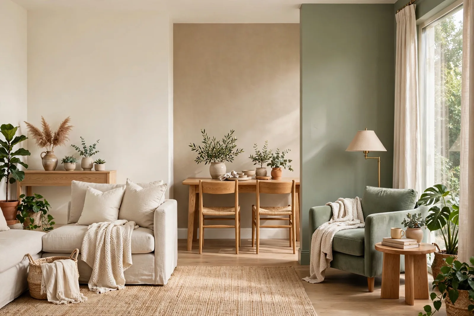
Most paint decisions go wrong before a single swatch is taped to the wall, they go wrong at the moment you compare two colors from different families and try to judge them like-for-like. A warm white next to a greige is a category error: you’re not comparing two colors, you’re comparing two levels of commitment. This guide fixes that by comparing whole families instead, warm whites, greiges, and sage greens, the three families designers reach for most, so you choose the right family first and the right color second. Colors shift with lighting, surface, and sheen, so always test a large physical sample in your own space before committing. Sherwin-Williams and Benjamin Moore color names appear as widely-known designer references only; The Global Abode is an independent brand, not affiliated with or endorsed by either company.
Why compare whole families, not just colors
Walk into a paint aisle with “Alabaster vs. Agreeable Gray” in your head and you’ll leave confused, because the comparison is rigged from the start. Alabaster is a warm white; Agreeable Gray is a mid-tone greige. Comparing them head-to-head is like comparing a flashlight to a lamp, they’re different tools, and the real question is which tool the room needs, not which one looks prettier on the chip.
Paint colors cluster into families, and each family makes a different promise. Warm whites promise brightness with kindness: they bounce light around, read as “white” from across the room, and carry just enough warmth to avoid sterility. Greiges promise middle ground: enough color to have presence, enough neutrality to disappear, the family’s way of saying “I want something but not something.” Sage greens promise color without courage, they’re genuine, recognizable color, but muted with enough gray to behave politely in a room, which is why they’ve become the default “first color” for people who think they don’t like color.
Here’s the decision order that professionals actually use, whether they say it out loud or not:
Step one: family. Does this room need light (warm white), softness with presence (greige), or quiet color (sage green)? That decision is made from the room’s light, size, and job, not from the fan deck.
Step two: warmth. Within the family, which side of the warm-cool line do your finishes sit on? Warm woods and brass want the warmer member of the family; cool quartz and chrome want the cooler one.
Step three: color. Now you compare specific colors, and only within the family, where the comparisons are actually fair.
Most homeowners start at step three and wonder why the comparisons feel impossible. Skip to step one and the fan deck gets dramatically smaller. Each of the three sections below follows the same structure: a ranking table of the family’s five most-discussed colors, two-to-three-sentence verdicts on each, and the family’s decision framework, the three questions that pick the right member for your room.
Warm white family face-off
Warm whites are the highest-traffic family in residential painting: trim, cabinets, ceilings, whole-house wall systems. The family job is to read as white while refusing to read as cold. All five of these are designer-reported staples; none is objectively best, each wins a different room.
| Rank | Color | Warmth | The verdict |
|---|---|---|---|
| 1, the all-rounder | White Dove OC-17 (BM) | Gentle warmth, gray-muted | The most versatile member of the family, soft enough for walls, clean enough for trim, stable across north and south light. If you can only pick one warm white for the whole house, this is the professional consensus answer. |
| 2, the cozy pick | Alabaster SW 7008 (SW) | Noticeably warm, yellow-beige | Warmer and creamier than White Dove, the choice when you want the warmth to be felt. Beloved on cabinets and exteriors; can read almost cream in strong southern sun, so it’s a commitment to warmth. |
| 3, the clean pick | Pure White SW 7005 (SW) | Mild warmth, near-neutral | A touch brighter and cleaner than White Dove, the warm white for people who flinch at cream. Pairs beautifully with white quartz; can fall a little flat in north-facing rooms where it doesn’t have enough warmth to fight the cool light. |
| 4, the bright pick | Simply White OC-117 (BM) | Bright with a yellow whisper | The brightest of the group, reads as genuinely white in daylight, with a faint yellow undertone that shows mostly in dim rooms. The safe “bright but not sterile” trim white; in very dim rooms the warmth becomes the story. |
| 5, the cool-leaning pick | Snowbound SW 7004 (SW) | Soft, slightly cool, taupe thread | The family outlier, a touch cooler than the rest, with a taupe undertone that keeps it livable rather than icy. The right answer for gray-leaning homes that still want a white that doesn’t feel stark. |
The warm-white decision framework, three questions:
1. How much warmth can the room’s light support? North-facing rooms and dim hallways need the family’s warmer members (Alabaster, White Dove) to absorb the cool cast; bright south-facing rooms can carry the cleaner members (Pure White, Simply White) without them going stark.
2. Is this white going on trim or walls? Trim whites can be brighter and cleaner (Simply White, Pure White); wall whites benefit from a touch more softness (White Dove, Alabaster) so large surfaces don’t glare.
3. What temperature are your fixed finishes? Warm woods, brass, and cream stone want White Dove or Alabaster; cool quartz, chrome, and gray tile want Pure White or Snowbound. A white that disagrees with your finishes will always look slightly wrong, no matter how pretty it is alone.
Greige family face-off
Greiges are the family’s compromise made visible: gray’s sophistication, beige’s warmth, blended until the argument disappears. The family job is to give walls presence without demanding attention, which makes greige the most-chosen family for whole-house wall systems, open plans, and anyone who wants “something” on the walls but can’t name what.
| Rank | Color | Warmth | The verdict |
|---|---|---|---|
| 1, the consistent one | Agreeable Gray SW 7029 (SW) | Warm beige-gray, steady | The most predictable greige in common use, warm, balanced, and remarkably stable across light changes. The choice when you want greige with the fewest surprises; slightly lighter and more straightforward than its BM rivals. |
| 2, the characterful one | Revere Pewter HC-172 (BM) | Warm greige, green-mauve shifting | A touch deeper and more complex than Agreeable Gray, with a green-leaning base that can flash faintly mauve in evening light. The choice when you want the greige to have movement through the day rather than staying put. |
| 3, the forgiving one | Edgecomb Gray HC-173 (BM) | Soft warm greige, taupe-leaning | Revere Pewter’s lighter, warmer, calmer sibling, similar DNA with the drama removed. The choice for whole-house use where consistency matters more than character: bedrooms, hallways, open plans. |
| 4, the soft one | Repose Gray SW 7015 (SW) | Gentle warmth, livable | Softer and slightly cooler-feeling than Agreeable Gray, with a gentle warmth that keeps it from going flat. The choice for serene spaces, bedrooms, baths, where you want the greige to whisper rather than speak. |
| 5, the warm one | Worldly Gray SW 7043 (SW) | Warm gray, beige-green thread | The warmest of the five, with a beige-green undertone that flatters warm woods and traditional furnishings. The choice for heritage-leaning homes where the cooler greiges feel historically wrong. |
The greige decision framework, three questions:
1. Do you want the greige to stay put or move? Agreeable Gray and Edgecomb Gray are the stable ones, what you see at noon is close to what you get at 8pm. Revere Pewter is the mover, it shifts through the day, which is either its charm or its flaw depending on your temperament.
2. How much light does the room actually get? Greiges darken faster than whites in dim rooms. The lighter members (Agreeable Gray, Edgecomb Gray, Repose Gray) are safer in low-light spaces; the deeper members (Revere Pewter, Worldly Gray) want decent natural light to show their warmth rather than their weight.
3. Are you sensitive to pink or green in neutrals? If yes, avoid Revere Pewter (the mauve flash) and test Worldly Gray carefully (the green thread), and default to Agreeable Gray or Edgecomb Gray, the two least likely to show you an undertone you didn’t order.
Sage green family face-off
Sage greens are the family’s quiet revolution: real, recognizable color that behaves like a neutral. The gray mixed into every sage is what makes the family work, it mutes the green enough to live with for years, while keeping enough green to make a room feel alive. Sages are the most-chosen “first color” for homeowners moving away from all-neutral schemes.
| Rank | Color | Depth & temperature | The verdict |
|---|---|---|---|
| 1, the deep one | Evergreen Fog SW 9130 (SW) | Mid-depth, cool gray-green | The moodier, more sophisticated sage, deeper than the rest, with a strong gray undertone that reads grounding rather than sweet. The choice for studies, moody bedrooms, and kitchen islands; a former Color of the Year for good reason. |
| 2, the light one | October Mist 1495 (BM) | Light, warm sage | Noticeably lighter and warmer than Evergreen Fog, with soft warm undertones that keep it fresh rather than cool. The choice for living rooms and hallways where you want the sage idea at its most approachable; also a former Color of the Year. |
| 3, the warm one | Clary Sage SW 6178 (SW) | Light-mid, warm muted green | The coziest sage of the group, a soft, warm, slightly muddy green that flatters natural wood and warm finishes. The choice for bedrooms and kitchens in warm-leaning homes; can read almost beige-green in dim light. |
| 4, the serene one | Retreat SW 6207 (SW) | Mid-tone, balanced gray-green | The even-keeled middle of the family, muted, serene, neither warm nor cool leaning hard. The choice for bathrooms and bedrooms where the job is calm, and for anyone who wants sage without a strong temperature opinion. |
| 5, the classic one | Saybrook Sage HC-114 (BM) | Mid-tone, cool with gray | The cooling undercurrent of gray gives this sage a refined, upscale read, distinctly sage, distinctly composed. The choice for gray-leaning homes and traditional rooms; pairs beautifully with cream rather than stark white. |
The sage decision framework, three questions:
1. How much depth can the room take? Evergreen Fog is the only true mid-depth member here, it wants rooms with decent light or a deliberate moody brief. The other four are light-to-mid and far more forgiving in average rooms.
2. Warm home or cool home? Clary Sage and October Mist lean warm and flatter wood, brass, and cream; Saybrook Sage and Evergreen Fog lean cool and suit gray tile, chrome, and crisp whites. Retreat sits in the middle for genuinely mixed homes.
3. Accent or all-over? The lighter sages (October Mist, Clary Sage) work as all-over wall colors; Evergreen Fog is at its best as the deeper moment, an accent wall, cabinetry, a study, with lighter companions doing the heavy lifting.
Cross-family decisions: which family does this room actually need?
Now the decisions the tables can’t make for you, the ones that happen between families, which is where most real paint dilemmas actually live.
When a room wants white but needs greige. This is the most common cross-family tension: you love the idea of white walls, but the room has warm oak floors, a cream sofa, and honey-toned trim that would make a true white look glaring. The answer is almost always the warm-white family, not the greige family, specifically its warmest members (Alabaster, White Dove). People jump to greige because they think “white is too stark,” but what they usually mean is “cool white is too stark.” A warm white gives you the brightness you wanted with the kindness your finishes need. Only move to greige if the room has the light to support a mid-tone, which usually means a south or west exposure, or generous artificial lighting.
Greige vs. sage as the whole-house anchor. Both families can carry a whole house, but they make different houses. A greige anchor (Agreeable Gray, Edgecomb Gray) makes a calm, gallery-like home where art, textiles, and furniture do the talking, the walls are the quiet background. A sage anchor (October Mist, Retreat, Clary Sage) makes a home with a point of view, the walls participate, and everything else needs to get along with green. The practical rule: if your furnishings are varied, collected, or colorful, choose greige (it accommodates everything); if your furnishings are quiet and neutral, sage gives the house the personality the furniture doesn’t.
Warm white vs. greige on trim-adjacent walls. Here’s a subtle one: when your trim is a warm white and your walls need to relate to it, the wall color should come from a different depth than the trim, not just a different family. White Dove walls with Simply White trim can look like a mistake, too close, no intention. White Dove trim with Edgecomb Gray walls reads as deliberate. The family matters less here than the visible step between the two.
Can you mix families in one house? Yes, and the best whole-house palettes usually do. The classic structure is one family per role: warm whites on trim, ceilings, and the brightest rooms; greige as the main wall anchor through the open plan; sage as the deeper moment in one or two rooms (a study, a bedroom, the dining room). What makes it work is undertone agreement across the families, warm-leaning members together (Alabaster trim, Edgecomb Gray walls, Clary Sage study) or cool-leaning members together (Snowbound trim, Repose Gray walls, Saybrook Sage bedroom). Mixing a warm white with a cool sage is where houses start to feel assembled rather than designed.
The commitment ladder. Think of the three families as rungs: warm white is the lowest commitment (brightest, most forgiving, easiest to repaint over), greige is the middle (more presence, more light-dependent), sage is the highest (real color, real opinions, hardest to undo on a whim). There’s no wrong rung, but climb deliberately. A surprising number of “I hate my paint color” stories are really “I climbed two rungs at once” stories: jumping from white walls straight to a deep sage without ever living with a greige in between.
Choosing a family is step one, building the palette is the project.
The Whole Home Paint Guide is a complete, ready-to-use color system, anchor neutrals, gentle color moments, trim and ceiling pairings, all with undertones already coordinated across families, so whichever family you choose lands in a house designed to hold it.
Frequently asked questions
Greige is the most-chosen answer, specifically the stable, light members like Agreeable Gray or Edgecomb Gray. Open plans need one color to flow across kitchen, dining, and living areas without changing character as the light shifts, and greige’s mid-tone neutrality handles that better than warm white (which can glare across large expanses) or sage (which can feel like a lot of color at open-plan scale). If the open plan is dim, step up to a warm white instead.
Warm whites win north rooms outright, White Dove or Alabaster absorb the cool, indirect light and keep the room feeling clean rather than cold. Greiges are the risky middle: the warm members (Agreeable Gray, Worldly Gray) can work with good artificial lighting, but the cooler ones go flat. Sages in north rooms need care, choose the warm-leaning members (Clary Sage, October Mist) and avoid the cool ones unless you warm the bulbs to 2700–3000K.
Yes, assign each family a role: warm whites on trim, ceilings, and the brightest rooms; greige as the main wall anchor; sage as the deeper moment in one or two rooms. The rule that makes it work is undertone agreement: keep all three families on the same side of the warm-cool line (all warm-leaning or all cool-leaning). A warm white with a cool sage is where houses start to feel assembled rather than designed.
Warm whites age the most gracefully, they’re background, and backgrounds don’t date. Greiges age well too, though specific greiges can timestamp a house to their peak years (the mid-2010s gray wave taught everyone this). Sages age best when they’re muted: the gray in a true sage keeps it classic, while brighter or yellower greens date faster. The deeper the color commitment, the more it benefits from being the muted, grayed version of itself.
Beautifully, but choose the warm-leaning sages. Clary Sage and October Mist were practically designed for oak floors, walnut, and warm cabinetry; the warmth in the green harmonizes with the warmth in the wood instead of fighting it. The cool sages (Saybrook Sage, Evergreen Fog) next to warm woods can feel disconnected, that pairing wants the woods to go cooler or the sage to go warmer. When in doubt, hold the sage board against the actual floor: the pairing either sings or it doesn’t.
Warm white, without hesitation, White Dove or Alabaster. Small dark rooms punish mid-tone colors: greiges read heavy and flat, and even the lighter sages can feel muddy without enough light to show their green. A warm white bounces what light exists around the room and keeps it feeling intentional rather than cave-like. Save the greige and sage ambitions for rooms with the light to support them.

