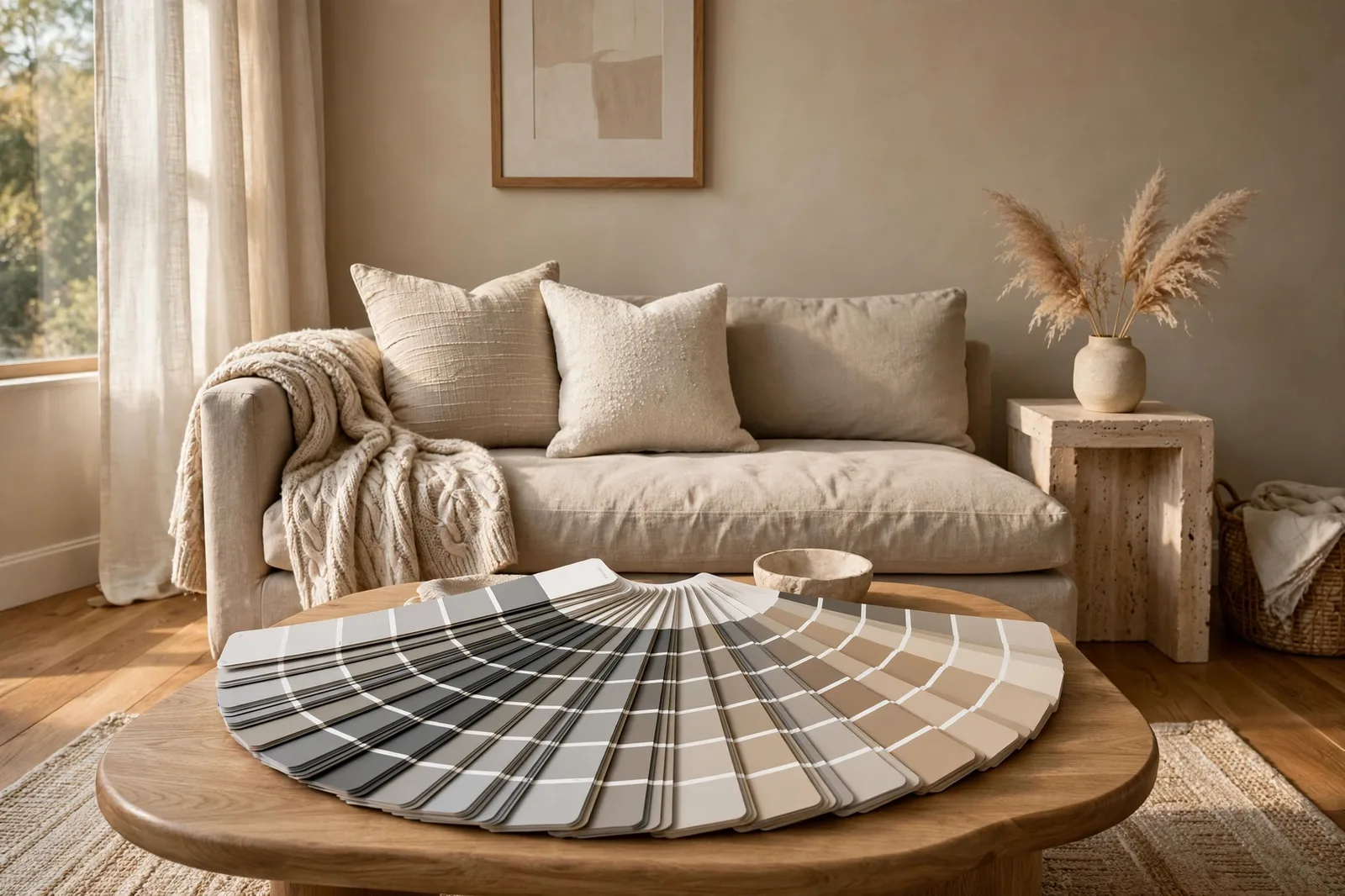
Greige won the last decade of paint. It’s on more living room walls than any other neutral family, the safe, sophisticated middle ground between cold gray and dated beige. But “safe” is exactly where the trouble starts: because greiges all look alike on the fan deck, most people choose one on autopilot, and autopilot is how you end up with a living room that flashes lavender at sunset or goes flat and muddy by February. Here’s how to choose a greige the way designers do, by its undertone, its light behavior, and its relationship to your room.
What greige actually is (and why it won)
Greige is exactly what the name says: a color that sits on the border between gray and beige, borrowing from both. The gray half gives it restraint and modernity; the beige half gives it warmth and livability. It was invented, in the cultural sense, as the answer to two disappointments: gray, which turned cold and flat in real rooms, and beige, which carried the memory of every dull 1990s rental.
It worked because it’s genuinely useful. A good greige does what designers call “sitting back”, it recedes and lets furniture, art, and materials do the talking. That’s why it’s the most-specified whole-home neutral in American design: it survives open floor plans, mixed wood tones, and changing decor without demanding attention. One designer puts it plainly, sometimes you need the walls to sit back so everything else can perform.
But here’s the honest part nobody puts on the fan deck: greige is a spectrum, not a color. Two greiges can look nearly identical on a chip and behave completely differently on your wall. One reads warm and cozy in the afternoon and faintly pink under evening lamps. Another reads calm and neutral all day, then turns slightly green in a north-facing room. The name tells you the color lives between gray and beige. It doesn’t tell you which side it leans toward, and the lean is the whole decision.
That’s also why the “is greige out of style?” debate misses the point. Trend coverage in 2026 leans toward warmer neutrals, mushroom, oatmeal, clay, warm taupe, but that’s a temperature shift within the greige spectrum, not its death. A warm, muddy greige chosen for your light is more current than any trend name. Greige isn’t out; thoughtless greige never was in.
How to read a greige’s lean
Every greige has two layers of undertone, and knowing both is what separates a confident choice from a gamble.
The dominant lean is the color’s overall direction: warm beige, cool gray, or balanced between the two. Hold the chip against a sheet of true white paper in daylight, the lean shows itself in seconds. If the greige goes buttery or blushing next to the paper, it leans warm. If it goes silvery or shadowy, it leans cool. This is the lean that decides the room’s mood and its relationship to your finishes.
The secondary undertone is the hidden hue inside the lean, green, pink, violet, or yellow, and it’s where most greige surprises live. A greige can have a dominant beige base with a secondary pink pull that stays quiet on the chip and wakes up on the wall. Some colors are famous for this: widely-cited designer examples note that certain popular greiges can flash faintly violet or pink in northern light, or shift green next to warm wood.
The important insight: your room activates the undertone, not just the color. A greige doesn’t have one fixed appearance, it has a range of appearances, and your light, floors, and trim decide which one shows up. A green-leaning greige can read calm and neutral beside white oak floors and muddy beside red oak. The floor didn’t change; the comparison your eye makes changed. This is why designers test greiges in the room, against the finishes, never against other chips.
Three rules follow from this:
1. Judge the greige with your finishes, not your furniture. Sofas move. Rugs move. Your oak floors and stone counters do not. Match the wall to the most permanent surface in the room.
2. The bottom of the strip tells the truth. Paint companies arrange chip strips by intensity, the darkest shade is the same hue family, concentrated. If the bottom of the strip looks mauve or olive, the pale greige at the top carries that DNA.
3. Light is a second undertone. North-facing rooms pull cool out of any greige; south-facing rooms pull warm. Know your window direction before you fall for a chip.
9 designer-picked greiges, compared
These are the greiges designers reach for most often, organized from warmest to coolest. Treat every entry as a starting point to sample, not a verdict, the “watch out for” column matters more than the name.
| Greige | Lean | Character | Best light | Best finishes | Watch out for |
|---|---|---|---|---|---|
| Accessible Beige (SW family) | Warm, yellow-gray | The coziest of the group; reads nearly beige in warm light | South and west rooms; open plans with real sun | Honey oak, warm wood, brass | Can tip too golden in strong southern exposure |
| Anew Gray (SW family) | Warm, beige-leaning gray | Soft and welcoming; a warm gray rather than a cool beige | Any; cozy rooms especially | Warm woods, cream stone, mixed metals | Green or violet hints surface in certain light |
| Edgecomb Gray (BM family) | Warm-neutral, soft yellow-green | Light, airy, forgiving; the gentle greige | North-facing rooms wanting lightness | White oak, warm whites, linen | Can read almost white in very bright rooms |
| Agreeable Gray (SW family) | Balanced, faintly warm | The safe default; unifies mixed finishes beautifully | Any room; the lowest-risk choice | Mixed warm and cool finishes; open plans | Can flash faintly violet in cool northern light |
| Worldly Gray (SW family) | Balanced, green-beige | Quiet and neutral; low-commitment whole-house color | Any | Stone, painted cabinetry, varied woods | Needs decent light to show its character |
| Pale Oak (BM family) | Warm-neutral, yellow-beige | Stable across light conditions; the dependable light greige | Mixed exposures; tricky rooms | Both warm and cool rooms | Sits near off-white, confirm it reads as a color, not a white |
| Revere Pewter (BM family) | Balanced, green base | The classic greige; structured and earthy | Well-lit rooms; south-facing spaces | Cool stone, concrete, white oak | Can flash mauve; clashes with red brick and honey oak |
| Balboa Mist (BM family) | Cool-leaning neutral | Soft and sophisticated; shifts with the light | Bright rooms | Cool stone, gray tile | Violet-gray at higher light, warm beige at lower, test carefully |
| Repose Gray (SW family) | Cool, slight purple base | Clean, modern, architectural | Bright rooms that need a cooler greige | Cool stone, marble, dark floors | Reads cold under cool LEDs and in dim north rooms |
A few patterns worth noticing. The warmest greiges (Accessible Beige, Anew Gray) are the coziest but carry the most flash risk in strong sun. The balanced middle (Agreeable Gray, Worldly Gray, Pale Oak) is where whole-house safety lives, these are the colors that survive open floor plans and mixed finishes. The cool end (Repose Gray, Balboa Mist) is crisp and modern but demands good light. And Revere Pewter, the original greige celebrity, earns its reputation in the right room and causes the most trouble in the wrong one, its green base is exactly what makes it sing beside cool stone and fight beside warm red oak.
The greige that behaves best is the one you test
Notice that every “watch out for” entry is a light-and-finish interaction, not a flaw in the color. That’s the whole thesis of this guide: there are no bad greiges, only greiges in the wrong room. The designer-picked color is the one that agrees with your floors, your windows, and your trim, which no ranking list can know. For the full testing protocol, see how to test paint samples.
The 3 greige traps
These are the three ways greige choices actually fail in real homes. Each one is preventable once you know to look for it.
Trap 1, The pink or violet flash
The most common greige complaint, and the most misunderstood. You chose a sophisticated neutral; on the wall it flashes faintly pink, mauve, or lavender, usually in one specific light, which makes it feel haunted. Here’s what’s happening: many greiges carry a secondary pink or violet undertone that stays dormant on the chip and activates in cool, dim, or northern light. Designers widely report this on some of the most popular greiges in existence, it’s not a defect, it’s the undertone doing what undertones do.
The prevention is simple: test the greige in the room’s worst light, the north wall at dusk, the dim hallway, and look specifically for the flash. Hold a white paper beside the sample; the pink or violet will announce itself. If it flashes and bothers you, move one step toward a warmer, more beige greige on the same strip. And if the flash only bothers you sometimes, know that warm 2700K bulbs amplify it, a neutral 3000K bulb with high CRI often calms it. Our undertones guide covers the paper test in detail.
Trap 2, Going flat in low light
Mid-tone greiges are designed for light to play across. In a dim room, a north-facing bedroom, a hallway with no windows, a basement, there isn’t enough light for the undertone to show, and the color goes flat: neither warm nor cool, just a dull, lifeless mid-tone that makes the room feel smaller. Designers call this “muddy,” and it’s the reason so many dim rooms painted in greige feel disappointing rather than cozy.
The fix: in low light, go lighter or warmer than your instinct. A light greige (Edgecomb Gray or Pale Oak territory) reflects what little light exists and keeps its character; a mid-tone greige absorbs it. And if the room is both dim and north-facing, lean warm, warmth is the buffer that keeps a neutral honest when the light is weak. When torn between two greiges for a dark room, always take the lighter one.
Trap 3, The trim mismatch
This one hides until the job is done. You’ve chosen a beautiful warm greige, and your existing trim is a bright, cool white. On the wall, the trim makes the greige look dingy, yellow, or dirty by comparison. The trim became an unflattering “true white” that the greige is judged against, and the greige loses. It’s one of the most common real-home mistakes there is, and it has nothing to do with the greige’s quality.
The rule: keep the trim in the same temperature family as the greige, and sample them together. Warm greige wants a warm or soft white trim; cool greige wants a crisper, cooler white. Never match a bright cool-white trim against a warm greige wall and expect both to look their best. If repainting the trim isn’t in the plan, let the trim’s temperature vote on the greige, it’s the permanent finish here, so it wins. See matching whites to your finishes for the full trim method.
Pick your greige: the 5-question framework
Don’t start from the nine names. Start from your room, these five questions narrow the field to one or two candidates before you ever open the fan deck.
Question 1, Which way do the windows face? North-facing or mostly dim: lean warm and light (Edgecomb Gray, Pale Oak, Accessible Beige territory). South-facing and bright: you have the full range, the sun forgives almost any lean. East or west: test at the hour you’ll actually use the room; west evening sun pushes warm greiges golden.
Question 2, What are your floors? Honey oak or warm red-toned wood: avoid green-leaning greiges (the contrast activates the green) and lean warm-beige. Gray-washed or cool wood: a warm greige bridges beautifully. Dark walnut or espresso: any greige works, the contrast does the talking, so choose by mood.
Question 3, How much light does the room get? Low light: go lighter than your instinct, mid-tone greiges go flat. Bright light: you can use the deeper, moodier greiges without the room going heavy.
Question 4, What temperature is your trim? Bright cool white trim: stay in neutral-to-cool greiges so the walls don’t look dirty. Warm or existing cream trim: warm greiges sit comfortably. Repainting the trim anyway: match it to the greige’s family and sample both together.
Question 5, What mood do you want? Cozy and enveloping: warm-beige greiges. Calm and modern: balanced neutrals. Crisp and architectural: the cool end. Be honest, the best greige is the one you’ll still love in five years, not the one that photographs best today.
Testing and placing your greige
Once the framework hands you two finalists, the testing protocol is non-negotiable, and greige deserves the full version, because its whole personality is light-dependent.
Sample large, two coats, on boards. At least 2×2 feet per color. Small swatches can’t show you how a greige behaves at wall scale, and one thin coat reads lighter and less saturated than the real thing.
Test on multiple walls. One wall catches direct sun; the opposite sits in shade. In south and west rooms the same greige can look like two different colors on opposing walls, you need to love both versions.
Check at four moments. Morning, midday, late afternoon, and under your lamps at night. The flash trap (see §4) reveals itself at dusk and under warm bulbs, if you’re only testing at noon, you’re testing the greige’s best hour and deciding blind.
Judge at six feet, against the finishes. Step back to conversation distance and look at the sample next to your flooring, countertops, and trim. The paint has to get along with everything you aren’t changing, that’s the real test.
Place with intention. Greiges earn their keep as whole-home anchors: carry your chosen greige through living areas, hallways, and open spaces, then let bedrooms shift one step lighter or deeper within the same family. In open plans, every wall visible from one spot should share the same greige family, see our open-concept color flow guide for placement rules. And read cool gray vs. warm greige if you’re still torn between the two families.
Want the greige without the guesswork?
The Whole Home Paint Guide is a complete, ready-to-use color system, greige anchors already matched to trim whites, every room mapped, undertones already coordinated, so you skip the sampling anxiety entirely and go straight to the part where your house feels finished.
Frequently asked questions
Beige leans warm and golden; gray leans cool and flat. Greige sits between them, it keeps beige’s warmth but adds enough gray to feel current and grounded. If a neutral reads cozy but not yellow, it’s probably a greige.
No, the temperature is shifting, not the category. 2026’s momentum is toward warmer, muddier neutrals (mushroom, oatmeal, warm taupe) rather than cool grays, and that’s a shift within the greige spectrum. A warm greige chosen for your light is more current than any trend name.
It’s the secondary pink or violet undertone activating, most likely in cool, dim, or northern light, which is exactly the light that wakes those undertones up. Test your finalists in the room’s worst light before committing; if the flash bothers you, move one step warmer on the same strip, toward a more beige greige.
Lean warm and light, Edgecomb Gray or Pale Oak territory. North light pulls cool out of every color, so a warm-leaning greige balances it instead of fighting it. Avoid cool greiges in dim north rooms; they go flat or chilly. See how light changes paint color for orientation strategy.
A white in the same temperature family as the greige. Warm greiges want a warm or soft white trim; cool greiges want a crisper white. The one rule: don’t pair a bright cool-white trim with warm greige walls, the trim becomes an unflattering reference white and the walls look dirty by comparison.
Yes, that’s what greige is best at. Carry your chosen greige through living areas, hallways, and open spaces, then shift one step lighter or deeper within the same family for bedrooms and secondary rooms. Keep one trim white everywhere, and the house reads as one home. The method is in choosing a whole-home palette.

