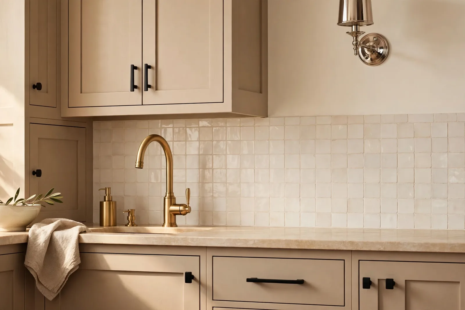
There was a time when matching every faucet, knob, and hinge in a home felt like the only respectable choice, but designers today treat mixed metals as the surest way to make a warm neutral palette feel collected, layered, and intentional rather than flat. The trick isn’t owning four metals; it’s knowing how brass, black, chrome, and nickel behave against warm paint, and giving each metal a clear job in the room. A quick note before we start: paint colors shift with lighting, surface, and sheen, test a large physical sample in your own space before committing. The Global Abode is an independent publication, not affiliated with or endorsed by Sherwin-Williams or Benjamin Moore; color names and codes are referenced as widely-known designer examples.
Key takeaway: Mixing metal finishes works when you follow two rules: pick one dominant metal that shows up in most of the room, add one accent metal in two or three places, and treat matte black as a free pass. Warm metals (brass, bronze, copper) naturally flatter warm neutral paint; cool metals (chrome, nickel) can still work if you place them away from warm metals and repeat them deliberately.
1. Metals Are a Color Family: Warm vs. Cool
The most useful reframe designers offer is simple: metals aren’t neutral accessories, they’re colors with undertones, and they behave exactly like paint colors do. Brass, gold, copper, and oil-rubbed bronze sit on the warm side of the spectrum. Chrome, polished nickel, and stainless steel sit on the cool side. Matte black, iron, and pewter act as neutrals that, in widely-reported designer observations, pair happily with either temperature. Once you see metals as a color family with its own warm–cool axis, mixing them stops feeling mysterious and starts feeling like any other color decision in your whole-home palette.
Why does temperature matter? Because every metal carries a visual echo of something. Brass and gold echo candlelight and sun; chrome and nickel echo water, ice, and moonlight. When a brass faucet catches morning sun against a warm greige wall, the two amplify each other, the metal looks richer and the wall looks warmer. When chrome sits against that same wall, the eye registers a gentle tension: one element pulling warm, one pulling cool. That tension isn’t wrong, contrast is what keeps a room from feeling one-note, but it needs to be placed and repeated with intention, or it reads as a mistake.
The warm metals read as inherently soft and storied. Brushed brass, aged bronze, and copper all have depth in the finish itself, subtle variation, a little glow, sometimes a slight antique quality that keeps them from looking flat. Designers widely report that this visual texture is part of why warm metals flatter warm neutral paint so reliably: both the wall and the metal have complexity, so they belong to each other. Cool metals read crisper. Chrome is the most reflective and therefore the most demanding, it throws sharp highlights and bounces whatever light hits it. Polished nickel is gentler than chrome, with a warmer reflection that makes it the most forgiving cool metal to introduce into a warm scheme.
Then there is luster, whether a finish is polished, satin, brushed, or matte, which designers treat as a second dimension beyond temperature. Mixing temperatures is one kind of contrast; mixing lusters is another. A polished brass faucet next to a brushed brass cabinet pull can look like an accident because the colors match but the finishes argue. But polished brass next to matte black looks deliberate, because the contrast is unmistakable. This is why so many successful mixed-metal rooms pair a polished accent with matte finishes: the difference is clear enough to read as a choice.
2. The Two-Metal Rule: One Dominant, One Accent
If you take nothing else from this guide, take this: limit each room to two metals, one dominant, one accent. Designers widely recommend letting the dominant metal account for roughly two-thirds of the room’s metal presence, with the accent covering the remaining third in two or three intentional spots. The dominant metal is your anchor; it appears on the high-frequency, high-visibility items, faucets, cabinet hardware, door handles. The accent appears in two or three deliberate placements, light fixtures, a mirror frame, a faucet’s soap dispenser.
The reason two metals work better than three is visual noise. Every additional finish the eye must process adds cognitive load; two metals read as a designed contrast, while three or four start to read as leftovers from different shopping trips. That said, a third metal can occasionally sneak in through an appliance (stainless steel is nearly impossible to avoid in kitchens) or through one small accessory, the trick is keeping it minimal and letting the dominant–accent pair do the heavy lifting.
Here is how the rule plays out in practice. In a kitchen, you might choose matte black as the dominant metal: black faucet, black cabinet pulls, black window frames. The accent, say, brushed brass, appears on the pendant lights over the island and the faucet’s matching soap dispenser. Two metals, clear hierarchy, and because each one repeats at least twice, the eye reads the mix as a system rather than a series of exceptions.
In a bathroom, the formula might flip: polished nickel dominates on the faucet, shower trim, and cabinet hardware, while warm metal, aged bronze or brushed brass, shows up on the sconces and the mirror frame. In a living room, where metals mostly live in furniture and decor, you might let black iron dominate (coffee table base, curtain rods) with brass accents on lamps, picture frames, and a tray.
The other half of the rule is placement. Metals that clash worst tend to be the ones installed side by side, where the eye can compare them directly, a brass faucet next to a chrome soap dispenser, for example. Designers consistently note that spatial separation does quiet work: in a small bathroom, a chrome faucet and brass sconces can coexist beautifully precisely because they are not adjacent. When you’re mixing temperatures, put some distance between them and let the room breathe.
Tip: If you’re nervous about mixing, start with accessories instead of plumbing. A brass picture frame on a bookshelf, a black tray on a side table, or a nickel-framed mirror lets you live with a combination for weeks before you commit to a faucet or light fixture. Bookshelves are the perfect low-stakes laboratory for mixed metals.
3. Warm Metals with Warm Neutrals: The Natural Pairing
This is the pairing with the least risk and the biggest payoff. In a warm neutral home, creamy whites, warm beiges, greiges with visible warmth, taupe, soft olive, warm metals like brass, bronze, and copper are essentially family. They share a temperature, they share an emotional register (soft, welcoming, collected), and they flatter the paint the way good lighting does.
Brass is the workhorse. Brushed and satin brass finishes read warm without the yellow intensity of polished gold, which is why they’ve become the default warm metal in modern farmhouse and transitional homes. Against a warm white wall, widely-reported designer observations note that brass hardware glows rather than shouts, it reads as jewelry for the room. If your palette leans toward the creamy end, think warm whites like those covered in our best warm whites guide, brushed brass cabinet pulls, a brass chandelier, or brass picture lights will feel like they were born there.
Oil-rubbed bronze and aged bronze bring depth rather than shine. They’re the right warm metal when the room needs grounding, a blackened-bronze faucet on warm greige cabinets, bronze curtain rods against creamy walls, a bronze-framed mirror in a room that leans beige. Copper is the wild card: rosy, glowing, and less expected, it pairs beautifully with muted green-grays and warm taupes because the pink undertone of copper plays off green undertones in a way designers widely describe as complementary.
| Wall color direction | Natural warm-metal partner | How it reads |
|---|---|---|
| Warm white (creamy, soft) | Brushed or satin brass | Glows like jewelry; softens the whole wall |
| Warm beige / greige | Aged bronze, oil-rubbed bronze | Grounding and collected; adds depth |
| Taupe / mushroom | Copper, antique brass | Rich and rosy; emphasizes the wall’s warmth |
| Soft olive or muted green-gray (e.g., a green like Evergreen Fog SW 9130) | Brass or aged bronze | The green-plus-brass combination designers call classic |
| Deep espresso or dark warm walls (e.g., Urbane Bronze SW 7048) | Polished brass or champagne bronze | Contrast that lifts the dark wall without fighting it |
One caution within the “easy” pairing: avoid warm metals that are too close in tone but different in finish sitting right next to each other, satin brass next to polished brass on adjacent cabinets can look like a mismatched replacement rather than a design decision. If you’re staying within the warm family, vary the luster clearly (matte against polished) or vary the metal itself (brass against bronze).
4. Black as the Universal Metal
Designers almost universally describe matte black as the free pass of metal mixing, neutral, grounding, and compatible with both warm and cool metals. It works with any temperature and any luster because it reads less as a color and more as an outline: black hardware traces the edges of cabinets, black frames give mirrors and art crisp borders, black faucets punctuate a bathroom with graphic confidence.
Black’s real gift is how it behaves in a warm neutral home specifically. Warm neutrals can drift toward softness, cream walls, beige upholstery, wood tones all melting into one gentle wash. Black introduces structure. A black faucet against a warm white backsplash, black window frames in a beige living room, black pendant lights over a greige island: each one draws a clean line through the softness and makes everything else look more intentional. Designers widely observe that without at least one dark anchor, warm palettes can feel washed out; matte black is the easiest anchor to install.
Black also solves the two-metal rule gracefully. Because it reads as neutral rather than competing, you can treat black as the dominant metal in one room and the accent in another, or even use it as a quiet third metal alongside a warm–cool pair without triggering the visual noise problem. Chrome faucet, brass sconces, and a black mirror frame in the same bathroom? Designers would generally bless that, because the black is doing framing work, not competing work.
The finishes within black matter, though. Matte black is the versatile standard, soft, modern, fingerprint-forgiving in widely-reported experience. Satin or powder-coated blacks read slightly richer. Oil-rubbed black and blackened finishes edge toward bronze territory and behave more like warm metals. And glossy black lacquer is a different animal entirely: reflective, dramatic, and better suited to statement furniture than to mixed-metal hardware schemes.
5. Cool Metals in Warm Homes: Where They Work (and Where They Fight)
Cool metals in warm homes are where most people get nervous, and where the most sophisticated rooms are made. Chrome, polished nickel, and stainless steel can absolutely live in a warm neutral home, but they need clearer placement rules than warm metals do, because the warm–cool tension is doing visible work.
The safest entry point is polished nickel. Designers frequently single it out as the most forgiving cool metal for warm schemes because its reflection is softer than chrome’s and carries a slight warmth, it glints rather than glares. Polished nickel faucets and hardware pair beautifully with warm whites and beiges precisely because nickel doesn’t throw the crisp blue-white highlights that chrome does. The classic designer pairing of polished nickel with brushed brass, one cool, one warm, works because each metal is clearly itself; there’s no ambiguity about whether they were meant to match.
Chrome is bolder. It’s the most reflective common finish, and in a warm neutral room it functions like a crisp white shirt with a beige suit: the contrast is the point, and it works best when the chrome is given real presence rather than sprinkled around. A chrome faucet against warm white tile, chrome picture lights over warm beige walls, or chrome-framed chairs at a wood dining table, each of these works because the chrome is a deliberate statement repeated at least twice. What tends to fail is chrome as a timid accent: a single chrome towel ring in a brass bathroom reads as a leftover, not a layer.
Stainless steel is the special case, because it arrives whether you invite it or not, appliances. Designers widely treat appliances as a separate category from the room’s designed metals: the refrigerator is simply stainless, and the rest of the scheme is built around it rather than with it. If you want to bridge it, brushed nickel hardware echoes stainless steel’s cool brushed texture better than chrome does, and black handles against stainless appliances create a handsome modern contrast.
Where do cool metals fight? In direct adjacency with warm metals of similar luster, a polished chrome soap dispenser next to a polished brass faucet, or polished nickel drawer pulls touching brushed gold knobs. The eye compares them, finds them almost-but-not-quite matching, and concludes someone made an error. The fix is always one of two things: more separation (distance between them) or more contrast (different lusters, different scales, a black element in between). A useful rule from designer practice: brass with nickel or bronze is easy; chrome wants to be either clearly dominant or clearly accent, never ambiguously in-between.
Warning: The most common mixed-metal mistake isn’t mixing, it’s matching almost. Two warm metals in slightly different finishes installed side by side (satin brass pulls next to polished gold knobs) look like a shopping error, not a design choice. Either keep the same family of finish consistent on adjacent items, or make the contrast unmistakable by mixing lusters, matte against polished, and repeating each finish at least twice in the room.
6. How Metals Change Your Paint’s Read
Here’s the part most paint guides skip: the metal finishes in a room actively change how your paint color reads. A warm white wall doesn’t look the same under brass sconces as it does under chrome ones. Metals are part of the light story of the room, they reflect light back onto walls, tint it with their own temperature, and set up color relationships the eye can’t ignore.
Warm metals warm the wall. Brass, bronze, and copper fixtures throw warm-tinted reflections and catch warm light, which nudges surrounding paint toward its warm undertones. A beige wall next to brushed brass hardware reads creamier and softer than the same beige next to chrome. This is genuinely useful: if your warm white is reading a touch flat or chalky, introducing brass, a chandelier, picture lights, cabinet hardware, can coax out the warmth the paint promised on the swatch. Designers use this the way painters use glazing: the metal is a transparent warm layer over the wall color.
Cool metals cool the wall. Chrome and polished nickel throw crisp, blue-white highlights and bounce light without warming it, which nudges surrounding paint toward its cool undertones. In a warm neutral room this can be refreshing, a chrome faucet keeps a beige bathroom from feeling sleepy. But it can also expose what you didn’t want exposed: a greige with subtle cool undertones may read distinctly gray under chrome where it read warm under brass. If you’re committed to cool metals, paint selection matters more, not less, test the paint with the actual metal finishes in place, in both daylight and evening light, because the metal is effectively a second light source.
Black sharpens the wall. Matte black fixtures and frames don’t tint reflections, but they deepen the contrast around them, and contrast changes perception. A warm white wall next to black window frames looks brighter and cleaner than the same wall without them, because the eye judges brightness relative to the darkest thing in view. Designers widely note this is why black hardware on warm white cabinetry looks so crisp: the black is doing perceptual work on the paint, not just decorative work in the room.
The practical upshot is that metal and paint decisions belong to each other. Choose your metals early, bring actual finish samples to the paint store, and hold them against your swatches in the room’s real light. The brass that makes your greige glow and the chrome that makes it flatten are the same brass and chrome, the difference is entirely in the pairing. For more on how light and sheen shift color perception, our guides to Evergreen Fog SW 9130 and Urbane Bronze SW 7048 show the same principles at work in specific colors.
Bring your metals and your paint into one system
Metals are the final layer of a whole-home color plan. Our Modern Farmhouse Whole Home Paint System maps wall colors, trims, and accents across every room, so your brass, black, and nickel always have the right paint behind them.
Frequently asked questions
Yes, brass with chrome is one of the most designer-approved warm-cool pairings, but placement is everything. Choose one as the dominant metal and the other as an accent in two or three spots, keep them spatially separated rather than side by side, and give them clearly different lusters so the contrast reads as deliberate. A brass faucet with chrome cabinet pulls in a kitchen, or chrome fixtures with brass sconces in a bathroom, works when each metal repeats at least twice.
The two-metal rule says to limit each room to two metal finishes: one dominant metal that appears in roughly two-thirds of the room’s metal elements (faucets, hardware, handles), and one accent metal that appears in the remaining third across two or three intentional placements (lighting, mirror frames, accessories). Two metals read as a designed contrast; three or more tend to read as visual noise unless one of them is a neutral like matte black.
Designers widely treat matte black as the one metal that pairs with any temperature and any luster. It reads as an outline rather than a color, so it grounds warm metals like brass and bronze just as easily as it grounds cool metals like chrome and nickel. In a warm neutral home it adds the structure that keeps soft palettes from feeling washed out, black hardware, faucets, frames, or lighting work with virtually any wall color.
Yes, with intention. Polished nickel is the most forgiving cool metal for warm schemes because its reflection is softer than chrome’s. Pair opposites that are clearly different, polished nickel with brushed brass, or chrome with aged bronze, rather than metals that look almost matching. Separate the warm and cool metals spatially so the eye doesn’t compare them directly, repeat each one at least twice, and let matte black act as a bridge between them if you’re nervous.
Metals change paint’s read by tinting the light they reflect: warm metals like brass and copper nudge surrounding paint toward its warm undertones, making whites creamier and beiges softer. Cool metals like chrome throw crisp, cooler highlights that nudge paint toward its cool undertones, the same greige can read warmer under brass and grayer under chrome. Matte black doesn’t tint but deepens contrast, which makes nearby whites look brighter. Always test paint with your actual metal samples in the room’s real light.
It no longer needs to be, matching everything is no longer the rule. Most designers now recommend mixing two finishes instead: pick a dominant metal for the majority of hardware and fixtures (say, matte black pulls and faucet), then add an accent metal in two or three places (brass pendant lights, a brass faucet’s soap dispenser). Match the style of the pieces rather than the finish, keep the two metals in clear proportion, and use stainless appliances as a separate neutral category.

