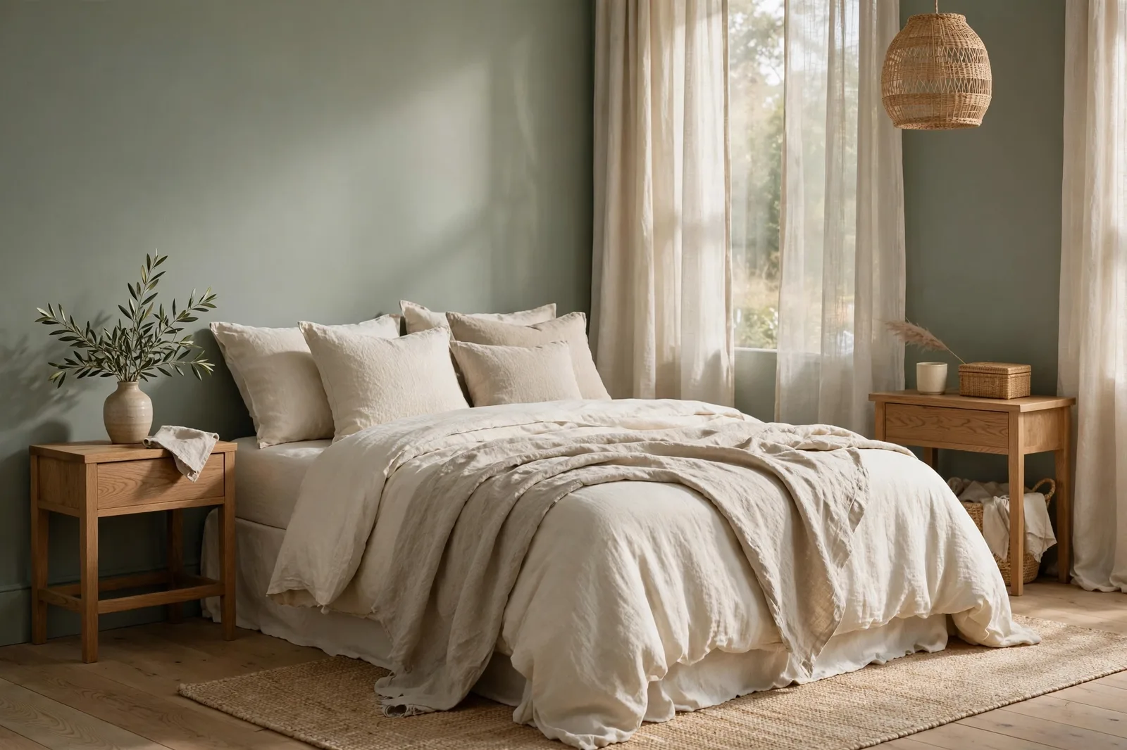
The most common mistake in a bedroom isn’t choosing a color that’s too bold, it’s choosing a palette so cautious it puts no one to sleep but the room itself. A bedroom painted in one flat, near-nothing neutral can feel less like a sanctuary and more like a waiting room: calm in theory, boring in practice. The good news is that “calm” and “interesting” are not opposites. The calmest bedrooms designers actually build share a specific formula, muted, low-contrast color as the base, layered with depth, texture, and pattern so the eye has somewhere to rest and something to notice. This guide walks through that formula: what “calm” really means in color, the five families that deliver it (soft blues, sage greens, warm whites, soft mauves and lavenders, warm greiges), why stark white bedrooms fail, the layering techniques that keep muted palettes alive, and the undertone agreement rule that makes it all cohere. Colors shift with lighting, surface, and sheen, so always test a large physical sample in your own space, especially in your evening lamplight, before committing. Sherwin-Williams and Benjamin Moore color names appear as widely-known designer references only; The Global Abode is an independent brand, not affiliated with or endorsed by either company.
What “Calm” Actually Means in Color
“Calm” is not a color, it’s a set of color properties. Once you know the properties, you can find calm in almost any hue family, which is why one person’s serene bedroom is soft blue and another’s is warm greige. Color psychologists and designers converge on the same three qualities: muted saturation, low contrast, and gentle temperature.
Muted saturation is the big one. Research consistently links saturated, high-intensity colors, bright reds, vivid yellows, electric tones, with alertness and elevated heart rate, which is the opposite of what a bedroom is for. Soft, grayed-down versions of hues promote calm instead. A color psychology note worth keeping: saturation matters more than hue. A bright, saturated blue can be more stimulating than a soft, muted terracotta. So the calm question isn’t really “which hue?”, it’s “how muted is it?” The calmest bedrooms live in the muted middle of the fan deck, wherever their hue happens to be.
Low contrast is the quieter property. A bedroom where the walls, trim, and bedding sit close together in value, all light, or all mid-tone, feels restful because the eye isn’t being asked to adjust constantly. High-contrast combinations (black and white, deep navy with bright white) are visually stimulating even when each color is “neutral.” This is why the tonal bedroom, everything in one family, stepping gently from light to mid, reads as serene almost by default. The eye moves slowly across low-contrast surfaces, and slowness is what calm feels like.
Gentle temperature is about avoiding extremes. Icy, blue-cast palettes can feel cold and distant rather than restful; fiery, orange-cast palettes can feel energizing rather than soothing. The calmest bedrooms usually sit near the warm-cool middle, warm whites rather than blue-whites, soft blues with gray in them rather than icy blues, warm greiges rather than cool charcoals. That doesn’t mean a bedroom can’t lean cool (soft blue is a classic calm choice), it means the cool should be softened, and paired with warm companions so the room doesn’t feel like a refrigerator.
Put together: a calm bedroom color is muted, low-contrast with its surroundings, and gentle in temperature. That definition covers the soft blue, the sage green, the warm white, the dusty mauve, and the warm greige, and it explains why they all work while a saturated jewel tone or a stark white doesn’t. Keep this definition handy through the rest of the guide; it’s the test every color below has to pass.
The Five Calm Families, Honestly Compared
Designers reach for five families when a bedroom needs to exhale. Each delivers calm through a different route, and each has its own failure mode. The table below compares them on what kind of calm they give and what to watch for, with widely-reported designer color picks in each family.
| Family | Best colors | The calm it gives | Watch out for |
|---|---|---|---|
| Soft blues | Sea Salt SW 6204 (SW), Rainwashed SW 6211 (SW), soft misty blues with gray undertones | Expansive and serene, cool hues recede visually, making the room feel airier and composed | Can read chilly or melancholy in north light or with cool bulbs; pair with warm textiles and wood |
| Sage greens | Clary Sage SW 6178 (SW), October Mist 1495 (BM), Retreat SW 6207 (SW) | Grounding and natural, green is associated with nature, which reads as safety and renewal | Shifts with neighbors: greener next to warm wood, grayer next to cool finishes; verify against your floor |
| Warm whites | White Dove OC-17 (BM), Alabaster SW 7008 (SW), Swiss Coffee OC-45 (BM) | Clean and cocooning, visual simplicity without the coldness of stark white | Needs texture to avoid blandness; goes creamier than expected in south sun |
| Soft mauves & lavenders | Dusty lavender and mauve tones, grayed rather than purple | Gentle and romantic, the softest personality of the five, with a whisper of color | The easiest to get wrong: too saturated and it energizes; too pink and it dates; keep it grayed and quiet |
| Warm greiges | Edgecomb Gray HC-173 (BM), Accessible Beige SW 7036 (SW), Balboa Mist OC-27 (BM) | Enveloping and timeless, warmth with substance, the most forgiving family | Can read heavy or tan in dim rooms; needs decent light to show warmth instead of weight |
A few notes on choosing between them:
Soft blues are the classic calm answer for a reason, color psychology research points to muted blues as uniquely suited to relaxation and restful sleep, and designers reach for them in spas for exactly that quality. But “soft” is doing all the work. Icy blues and bold teals don’t calm; the gray-mist blues do. And a blue bedroom needs its warmth elsewhere: wood floors, warm lamps, cream bedding. A blue room with nothing warm in it can feel sad rather than serene, the difference is in the companions, not the wall.
Sage greens are the rising answer, the “first color” for people who thought they only liked neutrals. The gray mixed into every true sage is what makes it behave: muted enough to live with for years, green enough to make the room feel alive. Research on green tones suggests they may lower heart rate and anxiety, and the nature association does real psychological work. Sage is also the most light-responsive of the five, it changes most through the day, which is either its charm or its complication depending on your temperament.
Warm whites are the safe answer that isn’t actually plain, warm whites give the bedroom visual simplicity and a sense of openness while the warm undertones keep it cozy. They’re the most forgiving family for small rooms, north rooms, and renters. The catch is the blandness trap this whole guide is about: a warm white room with nothing layered over it is the most common “calm but boring” bedroom in existence. Warm white is a starting point, not a finished room.
Soft mauves and lavenders are the personality answer, the family for someone who wants their calm to have a point of view. Kept grayed and dusty, they’re genuinely restful; they read as a neutral with a secret. But they’re the least forgiving: push the saturation up even slightly and the calm breaks. Sample carefully, in your evening light, because mauve’s pink thread is most visible after dark.
Warm greiges are the enveloping answer, more substance than white, more warmth than gray, and the most forgiving family when you’re unsure. Accessible Beige and Edgecomb Gray are the workhorses: they hold their warmth in tricky light, they coordinate with almost any bedding, and they age gracefully. The trade is light: they’re the deepest of the calm families, so they ask the most of your windows.
Why Stark White Bedrooms Fail (and the Warm-White Fix)
The stark white bedroom looks serene in photographs. In real life, at 7pm, under your lamps, it often feels like a dental office, bright, hard, and oddly alert. Designers consistently flag stark, brilliant white as one of the worst bedroom choices: it lacks the warmth and depth a restful space needs, and it can feel clinical and cold rather than cozy. The problem isn’t whiteness, it’s starkness. A white with no undertone has nothing for the eye to settle into, and a bedroom should be the easiest room in the house to settle into.
There’s also a contrast problem. Stark white walls next to stark white trim next to stark white bedding isn’t low-contrast calm, it’s a glare field. The eye reads all that unbroken brightness as stimulation, not rest. And in dim light, stark white doesn’t stay white: it goes gray-blue and flat, the way snow looks at dusk. The room you photographed at noon is not the room you’re trying to sleep in.
The warm-white fix is simple: replace the stark white with a warm white that carries an undertone, White Dove’s gentle gray-muted warmth, Alabaster’s creaminess, Swiss Coffee’s golden softness. A warm white gives you everything you wanted from white (brightness, simplicity, spaciousness) plus the thing stark white withholds (warmth, depth, a reason to relax). It also solves the evening problem: warm whites stay warm and glowing under lamplight, where stark white turns cold.
Three rules make warm white work as a calm bedroom base:
1. Choose the warmth by your light. North-facing bedrooms want the warmer members (Alabaster, Swiss Coffee) to absorb the cool cast; south-facing bedrooms can carry the cleaner ones (White Dove) without going stark. The exposure decides the undertone, this is the same rule as everywhere else, applied with extra care because bedrooms are so light-sensitive.
2. Break up the white. A warm white bedroom fails when everything is warm white. The walls can be warm white, but the bedding should step somewhere, a shade deeper, a shade warmer, a texture with visible weave. Wood furniture, a patterned rug, a deeper headboard: these are what keep a white room from being a white box. Section 4 is the full playbook.
3. Warm the light to match. Warm whites under cool daylight-balanced bulbs (4000K+) lose their warmth and turn flat, the bulb is fighting the paint. Bedrooms want 2700K–3000K warm bulbs as a rule, and warm-white walls want them especially. The bulb and the wall are one decision.
Layering Interest Without Color: Depth, Texture, Pattern, Wood
This is the section that answers the article’s real question: how does a calm bedroom avoid being bland? The answer is that calm is a property of the palette, and interest is a property of the layers. You can keep the palette fully muted, every color grayed, every contrast low, and still build a room with enormous visual richness, because richness comes from four things that have nothing to do with saturation.
Depth: the tonal step. The single most effective anti-bland move is stepping the palette in value: walls in the light version of the family, bedding a step deeper, the headboard or one wall two steps deeper. A soft blue room with a deeper slate-blue upholstered headboard. A sage room with an Evergreen Fog-colored throw and deep green velvet cushions. A warm white room with greige bedding and a walnut headboard. These are all still calm, muted, low-contrast, gentle, but they have dimension, and dimension is what separates “designed” from “empty.” The rule: stay in the same family, move in depth.
Texture: the light-catcher. Texture is how a muted room stays interesting in changing light. Linen bedding with visible weave, a chunky knit throw, a bouclé accent chair, a jute or wool rug, grasscloth or limewash on one wall, each texture catches light differently through the day, so the room subtly changes from morning to evening without any color doing the work. A flat, smooth, matte-everything room in one muted color is what reads as bland; the same color with four textures reads as layered and intentional. Texture is the cheapest form of visual interest, and bedrooms are the best room for it, because bedding and soft furnishings are texture by nature.
Pattern: the quiet one. Calm rooms can take pattern, they just need it quiet. A small-scale floral or stripe on the duvet in tones of the wall color. A rug with a faded, low-contrast pattern. Curtains with a subtle weave pattern. The rule for pattern in a calm bedroom: it should be readable only from a few feet away. If you can see the pattern clearly from the doorway, it’s too loud for the palette. Pattern at whisper volume adds the visual complexity that keeps a muted room from feeling flat.
Wood: the warmth anchor. Natural wood is the calm bedroom’s best friend across all five families. It adds warmth (balancing the cool families), depth (balancing the white families), and organic variation (balancing everything). Oak nightstands in a blue room, a walnut headboard in a warm white room, a rattan bench in a sage room, wood is the element that makes a muted palette feel like a home rather than a palette. Even painted furniture benefits from one wood element somewhere; it’s the texture the eye trusts most.
The layering checklist, run this before calling the room done:
1. Is there a deeper tone somewhere (headboard, throw, one wall) stepping down from the wall color?
2. Are there at least three textures (bedding weave, throw, rug, curtains)?
3. Is there one quiet pattern, visible up close but calm from the door?
4. Is there natural wood somewhere in the room?
5. Is there one living element, a plant, fresh flowers, a bowl of something natural?
A “yes” to four of the five means the room will read as calm and complete. A “no” to three or more means the room is probably the bland kind of calm, and the fix is layers, not a bolder wall color.
The Undertone Agreement Rule: Walls, Bedding, Trim, Floors
Here’s the rule that makes or breaks every calm bedroom: every large surface in the room must agree on warm vs. cool. Undertone disagreement is the silent killer of serene rooms. A warm greige wall with cool blue-gray bedding, a soft blue wall with warm golden oak floors and nothing to bridge them, a warm white wall with a cool white ceiling, each mismatch is small, but together they create a low-level visual static that the nervous system reads as not calm. You can’t quite name what’s wrong; the room just doesn’t exhale.
The rule applies in a specific order, from hardest to change to easiest:
Floors vote first. Your floors are the room’s largest fixed surface and its undertone anchor. Warm oak or honey-toned wood floors want the warm side of every family: warm whites over cool whites, warm-leaning sages (Clary Sage) over cool ones, warm greiges over cool grays. Cool gray floors or pale ash want the cooler side: misty blues, cool-leaning sages, soft cool grays. If your floors are warm and your heart is set on a blue bedroom, bridge with a warm rug under the bed, the rug mediates between the cool wall and the warm floor.
Walls vote second. Choose the wall color from the family member that agrees with the floor. This is where the family tables in section 2 do their real work: don’t just pick “sage”, pick the sage whose temperature matches your floors.
Bedding votes third, and it’s the swing vote. Bedding covers a huge visual area in a bedroom, and it’s the easiest thing to get wrong because it’s bought separately from the paint. The most common calm-bedroom failure after stark white is bedding that fights the wall: cool gray sheets against a warm beige wall, bright white duvet against a soft blue wall with nothing bridging the contrast. The fix: buy bedding in the same temperature family as the wall, stepping gently in depth. A warm white wall wants cream, ivory, or warm greige bedding, not blue-white. A soft blue wall wants blue-gray, misty, or warm-white-with-blue-undertones bedding, not golden cream.
Trim and ceiling vote last. Keep the trim consistent with the whole house (one trim white everywhere is the flow rule), but make sure it’s not fighting the bedroom: a warm bedroom with a stark cool-white trim will have a visible cold frame around every warm surface. If your house trim is a warm white (White Dove) and your bedroom is a soft blue, the combination works, the trim is warm-neutral enough to bridge. If your house trim is a cool, crisp white and your bedroom is warm greige, consider whether the bedroom wants its trim softened. The ceiling should be the trim white or the wall color in flat, never a competing fourth white.
Light and Sheen for Bedrooms: Mornings, Evenings, Finishes
Bedrooms are judged in two lights, the morning you wake up in and the evening you wind down in, and a calm color has to survive both. This section is the practical half: orientation, bulbs, and sheen.
Morning light: the wake-up test. East-facing bedrooms get warm, direct morning sun, beautiful, but it amplifies every warm undertone. A warm greige that looked perfect at noon can read surprisingly golden at 7am. West-facing bedrooms get cool, indirect morning light, the calmest morning light, and the most forgiving for the warm families. North-facing bedrooms get cool, flat morning light all day: this is the exposure that most needs the warm families, and the one where cool blues and grays are riskiest. South-facing bedrooms get bright, warm light that flatters everything but can over-warm the warmest colors, step one notch cooler on your shortlist if the room is very bright.
Evening light: the verdict. Bedrooms are evening rooms, the color you fall asleep with is the lamplight version, not the daylight version. Every finalist must be judged under your actual evening lamps, because undertones surface after dark: the pink thread in a mauve, the green note in a sage, the blue cast in a gray. Warm 2700K–3000K bulbs are the bedroom standard for a reason, they flatter every calm family, keep warm colors glowing, and don’t suppress the melatonin response the way cool daylight bulbs can. If your bedroom currently has cool white bulbs, changing them is the single highest-leverage calm upgrade you can make, more impactful than repainting.
Sheen: matte and eggshell, nothing shinier. Bedrooms want the flattest practical sheen. Matte or flat on the walls gives the softest, most light-absorbing finish, the visual equivalent of a whisper, and it hides wall imperfections, which matters in bedrooms with big, lamp-lit walls. Eggshell is the practical alternative: slightly more wipeable, slightly more sheen, still calm. Never go above eggshell on bedroom walls, satin and semi-gloss reflect lamplight in ways that energize the room, which is the opposite of the brief. Trim in semi-gloss (the house standard), ceiling in flat. And test your finalist in the actual sheen: flatter sheens read slightly lighter and softer than the same color in eggshell.
The bedroom sampling protocol: paint large boards (2×2 feet, two coats, your actual sheen), prop one on the wall opposite the window and one on the darkest wall, and check at three moments that matter for bedrooms specifically, morning wake-up light, late afternoon, and 9pm under your evening lamps with the overheads off. The 9pm check is the one that predicts whether the room will feel calm when it counts. Photograph the boards from the bed, that’s the view you’ll wake up to. Then commit.
Building the bedroom palette is step one, coordinating the whole home is the project.
The Whole Home Paint Guide is a complete, ready-to-use color system, anchor neutrals, gentle color moments, trim and ceiling pairings, all with undertones already coordinated, so your calm bedroom lands in a house designed to hold it. And the Paint Color Workbook includes room-by-room sampling checklists and undertone-testing worksheets for choosing between finalists with evidence, not guesswork.
Frequently asked questions
Muted, grayed-down blues and greens top most lists, soft misty blues and dusty sages are consistently rated as the most restful, with research linking cool muted tones to lower stress responses. But the “most relaxing” color is the muted one that agrees with your light and finishes: a soft blue in a north room with cool bulbs can feel melancholy, while a warm greige in the same room feels enveloping. Pick the calm family first (section 2), then the member that matches your exposure. Our 48-hour sampling method is how you confirm it in your own light.
Warm whites, White Dove or Alabaster, bounce the most light and keep the room feeling open while staying cozy. Keep the trim the same white in a different sheen so there are no visual stops, and keep the ceiling bright. Avoid the deeper calm colors (mid-tone sages, warm greiges) in small, dim bedrooms: they absorb light and the room closes in. See how light changes paint color for the orientation rules.
Yes, dark and calm are not opposites, but dark needs the layering rules more, not less. A deep, muted color (a moody sage like Evergreen Fog, a deep warm charcoal) can feel deeply restful, cocooning, even, as long as the saturation stays muted, the contrast stays low (deep bedding, deep headboard, tonal layers), and the lighting is warm and layered. What makes dark bedrooms fail is dark plus stark: dark walls with bright white bedding and cool bulbs is stimulating, not serene. Dark calm wants tonal depth and warm light.
The warm families: warm whites (Alabaster, White Dove) or warm greiges (Accessible Beige, Edgecomb Gray), they absorb the cool, indirect light and keep the room feeling clean and cozy rather than cold. Avoid the cool calm families (icy blues, cool grays) in north bedrooms unless you warm the bulbs to 2700K and add warm textiles and wood to compensate. And test on a large board at 9pm: north rooms are where cool colors reveal their chill.
You can, the headboard wall is the natural candidate, but keep it in the family. An accent wall works in a calm bedroom when it’s a deeper step of the same muted color (two shades deeper, same undertone), not a contrasting hue. A soft blue room with a deeper slate-blue headboard wall is still calm; a soft blue room with a terracotta accent wall is a different room entirely. And never do an accent wall in a near-neighbor of the main color, the accent should be visibly deeper or it’s a mistake.
Yes, and it’s one of the best anti-bland moves available. Calm walls with a patterned or deeper-toned duvet give you the interest without repainting, and bedding is the easiest thing in the room to change. The rule: keep the bedding’s undertone in agreement with the walls (section 5), and keep one calm element large, if the duvet is bold, the walls, rug, and curtains stay quiet. Bold bedding on calm walls is a feature; bold bedding on bold walls is a different design brief.

