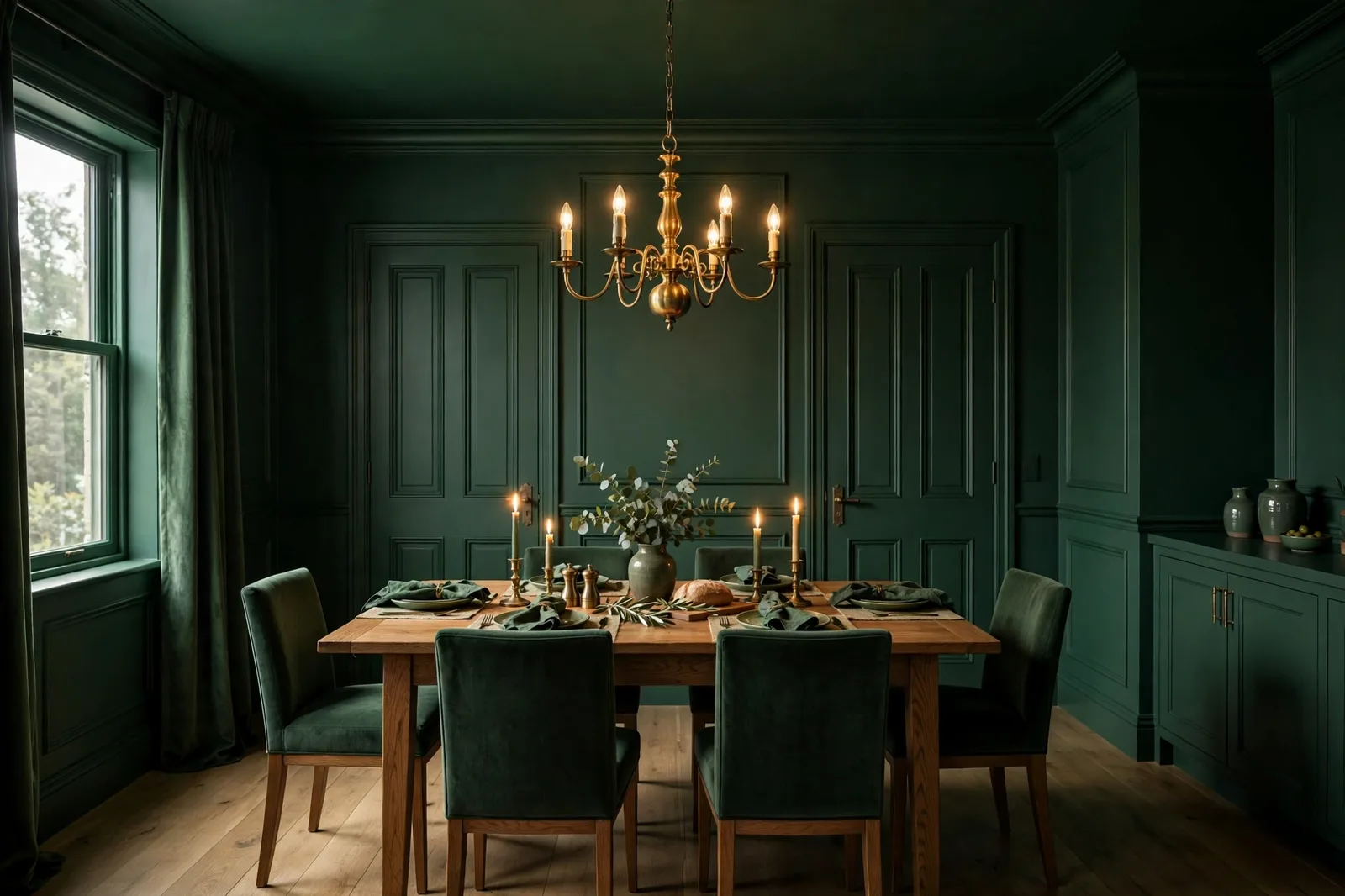
There is a painting move that sounds like a mistake and looks like a masterstroke: covering the walls, the trim, the doors, and the ceiling in one single color. No white baseboards. No crisp ceiling line. No contrast anywhere. Designers call it color drenching, and it has quietly become one of the most useful techniques in the whole-home color playbook, a way to make small rooms feel enveloping rather than cramped, to turn awkward architecture into atmosphere, and to give a single room the confident, finished feeling that usually takes a full palette to achieve. But it is also easy to get wrong: the wrong color, the wrong room, or the wrong sheen turns a bold statement into a flat, heavy box. This guide walks through the technique properly, what color drenching is and is not, why it works, which colors and rooms suit it, the sheen secrets that keep it from going flat, and how one drenched room connects to the rest of your home. Paint colors shift with lighting, surface, and sheen, so always test a large physical sample in your own space, in your own light, before committing, screen swatches are approximations. The Global Abode is an independent publication, not affiliated with or endorsed by Sherwin-Williams or Benjamin Moore; all color names and codes are referenced as widely-known designer examples.
Key takeaway: Color drenching means painting the walls, trim, doors, and ceiling in one color family, dissolving the visual boundaries that make a room read as a box. It works because the eye stops detecting edges and starts reading atmosphere: cocooning, intimate, intentional. It suits rooms with a door and a purpose, dining rooms, studies, powder rooms, bedrooms, especially in deep greens, charcoals, warm taupes, and muted jewel tones. It fails with overly bright or neon colors, with flat sheen on every surface, and in rooms where the light cannot support the color. Undertone and sheen notes below are widely-reported designer observations, not exact manufacturer specifications.
What Color Drenching Is, and What It Isn’t
The definition is simple: color drenching means painting the walls, trim, baseboards, doors, and ceiling of a room in the same color. Not a coordinated palette. Not a wall color with white trim. One color, wrapped around the entire room, every surface that paint can reach, in one continuous envelope of hue. The term itself is new, but the technique is old: designers have been dissolving room boundaries with monochrome treatments for decades, long before the name trended.
What it is not matters just as much. It is not an accent wall. An accent wall is one wall painted differently from the others, a single moment of contrast, designed to draw the eye to a focal point. Color drenching is the opposite philosophy: instead of one wall standing out, no wall stands out. The eye has nowhere to land, so it relaxes, and the room reads as atmosphere rather than architecture. Where an accent wall says look at this, a drenched room says be here.
It is not the envelope technique either, though they are cousins. The envelope technique (carrying the wall color onto the ceiling in a small room) dissolves one boundary: the wall-ceiling line. Color drenching goes further, dissolving every boundary in the room: trim, doors, moldings, all absorbed into the same color. The envelope technique is a small-room trick; color drenching is a full-room commitment. Our small-room colors guide covers the envelope method in detail, this guide is about taking the idea all the way.
And one important nuance: color drenching does not require the exact same paint can on every surface. Most professionally drenched rooms use the same color family with subtle variations, a slightly lighter tint on the ceiling, the same color in a different sheen on the trim, rather than one literal gallon everywhere. The effect is monochrome, but the execution is layered. The rule is not “one can”; it is “one family, no contrast breaks.” Understanding that distinction is the difference between a drenched room that looks rich and one that looks like it was painted by accident.
Tip: Before you commit to drenching a room, photograph it and look at the photo rather than the room itself. The camera flattens the space the way your eye will flatten it once the boundaries dissolve, and it reveals whether the room has enough architectural interest (moldings, a fireplace, built-ins) to carry the color, or whether it will read as a featureless box.
Why It Works: The Psychology of the Envelope
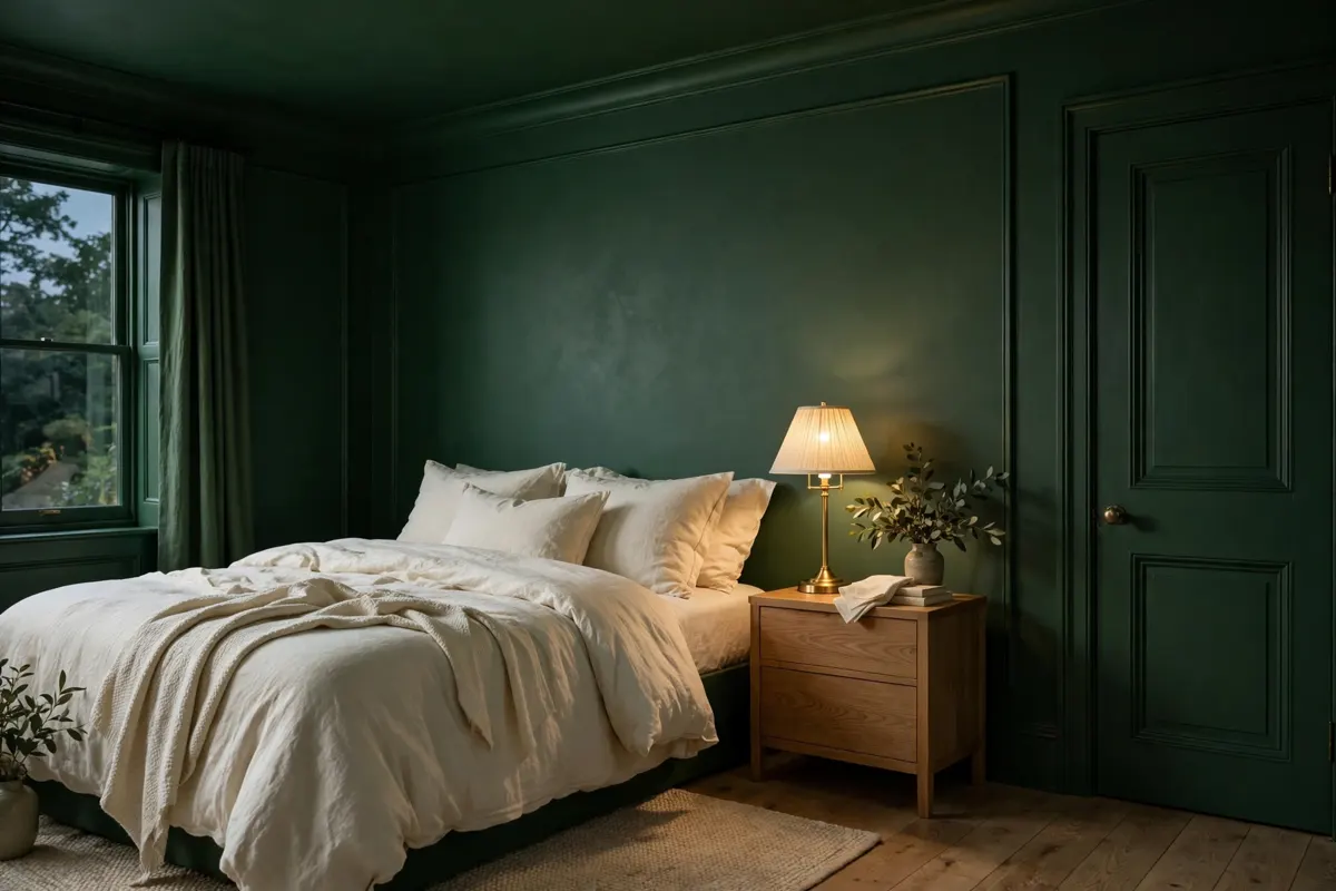
To understand color drenching, you have to understand what the eye does in a normally painted room. In a standard room, colored walls, white trim, white ceiling, the eye is constantly detecting boundaries: the line where wall meets trim, the line where wall meets ceiling, the frame around every door and window. Each boundary is a small piece of visual information, and the brain processes the room as a collection of edges: a box, measured and subdivided. That subdivision is useful in a large, bright room. In a small or awkward room, it is a liability, every edge announces the room’s limits.
Color drenching removes the edges. When the trim, walls, and ceiling are one color, the eye cannot find where one surface ends and the next begins. The brain stops measuring and starts feeling, and what it feels is enclosure without confinement. Designers describe the effect as cocooning: the room wraps around you instead of boxing you in. Corners soften. The ceiling feels less like a lid and more like a continuation. Awkward angles, sloped ceilings, odd nooks, strange bulkheads, stop reading as problems and start reading as character, because the color turns architectural quirks into sculptural moments.
There is also a light effect at work. A white ceiling reflects light downward and creates a bright “lid” that emphasizes the room’s height limits, the eye sees the white plane and registers exactly where the room ends. A drenched ceiling absorbs or softly reflects that same light within the color family, so the ceiling recedes rather than announces itself. The room feels less tall on a measuring tape and more infinite to the eye. This is why color drenching so often enlarges the felt experience of a room, even in deep, dark colors, the boundaries dissolve, and with them the brain’s sense of the room’s exact dimensions.
The emotional register follows: drenched rooms feel intentional, intimate, and confident. A powder room drenched in deep green reads as a jewel box, deliberate, luxurious, complete. The same room with green walls and white trim reads as a small room that happens to be green. The color didn’t change; the conviction did. Color drenching is, at its core, a commitment device: it tells everyone who walks in that this room was decided, not decorated around.
Which Colors Drench Well, and Which Don’t
Not every color survives being spread across every surface. On a single wall, almost any color works, the surrounding white trim and ceiling forgive a lot. When the color has to carry the trim, the doors, and the ceiling too, its weaknesses are exposed at full scale. The colors that drench well share one trait: complexity. They have enough depth and nuance to stay interesting across a whole room. The colors that fail share the opposite: flatness, harshness, or a one-note intensity that becomes exhausting at full coverage.
Deep, muted greens. The most widely-referenced drenching colors in the design world, forest greens, deep olives, smoky sages like Evergreen Fog, work because they are naturally complex: green sits between blue and yellow, so it reads differently in different light, keeping the room alive through the day. A deep green drenched room feels organic and enveloping, especially with brass and warm wood. Designers widely describe green as the safest first drench: rich enough to feel intentional, natural enough to never feel harsh.
Warm charcoals and deep bronze neutrals. Warm charcoals, deep taupes, and bronze darks like Urbane Bronze are the sophisticated drenching neutrals, dark enough to dissolve boundaries, warm enough to avoid the coldness that true black or cool gray can bring. A warm charcoal drenched study reads as old-library confidence; a warm taupe drenched bedroom reads as calm and collected. The warmth is the key: it keeps the envelope from feeling like a cave.
Muted jewel tones. Deep navy, dusty teal, rich eggplant, warm terracotta, the jewel tones with gray or brown in them drench beautifully because they have the saturation to feel luxurious and the mutedness to avoid shouting. A navy drenched dining room is the classic: dramatic, intimate, timeless. The operative word is muted, a dusty, complex jewel tone, not a pure, electric one.
Soft, light drenching. Color drenching is not only for dark colors. Soft whites, warm creams, pale sages, and gentle plaster pinks drenched across a room create an airy, seamless envelope that makes small bright rooms feel larger and calmer, the boundaries dissolve into light rather than into mood. A light-drench is the choice when you want the spaciousness of all-white without the starkness: the single soft color wraps the room in warmth the way all-white never quite manages.
What to avoid. Overly bright or neon colors become overwhelming at full coverage, a vivid orange that charms on one wall feels like an assault on six surfaces. Pure, flat black shows every dust particle and paint imperfection and reads as a void rather than a color. And cool, flat grays, the popular greiges that look sophisticated on a single wall, can go dingy and lifeless when spread across ceiling and trim, where there is no white to rescue them. Designers widely caution that the gray that looked perfect with white trim may look tired without it. When in doubt, choose a color with a clear undertone, green, brown, blue, over a color with no undertone at all.
| Color family | Why it drenches well | Watch out for |
|---|---|---|
| Deep muted greens | Complex undertone reads differently in different light; organic, enveloping | Test in north-facing rooms, some greens flatten in cool light |
| Warm charcoals & bronze neutrals | Dark enough to dissolve boundaries, warm enough to avoid coldness | Needs layered warm lighting at night or it can go flat |
| Muted jewel tones | Saturated enough for luxury, muted enough to avoid shouting | Keep it dusty and complex, electric jewel tones overwhelm |
| Soft light neutrals | Dissolves boundaries into light; airy without all-white starkness | Choose warmth over starkness, flat cool whites can read clinical |
| Bright / neon colors | – | Overwhelming at full coverage; avoid |
| Flat cool grays | – | Can go dingy without white trim to contrast against; avoid |
Which Rooms Suit It, and Which Don’t
Color drenching does not work equally well in every room. The technique’s power comes from enclosure, and enclosure suits some rooms’ purposes beautifully and fights others. The rule of thumb designers cite most: drench the rooms with a door and a purpose, the contained spaces where atmosphere is the point, and be cautious in the rooms where light, function, or openness argue against it.
Powder rooms: the perfect first drench. If you want to try color drenching once, start here. A powder room is small, self-contained, and visited briefly, which means you can go bold without living inside the decision all day. Guests walk in and the color hits like a statement: deep green, navy, or a rich jewel tone turns the smallest room in the house into a jewel box. It is also the cheapest room to paint and the easiest to redo if you change your mind. Designers consistently name the powder room as drenching’s natural home.
Bedrooms: the cocooning case. The bedroom is the second-best drenching room, because the cocooning effect is exactly what a bedroom wants. Deep blues and greens promote rest; warm clays and blush tones feel nurturing; even rooms with sloped ceilings benefit, because the drenching turns architectural awkwardness into intimate charm. A drenched bedroom reads as a sanctuary, the whole room exhaling at once.
Dining rooms and studies: the drama rooms. Dining rooms used in the evening and studies used for focus are natural drenches: both are contained, both benefit from atmosphere, and both are rooms where a little drama is the point. A deep green or warm charcoal drenched dining room makes every dinner feel like an occasion; a drenched study reads as quiet authority, the color equivalent of a closed door.
Where to be cautious. Large, open-concept living areas are the main caution zone: drenching a big open space in one dark color can make it feel flat or lifeless, because there are no boundaries left to give the eye variety, the room becomes one unbroken volume with nothing to look at. Designers widely advise keeping large open areas in lighter, more varied palettes and reserving the drench for the pocket rooms. Kitchens are a second caution: the room’s function (food, cleanliness, task light) usually wants clarity more than cocooning, though a butler’s pantry or a small galley kitchen can drench beautifully. And low-light small rooms need care with dark drenching, a north-facing room with one small window drenched in deep charcoal can read as a cave unless the lighting is layered generously. The fix is not always a lighter color; it is enough light, in enough layers, to let the dark color show its complexity. Our room-exposure guide covers how light direction changes what a dark color can do.
Watch out: The most common drenching regret is choosing the color at noon and living with it at night. A deep color that reads rich and dimensional in daylight can flatten to near-black in a dim room after sunset, and in a drenched room, there is no white ceiling to rescue the light. Always sample your drenching color at the room’s darkest hour, under your actual evening bulbs, before committing to full coverage.
The Technique: Sheen Is the Secret
Here is what separates a professional-looking drenched room from a room that just looks painted one color: sheen variation. The most common beginner mistake is using the same flat finish on every surface. Without any contrast in color, the room has only one tool left for creating depth, how each surface reflects light, and a single flat sheen everywhere makes the room read as flat in every sense. The color is right; the room still looks wrong. The fix is to let the sheens do the work the colors used to do.
The widely-recommended formula: flat or matte on the ceiling, eggshell on the walls, satin or semi-gloss on the trim and doors. Each sheen reflects light slightly differently, so the moldings, door frames, and ceiling read as distinct surfaces even though they share the color, the architecture stays legible, but the color story stays unified. The trim in satin catches the light and defines the room’s edges subtly; the flat ceiling absorbs light and recedes; the eggshell walls sit in the middle with a soft, honest glow. It is the same color, experienced three ways.
Trim deserves special attention. In a drenched room, the trim is painted the wall color, but it should be painted in a durable enamel in satin or semi-gloss, not in the wall paint. Trim takes abuse: vacuum bumps, shoe scuffs, handprints around doors. A high-quality enamel in the same color gives you the monochrome look with the durability the trim needs. Designers consistently flag this as the detail that makes a drenched room livable rather than just photogenic.
The ceiling question. Including the ceiling is what makes color drenching color drenching rather than just dark walls. A white ceiling in an otherwise drenched room breaks the envelope instantly, it becomes a visible lid that makes the walls feel like they are closing in. When the ceiling carries the color, the room feels taller and more continuous. The standard choice is the wall color in flat, flat scatters light and hides the imperfections ceilings always have. One bold alternative designers use: the ceiling in a slightly lighter tint of the wall color (a 25–50% formula of the same hue), which keeps the envelope while lifting the ceiling a touch. And one dramatic alternative: a high-gloss ceiling in the drenched color, which reflects light downward like a mirror and can visually expand the room’s height, a trick that works especially well in small powder rooms.
Built-ins and doors. In a true drench, built-in bookcases, window seats, radiators, and interior doors all take the color too. This is what turns the room from “painted” to “designed”, the bookshelf that matches the walls stops being furniture and becomes architecture. The one surface to think twice about: the floor. Floors stay their own material in almost every drenched room; the wood or tile grounds the color and keeps the room from feeling like the inside of a paint can. The envelope is for the walls-up; the floor is the anchor.
Prep matters more than usual. A drenched room shows every flaw the white trim used to hide: uneven plaster, patched drywall, rough caulk lines. Because there is no contrasting trim to distract the eye, surface imperfections become visible in a way they never were. Skim-coat rough walls, sand the trim smooth, caulk cleanly, and use two full coats. The technique is simple; the execution has to be meticulous.
How One Drenched Room Connects to the Whole Home
The obvious question about color drenching: if the whole-home goal is flow and cohesion, doesn’t a room painted entirely one deep color break the system? The answer is no, but only if the drenched room follows the connection rules. A drenched room is not a rebellion against the palette; it is the palette’s boldest expression. The discipline that keeps it connected is the same temperature discipline that governs everything else.
The door rule. The rooms that drench best, powder rooms, studies, dining rooms, bedrooms, almost all have doors, and that is not a coincidence. A closed door is a boundary the eye respects: it lets the room inside have its own temperature logic and its own depth without arguing with the hallway. The drenched room’s color should still belong to the home’s undertone family, a warm home gets a warm drenched room, a cool home gets a cool one, but the depth is the room’s own. The door is what makes the depth possible. This is why drenching works so poorly in open plans: without the door, there is no boundary, and the deep color has nowhere to be deep within.
Sightlines and thresholds. Even with a door, the drenched room is usually glimpsed from the hallway, the door stands open, the color shows through. The hallway’s job is to be the calm bridge, and a drenched room visible through an open door is the reward at the end of the bridge: the calm neutral hallway makes the deep green study beyond it feel even richer by contrast. The two need each other. A hallway in the anchor neutral and a study drenched in deep green read as one designed sequence; the contrast is the design. Our color flow framework covers this bridge-and-destination structure in full.
Temperature agreement, depth freedom. The precise rule: the drenched room’s color must agree in temperature with the home’s palette, but it is free in depth. A warm greige home can hold a deep warm green drenched dining room; it cannot comfortably hold a drenched icy blue-gray, because the temperature argues through the open door. Within the family, go as deep as the room’s light allows. The drenched room is where the palette shows its range, the moment of richness that makes the calm rooms feel calmer by contrast. The calm needs the drama to read as a choice rather than a default.
One drenched room per sightline. A final discipline: don’t drench adjacent rooms in competing deep colors. One drenched room visible from the hallway is a destination; two drenched rooms side by side is a theme park. If the study is drenched in deep green, the bedroom down the hall should be calm, the house needs its quiet rooms to make the bold room feel bold. Restraint in the neighbors is what gives the drenched room its power.
And when you are ready to choose the color, the sampling discipline is non-negotiable: test large, at least two square feet on two walls, at morning, midday, and evening, under your actual bulbs, next to the fixed finishes. In a drenched room, the color is the room, so the sample has to be judged as a room, not as a chip. Our 48-hour sampling method walks through the full protocol.
Ready to commit to a color, for the whole room?
The Whole Home Paint Guide is a complete, ready-to-use color system, anchor neutrals, trim and ceiling pairings, accent colors, all with undertones already coordinated, so your drenched room’s deep color belongs to the same temperature story as the calm rooms around it. And the Paint Color Workbook includes room-by-room worksheets and a finish-inventory checklist for choosing a drenching color that agrees with your floors, stone, and light.
Frequently asked questions
Color drenching is the technique of painting a room’s walls, trim, baseboards, doors, and ceiling in the same color, dissolving the visual boundaries that make a room read as a box. The eye stops detecting edges and starts reading atmosphere: cocooning, intimate, intentional. It does not require the exact same paint can on every surface; most professional drenches use the same color family in different sheens (flat ceiling, eggshell walls, satin trim) for depth without contrast.
It generally makes rooms feel bigger, even in dark colors. When every surface is the same color, the eye cannot detect where the walls end and the ceiling begins, the boundaries dissolve and the space reads as one continuous volume instead of a box with visible edges. Light drenching creates airy spaciousness; dark drenching creates an intimate cocoon that still feels cohesive rather than cramped. The effect fails only when the color is wrong for the room’s light, a dark drench in a very dim room needs layered lighting to show its complexity.
They are opposite philosophies. An accent wall paints one wall differently to create a focal point, it says look at this. Color drenching paints every surface the same to remove focal points entirely, it says be here. An accent wall adds contrast and visual information; drenching removes contrast so the room reads as pure atmosphere. Designers increasingly prefer drenching over accent walls because a single dark wall surrounded by white trim can make a room’s boundaries more visible, not less.
Yes, the ceiling is the most important surface to include. A white ceiling in an otherwise drenched room breaks the envelope instantly, creating a visible lid that makes the walls feel like they are closing in. When the ceiling carries the color (usually in flat), the room feels taller and more continuous because there is no hard line where the wall stops. The one common variation: the ceiling in a slightly lighter tint of the wall color, which keeps the envelope while lifting the ceiling a touch.
Avoid overly bright or neon colors, they become overwhelming across every surface. Avoid pure flat black, which shows every imperfection and reads as a void. And be cautious with flat cool grays: the popular greiges that look sophisticated on a single wall can go dingy and lifeless when spread across ceiling and trim with no white to contrast against. The safest drenches use colors with clear, complex undertones, deep greens, warm charcoals, muted jewel tones, rather than colors with no undertone at all.
Yes, small rooms are some of the best drenching candidates, because dissolving the boundaries makes them feel larger and more intentional. Dark rooms need more care: a deep color in a dim room can flatten to near-black without enough light, so layer your lighting generously (overhead, lamps, warm 2700K–3000K bulbs) and always sample the color at the room’s darkest hour before committing. In very dim small rooms, consider a lighter drench, a soft warm neutral across every surface, which gives you the seamless envelope with none of the cave risk. See our small-room colors guide for the full method.

