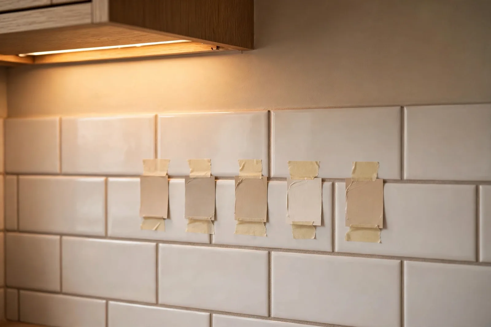
Tile is the one finish you cannot easily change. Repainting a wall takes a weekend and a gallon of paint; retiling a backsplash or a shower means demolition, dust, and a real budget. That is why designers work the color equation in one direction only: tile first, paint second. The tile is the boss of the palette, and the wall color is hired to support it. Learn to read your tile’s undertone, respect the fixed-finish hierarchy, and choosing kitchen and bathroom paint stops feeling like a gamble.
A quick word before you choose: paint colors shift with lighting, surface, and sheen, always test a large physical sample in your own space before committing. The Global Abode is an independent publication, not affiliated with or endorsed by Sherwin-Williams or Benjamin Moore; color names and codes referenced here are widely-known designer examples, and undertone notes are widely-reported designer observations rather than exact manufacturer data.
Key takeaway: Fixed finishes set the palette. Read the undertone in your tile first, warm (creamy, peachy, beige) or cool (gray, blue, true white), then choose a wall paint that shares that temperature. The backsplash is the bridge between countertops and walls, grout reads as part of the tile field, and every candidate must be sampled against the actual tile in the room’s own light.
Tile is the boss: the fixed-finish hierarchy
Every room has finishes that are permanent and finishes that are changeable, and every color conflict in a home can be traced to treating them as equals. Tile, on the backsplash, the shower walls, the bathroom floor, belongs to the permanent camp along with stone countertops, and paint belongs to the flexible camp. Once you sort every surface into these two groups, the decision order becomes obvious: choose, or work around, the permanent things first, and let paint do the adapting.
This is the principle professional designers repeat almost word for word: tile comes with unique undertones, variations, and textures that are fixed, so it is far simpler to custom-match a paint color to the tile than to find a tile that perfectly matches a pre-selected paint. Tile is often the most expensive finish in the space and the visual focal point, so it earns the first decision. Paint, with thousands of mixable colors, is the most accommodating finish in the room, it is the one material that can be tuned to agree with everything else.
The practical hierarchy runs like this: tile and stone first, then cabinetry, then paint. If your kitchen is already built, read the chain backward, look at the tile and countertop, note their shared temperature, and bring paint into line with them. If you are renovating and selecting finishes in sequence, pick tile before paint every time. This is also how you keep a whole home cohesive: the fixed finishes vary from room to room, but a consistent method of responding to them keeps the house feeling intentional. Our guide to choosing a whole-home paint palette covers how this room-by-room reading connects into one flowing scheme.
One more reason to let tile lead: paint next to tile is judged differently than paint on a swatch. A wall color sits inches from a glazed surface that reflects light and carries its own strong undertone, and the two surfaces are read together as one field of color. A warm greige that looked perfect in the paint aisle can suddenly look muddy next to cool gray-veined marble, not because the paint is wrong but because the pairing was never tested. Tile sets the terms; paint signs the agreement.
How to read your tile’s undertone
Undertone is the quiet color hiding beneath the obvious one, the whisper of yellow under a cream tile, the breath of blue under a gray one. It is also the single biggest cause of paint-and-tile clashes, because people choose by the loud color and ignore the quiet one. To read your tile’s undertone, pull a few paint chips in plain warm white, cool white, and gray, and hold each one against the tile in daylight. The chip that makes the tile look calm and settled shares its undertone; the chip that makes the tile look dirty, pink, or green is fighting it.
White subway tile is the classic test case. Widely-reported designer observations note that most white subway tiles lean either warm (creamy, with a yellow or beige cast) or cool (crisp, with a faint gray or blue cast), and handmade or crackle-glazed versions add variation from tile to tile. A warm subway tile asks for wall paint with a compatible warmth, soft whites, warm greiges, gentle creams, while a cool, crisp subway tile sits more comfortably with cooler or truly neutral walls. The tile itself tells you which family it belongs to; your job is to listen.
Gray-veined stone and marble-look tile carry their own temperature, and the veining is the giveaway. Veins that read brown, taupe, or gold signal a warm stone; veins that read charcoal, steel, or blue-gray signal a cool one. Colored tile is more direct, handmade zellige in green or blue, terracotta, deep navy, but even there the undertone matters, because the paint should echo the tile’s temperature rather than compete with its color. Our full primer on paint undertones explained walks through the comparison method in detail if you want to practice on paint chips first.
The table below summarizes the most common tile situations and the paint direction each one points toward. Treat it as a starting compass, not a prescription, every tile installation varies, which is why the sampling protocol in section 6 is non-negotiable.
| Tile situation | What to look for | Paint direction |
|---|---|---|
| Warm white or cream subway tile | Yellow or beige cast in the glaze, especially in daylight | Warm whites, warm greiges, soft creams that share the warmth |
| Cool white or gray-veined tile | Gray, blue, or steel cast; charcoal or blue-gray veining | Crisp or cool-leaning whites, soft grays, gentle cool neutrals |
| Beige, travertine, or pink-cast tile | Peach, pink, or tan undertones in the body of the tile | Warm neutrals with a whisper of pink or peach, warm taupes |
| Handmade or zellige tile | Variation tile to tile; glaze pools that shift color in the light | Muted, desaturated colors pulled from the tile’s quietest tone |
| Bold colored or patterned tile | The tile’s dominant color and its temperature | Quiet neutrals in the same temperature family; let the tile star |
| Large-format neutral tile | The undertone of the field color, revealed by grout lines | Wall color matched to the tile’s temperature, slightly lighter or deeper for contrast |
Kitchen tile + wall color: the backsplash bridge
In the kitchen, the backsplash is the bridge between two fixed finishes, the countertop below and the wall paint around it, and it touches both. That makes it the most useful diagnostic surface in the room. Stand back and read the backsplash together with the countertop: do they share a warm, creamy temperature, or a cool, gray one? The wall paint then joins the family they have already formed. A kitchen where the backsplash and counters agree on warmth will reject a cool, blue-gray wall no matter how beautiful that color looked on its own.
Cabinets complicate the picture, but the same rule holds: fixed finishes outrank paint. Read the undertone chain from the most permanent surface outward, countertop, then backsplash tile, then cabinet finish, and choose wall paint that agrees with the consensus. Our guide to kitchen wall colors for cabinets and countertops maps the full three-way relationship if your kitchen has strong cabinet color in the mix.
For the classic white-subway-backsplash kitchen, the decision is rarely about whether white tile “goes with” a color, it is about which white the tile actually is. Designers widely report that creamy subway tile paired with a stark, cool white wall makes the tile look dingy by comparison, while the same tile next to a warm, soft white looks intentional and clean. When the backsplash is the star, handmade tile, a bold color, an interesting pattern, the wall paint should step back into a quiet supporting role in the same temperature family, so the eye has somewhere to rest.
Designer trick: Use the backsplash as your paint-chip holder. Tape candidate chips directly to the tile (not the wall) and step back to the doorway. The chip that disappears into the scheme, looking like it was always part of the kitchen, is the winner. The chip that shouts is the one to discard, however much you loved it in the store.
Small kitchens benefit from keeping the wall color close in value to the tile: low contrast between backsplash and walls makes the room read larger and calmer. In larger kitchens with plenty of wall area above the backsplash, you can afford more contrast, a deeper tone on the walls can frame a light backsplash beautifully, as long as the temperature still agrees. Either way, test in the kitchen’s actual light, because under-cabinet lighting and pendant bulbs shift everything.
Bathroom tile + wall color: the grout factor
Bathrooms add a variable kitchens rarely have: the grout. Grout is not background noise, on a tiled shower wall or bathroom floor, grout lines can cover a meaningful share of the visible surface, and their color shifts how the whole tile field reads. Bright white grout makes tile look crisper and higher-contrast; warm gray or beige grout softens the field and pulls it warmer. When you are choosing wall paint, you are really choosing paint to go with the tile-plus-grout combination, not the tile alone. If you are mid-renovation, finalize grout before you finalize paint, and sample your paint chips against installed tile with its actual grout, not a bare sample board.
Large-format tile changes the balance again. With fewer grout lines, the tile’s field color dominates and its undertone becomes harder to hide, a large-format gray tile with a warm cast will warm up the entire bathroom, and a cool white wall next to it will look disconnected. In that situation, echo the tile’s temperature in the wall color and get your contrast from value instead: a slightly deeper or slightly lighter version of the same temperature family keeps the room cohesive without going flat. Where tile covers most of the wall, a fully tiled shower, wainscot-height tile, the remaining painted area is small, so even a fairly saturated color stays balanced as long as its temperature agrees with the tile.
Beige, travertine-look, and pink-cast tile deserve special mention because they cause more repainting regret than any other bathroom finish. The instinct is to fight the pink or beige with a cool, gray paint that “neutralizes” it, but widely-reported designer experience says the opposite works better: choose a warm neutral that shares the tile’s warmth, ideally one with a whisper of the same pink or peach, and the tile suddenly looks deliberate instead of dated. Fighting a fixed finish’s temperature almost always loses; agreeing with it almost always wins.
Finish matters in bathrooms too. Kitchens and baths are wet, steamy rooms, so choose moisture-tolerant paint and lean toward satin or eggshell on walls for durability with a soft sheen; semi-gloss is the workhorse for trim and doors. A useful texture rule from designer practice: pair matte or low-sheen wall paint with glossy glazed tile. The contrast between a chalky wall and a reflective tile keeps the room from looking flat and lets each surface do what it does best, the tile shines, the paint recedes.
What to avoid: fighting the tile
Most paint-and-tile failures fall into a short list of avoidable mistakes. The first is fighting the tile’s temperature, putting a cool gray wall against warm beige tile, or a creamy yellow-white against crisp blue-gray marble-look tile. Each surface then makes the other look wrong: the tile looks dirty, the paint looks sickly, and neither is actually at fault. Temperature agreement is the foundation; everything else is decoration.
The second is busy-on-busy: patterned tile plus patterned wallpaper, or a veined statement backsplash plus a high-contrast wall color that competes for the same attention. Designers often cite a rough proportion rule, let one surface dominate (around sixty percent of the visual field), a second support it, and keep the third quiet. If the tile is the star, the paint is the frame, not a second star. Contrasting grout counts toward the busy side of the ledger: light tile with dark grout reads as a strong pattern on its own, so keep the wall paint calmer to compensate.
The third is choosing paint before tile in a renovation. It is tempting to fall in love with a wall color early, but locking paint first forces the tile to match it, exactly the backward direction this guide warns against, and the reason so many renovations end with a tile that “almost” works. If you have already painted, all is not lost: treat the existing paint as a fixed finish for the purpose of tile selection, and choose tile whose undertone agrees with the wall. The hierarchy bends to what is already installed; it never disappears.
Watch out: The most expensive mistake is sampling paint chips in the store and never against the tile. Store lighting is engineered to flatter paint, not to reveal undertones, a chip that looked neutral under fluorescents can swing visibly warm or cool next to your actual tile in your actual room. No chip is approved until it has met the tile.
The sampling protocol: chips against real tile
Here is the method that prevents nearly every paint-and-tile regret. Gather five to eight paint chips in the temperature family your tile has indicated, not one favorite, a range, and tape them directly to the tile surface, or prop them against it on the counter. Look at them in morning light, afternoon light, and under the room’s artificial lighting at night, because tile glaze and paint both shift as the light changes. Eliminate ruthlessly: any chip that makes the tile look dirty, pink, green, or gray in any light is out, no matter how much you liked it alone.
For the two or three survivors, buy sample pots and paint large swatches, at least poster-board size, on the wall immediately adjacent to the tile, not across the room. Paint two coats, let them dry fully (wet paint lies about its final color), and live with them for two full days. Notice how each swatch behaves at the boundary where wall meets tile: the winner is the one where the boundary feels calm, like the two surfaces belong to the same family. That calm at the boundary is the whole game.
A few protocol details that make the difference: sample on white poster board you can move around if you cannot paint the wall yet, and place the board so it overlaps the tile edge, you need to see the two finishes touching. Check the swatch against the grouted tile, since grout changes the field color. And if your kitchen or bathroom lighting runs warm (many under-cabinet and vanity lights do), do your final judging at night under those lights too, that is the light you will actually live with. For the finer points of choosing paint in rooms where counters and cabinets also weigh in, see our guide to paint colors around countertops.
Get the whole-home color system
Coordinating paint with tile is one decision inside a bigger one: a palette that flows through every room. The Modern Farmhouse Whole Home Paint System maps it all out, room by room, finish by finish, so you never guess again.
Frequently asked questions
Choose the tile first. Tile carries fixed undertones, variation, and texture that cannot be adjusted, and it is usually the most expensive finish in the room, so designers recommend selecting tile first and then custom-matching paint to complement it. Paint offers thousands of mixable colors and is the easiest finish to change, which makes it the natural adapter in the palette.
It depends on which white your tile actually is. Hold warm-white and cool-white chips against the tile in daylight: creamy subway tile pairs best with warm whites, warm greiges, and soft creams, while crisp, cool subway tile sits more comfortably with cooler or truly neutral walls. Matching the tile’s temperature matters more than any specific color name.
Agree with the tile rather than fighting it. Widely-reported designer experience says warm neutrals that share the tile’s temperature, including taupes or warm whites with a whisper of pink or peach, make beige or pink-cast tile look intentional, while cool grays tend to make it look dated by contrast. Sample the paint directly against the tile before deciding.
Yes, grout reads as part of the tile field, not as background noise. Bright white grout makes tile look crisper and higher-contrast, while warm gray or beige grout softens the field and pulls it warmer. Choose your wall paint against the tile-plus-grout combination, and finalize grout before you finalize paint if you are mid-renovation.
Choose a moisture-tolerant paint, with satin or eggshell on the walls for durability with a soft sheen and semi-gloss on trim and doors. A handy texture rule: pair matte or low-sheen wall paint with glossy glazed tile, the contrast between a chalky wall and a reflective tile keeps the room from looking flat.
You can, but give one surface the starring role. If the tile is bold or patterned, keep the wall paint quiet and in the same temperature family so the eye has somewhere to rest, busy-on-busy is the fastest way to make a room feel chaotic. In a small bathroom where tile covers most of the wall, even a fairly saturated paint stays balanced on the remaining area as long as its temperature agrees with the tile.

