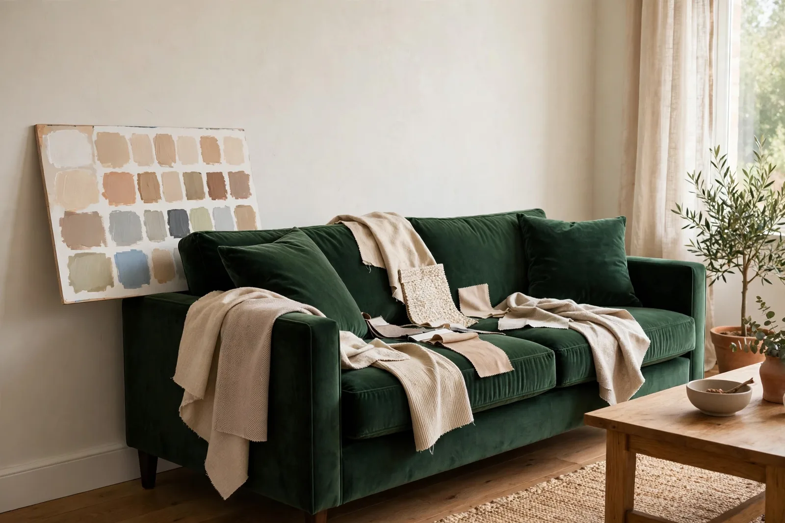
Your sofa is the single largest color commitment in your living room, usually harder and more expensive to change than a gallon of paint. The wall color has to agree with it, not fight it. Before you commit, know this: paint colors shift with lighting, surface, and sheen, so always test a large physical sample in your own space before committing. The Global Abode is an independent publication, not affiliated with or endorsed by Sherwin-Williams or Benjamin Moore; color names and codes are referenced as widely-known designer examples.
Key takeaway: Read your sofa like a fixed finish, its fabric, depth, and undertone decide which wall colors will flatter it. Neutral sofas give you the most freedom; colored sofas ask for either a harmonizing wall or a deliberate contrast. The one rule that never fails: the sofa’s undertone and the wall’s undertone must agree.
The sofa is a fixed finish, read it like flooring
Designers work from a simple hierarchy: you choose the things you cannot easily change first, floors, stone, cabinetry, and upholstery, and you choose paint to agree with them. A sofa can easily cost ten to twenty times what the wall paint costs, and returning one is a chore most of us will never attempt. So when a living room feels “off,” the wall color is almost always the thing that should bend.
Start by reading your sofa the way you would read a wood floor: not as a single flat color but as a material with depth, sheen, and undertone. Three readings matter:
Fabric first. Velvet reflects light back at you, so a velvet sofa always reads richer and more saturated than the same color in flat linen. A nubby boucle or chenille diffuses light and softens everything around it. Leather has a natural sheen and temperature of its own, warm cognac leather behaves almost like a wood tone, while black leather behaves like a cool mineral. These aren’t decorative details; they change how the wall color beside them will appear. A matte wall next to a shiny sofa creates welcome contrast; a lustrous wall next to lustrous leather can feel like too much shine competing for attention, which is why many designers lean toward matte or eggshell walls beside leather.
Depth second. A sofa’s depth, how light or dark it sits, sets the contrast level of the whole room. Deep charcoal or navy sofas need enough wall lightness around them to keep the room from feeling heavy; pale cream or greige sofas can carry deeper, moodier walls because the furniture won’t visually disappear. If the sofa and the walls sit at nearly identical depth, the sofa melts into the background, which can be a deliberate strategy in a small room, a light sofa against a light wall makes both recede and the room feel larger, but it is a choice to make on purpose, not an accident.
Undertone third. This is the one that breaks the most rooms, and it gets its own full section below. Two grays can clash as violently as orange and blue if one is green-gray and the other is violet-gray. Read the sofa in natural daylight, away from colored lamps, and decide: does it lean warm (yellow, red, brown) or cool (blue, green, violet)? Write that answer down. Every wall color you shortlist has to answer the same question, and the answers have to match.
If you are planning a whole house and the living room is your starting point, build the sofa’s reading into your whole-home paint palette, the sofa is often the anchor that the rest of the home’s color flow grows from.
Neutral sofas: beige, gray, greige, and cream
A neutral sofa is the most forgiving furniture decision you can make, but “neutral” is not a blank check. Each neutral family points toward certain wall directions and warns you away from others.
Beige and warm tan sofas. These are warm by nature, their base leans yellow or red even when they look pale. They ask for walls with a matching warm heart: creamy whites, soft greiges that lean beige, muted sages, warm terracotta-adjacent tones. What to avoid: stark cool whites and icy blue-grays, which will make a beige sofa look dingy and tired by contrast. Warm beige sofas with warm walls produce the cocooning, layered rooms that photograph so well, just keep the wall either clearly lighter or clearly deeper than the sofa so the two don’t blur into one flat beige field.
Gray sofas. The most common sofa color, and the trickiest, because gray’s undertone varies more than any other neutral’s. A cool, blue-gray sofa pairs beautifully with soft whites, pale watery blues, and muted sage walls, colors that share its coolness. A warm gray (greige-leaning) sofa is happier beside warm whites and creamy neutrals. The classic mistake is a cool gray sofa against warm beige walls: both are neutrals, neither is “wrong,” but the temperature mismatch reads as discord. If your gray sofa feels cold and unwelcoming, the fix is rarely a new sofa, it is usually a warmer wall color or warm textiles layered on the sofa itself. In a small room, a light gray sofa against a wall only slightly deeper keeps the furniture crisp without shrinking the space.
Greige sofas. The diplomat of neutrals, gray-beige hybrids that bridge warm and cool. Greige sofas are unusually flexible: they can sit against warm whites, cool soft whites, and many muted colors as long as the wall’s undertone isn’t extreme. This is why greige is the favorite “safe” sofa color. Your freedom here is real, but don’t mistake it for total freedom: pair greige with a wall that shares its beige-leaning side for calm, or its gray-leaning side for crispness.
Cream and ivory sofas. Cream reads warm almost by definition. Cool, stark whites on the wall will make cream upholstery look yellowed, the walls need to be at least as warm as the sofa. Warm whites, soft butter-inflected neutrals, and gentle earth tones are the natural partners. Cream sofas also carry deeper walls beautifully: a dark, warm wall behind a cream sofa is one of the most reliably elegant combinations in interior design because the contrast is strong but the temperatures agree.
| Sofa color | Wall colors that flatter it | Wall colors to avoid |
|---|---|---|
| Beige / warm tan | Creamy whites, warm greige, muted sage, soft clay | Icy blue-grays, stark cool whites |
| Cool gray | Soft white, pale blue, muted sage, light greige | Warm beige, yellow-based creams |
| Warm gray / greige | Warm whites, soft greige, muted greens | Very cool blue-grays |
| Cream / ivory | Warm whites, soft earth tones, deep warm colors | Stark cool whites, icy grays |
Colored sofas: blue, green, rust, and patterned
A colored sofa is a statement, and statements need a strategy. There are really only two, and both work when chosen deliberately:
Strategy 1: Harmonize. Choose a wall color from the same family or a neighboring one, and let the sofa be the deepest expression of it. A navy sofa against soft blue-gray walls. A forest green sofa against muted sage walls. A rust or terracotta sofa against warm clay or soft peach walls. This tonal approach is what designers call color enveloping, the room feels immersive and intentional, and it has the side benefit of making small rooms feel larger because the boundaries soften. The one non-negotiable: vary the depth. The wall must be clearly lighter or clearly deeper than the sofa, or the two merge into a shapeless mass. Also vary the finish, matte walls beside velvet upholstery keep a tonal scheme from falling flat.
Strategy 2: Contrast deliberately. Pair the sofa with a wall color that sits apart from it, ideally a quiet neutral that lets the sofa carry the room’s color. A navy sofa against warm off-white walls is the classic for a reason: the contrast is crisp, the sofa becomes the hero, and the warmth of the walls keeps the blue from feeling severe. A green sofa against soft warm white or warm greige. A rust sofa against a deep teal or charcoal wall for drama. What makes contrast work is temperature awareness: a cool sofa needs the wall to supply warmth somewhere (or at least neutrality), and a warm sofa needs the wall to stay calm so the room doesn’t overheat visually.
Blue sofas specifically. Navy and deep blue are the most common colored sofas, and they are easier to live with than their boldness suggests. The safest wall partner is a warm or chalky off-white, designers consistently warn against brilliant, stark white, which creates a harsh edge that makes navy look severe. If you want more than white, reach for walls with warmth: warm greiges, soft putty tones, even pale warm taupes. Cool gray walls can work, but only if the gray leans warm or beige; blue-based grays sit too close to navy in temperature and the room loses all contrast.
Green sofas. From emerald velvet to olive linen, green sofas are wonderfully easy: green is nature’s neutral. Warm whites, creamy neutrals, and soft greiges are the easy answers. For something moodier, wrap the room in a deep tone with a shared warm base. Green also pairs beautifully with the color flow framework, because green sofas share DNA with plants and wood, they often connect naturally to adjoining rooms painted in warm neutrals.
Rust, terracotta, and warm-toned sofas. These are warm statements and they want either a harmonizing warm wall (clay, warm beige, deep warm neutral) or a cool counterpoint that stays desaturated, a muted teal or deep slate can be striking, but keep it dusty rather than electric so the temperatures balance instead of brawl.
Patterned sofas. Treat a patterned sofa as a palette, not a color. Pull your wall color from the pattern’s background or its quietest secondary tone, the wall should recede so the pattern can breathe. If the pattern is bold, the wall must be simple: a soft neutral drawn from the fabric keeps the room from feeling busy.
Designer shortcut: When in doubt with a colored sofa, default to a warm off-white wall and let the sofa do the talking. It works with navy, green, rust, and most patterns, and it costs nothing to be right about. You can always go deeper later once you’ve lived with the pairing.
The undertone rule that ties sofa and wall together
Here is the single rule that resolves nearly every sofa-and-wall dispute: the sofa’s undertone and the wall’s undertone must agree. Not the surface colors, the undertones.
A color’s undertone is the warm or cool bias hiding beneath what you think you see. Two paints can both look “gray” on a chip and be mortal enemies on a wall: one hides green, the other hides violet. Put the green-gray sofa against the violet-gray wall and both look worse, the sofa looks muddy, the wall looks lilac, and neither is wrong on its own. They just disagree.
How to read undertones, from your sofa first:
1. The white-paper test. In natural daylight, hold a sheet of plain white paper against the sofa fabric. The white gives your eye a neutral reference, and the sofa’s undertone will announce itself by comparison, the gray suddenly looks green, or the beige suddenly looks pink. Designers use this trick constantly because our eyes adapt to a color’s context and lie to us; the white sheet breaks the adaptation.
2. The chip-fan test. Fan out several paint chips in the same family near the sofa and look for which ones the sofa “agrees” with. Chips that share the sofa’s undertone will look like they belong together; chips from a different temperature will look jarring even when the chips themselves are beautiful.
3. The neighbor test. Look at what already lives happily near the sofa, the rug, the flooring, the curtains. If everything around the sofa leans warm and your proposed wall color leans cool, the wall will be the odd one out no matter how much you love the chip. Our guide to paint undertones walks through this reading process in detail, with the common warm and cool families and how to spot them.
A note on honesty: undertone reading is observation, not chemistry. Designer observations about which colors lean warm or cool are widely reported and useful, but no paint chip comes with a certified undertone label, trust your eyes in your own light, over any chart.
Don’t skip this: The most common sofa-wall failure is a cool gray sofa against warm beige walls (or the reverse). Both are “neutrals,” both look fine alone, and together they feel subtly wrong in a way that’s hard to name. If your room feels off and you can’t say why, check the temperatures first, it is almost always the undertone.
When the sofa is the problem, not the paint
Sometimes the sofa’s color genuinely doesn’t work, it clashes with fixed finishes, it fights the light, or you inherited it and never chose it. Before you repaint the room around a sofa you don’t love, consider that the sofa is the easier thing to change in one specific way: you don’t have to reupholster it to change its color relationship with the room.
Slipcovers are the reset button. A well-fitted slipcover in a neutral you actually like, natural linen, warm white, soft greige, replaces the sofa’s color commitment entirely, at a fraction of reupholstery or replacement cost. Suddenly your wall options multiply. If the sofa’s shape is good and only its color is the problem, a slipcover is the highest-leverage move in the room.
Pillows and throws are bridges. You don’t always need to neutralize the sofa, sometimes you just need to negotiate between it and the wall. A sofa whose undertone clashes with your walls can often be mediated with textiles that contain both temperatures: a throw that picks up the sofa’s color and the wall’s color, pillows in a pattern that ties the two together. These bridge pieces don’t fix a true temperature war, but they can soften a mild disagreement enough that the room feels intentional.
Move the sofa. It sounds obvious, but a sofa that fights the living room’s walls may be perfectly happy in the family room, the study, or a bedroom where the walls and light are different. Fixed finishes vary room to room; a sofa that clashes with one room’s palette may harmonize with another’s.
Know when it’s the sofa’s turn to bend. If the sofa is dated, uncomfortable, or a color you’d never choose again, repainting the walls to flatter a piece of furniture you’re planning to replace in two years is backward. Paint is the cheap, reversible layer. Let the sofa you want, not the sofa you have, guide a room you’re already planning to change. But if the sofa is staying for the next decade, do the honest reading, match the undertone, and give it walls that make it look like a choice.
Sampling protocol: fabric swatch meets paint sample
Coordinating sofa and wall is not a decision you make at the paint counter, it’s a decision you make in the room, in your light, with the actual materials side by side. Here’s the protocol:
1. Get a fabric swatch, not a memory. If you can, cut or request a real swatch of the sofa fabric, a cushion cover you can detach, a sample from the manufacturer, a hidden flap of fabric. Memory of a color is unreliable; a physical swatch is not. If the sofa is leather, note that leather shifts more under artificial light than fabric does, so your evening check matters even more.
2. Sample paint large. Small paint chips are nearly useless against a sofa, a postage-stamp chip surrounded by white card reads far lighter than the same color across a wall. Paint two coats on a large board (at least A2 / 16×20 inches), leaving the edges unpainted so the board acts as its own frame. Sample your top two or three candidates; you’ll be surprised how often the favorite at the store drops to second place at home.
3. Prop the board against the sofa, then move it to the wall. Look at the pairing in three lights: morning daylight, afternoon daylight, and evening lamplight. Sofa fabrics, especially deep colors like navy and green, shift noticeably under warm artificial light, often reading deeper and warmer. A wall color chosen in daylight only can disappoint after dark. Check the board against the rug and flooring too: walls, floor, and sofa are the room’s three largest color blocks, and all three need to agree on temperature.
4. Live with it for at least two days. Tape the boards up and walk past them. Look at them with fresh eyes in the morning. Colors that thrill on day one sometimes fatigue by day three, and colors that seemed quiet often reveal themselves as exactly right. Two days of passive looking costs nothing and prevents the most expensive mistake in decorating: repainting.
Build your whole palette around the anchor piece
Your sofa is your living room’s anchor, but it still has to connect to the hallway, the kitchen, and every room beyond. Our guides walk you through the full system.
Frequently asked questions
Either works, what matters is that it’s a deliberate choice. Matching (tonal) sofa and wall colors makes a room feel larger and more serene, because the boundaries soften; it’s a favorite strategy in small rooms. Contrasting them makes the sofa a focal point and adds energy. The failure mode is neither: it’s a sofa and wall that sit at nearly identical depth by accident, which just looks muddy. Pick tonal or pick contrast, and vary the depth clearly either way.
It depends on the gray’s undertone. For a cool, blue-gray sofa, soft whites, pale watery blues, and muted sages are the safest directions. For a warm, greige-leaning sofa, warm whites and creamy neutrals. The universal safe answer if you haven’t read the undertone yet: a soft, slightly warm off-white. What to avoid with any gray sofa is a wall in the opposite temperature, cool sofa against warm beige walls (or warm sofa against icy gray walls) is the most common clash.
A warm or chalky off-white is the classic pairing, crisp contrast without harshness. Avoid brilliant stark white, which makes navy look severe, and avoid blue-based grays, which sit too close to navy in temperature. If you want more color, warm greiges, soft putty tones, or a tonal approach (deep blue-gray walls clearly deeper or lighter than the sofa) all work. Test your choice in evening lamplight, navy shifts noticeably warmer and deeper under artificial light.
Pull your wall color from the pattern’s background or its quietest secondary tone, and keep the wall simple, the wall should recede so the pattern can breathe. A bold pattern needs a calm, neutral wall drawn from within the fabric itself. Resist the urge to match the pattern’s loudest color on the walls; that’s almost always too much of a good thing.
Yes, this is the tonal, color-enveloping approach, and it can look rich and intentional. The keys are shared undertone (the wall and sofa must agree on temperature) and clearly separated depth: the wall should be noticeably lighter or darker than the sofa, not nearly identical. Vary the finishes too, matte walls beside velvet or leather keeps a dark-on-dark scheme from falling flat. In a small room, this approach actually makes the space feel larger because the edges dissolve.
Check the undertone first, most “clashes” are temperature disagreements, and repainting in the sofa’s temperature family often fixes the room for the cost of a gallon. If the sofa itself is a color you’d never choose again, consider a slipcover as a middle path before repainting around furniture you’re planning to replace. Repaint to flatter a sofa you’re keeping; don’t repaint to flatter a sofa you’re about to donate.

