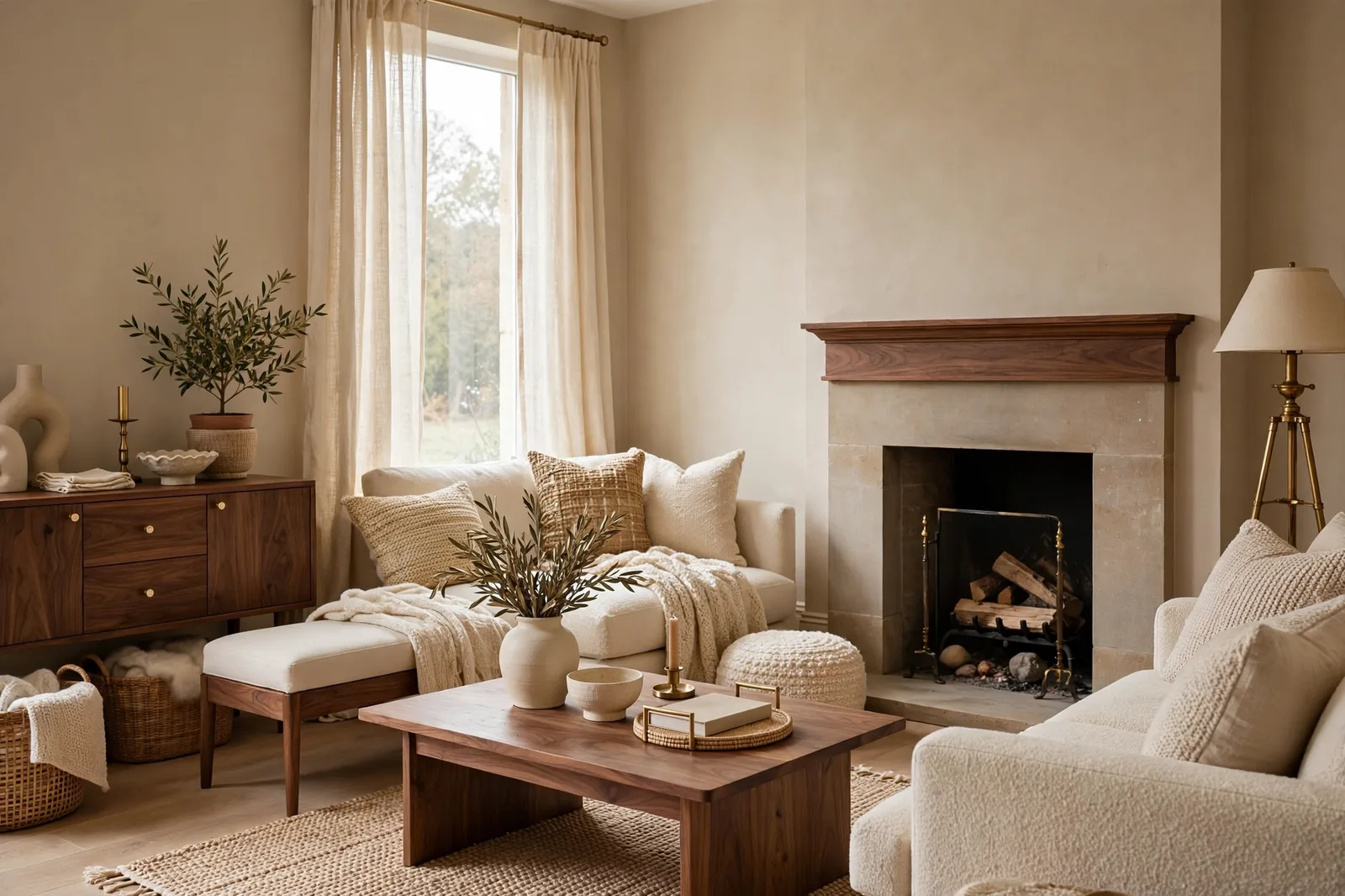
Few paint colors have earned their reputation the way Accessible Beige SW 7036 has, through sheer, quiet reliability in thousands of real homes. This is Sherwin-Williams’ warm greige that sits confidently on the beige side of the family: warmer and deeper than its famous sibling Agreeable Gray, softened by a gray base and a whisper of green that keeps it from ever reading like the dated builder beiges of decades past. Designers reach for it when a room needs to feel warm without feeling yellow, grounded without feeling heavy, and welcoming from the first coat. But it is not a color without opinions: its warmth needs light to show its best, its faint green undertone surfaces in certain conditions, and next to the wrong finishes it can look muddy instead of cozy. This guide gives you the complete, honest picture, what Accessible Beige is, how it behaves in every light, where it shines and where it fails, what to pair it with, and how to sample it so you know exactly what you’re getting. Colors shift with lighting, surface, and sheen, so always test a large physical sample in your own space before committing, screen swatches are approximations, never the verdict. The Global Abode is an independent publication, not affiliated with or endorsed by Sherwin-Williams; all color names and codes are referenced as widely-known designer examples only.
Key takeaway: Accessible Beige is a warm greige that leans beige, cozy, earthy, and forgiving in well-lit rooms, with a gray base and a whisper of green that keeps its warmth from going golden. It is deeper and warmer than Agreeable Gray, which makes it the better choice when you want warmth to be felt, and the worse choice when the room is dim or the finishes run cool. Its best homes are warm-lit living rooms, bedrooms, and kitchens with wood floors and warm stone; its riskiest are dark north rooms and kitchens with cool gray tile. Undertone notes here reflect widely-reported designer observations from real homes, not exact manufacturer specifications, and the green thread only shows up if you sample it under the conditions that reveal it, which is exactly what section 6 teaches you to do.
What Accessible Beige Is: The Famous Warmth
Accessible Beige is technically a greige, a blend of gray and beige, but it reads as beige first. That distinction matters, because it’s the whole reason this color has the following it does. Where Agreeable Gray sits at the gray-beige hinge and lets you decide which side it leans, Accessible Beige has already decided: it is a warm, earthy, grounded beige that has been civilized by gray. The gray in its formula is doing two jobs at once, keeping the warmth from tipping into yellow or gold territory, and keeping the color current rather than dated. The result is the thing designers kept describing in every source consulted for this guide: cozy without being heavy, warm without being yellow, classic without being boring.
It helps to place it against the beiges it gets compared to. It is noticeably warmer and more saturated than the cool grays of the last decade, which is why it became the answer for homeowners tired of gray but afraid of beige. It is calmer and more muted than Kilim Beige, which is a fuller-strength, more orange beige, Accessible Beige is Kilim’s softer, more contemporary sibling. And it is warmer and a touch deeper than Agreeable Gray, which reads as the cooler, more balanced, more flexible of the two. If Agreeable Gray is the diplomat of the warm-neutral family, Accessible Beige is the hug.
The “accessible” in the name is doing real descriptive work, too. Designers consistently describe this color as easy to live with, it doesn’t demand specific lighting to look good, it doesn’t fight most furnishings, and it has enough color to feel intentional without enough to feel risky. That ease is why it shows up everywhere: whole-house wall systems, kitchen cabinets, exterior siding, bedrooms, rental repaints. It is one of the few colors that genuinely works as a single color carried through an entire home, provided the home has the light and the finishes for it, which is what the next four sections are about.
One more thing the name promises: this beige is not the beige of 2005. The builder beiges of that era were yellow-heavy, flat, and slightly pink in the wrong light, and they earned beige its bad reputation. Accessible Beige’s gray base and green whisper are exactly what separate it from that generation. It has depth. It has movement through the day. It does not read as a default. When designers call it “bodacious rather than boring,” this is what they mean: a beige with actual character, doing actual work.
Tip: If you’re choosing between Accessible Beige and Agreeable Gray, the decision is simpler than the internet makes it sound: pick Accessible Beige if you want to feel the warmth when you walk in, cozy, traditional, farmhouse, rooms with wood and brass. Pick Agreeable Gray if you want the warmth to stay in the background, flexible, transitional, rooms that mix warm and cool finishes. They’re not competitors; they’re answers to different questions.
Undertones and Light Behavior
Every popular neutral has a secret, and Accessible Beige’s is green, a whisper of it, so subtle that many homeowners never notice it at all, but real enough that designers name it in nearly every deep review of this color. The undertone stack, as widely reported: a warm beige base, a soft gray that mutes and modernizes it, and a faint green-taupe thread that grounds it. That green is the color’s insurance policy against yellowness, it’s what keeps Accessible Beige from reading golden or buttery, and it’s what gives it that “earthy” quality designers keep reaching for. It is not, to be clear, a green color. Nobody walks into an Accessible Beige room and thinks “green.” It’s a warmth that has been steadied, and the steadying agent happens to be green.
But whispers have a way of surfacing, and the green thread does, under specific conditions that you should know before you commit. Designers report it most in south and west exposures, where strong warm light seems to activate it; in rooms with a lot of greenery outside the windows, where the view reflects onto the paint; and in dim, low-light rooms, where the color’s warmth recedes and the gray-green base is what’s left standing. In bright, balanced light, which is most rooms, most of the day, the green is essentially invisible, and the color reads as the warm, creamy beige everyone expects. The green is a conditional phenomenon, not a constant one. Still: if you are sensitive to green in neutrals, this is the color to sample most carefully, because its green is more real than Agreeable Gray’s.
Now the light, exposure by exposure, because this is a color whose personality genuinely changes through the day:
South-facing rooms: this is Accessible Beige’s best light, and the version of the color most people fall in love with. Strong warm sun brings out the creaminess, soft, glowing, settled. In very bright south rooms it can read a touch lighter than expected, and the warmth deepens into something rich rather than flat. If you want to see this color at its absolute best, look at it in a south-facing living room at 2pm. That said, in extremely bright, sun-blasted rooms, watch that it doesn’t go more golden than you intended, the warmth is the point, but there’s a line between warm and tan, and strong sun pushes toward it.
West-facing rooms: the golden afternoon light is a natural partner for this color, warm on warm, rich and classic in the evening. Designers report it taking on a particularly beautiful, traditional quality in west light. This is the exposure where Accessible Beige feels most like the cozy, established color its fans describe. Evening rooms, dining rooms, living rooms used after work, benefit enormously from a west-facing Accessible Beige.
East-facing rooms: warm mornings flatter it, cooler afternoons settle it into a softer taupe. It’s a pleasant, gentle transition, warm and inviting when you wake up, calm and neutral by afternoon. Good for bedrooms and breakfast spaces, where the morning matters most.
North-facing rooms: this is the exposure that divides the reviews, and honesty requires presenting both sides. Many designers report that Accessible Beige holds up better in north light than most neutrals, its warm base pushes back against the cool, indirect light, and it stays cozy where cool grays go flat. Others report that in dim north rooms, the green-taupe undertone becomes more visible and the color can read slightly muddy or dull, it keeps its warmth, but loses its glow. The reconciliation: in a north room with decent light and warm 2700–3000K bulbs, it’s genuinely good. In a dark, low-light north room, it’s a risk, the warmth survives, but the color can look heavy and a little murky. If your north room is dim, sample ruthlessly, and have a lighter backup in mind.
Artificial light: warm 2700K bulbs are this color’s best friend, they activate the beige and keep the evening version glowing. Cool daylight-balanced bulbs (4000K+) pull the gray forward and can make it read flatter and slightly green. This is a bigger deal for Accessible Beige than for more neutral colors, because the bulb temperature effectively chooses which undertone you see.
Watch out: The dim-room trap is this color’s real failure mode. In rooms with little natural light, Accessible Beige can look dull, muddy, or heavier than you expected, designers consistently flag this. It’s not a color problem; it’s a light problem. This color needs light to show its warmth. If the room is dark, either add serious lighting (warm bulbs, layered lamps) or choose a lighter, brighter neutral instead. Never commit to Accessible Beige in a dim room based on how it looked in a bright one.
Room by Room: Where It Shines, Where It Fails
Living rooms: its natural habitat. This is the room designers specify it for most, and the reasons are structural: living rooms are evening rooms, gathering rooms, rooms with wood furniture and textiles and lamplight, and Accessible Beige was essentially designed for exactly that brief. It wraps a living room in warmth without closing it in, it flatters wood tones and upholstery, and it stays interesting from morning to night. In open-plan living areas it flows beautifully, carrying one warm note through kitchen, dining, and living zones. The caveat is light: a dim, north-facing living room needs the sampling protocol from section 6 before you commit.
Bedrooms: the cozy case. Warm, enveloping, restful, Accessible Beige is one of the most-specified bedroom neutrals for people who find white bedrooms cold and gray bedrooms flat. It holds its warmth in the evening lamplight that bedrooms are actually lived in, and it pairs beautifully with cream bedding, wood nightstands, and textured throws. For a whole-house system, it’s a natural bedroom companion to a slightly lighter greige in the living areas, same family, stepped in depth.
Kitchens: the warm-kitchen answer. On walls, it’s the color for kitchens with warm bones, oak or walnut floors, warm granite, brass hardware, cream or wood cabinetry. It makes a kitchen feel like the heart of the home rather than a laboratory. On cabinets, it’s a genuinely popular choice: warm, classic, and far more forgiving than white when it comes to showing wear. The critical test for kitchen use is the countertop, hold the sample against your actual stone, because warm granite’s pink and gold threads will converse with this color’s warmth, and you want to hear that conversation before the gallons are open. In kitchens with cool gray tile or white quartz, it’s usually the wrong choice, the warmth fights the stone.
Bathrooms: conditional. In a warm, well-lit bathroom with warm tile or wood vanity, it can be lovely, cozy and flattering. In a small, dim, or cool-tiled bathroom, it risks the muddy look. Powder rooms with warm lighting are a better bet than steamy full baths. And the sheen matters: satin or semi-gloss in bathrooms, always, with a bath-appropriate formula.
Exteriors: the warm-stone specialist. Designers report it working beautifully on exteriors paired with warm stone, brick, and natural wood, it reads as a soft, creamy limestone-like neutral on siding, warm and established rather than stark. It’s a natural fit for traditional, farmhouse, and transitional exteriors. The caution: on exteriors it will read lighter than it does inside (sunlight washes color out), and next to cool gray stone or stark white trim it can look disconnected. Always test exterior colors on large boards, on the actual house, in morning and afternoon sun.
Whole-house use: yes, with the light caveat. This is one of the few colors designers genuinely recommend as a single whole-house color, it flows, it coordinates with itself, and it gives every room the same warm foundation. The condition, as always: the house needs adequate light. A bright, warm home in Accessible Beige is cohesive and glowing. A dim home in Accessible Beige is heavy. The color doesn’t change; the light does.
Best Pairings: Trim, Accents, and Coordinating Colors
Accessible Beige is a team player, it was designed to sit inside a palette, not to stand alone. Here’s how designers build around it.
| Role | The picks | Why it works |
|---|---|---|
| Trim white | Alabaster SW 7008, White Dove OC-17, Pure White SW 7005 | Warm whites agree with its warmth; the trim reads as crisp without going cold. Avoid cream or yellow-leaning trims, they push the combination toward dated. |
| Ceiling | Same trim white in flat, or the wall color in flat | Keeps the envelope calm; a bright ceiling lifts the warmth so the room doesn’t feel heavy overhead. |
| Deeper neutral partner | Warm mid-tone greiges and taupes (two steps deeper, same warmth) | For built-ins, accent walls, or island cabinetry, depth in the same family reads as intentional, never as a clash. |
| Green accents | Muted sages, soft olive tones, deep botanical greens | The natural harmony: the color’s green whisper makes green accents feel inevitable rather than added. Sage textiles, olive velvet, deep green cabinetry. |
| Blue accents | Soft muted blues, dusty navy | Warm beige and soft blue are a classic complementary pairing, the blue cools and freshens, the beige warms and grounds. |
| Wood and metal | Oak, walnut, warm stained woods; brass, bronze, oil-rubbed bronze | Warm metals and warm woods are this color’s native companions, they amplify the coziness rather than competing with it. Cool chrome and stainless are the harder pairing. |
| Textiles | Cream, ivory, oatmeal, warm linen, soft rust or terracotta touches | Stay in the warm family; the textiles are what keep a beige room from reading flat. |
Two pairing principles cover most situations. First: match the trim’s temperature to the wall’s. Accessible Beige wants a warm white on the trim, Alabaster is the most-reported pairing, White Dove the Benjamin Moore answer, Pure White the cleaner option for a slightly more modern read. A cool, crisp white trim against this warm wall creates a visible temperature argument at every doorway and window. Second: let the green whisper guide the accents. Because the color carries that faint green grounding, green accents, sage pillows, olive throws, a deep green velvet chair, even plants, sit inside the palette rather than on top of it. It’s the easiest accent color in the world for this particular beige.
For the full coordination method, our greige paint colors guide shows how the whole warm-neutral family relates, and our undertones guide teaches the temperature-matching method that makes any pairing work.
Fixed Finishes: Floors, Stone, and the Cool-Tile Caution
Light decides the shortlist; fixed finishes decide the winner. Accessible Beige is more finish-sensitive than its “easy” reputation suggests, because its warmth is a commitment, and commitments have consequences.
Oak, walnut, and warm wood floors: home turf. This is the pairing designers praise most. Warm wood amplifies warm neutrals, and Accessible Beige’s beige-green base harmonizes with oak, walnut, hickory, and warm stained floors instead of fighting them. The green whisper is actually an asset here, it’s the same green-brown language as wood itself. If your floors are warm wood, this color is one of the safest choices you can make.
Warm granite and busy stone: the conversation. Warm granites, the golds, rusts, creams, and browns, carry warm threads that will converse with this color’s warmth. Usually it’s a good conversation: the wall echoes the stone’s warmest notes and the kitchen or bath feels cohesive. But busy stone is also the undertone lie detector, hold large sample boards directly against your countertop in both daylight and lamplight, because a granite with strong pink or gold movement can pull the wall warmer than you expected. The wall that looked like soft beige on the board can read as distinctly warm next to the wrong stone.
Cool gray tile and white quartz: the caution. This is the pairing to think hardest about. Cool gray tile, concrete-look porcelain, white quartz with cool veining, these are cool finishes, and Accessible Beige is a warm color with a green thread. Next to cool finishes, two things can happen: the warmth can look mismatched, like the wall belongs to a different renovation than the tile; and the green whisper is most likely to surface, because cool surroundings make warm-green undertones more visible. Designers consistently flag this as the combination to test most carefully. It can work, a warm wall against cool tile is a legitimate design move, but it needs to be deliberate, tested, and balanced with warm elements (wood, brass, warm textiles) that bridge the temperature gap. Without the bridge, it’s a risk.
Brick and warm stone exteriors: natural partners. On the outside of the house, warm brick, natural stone, and wood siding are this color’s native context. It reads as established and harmonious against them, the color equivalent of a house that has always been there.
White and cream cabinetry: the classic. Warm white cabinets (White Dove, Alabaster) with Accessible Beige walls is one of the most-reported kitchen combinations, the wall brings the warmth the cabinets don’t, and the undertones agree. Just make sure the cabinet white is warm, not cool: a crisp blue-white cabinet against this warm wall will look disconnected.
Tip: The floor test settles most finish questions in ten seconds. Tape your sample board to the floor, not the wall, and look at it from standing height. Floors are the largest fixed surface in most rooms, and a wall color that argues with the floor will argue with the whole room. If the board and the floor look like they belong to the same family, the finishes will work. If they look like they’re from different houses, no amount of styling fixes it.
How to Sample It: The Protocol and the Green-Thread Check
Accessible Beige is a sampler’s color, not because it’s difficult, but because its two conditional behaviors (the green whisper, the dim-room dulling) only reveal themselves under specific conditions. Here’s the protocol that catches both:
Step 1: Buy the real thing. A sample pot of the actual Sherwin-Williams color, in the sheen you plan to use. Not a computer match, not a chip, the real paint. Sheen shifts color, so the finish you test should be the finish you buy.
Step 2: Paint large boards, two coats. At least 2×2 feet per board, on white poster board or primed drywall. Label the back. Small chips are exactly how people miss the green thread, it only shows at scale.
Step 3: The four-moment check. Prop the boards on the actual walls, one on the brightest wall, one on the darkest, and look at them in the morning, at midday, in the late afternoon, and at 8pm under your evening lamps. Write down what you see each time. You’re watching for two things: does the warmth hold (good), and does anything green or muddy surface (note when and where).
Step 4: The green-thread check. This is the Accessible Beige-specific test. Look at the board in your brightest warm light (south window, afternoon sun) and in your dimmest corner, and ask: do I see green? Then hold the board against your fixed finishes, the floor, the countertop, and ask again. If you see a faint green cast in the dim corner but love the color everywhere else, that’s normal for this color, it’s the whisper, and most people stop noticing it within days. If the green bothers you in the conditions where you’ll actually live with the color, this isn’t your color, and that’s useful information.
Step 5: The white-paper test. Hold a sheet of plain white printer paper against the board in daylight. Against true white, the color’s real character shows: you’ll see the warmth clearly, and you’ll see whether it leans beige (good), yellow (reconsider), or green (note it). Thirty seconds, no painting required, surprisingly revealing.
Step 6: The photograph test. Photograph the boards from across the room. Cameras exaggerate undertones, the green thread your eyes adapt to will jump out in a photo, which tells you what guests will notice before they adapt. If the photo looks green and the wall doesn’t, trust the wall, but know that the photo is showing you the color’s worst day.
Step 7: Live with it for 48 hours. Tape the boards up and walk past them for two days. The right color stops catching your eye; the wrong one keeps nagging. Trust the nag.
For the complete method, our guide to testing paint samples walks through every step in detail, and our natural light guide explains the exposure effects behind everything above.
Choosing Accessible Beige, or choosing between finalists?
The Paint Color Workbook includes side-by-side comparison worksheets, undertone-testing pages, and a room-by-room sampling checklist, so the decision happens with evidence in your own light, not in the paint aisle. And the Whole Home Paint Guide gives you a complete color system, every room mapped, trim and ceiling pairings included, so Accessible Beige lands in a house designed to hold it.
Frequently asked questions
Warm, confidently so. It’s a warm greige that leans beige, with a warm beige base steadied by gray and a whisper of green. It reads warmer than Agreeable Gray and most of the greige family, which is exactly why designers specify it when they want warmth to be felt. In dim rooms or next to cool finishes, its gray-green base can make it read slightly more muted, but it doesn’t flip cool, it just gets quieter.
Accessible Beige is warmer, a touch deeper, and more beige; Agreeable Gray is cooler, slightly lighter, and more balanced between gray and beige. Designers describe Accessible Beige as the cozy, traditional, farmhouse-leaning choice and Agreeable Gray as the flexible, transitional, modern-leaning one. Accessible Beige holds its warmth better in north light but risks looking muddy in dim rooms; Agreeable Gray is more light-forgiving but can read slightly cool. Our three-way comparison settles the full trio in detail.
Balanced Beige is the warmer and more golden of the two, a true beige with sunny warmth that reads traditional and enveloping. Accessible Beige is cooler and more muted by comparison, its gray-green base making it the more contemporary, flexible pick. If Balanced Beige feels like a warm hug, Accessible Beige feels like a warm handshake, still warm, but with more restraint. Choose Balanced Beige for golden traditional warmth; choose Accessible Beige when you want warmth that stays modern.
Often yes, with caveats, and this is the honest version. Its warm base pushes back against cool north light better than most neutrals, so it stays cozy where cool grays go flat. But in dim north rooms, its green-taupe undertone can surface and the color can read slightly muddy or heavy. The rule: north-facing with decent light and warm 2700–3000K bulbs, genuinely good. Dark, low-light north room, sample ruthlessly and have a lighter backup ready. See how light changes paint color for the full orientation rules.
Yes, it’s a popular cabinet color in warm kitchens, especially with warm wood floors and natural stone. Use a dedicated cabinet enamel in satin or semi-gloss, and test it against your countertop first: its warmth and faint green thread need to agree with your stone. In kitchens with cool gray tile or white quartz, a cooler neutral is usually the safer cabinet choice. Our Sherwin-Williams guide covers the brand’s cabinet favorites in full.
Yes, particularly with warm stone, brick, and natural wood, it reads as a soft, creamy, limestone-like neutral on siding. Test it on large boards on the actual house in morning and afternoon sun, because exteriors read lighter than interiors and the color will look different at scale. Pair it with warm trim whites and avoid stark white trim, which can make it look disconnected. And confirm it against your roofing and hardscaping, the exterior is a fixed-finish decision, and the same undertone rules apply.

