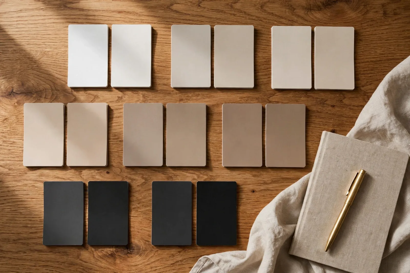
Ask a designer their most-answered question and it won’t be “what’s your favorite color”, it will be “Alabaster or White Dove?” Nobody decides a paint color from a single color review. Decisions happen between colors: two or three finalists, held against the same wall, in the same light, fighting for the same room. This guide collects the twenty head-to-head comparisons designers and color consultants field most often, with an honest verdict on each: what the two colors actually are, the single difference that matters, and who should pick which. Undertone descriptions reflect widely reported designer observations, not exact manufacturer specifications, and because colors shift dramatically with light, treat every verdict here as a shortlist, then confirm with physical samples on your own wall. This is an independent editorial guide. The Global Abode is not affiliated with, endorsed by, or sponsored by Sherwin-Williams or Benjamin Moore.
Key takeaway: In nearly every popular comparison, the two colors differ in only one decisive way, temperature (warm vs. cool undertone), depth (a half-step lighter or deeper), or character (softer vs. sharper). Alabaster reads warmer and creamier than White Dove; Agreeable Gray reads warmer and softer than Repose Gray; Iron Ore reads as warm charcoal where Tricorn Black reads as true black. Learn which single difference your comparison turns on, test both colors large in your actual light, and the decision usually makes itself. Test physical samples before painting, screen colors are approximations, and samples are the only verdict that counts.
Why Side-by-Side Comparisons Beat Color Reviews
A single color review answers one question: what is this color like? A comparison answers the question you actually have: which of these two should I choose? The difference matters because whites, greiges, and beiges are relational colors, their personalities only emerge next to something else. Hold Alabaster alone against your trim and it looks like a pleasant warm white. Hold it next to White Dove and the creaminess steps forward. Hold either next to Pure White and both suddenly look creamy. The comparison is the instrument; the lone review is just the calibration.
This is also why comparisons survive trends better than reviews. A 2026 list of “the best neutrals” will age, but the honest difference between Revere Pewter and Edgecomb Gray, one deeper and more changeable, one lighter and more consistent, is as true today as it was five years ago. The twenty pairs below are the ones that come up again and again in designer consultations, color-consultant reports, and homeowner forums, which makes them worth understanding as a group rather than hunting down one at a time.
One structural note before we begin: each verdict names the one key difference, temperature, depth, or character, because in popular pairs the colors are close enough that everything else cancels out. If your comparison doesn’t turn on the difference this guide names, test again in different light; the light is probably telling you something the swatch isn’t.
White Pairs: The Three Questions Everyone Asks
White comparisons are the most-searched paint comparisons on the internet, and they’re also the most misunderstood, because the differences between popular whites are the smallest and therefore the easiest to get wrong at wall scale.
Alabaster (SW 7008) vs. White Dove (OC-17)
The most famous white duel in paint. Alabaster is a warm, creamy white with a soft yellow-beige undertone, designers widely report it reading warmer and creamier, with a touch of gray that keeps it from going buttery. White Dove is Benjamin Moore’s answer: a warm white with a gray restraint that keeps it soft rather than creamy, reading slightly cooler and more neutral next to Alabaster. The key difference is warmth level: Alabaster is the warmer, creamier of the two. Pick Alabaster for cozy, traditional, or warm-lit rooms where you want the warmth felt; pick White Dove when you want warmth that stays in the background.
White Dove (OC-17) vs. Simply White (OC-117)
Both Benjamin Moore, both warm whites, completely different jobs. Simply White is the brightest and crispest of the two, a clean white with only a faint warm undertone that shows mostly in dim light. White Dove is softer, warmer, and creamier, with its gray note making it read as a true off-white rather than a white. The key difference is brightness: Simply White reads as white that happens to be warm; White Dove reads as a warm off-white. Pick Simply White for trim, cabinets, and rooms that need brightness; pick White Dove for walls, traditional rooms, and anywhere you want softness.
Alabaster (SW 7008) vs. Pure White (SW 7005)
Both Sherwin-Williams, both enormously popular, and the comparison that confuses people most, because the difference is subtle. Pure White is the crisper, more neutral of the two: a clean white with only the faintest warmth, leaning slightly greige in some lights. Alabaster is a touch deeper and noticeably creamier, with its beige-yellow undertone clearly visible in warm light. The key difference is neutrality: Pure White is the safer neutral, Alabaster the warmer personality. Pick Pure White for modern schemes and rooms where you want the white to disappear; pick Alabaster for warmth with manners.
| Pair | What each is | The one key difference | Pick this one if… |
|---|---|---|---|
| Alabaster vs. White Dove | Both warm designer whites, SW vs. BM | Warmth level, Alabaster is creamier | Alabaster for cozy warmth felt; White Dove for warmth in the background |
| White Dove vs. Simply White | Both BM warm whites, different jobs | Brightness, Simply White reads as white; White Dove as off-white | Simply White for trim and brightness; White Dove for walls and softness |
| Alabaster vs. Pure White | Both SW, both hugely popular | Neutrality, Pure White is the cleaner neutral | Pure White for modern neutrality; Alabaster for warm personality |
Tip: White pairs are where side-by-side boards matter most, because the difference you’re judging is often a single degree of warmth. Paint both finalists on one board, leave the board where you’ll see it in the evening, and judge under your actual lamps, whites reveal their undertones after dark, not at noon.
Greige and Gray Pairs: The Undertone Arena
If white comparisons are about degrees of warmth, greige and gray comparisons are about undertones, the hidden hues that surface when the light changes. These eight are the pairs that generate the most “why does my gray look purple?” questions in existence.
Agreeable Gray (SW 7029) vs. Repose Gray (SW 7015)
The single most-searched gray comparison, full stop. Agreeable Gray is the warmer greige: a balanced warm gray with subtle beige undertones that reads cozy and welcoming, a favorite for traditional and transitional homes. Repose Gray is a bit more gray than Agreeable Gray, cooler, with a subtle cool undertone that designers describe as blue-green to violet depending on the light, and a touch deeper. The key difference is temperature: Agreeable Gray leans warm, Repose Gray leans cool. Pick Agreeable Gray for warmth, wood tones, and family-friendly softness; pick Repose Gray for clean, modern calm and cool-toned finishes.
Agreeable Gray (SW 7029) vs. Accessible Beige (SW 7036)
Both warm, both enormously popular, and more different than their fame suggests. Agreeable Gray is a true greige, gray and beige in near-equal measure, sitting right at the hinge. Accessible Beige is a beige with gray restraint: warmer, toastier, with a subtle gray-green undertone that keeps it from going yellow-brown, and a touch deeper. The key difference is family: Agreeable Gray is a gray that leans warm; Accessible Beige is a beige that leans gray. Pick Agreeable Gray for lightness and flexibility; pick Accessible Beige when you want the warmth to be the point.
Revere Pewter (HC-172) vs. Edgecomb Gray (HC-173)
Benjamin Moore’s most-famous greige siblings. Revere Pewter is the deeper, more complex of the two, a warm greige with a green-leaning base that shifts through the day and can flash faintly mauve in certain lights. Edgecomb Gray is its lighter, warmer, steadier sibling: a soft warm greige that stays remarkably consistent from morning to evening. The key difference is character: Revere Pewter has movement and depth; Edgecomb Gray has consistency and forgiveness. Pick Revere Pewter for well-lit rooms with personality; pick Edgecomb Gray for whole-house use where you don’t want surprises.
Revere Pewter (HC-172) vs. Agreeable Gray (SW 7029)
The cross-brand greige championship. These two occupy the same territory, warm mid-tone greige, but with different personalities. Revere Pewter is deeper and more changeable, with its green-mauve shifting giving it movement through the day. Agreeable Gray is a touch lighter and more straightforward in its warmth, staying more consistent across lighting conditions. The key difference is depth and temperament: Revere Pewter brings more depth and character; Agreeable Gray brings more lightness and predictability. Pick Revere Pewter for richness; pick Agreeable Gray for ease.
Mindful Gray (SW 7016) vs. Repose Gray (SW 7015)
Adjacent on the Sherwin-Williams strip, often confused, genuinely different. Mindful Gray is the warmer and earthier of the two, a greige-leaning mid-tone gray that sits comfortably with warm woods and brass. Repose Gray is cooler and grayer, the cleaner neutral. The key difference is temperature: Mindful Gray leans earthy-warm; Repose Gray leans clean-cool. Pick Mindful Gray for transitional warmth; pick Repose Gray for modern crispness.
Worldly Gray (SW 7043) vs. Agreeable Gray (SW 7029)
Both warm greiges, but a half-step apart on the strip. Worldly Gray is warmer and a touch deeper than Agreeable Gray, beige-leaning, with a toastiness that reads traditional and cozy. Agreeable Gray is lighter and more neutral, the more flexible of the two. The key difference is warmth and depth: Worldly Gray is the toastier, deeper cousin. Pick Worldly Gray for warm, enclosed coziness; pick Agreeable Gray for lighter, more adaptable neutrality.
Colonnade Gray (SW 7641) vs. Repose Gray (SW 7015)
Two of Sherwin-Williams’ most-recommended “safe grays,” and the warm-vs-cool question in miniature. Colonnade Gray is the warmer of the two, a warm gray that plays well with beige and greige surroundings. Repose Gray is cooler and slightly deeper, the more modern pick. The key difference is temperature: Colonnade Gray is the warm safe gray; Repose Gray is the cool safe gray. Pick Colonnade Gray for transitional schemes; pick Repose Gray for contemporary ones.
Gray Owl (OC-52) vs. Stonington Gray (HC-170)
Benjamin Moore’s cool-gray comparison. Gray Owl is the lighter, airier of the two, a soft cool gray with a faint blue-green cast that reads fresh in good light. Stonington Gray is deeper and cooler, a blue-gray with more saturation that reads formal and serious. The key difference is depth and saturation: Gray Owl is the light, easy cool gray; Stonington Gray is the deeper, more deliberate one. Pick Gray Owl for bright, airy coolness; pick Stonington Gray for confident, architectural cool.
| Pair | What each is | The one key difference | Pick this one if… |
|---|---|---|---|
| Agreeable Gray vs. Repose Gray | SW’s two most-searched grays | Temperature, AG warm greige, RG cool gray | AG for warmth and coziness; RG for modern calm |
| Agreeable Gray vs. Accessible Beige | Greige vs. beige, both warm | Family, AG is gray-leaning, AB is beige-leaning | AG for lightness and flexibility; AB for warmth as the feature |
| Revere Pewter vs. Edgecomb Gray | BM’s famous greige siblings | Character, RP has movement, EG is consistent | RP for personality in good light; EG for whole-house forgiveness |
| Revere Pewter vs. Agreeable Gray | Cross-brand greige rivals | Depth, RP deeper and more changeable | RP for richness; AG for predictability |
| Mindful Gray vs. Repose Gray | Adjacent SW grays | Temperature, Mindful warmer and earthier | Mindful for transitional warmth; Repose for modern crispness |
| Worldly Gray vs. Agreeable Gray | Warm SW greiges, half-step apart | Depth, Worldly Gray toastier and deeper | Worldly Gray for cozy enclosure; AG for adaptable neutrality |
| Colonnade Gray vs. Repose Gray | SW’s two “safe grays” | Temperature, Colonnade warm, Repose cool | Colonnade for transitional; Repose for contemporary |
| Gray Owl vs. Stonington Gray | BM’s cool-gray pair | Depth, Gray Owl light and airy, Stonington deeper | Gray Owl for fresh brightness; Stonington for architectural confidence |
Watch out: Greige and gray comparisons are where undertone surprises live, the mauve flash in Revere Pewter, the violet note in Repose Gray, the green thread in Accessible Beige. These only appear in your actual light, never reliably on a chip. Never finalize a gray or greige from a comparison table alone; the table shortlists, your room decides.
Beige and Warm Neutral Pairs: Warmth, Calibrated
Beige comparisons are about calibrating exactly how much warmth you want, the difference between these pairs is a single click on the warmth dial.
Swiss Coffee (OC-45) vs. White Dove (OC-17)
Two of Benjamin Moore’s most-specified warm whites/off-whites, and the creaminess question in pure form. Swiss Coffee is the creamier and deeper of the two, a warm off-white with a golden undertone (designers occasionally report a faint green note in dim light) that reads as genuinely cozy. White Dove is lighter and more neutral, its gray restraint keeping the warmth in check. The key difference is creaminess: Swiss Coffee commits to warmth; White Dove suggests it. Pick Swiss Coffee for traditional coziness; pick White Dove for warmth with versatility.
Accessible Beige (SW 7036) vs. Kilim Beige (SW 6106)
Both warm beiges, very different energy. Kilim Beige is the deeper, richer, more saturated of the two, an orange-beige with real presence that reads traditional and grounded. Accessible Beige is lighter and more muted, its gray-green undertone making it the more contemporary, flexible pick. The key difference is saturation: Kilim Beige is the full-strength beige; Accessible Beige is the softened one. Pick Kilim Beige for heritage richness; pick Accessible Beige for modern warmth.
Canvas Tan (SW 7531) vs. Accessible Beige (SW 7036)
Two soft warm neutrals that look similar on the strip and behave differently on the wall. Canvas Tan is the lighter, softer, more neutral of the two, a gentle tan that stays quiet in most lights. Accessible Beige is a touch deeper and warmer, with more personality and that subtle gray-green grounding. The key difference is presence: Canvas Tan is the whisper; Accessible Beige is the voice. Pick Canvas Tan for the lightest touch of warmth; pick Accessible Beige when you want the beige to actually register.
Balanced Beige (SW 7037) vs. Accessible Beige (SW 7036)
Adjacent beiges, often sampled together, and the golden-vs-muted question. Balanced Beige is the warmer and more golden of the two, a true beige with sunny warmth that reads traditional and enveloping. Accessible Beige is cooler and more muted, its gray-green note making it the more contemporary pick. The key difference is golden warmth: Balanced Beige leans sunny; Accessible Beige leans soft. Pick Balanced Beige for golden traditional warmth; pick Accessible Beige for muted, flexible warmth.
| Pair | What each is | The one key difference | Pick this one if… |
|---|---|---|---|
| Swiss Coffee vs. White Dove | BM’s two signature warm off-whites | Creaminess, Swiss Coffee commits, White Dove suggests | Swiss Coffee for traditional coziness; White Dove for versatile warmth |
| Accessible Beige vs. Kilim Beige | Two SW warm beiges | Saturation, Kilim full-strength, Accessible softened | Kilim Beige for heritage richness; Accessible Beige for modern warmth |
| Canvas Tan vs. Accessible Beige | Two soft SW warm neutrals | Presence, Canvas Tan whispers, Accessible Beige speaks | Canvas Tan for the lightest warmth; Accessible Beige to make it register |
| Balanced Beige vs. Accessible Beige | Adjacent SW beiges | Golden warmth, Balanced sunny, Accessible muted | Balanced Beige for golden tradition; Accessible Beige for flexible modernity |
Deep, Dark, and Accent Pairs: Where the Drama Lives
Deep-color comparisons turn on undertones too, but the stakes are higher, because dark colors amplify every undertone and every lighting shift.
Iron Ore (SW 7069) vs. Tricorn Black (SW 6258)
The most-searched dark comparison, and the softness question. Iron Ore is a deep charcoal-gray with warm undertones (designers widely report a subtle green-charcoal note) that reads as a “soft black”, slightly lighter, slightly warmer, slightly more forgiving. Tricorn Black is one of the darkest, most neutral blacks available: virtually no undertones, reading as true black in nearly any light. The key difference is softness: Iron Ore is the charcoal you can live with; Tricorn Black is the black you commit to. Pick Iron Ore for warmth and versatility; pick Tricorn Black for maximum drama and neutrality.
Hale Navy (HC-154) vs. Naval (SW 6244)
Benjamin Moore’s signature navy against Sherwin-Williams’ answer. Hale Navy is the gray-grounded, slightly lighter of the two, a deep maritime navy with charcoal notes that keeps it architectural rather than bright. Naval is darker, richer, and bolder, a more saturated navy with more drama and less gray. The key difference is intensity: Hale Navy is the tailored navy; Naval is the bolder one. Pick Hale Navy for sophisticated restraint; pick Naval for rich, confident color.
Kendall Charcoal (HC-166) vs. Urbane Bronze (SW 7048)
Two deep warm neutrals that sit in the same territory and feel completely different. Kendall Charcoal is the grayer, cooler of the two, a deep charcoal with warm restraint that reads architectural and modern. Urbane Bronze is warmer and browner, a bronze-gray with earthy depth that reads moody and evening-like. The key difference is brown vs. gray: Urbane Bronze is the warm bronze dark; Kendall Charcoal is the cool charcoal dark. Pick Urbane Bronze for warm, earthy mood; pick Kendall Charcoal for clean, graphic depth.
Sea Salt (SW 6204) vs. Rainwashed (SW 6211)
Sherwin-Williams’ two famous coastal colors, and the green-vs-blue question. Sea Salt is the softer and greener of the two, a muted blue-green that shifts with the light, reading more green in warm light and more blue in cool light. Rainwashed is a touch deeper and bluer, a muted blue with green notes that stays more consistently blue. The key difference is the green-blue balance: Sea Salt leans green, Rainwashed leans blue. Pick Sea Salt for soft coastal green; pick Rainwashed for calm coastal blue.
Drift of Mist (SW 9166) vs. Eider White (SW 7014)
Two pale off-whites that look nearly identical on the strip and separate on the wall. Drift of Mist is the cooler of the two, a pale gray with a subtle blue undertone that reads fresh and airy. Eider White is the warmer one, a pale gray with a faint violet-pink undertone that reads soft and enveloping. The key difference is temperature: Drift of Mist leans cool-blue; Eider White leans warm-violet. Pick Drift of Mist for crisp, airy paleness; pick Eider White for soft, cozy paleness.
| Pair | What each is | The one key difference | Pick this one if… |
|---|---|---|---|
| Iron Ore vs. Tricorn Black | SW’s two signature darks | Softness, Iron Ore is soft black, Tricorn true black | Iron Ore for warmth and forgiveness; Tricorn for drama and neutrality |
| Hale Navy vs. Naval | BM vs. SW signature navies | Intensity, Hale Navy tailored, Naval bolder | Hale Navy for restraint; Naval for rich confidence |
| Kendall Charcoal vs. Urbane Bronze | Two deep warm neutrals | Brown vs. gray, UB warmer, KC cooler | Urbane Bronze for earthy mood; Kendall Charcoal for graphic depth |
| Sea Salt vs. Rainwashed | SW’s two coastal colors | Green-blue balance, Sea Salt greener, Rainwashed bluer | Sea Salt for coastal green; Rainwashed for coastal blue |
| Drift of Mist vs. Eider White | Two pale SW off-whites | Temperature, Drift of Mist cool-blue, Eider White warm-violet | Drift of Mist for airy crispness; Eider White for soft coziness |
Tip: Dark pairs diverge most under artificial light, because different pigment recipes respond differently to warm bulbs. A pair that looks nearly identical at noon can split wide open at 8 p.m., and you live with the 8 p.m. version. Always judge deep colors in your evening light before deciding.
How to Run Your Own Comparison: The Side-by-Side Method
Every comparison in this guide ends the same way: with two sample boards and your own eyes. Here’s the method designers use to turn a shortlist into a decision.
Step 1: Buy sample pots of the actual colors. Not store-mixed matches, not printed chips, the real color, in the real brand, in the sheen you plan to use. Sheen shifts color, so the finish you test should be the finish you buy.
Step 2: Paint large boards, two coats each. White poster board or primed drywall sheets, at least 60 × 60 cm. Label the back of each board with the color name and code. Small chips lie about exactly the differences this guide describes, warmth degrees and undertone flashes only show at scale.
Step 3: Place them together, in the actual room. Prop both boards against the wall they’ll live on, touching each other so there’s no gap. Comparisons only work in contact, separated boards let your eye adapt and the difference vanishes.
Step 4: Judge at four moments. Morning, midday, late afternoon, and under your evening lamps. Write down which color you prefer at each moment. The winner is the one you prefer in the moments you actually use the room, a bedroom decision is made in the evening, a kitchen decision in the morning.
Step 5: Test against your fixed finishes. Move the boards to the floor, the countertop, the fireplace stone. Undertone clashes show up against fixed finishes, not against white board, this is where “warm vs. cool” decisions get made for real.
Step 6: Photograph, then live with them for 48 hours. Phone photos exaggerate undertones, useful for spotting what your eye forgives. Then tape the boards up and walk past them for two days. The right color stops catching your eye; the wrong one keeps nagging you. Trust the nag.
For the complete protocol, our guide to testing paint samples walks through every step in detail.
Comparing finalists? Make the decision with a system, not a guess.
The Whole Home Paint Guide gives you a complete color system, every room mapped, trim and ceiling pairings included, so the winner of your comparison lands in a house that’s designed to hold it. And the Paint Color Workbook includes side-by-side comparison worksheets, undertone-testing pages, and a room-by-room sampling checklist for the decision itself.
Frequently asked questions
The one between your own two finalists, every other comparison is preparation. That said, the comparisons that generate the most real decisions are the warm-vs-cool gray pairs (Agreeable Gray vs. Repose Gray), the famous white pairs (Alabaster vs. White Dove), and the dark pairs (Iron Ore vs. Tricorn Black), because those are the colors most people actually shortlist. Find your comparison in this guide, note the one key difference, then test both in your light.
Two is better than three. Comparing three colors at once muddies the judgment, the eye keeps re-ranking and the middle color gets unfairly ignored. Test your top two side by side, make the call, and only bring in the third if neither of the two survives. A two-color comparison is decisive; a three-color comparison is a debate.
No, and it isn’t trying to. A comparison guide tells you which difference to look for and which questions to ask; it can’t tell you how that difference behaves in your north-facing bedroom at 7 p.m. under your particular lamps. Use this guide to build a smart shortlist of two, then let the sample boards in your own light make the final call.
Believe the comparison, that’s what it’s for. The most common reason a favorite loses is that you loved it in isolation (on a chip, in someone else’s room) and it doesn’t survive your light or your finishes. Mourn briefly, then commit to the winner: a color chosen by evidence in your own room will make you happier than a color chosen by hope in the store.
Two, occasionally three, never more. More than three finalists means you haven’t done the thinking this guide is for: use the comparisons to eliminate down to two, then sample those two seriously. Five sample boards on a wall is not research, it’s procrastination with extra steps.
Compare the actual stock colors in each brand’s real formula, never a store-mixed match against the original. Buy sample pots of both, paint large boards, and judge them side by side at morning, midday, and evening light. Cross-brand pairs often diverge most under artificial light, so the evening check matters most. Our cross-brand equivalents guide covers the honest mechanics of comparing across brands.

