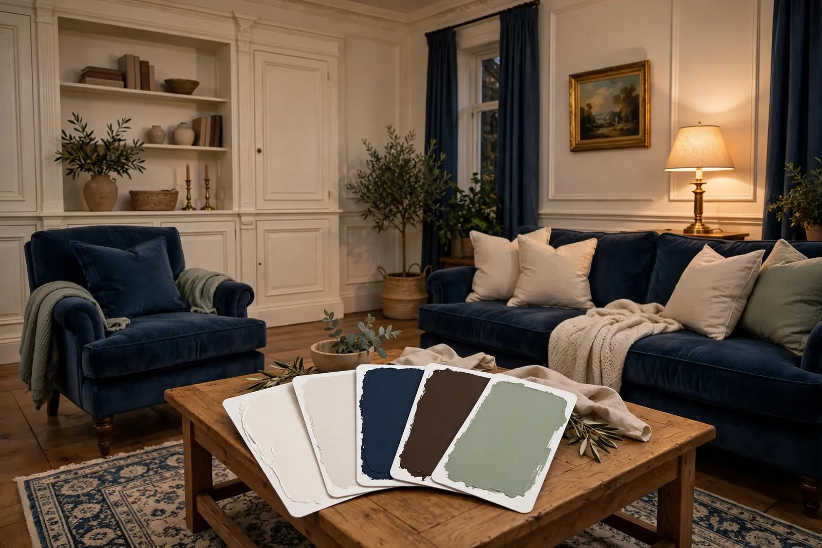
Benjamin Moore doesn’t sell paint the way most brands do, it curates it. With roughly 3,500 colors organized into heritage collections, fashion-forward previews, and a legendary off-white library, BM rewards a different way of choosing: understand how the brand’s system is organized first, then the right colors practically introduce themselves. This guide decodes the system and hands you the essential colors worth knowing, with honest notes on undertones, best rooms, and where each one fits a whole home.
How Benjamin Moore organizes its colors
Walk into most paint brands and you’re browsing one undifferentiated wall of chips. Benjamin Moore is organized more like a library, and once you understand the shelves, choosing gets dramatically easier. Four collections matter:
The Off White Collection (OC numbers). BM’s most famous contribution to color: 140 off-whites engineered to hold their subtlety on the wall, where cheaper whites go yellow or dingy. This is where White Dove, Simply White, Chantilly Lace, and Cloud White live. If your search starts with “the right white,” start here, not on the general wall.
The Historical Collection (HC numbers). 174 colors drawn from American architectural heritage, Williamsburg, coastal New England, colonial farmhouses. This is the home of Revere Pewter, Edgecomb Gray, Hale Navy, and Narragansett Green. The practical takeaway: Historical colors tend to be muted, complex, and forgiving in traditional and transitional homes. They’re the workhorses of the brand.
Color Preview (AF and CSP numbers). BM’s forward-looking collection, the colors designers are specifying right now. Silhouette (AF-655), the brand’s 2026 Color of the Year, lives here, alongside Batik (AF-610) and First Crush (CSP-310). Browse here when you want current, not classic.
The Classics. BM’s greatest-hits list, colors that have survived decades of trends. Manchester Tan, Antique Pewter, and Pashmina are designer-reported standbys that keep appearing in real homes year after year.
Why this matters for your decision: the collection tells you the color’s intent. A white from the Off White Collection was engineered for walls; a white from the general line wasn’t. A muted sage from Historical Collection was designed to age gracefully; a brighter sage from Color Preview was designed to feel current. Start in the right collection and half the narrowing is done.
How to read a Benjamin Moore color number
BM color numbers look cryptic until someone decodes them. They actually carry useful information:
OC (Off White Collection): e.g., White Dove OC-17, Simply White OC-117, Chantilly Lace OC-65. These are BM’s refined whites and off-whites, if the number starts with OC, you’re looking at a color engineered to behave on walls, trim, and cabinetry.
HC (Historical Collection): e.g., Revere Pewter HC-172, Edgecomb Gray HC-173, Hale Navy HC-154. Heritage-inspired, typically muted and complex. HC colors are the brand’s most forgiving neutrals, they were formulated for real rooms, not showroom lighting.
AF (Affinity Collection, now part of Color Preview): e.g., Silhouette AF-655, Batik AF-610, Pashmina AF-100. The Affinity line was designed around colors that harmonize with each other, a practical clue that AF colors tend to play well together in one home.
CSP (Color Stories Preview / full-spectrum): e.g., First Crush CSP-310. These are formulated with more complex pigment blends, which designers report gives them unusual depth, they shift less between morning and evening light than simpler mixes.
Plain numbers (e.g., 1572, 1617, 1054): the general Benjamin Moore palette. Raindance 1572, Cheating Heart 1617, Sherwood Tan 1054, all widely-used colors without a collection prefix.
The takeaway isn’t to memorize prefixes; it’s to notice them. When a designer recommends three colors and they’re all HC numbers, that’s a signal, Historical Collection colors share a muted, heritage sensibility that makes them natural companions. Match the prefix, match the sensibility.
The essential whites and off-whites
BM’s white game is arguably the strongest in the industry, and it’s where most people should start, because the white you choose influences everything it touches. Designer-reported standbys:
| Color | Character | Best for | Watch out for |
|---|---|---|---|
| White Dove OC-17 | Soft, warm, forgiving | Walls, trim, cabinets, the universal answer | Can read slightly creamy in very warm light |
| Simply White OC-117 | Clean, warm-bright | Kitchens, trim, ceilings | Brighter than it looks on the chip |
| Chantilly Lace OC-65 | Crisp, clean, minimal | Modern interiors, trim contrast | Can feel stark in dim, north-facing rooms |
| Swiss Coffee OC-45 | Creamy, enveloping | Traditional kitchens, cozy bedrooms | Goes more golden in strong sun |
| Cloud White OC-130 | Soft and balanced | Whole-home continuity, trim | Sits close to White Dove, compare side by side |
| Decorator’s White OC-149 | Cool, contemporary | Modern kitchens and baths | Needs cool finishes around it to feel at home |
| Classic Gray OC-23 | Off-white with quiet warmth | Walls needing subtle contrast with trim | Not a true gray, reads as a warm off-white |
White Dove OC-17 deserves its reputation as the most-referenced BM color in designer circles, it’s the white that appears on trim, cabinets, and walls in real homes more than any other, precisely because it stays consistent across lighting conditions. Simply White OC-117 is the brighter, cleaner sibling, the choice when White Dove feels too soft. Chantilly Lace OC-65 is the minimalist’s white: crisp without being blue, but it demands good light.
The 2026 momentum is behind Swiss Coffee OC-45, a creamy warm off-white that designers are specifying as the antidote to sterile bright whites. It pairs naturally with the year’s earthier palette: Sherwood Tan, Southwest Pottery, and the espresso depth of Silhouette.
The essential neutrals and greiges
BM’s neutrals run warmer and more complex than the average brand’s, which is why they’ve outlasted the gray era. The standbys designers keep specifying:
Revere Pewter HC-172, the greige that launched a thousand living rooms. Warm, balanced, endlessly forgiving; the default answer for “a neutral that works everywhere” for over a decade. Edgecomb Gray HC-173, Revere Pewter’s lighter, airier sibling; less commitment, same warmth. Pashmina AF-100, a soft, warm taupe with unusual depth; designers report it as the answer when gray feels cold but beige feels dated.
Manchester Tan HC-81, BM’s heritage warm tan, straight from the Historical Collection; grounded and classic in traditional homes. Antique Pewter 1560, a complex gray-green-taupe that shifts beautifully through the day; a favorite for bedrooms and dining rooms. Balboa Mist OC-27, pale, warm, quiet; the “barely there” neutral for small or dim rooms. Wickham Gray HC-171, a hushed cool gray for those who still want gray but warmer than the stark stuff. Gray Owl OC-52, BM’s answer to the modern cool gray, at its best in bright, south-facing rooms.
The pattern to notice: BM’s most enduring neutrals all carry warmth or complexity, they were formulated to live in real rooms with real wood, not in showroom light. That’s the brand’s quiet advantage in the neutral category, and it’s why colors like Revere Pewter and Edgecomb Gray have survived trend cycles that killed flatter grays.
The depth colors: navy, green, and the 2026 palette
BM’s deep colors are where the brand shows its range, and 2026 is their year. The cultural shift designers call “cocooning”, rooms that feel enveloping rather than stark, has put BM’s handsome midtones and deep heritage colors at the center of the conversation.
Silhouette AF-655, Benjamin Moore’s 2026 Color of the Year: a rich espresso brown with charcoal undertones. BM describes the 2026 palette as balancing “enchanting pales and handsome midtones,” and Silhouette is the anchor, designed for powder rooms, studies, dining rooms, and anywhere depth feels like luxury. Its coordinating palette (per BM’s announcement): Raindance 1572, Swiss Coffee OC-45, First Crush CSP-310, Batik AF-610, Narragansett Green HC-157, and Southwest Pottery 048.
Hale Navy HC-154, the navy against which all other navies are measured. Rich, classic, nearly black in dim light; the safe deep color for shutters, front doors, islands, and studies. Narragansett Green HC-157, a deep heritage green from the Historical Collection; quieter than Hale Navy, more organic; beautiful with brass and warm wood.
Black Forest Green HC-187, deeper and moodier than Narragansett; the library-and-den green. Cheating Heart 1617, a soft black with blue-gray depth; the sophisticated alternative to pure black for doors and cabinetry. Kendall Charcoal HC-166, BM’s most versatile dark neutral; warm enough for traditional homes, crisp enough for modern ones.
From the 2026 trends palette, three more worth knowing: Raindance 1572 (a muted blue-green designers are using for calm bedrooms), Batik AF-610 (a dusty violet-leaning midtone for enveloping dining rooms), and Southwest Pottery 048 (an earthy terracotta that pairs naturally with BM’s warm neutrals).
Benjamin Moore vs. Sherwin-Williams: the honest version
The internet’s favorite paint debate usually devolves into brand loyalty. Here’s the useful version, the differences that actually change how you choose:
Philosophy. Benjamin Moore organizes by collection, heritage, off-whites, forward-looking previews. Sherwin-Williams organizes by color family and use case, with a heavier emphasis on whole-home coordination systems. Practically: BM rewards browsing by collection; SW rewards browsing by room or style.
Neutrals. BM’s signature neutrals (Revere Pewter, Edgecomb Gray, Pashmina) run warmer and more complex, formulated for heritage and traditional rooms. SW’s signature neutrals (Agreeable Gray, Accessible Beige, Repose Gray) run slightly cooler and more streamlined, formulated for modern whole-home flow. Neither is better; they’re tuned for different houses.
Whites. BM’s Off White Collection is the industry’s deepest bench, 140 engineered off-whites. If your project hinges on the perfect white, BM gives you more to choose from. SW’s whites (Alabaster, Pure White, Extra White) are fewer but each is a proven workhorse.
The same-name trap. Both brands have an “Alabaster”, and they’re different colors. Designers report BM’s Alabaster (OC-129) leans cooler with subtle gray-beige character, while SW’s Alabaster (SW 7008) is the warmer, creamier of the two. Never assume same-name colors match across brands; always sample the specific brand’s version.
Where to start if you’re building a whole-home palette from BM: pick one anchor from the neutrals above (Edgecomb Gray for light and airy, Pashmina for warmth, Revere Pewter for the proven middle), one white from the Off White Collection (White Dove for universal, Simply White for brighter), and one deep color for contained moments (Hale Navy for classic, Narragansett Green for organic, Silhouette for current). That’s a complete BM whole-home system in three decisions.
Want the palette without the guesswork?
The Whole Home Paint Guide gives you a complete, ready-to-use color system, every room mapped, trim and ceiling pairings included, undertones already coordinated, so you skip the shortlisting and go straight to the part where your house feels finished. (Independent guide; not affiliated with Benjamin Moore or Sherwin-Williams.)
Frequently asked questions
White Dove OC-17 is the most widely referenced BM color in designer circles, used on walls, trim, cabinets, and built-ins because it stays consistent across lighting conditions. Among neutrals, Revere Pewter HC-172 and Edgecomb Gray HC-173 are the long-running standbys, and Hale Navy HC-154 is the brand’s signature deep color.
They identify the collection: OC is the Off White Collection (refined whites like White Dove), HC is the Historical Collection (heritage colors like Revere Pewter and Hale Navy), and AF/CSP are Color Preview colors (current, designer-forward shades like Silhouette AF-655). Matching the prefix is a shortcut to matching the color’s sensibility.
Neither is objectively better, they’re tuned differently. BM’s strengths are its Off White Collection and complex, warm-leaning heritage neutrals; SW’s strengths are streamlined whole-home neutrals and strong coordination systems. Choose by which brand’s palette matches your house’s finishes and style, not by loyalty.
Lean warm: White Dove OC-17 or Swiss Coffee OC-45. North light is cool and indirect, and it makes crisp whites (like Chantilly Lace) read icy, a warm off-white balances the cool cast. Test any finalist in the room’s actual light before committing.
Paint stores can usually color-match across brands, but it’s not exact, each brand’s base and pigment system differs, so a matched color can shift slightly in undertone or depth. For the most faithful result, buy the color in the brand that formulated it, especially for whites and complex neutrals.
Silhouette AF-655, a rich espresso brown with charcoal undertones, announced as the centerpiece of BM’s 2026 “enchanting pales and handsome midtones” palette. It’s designed for enveloping, cocooning spaces: powder rooms, studies, dining rooms, and anywhere depth reads as luxury.

